Our Venture Capital Website Design Best Practices, Header-to-Footer
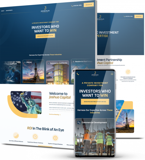
Building trust and credibility is key when it comes to venture capital website designs. Best practices include:
- Use your hero section to display your UVP so potential clients know who you are and what you have to offer
- Opt for a module instead of a carousel to display images or portfolios, as a carousel can potentially disrupt the user journey, by causing the user to get stuck in a section
- Use specific wording for CTAs so visitors know exactly where the button will take them
- Use short and benefits-driven copy to allow skimming throughout the site while educating your visitors about your offerings
- Display social proof on the homepage, such as successful entrepreneur stories to increase your brand’s credibility and to educate prospects on how your brand has helped previous founders and companies
- Position your contact details in a sticky navigation menu so your visitors never lose sight of them, no matter where they are on your website
- Place a contact CTA in the nav menu (for example, Let’s Talk) so your user can jump to the conversion page at any step of their journey
- Design a strategic conversion funnel to help encourage visitors toward key conversion points
Get Weekly Web Design Insights & Inspiration
Before Planning Your Venture Capital Website, Consider These Insights
Industry insights are crucial to your business. They allow you to understand your target audience, help you make strategic decisions and drive your design.
For example, here’s an interesting insight to consider when planning your venture capital website design:
60% of startups use Twitter to spread venture capital awareness, while 47% use Facebook and 36% use LinkedIn.
What does this mean for venture capital web design? It means you need a strong social media presence that connects to your website and vice versa.
A social media presence as a venture capital firm can help you attract startups and other budding businesses with significant potential growth potential, allowing you to find the best opportunities for investment.
You can build a better social media presence by keeping your brand voice consistent and engaging with your target audience through images, videos, polls and other interactive elements.
Best Venture Capital Website Design Examples To Get Inspired By [+ Our Strategists’ Notes On Each]
From modern design to testimonials and stunning stats, here are our picks for the top venture capital website designs.
1. Fanjul Capital
Website: fanjulcapital.com
Category: Venture Capital Firm
Design by: Digital Silk
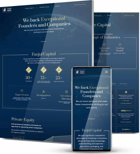
Fanjul Capital’s homepage opens with a clear and bold unique value proposition (UVP): “We back exceptional founders and companies. We are more selective and make fewer investments sticking to our core values.”
It’s clear from the start that this venture capital brand only partners with the best of the best.
The navigation menu is sticky and concise, with just four menu options: Private Equity, Venture Capital, Contact and Investor Portal.
The messaging throughout the website is kept concise to highlight key points and allow skimming.
We create fully optimized digital solutions at Digital Silk, and Fanjul Capital’s website is no different. The site follows our SEO best practices such as keyword-optimized title tags, meta descriptions and headers.
Optimizing your site for SEO allows it to rank better on search engine results pages (SERPs) and attract more qualified traffic.
An authoritative serif typeface is used for headers, balanced by a sans serif typeface in the sub copy, which is slightly softer and more inviting.
Even the typography exudes a premium feel, with a gold gradient effect on the text throughout.
Color psychology plays a crucial role in web design when it comes to triggering certain emotions from website visitors.
The dark blue as the primary color throughout Fanjul Capital’s site is representative of honesty and loyalty.
White stands as the secondary color, closely aligned with purity, and gold is used as the accent color, which symbolizes sophistication.
Faint images of globes are used in the background to break the monotony of a flat background while still allowing site visitors to focus their attention on the site’s messaging.
Underneath icons that showcase the brand’s key stats, a line graph displaying an upward trend is found midway through the homepage. This line is used to segment the company’s identity as both a private equity and venture capital firm.
Subtle animation is used throughout, including a gold color that fills CTA boxes with a hover, for added engagement.
Just below the hero section, the website displays social proof in numbers. This shows their expertise and knowledge through their years of experience and investing — a key factor for brands in this industry.
2. Intel Capital
Website: intelcapital.com
Category: Venture Capital Firm
Copy on Intel Capital’s website is kept simple and direct. Calls-to-action (CTAs) such as “Meet the Team” and “See Our Portfolio” are specific, so site visitors know where they’ll go if they click.
Navigation is sticky with the contact details clearly visible in the top right corner, so the user is always able to convert, regardless of where they’re at on the site.
Landing on the homepage, visitors are greeted with images of people who are smiling — a trend that continues throughout the user journey.
The element of human faces provides a human touch that helps create an emotional bond and showcase the brand as friendly, trustworthy and approachable — key for potential clients who are considering reaching out.
The site utilizes four colors in their color palette: dark blue, red, light blue and yellow — primary colors that transition to each individual section of the homepage as the visitor scrolls down.
Mid-way through the homepage, social proof in the form of numbers showcases stats about clients and market value.
These bold numbers against the equally bold background make a statement for potential clients — this venture capital brand has experienced great success, and they can help you become successful, too.
From 700 customer intros made each year to $150 billion market value of exited companies in the last 10 years, these numbers showcase the brand as a professional and trustworthy partner.
So what would we adjust? Landing on the homepage, the visitor sees news instead of a UVP about the brand.
The “Watch Now” button also creates a confusing user journey for site visitors, because it directs them to case study video right off the bat, when they’re likely not ready for that step yet.
While the color contrast of the light typography against the dark backgrounds makes the text stand out, some of the font sizes are too small, which affects readability.
The small fonts, busy backgrounds and low contrast make it difficult for visitors to read.
The website also is not optimized for SEO — a big miss for visibility.
3. Lightspeed Venture Partners
Website: lsvp.com
Category: Venture Capital Firm
Lightspeed’s UVP is clear and concise. With paragraphs under two sentences, the site visitor can easily skim through the copy, and the short lines of text add to the brand’s sleek and consistent branding.
Lightspeed proves to be a top contender on our list with a site optimized for SEO.
Like Fanjul Capital, the site follows best practices such as optimized headers, title tags and meta descriptions. Search engine optimization allows Lightspeed to be more visible in SERPs.
This venture capital site uses bold yet simplistic typography for easy readability, with headers standing out in all caps to demand attention.
This typography positions Lightspeed as modern and cool — a venture capital brand that is certainly up-to-date on the latest technologies and industry best practices.
From celebrities the company has worked with to the team members who make up the brand, Lightspeed uses bold images to highlight people and bring the brand to life.
Scrolling down the page, visitors get to see the team members (not just stock images) behind the venture capital firm, which helps them humanize the brand and build trust.
From Lady Gaga’s HAUS LABORATORIES to Snap (formerly Snapchat), Lightspeed showcases the famous brands they’ve partnered with under their featured portfolio section to further build a reputable reputation.
Overall, Lightspeed Venture Partners breaks the boundaries of the usual minimalist website design with their unique approach to typography and bold image treatment.
But alas, we have recommendations. While they look flashy, a carousel can confuse often the user journey, causing users to get stuck. Instead of a carousel, we’d use modules, which typically provide a better user experience by laying out all the info in one glance.
Other things we’d change include more specific language to CTAs, using a sticky navigation bar to improve the user experience and making sure contact details were visible.
4. Nio Ventures
Website: nioventures.com
Category: Venture Capital Firm
Out of all the examples we’ve listed, NIO Ventures is the only venture capital firm that makes use of a video that plays automatically in the hero section to capture attention and drive engagement.
The messaging on top of the video shares the firm’s UVP, though difficult to read at times as the video plays.
The key messaging, “We accompany you so that you can find your bearings even on the most complex journeys” speaks directly to the target audience — entrepreneurs who are looking for support to turn their dream into a reality.
Nio Ventures uses a module in the “What we do” section, so the website visitor has all the information they need right in front of them, in a user-friendly design.
On the homepage, NIO Ventures displays social proof in not one but two ways — through numbers and client testimonials.
Social proof can act as a powerful deciding factor for entrepreneurs who are considering reaching out. Impressive numbers and praise-worthy reviews can help push a website visitor from consideration to conversion.
Overall, NIO Ventures offers a clear conversion funnel, from top to bottom. The only element that’s missing? CTAs.
The visitor doesn’t see a single call to action until they’ve scrolled halfway down to the “What we do” section, where a “Learn more” link is nearly hidden. The site also isn’t optimized for search engines.
While the typeface used is consistent throughout the homepage, there are spots in the homepage that are difficult to read because of inefficient color contrasting. The white typography also disappears with busy backgrounds.
While an engaging video, sticky navigation, valuable social proof and other factors land this web design on our list, key areas for improvement include CTAs, readability and search engine optimization.
5. Pear
Website: pear.vc
Category: Venture Capital Firm
Right off the bat, Pear’s hero messaging is specific and clearly states what they do: “We partner with entrepreneurs from day zero to build category defining companies.”
This messaging instantly connects with an entrepreneur who is eager for financial backing to help get their company off the ground.
The site has a sticky navigation menu that consists of three key pages, which stays in sight as users scroll down the homepage. Clicking on the hamburger menu in the top right corner also provides access to additional pages.
In addition to the line vector art used as the background for the main messaging, Pear uses images of their team members in a carousel format, helping to provide a realistic touch and give the website visitor a sort of behind-the-scenes look into the brand.
Mid-way through the homepage, the website shows social proof that displays some of the most impressive numbers they’ve acquired throughout the past eight years.
These numbers carry weight for an entrepreneur who is looking to partner with a brand that has a successful track record.
While we applaud the sticky navigation, clear UVP, branded color palette and portfolio display, Pear lacks an engaging user journey without a conversion funnel or CTAs.
While Pear adheres to some of our SEO best practices, the header structure is off and needs to be reviewed. By implementing H2s and H3s, the site could improve the structure and guide users to specific sections of their content.
Pear is also missing easy-to-find contact information – a misstep that can increase bounce and decrease conversion.
Let's Discuss Your Venture Capital Website Design
Whether you'd like to hear more about our experience in your industry, our experts, our request a custom proposal for your project, get in touch and we'll get back to you promptly.
Contact us at (800) 206-9413 to discuss your venture capital web design project or fill out our Request a Quote form to receive a custom proposal and expert recommendations.