
Healthcare
HIPAA-compliant websites designed to attract and engage patients.

"*" indicates required fields

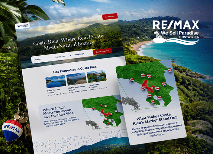
RE/MAX Costa Rica curates a life in paradise, and Digital Silk shaped a digital presence to speak to those seeking that same feeling: an elevated, nourishing lifestyle, and a place to rest.
We moved onto a platform built for that vision, with a custom listing database, refined search and broker tools, so every property is presented with that same intention and elegance.
Each listing lives within a website as organized and beautiful as the locale itself.
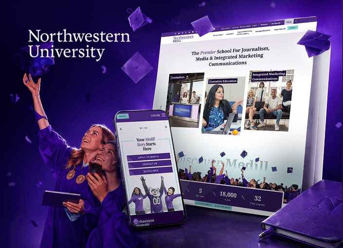
Northwestern Medill carries a century of defining the communications field.
Digital Silk reimagined the strategy, messaging and architecture beneath it, translating a legacy of authority into an elevated digital experience for a modern audience.
Micro-animations and a refined user journey capture results, goals and expertise that only a century of peerless reputation could command.
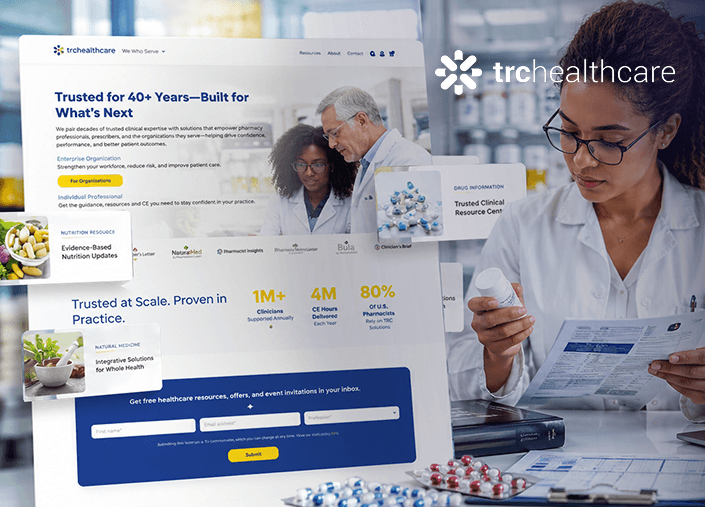
TRC Healthcare embodies decades of trust as the name pharmacy professionals and prescribers rely on, and Digital Silk developed a website that carries that same certainty.
We restructured the foundation without technical noise, so the mission and the results could stand on their own, and the portfolio presentation now feels personal and human.
The value of their work is visible the moment you visit the site, deliberate and unmistakably trustworthy in every detail, conveying the same precision and authority the organization has earned.
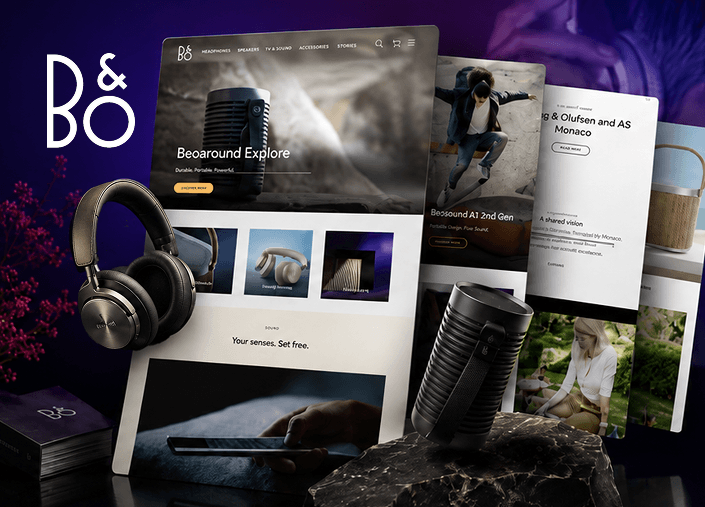
Bang & Olufsen is a name that has shaped how the world sees, hears and feels sound, and Digital Silk developed an eCommerce experience that invites people into the world behind it.
The experience we crafted showcases exclusive services, close-up product photography, and a dedicated space for the brand’s universe.
Every step toward purchase feels effortless, so the sale arrives as a natural conclusion.
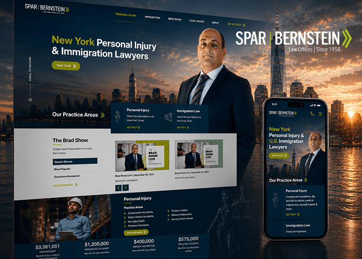
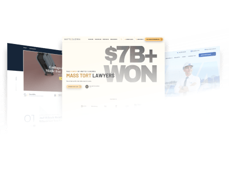
With over 100,000 clients across immigration and personal injury law, Spar & Bernstein’s reputation was already earned, so we rebuilt their website to reflect that scale of trust.
Digital Silk made it work seamlessly on every device, rewrote the content to rank higher, and reshaped the messaging to attract the right clientele.
Our SEO team resolved the keyword and technical issues holding them back. Within six months, Google traffic rose 14x, a result as decisive as the outcomes they secure for clients.
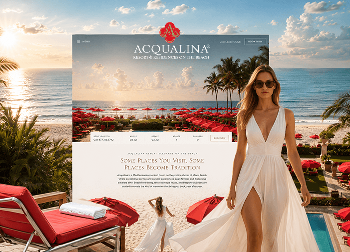
Acqualina is a world leading resort offering an unforgettable experience, and Digital Silk was tasked with making its digital presence feel every bit as refined.
We architected the site around the guest journey: rooms, dining, spa, experiences, and residences, so that finding your escape is its own kind of pleasure, and reserving it, part of the experience.
Motion design, photography and every detail is designed with intention so booking feels less like a transaction and more like you’re already checking in.
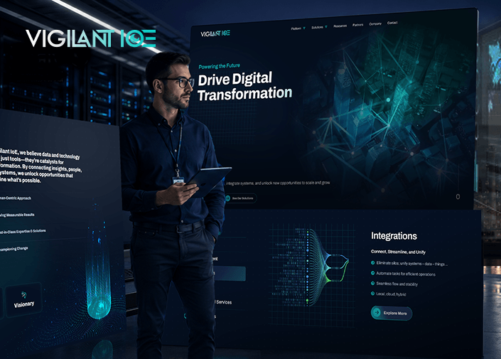
VigilantIoE is redefining what it means for every business to run on connection, so we redesigned the site to make that vision clear.
We restructured the navigation so real-time monitoring, predictive insights, interoperability, managed operations and custom development could be understood at a glance.
Virgil, VigilantIoE’s patented monitoring platform, now has a spotlight of its own to showcase the future of connectivity already in motion.
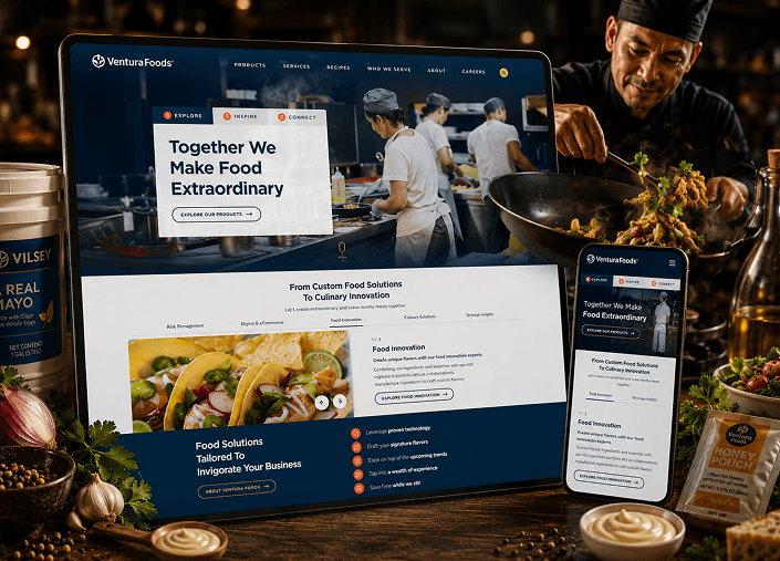
Ventura Foods supplies retail, industrial and manufacturing brands nationwide, and Digital Silk shaped a digital presence to match that expansive scale.
We streamlined the navigation, elevated the photography, and added a homepage video that commands attention, while a chatbot and clearer content structure make every product and recipe easy to find.
The result is a site built to serve buyers, partners and consumers alike, matching Ventura Foods’ standing as one of the largest names in the food industry.
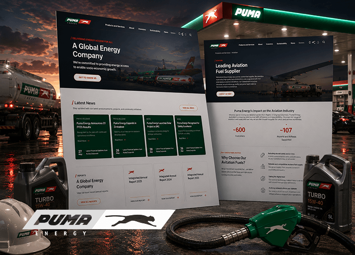
Puma Energy is a global energy leader, powering everyday drivers and commercial operations across dozens of markets worldwide.
Distinct audiences required two separate website experiences, consumer and B2B, so Digital Silk built each with its own navigation while maintaining one consistent brand identity.
Search optimization followed, and within a month, engagement rose 63% and traffic climbed 27%, a performance as sharp as the operations behind it.
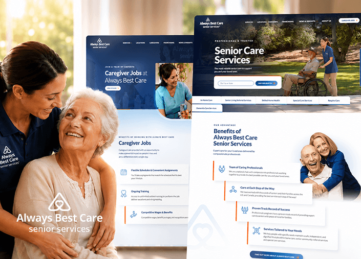
ABC Senior Services exists to bring the most compassionate and consistent care to families who need it most.
Digital Silk redesigned the path through the site and brought clarity to the every page, so each service, from in-home visits to daily support, is found without resistance.
A stronger SEO foundation followed, elevating visibility, strengthening domain authority, and delivering more qualified leads for long-term business growth.
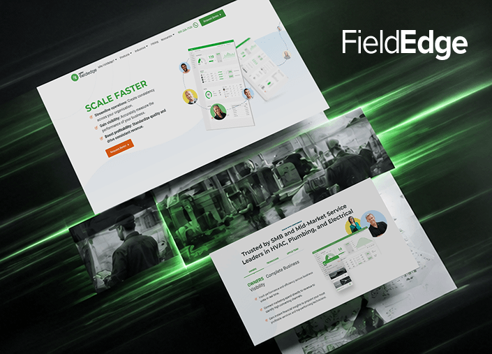
FieldEdge equips businesses with the software to manage on-site operations, and Digital Silk mapped a user journey built to guide decision-makers toward action.
Motion elements and interactive dashboards bring the platform to life, while messaging speaks their language and holds their attention.
The result strengthened the brand’s position in the field service space, with traffic growing 19% shortly after launch.
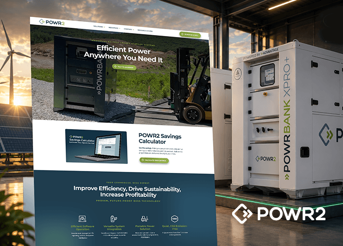
POWR2 builds the systems fueling a more sustainable energy future.
Their technology deserved to be understood, so Digital Silk built a site translating complex energy storage systems into something people could grasp.
Live counters and graphics bring the technology into view, while testimonials and case studies lend credibility. Within six months, traffic grew 77%, momentum that continues to build.
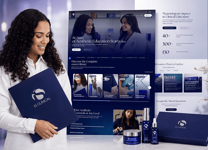
iS Clinical is elevating aesthetic education for practitioners around the world.
Digital Silk refined the architecture, strengthened the LearnDash foundation behind it, and reorganized how courses and resources come together.
Now, the learning journey unfolds naturally, one course leading into the next, exactly as the material was designed to be understood.
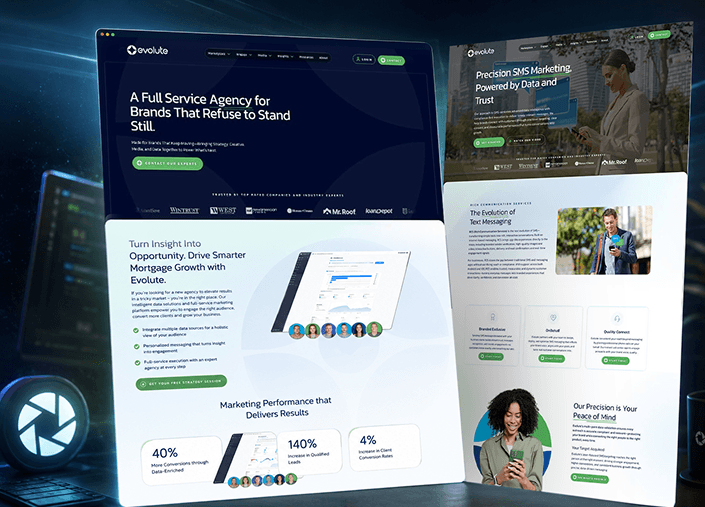
Evolute partners with some of the most recognized names in mortgage and home services, connecting them with qualified buyers through an end-to-end marketing model.
As the company expanded into integrated media and creative solutions, Digital Silk developed a new, SEO-ready platform with segmented pathways for service buyers, affiliates and partners.
The result: 100% brand-website alignment across every touchpoint, and active partnerships that have more than doubled since launch.
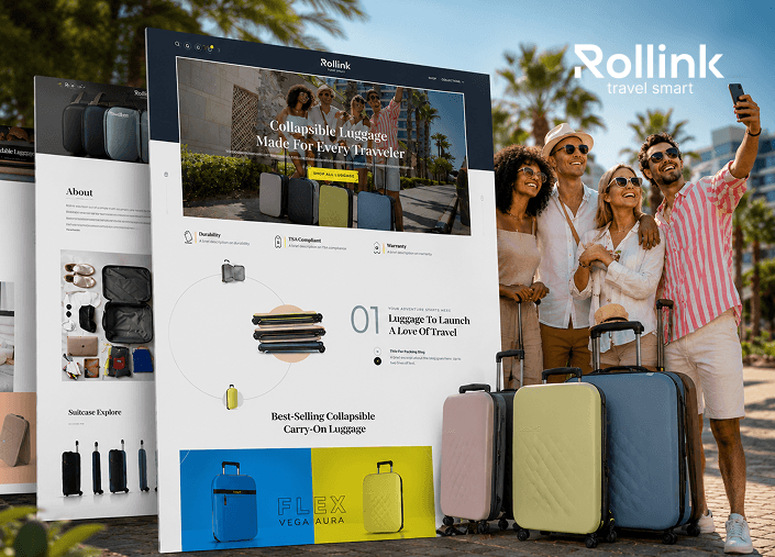
Rollink set its sights on the U.S. market, and Digital Silk delivered a custom eCommerce store, marketing strategy and SEO built for American travelers.
Product pages were designed to perform across every screen, elevated with subtle animation, while checkout was simplified into a fast, effortless experience.
The result was a fivefold increase in revenue and 700,000 new customers, establishing Rollink among U.S. consumers.
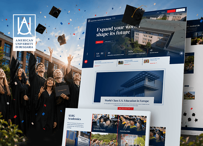
The American University in Bulgaria offers a world-class U.S. education inside a European campus community.
Digital Silk developed an intuitive digital platform tailored to prospective students, streamlining access to information while elevating navigation and engagement across every page.
The design contributed to a spike in online applications, a fitting outcome for a school that procuces marketing’s next success stories.
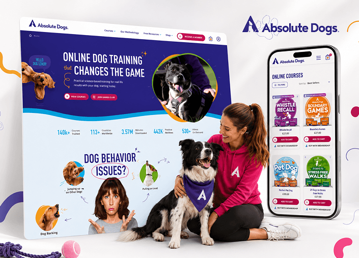
Absolute Dogs has built a name in dog training through real, results-driven methods that have changed thousands of dogs and their owners.
Digital Silk relaunched the platform on Shopify, restructuring conversion funnels, and reorganizing courses and memberships presentation.
Within the first month, completed purchases and organic traffic had over 30% growth, proof that the right structure converts.
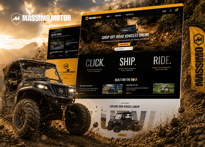
We redesigned Massimo Motor’s storefront with a bold eCommerce experience that reflects the brand’s rugged product lineup and supports both B2C and B2B buyers.
Our team connected Shopify with NetSuite through Celigo so inventory, orders and customer data sync in real time across the business.
We built advanced product filtering, mega menu navigation, a dealer and service center locator and a dual-checkout flow while keeping parts and accessories easy to buy online.
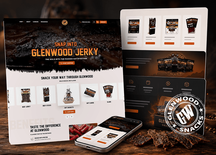
Glenwood Snacks has been a leader in premium dried meat snacks since 1975, trusted by generations of households in the United States and abroad.
A Squarespace site could no longer keep up with the business behind it, so Digital Silk made the migration to WooCommerce, designed for both retail and wholesale.
Payments now run seamlessly, while subscriptions let loyal customers auto-reorder favorites, driving repeat revenue.
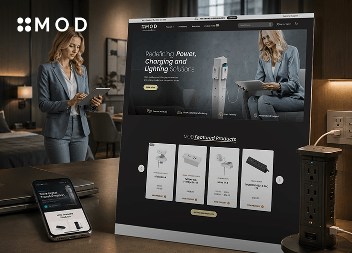
MOD, powered by National Lighting, has spent 25+ years engineering power and lighting solutions for the furniture industry.
Digital Silk replaced the outdated system with one that’s fast to search and easy to order. We added eCommerce tools, developed a dedicated partner-access portal, and fixed the points where potential orders were being lost.
The result is a buyer experience built with the same precision MOD brings to every product it engineers.
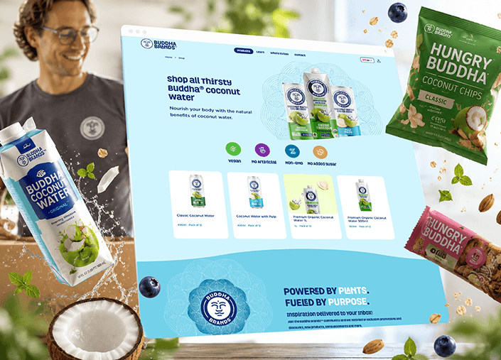
Buddha Brands has built a bold, plant-based identity, vegan-certified and made without anything artificial, found on shelves at some of North America’s leading markets.
Digital Silk developed a custom eCommerce site where the design carries that same identity, translating the brand’s story into every layout and interaction.
Color, texture and micro-animations run through every page, giving the site the same vibrancy as the product’s packaging.
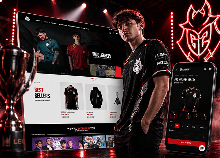
G2 Esports has established one of the most recognized names in competitive gaming, with 40 million fans worldwide and partnerships with brands like Logitech and Red Bull.
Digital Silk developed a platform built around G2’s community-driven identity, improving navigation across teams, collabs and the Performance Lab for a more intuitive experience.
The result was a platform built to increase both conversions and brand authority, aligned with G2’s scale and market position.
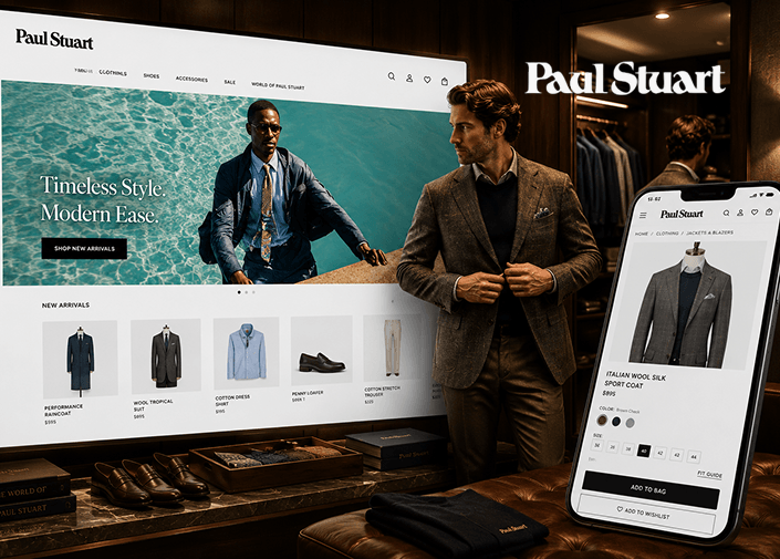
Paul Stuart has been a fixture of New York menswear since 1938, known for tailored clothing and made-to-measure craftsmanship that reflects the city itself.
Digital Silk simplified website navigation, streamlined checkout, and elevated photography throughout. Product collections now come forward clearly, with filters that let customers quickly find what they need.
Calls-to-action guide people toward purchase with strategic confidence, strengthening sales in luxury retail.
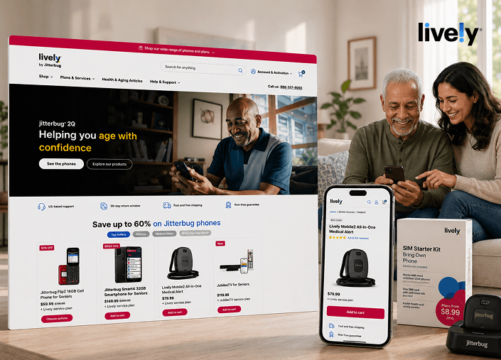
Lively has spent 20 years helping seniors age with confidence and independence.
Digital Silk redesigned its storefront around accessibility and intuitive navigation, with layouts built for future product launches, larger tap targets and smoother product discovery.
The result is a shopping experience where browsing, comparing and checking out feel effortless for every customer, regardless of age or digital experience.

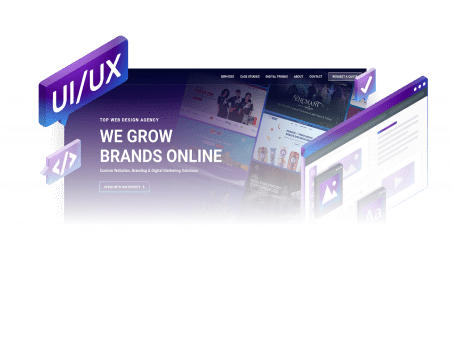
From startups to Fortune 500 companies,
we create custom solutions that grow brands online.


As a leading web design company, we have deep experience in regulated, high-growth, startup and consumer-facing industries.
This expertise allows us to deliver digital solutions faster and make smarter design decisions for your business.


Our experts handle everything related to web design and development, branding and digital marketing.
We begin by taking the time to understand your business, your goals, and what success actually looks like for you. From there, we build a clear, tailored digital marketing strategy grounded in research and real opportunity, not assumptions.
Once the direction is set, we move into execution. That means designing and implementing the right mix of tactics to bring qualified people to your site and turn that attention into measurable results.
Everything is handled in-house by our team, so you have full alignment, accountability and speed. If it lives in the digital space and supports your growth, we can take it on and deliver it.
We design custom websites around how your users behave. Every layout and functionality come from research and UX best practices, so your site looks good and moves people toward the actions that matter to your business.
Explore our Custom Web Design services.
We build on WordPress and other platforms, depending on what your business needs. Our developers write clean code and make sure your website works well on every device.
Explore our Custom Web Development services.
Our team creates online stores on Shopify, WooCommerce and custom platforms.
Every eCommerce project we work on is designed to turn your leads into buyers by making product pages, filters and the checkout process simple and smooth.
Explore our eCommerce Web Design and Development services.
Our team builds brand identities from scratch, including logo design, visual systems, messaging and guidelines.
If you are going through a rebrand, we make sure your new identity is consistent everywhere.
Explore our Branding services.
SEO best practices go into every project from the start. Our digital marketing team handles SEO, paid campaigns, social media marketing and content so your site gets found by your target audience.
Explore our Digital Marketing services.
If your website is underperforming, a redesign can make a big difference.
As your web design agency, we audit your platform, protect your SEO rankings and rebuild your site so it is faster, provides a better user experience and looks more modern.
Explore our Website Redesign services.


"*" indicates required fields


"*" indicates required fields
"*" indicates required fields