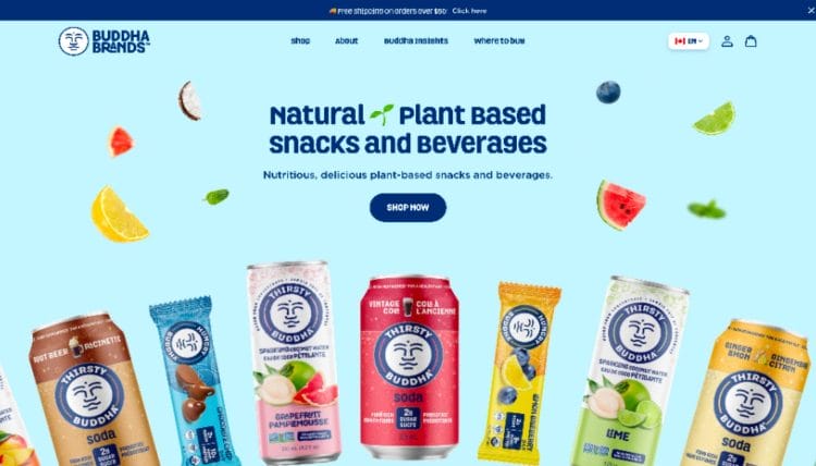
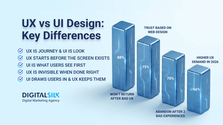
The Importance Of Using Responsive Web Design
Responsive web design ensures that websites function and display correctly across all screen sizes and devices.
Instead of designing separately for each device, flexible layouts and scalable components adjust automatically to fit the available screen space.
With 59% of users expecting sites to display properly on their device, poor responsiveness can lead to higher bounce rates and lost conversions.
Prioritizing mobile usability, clear navigation and performance optimization helps create a consistent user experience across platforms.
How Does Responsive Web Design Work?
Responsive web design is based on three main principles:
1. Fluid Grids
Think of your screen as a container separated into different content areas that form a grid. Once the size of the screen changes, the content areas adjust accordingly in order to stay within the container.
The grid will end up with a different shape but the content will still be there. The ability of the content areas to move is characterized as “fluid.”
2. Media Queries
Media queries are like smart filters that help your website adjust to different screen sizes.
They change the page layout based on the device someone's using to view your content.
This may sound technical, but the good news is that there are tools like Bootstrap, H5P and Elucidat that help with this process.
3. Fluid Images
Images, unlike grids, don't naturally change their size and flow.
Images come with set dimensions, which means they can look weird or broken when viewed on different screen sizes.
On mobile, the user would have to zoom into different parts of the page to read the copy and in other cases, images could take up the entire screen, causing the need to scroll.
By applying a CSS/ HTML command, images acquire the necessary fluidity and automatically adjust to the relevant screen.
What Does Responsive Web Design Look Like?
When working with a responsive web design company like Digital Silk, the process usually involves the provision of two UX designs: desktop and mobile.
Here’s an example of what responsive web design looks like:

The designers start with the desktop version, then scale it down to mobile.
The grayscale versions you see on the left are of the UX design on our website. The purpose of this black-and-white version is to map out the conversion funnel and content both on desktop and mobile devices.
Once the UX designs are confirmed by the client, the designers can proceed with user interface (UI) design which applies color, images, branding elements and other details onto the approved UX structure.
Responsive Web Design vs. Mobile-First Web Design: What Is The Difference?
Responsive web design and mobile-first web design each have their pros and cons. Let’s break down the key differences.
Mobile-first web design differs from responsive web design in:
- Design process: With mobile-first design, web designers begin with a website that fits the mobile device first, before adapting it for desktop computers. By scaling from mobile to desktop layout, they ensure an excellent user experience characterized by fast download speeds, rich media content and easy navigation. Responsive web design, on the other hand, begins with the maximum required screen resolution. Designers narrow it down to smaller screens so the content and layout fit different devices.
- Purpose: Although both B2B and B2C sectors use both mobile-first and responsive web design, responsive web design is more common among B2B businesses. Most B2B clients access their website via laptop or desktop computers which makes this type of design a priority. For B2C businesses, mobile-first is ideal because their customers are on the go and the majority use smartphones.
- UX: Both responsive and mobile-first designs aim to create a seamless UX across multiple screen sizes. The only real difference comes in terms of the design process. While a responsive web design will include adaptable elements to ensure cross-channel synergy, a mobile-first design will focus on smaller screen functionalities before working up toward desktop UX-optimization.
- SEO: Responsive web design focuses primarily on providing value to the user by giving them an easy-to-use design across devices—something Google sees as a huge plus in its ranking factors. Mobile-first designs instead limit potential issues with duplicate content and technical faults, while also opening the opportunity to align with Google’s mobile-first crawling and indexing methods.
For instance, this website is not only built for large screens, but its cluttered layout, tiny text, and overwhelming number of elements make it difficult to understand or navigate.

Because it doesn't follow responsive and mobile-first principles, the page becomes difficult to read, scan and navigate, especially on smaller devices.
Responsive Web Design Examples From Renowned Brands
To put UX/UI design into perspective, let’s take a look at some of the best responsive web design examples.
These examples will show you the difference between desktop and mobile versions of websites and demonstrate the importance of having fluid grids and flexible images that adapt to different screen sizes.
1. QuickBooks
With a lot of white space in both the desktop and mobile version of its website, QuickBooks offers a clean page layout, a clear value proposition in the hero section and distinctive color for CTA buttons that allows them to stand out.
The desktop version features a complete navigation bar in the website header, as well as additional information about the special offers in the hero section.
On the other hand, the above-the-fold area on the mobile version shows just the key information with a hamburger menu and to-the-point CTAs. Thanks to this responsive design, the user is able to get the full brand experience on both desktop and mobile.

2. Harvard Business Review
Harvard Business Review's desktop site shows more headlines and stories compared to the mobile version.
However, both versions highlight one main article with a large featured image while other headlines appear as text-only. That key story grabs your attention whether you're on your phone or laptop.
The navigation works differently on each device. On desktop, you see the full menu with all the main categories in the navigation bar. On mobile, you need to tap the menu icon first.
Even with these differences, the experience feels the same and the important elements are always easy to find no matter the device you're using.

3. Converse
Converse takes a similar approach.
Their desktop header shows the full category menu plus options to sign in, manage your profile, search the site and check your wish list and cart.
The information displayed in the hero section on both desktop and mobile is the same, including the slider with different products.
But the desktop version shows an additional image and a distinctive CTA button, while the same call to action on the mobile version isn’t visible until visitors scroll down.
The truth is, you can't fit everything from a desktop site onto a phone screen.
Converse gets this and still provides users with a solid experience on both.

4. The New York Times
The New York Times nails the transition from desktop to mobile.
Desktop includes all the sections, including the news categories in the menu, the ability to switch between local and international coverage, featured stories and even the current temperature in New York.
On mobile, you can explore the stripped down version that includes the most important sections. You can see the date, subscription and sign-in buttons at the top and one main story front and center when you land on the page.
If you put them side by side, you'll see mobile keeps the core elements from desktop, such as the top story, the image and quick access to sign in or dive deeper.

5. Shopify
Shopify's website shows how responsive design doesn't need to be complicated.
The copy is short and gets to the point immediately. Images are original and appealing. And you also can't miss the call-to-action buttons.
On desktop, the navigation menu has dropdown options. On mobile, that becomes a hamburger menu.
The desktop header includes links to "Pricing" and "Learn" while the mobile version features only the "Log in" button.
What really works here is the clean design with plenty of breathing room. Instead of cramming copy and elements everywhere, they let a clear value proposition, quality video and strong CTA do the heavy lifting.

Have you noticed how each of these examples showcases a simplified, decluttered and attractive layout that naturally fits into smaller screens, while the desktop versions offer more information, larger images and various CTA buttons?
That's what responsive web design is all about.
You're not trying to squeeze every last detail from a desktop site onto a tiny phone screen.
You're keeping what matters and making sure people get a great experience no matter how they're viewing your site.
Digital Silk's Responsive Web Design Examples
As a full-service responsive web design agency, we create websites that look sharp on any device and deliver measurable results.
Here's how our team combines responsive design, smart technology and strategy to build experiences that perform across the board.
1. Procom
We built Procom Services a fully responsive website that works in multiple languages to support their global expansion..

We restructured how their services are presented so everything makes sense on any screen, streamlined the user experience, boosted site speed and implemented a CMS that makes managing content and translations painless.
2.Clear Blue Insurance Group
Clear Blue Insurance Group came to us because they wanted to refresh their brand and get a responsive site that reflects their position in the insurance industry.

We created polished visuals and a website that makes complex program information easy to understand.
The results include better mobile performance, smoother usability and a site that naturally moves visitors toward conversion.
3. Servion
We completely rebuilt Servion's website to reflect their status as a company with a global impact in the customer experience field.

The new responsive site has a bold look, clearer messaging about what they do and a user experience built specifically for the enterprise decision makers they are trying to reach.
Why Is Responsive Website Design A Must?
- With more than 61.5% of global internet traffic coming from mobile devices, cross-device optimization is no longer just an afterthought. Your website needs to operate, function and respond at the same speed and efficiency as the desktop version.
- Brand consistency and uniform user experience (UX) are key. Whether on desktop, mobile or tablet, your user should have a seamless, uniform experience across all devices and all interactions with your brand.
- Google uses mobile-first indexing, which means your site has a better chance of ranking if you have a responsive web design that displays properly on mobile.
- Separate websites require more maintenance. Responsive web design ensures a proper layout on every screen size, with one web design.
- A responsive web design will help decrease your bounce rate on mobile and other handheld devices. If a website isn’t loading properly mobile users will bounce quickly and avoid returning again.
Responsive Web Design Best Practices
When building a responsive web design, there are certain best practices to keep in mind to ensure your site functions as it should and ultimately offers a consistent user experience.
1. Consider CTA Placement & Frequency
CTAs are the holy grail of website elements.
Amidst the hustle and bustle of adjusting content to fit the relevant screen sizes, never neglect the importance of your CTA.
- Make your CTAs visible to the user upon landing
- Include more than one CTA throughout each page
- Make CTAs stand out using engaging action verbs
- Consider the size of CTAs to ensure they stand out on smaller screens

2. Choose Typography Carefully
In 2012, American film director Errol Morris wrote a piece for the New York Times titled “Are You an Optimist or a Pessimist”?
What people reading the article didn’t know was that Morris was conducting an experiment on the effect of typefaces in changing people’s opinions.
Six typefaces were used in this experiment: Baskerville, Helvetica, Comic Sans, Computer Modern, Georgia, and Trebuchet. In a follow-up article, he shared the results.
- Comic Sans caused the most disagreement
- Baskerville had the most positive responses
Choosing a font type might seem tedious to most, but history and data tell us otherwise. Fonts can make or break your website.
Here are a few font-specific details you need to be mindful of:
- Type: Legibility on all screen sizes is critical
- Size: Fonts should be proportionate with the device
- Spacing: Spacing between letters can aid/hinder the reading speed
- Width of text block: Chunky content blocks are lees inviting to read
- Selection: More than 1-2 fonts make the website too “noisy”
- Alignment: Always align copy for an optimal reading experience

3. Prioritize User Interaction (UI)
When you're designing for different screen sizes, you need to think about how people use each device. Here are some things to keep in mind:
- For desktops, visitors use a cursor
- For tablets, visitors use an index finger
- For mobile devices, visitors use a thumb
Schedule A Consultation With Our Responsive Web Design Company
At Digital Silk, we create custom responsive web design projects unique for each brand, to increase visibility and traffic, ensure a consistent brand experience and ultimately, increase conversions.
As a full-service responsive web design agency, we are also specialists in creating designs that appeal to the right user intentions.
We offer a free consultation & custom proposals for custom website design projects. Simply fill out the Request a Quote form, tell us about your goals and our experts will provide you with actionable insights and cost estimates.
Or, call us at (800) 206-9413 to start the conversation.


