Background Gradient

Minimalist Website Design Company

Work with a top-rated minimalist website design company to create a sleek, custom site and a superior user experience.

  • Build A Custom Design
  • Streamline The User Experience
  • Boost Traffic & Conversions
Request a Quote
Designrush logo

5 Star DesignRush Reviews

Web Design
Excellence Award

ecommerce-agencies-2024
Designrush logo

5 Star DesignRush Reviews

Web Design
Excellence Award

ecommerce-agencies-2024
Scroll Down

Minimalist Website Design Services

Build a minimalist website from scratch or simplify your existing web design to offer an engaging yet streamlined user experience on all devices.

Minimalist Website Design

CLICK TO VIEW MORE

Our award-winning designers create custom websites that bring our clients’ brand identities to life through strategic planning and design.

Minimalist Website Redesign

CLICK TO VIEW MORE

Whether you’re reinventing your brand or looking to modernize your website, our minimalist designers work with all leading platforms to deliver custom redesigns.

Minimalist Website Development

CLICK TO VIEW MORE

Whether you’re building a website from the ground up or looking to transition to a new platform, our website developers at Digital Silk are experts in all industry-leading platforms and technologies.

Minimalist eCommerce Website Design

CLICK TO VIEW MORE

From WooCommerce and Shopify to Adobe Commerce (Magento), our web design team works with all leading eCommerce platforms to deliver custom e-stores that convert.

Minimalist website design company custom web designs
Request A Quote

Maximize Your Conversions With Digital Silk

"*" indicates required fields

This field is for validation purposes and should be left unchanged.

Minimalist website design company custom web designs
Background Gradient
Our Clients

Trusted Minimalist Web Design Company

From startups to large corporations, we partner with companies across industries
to build engaging websites based on minimalist principles.

babiesrus logo
Babies R Us
rollink logo
Rollink
EV Universe logo
EV Universe
Northwestern_Qatar_Logo_2_
Northwestern University
ibm logo
IBM
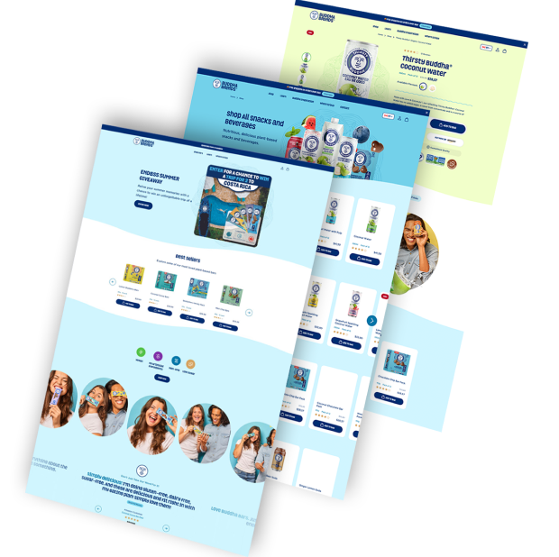
buddha brands logo
Buddha Brands
paul stuart logo
Paul Stuart
spar bernstein logo
Spar & Bernstein
Sony logo
Sony
new-dev-rev logo
NewDevRev
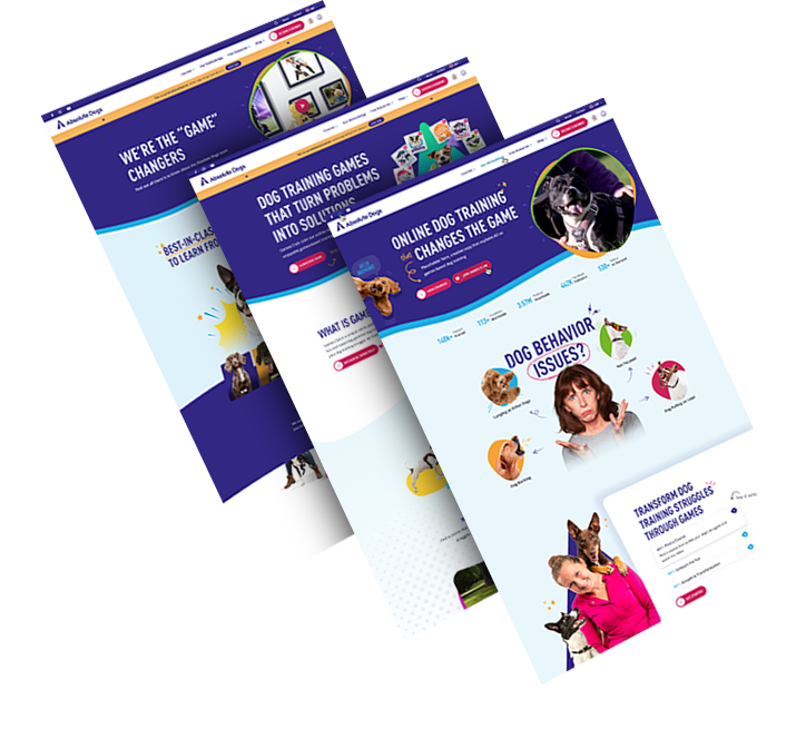
Dognomics Logo
Dognomics
Mitsui Plastics
puma logo
Puma Energy
xerox logo
Xerox
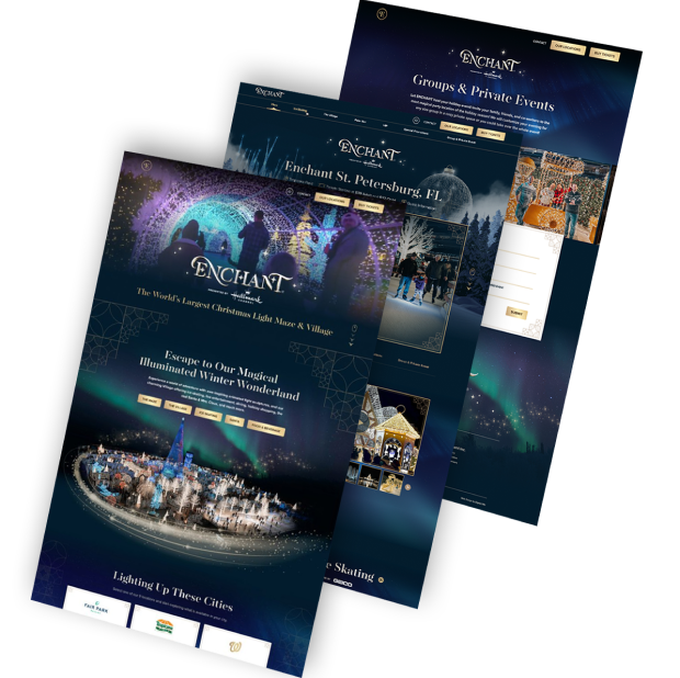
enchant logo
Enchant Christmas
grenco logo
Grenco Science
OUR WORK

Featured Projects

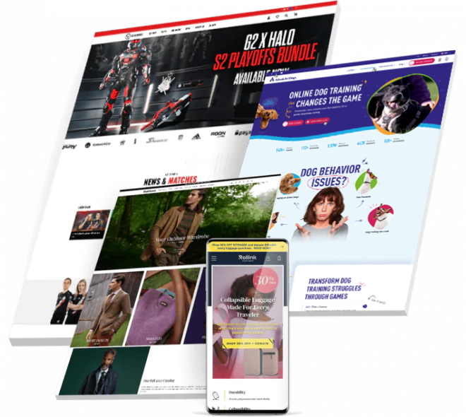
Check out our diverse portfolio of eCommerce, B2B and B2C website designs.
Featured
A background image for EV Universe of a car driving on an empty road. ev
Electric Vehicle eCommerce Marketplace

Our team crafted a cutting-edge, on-brand design that strengthens the distinctive visual identity of electric vehicle marketplace EV Universe.

Featuring dynamic visuals and interactive elements, the innovative platform drives credibility while elevating user experience for buyers and sellers alike.

A background image for Northwestern Medill of a professor giving a speech northwestern
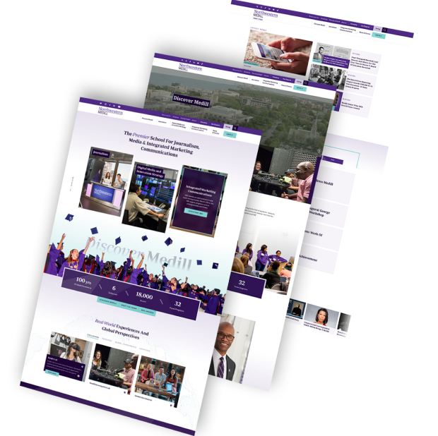
Responsive University Web Design

Our full suite of agency solutions, from digital strategy to messaging, site architecture and responsive development, transformed Northwestern Medill’s online experience.

We produced an engaging, easy-to-use experience through micro-animations and a meticulously planned user journey to boost conversions and drive student and staff satisfaction.

A background image for Sony Rewards of a couple laughing sony
Gamified Digital Platform

Our award-winning designers approached Sony Rewards’ aim to increase on-site engagements by delivering a stripped-back custom web design.

The intuitive technology website features easy-to-use dropdown navigation menus and crystal-clear CTAs to drive signups.

A scientist doing his work in a lab SNP
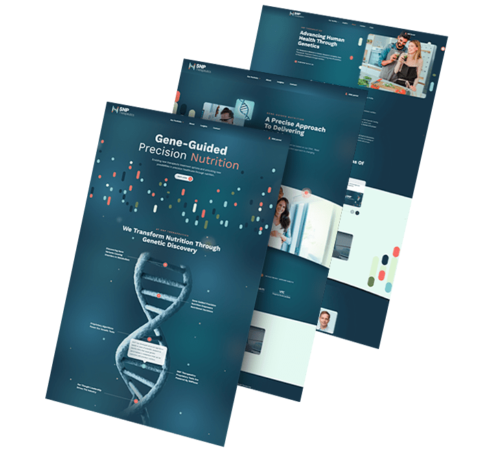
Biotech Brand & Digital Presence Development

We delivered a custom website redesign alongside new brand positioning and brand messaging solutions to rebuild SNP Therapeutic’s visibility in the DNA testing market.

Following in-depth research, our brand and digital strategists crafted a corporate design across redefined site architecture.

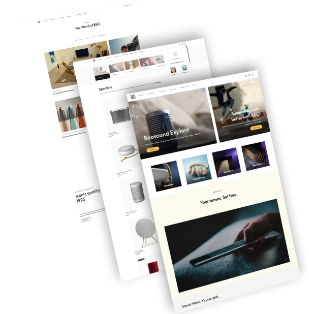
A background image for Bang & Olufsen of a man wearing headphones BO
Hi-Tech eCommerce Store

By creating a distinctive design tailored for a high-end electronics eCommerce store, we helped position Bang & Olufsen as a tech market innovator.

With a unique design and a streamlined sales funnel, our digital solutions targeted both UX and UI to grow brand visibility and customer engagement.

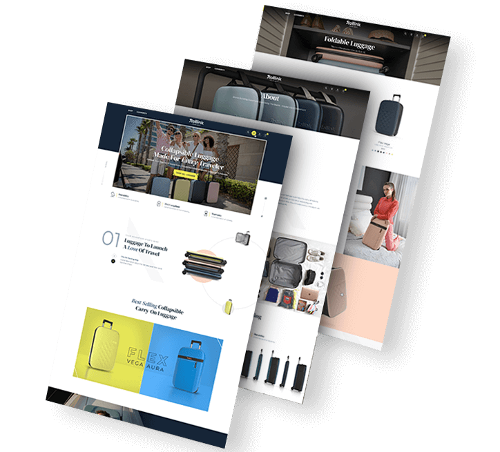
four people on a vacation rollink solution-2
Premium Luggage e-Shop

From website design to digital marketing, brand strategy and SEO, our end-to-end digital solutions helped Rollink grow their revenue by 500% as they entered the U.S. market.

Our WooCommerce-powered solution features micro-animations, an immersive product experience and a checkout process optimized for conversions.

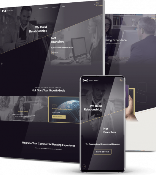
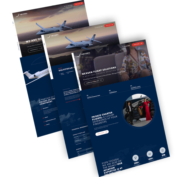
A background image for NewDevRev of skyscraper buildings Trio of NewDevRev website images
Real Estate Digital Experience

Our web design and development specialists worked to provide NYC-based real estate firm NewDevRev with an upscale web design on a custom-developed platform.

Through a creative, responsive design that includes a tailor-made search and filter element, visitors can easily access NewDevRev’s upscale website.

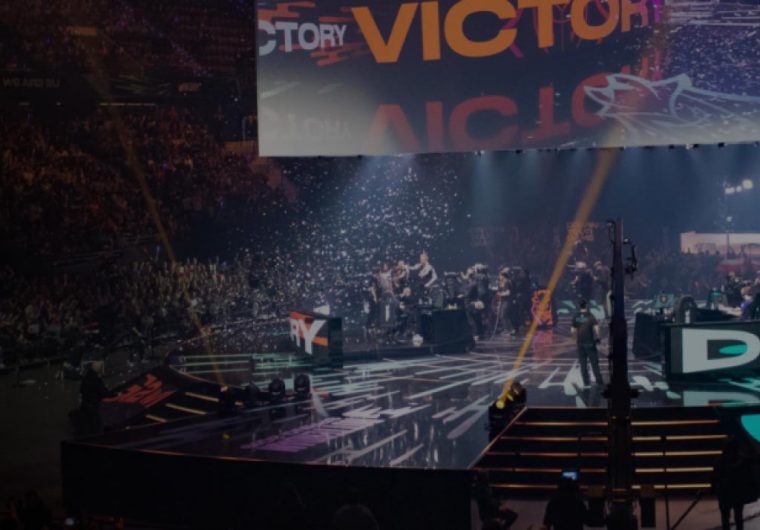
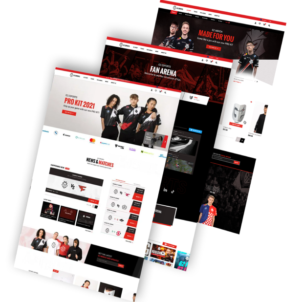
A background image for G2 Esports of a live eGaming show g2
Reimagined eSports Platform

Working with G2 eSports’ community-based identity, we developed a custom eCommerce platform to reinforce the organization’s legendary position in the eSports industry.

Our design and development team introduced a streamlined shopping experience and strategically planned community design to grow conversions and support brand authority.

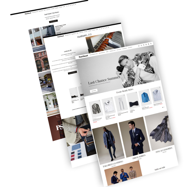
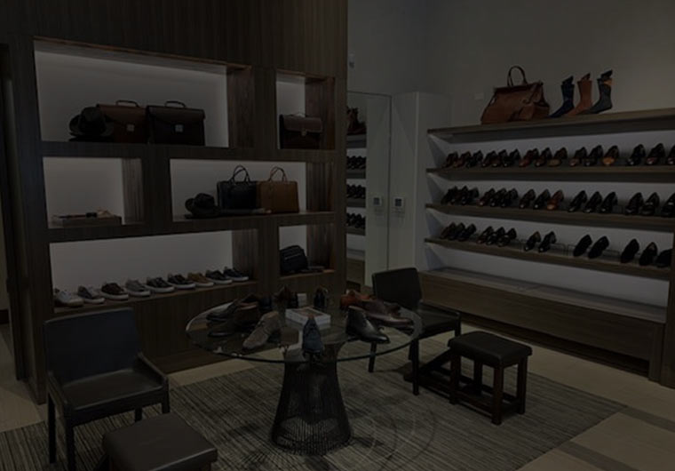
An image of a shoe store paul
Luxury eCommerce

We reimagined luxury men’s clothing brand Paul Stuart’s digital experience with a streamlined conversion funnel and custom eCommerce design.

Our design helped increase on-site engagement and conversions through a mixture of user-friendly features and a reinvention of Paul Stuart’s classic visual identity.

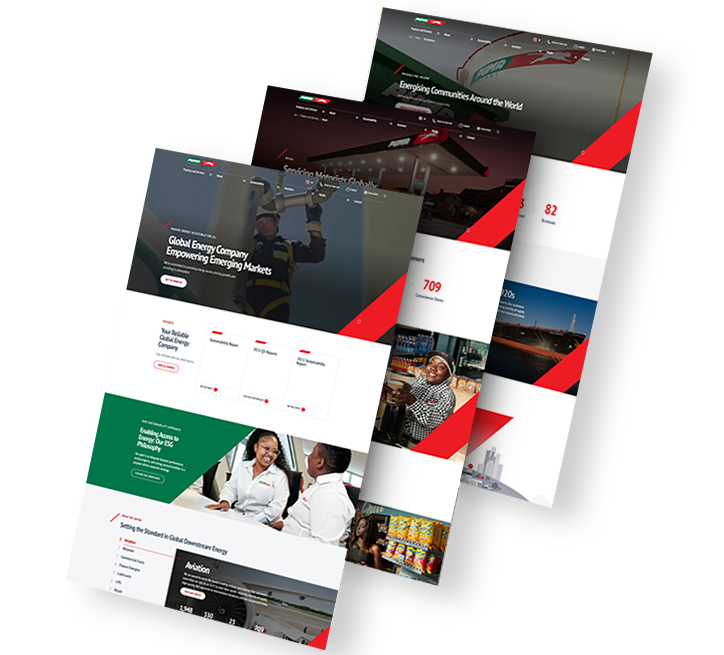
Background image of a man filling up his car with gas for Puma Energy puma energy solution
Modern Energy Website Redesign

We delivered a modern website redesign for global energy company Puma Energy. Our team created a responsive web design with UX-optimized features, including strategically chosen typography, vibrant colors throughout and high-quality custom graphics, in turn increasing engagement by 63% in three weeks.

We also provided extensive keyword research and search engine optimization, helping to grow website visitors by 27% in the same period.

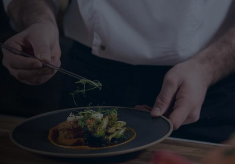
person cooking ventura
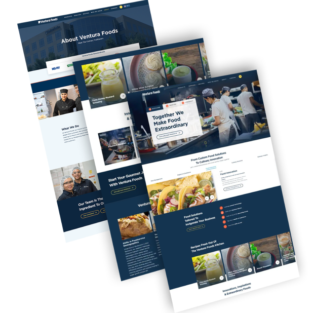
Food & Beverage Web Development

We redesigned Ventura Foods’ corporate website to create a fully optimized digital experience.

Included in the user-centric design is a video in the hero section, engaging micro-animations, a custom cursor and chatbot functionality.

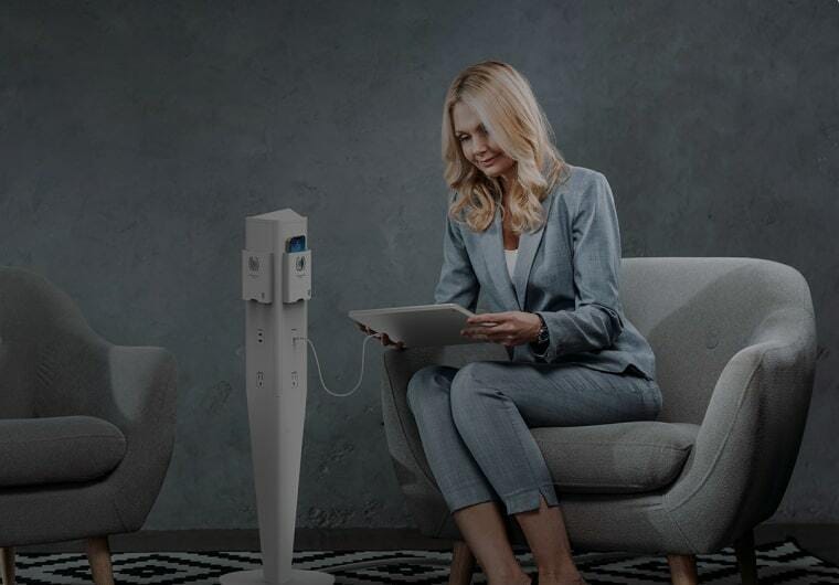
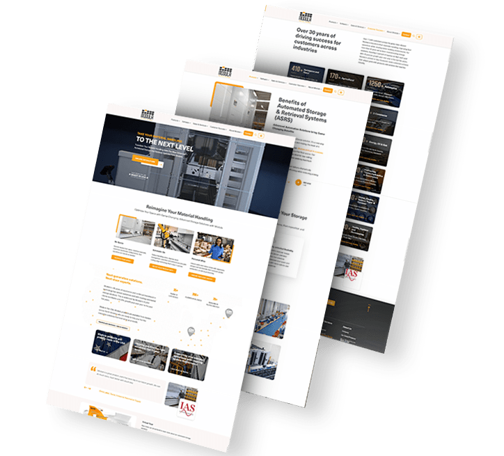
Background image of a woman using a tablet for MOD A trio of Modula website images
B2B eCommerce Design & Development

We were tasked with launching a new website for National Lighting’s high-quality B2B power charging accessories and lighting solutions company, MOD.

Our team delivered end-to-end digital services to elevate MOD’s UX and boost orders. Our partnership spanned website strategy, architecture and messaging, responsive design and development, custom eCommerce integrations and marketing.

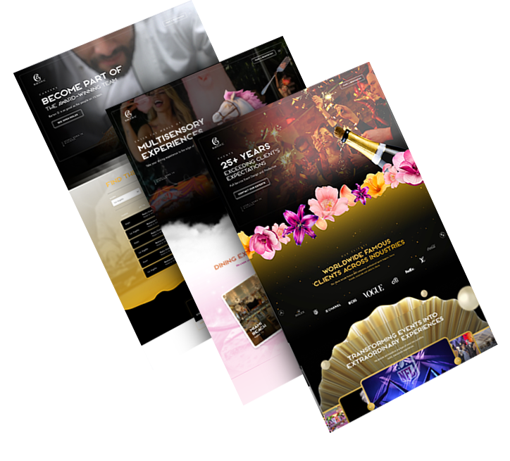
Background image of cupcakes for Barton G A trio of Barton G website screenshots
Immersive Events Website

We delivered a creative, interactive website for one-of-a-kind restaurants and events brand Barton G. Using custom images and motion graphics, our designers and developers crafted an engaging UX that perfectly captures the Barton G brand.

Despite aiming to entertain visitors on every step with a “wow” factor UI, Barton G’s website also follows core UX principles and contains simple, yet striking, messaging that converts.

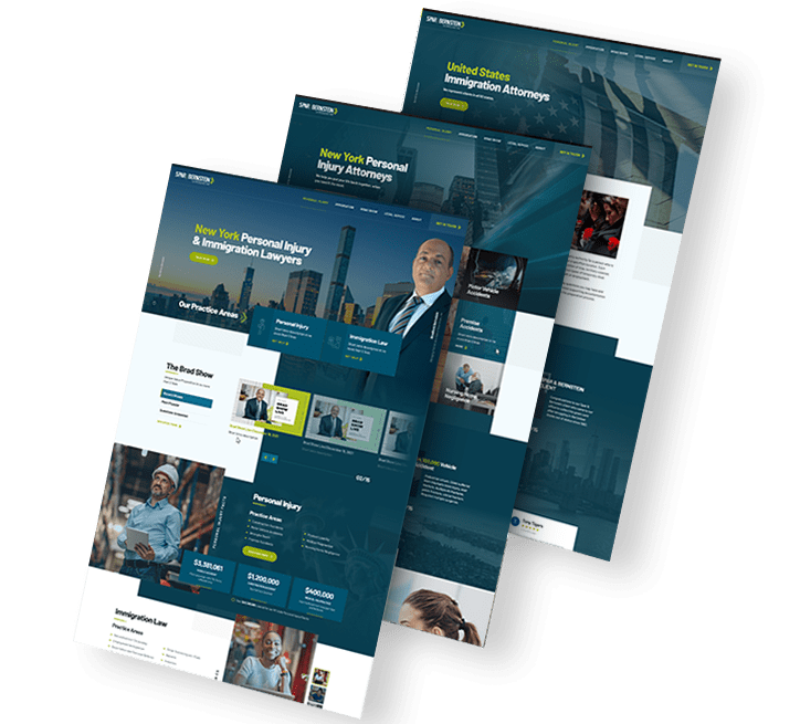
Background image of city skyline for Spar & Bernstein LawSB-solutions-1
Law Firm Digital Presence & Visibility

Our team worked with legal services provider Spar & Bernstein to extend the group’s online presence. To achieve this, we delivered a set of custom digital strategy, conversion-optimized messaging, responsive design and SEO solutions.

We improved LawSB’s keyword optimization, content and technical SEO strategy, extending the website’s organic traffic 14x in six months.

load more examples

Minimalist Web Design Process

Discover how our team creates intuitive user journeys
through engaging, minimalist interfaces.

Before & After

Featured Website Redesigns

Turn your website into a conversion-optimized, captivating digital experience.
Explore our redesign portfolio.

New Church logo
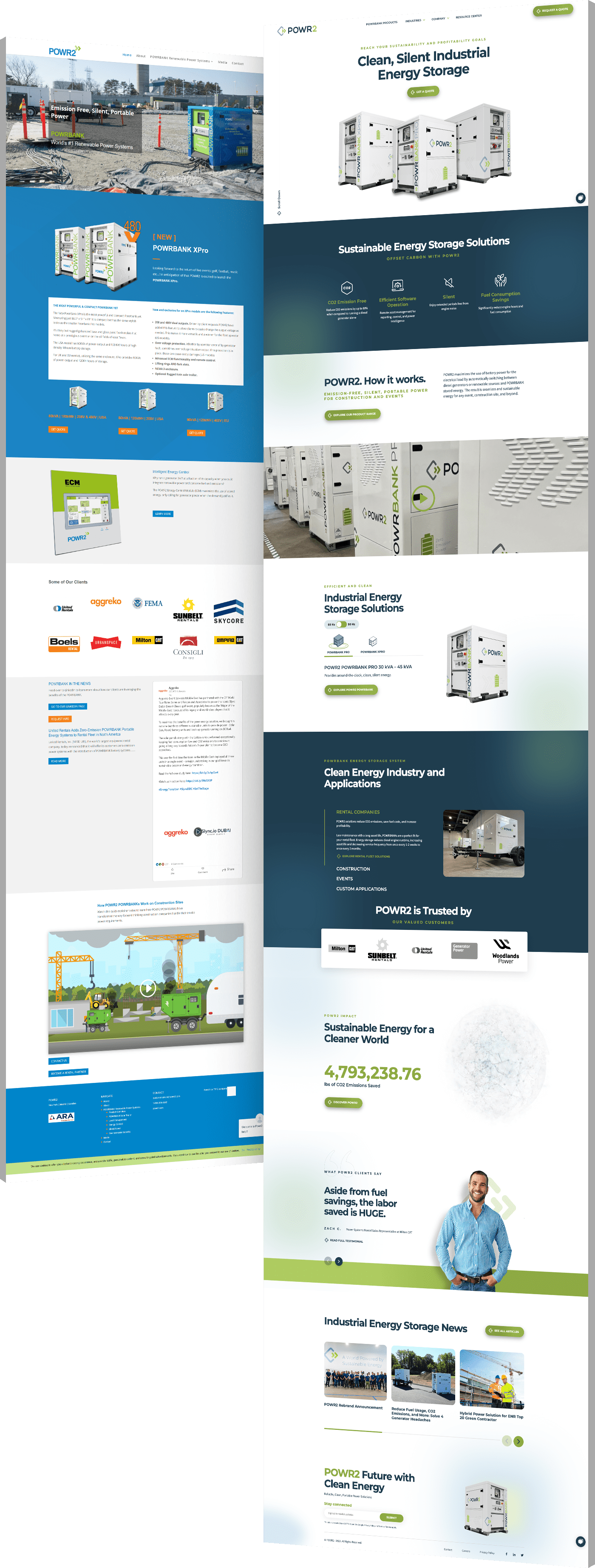
Powr logo
American University in Bulgaria logo
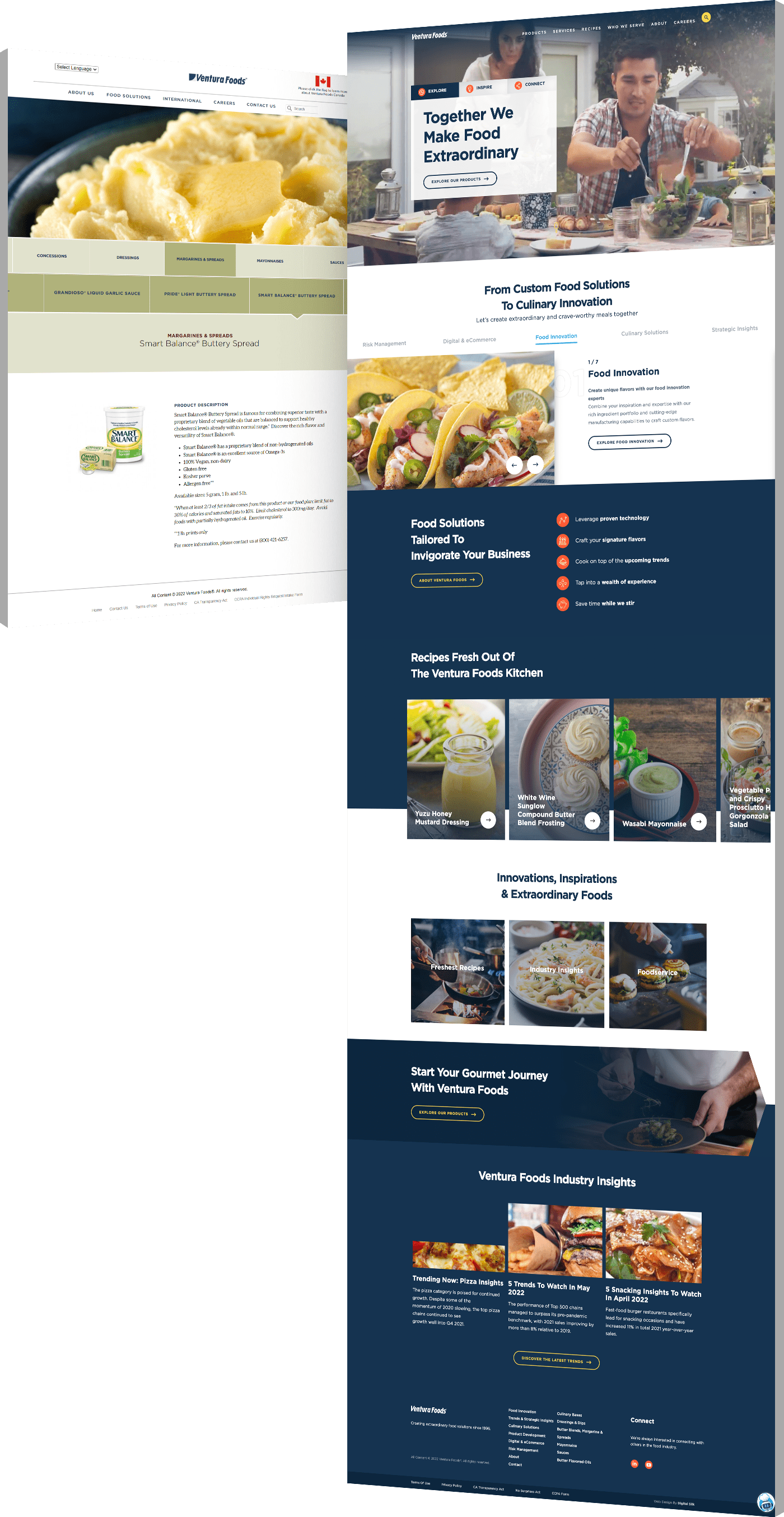
Ventura Foods logo
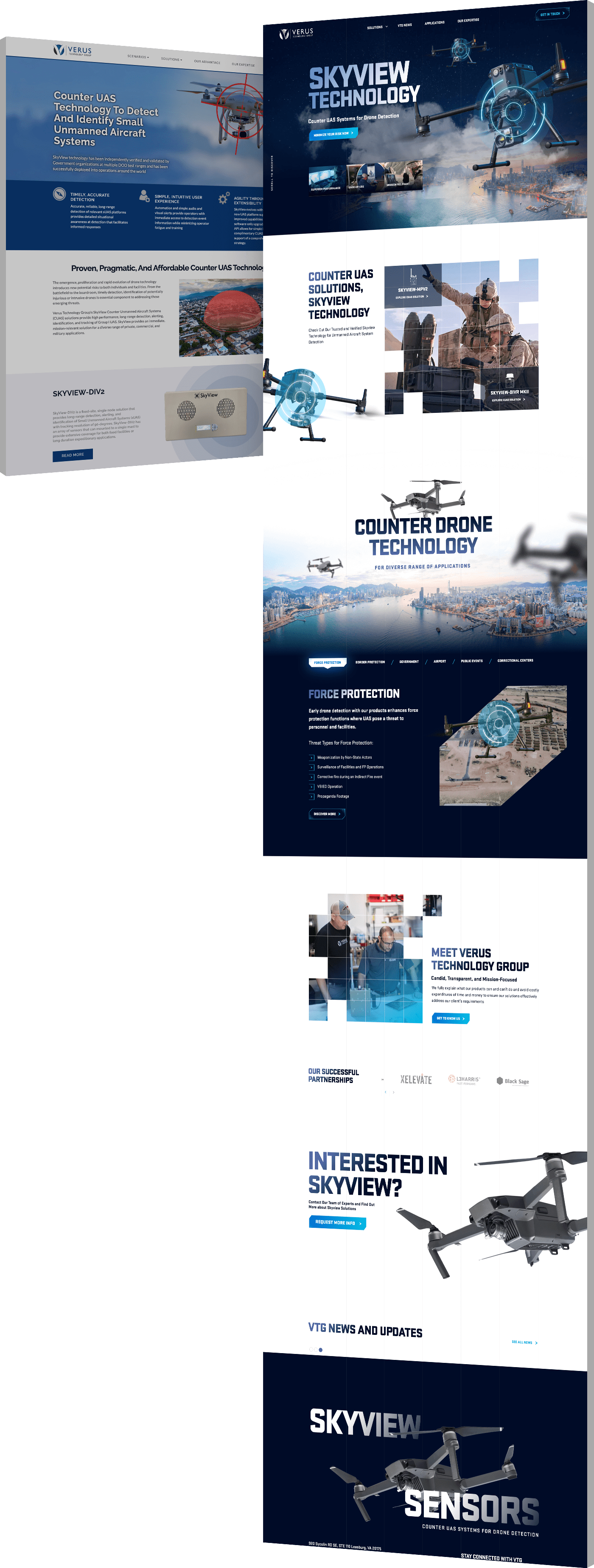
Verus tech group logo
BEFORE AFTER
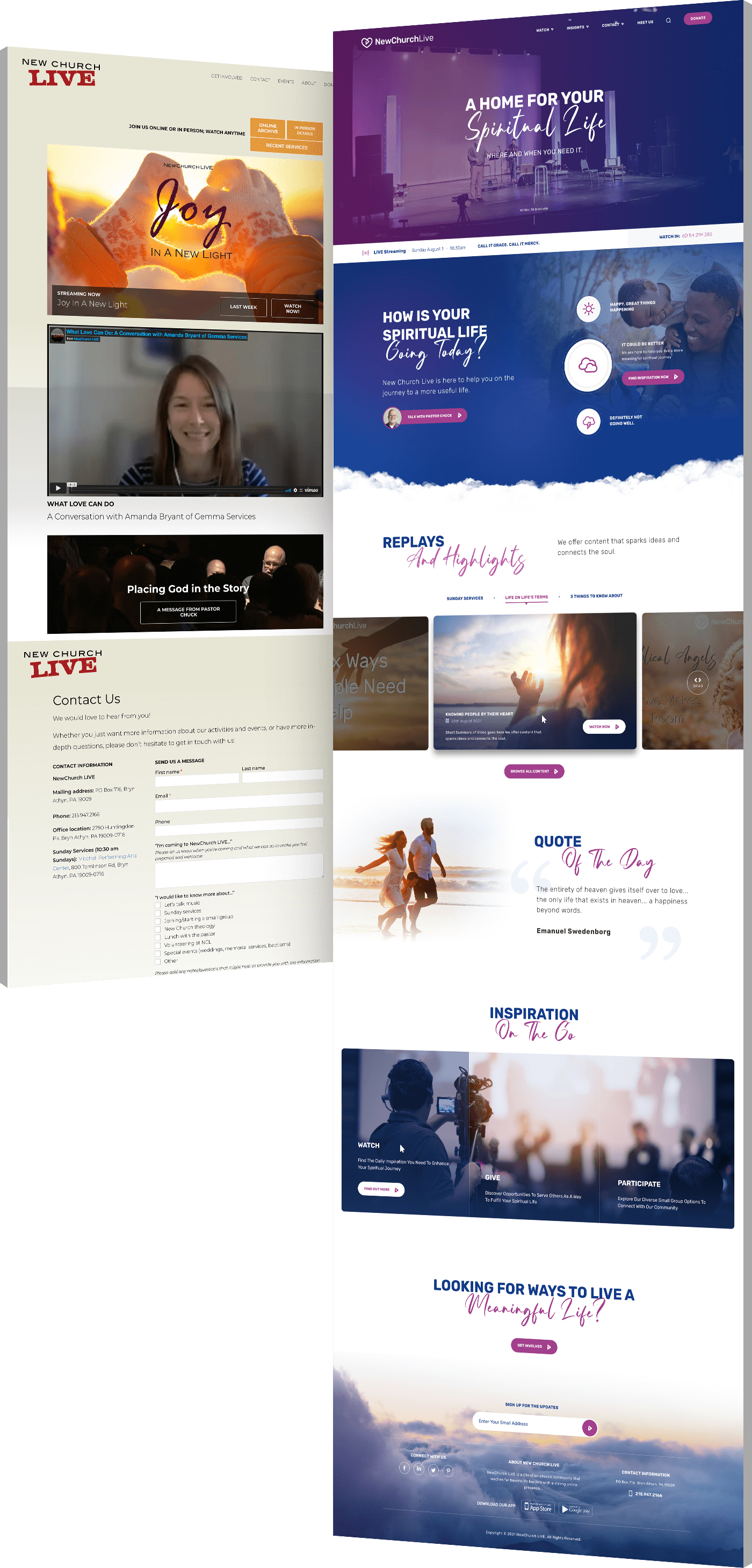
Screenshots showing NewChurch LIVE's website before and after our redesign
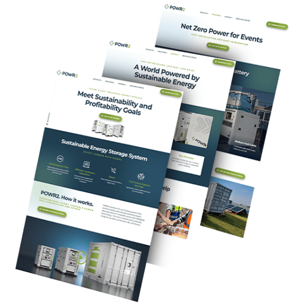
Screenshots showing POWR2's website before and after our redesign
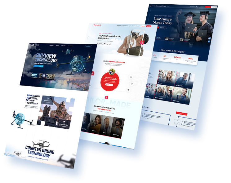
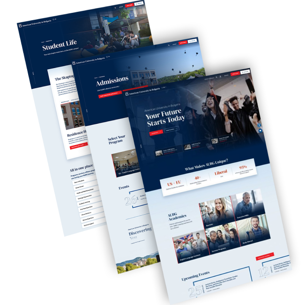
Screenshots showing AUBG's website before and after our redesign
Screenshots showing Ventura Foods' website before and after our redesign
Screenshots showing Verus' website before and after our redesign

Web Design Case Studies

We drive digital growth
for businesses in every industry.
Background image - people talking together

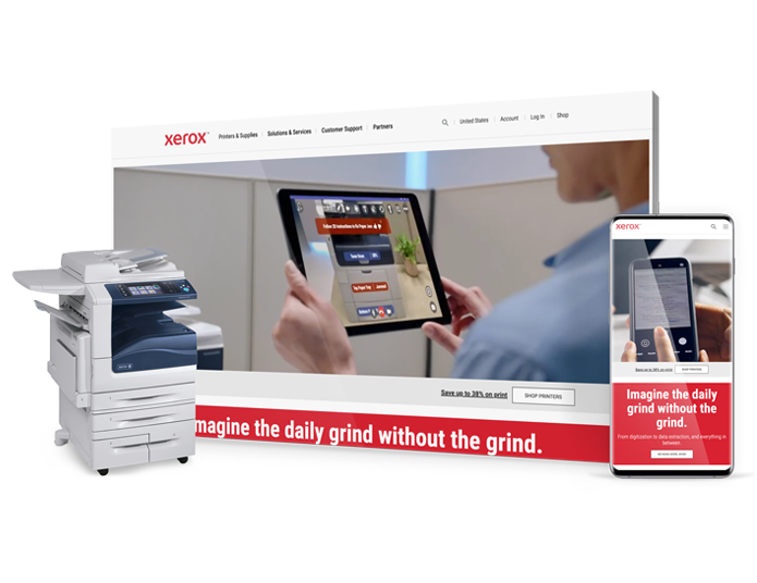
Xerox needed a new strategy and website to capture B2B leads for their new printer technologies.

In 6 months we achieved:

20k

Sales Increase for Xerox Versalink

40k

Conversion Rate for Nurtured Leads

View Full Case Study
MicrosoftTeams-image (8)
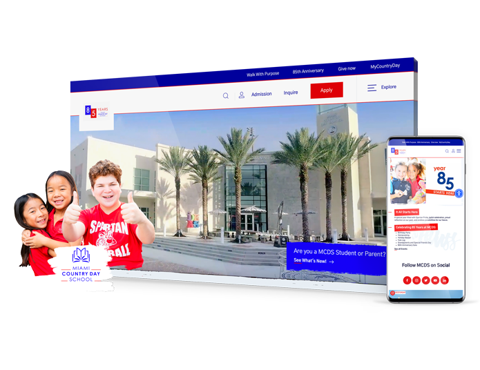
Branding agency case study: MCDS

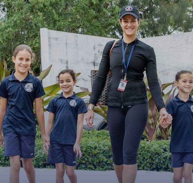
Miami Country Day School (MCDS), a top private school in Miami, wanted to grow online visibility and on-site engagement with a redesigned website. 

Shortly after launch, we achieved: 

32%

decrease in bounce rates

15%

increase in organic traffic

View Full Case Study
DigitalSilk-web-design-case-study-MCDS (1)
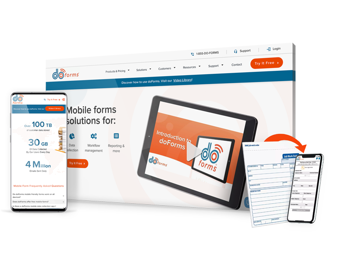
Web design case study doForms

doForms, provider of data collection mobile forms, needed a more user-friendly and SEO optimized website to grow conversions. 

In 2 months, we achieved: 

22%

increase in new traffic

1.5k

new organic keywords

View Full Case Study
DigitalSilk-web-design-case-study-doForms (1)
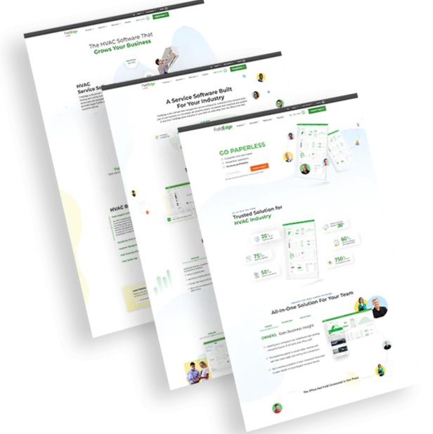
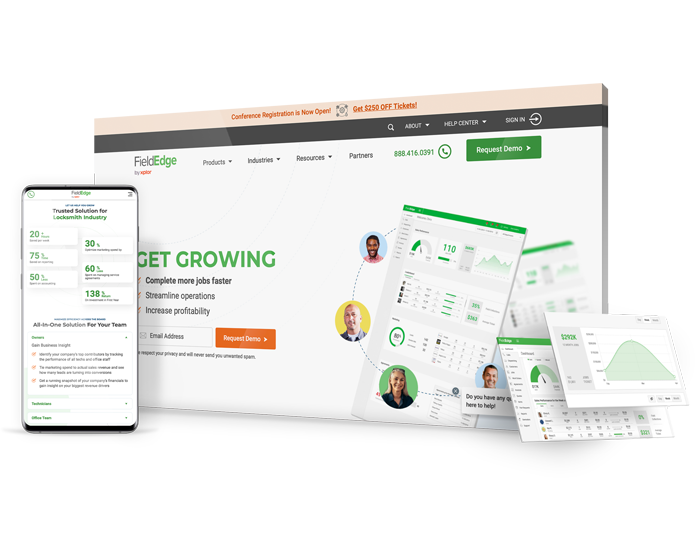
Law firm web design company custom website for FieldEdge

FieldEdge, a leading provider of field management solutions. needed to redesign their website to improve performance and attract more prospects. 

Shortly after launch, we achieved: 

19%

increase in overall traffic

50%

faster loading speed

View Full Case Study
Screenshot from Fieldge website

WHY COMPANIES CHOOSE US

Digital Silk’s Unique Value As A Minimalist Web Design Agency

Project Ownership. Transparency. Results. 

With decades of industry experience, our full-service web design agency has kept tabs on all the latest design trends — minimalism being a constant.

We know exactly how to craft a user-friendly, powerful minimalist web design that maintains and strengthens your brand identity, having already done so for businesses of all sizes, industries and backgrounds.

Headshot of Gabriel, Digital Silk's SEO

Our award-winning design team delivers captivating designs that resonate with your audience.

By combining strategy and innovation, our minimalist web designs deliver high-end user experiences that leave a lasting impact.

Headshots of 3 Digital Silk team members

From inception to launch and optimization, we take ownership of your minimalist web design project, treating your website as if it were our own.

From delving deep into market research to following well-structured QA protocols, we manage every aspect of the process, so you don’t have to.

This said, by also operating with total transparency, we ensure you are involved for communication and feedback at every step of the journey.

Headshots of 3 Digital Silk team members

Digital Silk grows brands online. It’s our mantra, but what does it mean?

It means we implement results-driven decisions based on your unique UVPs. Our digital strategists and web designers create, track and improve the KPIs that matter most to your brand’s success.

Add this to our wider branding, digital marketing and consulting solutions, and we can grow your entire brand online through one suite of services.

Headshots of 3 Digital Silk team members

Meet Our Minimalist Web Design Experts

schedule a consultation

A Complete Guide To

Minimalist Website Design

At Digital Silk, we believe the core values that drive minimalism are timeless.

While its specific elements will forever be shaped by emerging trends, the purpose of minimalism will remain key — to reduce the clutter, remove the distractions and center the user’s focus on what’s most important.

At Digital Silk, we believe the core values that drive minimalism are timeless.

While its specific elements will forever be shaped by emerging trends, the purpose of minimalism will remain key—to reduce the clutter, remove the distractions and center the user’s focus on what’s most important.

We’ll break down the key elements that make up a minimalist design and showcase some of our favorite examples. But to fully understand where minimalism is headed, we’ll first need to look at its past.

What Is Minimalist Website Design?

A minimalist website design is a user interface (UI) that exists without design elements and features that might be deemed unnecessary, like motion graphics or a cluttered background.

The aim of minimal websites is to focus the user’s attention on key elements by eliminating distractions.

A Brief History Of Minimal Design

Minimalism in design goes beyond minimalist websites.

Its roots can be traced to the early 1900s, when German-American architect Ludwig Miles Van der Rohe pioneered the language of simple design.

Bold colors, vivid photography and crisp and sans-serif typography supported the rise of a “less is more” attitude to design in the 1940s and 1950s.

Eventually this expanded to other mediums, including website and digital platforms.

As for minimal designs for websites, this occurred in response to the growing amount of elements being added to web designs, such as complex navigation, CTAs, images, forms, social media plugins and more.

Looking to start your web design journey? Our designers are experts in minimalism. Contact Us

5 Key Elements Of Minimalist Web Design

A minimalistic website design ensures simplicity and easy navigation, from media and typography to CTAs, colors and more.

Here are five elements that make a minimalist website design.

1. Negative Space

Arguably the defining element of minimal design, negative space’s primary function is to manipulate your user’s visual flow and direct his or her focus.

Essentially, the more negative space that surrounds a certain element, the more your user’s eye is drawn to it.

Negative space allows for a comprehensive organization of elements and design work that prevents the final design from overwhelming your user.

It also contains an aesthetical and psychological benefit: negative space is perceived as a sign of luxury, prestige and good taste.
2. Large And Vivid Photography

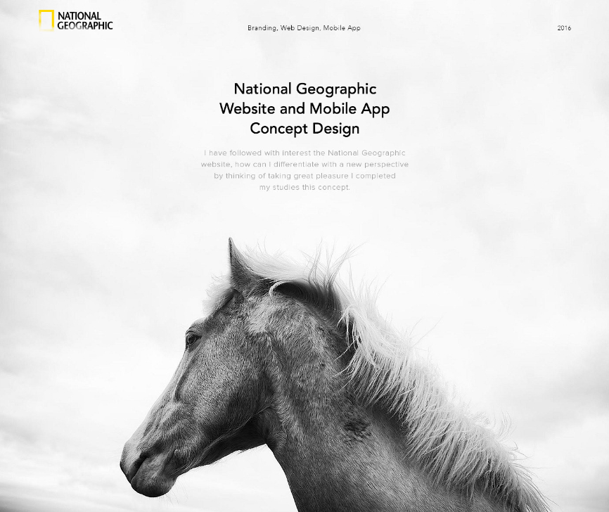
Minimalist web design, as well as minimal graphic design, can come across as emotionally distant when overdone. This is why a touch of contrast, such as oversized photos, add a bit of necessary balance.

Hero images and headers are the most commonly used examples of vivid imagery in minimal digital design. They create an emotional and contextual connection and set the atmosphere for the media they are a part of.

The contrasting nature of these elements – in relation to minimalism – complements the simplicity of your website’s interface.

However, to keep the minimal design intact, your images should not be busy: they too should feature minimal traits such as expansive skies, broad landscapes and minimalistic interior to name a few.
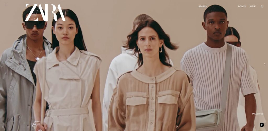
Clothing brand Zara has a minimalist homepage design with prominent lifestyle visuals
The clothing brand Zara uses large photography and uncluttered layouts to achieve a minimalist design.

3. Simple Typography

In the context of minimalist digital design, sharp, clean and readable typography can contribute to consistency.

Your typography should stem from no more than two font families and just as many color schemes. The most impressive examples of typography are those that are large, simple and legible, because they make a statement all on their own.
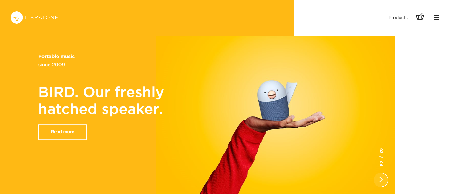
Simple UX and UI in web design
[Source: Tech company Libratone]

4.  Contrasting Colors

The philosophy and practice of minimal digital design dictate that color should always assist the typography and imagery on your visitor’s screen.

The preferred choice of color for minimalist designers is white. It creates a neutral canvas against which they are able to infuse color and other contrasting elements.

White can also serve as your background or foreground element, or even as an accent.

Contrast can be created through color, size, shape, location and scale. This brings attention to specific design elements and helps create a recognizable visual hierarchy.
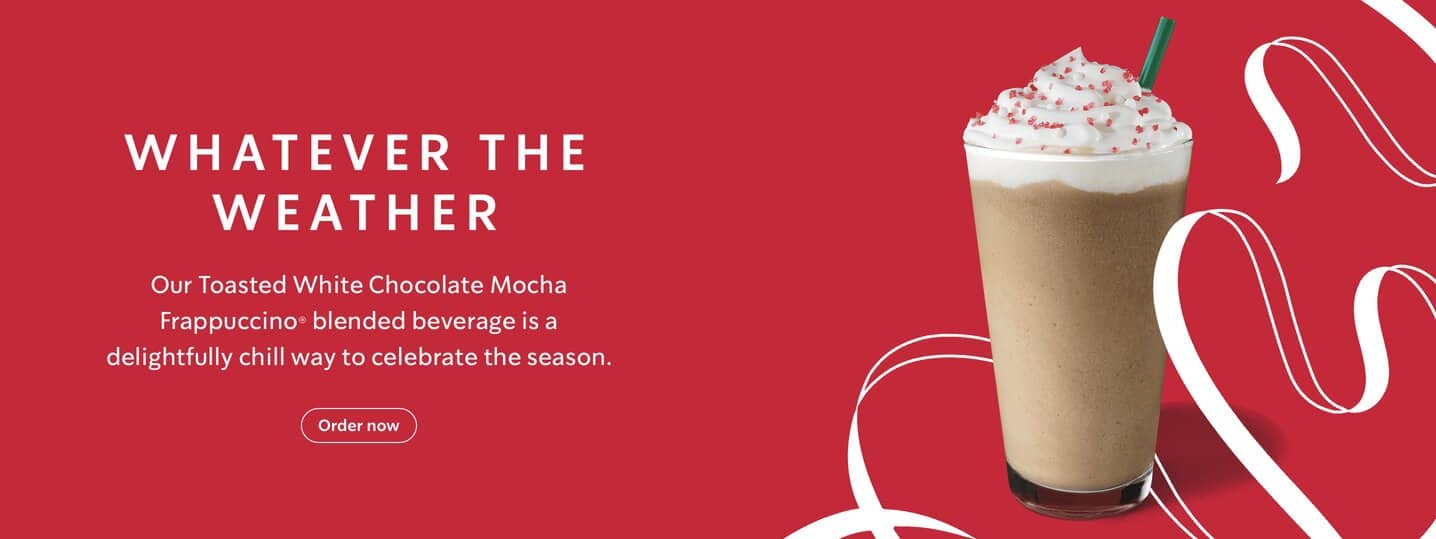
Minimalist web design example, Starbucks
[Source: Starbucks]

5. Simple UI/UX

Minimalist website design should affect your user experience and user interface as much as it affects your website’s aesthetical impression.

Simple navigation tools are an ideal pairing for a minimal design.

Hidden menus and navigation hamburger icons make way for approaches that are even more simplistic. When it comes to navigation, the idea is once again “less is more.” Stick to your main pages and ensure your menu is easy to read.
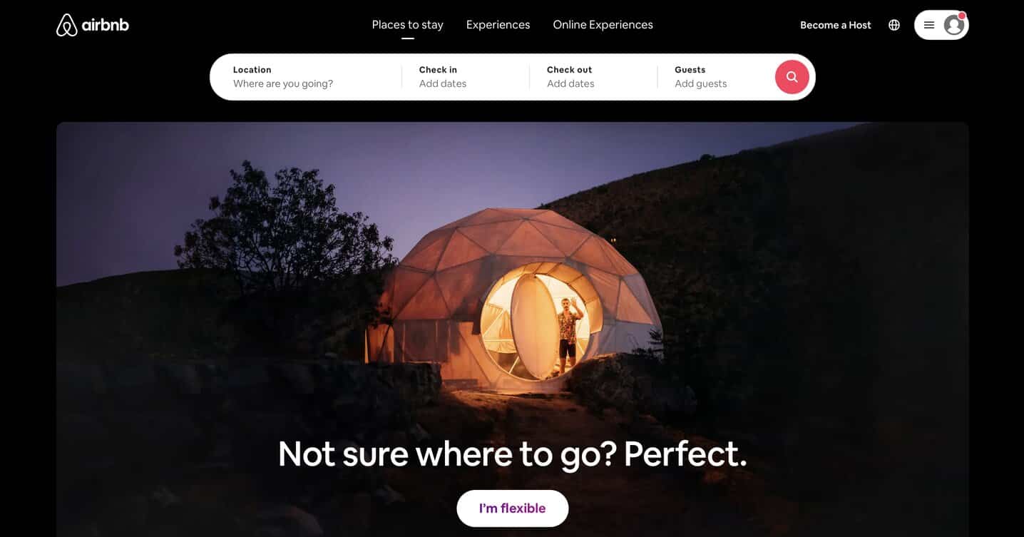
Minimalist web design example, Airbnb
[Source: Airbnb]

Why Minimalist Web Design?

So now you’ve seen the aesthetic appeal of minimalist website design.

It’s attractive, clean and easy to read, yet each element makes a statement. But what you might not know, is that there are plenty of other benefits to this type of design that go beyond the eye.

Why choose minimalist website design? Some of the key benefits include:

1. It Simplifies User Navigation

Minimalism does not automatically equal usability, and vice versa.

However, simple user interfaces that remove unnecessary buttons and complicated colors do lead to easier navigation and usability.

When designed correctly, minimalist websites are especially easy to scan and explore.

And what happens when your users are comfortable navigating your site, and they’re able to find what they need? Yep—conversion!

2. It Loads Faster

According to Google, the chance of your users bouncing off your website increases to 32% if your page takes one to three seconds to load.

So how do minimal web designs play a crucial role in making your page load faster?

Since minimalistic web designs have fewer elements, they’re typically void of flash content, large images and unnecessary plug-ins. This helps your website load faster, which improves your user experience.

3. It’s Trendy

Minimalism is on-trend and applicable on desktop computers, mobile devices and even smartwatches. It works on all platforms and is a part of a greater aesthetical movement that predates web design.

While it may be seen as a trend, we’re convinced that minimalism will never go out of style.

4. It's Optimized For SEO

Minimalist design is SEO-friendly because it allows search engines to crawl through and understand your website’s content more easily. This results in greater visibility in search results.

Google has openly declared that they award websites with clean coding and those that are optimized for mobile.

This SEO aspect of minimalism means that your website must be minimalistic in its backend as well, in terms of the codes it uses.

5. It Helps Convey Brand Identity

Some brands have taken minimalism to the core of their brand identity and made it their own—Apple’s brand strategy being a key example of this.

They apply their stripped back site design to their products and vice-versa, maintaining a consistent visual identity.

This gives consumers greater insight into the core values of the brand, instead of simply promoting its products.

6. It's Easier To Maintain

The minimal approach translates to a simpler design and this simpler design results in a cleaner build.

The less complicated your website’s design is, the easier it is for you to maintain it. This applies to removing bugs that cause errors as well as adding new content to your site.

Minimalist Web Design Examples From Top Brands

Whether used to highlight crisp visual elements or vital product descriptions, high-level minimalist web designs are bold and eye-catching.

Here is a trio of examples to inspire your next design:

1. Eiktyrne Whisky

Brand: Whiskey distillery

Website link: https://eiktyrnewhisky.com/home/

Your website has just 50 milliseconds to make a good impression.

We think Eiktyrne’s design will win you over in less.

With clear informational messaging, a crisp visual element surrounded by captivating negative space (black, in this case) and a simple CTA in the hero section, it’s impossible not to discover everything you need from their website within seconds.

Eiktyrne succeeds in drawing the user’s attention to what’s most important: their one-of-a-kind malt whisky (or whiskey to those of us on this side of the pond!)
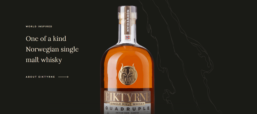
Eiktyrne's website homepage, featuring a bottle of whiskey on a black background
Eiktyrne’s single malt whisky website delivers everything the user needs to know about the product in milliseconds.
[Source: Eiktyrne]

2. Minerva Streetwear

Brand: Clothing retail

Website link: https://www.minervastreetwear.com/

Streetwear brand Minerva proves that minimalism can be cool with a stripped back eCommerce store that lets the products do most of the talking.

From the navigation menus to simple and direct product descriptions, every aspect revolves around simplicity, directing the user to the products themselves and leading them subtly to conversion with easily accessible “add to cart” buttons.
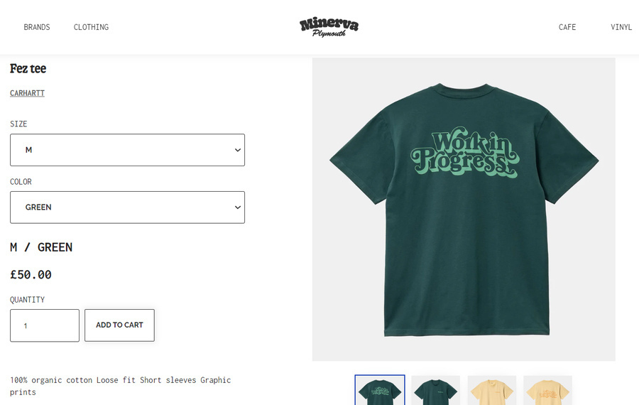
An example of Minerva Streetwear's product page, featuring a green t-shirt
Minerva streetwear uses whitespace to draw attention to its concise text and clear navigation buttons.
[Source: Minerva]

3. GoDaddy

Brand: Domain and hosting

Website link: https://www.godaddy.com/

Not all websites start out as minimalist.

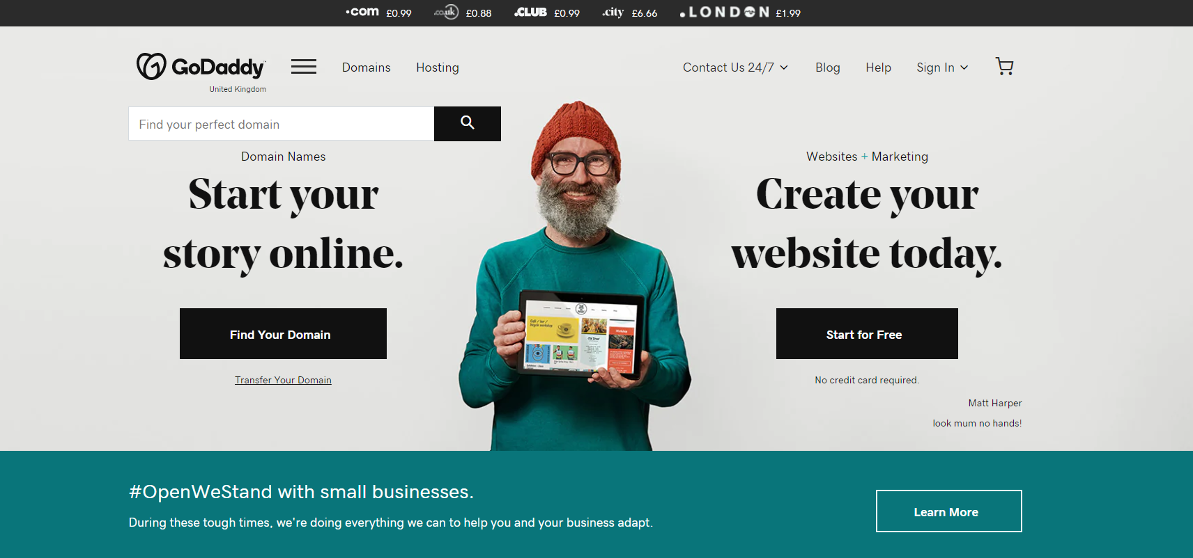
The UK GoDaddy website is a great example of a website moving from a cluttered design to a more minimalist approach.

GoDaddy moved from bright colors and cluttered text to a more subtle, earthy color palette and bold messaging that allows the user to choose their journey.

Check out a before and after of the web hosting group’s site below:

Before:
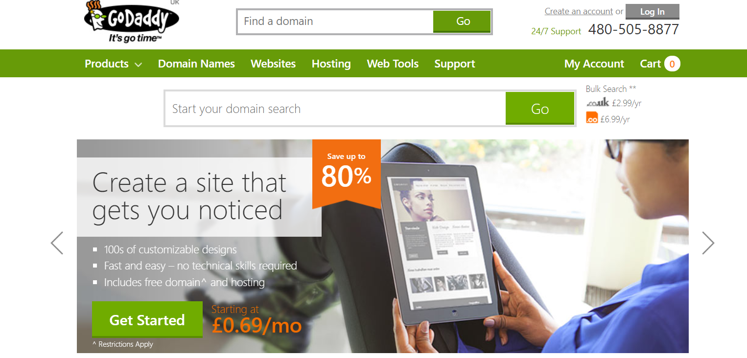
GoDaddy's pre-minimalism website
[Source: uk.godaddy.com]

After:

GoDaddy's minimalist website design
[Source: uk.godaddy.com]

A Minimalist Web Design From Digital Silk

At Digital Silk, our experts create custom websites based on thorough research into your industry, offering and target audience, to name a few.

Our data-driven insights help us craft unique branding elements, messaging and conversion funnels from page to page, with the ultimate goal of growing branding awareness and driving revenue.

Here's an interesting example from our kitchen: a colorful, yet minimalist landing page design for ACLU Virginia's Annual Report.

ACLU Virginia Annual Report

ACLU came to our team with a desire to stray from the typical (boring) report format. They wanted to do something different — something interactive.

The landing page utilizes large and clean typography, while the site’s vibrant solid background colors set the stage for a unique experience.
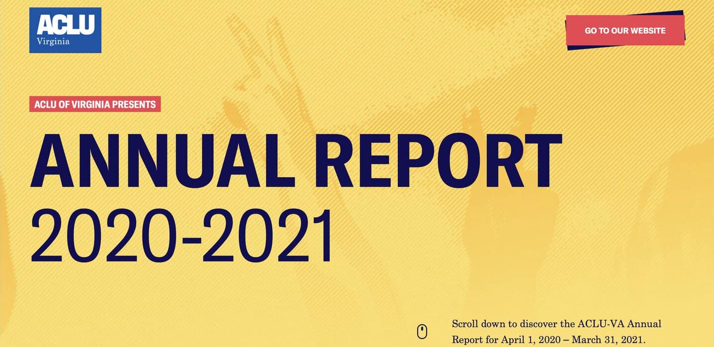
From custom icons to a color-coded timeline detailing the state’s memorable history, the design oozes energy and engagement, yet conveys the sincerity behind the content.
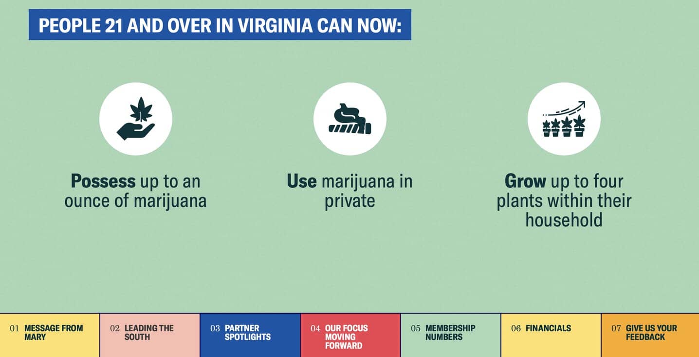
As you scroll down the page, the solid background colors change from topic to topic, and the branding elements remain consistent — large, readable typography that makes a statement, alongside powerful imagery and color-contrasting CTAs.

Schedule A Consultation With Our Minimalist Website Design Company

At Digital Silk we offer a free consultation & custom proposals for custom website design projects.

Simply fill out the Request a Quote form, tell us about your goals and our experts will provide you with actionable insights and cost estimates.

Or, call us at (800) 206-9413 to start the conversation.

Background Gradient

Minimalist Website Design FAQs

Minimalist web design is a strategy that targets clarity and purpose by removing unnecessary elements from a website’s user interface (UI).

By focusing on bold colors and typography, and utilizing negative space, minimalist designs hope to capture conversions and meet visitor intentions through a clean user experience and visual offering.

A minimalist UI is a website’s content-light, stripped back visual interface.

By using less elements and design aspects, minimalist UI supports fast loading speeds, seamless user journeys and device-adaptable concepts.

Each minimalist design will use different techniques to draw user attention to the details that matter most.

The most important factor in this is the interaction between visual elements and negative space.

The way a background surrounds, supports and highlights a website’s interactive UI is crucial in both user and visual experiences.

When used correctly, negative space will direct visitors to important visual aspects, like CTAs and navigation buttons, resulting in a great minimalist design.

Thank You!

We emailed you the download link. Check your inbox and enjoy the whitepaper!

Questions? Contact Us

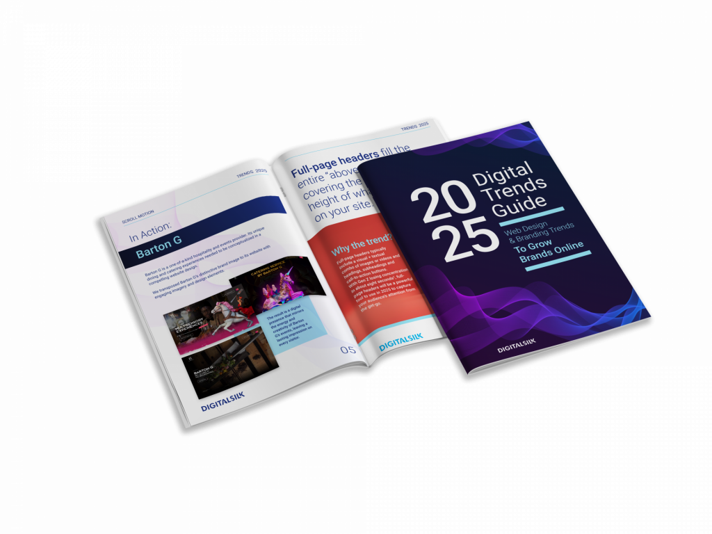
Digital Trends Guide

Download Our
2024 Guide To Growing Brands Online

"*" indicates required fields

This field is for validation purposes and should be left unchanged.
2024 digital trends guide graph
Background Gradient
Our Experts Have Won Industry Awards

Recognized Digital Agency Experts

Awards
Digital Silk IMA award
Digital Silk Telly award
Marcon awards
Digital Silk Horizon Interactive award
Digital Silk Communicator award
Videographer logo
Digital Silk Awwwards
Digital Silk W3 award
Recognition
FoxNews logo
CNN logo
design rush
Bloomberg Logo
CNBC logo
wcbs newsradio 880 WHITE logo
ABC News solid black logo
Reuters Logo
Expertise
  • Brand Strategy
  • Communication Strategy
  • Logo & Graphic Design
  • UI & UX Design
  • Package Design
  • Custom Web Design
  • eCommerce Development
  • Mobile App Development
  • Software & AI Development
  • ERP Portal Integration
  • Marketing Strategy
  • Social Media Marketing
  • Search Engine Optimization
  • Paid Media Marketing
  • Email Marketing
  • Creative Copywriting
  • Content Marketing
  • Influencer Marketing
  • Affiliate Marketing
  • B2B Direct Marketing
REQUEST A QUOTE
Background Gradient