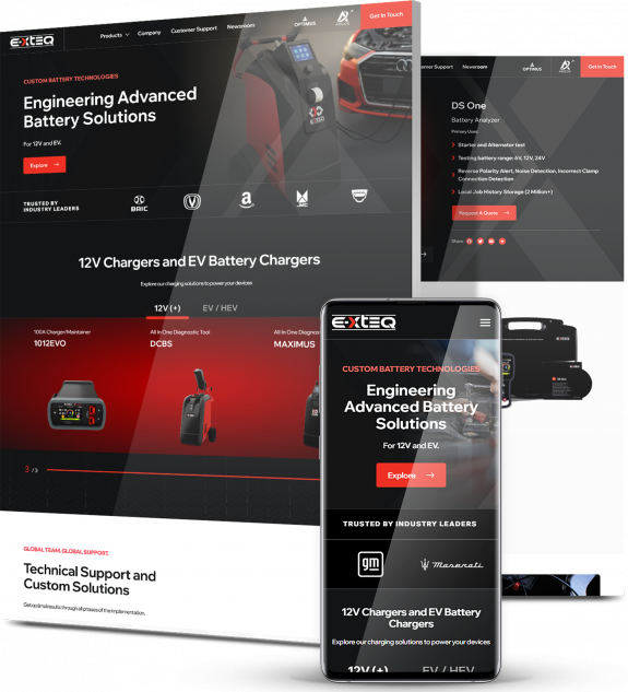
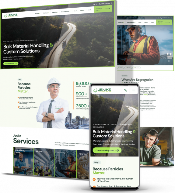
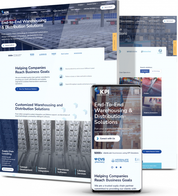
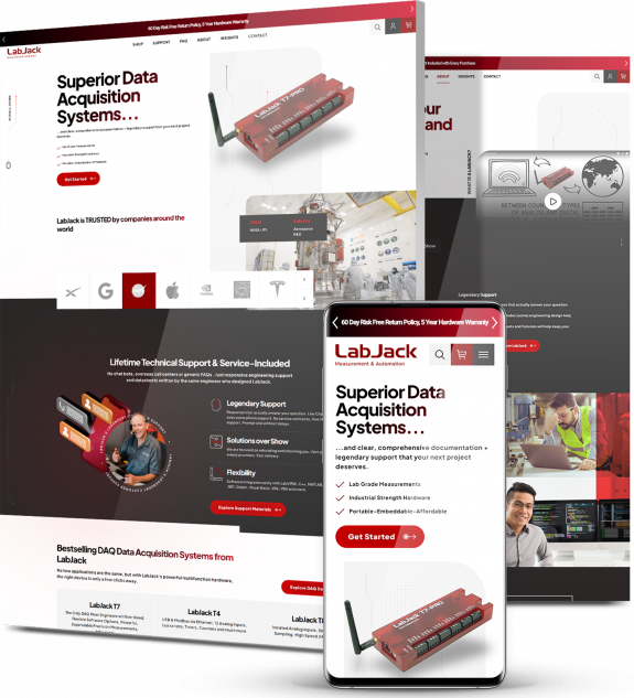
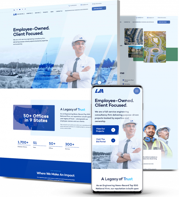
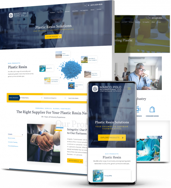
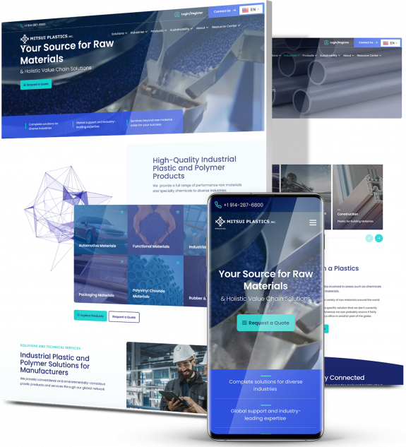
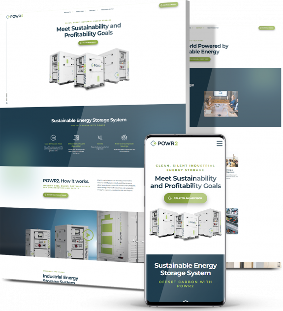
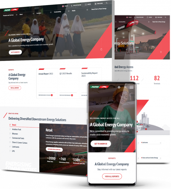
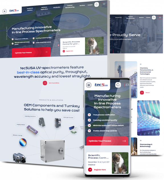
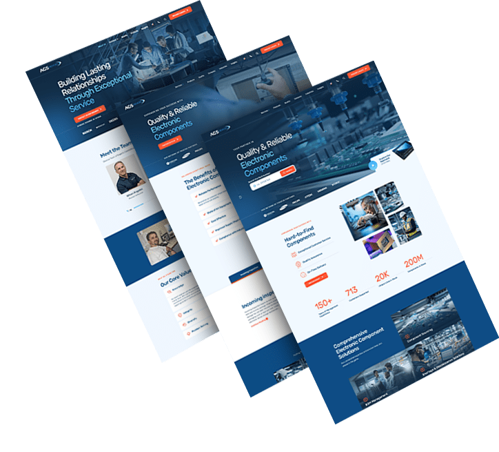
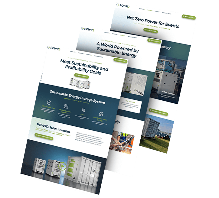
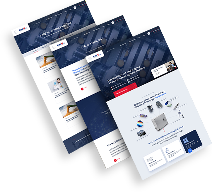
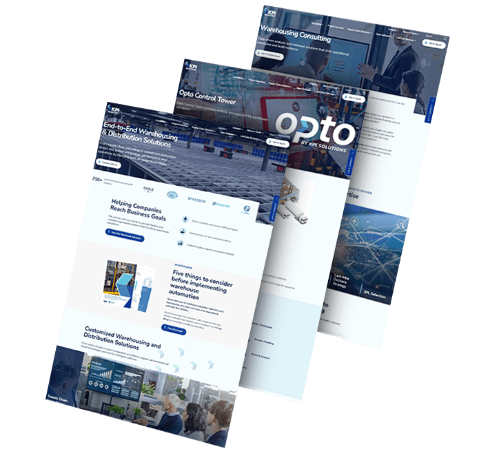
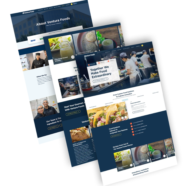
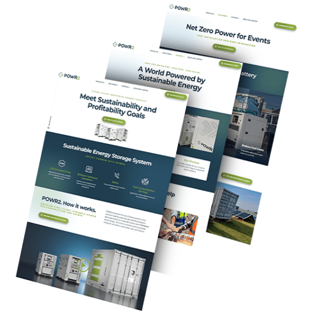
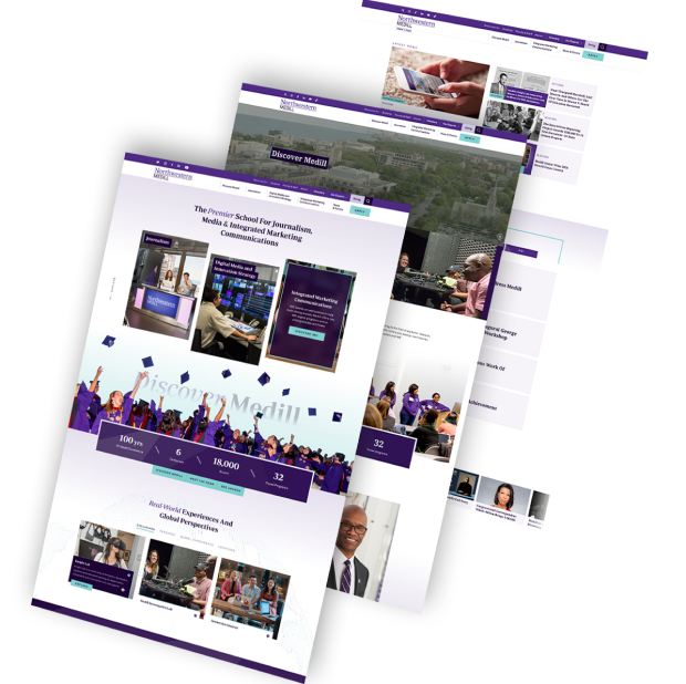
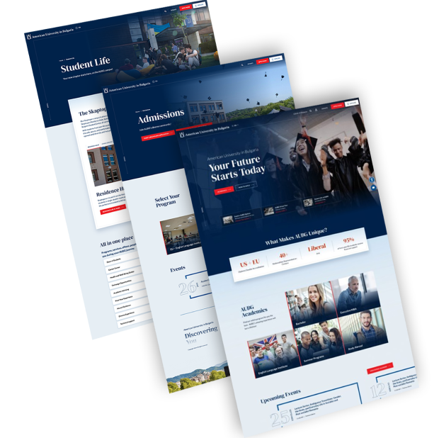
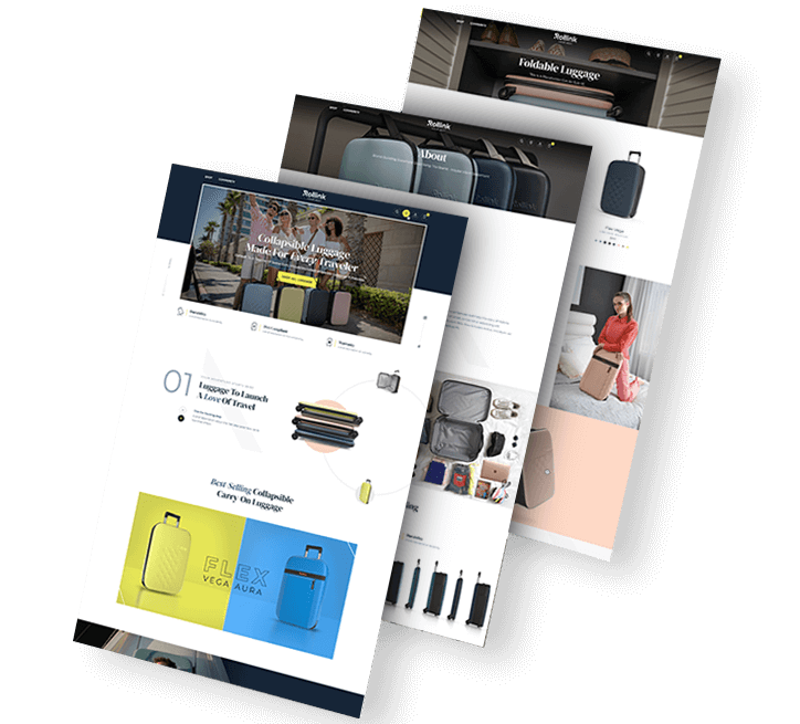
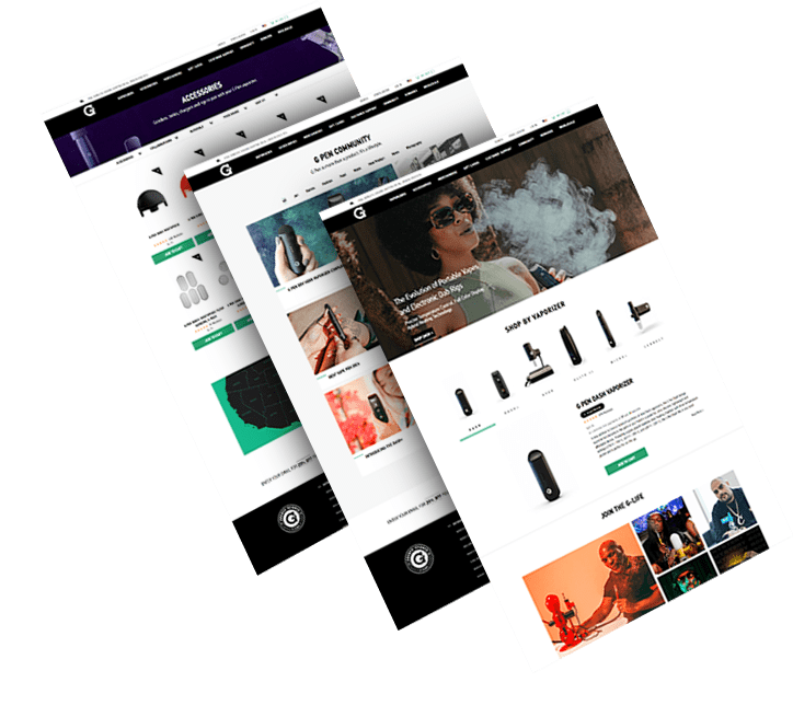
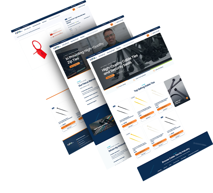
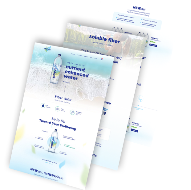
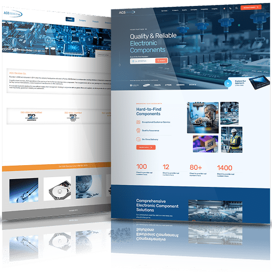
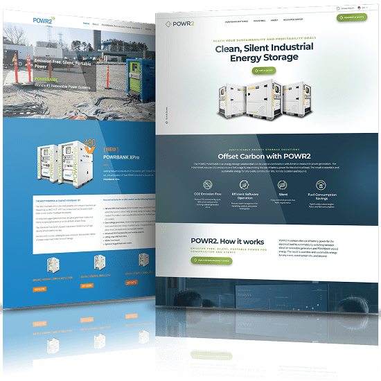
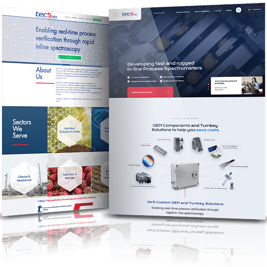
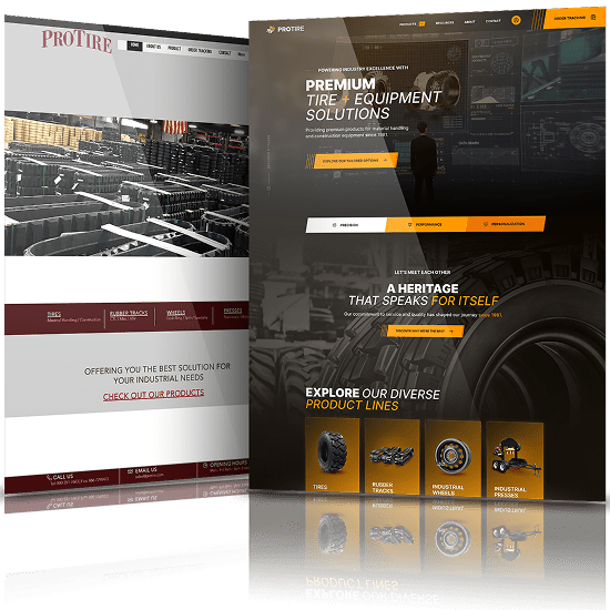
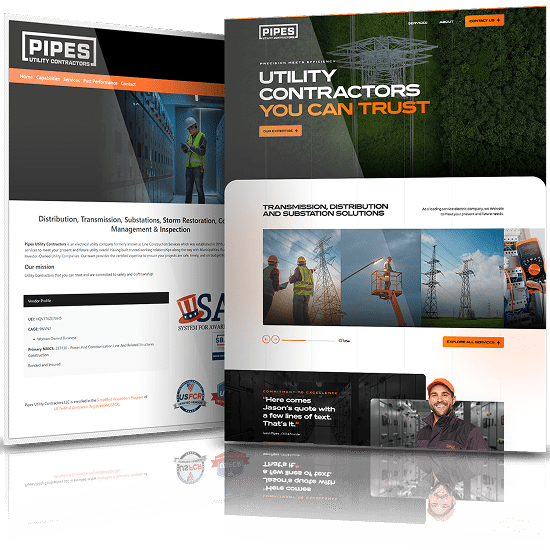
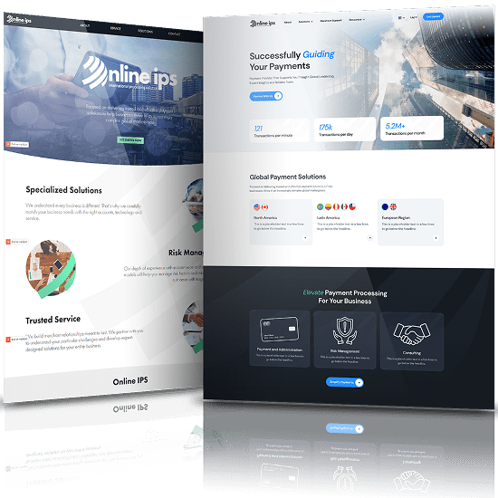
Our Manufacturing Website Design Best Practices, Header-to-Footer
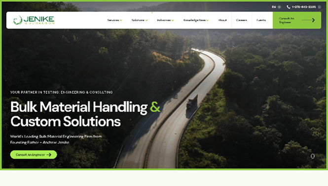
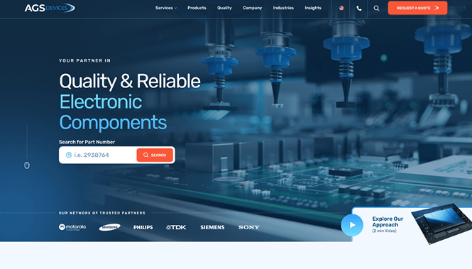
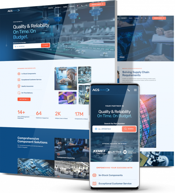
Messaging should clearly convey your values, and your content should speak to your buyer personas.
Make sure to share important information such as turnaround times, processing accuracy, product quality, lead times, shipping, etc.
Each product page should have necessary materials such as specification sheets, ordering guides and installation instructions.
Our Manufacturing Website Design Best Practices, Header-to-Footer
Messaging should clearly convey your values, and your content should speak to your buyer personas. Make sure to share important information such as turnaround times, processing accuracy, product quality, lead times, shipping, etc.
Each product page should have necessary materials such as specification sheets, ordering guides and installation instructions.
We’ll break down the rest of our best practices according to messaging, typography, imagery and social proof:
Messaging Best Practices
- Replace paragraphs with skimmable, minimalist copy. Use modules or a collapsible text feature to pack more content for users who show interest in it.
- Write benefits-driven copy highlighting your unique value proposition for top-of-the-funnel audiences. Write features-focused copy for your mid-to-bottom-funnel audiences.
- Create clear and engaging CTAs focusing on action verbs (Order, Discover, Explore, Download) to help visitors move from page to page in a natural, uninterrupted way to the point of conversion. For a unique touch, connect the CTAs semantically to your business — Fly, Dig, Speed up, etc.
- Optimize your content, including headers, title tags, meta descriptions, URLs and more, for SEO to improve your ranking and drive more traffic to your website.
- Include information on shipping and logistics data when applicable to increase trust and transparency.
- Offer your website visitors industry-specific resources (ex. blog, reports, whitepapers) to as added value as well as to build domain authority.
- Implement a digital supply network (DSN).
- Show-off your ownership as this may coincidentally be in line with a buyer’s diversity goal. Examples of ownership are: Women-owned, Native American-owned, and veteran-owned.
- Don’t skip on the importance of an “About Us” page. Besides learning about your company history and founding date, this page serves as a means to communicate your company’s tradition, legacy, and innovation.
- Be sure to include your value added services (VAS) if you have them as these could set you apart from the competition. More obvious VAS can be package deals and unique offers, while more covert VAS can be your company’s years in business or your employees’ collective years in the industry.
Typography Best Practices
- Use fonts that are large, easy to read and true to your brand.
- Make sure your fonts are ADA-compliant.
- Use contrasting colors to make text stand out.
Imagery Best Practices
- Use videos to show your products in more detail.
- Add a map of your distribution locations so prospects can find your sales agents.
- Make use of 360° photo and videos and provide a virtual tour of facilities when possible because buyers who want to form a lasting relationship with a vendor may want to visit their facilities some time.
Social Proof Best Practices
- Include testimonials and reviews from your customers to inspire trust and enhance your business reputation.
- Include a section on sustainability. This is a common issue for all manufacturing businesses as large contributors to the global warming crisis. Communicate your commitment to lowering your carbon footprint and working towards a more sustainable future.
- Showcase your industries served be it automotive, medical, etc. This gives buyers assurance that you have experience with customers in their segment.
- Provide updates about new products, awards–both community or industry, acquisitions, partnerships, commercial achievements, and press releases as soon as they come.
- Highlight your trade association memberships. This lends to your credibility and expertise by showing that you keep up with the industry best practices and continue to innovate and improve.
- Enumerate your company’s certifications and registrations. Large buyers insist that their suppliers maintain a certain level of certification. This proves that you care about the quality control process.
- Delivery performance is of huge concern to buyers and can make or break whether they would want to transact with your company. Emphasize on your guarantees such as a quick turn-around, zero returns, and minimal downtime.
- Prove your expertise through job samples, usually through case studies. Spotlight your projects and be sure to include noteworthy circumstances such as a large production run, quicker than estimated turnaround and how you delivered to your buyers in spite of complicated variances.
- Your product or services’ country of origin mark (specifically, the “Made in...” label) can be the simplest yet most direct assurance of quality. A “Made in the USA” label, for example, already gives an impression of quality. Highlight this in your web page design whenever possible.
Get Weekly Web Design Insights & Inspiration
Recommended Functionalities For Manufacturing Websites
- Optimize page speed to increase engagement and conversion.
- Use a Chatbot to secure 24/7 interaction with your clients.
- Secure user experience across all channels by implementing mobile-first web design.
- Install a searchable product catalog with product information. The product information in the catalogue should have technical specs, feeds and speeds of equipment, but it should also contain info on how the product solves a problem rampant in the industry.
- Implement an online warranty registration system. At its most basic form, the system collects basic information and forwards it to your email. A more advanced form is one that has CRM integration and hooks into marketing automation software that allows you to send follow-up messages and upgrade notices to your customers.
- Install an eCommerce solution to simplify the ordering process between consumers and distributors. This will be tied into your back-end ERP and other internal business management systems.
- Have an available configuration calculator for products that require specific types of configurations to function at maximum efficiency.
- Include a database or a retail and distributors locator tool that can reduce phone calls and increase sales from your dealers and distributors.
- Integrate CRM and ERP software with your website for more flexible web design.
Recommended Marketing Features For Manufacturing Web Designs
- Invest in SEO blog posts to educate your audiences on complex issues and help attract potential customers or clients.
- Specify the industries you serve to give your keyword search quotient a boost.
- Use a marketing repository to your content distribution method. This will enable your team to download high-resolution marketing materials and product logos without need of an FTP account as well as seamless sharing of marketing collateral to your distribution network or sales team.
- Strategically incorporate CTAs and lead generation throughout the site and blog posts. Examples of leads are RFQ submissions, newsletter sign-ups, phone calls, purchases or anything that convinces visitors to provide contact information for following-up with later and maximize possible ROI.
- Invest in a lead management tool that’s tailor-made for manufacturing companies that sell though distribution. Ensure that the software can route leads from the website directly to the regional sales managers. This software also acts as a funnel that guides leads to their applicable regional distributor.
Manufacturing Design Examples To Get Inspired By [+ Our Strategists’ Notes On Each]
Manufacturing is an enormous sector covering industries like aircraft manufacturing, renewable energy solutions, electronics and more.
Before we analyze manufacturing website design examples, here is a video where Digital Silk's CEO, Gabriel Shaoolian, compares Ford vs. Tesla web designs.
Now let’s look at a few examples of the best manufacturing websites.
1. Enel
Website: https://www.enel.com/
Category: Renewable energy solutions
What they do well:
Messaging: The slogan on the homepage — "Open power for a brighter future" — shows the brand directly responding to consumer needs and highlighting benefits.
The menu is simple and can be easily understood at a glance. The homepage contains short, well-structured paragraphs, minimal text and friendly, actionable and inviting CTAs like “Join Us,” “Discover more” and “See all our products,” highlighted in a contrasting shade of red.
From innovation and sustainability to transparent information for clients and investors, the content throughout the website presents as a story and helps the visitor relate to the brand and their offering.
Typography: Enel utilizes simple and consistent fonts to ensure readability throughout the website’s pages. The contrast between dark and light helps the text stand out across the site.
Visuals: The images, largely of the environment and different landscapes, are colorful and engaging. Enel also utilizes images of people throughout the site to humanize the brand.
Social proof: On their Careers page, the brand showcases testimonial videos from employees, describing life at Enel.
To show the scope of Enel’s work and further build trust, the company includes relevant stats and noteworthy achievements on the website, highlighting their dedication to sustainable practices.
The feedback form asking users to share their website experience demonstrates the company’s attention to detail and desire to make their customers as satisfied as possible.
Investor section: Enel’s Investor page provides stock information and quarterly financial reports. The website also showcases the company’s investor app, which provides updated financial information on the group, consistently and transparently.
This provides value by letting investors know they can get the information they need at their fingertips, quickly and easily.
What they could do better:
Overall, Enel's web design is engaging, easy to navigate and highly informational. We do however have one simple recommendation for copy throughout the site. We recommend shortening paragraphs where possible to improve readability and make the site more skim-friendly.
And in areas where longform text is necessary? Display the first three rows of the text and make the rest collapsible, or take a modular approach.
2. Samsung
Website: https://www.samsung.com/us/about-us/our-business/
Category: Electronics
What they do well:
Messaging: The text on the homepage is arranged in short, neat paragraphs and allows visitors to skim.
The products are arranged in categories and subcategories where the visitor can find all the necessary information, including special offers. This facilitates easy navigation and leads the user to the key landing pages.
The CTAs are actionable — “Explore,” “Buy Now,” "Stay In The Loop” — and they encourage the visitor to continue their journey throughout the site, following the carefully laid out conversion funnel.
An entire section with a bouquet of offers for diverse audiences show the company's desire to connect with people from different backgrounds, careers, etc.
Typography: The font is simple, on-brand and ADA compliant, which makes the reading experience easy and enjoyable.
Visuals: The images on Samsung's website focus on diverse consumer groups in their natural environment and the benefits Samsung products can add to their life. The visuals represent the bond formed between company and consumers through technical innovation.
Through their visuals, Samsung conveys a message that the brand unites consumers across the globe.
Social proof: Samsung's site includes an employee testimonial section on the Careers page where employees, presented with their photos, full name and position, share their experience with the company.
This section provides insights into the working environment at Samsung to help attract new talent.
An entire page dedicated to information on labor and human rights, corporate citizenship and digital responsibility demonstrate the company’s social commitment.
The company's history, presented at a glance on their Leadership & Mission page, shows their technical achievements, rewards and the social and community causes they support. This is an excellent way to attract interest, show authority and build trust.
Investor section: On the Investor Relations page, information is presented in modules and covers topics like sustainability reports, financial highlights, shareholder meetings and stock charts.
Each of these sections facilitates a sense of brand transparency for customers, employees and shareholders alike.
What they could do better:
We recommend simplifying the complicated menu on the homepage so the visitor can find what they’re looking for with less effort.
Shortening the paragraphs on some of the pages would improve readability. There are several sections that feel cluttered and are difficult to read.
We would also replace “Learn more” CTAs (which are used too often and implies that the visitor needs to work) with more unique and specific CTAs to guide the visitor through the conversion funnel.
3. GM
Website: https://www.gm.com/
Category: Automotive manufacturing
What they do well:
Messaging: Right from the homepage, the visitor is drawn into a parallel between the speed of GM’s cars and the movement that encompasses daily life.
The menu is simple and easy to navigate and the visitor loses no time finding the information they want.
The content on the main page is kept minimal and arranged in short paragraphs that do not exceed three lines, which corresponds to the best practices for minimalism. The use of modules keeps the content neat and easy to digest.
The CTAs are specific and engaging: “See how,” “Explore opportunities” and more.
An FAQ section on the Our Company page gives the user the most important facts and figures about the company’s history and achievements.
Typography: The fonts used throughout the site are simple, cohesive and in contrast to the background, which improves readability.
Visuals: The images and videos focus on GM's diverse audience.
Laughter, tears, a new-born baby, a child on his first bike, a daughter leaving home to go to college — the images line up with the message that appears at the top of the homepage: "Everybody in."
GM utilizes icons to present important company information at a glance, detailing stats to showcase the company as a producer, market leader, responsible employer and trustworthy investment partner.
Social proof: Employee testimonials make for an interesting element on the site. A company employee is presented in a two-function role on the Commitments page: as a Chief Engineer and also as a mother of three kids. This again creates an emotional bond and humanizes the brand.
The company’s social commitment can be seen in their investments and strategic partnerships over the years, including non-profit organizations and road safety programs.
What they could do better:
Overall, GM's site is engaging and highly informative for customers, potential employees and shareholders alike.
It offers detailed information from one aspect to the next, from the company history and social investments to employee testimonials and investor information.
Design-wise, we recommend shortening paragraphs to three lines of up to 36 words total. This will help improve legibility and keep the reader from losing interest.
We also recommend replacing the common CTAs with something more on-brand and unique, such "Speed up," "Race," "Accelerate," etc. to help visitors take the next step.
4. Caterpillar
Website: https://www.caterpillar.com/
Category: Construction equipment manufacturing
What they do well:
Messaging: The background on Caterpillar's homepage alternates automatically to show various locations around the globe related to the company's production processes, legacy, sustainability commitment and more.
This gives the website visitor the unique opportunity to start their journey in the direction that best meets their needs.
The CTAs are diverse throughout the site – “See more,” “View,” “Apply,” “Download” — and they urge the visitor to dive deeper into the website.
On the homepage, information on products, the company, career opportunities and sustainability is presented in clear modules with ample white space. The website uses modules throughout to present clear information without cluttering the pages.
The "Latest News" section provides an overview of the latest article updates regarding company and industry info, along with real-time stock numbers.
Typography: The typography is contemporary and bold, on-brand for the manufacturing site. Contrasting colors help increase readability and relate harmoniously to the brand.
Visuals: The images are rich, colorful and often full-screen, which subconsciously envelops the consumer into the Caterpillar world. We witness a balance between heavy machinery, people and scenery.
The visuals allow the visitor to perceive Caterpillar’s products as part of everyday life, on a mission to make it easier and more comfortable. Or as their strategy puts it, "to meet the needs of our customers and the communities in which we live and work."
The visual elements also have a common color theme throughout the site, which pulls the brand together and creates a cohesive image.
Social proof: In the Careers section, Caterpillar shares interviews, blogs and letters from employees to discuss things like company updates, career opportunities, social issues and more.
While not exactly testimonials, the insights could help provide visitors with a look into Caterpillar's culture.
Investor section: Caterpillar dedicates an entire section of their site to share transparent information for current and potential investors. Visitors can find stock charts, stock quotes, an investment calculator and more.
What they could do better:
Overall, we're impressed with the branding elements throughout the site. Caterpillar's color palette, typography and images come together to tell a cohesive story from page to page.
We recommend breaking chunky paragraphs into smaller paragraphs, where possible, to increase readability.
As you may have noticed, we're not big fans of the “Learn more” CTA, because implies effort on the visitor's part. We would replace it with something more inviting and engaging.
Schedule A Consultation With Our Manufacturing Website Design Company
At Digital Silk we offer a free consultation & custom proposals for custom website design projects. Simply fill out the Request a Quote form, tell us about your goals and our experts will provide you with actionable insights and cost estimates.
Or, call us at (800) 206-9413 to start the conversation.