Our Family Law Firm Website Design Best Practices, Header-to-Footer
Focus on messaging: clearly state that you specialize in family law and can meet your clients’ needs due to your history and proven record
Incorporate information about financing options, if you provide them, to attract clients who believe they cannot afford to be defended by a family lawyer
Include your UVP in the hero section so your visitor knows immediately what sets you apart from your competition
Our Family Law Firm Website Design Best Practices, Header-to-Footer
- Focus on messaging: clearly state that you specialize in family law and can meet your clients’ needs due to your history and proven record
- Incorporate information about financing options, if you provide them, to attract clients who believe they cannot afford to be defended by a family lawyer
- Include your UVP in the hero section so your visitor knows immediately what sets you apart from your competition
- Implement a sticky navigation menu that includes contact details and follows the user as they scroll
- Include landing pages for your services so users can find exactly what they are looking for
- Define a clear conversion funnel and plan your design around it, including standout, unique CTAs
- Adding a “Meet the team” section with photos and bios of your attorneys to help visitors put a face to your firm and feel more comfortable reaching out. Instead of using the hero section to do this, focus the hero section on your unique value proposition and move the “Meet the team” section further down the page at the consideration point in your conversion funnel
- Create benefits-driven copy so the visitor understands exactly how you can help them in their time of need, whether they're going through a divorce, property division, custody or another event
- Use SEO best practices to boost traffic and ranking on search engines, including keywords aligned with the user’s search intent, optimized title tags and meta descriptions, links to internal and external valuable resources and more
- Use large, clean typography that is easy to read and digest for all visitors, including those with disabilities
- Use professional high-res images to add a human element to the design and help visitors relate and feel more comfortable reaching out
- Use a mobile-first web design since 53% of people use both mobile and desktop devices to search for an attorney and 23% prefer using a mobile device only
5 Best Family Law Attorney Websites [+ Our Top Takeaways]
Here are the five family law firms we researched.
1. GloverPriest Solicitors
Website: www.gloverpriest.com/
Category: Personal And Business Lawyers
What they do well:
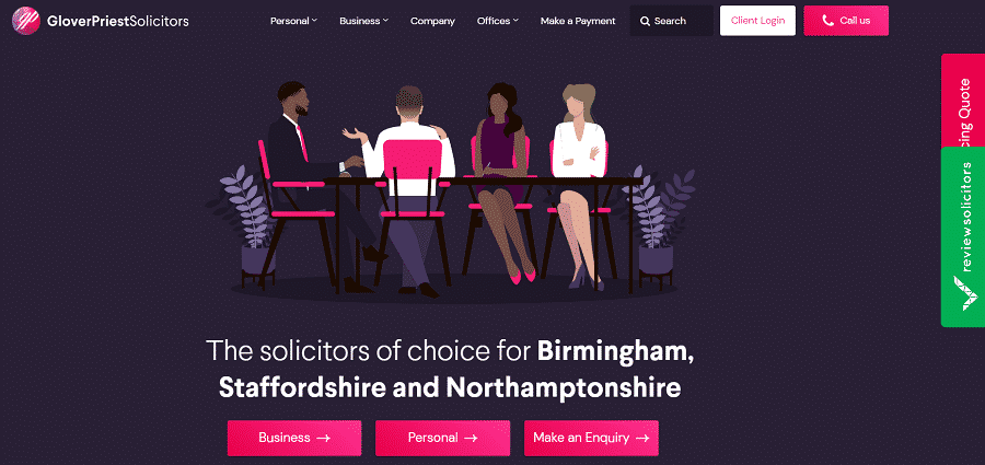
When landing on the homepage, the user’s eye is immediately drawn to the simple messaging that stands out in white against a dark background — a clear presentation of the industry and geographic location of the firm.
This practical approach to messaging immediately adds value: if you live or work in the area, they instantly become a frontrunner for your situation.
The navigation is sticky, which ensures the “Call us” CTA remains visible as the visitor scrolls.
CTAs throughout the homepage stand out in bold pink against a dark background, ensuring they can’t be missed.
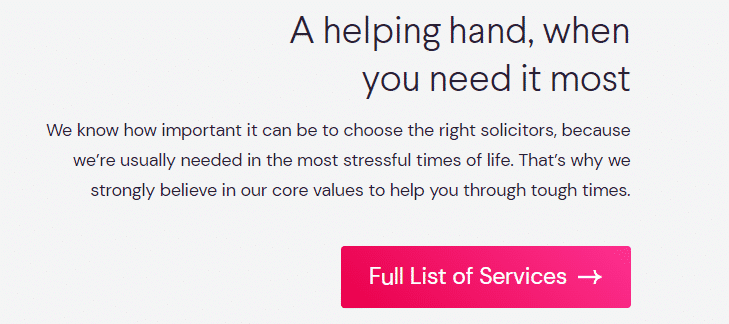
True to best practices, the copy is arranged in short, skimmable paragraphs throughout the site. This keeps the user interested and able to easily digest information, without being overwhelmed by long copy.

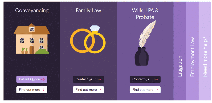
The service-dedicated pages are clean and well structured. They feature bulleted information to make long and complicated copy simple and understandable to the site visitor.
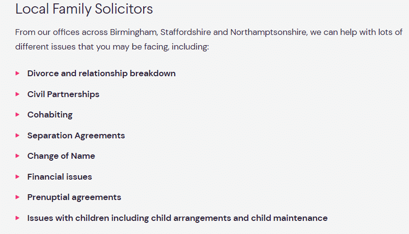
Unlike most law firms that might opt for traditional blue, green and black, GloverPriest Solicitors uses a unique color palette of pink and purple — not a color scheme you typically associate with a law firm.
This unorthodox choice of colors allows the company to stand out, escape from the severity and boredom of legal topics and appear softer and more approachable.
This in turn makes the user feel more comfortable in this colorful environment.
What they could do better:
So what would we change? One key aspect we’d adjust is the messaging.
GloverPriest uses phrases like “Personal law experts, leaving you with one less worry” and “A helping hand when you need it most.”
We see this as too vague and lacking real value. Why?
People in high-stress situations are looking for specific information and want to know exactly how a law firm can help them find a solution to a serious issue — one that’s typically associated with high financial costs.
Since law is a complicated topic, they would expect explanations in simple terms so that they both find an answer for their problem and are educated on the topic.
We would focus the copy on the clear value for the potential client. What is unique about the services this law firm offers? How does this law firm differ from the competition?
We would also cut the number of CTAs in the hero section to two — the three that are there now could be overwhelming or confusing to the visitor.
Although GloverPriest Solicitors follows the best practices for short paragraphs, the font is too small and the text is hardly readable. Making it between 16 and 18 pt would help improve readability.
2. SVA Société D'avocats
Website: www.sva-avocats.fr/
Category: Family Law Firm
What they do well:
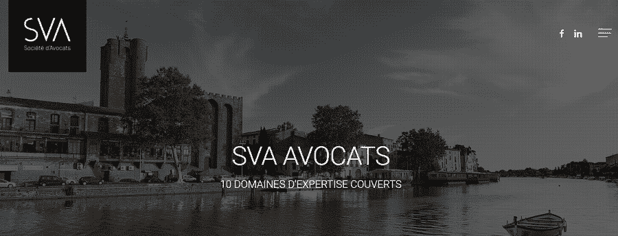
From the moment you land on the SVA Société D'avocats’ homepage, you are immersed into landscape scenes throughout France.
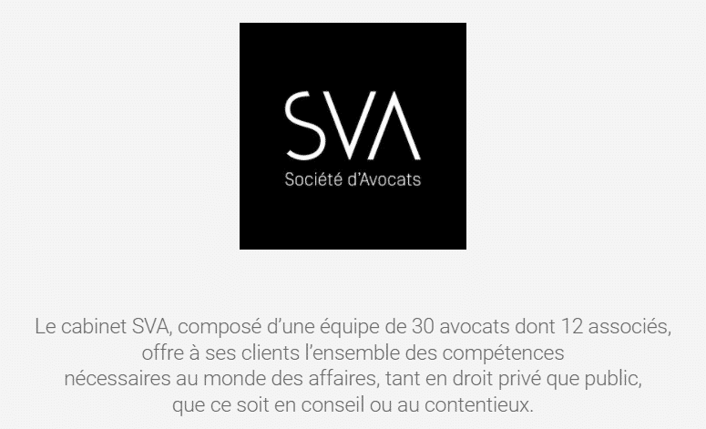
The hero section impresses the user with numbers — 50 years of expertise, 10 service areas, 30 lawyers and 12 partners.
Highlighting their long history and combining sophisticated typography with an elegant grey-scale palette and black-and-white imagery conveys both professionalism and authority.
With a clean design throughout, this family law website offers easy and simple navigation using a hamburger-style menu.
Aside from the rotating hero images, the design offers minimal use of images — there are only two, plus a set of beautiful iconography on the homepage.
Instead of images of people, common on law firm websites, scenery images depict the locations of the firm’s offices.
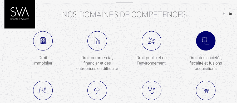
The icons underneath the hero section show the areas of expertise in a simplistic yet professional approach.
What they could do better:
SVA Société D'avocats’ website is aesthetically pleasing in its minimalistic design, but there are key elements missing for conversion.
We would leave the 50 years of expertise as part of the unique value proposition, to show how long the company has supported its clients in stressful moments of their lives.
However, we recommend skipping the number of lawyers and partners, since this information does not provide real value to the website visitor.
The CTAs on the site are barely noticeable, which can weaken the impact on both the user journey and conversion.
The thin font style is an interesting choice, compared to the typically bold, in-your-face typography used on other law firm web designs.
While it comes across as elegant, it’s not ADA-compliant in some sections, due to the busy background.
We would increase the contrast in some sections, especially where there is grey copy against grey background.
We recommend using contrasting colors for CTAs to help them stand out, and using a slightly more dominant typography throughout the site, to avoid a passive notion.
Another element that is clearly missing? Contact details. The visitor has to scroll to the footer of the homepage to find them, which should never be the case.
While SVA Société D'avocats’ website presents a clean design, skipping key elements in the name of minimalism is sure to hurt conversion.
3. Fox Rothschild LLP
Website: www.foxrothschild.com/
Category: Family Law Firm
What they do well:
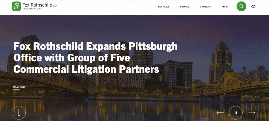
When landing on the homepage of Fox Rothschild LLP, the visitor is welcomed by bold, white typography over a landscape image background, and a short and simple menu in the top right corner.
This clean organization and balance make the user feel comfortable and safe in an industry that could be daunting for many.
A prominently displayed search option in the website menu allows the user to quickly jump to what they’re looking for, which is a helpful option for simple navigation, especially on content-rich websites.
The option to choose high contrast mode shows improved website accessibility and much like the search option, shows consideration for the user.

Underneath the hero section, the firm displays relevant stats: 950 attorneys, 27 offices and 70 diverse services, which validate the scope and power of the firm and their potential to support clients in challenging times.

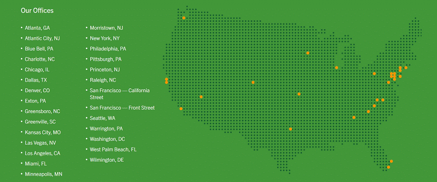
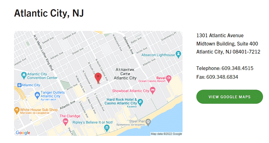
At the bottom of the short and concise homepage, a map with office locations shows visitors where they can find Fox Rothschild LLP’s services, with a link to a city map and contact details.
This shows the firm’s concern for their clients and their desire to ensure potential clients are able to easily reach them and get the support they need.
What they could do better:
We had to search high and low to find family law website designs that follow industry best practices while also being aesthetically pleasing.
While the design is visually appealing, typography is attention-grabbing and the simple navigation even includes a search bar (bravo!), the absence of key elements undoubtedly affects conversion for Fox Rothchild.
The high-res images in the hero section are pretty to look at, but the firm missed out on one of the most important aspects of the hero — displaying their UVP.
The hero section leaves the user wondering “Who is Fox Rothschild? What areas do they specialize in? Why should I choose this firm over others?”
The visitor gets no immediate value on the homepage, which almost guarantees a bounce.
Another element we have to point out is the carousel. In general, carousel designs should be avoided because they confuse the user journey — website visitors are unlikely to click on a section without knowing what’s behind it.
A big miss? CTAs. Where can the visitor get in touch with the firm?
While there are other bones we have to pick with this design, we’ll highlight one more: services.
It’s clear from clicking on the “Services” tab in the menu that the firm offers expansive services, so displaying them all on the homepage might be overwhelming.
A hover-over dropdown menu could be implemented to avoid too many clicks that can hinder the users from reaching the next milestone in their journey.
Remember: A visually appealing website is one thing. A design that’s visually appealing and also optimized for conversion is another.
4. HG Lawyers
Website: www.hopgoodganim.com.au/
Category: Law Practice
What they do well:
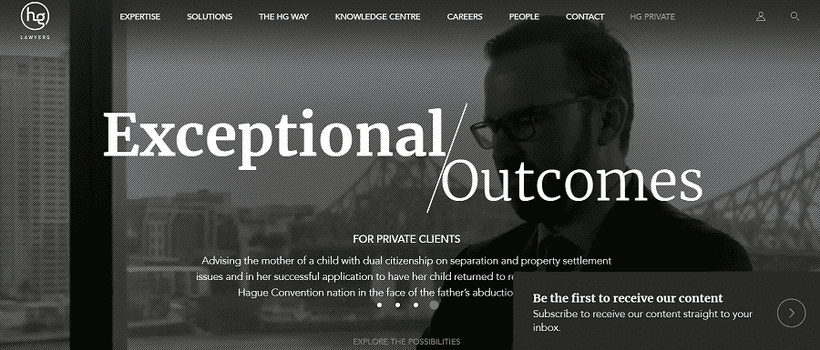
HopgoodGanim Lawyers’ design is clean and simple, with modules showing the firm’s expertise, team and solutions.
The simple navigation ensures the user finds the information they need quickly.
As a video runs in the background of the hero section, “Exceptional outcomes” remains in large, bold font throughout each slide, to remind the website visitor of the firm’s positive track record.
Two CTAs on the homepage — “View more” and “Explore solutions for your business” — mark important conversion funnel stages, inviting the user take the next step of their journey and further engage with the website.
The third CTA, “Be the first to receive our content,” dynamically moves with the user as they scroll.

The out-of-the-box CTAs (quite literally) are a bit of risk, as an outline typically makes them more visible.
However, the bold, orange font is hard to miss, and the calls-to-action seem natural and unobtrusive, yet easy to spot.
The video in the hero section serves as the main attention-grabber visually.
Other images used on the website focus appear to be simple stock images, but they do add some value by focusing on different groups of people, showing human faces and emotions, helping to humanize the firm and establish a connection with site visitors.

What they could do better:
There’s no doubt that the video is the attention-grabber on the site. But HopgoodGanim Lawyers ensures that along with visual appeal, the visitor is also getting a clear UVP, so they can instantly form an opinion about the law firm.
Of course, we do have some changes to recommend. While the navigation menu is clear and sticky, the drop-down menu in the Expertise section is cluttered and may be overwhelming to visitors.
CTAs — just two throughout the homepage — are scarce, which affects the conversion funnel. We would include additional CTAs to create a clear funnel for the user journey.
The content on the internal pages such as Family and Relationship Law is considerably text-heavy, which discourages readability, and the color of the text is too close to the color of the background, which can lead to eye strain.
We recommend shortening copy wherever possible to include the most valuable information, breaking up copy with images, and changing the color of the text or background to make the copy easier to read.
At Digital Silk, our best practices for website copy include shortening paragraphs to three lines and 36 words max.
This encourages readers and even allows users to skim to gain the most valuable information.
5. Godwin Campos LLC
Website: www.godwincampos.com.sg/
Category: Divorce And Family Lawyers
What they do well:
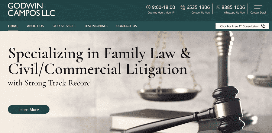
Godwin Campos LLC uses a client-centered design with strong messaging, bold typography and simple navigation.
Right from the get-go, the visitor is aware of their field of expertise and their notable track record.
Two prominent CTAs — “Click for first free consultation” and “Learn more” stand out against a contrasting background and invite the user to move to the next step of the conversion funnel.
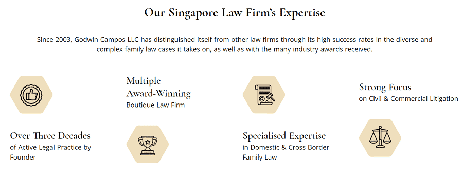
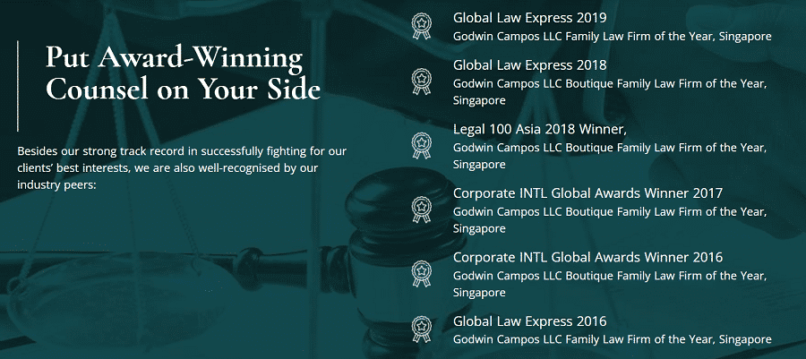
The website uses iconography to display the unique value proposition of this family law firm — over three decades of professional history, multiple awards and areas of specialized expertise.
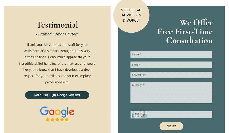
After the visitor scrolls through the firm’s expertise, along with awards, services and success rates, they find a built-in consultation form, strategically placed next to client testimonials.
This placement is notable for a key reason: potential clients are more likely to contact the firm to seek a solution to their own problem, after being encouraged the successful outcome for other clients.

The images on the site are kept somewhat basic and neutral, focusing on legal expertise and showing people who going through difficult situations and require the support of an attorney. The images are subtle, which allows the visitor to focus on the messaging.
The firm displays several instances of social proof on the homepage, showing their strong track record with awards and valuable stats in addition to client testimonials, which displays transparency and helps build trust.
What they could do better:
Between the sticky navigation with contact details constantly in full view, the built-in form for quick and simple contact, the direct messaging and the many instances of social proof — which far too many websites miss out on — Goodwin Campos LLC has our full attention.
Of course, at Digital Silk, it’s all in the details, so we do have some recommendations.
We recommend replacing the copy on the “Learn more” and “Enquire more” CTAs. These actions imply work on the visitor’s part.
Instead, we stick to CTAs like “Explore our services” or “Discover how we can help” — wording that seems to lighten the load for the potential client and focus on benefits instead.
An important miss for this site is the lack of search engine optimization (SEO), which helps target audiences find your website when searching for relevant keywords.
One tool to check if a website has been optimized for search engines is SEO Minion.
In this case, one look at SEO Minion and you’ll notice the header structure is not properly set, which will affect the site’s ranking, along with brand visibility and the possibility of attracting new clients.
At Digital Silk, we deliver fully optimized websites to ensure visibility, ranking and conversion.
Based on a detailed digital strategy that we create for your brand, we optimize your online presence using the best practices for family law website design.
Family Law Firm Web Design Mistakes To Avoid
To summarize and even reiterate some of the key points mentioned in our analysis of the five designs above, the family law industry has some catching up to do when it comes to creating strategic website designs that convert.
The recurring issues we’ve seen in web designs in this industry include:
- Overcrowding, between messaging, visuals and animation that overwhelms the visitor OR underwhelming design that fails to show the UVP
- Messaging focused on how great the law firm is vs. how the law firm can help clients
- Awkward taglines in hero sections that don't provide value, such as "We were born to solve problems" (with messaging focused on the company, not the client) or "We are the attorneys for you" (without indication of the practice areas or why they’re the right choice)
- No clear conversion funnel
- Missing contact information throughout the site
- Lawyer/team images cluttered into the hero section, which focuses on the firm instead of on the client
Schedule A Consultation With Our Family Law Attorney Website Design Agency
At Digital Silk we offer a free consultation & custom proposals for custom website design projects. Simply fill out the Request a Quote form, tell us about your goals and our experts will provide you with actionable insights and cost estimates.
Or, call us at (800) 206-9413 to start the conversation.


