Background Gradient

Construction Website Design Services

Plan, design and develop a custom construction website with Digital Silk.

  • Grow Visibility Online
  • Build Trust & Credibility
  • Book New Projects
Request a Quote
Designrush logo

5 Star DesignRush Reviews

Latest Web Design Award

CSS design awards logo
Designrush logo

5 Star DesignRush Reviews

Latest Web Design Award

CSS design awards logo
Scroll Down

Our Construction Website Design Services

From custom design to end-to-end development and more, we handle all of your digital needs under one roof.
CLICK TO VIEW MORE

Construction Website Design

CLICK TO VIEW MORE

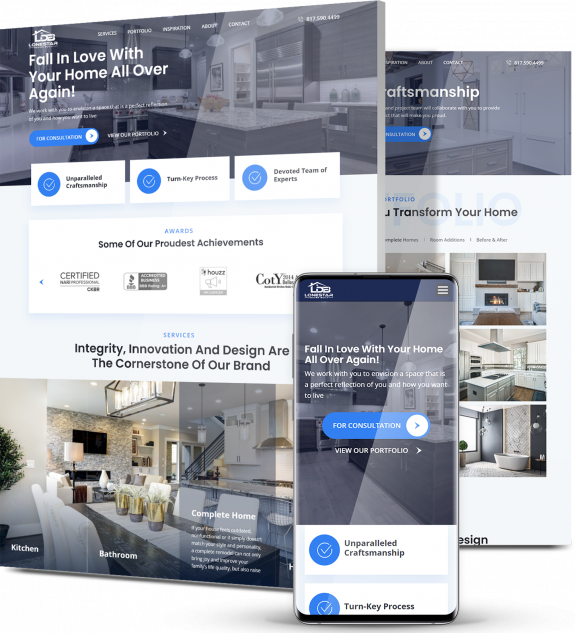
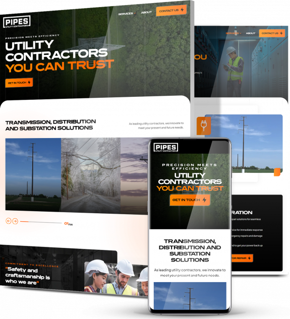
Work with our award-winning designers to plan, build and launch a custom website for your construction brand. From client testimonials to before and after galleries, we’ll help you showcase your best work, get the word out about your company and drive new projects.

Construction Website Redesign

CLICK TO VIEW MORE

If your website is outdated or performs poorly in search-rankings, Digital Silk has the expertise to revamp your online identity and answer your current digital needs. From galleries showcasing your projects, to optimization that increases visibility and improves your website’s ranking, we will redesign your website to grow your construction brand online.

Construction Website Development

CLICK TO VIEW MORE

Custom design isn’t our only area of expertise. Our team is comprised of top developers who work with all leading platforms, to develop a website that fits your needs. Our experts will help you choose and customize a Content Management System (CMS) to fit your exact operational needs while increasing visibility and improving conversions.

Local SEO

CLICK TO VIEW MORE

We’ll optimize your construction website for target keywords that allow you to appear front and center in local search queries.  

Whether a potential client is looking for “construction companies near me” or “leading construction companies nearby” for example, your website will appear in search engines to help you grow brand awareness and build your client base.  

Website Content Creation

An aesthetically pleasing website isn’t enough to bring you new clients on its own — this is where quality content comes in. Clear and consistent messaging helps engage your prospects and contributes to your website’s SEO. From engaging website copy to educational blog posts and informative press releases, our content experts will help you create meaningful content that speaks to your target audience and helps you build credibility as a leading construction company in your area.

Construction web design company custom websites
Request A Quote

Strengthen Your Website’s Foundations With Digital Silk

"*" indicates required fields

This field is for validation purposes and should be left unchanged.

Construction web design company custom websites
Background Gradient
Our Clients

A Trusted Construction Website Design Company

From global to local construction companies, we work with clients of all sizes to build custom websites that drive new business.

babiesrus logo
Babies R Us
rollink logo
Rollink
EV Universe logo
EV Universe
Northwestern_Qatar_Logo_2_
Northwestern University
ibm logo
IBM
buddha brands logo
Buddha Brands
paul stuart logo
Paul Stuart
spar bernstein logo
Spar & Bernstein
Sony logo
Sony
new-dev-rev logo
NewDevRev
Dognomics Logo
Dognomics
Mitsui Plastics logo
Mitsui Plastics
puma logo
Puma Energy
xerox logo
Xerox
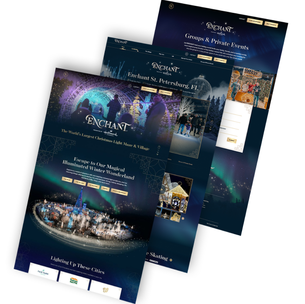
enchant logo
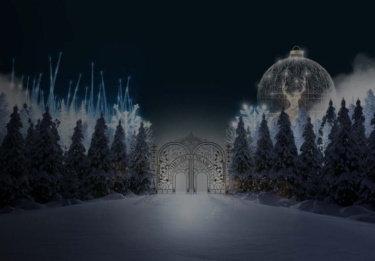
Enchant Christmas
grenco logo
Grenco Science
OUR WORK

Featured Case Studies

Explore our work for clients across industries.
Featured
A background image for EV Universe of a car driving on an empty road.
ev
Electric Vehicle eCommerce Marketplace

Our team crafted a cutting-edge, on-brand design that strengthens the distinctive visual identity of electric vehicle marketplace EV Universe.

Featuring dynamic visuals and interactive elements, the innovative platform drives credibility while elevating user experience for buyers and sellers alike.

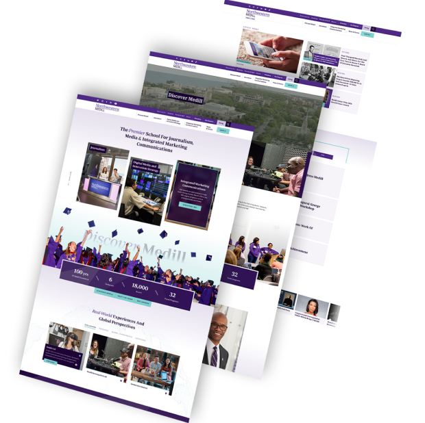
A background image for Northwestern Medill of a professor giving a speech
northwestern
Responsive University Web Design

Our full suite of agency solutions, from digital strategy to messaging, site architecture and responsive development, transformed Northwestern Medill’s online experience.

We produced an engaging, easy-to-use experience through micro-animations and a meticulously planned user journey to boost conversions and drive student and staff satisfaction.

A background image for Sony Rewards of a couple laughing
sony
Gamified Digital Platform

Our award-winning designers approached Sony Rewards’ aim to increase on-site engagements by delivering a stripped-back custom web design.

The intuitive technology website features easy-to-use dropdown navigation menus and crystal-clear CTAs to drive signups.

TRC Healthcare's background image of doctors and nurses in scrubs
trc healtcare_flip
A Website Built For Connection And Growth

We partnered with TRC Healthcare, a leader in continuing education for healthcare professionals to effectively articulate their broad expertise and extensive portfolio.  

Our approach spotlighted TRC Healthcare’s mission and distinctive value, shifting the narrative from technical features to the meaningful impact and benefits delivered to their diverse audience.  

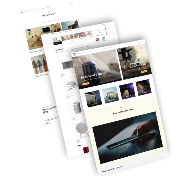
A background image for Bang & Olufsen of a man wearing headphones
BO
Hi-Tech eCommerce Store

By creating a distinctive design tailored for a high-end electronics eCommerce store, we helped position Bang & Olufsen as a tech market innovator.

With a unique design and a streamlined sales funnel, our digital solutions targeted both UX and UI to grow brand visibility and customer engagement.

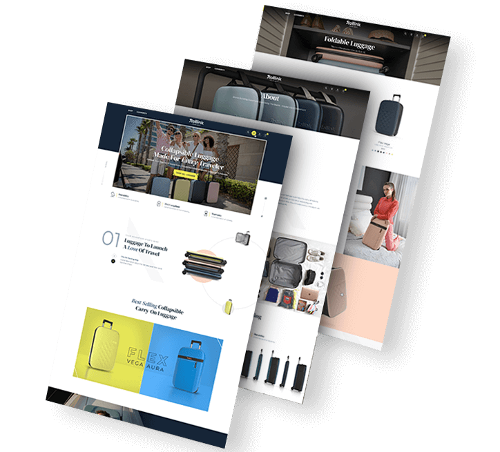
four people on a vacation
rollink solution-2
Premium Luggage e-Shop

From website design to digital marketing, brand strategy and SEO, our end-to-end digital solutions helped Rollink grow their revenue by 500% as they entered the U.S. market.

Our WooCommerce-powered solution features micro-animations, an immersive product experience and a checkout process optimized for conversions.

A background image for NewDevRev of skyscraper buildings
Trio of NewDevRev website images
Real Estate Digital Experience

Our web design and development specialists worked to provide NYC-based real estate firm NewDevRev with an upscale web design on a custom-developed platform.

Through a creative, responsive design that includes a tailor-made search and filter element, visitors can easily access NewDevRev’s upscale website.

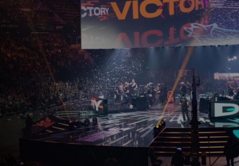
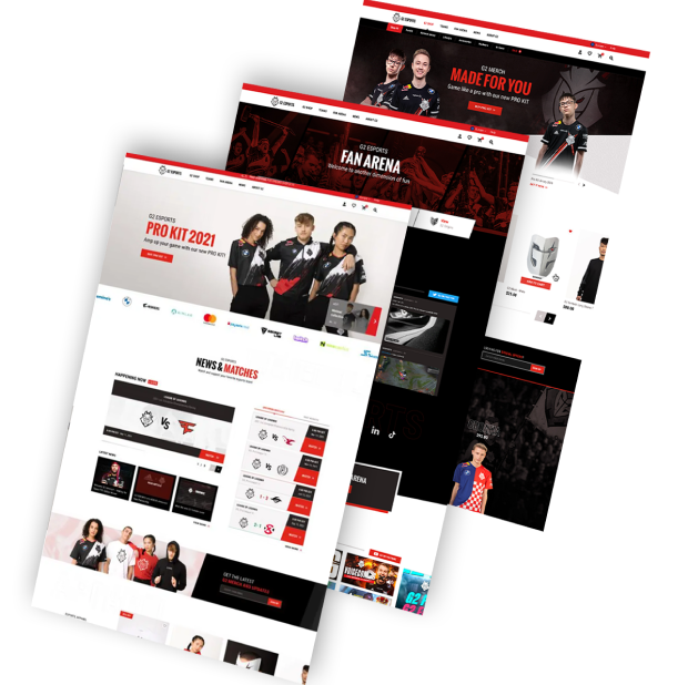
A background image for G2 Esports of a live eGaming show
g2
Reimagined eSports Platform

Working with G2 eSports’ community-based identity, we developed a custom eCommerce platform to reinforce the organization’s legendary position in the eSports industry.

Our design and development team introduced a streamlined shopping experience and strategically planned community design to grow conversions and support brand authority.

An image of a shoe store
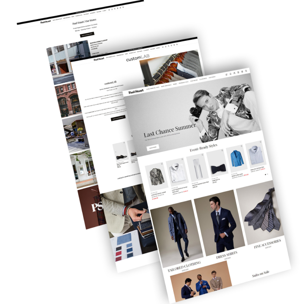
paul
Luxury eCommerce

We reimagined luxury men’s clothing brand Paul Stuart’s digital experience with a streamlined conversion funnel and custom eCommerce design.

Our design helped increase on-site engagement and conversions through a mixture of user-friendly features and a reinvention of Paul Stuart’s classic visual identity.

Background image of a man filling up his car with gas for Puma Energy
puma energy solution
Modern Energy Website Redesign

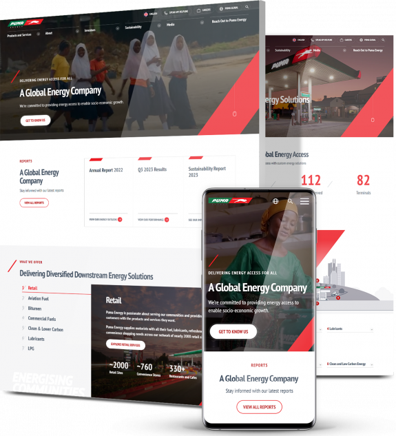
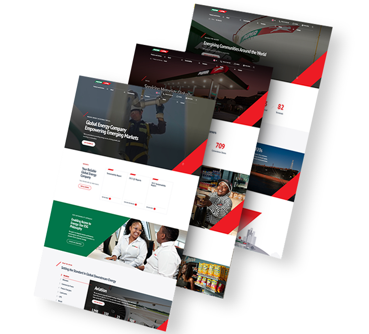
We delivered a modern website redesign for global energy company Puma Energy. Our team created a responsive web design with UX-optimized features, including strategically chosen typography, vibrant colors throughout and high-quality custom graphics, in turn increasing engagement by 63% in three weeks.

We also provided extensive keyword research and search engine optimization, helping to grow website visitors by 27% in the same period.

person cooking
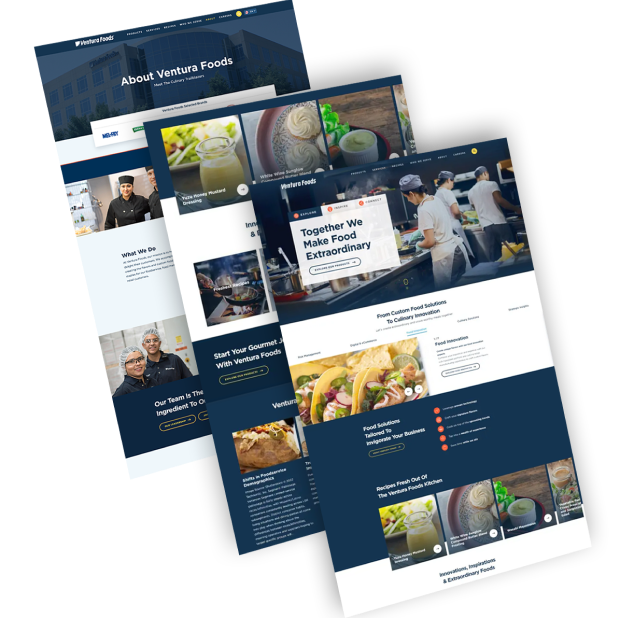
ventura
Food & Beverage Web Development

We redesigned Ventura Foods’ corporate website to create a fully optimized digital experience.

Included in the user-centric design is a video in the hero section, engaging micro-animations, a custom cursor and chatbot functionality.

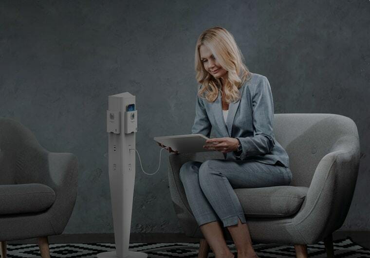
Background image of a woman using a tablet for MOD
A trio of Modula website images
B2B eCommerce Design & Development

We were tasked with launching a new website for National Lighting’s high-quality B2B power charging accessories and lighting solutions company, MOD.

Our team delivered end-to-end digital services to elevate MOD’s UX and boost orders. Our partnership spanned website strategy, architecture and messaging, responsive design and development, custom eCommerce integrations and marketing.

Background image of cupcakes for Barton G
A trio of Barton G website screenshots
Immersive Events Website

We delivered a creative, interactive website for one-of-a-kind restaurants and events brand Barton G. Using custom images and motion graphics, our designers and developers crafted an engaging UX that perfectly captures the Barton G brand.

Despite aiming to entertain visitors on every step with a “wow” factor UI, Barton G’s website also follows core UX principles and contains simple, yet striking, messaging that converts.

Background image of city skyline for Spar & Bernstein
LawSB-solutions-1
Law Firm Digital Presence & Visibility

Our team worked with legal services provider Spar & Bernstein to extend the group’s online presence. To achieve this, we delivered a set of custom digital strategy, conversion-optimized messaging, responsive design and SEO solutions.

We improved LawSB’s keyword optimization, content and technical SEO strategy, extending the website’s organic traffic 14x in six months.

load more examples

Our Construction Website Design Process

From planning to launch, our expert team takes a step-by-step approach to deliver a construction website that works for you.

Before & After

Our Website Redesigns

With decades of industry experience, our team has transformed countless brands online.
Explore our redesign portfolio.

New Church logo
Powr logo
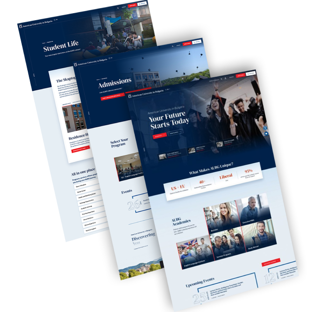
American University in Bulgaria logo
Ventura Foods logo
Verus tech group logo
BEFORE AFTER
Screenshots showing NewChurch LIVE's website before and after our redesign
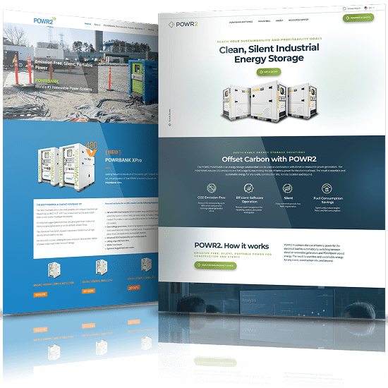
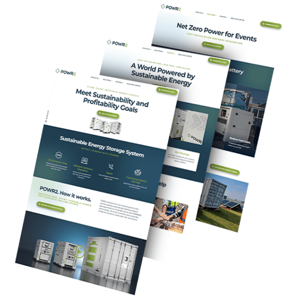
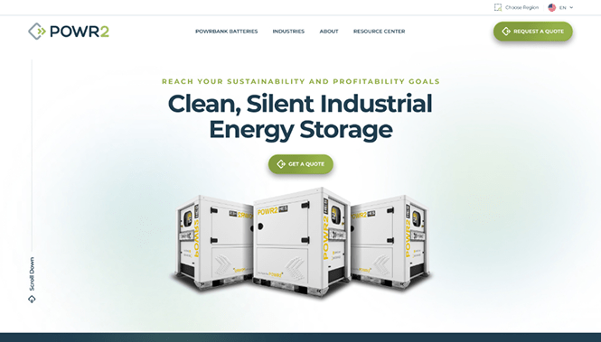
Screenshots showing POWR2's website before and after our redesign
Screenshots showing AUBG's website before and after our redesign
Screenshots showing Ventura Foods' website before and after our redesign
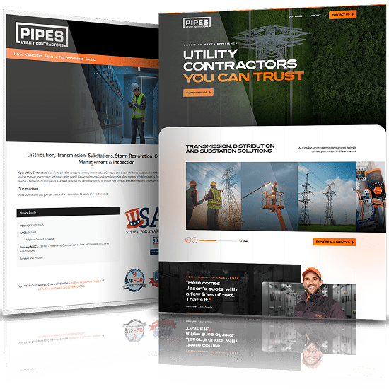
Screenshots showing Verus' website before and after our redesign

Our Web Design Case Studies

Check out some of our recent case studies to see how we’ve delivered measurable results for brands across industries.
See for yourself.
A background image for Xerox of a man in a suit

Xerox needed a new strategy and website to capture B2B leads for their new printer technologies.

In 6 months we achieved:

20k

Sales Increase for Xerox Versalink

40k

Conversion Rate for Nurtured Leads

A trio of images highlighting Xerox's website design
A background image for doForms - Two workers in hard hats

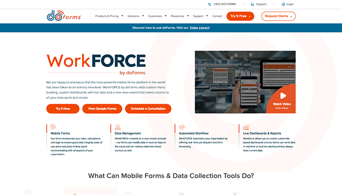
doForms, provider of data collection mobile forms, needed a more user-friendly and SEO optimized website to grow conversions. 

In 2 months, we achieved: 

22%

increase in new traffic

1.5k

new organic keywords

A trio of images highlighting doForms' website design
A background image for FieldEdge of a woman standing with her arms folded

FieldEdge, a leading provider of field management solutions. needed to redesign their website to improve performance and attract more prospects. 

Shortly after launch, we achieved: 

19%

increase in overall traffic

50%

faster loading speed

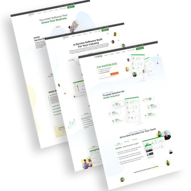
FieldEdge's website design - Desktop, Mobile, and tablet design

WHY COMPANIES CHOOSE US

Digital Silk’s Unique Value As A Construction Web Design Company

Project Ownership. Transparency. Results. 

Unlock the full potential of your construction business with Digital Silk. We provide a spectrum of services, ranging from expert consulting to bespoke design and development.

By employing a strategic approach, combining SEO, digital marketing expertise and cutting-edge design, we increase your online visibility, attract and engage visitors and solidify your brand’s position as an industry leader. Partner with us to excel in the ever-evolving digital landscape for construction companies.

Headshot of Gabriel, Digital Silk's SEO

Our Digital Silk team includes award-winning designers. From custom graphics and micro animations to high-quality media that showcases your best construction projects, our design will focus on conveying your talent to prospective clients.

Headshots of 3 Digital Silk team members

At Digital Silk, we hold your construction website project close to our hearts, from its inception and far beyond. Whether it’s shaping a unique strategy, offering expert insights, conducting thorough research or meticulously overseeing quality assurance, each stage is embraced as if it were our very own.

Our commitment to complete transparency and ongoing communication forms a collaborative partnership that empowers us to nurture and elevate your brand’s digital presence.

Headshots of 3 Digital Silk team members

Digital Silk is your partner in construction website design, committed to fostering your brand’s digital growth. Our approach is founded on research-backed, objective-driven decision-making, ensuring each step aligns with your brand’s vision and goals.

Our extensive suite of services encompasses custom web design, development, branding and digital marketing, all designed to resonate with your target audience. We harness innovative techniques to ignite your brand’s digital transformation, maximizing its potential in the online landscape.

Headshots of 3 Digital Silk team members

Meet Our Expert Web Designers

schedule a consultation

Digital Silk’s Construction Website Design Best Practices, Header-To-Footer

Our construction website design messaging best practices include:

  • Use minimalistic copy that can be easily skimmed
  • Implement modules or collapsible text features in sections where more content is needed
  • Use your hero section to display your unique value proposition
  • Use standout CTAs with clear messaging to guide visitors through the conversion funnel
  • Optimize your website messaging for search engines to increase organic traffic

Our construction web design messaging best practices include:

  • Use minimalistic copy that can be easily skimmed
  • Implement modules or collapsible text features in sections where more content is needed
  • Use your hero section to display your unique value proposition
  • Use standout CTAs with clear messaging to guide visitors through the conversion funnel
  • Optimize your website messaging for search engines to increase organic traffic

Construction web design typography best practices:

  • Use clean ADA-compliant typography that is consistent throughout your band representation
  • Use contrasting colors between typography and backgrounds to improve readability and allow key points to stand out

Construction web design imagery best practices:

  • Use high-res photos and images to showcase your construction projects
  • Create videos to give potential customers and clients a sneak peek into your construction brand and offering

Construction web design social proof best practices:

  • Include testimonials to help improve transparency and enhance your business reputation
  • Create a Social Responsibility section to demonstrate your concern and care for people and environment when working on construction projects
  • List your memberships in construction chambers, associations and partnerships to build trust
  • Include certifications and registrations to show your adherence to quality control standards and regulations
  • Optimize website speed to meet the core web vitals standards and engage audiences from the get-go
  • Include a built-in contact forms for quick and easy communication
  • Implement email signups to engage and retain audiences over time

Construction Website Design Examples To Get Inspired By [+ Our Takeaways]

Our designers at Digital Silk reviewed construction company websites around the globe and here are the top five construction company web designs that made it onto our list:

1. Emaar

Website: www.emaar.com

Category: Real estate development
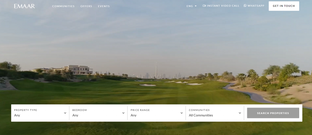
Construction website design example: Emaar homepage
[Source: Emaar]

From the moment you land on Emaar’s homepage, the brand envelops you in the unique atmosphere of their construction projects, through a video depicting impressive skyscrapers, full-scale golf courses, luxury hotels and attractive villas.

A built-in search form in the hero section allows the visitor to instantly customize their journey by choosing the property type, community and price range they’re interested in.

The website uses clear and concise calls-to-action (CTA), such as “Get in touch” and “Search properties,” so the visitor knows exactly where each button will take them.

The navigation bar is broken up into two sections: key menu options on the left and contact details on the right. This simple organization element allows visitors to customize their journey by quickly choosing the menu item they're interested in.

Only partially sticky, the disappears as the visitor scrolls down, but reappears when scrolling back up, serving as a guiding point for visitors scrolling through the site.

As you scroll down from the hero section, information appears in organized modules with clear, concise messaging and highlighted CTAs that can't be missed.
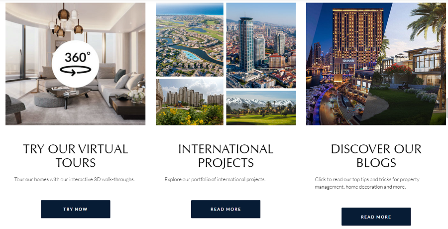
Construction website design example: Emaar modules

From the dynamic video in the hero section to beautiful and vivid images throughout, visuals play a key role in Emaar’s web design — and rightly so! Visuals are an important element when it comes to construction website design.

While testimonials are also key, there’s no doubt the visitor wants to see finished products — a testimonial in visual form.

Along with a full portfolio, the homepage also offers 3D virtual tours, bringing properties to life for website visitors around the globe.
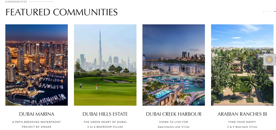
Construction website design example: Emaar featured communities

What they could do better:

We love the dynamic visuals, the built-in search bar in the hero section, the ample white space and CTAs that stand out. But we have a few recommendations for improvement.

We applaud the simple navigation bar, but we would implement a fully sticky menu to improve the user journey by ensuring it remains in sight for easy access to key pages.

Last but not least, we have to mention the lack of search engine optimization (SEO). At Digital Silk, all of the websites we create are fully optimized.

With a quick look at our handy SEO Minion, we see that Emaar does make use of a title tag and meta description, but headers aren’t optimized, neither for keywords or structure.

With just a little effort to optimize their website, they'd easily rank for non-branded keywords and, in doing so, grow their organic traffic and strengthen the top of their website conversion funnel.

2. Chelsea Construction

Website: www.chelsea-construction.co.uk

Category: Refurbishment, development and maintenance services
Construction website design example: Chelsea homepage
[Source: Chelsea Construction]

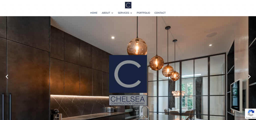
When landing on the homepage of Chelsea Construction’s website, the visitor is greeted with a full-screen image that changes every few seconds, from one room design to the next, and a large logo that remains prominent over the alternating imagery.

The brand is showcasing two things at once with this design — past projects to illustrate the diversity of their portfolio and a bold logo that demands attention to boost brand awareness.

A simple white navigation bar stands out at the very top, and stays with the user as they scroll throughout the site, ensuring they’re always one click away from key pages.

Below the fold, the visitor is welcomed to the website. A short paragraph of three lines — which follows our best practices for direct and concise copy — shares a message about the company’s history and expertise.

Construction website design example: Chelsea welcome message

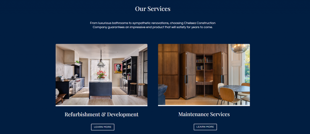
Below the welcome message, the company showcases its key services, organized in a simple module with engaging images that help the visitor feel the comfort and ambience Chelsea Construction offers.

Each service has a designated CTA the visitor can click on to begin their journey. This user-centered approach adds a touch of personalization, which helps the brand connect with their audience.
Construction website design example: Chelsea services

The messaging is kept direct, short and sweet, throughout the site — perfect for visitors who skim through and want to get where they’re going as quickly as possible.

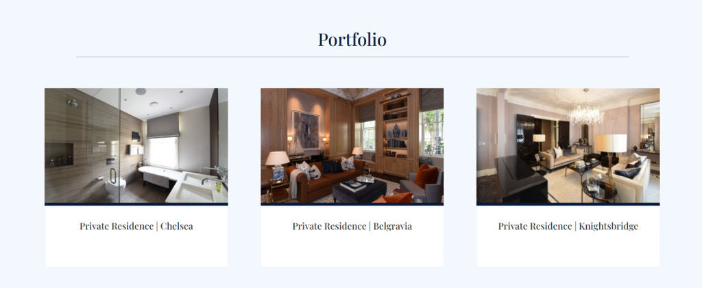
After scrolling through details about their approach, the visitor finally gets to the exciting part: the portfolio.

High quality and vivid photography help showcase the company’s portfolio right from the home page, where visitors can imagine that the beautiful and stylish environments shown can become a reality for them, if they choose Chelsea Construction.
Construction website design example: Chelsea portfolio

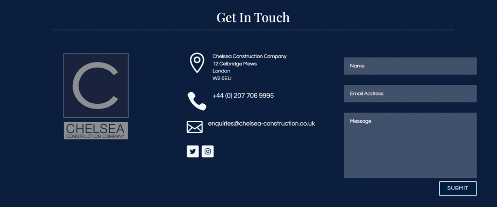
At the bottom of the homepage, instead of simply including contact information, the brand takes it a step further and includes a built-in contact form.

This extra feature helps make conversion simpler and encourages visitors to take their curiosity further and reach out.
Construction website design example: Chelsea contact form

What they could do better:

With the sticky navigation bar, skimmable copy, strategic user journey and built-in contact form, Chelsea Construction Company nailed some of our best practices.

So what would we improve?

We’d make better use of the hero section by including a unique value proposition (UVP) above the fold, to immediately share the specific value of the company to website visitors.

We’d replace generic “Learn More” CTAs with more engaging messaging, and we’d also include a link to the testimonial section, which is currently hidden in the About page, to help further sway potential customers.

Another key area to improve — SEO. While the header structure is laid out properly, headers aren’t optimized for keywords and the website is currently missing a meta description.

3. Korte

Website: www.korteco.com

Category: General contracting and construction management services
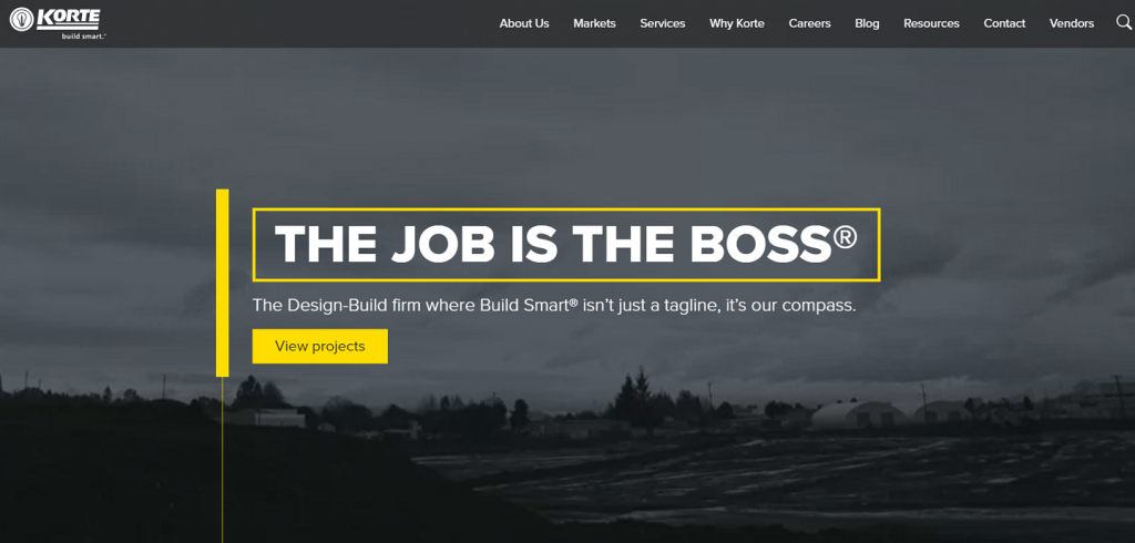
Construction website design example: Korte homepage
[Source: Korte]

Korte’s homepage reveals a white text overlay of “The Job Is The Boss,” boxed in bright yellow, making it impossible to miss.

A black-and-white full-screen video serves as a dynamic background, displaying a slide show of their construction sites and immediately giving the user what they want to see — the company in action — along with a key “View projects” CTA that offers a quick jump.

The bold and simple messaging hits all the right notes: the sheer simplicity and punchy messaging communicates confidence and expertise.

The sticky menu offers simple navigation, which allows the user to find the information they need quickly and easily.

As the visitor scrolls, they see Korte’s numerous clients, which boosts trust for potential customers.

Construction website design example: Korte social proof

Beneath the logos, the visitor has two options: Services or Markets. The CTAs in this section particularly caught our attention.

Visitors can use the drop-down CTAs to define their area of interest even further, and move to the exact page they want to find.

This is an excellent design feature for both user experience and personalization.
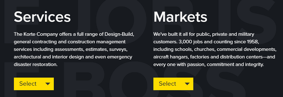
Construction website design example: Korte modules

What they could do better:

Korte uses bold typography, concise messaging, a sticky navigation bar and interactive CTAs to facilitate an engaging user journey. They even include social proof on the homepage, which other brands in the construction industry often miss.

However, while Korte leverages video in the hero section and uses images throughout the site, the visuals take a backseat due to the dark background, going largely unnoticed or presented as blurry.

The homepage does include a clear conversion funnel, but we’d also recommend adding a contact form in the footer section of the page. This quick and easy contact point could boost lead generation efforts, which, in turn, could increase conversions.

Last but not least, Korte does display case studies and testimonials on the Why Korte page, but a direct link to this page from the homepage could help increase click-through rates and consequently give Korte’s services better exposure.

4. Naylor Love

Website: www.naylorlove.co.nz

Category: Commercial Construction
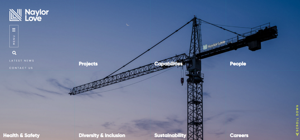
Construction website design example: Naylor Love homepage
[Source: Naylor Love]

Naylor Love’s homepage takes a different approach to the traditional navigation menu — one that varies significantly from the rest of the construction website designs on our list.

The visitor is greeted by an image that fills the entire screen, along with menu options listed as distinct modules. Hovering over each module triggers a change in the background image. Still, each image displays a vivid, high-quality scene of their construction work, teams or employees.

The hover effect also displays short and concise copy on each module: the title of the page, a brief description and a CTA.

This unique approach gives the visitor a chance to interact with the brand immediately upon landing on the homepage, encouraging both engagement and increased time on page.
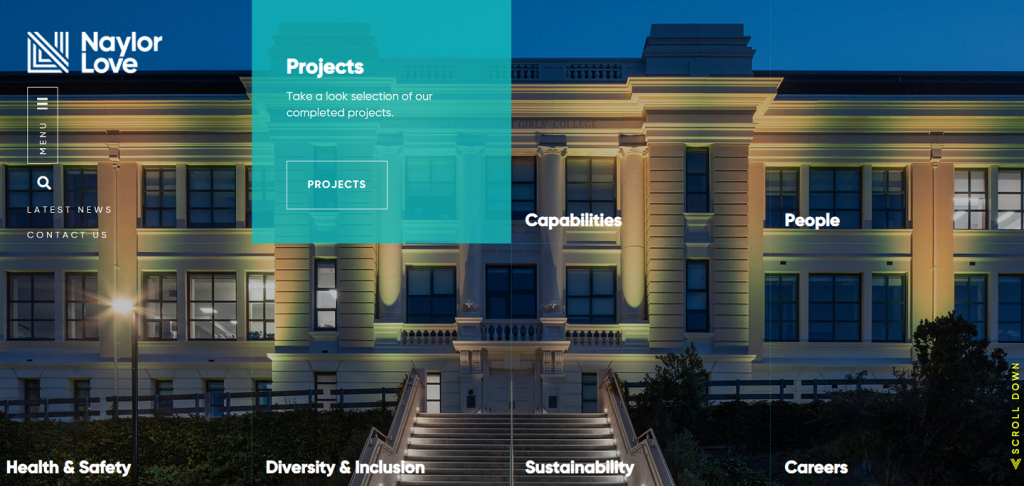
Construction website design example: Naylor Love modules

Underneath the hero section, the brand displays its most impressive stats with custom iconography and oversized bolded typography, boosting both trust and credibility.
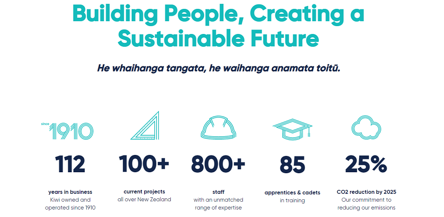
Construction website design example: Naylor Love stats

The next section of the homepage offers another chance for engagement, in the form of an interactive map. The visitor can zoom in or out, and hover over key points to find contact details for different locations.
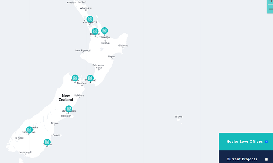
Construction website design example: Naylor Love map

With another scroll, the portfolio finally appears, neatly laid out with an image, a title, a concise description and a CTA under each section.

From retail spaces and boutique apartments to an immersion school and a memorial archway, the visuals depict the broad expertise of the company, accompanied by an engaging story for each project.
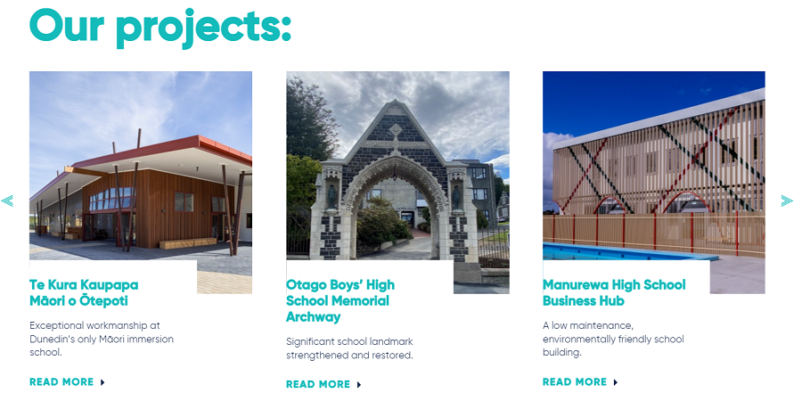
Construction website design example: Naylor Love projects

What they could do better:

While not true to our best practices for navigation design, the untraditional approach Naylor Love uses in the hero section may prove to boost engagement. However, it also leaves the visitor without a menu in view as they scroll through the site.

Another issue with the hero section: Without a well-defined and visible UVP, the possibility of turning away potential leads increases. A potential client might wonder: “Who is Naylor Love?” “Why should I choose them?”

Remember, it only takes seconds for a website visitor to form an opinion about a brand.

Some additional tweaks: We recommend reworking the conversion funnel, adding a built-in contact form at the bottom of the homepage, and including a sticky contact menu or button that remains with the visitor throughout their journey.

And of course, we recommend taking a closer look at SEO. As is, meta descriptions and optimized headers are absent.

Last but not least: testimonials. Ask your happy clients to shout out their enthusiasm from the rooftops and create a space for it right on your home page, Naylor Love, to help increase leads.

5. Vinci Construction

Website: www.vinci-construction.com/en/

Category: Infrastructure, Building And Civil Construction
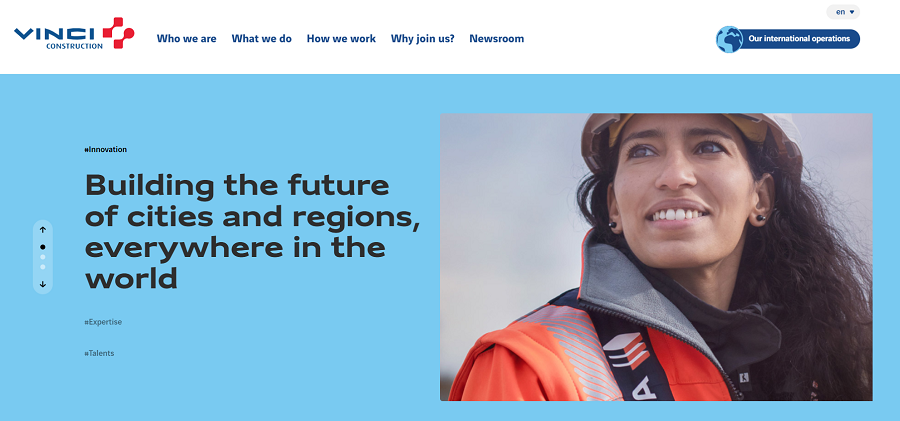
Construction website design example: Vinci homepage
[Source: Vinci Construction]

With a prominent UVP, simple imagery and easy navigation, visitors have the chance to choose their journey by clicking on their preferred hashtag in the hero section, after landing on Vinci Construction’s website.

The navigation is partially sticky, the design is well-organized with ample white space, and the blue and white color palette offers consistency in branding throughout the site.

Unlike the other construction website designs on our list, Vinci Construction places a Newsroom section directly below the fold, showing off new press releases and notable updates.
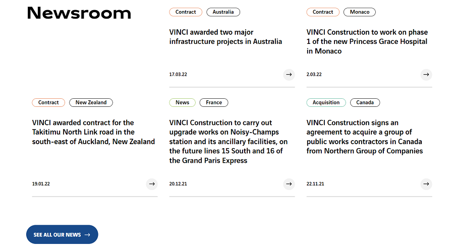
Construction website design example: Vinci newsroom

A site map, though not interactive, lies below, offering to take the visitor to the International Operations page through a CTA. Once on the page, the visitor can scroll through different countries to find how vast the brand’s work is, and explore projects in different locations.
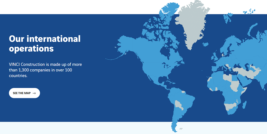
Construction website design example: Vinci map

With another scroll, the visitor lands on a Careers section, then a Key Figures section that offers key stats regarding the company. These numbers offer a form of “proof” for visitors who want to ensure the company is both reputable and successful.
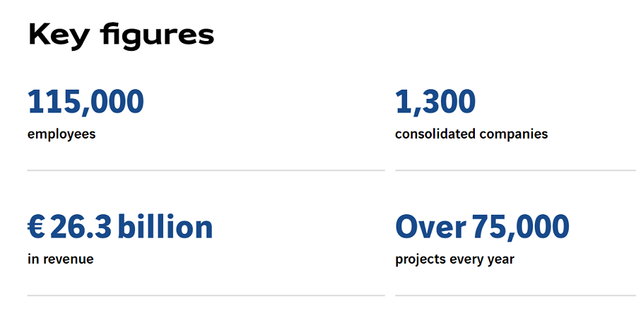
Construction website design example: Vinci figures

Then, somewhat abruptly, the footer appears and the homepage ends, leaving us with some questions.

What they could do better:

Another example of an interactive hero section, we applaud Vinci Construction for the engagement aspect, but more prominent CTAs instead of hashtags in small font, could help improve readability and attention.

Like other examples on our list, we’d also implement key features for the construction industry that are missing: A portfolio, testimonials and a contact form for simple conversion.

When it comes to SEO, Vinci Construction does include key aspects such as a meta title and a header structure. However, the meta description is a bit too long and the headers aren’t optimized for keywords.

With a few tweaks to their website design, Vinci Construction could improve their online visibility, generate valuable leads and increase conversion.

Seen anything you liked? Let's set new standards in construction web design, together! Request A Proposal

Let's Discuss Your Construction Website Design Project

Over to you!

If you have any questions about our process or would like to meet with our team, we'd love to hear from you.

Contact us at (800) 206-9413 to discuss your construction web design project or fill out our Request a Quote form to receive a custom proposal and expert recommendations.

Background Gradient

Construction Web Design F&Q

The budget required for a custom construction website design depends on several factors, including your specific project requirements and the expertise of the design agency you choose to work with. The complexity of the website, the number of pages and the desired features and functionalities all play a role in determining the cost.

A custom construction website design project could range from a few hundred dollars to several thousand dollars, with the final estimate being influenced by the unique needs and goals of your construction business.

Investing in a custom construction website design is a wise choice for your business for several compelling reasons:

  • Distinctive online presence: by opting for a custom design, you ensure that your construction website stands out with a unique, adaptable and optimized look. This not only enhances your brand’s visibility but also captivates the attention of your intended audience.
  • Brand identity showcasing: a custom design empowers you to showcase your construction business’s identity effectively. You can meticulously select typography, create a personalized color scheme and incorporate premium visual content that spotlights your services, thereby strengthening your brand image.
  • Full control: when you invest in custom construction website design, you retain complete control over both the appearance and functionality of your website. This control extends from the user interface to a user-friendly content management system, meticulously tailored to your specific requirements.
  • Long-term benefits: custom design offers enduring advantages. It allows you to control the look and feel of your website, optimize it for search engines and user experience and ensure robust security measures.

The average timeframe for developing a construction website with our agency can vary based on the specific project requirements and complexity. Generally, it falls within a range of 2-6 months. The duration of the development process is influenced by the intricacy of the construction website design.

If you require a straightforward site with easy access to construction services, clear contact information, and a user-friendly interface for inquiries, the development might lean towards the shorter end of the spectrum.

Conversely, if your construction website demands a more intricate setup with advanced features, such as real-time project tracking, complex integrations, and additional functionalities, the development timeline could extend to six months or even more. It’s essential to consult with our team to determine the precise timeframe for your construction website project.

Absolutely! At Digital Silk, we take pride in delivering custom website solutions with measurable results across industries such as:

Contact our team to learn more about our services and commence the revolution of your online brand.

Thank You!

We emailed you the download link. Check your inbox and enjoy the whitepaper!

Questions? Contact Us

Stay Ahead in 2025!

Download the Top Digital Trends Shaping Branding & Web Design

"*" indicates required fields

This field is for validation purposes and should be left unchanged.

digitalsilk_whitepaper_2025
Background Gradient
Our Experts Have Won Industry Awards

Recognized Digital Agency Experts

Awards
Digital Silk IMA award
Digital Silk Telly award
Marcon awards
Digital Silk Horizon Interactive award
Digital Silk Communicator award
Videographer logo
Digital Silk Awwwards
Digital Silk W3 award
Recognition
FoxNews logo
CNN logo
design rush
Bloomberg Logo
CNBC logo
wcbs newsradio 880 WHITE logo
ABC News solid black logo
Reuters Logo
Expertise
  • Brand Strategy
  • Communication Strategy
  • Logo & Graphic Design
  • UI & UX Design
  • Package Design
  • Custom Web Design
  • eCommerce Development
  • Mobile App Development
  • Software & AI Development
  • ERP Portal Integration
  • Marketing Strategy
  • Social Media Marketing
  • Search Engine Optimization
  • Paid Media Marketing
  • Email Marketing
  • Creative Copywriting
  • Content Marketing
  • Influencer Marketing
  • Affiliate Marketing
  • B2B Direct Marketing
REQUEST A QUOTE