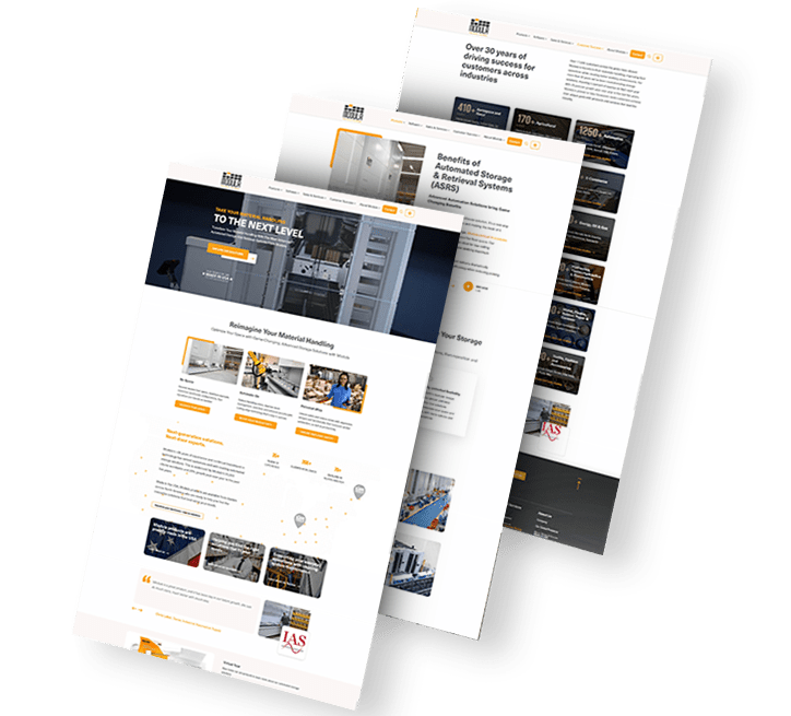
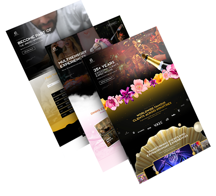
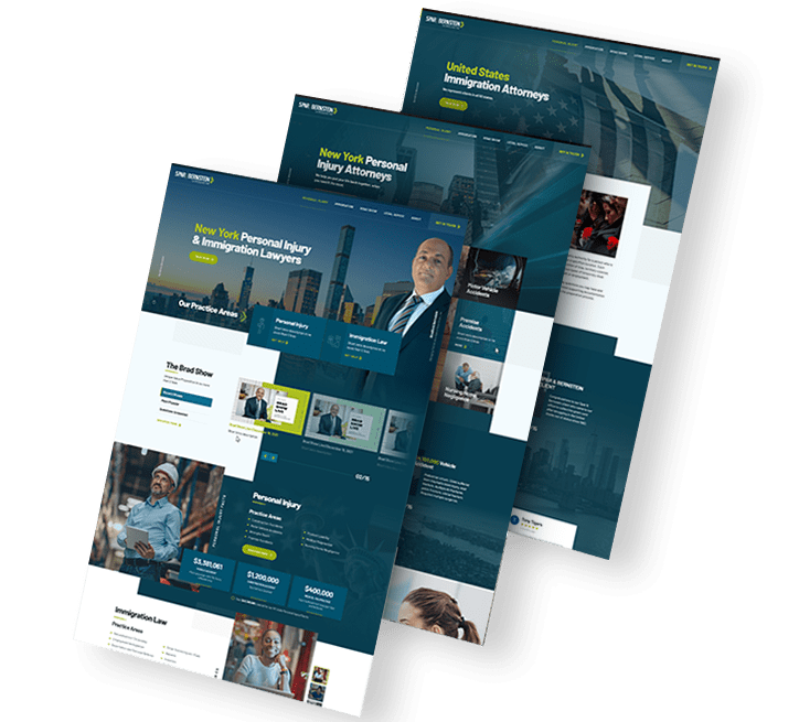
Types Of Website Redesign Projects
A website redesign can range from a light refresh to a complete overhaul.
A website refresh is a light makeover that typically includes upgrading design elements to align with brand updates.
Changes may include an updated color palette, typography modifications or small UI tweaks, while the website functionality and core structure typically remain unchanged.
A complete website redesign is a full overhaul, which may even include switching to a new website platform.
In this case, the website’s design and coding are changed to produce a new visual identity, including updated features, functionalities and a new user experience.
Get Insights On Web Design & Growing Your Brand
Do You Need A Website Redesign?
Many design professionals compare redesigning a website to remodeling a house — every element must be carefully considered to fit harmoniously into the big picture and serve both aesthetic and practical purposes.
To analyze the performance of your current website and decide if you need a light refresh or a complete redesign, consider the following questions:
- Does your website reflect your brand’s mission, vision and values?
- Is your website in line with your marketing strategy?
- Does your website convert?
- Do your pages load in three seconds or less?
- Do you have a high bounce rate?
- Do your visitors think your site is outdated?
- Is your website ranking well on search engines?
- Is your website mobile-friendly and accessible across all devices?
- Are you lagging behind your competitors in terms of digital presence?
- Do you have new products or services that you would like to present in a new way?
- Does your current website follow the best practices for web design in terms of messaging, typography, visuals and social proof?
- Do you plan to rebrand by changing your company’s image, offering new products or services or targeting new markets?
- Are you satisfied with your current website platform, features and functionalities?
Our Website Redesign Examples
Website redesign services offer a transformation for your brand, opening doors to new opportunities, more targeted reach, increased brand awareness and a satisfying user journey.
We’ll share five examples of our own website redesigns, explain how we approached each project and aim to wow you with the before and after photos.
1. Archon
The Client: Fitness brand Archon offers high-quality home and commercial fitness equipment.
Our Challenges: The "Before"
When Archon came to us, their website included impactful branding, on-brand colors and two-tier navigation.
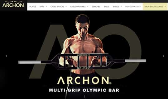
Specializing in gym equipment for both home and commercial fitness, the company wanted to present their diverse products in a more engaging way.
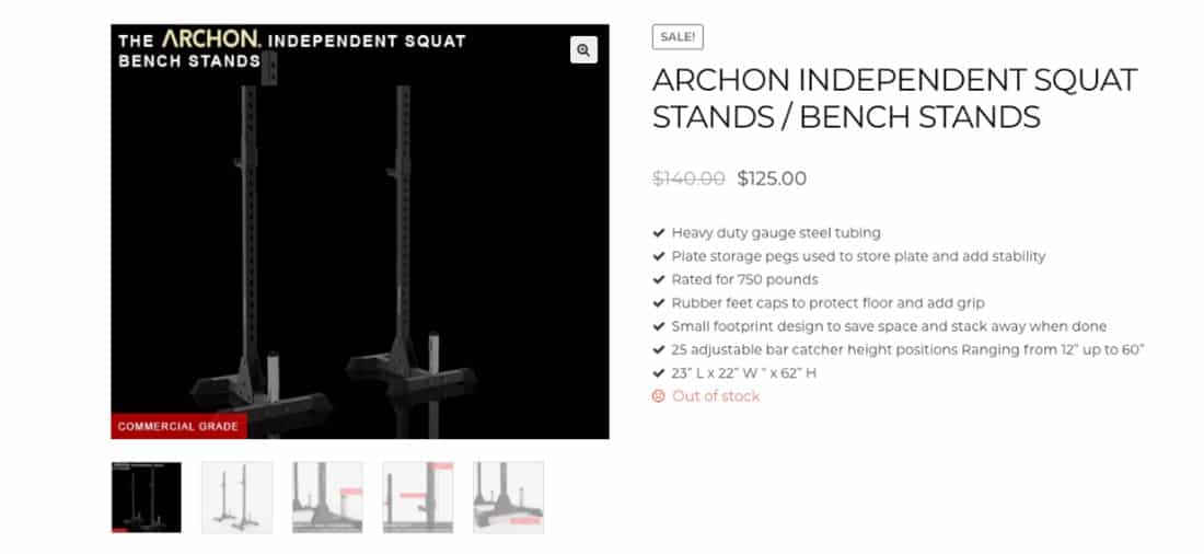
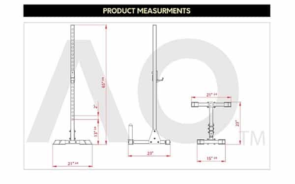
Due to the size of the gym equipment and flat photos on the website, it was difficult for consumers to envision Archon’s products, from the page to their home or gym.
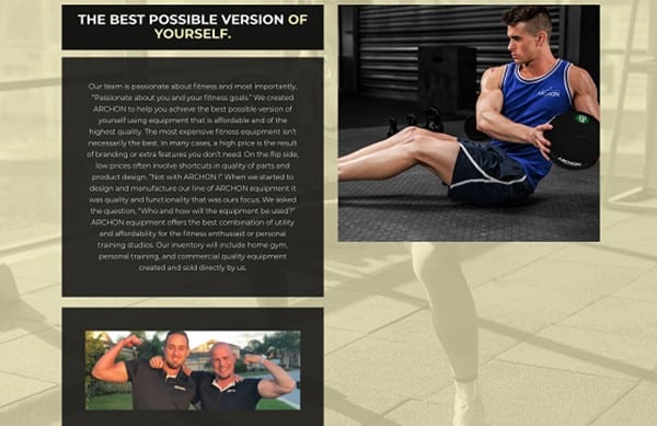
Some of Archon’s pages, including the About Us page, were also text-heavy and difficult to read.
Our Solutions And Upgrades: The "After"
We retained Archon's bold brand identity by translating their existing colors into the new website.
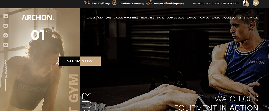
We placed the company’s unique value proposition in the main menu —Fast Delivery, Product Warranty and Personalized Support — highlighted by custom iconography to attract attention and bring immediate value to the visitor.
We also integrated a dynamic and actionable “Shop Now” CTA in a central page position to facilitate conversion from the moment the user lands on the page.
We added videos to the homepage with bold messing, “Watch our equipment in action,” to help visitors gain a better understanding of the products.
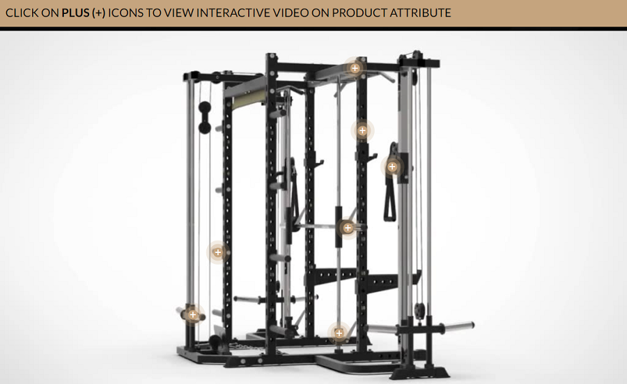
We upgraded the product pages by adding functionality that allows visitors to rotate product images, so they can see the product from every angle.
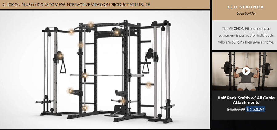
The added videos describe features, safety measures, exercises and more.
For the About Us page, we created more concise paragraphs to tell the brand’s story, along with custom iconography.
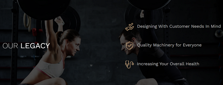
The redesign left the website breathable, uncluttered and easy to skim. The added videos and rotate functionality on product pages provide the visitor with valuable information about the equipment, making it much easier to visualize.
The overall result is a website that exudes energy and inspiration, similar to the way Archon’s fitness products add to physical and mental wellbeing.
2. Miami Country Day School
Website: https://www.miamicountryday.org/
The Client: Miami Country Day School is one of the top private schools for grades Pre-K to 12 in Miami, FL. Its mission is to provide a balanced mix of classical education, problem-based learning and an innovative approach.
Our Challenges: The "Before"
Miami Country Day School approached us with a request to transform their website to attract new parents and students who wanted to become a part of their community.
Although it showcased memorable moments of the school’s history, the old website was a bit static.
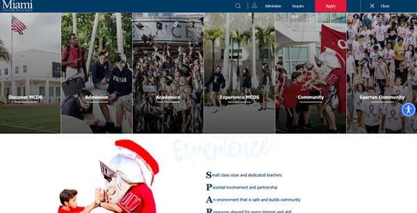
Information and photos were presented in the form of mosaics, an approach that was outdated and lacked an engaging touch.
Our Solutions And Upgrades: The "After"
With our website redesign services, we kept the brand identity and colors and focused on conveying value, sparking interest and showcasing the community aspect of MCDS.
We added a video to the school’s homepage to show the unique scope of the school’s facilities, including the open sports and recreation areas.
The slogan on the homepage — "Every Student. Every Day. Everywhere." — shows the school’s unique value proposition. Short and to the point, the messaging focuses on the unique qualities of every student and the school’s approach to help them reveal their potential.
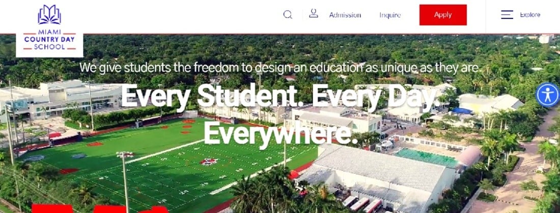
We included diverse and actionable CTAs like "Take Action," "Dive," "Explore" and "Join" to raise interest and encourage the visitor to continue their journey from page to page.
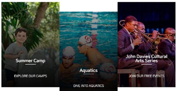
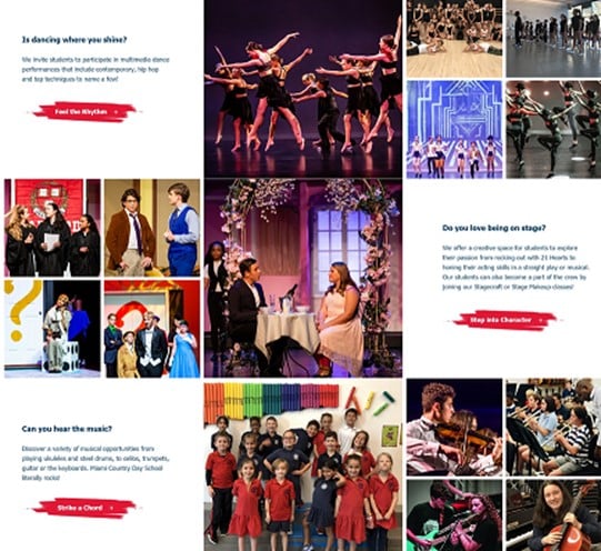
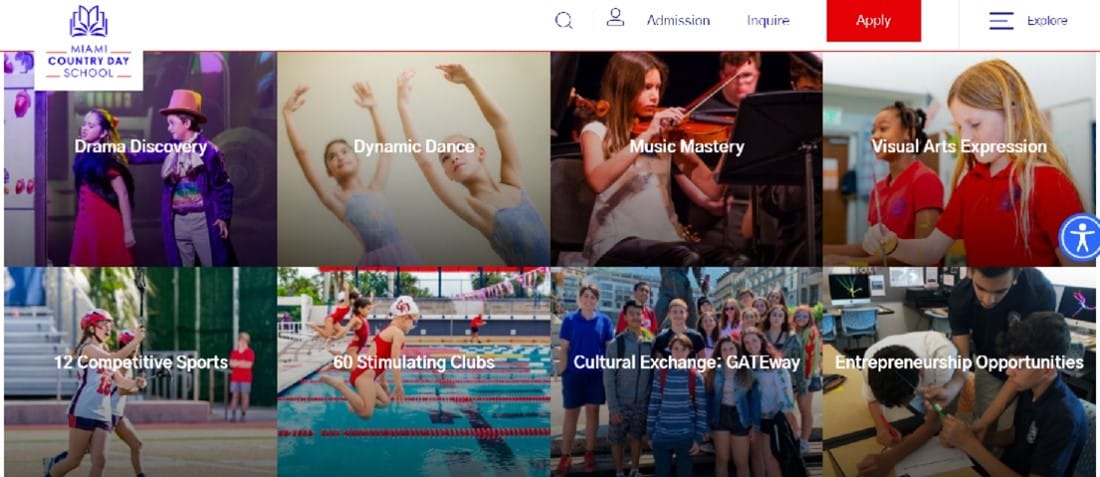
To present the wide range of classes offered, we created modules for each, including vivid images and detailed descriptions for parents and students alike.
Towards the bottom of the homepage, we added a testimonial section that features feedback from parents, students and teachers to help provide a glimpse into life at MCDS.

We incorporated a 360 Virtual Tour, a drone video that showcases the campus and a colorful collection of photos showcasing the vibrant daily life at Miami Country Day School.
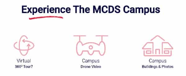
Our professional redesign of Miami Country Day School's website brought a fresh and innovative look and feel with strong brand messaging across all pages.
The dynamic media elements pull visitors in and offer a glimpse into the campus, programs and community that MCDS has to offer.
3. DS BLS
Website: https://www.dsbls.com/
The Client: DS BLS is an office technology and IT solutions company providing managed IT services, VoIP systems, copiers and printers to companies in New York and New Jersey.
Our Challenges: The "Before"
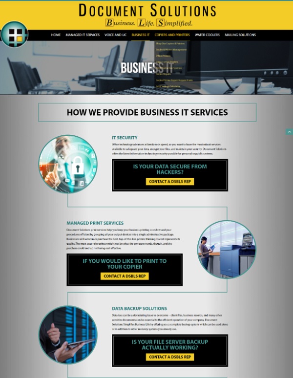
DS BLS approached us with a request to revamp their website’s outdated look to incorporate the latest trends in modern web design.
Their website at the time was simple and looked like a common template design. The grey background created a gloomy impression and didn’t encourage the visitor to explore the site further.
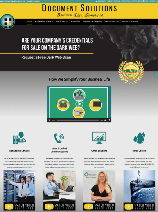
The fonts and images were not unique, and many elements were lost among the dark colors and inconsistent typography.
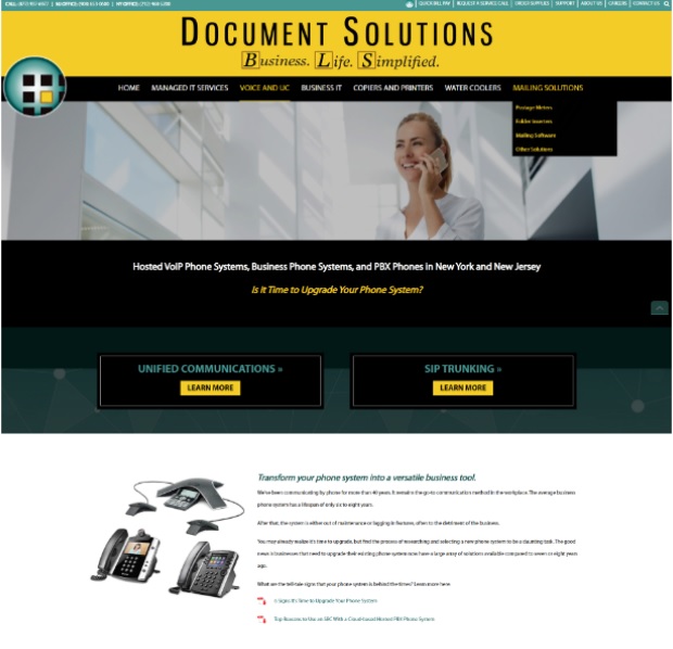
Product pictures were small and blurry, and the same “Learn More” CTA was used repeatedly across the site.
The generic images and inconsistent branding elements left the company lost in a sea of competitors.
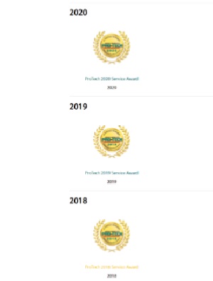
The site did include social proof in the form of company awards, but it was listed in an undistinguishable sequence of repeated elements.
There were no award ceremony photos, testimonials, reviews or other engaging aspects.
Our Solutions And Upgrades: The "After"
With our custom website redesign services, we gave the site a fresh look and implemented consistent branding elements to strengthen brand recognition and increase engagement.
We kept the basic color palette but transferred it to a clean and elegant white-background layout that exudes professionalism.

We changed the yellow that was part of the original color palette to more vibrant orange and red colors to grab attention through greater color contrast.

We designed an entirely new format for product presentation, focusing on the advantages in comparison to similar products and listing details about important features.
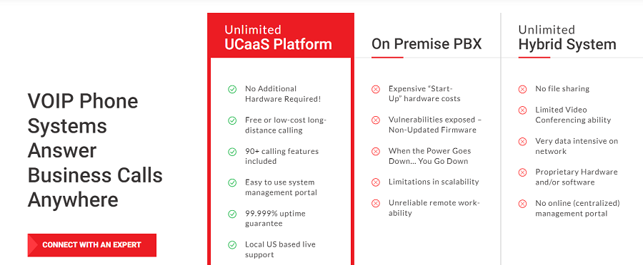
We strengthened the social proof by introducing a new section on company comparison metrics, to show the quality and value of DS BLS products and services, and build loyalty and trust.
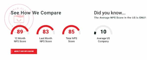
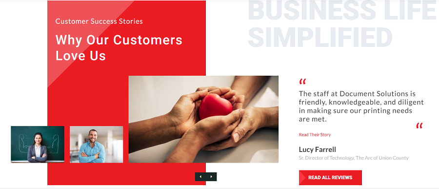
We also featured reviews by DS BLS partners and clients to enhance the company’s brand image and reputation.
The high-quality SEO blog articles we implemented target audiences with industry-specific keywords, help the site rank in search engines and attract traffic and potential leads.
They focus on company and industry insights, provide business recommendations and serve to educate, motivate and inspire.

Overall, we created a more attractive and engaging website design with ample white space, new functionalities, consistent branding elements and a dynamic product presentation.
The redesign presents DS BLS as a knowledgeable and reliable business partner focused on providing innovative office solutions.
4. WinWinit
Website: https://www.winwinit.eu/
The Client: WinWinit is an Italian company that offers software services and solutions.
Our Challenges: The "Before"
With bland colors, inconsistent branding elements and a lack of engaging visuals, WinWinit’s website looked like a common template.
It lacked value for the visitor, was unable to connect with the brand’s target audience and left visitors confused about the purpose of the brand.
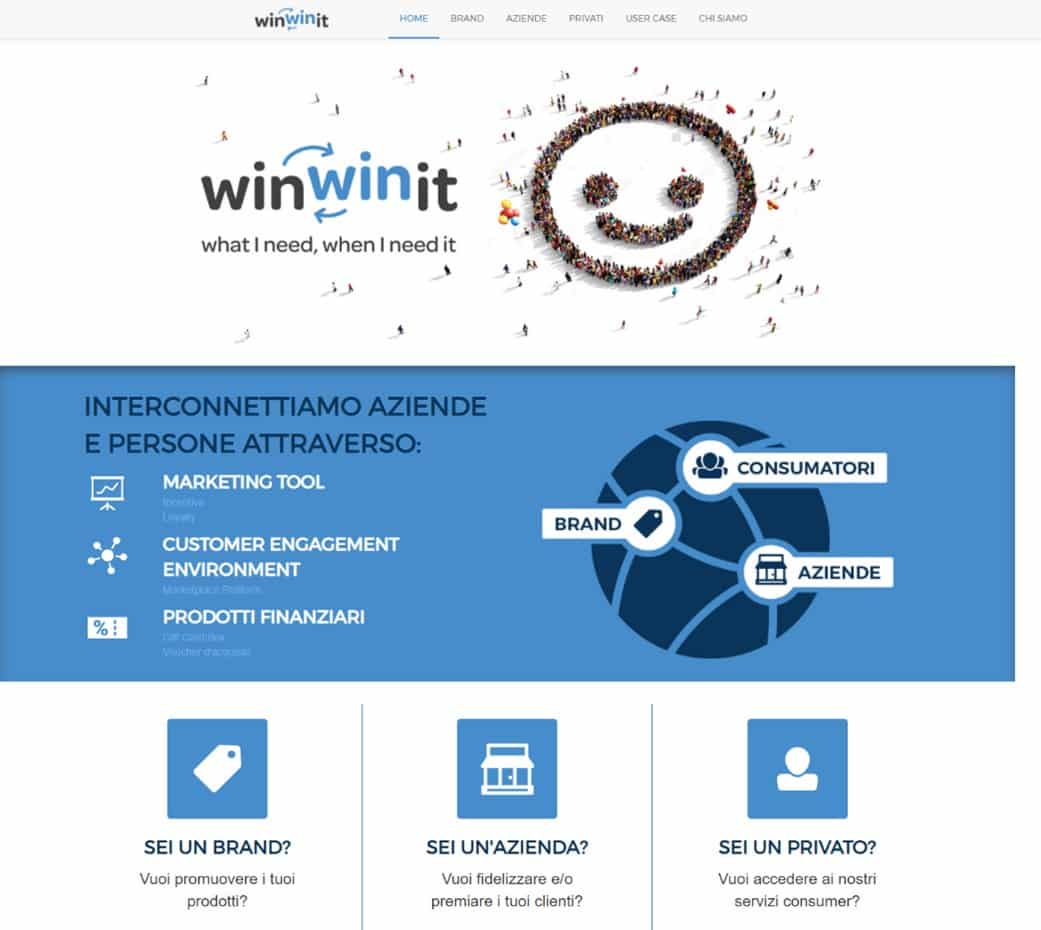
The layout was overwhelming to visitors because it displayed a large amount of information in a compressed design, which made the copy intimidating and difficult to digest.
Our Solutions And Upgrades: The "After"
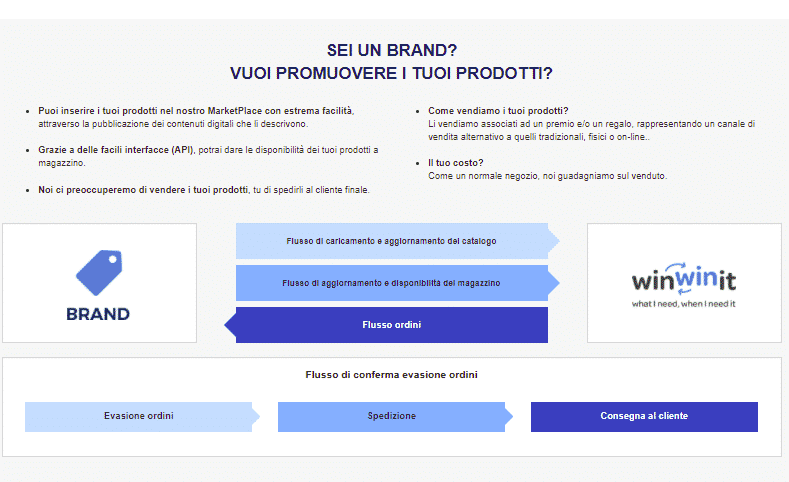
We embarked on a complete website redesign to feature WinWinit as a company at the top of their industry, using consistent branding elements and clear messaging.
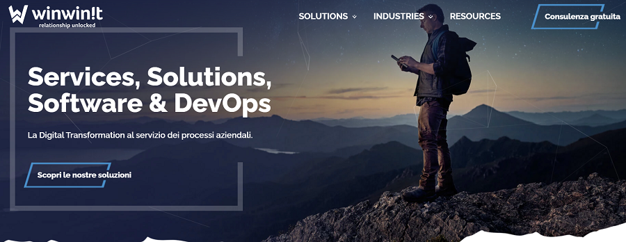
Our strong visuals and well-structured paragraphs makes the website more engaging and the content easy to skim.

We used custom iconography as a branding element to convey the company’s solutions, industries and resources.

We also included information on WinWinit’s partners to build social proof and enhance their brand reputation.

Overall, the result is an attractive and functional website with modern, on-brand elements that speak to the company’s target audience. It is simple, engaging and results-driven.
An updated color palette, engaging visuals, user-friendly navigation and simple typography combine to elevate the brand’s image, along with an enhanced browsing experience for effective storytelling.
Schedule A Consultation With Our Website Redesign Experts
At Digital Silk, we're a full-service web design company. Some of our most sought-after website redesign services include:
- Website Redesign Strategy
- UX & UI Design
- Website Development
- Rebranding Strategy & Visual Identity Design
We offer a free consultation & custom proposals for custom website design projects. Simply fill out the Request a Quote form, tell us about your goals and our experts will provide you with actionable insights and cost estimates.
Or, call us at (800) 206-9413 to start the conversation.


