Before Planning A Bank Web Design, Consider These Insights
Today, users want to access their bank information and complete their daily financial operations quickly and easily, anytime, anywhere.
In other words: they want a bank web portal that works seamlessly across devices.
Here are some important consumer insights to consider when planning a web design for a bank or financial institution:
Before Planning A Bank Web Design, Consider These Insights
Today, users want to access their bank information and complete their daily financial operations quickly and easily, anytime, anywhere. In other words: they want a bank web portal that works seamlessly across devices.
Here are some important consumer insights to consider when planning a web design for a bank or financial institution:
- 94% of mobile banking customers also use online banking on other devices once a month or more
- 76% of customers have used a bank’s mobile app to perform everyday banking tasks
- 70% of potential customers consider online and mobile banking services when selecting a bank
- 82% of account holders define their bank’s digital platforms as a factor for not switching to other banks
- Only 20% of banking customers prefer visiting a financial institution’s physical branch
- As of February 2020, physical banking branches had decreased by more than 1,500 over the course of a year
- 66% of customers are happy with their bank services
- Predictions are that the total number of online and mobile banking users will exceed 3.6 billion by 2024
- Estimations show that the use of chatbots will save the banking industry $7.3 billion in annual customer service costs by 2023
- 63% of US citizens prefer to try new digital apps for banking, while 82% are worried to visit local banking branches.
We have seen how some banks have tailored their users’ online banking experiences to cater to the growing consumer demands and expectations. Here are some overall website insights to illustrate just how important design is in engaging and retaining bank website visitors.
- Prior to making a purchase decision, consumers check 11 pieces of content on average, which means your bank website should stand out and differ from your competitors.
- The first impressions from a website are 94% design-related.
- 63% of users are ready to communicate with online chatbots when in need of information or support.
- 75% of users believe that credibility is directly related to the website’s aesthetic impact.
- Users abandon a website 5 times more often if it is not optimized for mobile devices.
To sum it up, a successful website design for banks should feature a blend of technology, psychological insights, appealing visuals and the ability to answer consumers’ expectations and needs.
Get Weekly Web Design Insights & Inspiration
Our Bank Web Design Best Practices, Header-to-Footer
The best practices you implement into your website design largely depend on the industry in you’re in. Here, we’ll provide some recommendations from our top experts, based on our detailed research of bank websites and the best web design practices they should follow:
- Use social proof to build trust from the get-go, since this is a major factor for banks. Include testimonials, media mentions, awards and reviews.
- Make signups quick and simple. Consider placing the signup form within the hero section itself. Minimize the number of fields to incentivize the user to start the process.
- Allow your users to contact and otherwise engage with you easily. This is another important element in building credibility. Add chatbots to sift through the inquiries and make it easy for your users to live chat with the right person who can give them the information they need to build trust.
- Be transparent about your rates and make your pricing sheets easy to find. This is very important, particularly for users in the consideration stage who are curious about your offerings. Include fees associated with opening up a checking account, applying for a loan, etc.
- Focus on your messaging. Cut the fluff. Highlight benefits. Show the user how you can help solve their plan points. Include clear and persuasive CTAs.
- Optimize your content for SEO to increase traffic and ranking.
- Provide value. Cater to your consumers’ needs, educate and inspire.
Must-Have Functionalities For Bank Websites
Based on our research and professional knowledge, we’ve distinguished several mandatory functionalities that will make your bank website design successful:
- A simplified and engaging sign-up experience: If your sign-up process is too complicated or it takes too long, users are more likely to back out.
- A simple, visually appealing signed-in experience: The whole experience behind the sign-up/log-in should be just as engaging and brand consistent as the front-end. This increases user stickiness (loyalty) and could contribute to advocacy.
- Live chat: People feel more comfortable when they can get the information they need, when they need it. This is important for all stages of the funnel.
- Mobile-friendly design: Whether mobile-first or responsive, your website needs to scale seamlessly across devices to cater to the increasingly mobile consumer base.
Here’s a bonus tip: Have you ever considered live currency monitoring for banks that cater to countries with high migration rates or similar?
According to United Nations report, over 250 million workers send remittances with is a large market that could benefit from a quick currency overview.
Including such information would be useful, add value to your services and distinguish your banking website from other financial institutions.
Must-Have Marketing Features For Bank Websites
Consider the integration of the following features to boost your website design performance in the banking industry:
- Email subscriptions: Allow your users and prospects to sign up for weekly or monthly newsletters with exclusive offers and other news. Newsletters are a great method to increase user engagement and even conversions.
- Social media links and sharing options: Social media is integrated into Millennial and Gen Z users’ day-to-day. Providing them with a quick access to your bank’s social media channels allows you to grow following and engagement across owned channels beyond website and email.
- App Store / Google Play links: Mobile banking is becoming an increasingly important element in banks’ digital user experience. Add easy-to-find links to your mobile applications to increase downloads.
Bank Website Design Examples To Get Inspired By [+ Our Strategists’ Notes On Each]
What we noticed in our research is that many, if not most, bank websites look outdated.
The existing content and visuals may have served their purposes back in the day, but they certainly do not follow today’s modern website design best practices.
Interestingly, this is particularly true for the longstanding regional and global leaders that have been struggling to cater to the growing digital native userbase.
It’s no wonder we are seeing these new online banking brands growing in popularity.
Banks that invest in their online presence today will reap the benefits in the long run.
Let’s analyze some of the best bank website design examples.
1. Nbkc bank
Website: nbkc.com
Category: Digital Bank
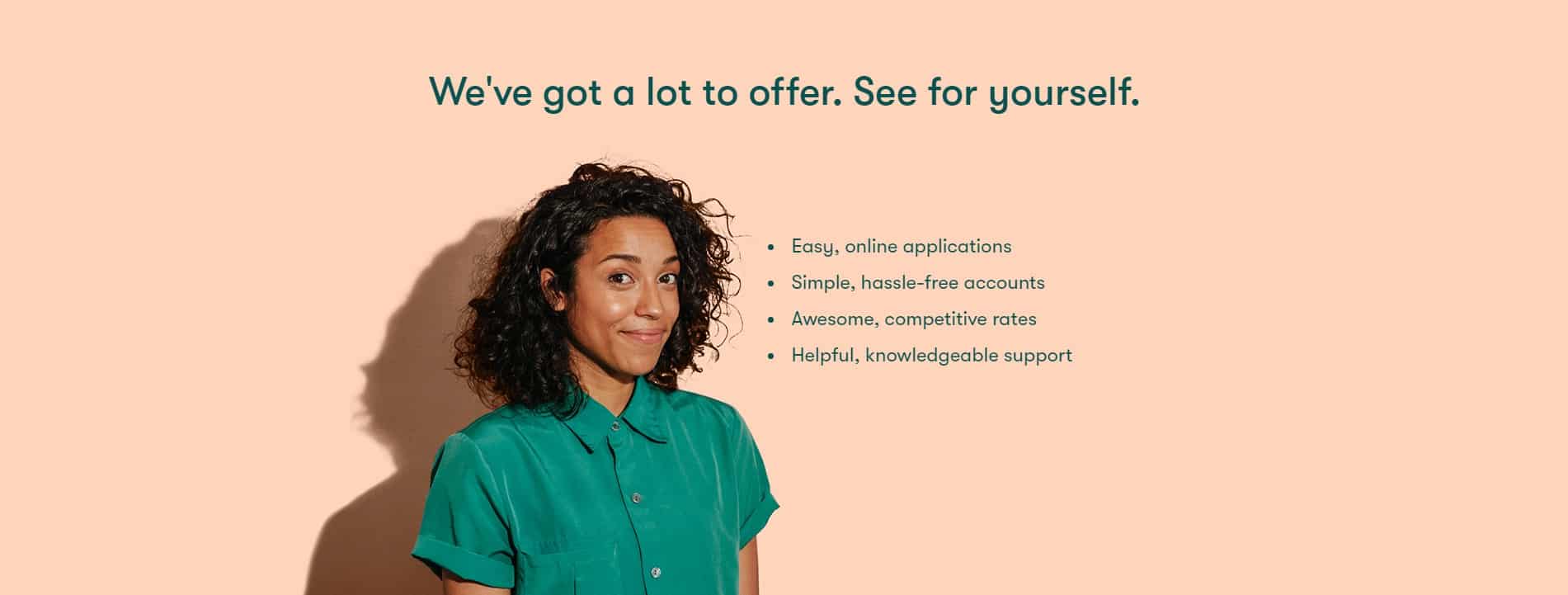
Right off the bat, nbkc’s website offers effective and consistent branding that immediately suggests who the bank’s target audiences are.
The simple form embedded directly into the hero section makes registration and log-in clear and easy to find, and the two-tier sticky menu provides a customer-friendly navigation journey.
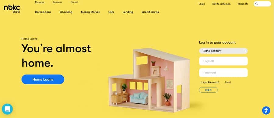
The top tier allows “Personal,” “Business” and “Fintech” users to tailor their journey and experience on this website.
Tailored user journeys like these tend to work well for bank websites because they allow them to highlight the unique value propositions for each audience segment.
The navigation is sticky and reveals the main call to action (CTA), “Get started,” as you scroll down, allowing you to quickly hop to the main conversion point at any stage of your user journey.

The website embraces the minimalist design both in terms of content and visuals. This makes it easier to skim, which caters to the vast majority of modern-day, tech-savvy users.
nbkc bank presents a concise, well-structured website, with clearly defined modules that help customers quickly find the information they need. This is good for users and search engines alike.
Messaging: The messaging is engaging and consistent on all pages. The headings are clear and they speak to the consumers’ needs.
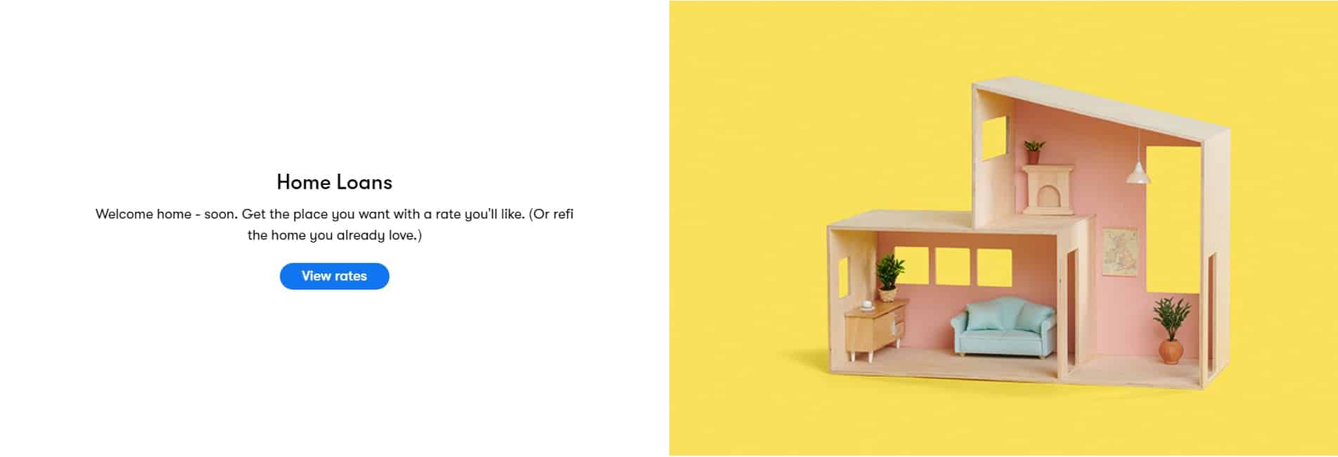
The website features diversified and strategically placed CTAs. Most of them including “View Rates,” “Get Started,” and “Let’s Chat” are simple, actionable and support the clear conversion funnel and a well-defined user journey.
The “Talk to a Human” CTA in the menu brings a lively touch to the user experience on several different levels:
- It helps personalize their on-site experience
- It contributes to the consideration stage of the user’s journey, granting them access to the information they need to convert

Typography: Most fonts are big, bold, legible and ADA compliant. These support readability and easy information processing.
Visuals: The brand consistency, vivid color story, photography and the subtle use of gifs make it very clear that nbkc knows their audience — mainly millennials and Gen Zs — and the ways to engage them.
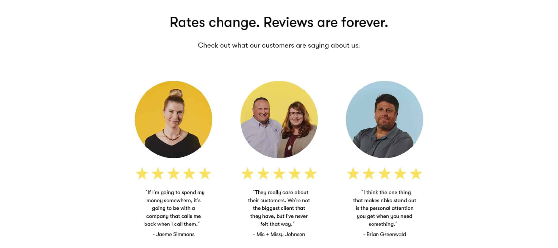
Social proof: Note how highlighted testimonials are in this bank website design. nbkc understands the value of social proof and how it helps them a) build users’ interest in their offering and b) build trust.
What could they do better?
While their typography is beautiful and adheres to ADA-compliance best practices for the most part, the secondary menu options — Personal, Business, Fintech — are too thin and discrete. This could hurt their visibility and click-through rates.

Speaking of the navigation, the drop-down menu is quite plain. A bit more attention to its design would make it a more engaging banking website.

Our only criticism in terms of CTAs is the use of “Learn More.” This is one of the most passive CTAs you can use; it is vague and makes users feel like they’re in a classroom again — not fun.
Overall, nbkc’s website is a good example that follows most bank website design best practices. They understand their user and they’ve built an easy-to-use on-site experience for them.
Where they could have done a much better job is SEO. Though invisible, SEO is just as important as user experience as it helps prospects discover you in search.
2. Societe Generale
Website: societegenerale.com
Category: Corporate Website
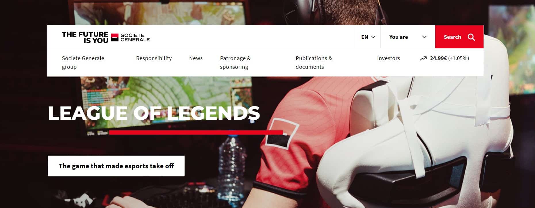
This corporate banking website is simple and functional, with two-tier sticky navigation and a prominent CTA.
We typically like to see a CTA that leads to the main conversion point featured in the navigation; however, given the diversity of Societe Generale’s audiences – and, consequently, the conversion points – we understand the logic behind the “Search” CTA.
It’s all about getting your target user(s) to their main destinations as quickly as possible.

The “You Are” menu option helps the user tailor their journey from the get-go, which is a smart choice considering the diversity of their audiences.
Messaging: The message is clear and consistent throughout the pages.
When it comes to CTAs, Societe Generale customizes each one based on the landing page or media it links to. CTAs such as “Watch the video” and Open the infographic” are simple and, best of all, specific.
Users are more likely to click on a CTA if they know what’s behind it.
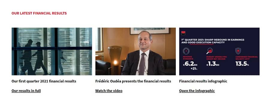
Typography: The font is large, neat and readable throughout the site.
Visuals: The website does a great job using engaging, human-centric photography that speaks to the diversity of the bank’s consumer base and target audiences including investors and prospective employees.
Social proof: On the homepage, Societe Generale provides a quick organizational overview in numbers as a form of social proof that testifies to the organization’s reach and impact.
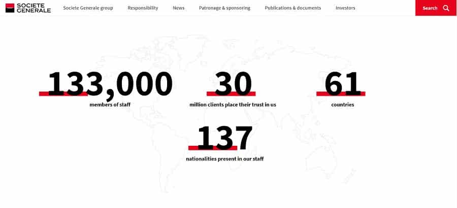
What could they do better?
Clickability — as we’ll call it — is an issue site-wide.
To simplify the user journey, you want to reduce the number of clicks to their destinations.
This is why you want to allow the user to reveal the drop-down menu as they hover over the main navigation without having to click on it.
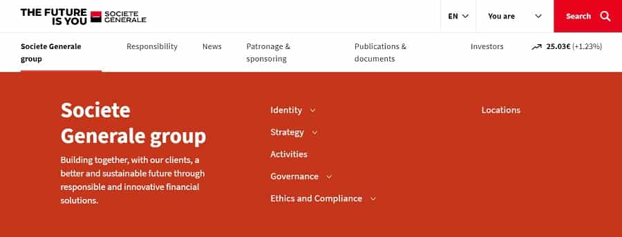
We’d also recommend focusing more on the CTA design. The CTAs on this website are a little plain and underwhelming, which could reflect on their click-through rates.

To improve their press release section, we would make both the image and the title clickable in addition to the CTA.
It’s a slight change that may not show a significant increase in click-throughs but it would add to the overall user experience.
3. Chime
Website: chime.com
Category: Digital Bank
Chime’s web design is clean, airy and on-brand.
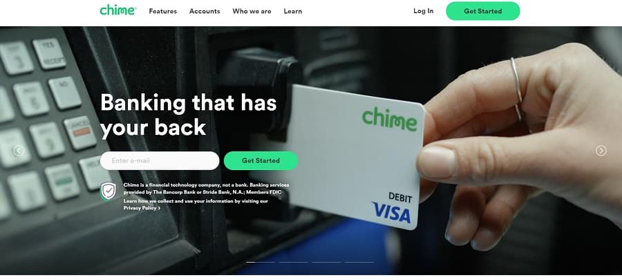
The navigation is sticky which is a plus; it allows the user to continue their journey throughout the website quickly and easily.
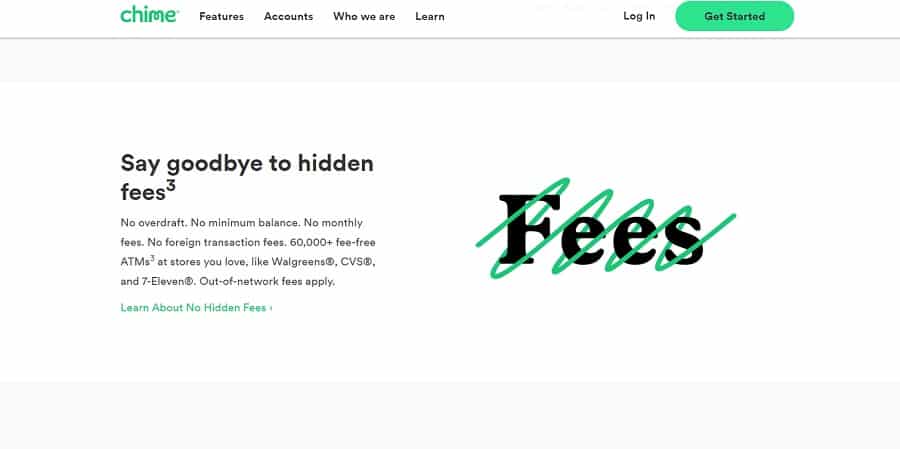
Messaging: The main header — i.e. H1 — is somewhat underwhelming and fluffy. The real value is packed in the less visible paragraph text underneath.
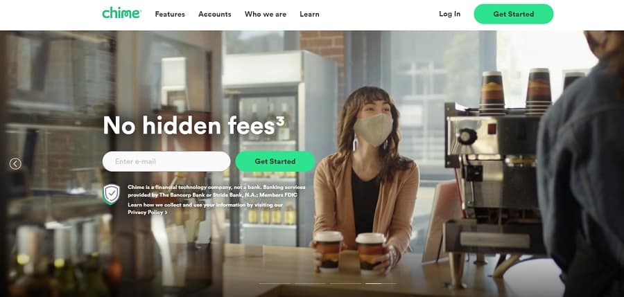
Unlike the H1, most subheaders — or H2’s — are simple, actionable and strong throughout the homepage. Look at these beauties: “Get paid early,” “Say goodbye to hidden fees,” “Make your money grow fast.”
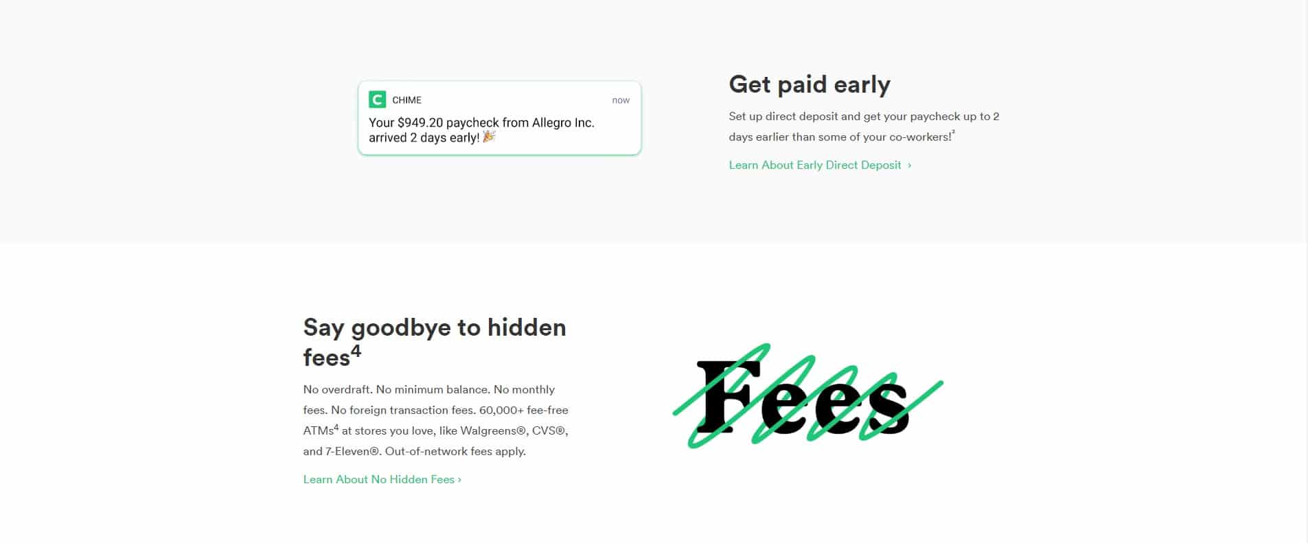
Typography: The fonts are large and in good contrast with the background which makes Chime’s website easy to skim.
Visuals: The bank’s entire design is light and sleek, which makes the content easy to consume.
They also present a consistent brand image that is modern and appealing to their target audience — presumably, millennials.
Social proof: Similarly to nbkc, they insert social proof right into the hero area, but instead of testimonials, they highlight media mentions to build interest and trust.
What could they do better?
Two tweaks could improve their navigation click-through rates:
- a second tier to reveal more of the sitemap
- more design attention to the drop-down menu
When it comes to messaging, they lack consistency; every once in a while, the messaging slips into the fluff territory.
Good examples are the homepage and Features page H1’s: “Banking that has your back,” and “Banking made awesome” respectively. These are vague and don’t communicate the bank’s main value propositions.
You want your content to have a unique voice, sure, but that doesn’t mean fluff.
To improve skimmability for top-of-the-funnel users, you want to stick to one paragraph per section max and each paragraph should be no longer than three lines.
Back to the copy, we’d rethink the CTA’s. As mentioned earlier, you want to stay away from passive CTAs such as “Learn more.”
Overall, this website does really well when it comes to branding, information architecture and, to a large extent, the user interface.
4. Raiffeisen Bank Serbia
Website: www.raiffeisenbank.rs/
Category: Corporate Website
Austrian-native Raiffeisen bank is one of the few traditional banks that we’ve come across that invest in their digital presence.
Their Serbian branch stood out to us in terms of design.
Though we cannot comment much on the messaging, at least not beyond the inconsistent English version, there are definitely lessons to be learned from their approach to design.
You’ll notice similarities between this menu and the one we’ve seen on Societe Generale’s corporate website. The design is bold and modern, but more importantly, it is functional. Every menu item is clearly visible, particularly the main CTA.
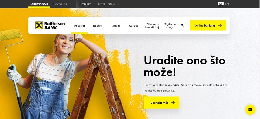
Observe the secondary menu which is the upper-tier section; it doesn’t compete with the main menu, but the options are still very visible and easy to navigate, unlike nbkc’s secondary menu.

Messaging: We’ll just say N/A due to language barriers. While some copy is available in English, the whole website doesn’t translate well.
Typography: The typography is excellent both in terms of font selection and size. It is on-brand, visible and ADA-compliant, ensuring customer-friendly messaging for all users while also meeting regulatory requirements and legal standards.
Also, note that none of their homepage sections has more than two or three lines of paragraph text. They optimized their content for skimmers.
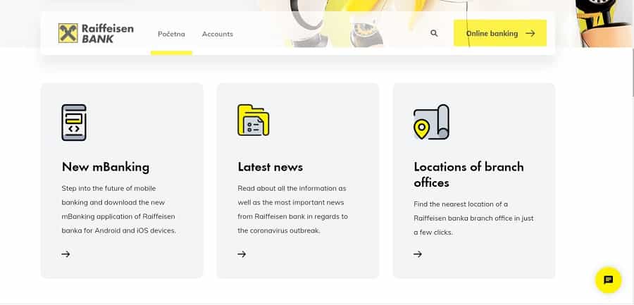
Visuals: From the fun and vibrant photo models to on-brand color palettes and celebrity endorsements (check out the great Novak Djokovic), their visuals are engaging and clearly target the Millennial demographic.
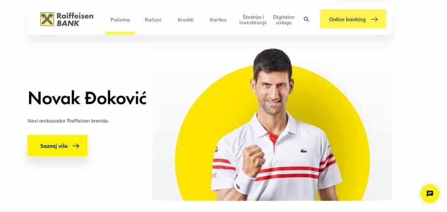
Bonus: This site placed a real-time currency overview on their homepage which is a very useful feature, especially in the regions with high migration rates.

Our recommendations:
Without full access to their messaging, there is very little to critique on this website.
One big recommendation would be SEO. Opening the SEO Minion, we see their title and meta tags are defined but there is no header structure.
5. Varo Money
Website: varomoney.com
Category: Digital Banking
What we like the most about Varo is its brand identity.
As soon as you land on this website, you see messages of inclusivity — “A bank for all of us” — both in writing and in the imagery.
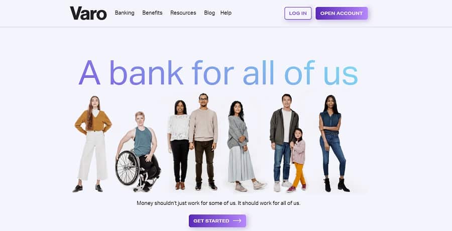
Their color palette and visual elements are consistent throughout the site.
Messaging: Their messaging is benefits-driven which is always a good idea to attract interest from top-of-the-funnel users. Check out these beauties:
- “Varo gives you more ways to take control of your money.”
- “Stretch your paycheck”
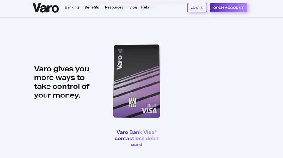
Typography: While the header typography stands out, the paragraph typography, though on-point in terms of size, is a little underwhelming in terms of font selection.
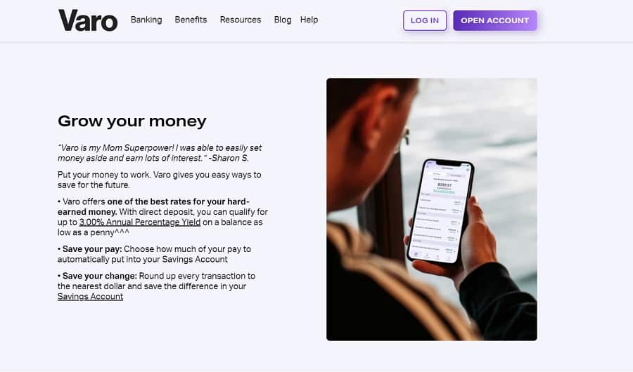
Visuals: The hero image is powerful and relatable. We wish they would have maintained this trend throughout the page.
The rest of the images are on the generic side which doesn’t live up to the brand’s powerful positioning.
Our recommendations:
This site is a great example of how important branding is, but also that branding alone is not enough to create an effective online presence.
While the positioning, visual identity (for the most part) and messaging are well-executed, this website doesn’t follow some important best practices.
So what would we change?
We’d clearly define the conversion funnel and outline the user journey with specific and diversified CTAs. We’d also fix the on-page SEO. For example, the best practice is to have only one keyword-optimized H1 on each page.
Next, we’d highlight the social proof. The testimonials featured on this website are barely visible and nestled at the bottom of the page. Testimonials, reviews and endorsements are how users build trust.
Finally, we’d create a two-tiered, better-organized menu to increase the visibility of the inner pages and, consequently, the click-through rates.
Schedule A Consultation With Our Bank Website Design Company
At Digital Silk we offer a free consultation & custom proposals for custom website design projects. Simply fill out the Request a Quote form, tell us about your goals and our experts will provide you with actionable insights and cost estimates.
Or, call us at (800) 206-9413 to start the conversation.


