Explore
What’s Considered A Modern Website Design Today?
Research has shown that 75% of users judge a brand’s credibility based on their web design.
Translation: If it’s not modern, consumers aren’t interested.
So what exactly is characterized as modern in today’s web design?
Here are some of the crucial elements of modern web design:
What’s Considered A Modern Website Design Today?
Research has shown that 75% of users judge a brand’s credibility based on their web design. Translation: If it’s not modern, consumers aren’t interested.
So what exactly is characterized as modern in today’s web design?
Here are some of the crucial elements of modern web design:
1. Fast Loading Speed
Nothing says “old” and “outdated” in the web design world as much as slow loading speed. In fact, 41% of users will stop viewing a website if it takes too long to load.
Page load speed is something you mustn’t compromise regardless of your industry. It’s equally important for a construction company website to load fast as it is for eCommerce, for example, because it leads to reduced bounce rates and increased average time spent on a web page.
2. Mobile-First Design
In mobile-first design, you first design the website for smartphones, then move to desktop and laptop versions. This ensures an excellent user experience across all devices.
While a responsive website also fits all devices, mobile-first design is better for several reasons. Responsive web design prioritizes bigger screens and typically has more functionalities and elements compared to mobile-first design.
Mobile-first design prioritizes the key aspects of a website and it’s based on how we use our fingers to navigate a website. Since our fingers are not as precise as a mouse cursor, mobile-first websites have fewer elements to enable easy reach and better user experience.
Designing for smaller screens first makes it easier to design for larger screens later on. Also, given that almost 85% of Americans use their phones to access the internet, it makes more sense to cater to this majority first and foremost.
If your audience uses mobile devices to engage with your brand, you should consider mobile-first design.
3. Shifting Away From Minimalism
Is minimalism over? Not quite.
With values that coincide with modern website design best practices, such as the utilization of negative space, we would argue that minimalism will never truly fall out of favor.
However, we have seen recent shifts in the way minimalism is used in modern websites, with changes to colors, whitespace and typography.
Interested in learning more about minimalism in 2023? Explore minimalism website examples in depth.
4. Oversized Fonts
Oversized typography and large text elements with an effective color scheme can help you highlight your key brand message.
Many of today’s modern websites don’t even feature images on their home page — just oversized text elements combined with other interactive elements such as animations.
5. Interactive Elements
Interactive elements can help grab and keep visitors’ attention and turn them from passive into active visitors.
Instead of just taking in the information, they can actually engage with your website through CTAs that change color when you hover over them, a globe that spins as you scroll past, forms, and really any element that they can interact with.
Subscribe For More Modern Web Design Insights
10 Modern Website Examples To Get Inspired By
We’ve discussed the key characteristics of modern web design. Now, let’s see what it actually looks like in practice.
We’ve compiled a list of 10 modern website examples spanning various industries for inspiration, and included our Digital Silk web designers’ notes on each.
1. Rollink
Business type: Consumer products
Website: rollink.com
Design by: Digital Silk
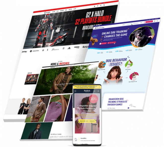
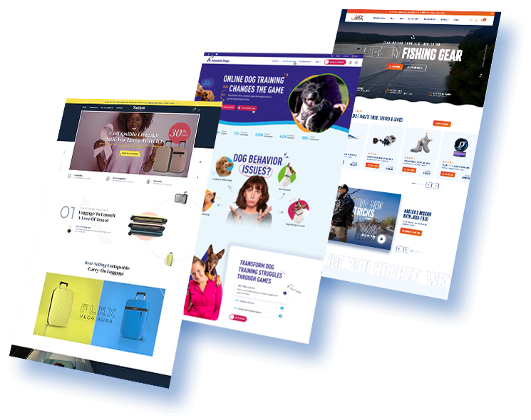
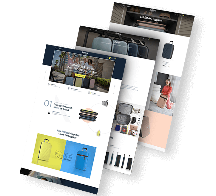
Rollink is revolutionizing the world of suitcases. Our own Digital Silk team designed a sleek, modern website to perfectly match their brand persona.
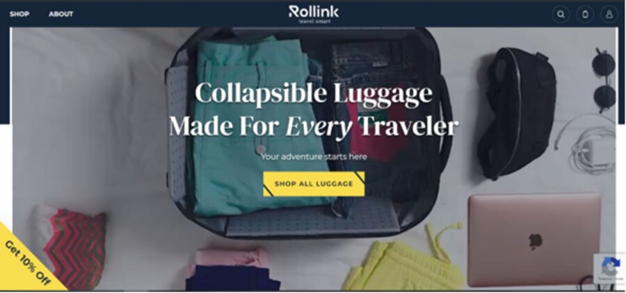
Rollink's unique value proposition greets the website visitor as soon as they land on the page: “Collapsible luggage made for every traveler." With direct, benefits-driven copy throughout, Rollink wastes no time with fluffy messaging.
The brand uses oversized fonts to highlight its key benefits, accompanied by somewhat retro and trendy visual elements. Rollink tells its story through bold, colorful images and minimal copy.
2. FieldEdge
Business type: Software service
Website: fieldedge.com
Design by: Digital Silk
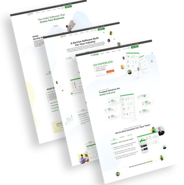
FieldEdge was another Digital Silk project, where our team applied modern web design best practices to create an engaging website.

Our web designers used interactive elements to create a unique and engaging user journey. When the user lands on the homepage, animations begin immediately as elements pop from left and right to assemble the hero section.
The CTAs become slightly darker as you hover over them, as an added effect to help them stand out.
From clean, organized copy to dynamic elements, FieldEdge uses modern web design best practices to create a site that engages and converts.
3. KnoppBio
Business type: Pharmaceuticals
Website: knoppbio.com
Design by: Digital Silk
Our creative web designers opted for a modern approach when creating Knopp Biosciences’ website.
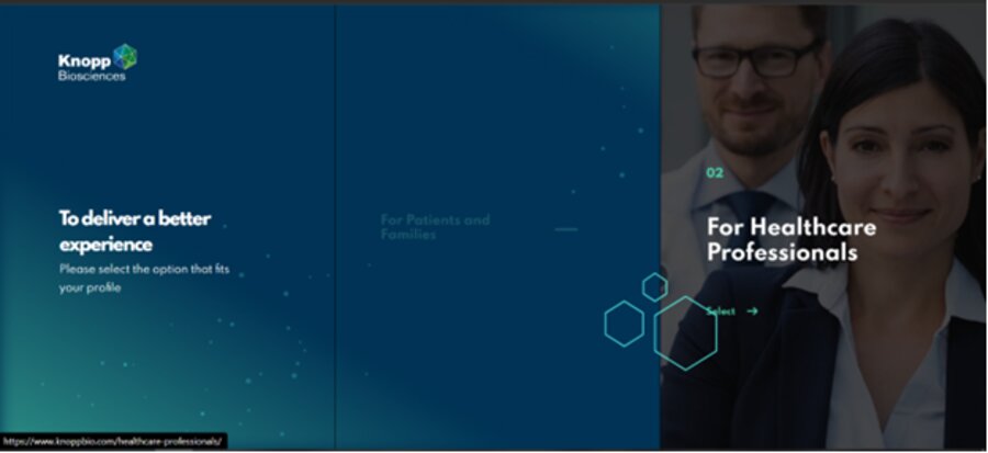
KnoppBio’s website is far from minimalist even though there is minimal copy on the homepage. With interactive, clickable headers and an animated background, Knopp creates an immersive user experience.
Knopps sticks to the golden rule of short, skimmable copy and manages to present its benefits in an easy-to-consume way. It uses animation and sticky navigation to create an engaging user journey.
All in all, Knopp ticks all the boxes regarding web design best practices.
4. Buddha Brands
Business type: Food & drinks retail
Website: https://buddhabrands.ca/
Design by: Digital Silk
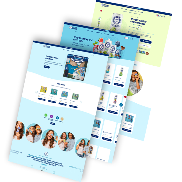
Our new website design for Buddha Brands follows a wider brand refresh and mixes trendy website design features with an updated brand style guide.
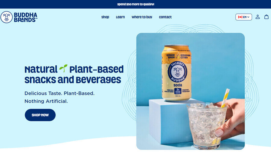
Buddha Brands’ revamped digital experience utilizes a number of current trends in website design, including the stylish pastel color scheme that runs throughout.
Meanwhile, dynamic patterns are placed behind and around the flat design and video features to give the site an exciting feel that doesn’t overwhelm the visitor.
Try not to explore Buddha Brands’ products at greater depth through its enticing messaging and visual elements—we dare you!
5. Plenty
Business type: Agriculture
Website: https://www.plenty.ag/
Design by: Digital Silk
Plenty is revolutionizing the world of agriculture with progressive indoor farming innovation, but the website design created by us at Digital Silk makes use of modern desires for 90’s nostalgia.

Plenty’s website contains bright yellow and red color schemes matched with fun, bold typography to catch onto the modern trend of Y2K culture.
Meanwhile, the site’s captivating hero section video gives the sensation of vertical tilting from traditional farmland to their upended alternative.
This mixture of visuals and messaging displays Plenty’s unique value proposition in a modern, yet playful website design.
6. McKinsey
Business type: Consulting firm
Website: mckinsey.com
McKinsey is a well-established consulting company with over 90 years in management consulting.
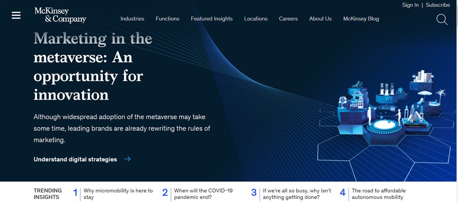
McKinsey uses oversized typography and large, impactful imagery to capture users’ attention. The brand uses interactive elements to engage users including typography that changes colors and images that rotate as you scroll down the page.
With fast loading speed, interactive elements and large, effective typography, McKinsey created a modern website that engages visitors.
7. Samsung
Business type: Consumer products
Website: samsung.com
As a leader in the electronics business, Samsung adheres to the modern web design trends.
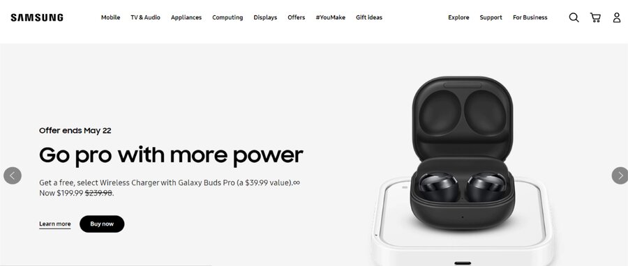
Don’t let this simple hero section fool you — Samsung is embracing the shift away from minimalism. In fact, the website is anything but minimalistic.
The brand features rotating headers highlighting different products and current deals so the user can find what they’re looking for without even scrolling down.
The typography is big and bold, in line with the oversized trend, and vibrant imagery covers the homepage.
Samsung uses rich visual elements to help users experience their products in a digital environment as a modern website should. The website’s page load speed is also quite good (loads in about one second).
8. Dropps
Business type: Consumer products
Website: dropps.com
Modern web design makes even cleaning products fun and engaging, as evident in Dropp’s example.
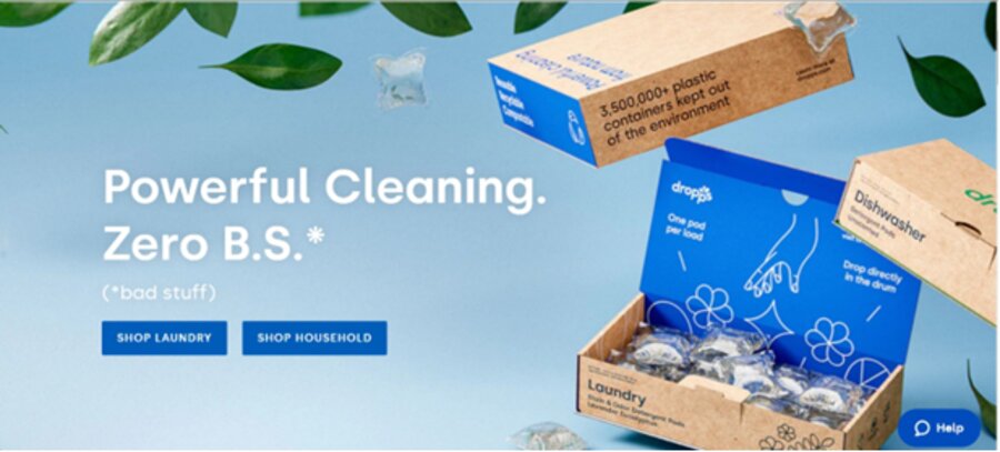
Dropp’s mobile website loads in less than a second, which is impressive in its own right and crucial for a modern website.
The color palette has a hint of both retro design and gradient elements. Gradient is a web design trend dominating in 2023 which embraces the blending of vibrant colors. Along with neatly-packed, concise copy and oversized typography, Dropps honors many of the modern web design elements.
9. Zendesk
Business type: Software service
Website: zendesk.com
Zendesk provides customer service software to businesses to help them improve the customer experience.
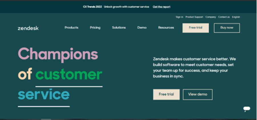
Zendesk applies modern web design practices, visible in its kinetic typography as well as interactive elements in the hero section. The text in the header changes to highlight the brand’s key benefits, such as “Champions of no-hassle returns” and so on.
CTAs change to white as you hover over, and the retro vibe makes a return with bold, colorful images further down the page.
Zendesk adheres to the modern best practices by implementing animation, and clean, bite-sized copy to create a website that engages.
10. Monday
Business type: Software service
Website: monday.com
Monday is a work-management tool with products designed for sales, marketing and project management.
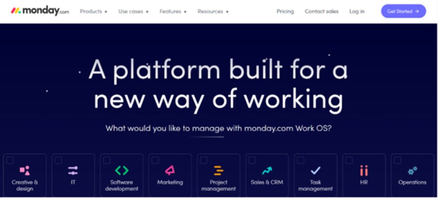
Monday takes page load speed seriously as it loads in less than a second on a mobile device. When it comes to modern web design trends, we can see an array of them here from rich colors and a shift from minimalism to oversized typography in the hero section.
Interactive elements are subtle seen in the CTAs that become slightly darker when you hover over them, while animation helps paint a picture for the visitor.
From rich visuals and animation to short and sweet copy, Monday makes our list of modern websites.
Ford vs. Tesla Web Design: Which Brand Does A Better Job With Modern Design?
Let’s move to a modern website comparison of two globally-recognized brands: Tesla and Ford.
Founded in 1903, Ford has over a century of history, rich in innovation.
Tesla on the other hand, founded in 2003, is still considered a newbie in the industry. Nevertheless, in just under 20 years they have managed to grow their brand, visibility and product line — a whopping 100 years less than Ford.
But is Ford’s longevity enough to connect with today’s digitally native consumers? After all, around 55% of global internet users are between 18 and 35 years old, and let’s face it — they’re the ones who are calling the shots when it comes to consumer trends.
While the idea here isn’t to pit the products of two iconic brands against each other, Ford and Tesla have web designs that are polar opposites and we can’t pass up the opportunity to talk about their hits and misses.
Here, Digital Silk CEO shares his thoughts on which car brand does a better job keeping up with modern web design trends to appeal to today’s audiences, in terms of UX, UI, messaging, SEO and creating an unmatched user journey.
It’s showtime!
Ford: A Heritage-First Brand
Let’s start with the homepage, below. Right off the bat, you see a simple image with messaging and a call to action to “View Offers.”
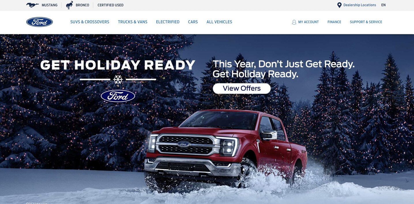
Our CEO’s main note here is the lack of responsiveness. The image doesn’t take over the entire screen on different devices and stops awkwardly on each side.
As noted above, responsiveness is one of the key factors in modern web design.
Moving down the page, you find a video.
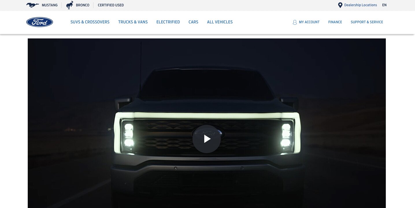
Where are the headers? Where are the CTAs? There’s nothing here that makes the user want to click on the video. They have no idea what they’ll get, so why bother?
Under the video, you have paragraph of text.

While the header is readable enough, the chunky paragraph is hardly inviting to the user, and we certainly wouldn’t refer to this font as bold — a trend in modern web design.
The CTA “Join the Electric Revolution” is vague to its core. What does that mean? And again, what incentive is there for the user to click, when they have no idea what they’re going to get?
As you move down the homepage, you find a collage of banners that seem random at best.
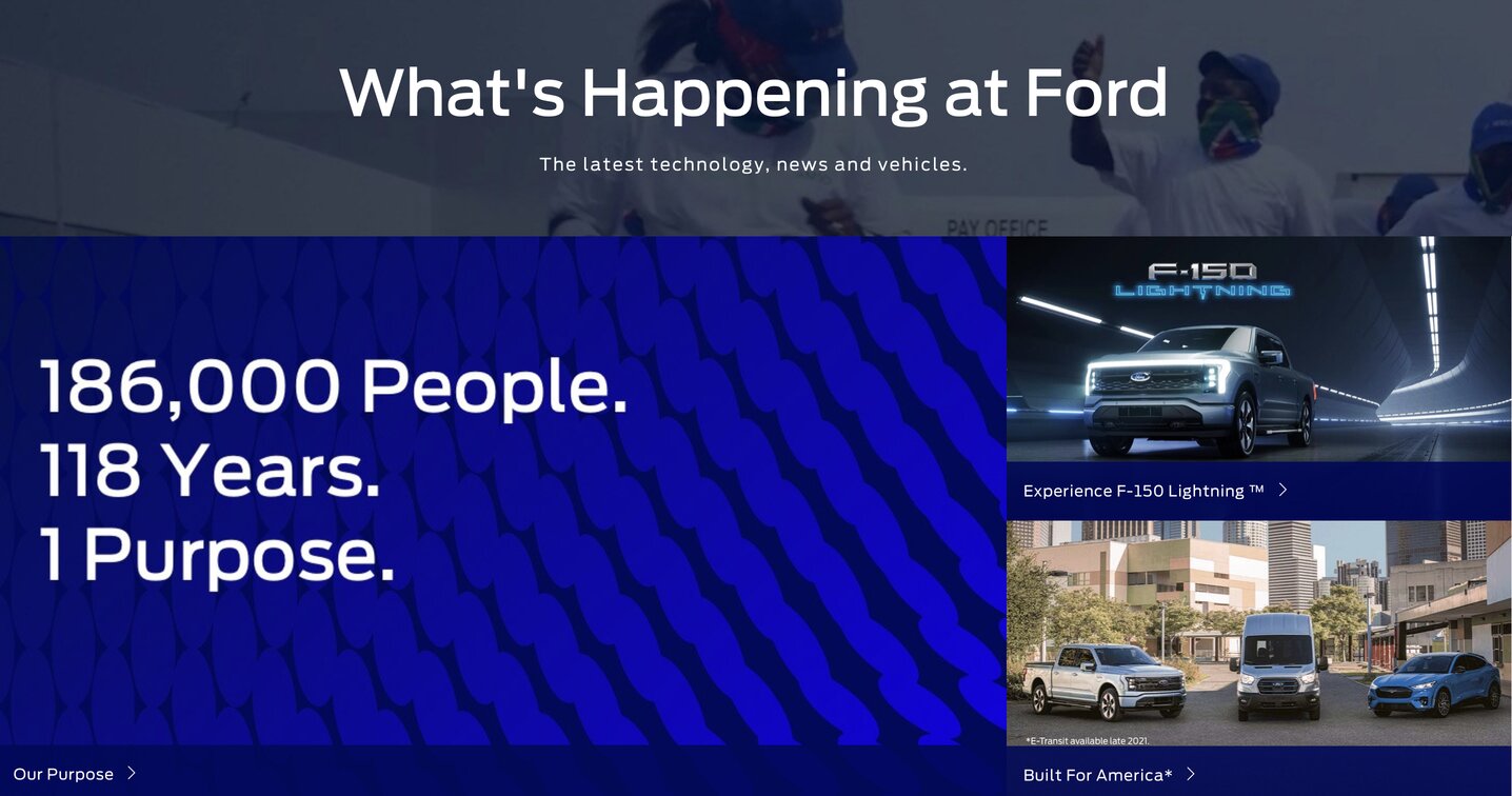
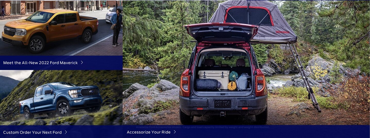
The main issue?
Where’s the conversion funnel? Where’s the storytelling?
From top to bottom, a homepage should take you on a journey. It should funnel your user to key conversion points and storytelling should flow naturally with each scroll.
Storytelling is key in modern web design, because it can help you craft a relatable and intimate user experience to connect with your audience — and that’s exactly what the bulk of today’s consumers, millennials and Gen Z’s are looking for in a brand.
While Ford does a better job with their easy-to-navigate dropdown menu, the product pages are again not fully responsive, and they contain chunky paragraphs that are almost certain to increase bounce rate.
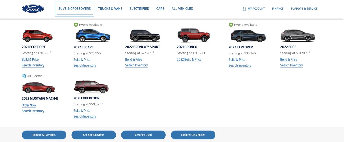
Our CEO’s verdict: Overall, Ford’s website isn’t up-to-date with the modern design trends that can make or break your brand in today’s environment. While the brand’s rich history is undebatable, the bulk of today’s consumers are looking for more from the brand’s they purchase from.
Ford’s homepage has no conversion funnel, isn’t optimized for SEO and ultimately, doesn’t offer users a one-of-a-kind user journey.
Tesla: A Digitally-Native Brand
When you land on Tesla’s homepage, the clean and dynamic yet minimalistic image spreads from one side of the screen to the next, showcasing a fully responsive design.
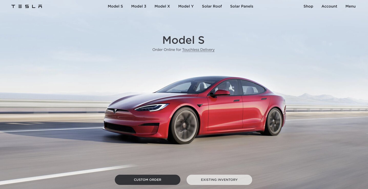
As you scroll, the images remain sharp, clean and to-the-point. The main CTAs, “Custom Order” and “Existing Inventory” follow you as you move down the page — an exemplary usage of modern web design trends.
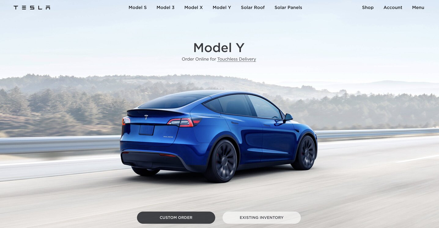
Clicking on a specific car model in the neatly-arranged, simple navigation menu leads you to yet another sleek and modern design that utilizes white space and minimalism.
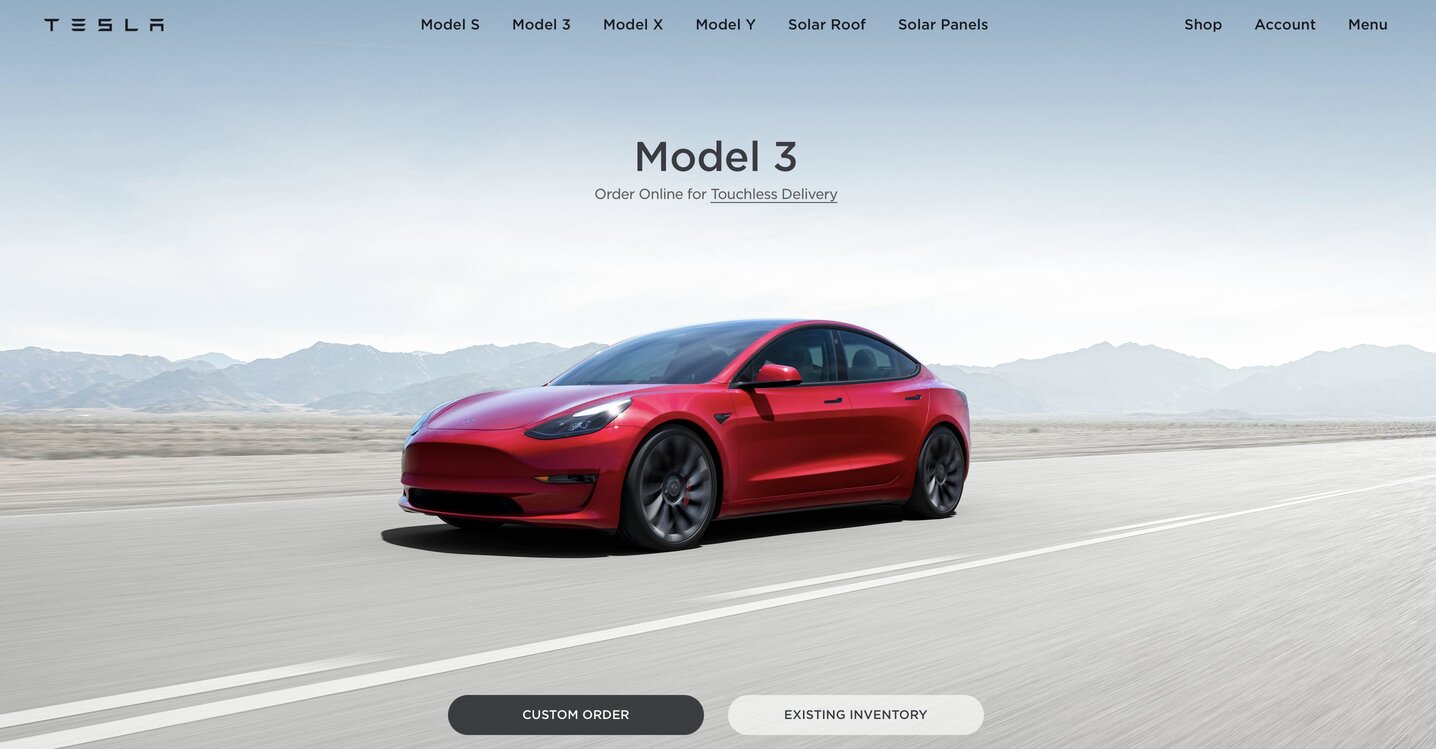
Tesla’s site takes the user on a journey. From displaying the make and model of the car, to sharing safety information and important specs, the brand is telling a story with each scroll, while educating the user about the product.
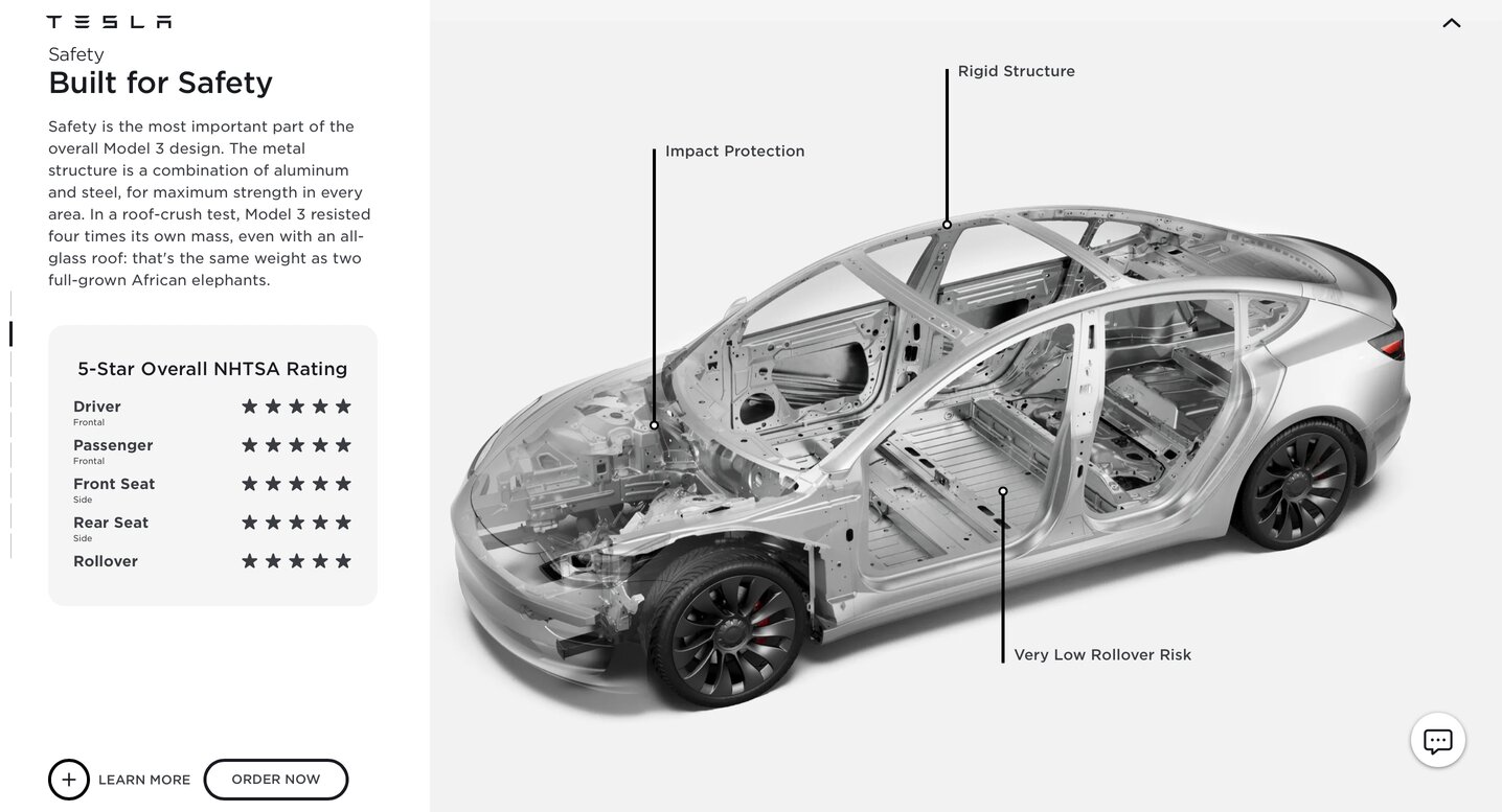
While they do include a slightly chunky paragraph to describe safety specs, it works here much better than on Ford’s website — and we’ll tell you why.
Because the use of several modern web design trends, including white space, minimalism, dynamic imagery and on-brand, easy-to-read typography, prevents this paragraph from coming off as overwhelming to the user.
Our CEO’s verdict: Tesla’s website provides an inviting and dynamic experience for the user. The brand follows modern web design trends almost to a T.
The site is responsive, includes sticky calls-to-action, utilizes minimalism techniques and directly appeals to today’s digitally native consumers — aspects that Ford’s web design is lacking.
Understanding the value of the user’s experience is key to reaching the next generation. While Ford continues to bank on their legacy, Tesla puts in the work and brings in around 16.7 million organic visitors every month.
While our CEO notes that both websites aren’t optimized for SEO — a missed opportunity — Tesla takes the cake for this round.
Top 5 Modern Web Design Trends For 2023
As user needs and behaviours change, web design trends must evolve to keep up with the changes and ensure user engagement at all stages.
We are seeing important shifts in both UI and UX trends that you should keep an eye on to maintain your website up to date.
Below are some of the modern website design trends to know in 2023.
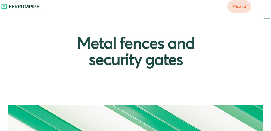
1. Ultra Minimalism
Minimalism has been at the forefront of modern design trends for several years.
How is this changing in 2023?
By taking things a step further.
Stripping back a website to its bare bones can create a dynamic, sleek design that showcases only the information desired by a select target audience.
The result? Faster loading speeds, higher customer satisfaction and increased conversions.
[Source: Ferrumpipe]
2. Gradients
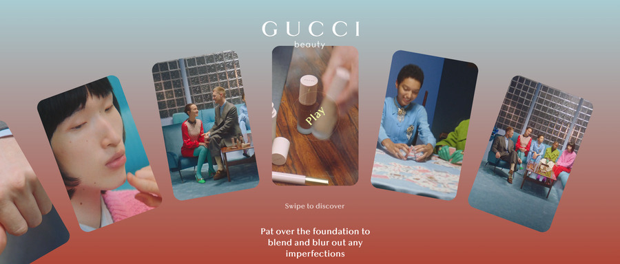
Gradients is a trend that has been seen before but is now being used in unique ways to add depth to minimalist designs.
While previously fitting to monochrome color palettes, designers are now utilizing eye-catching color gradients to provide a dash of excitement alongside bold typography and CTAs.
[Source: Gucci Foundation]
3. Geometric Elements
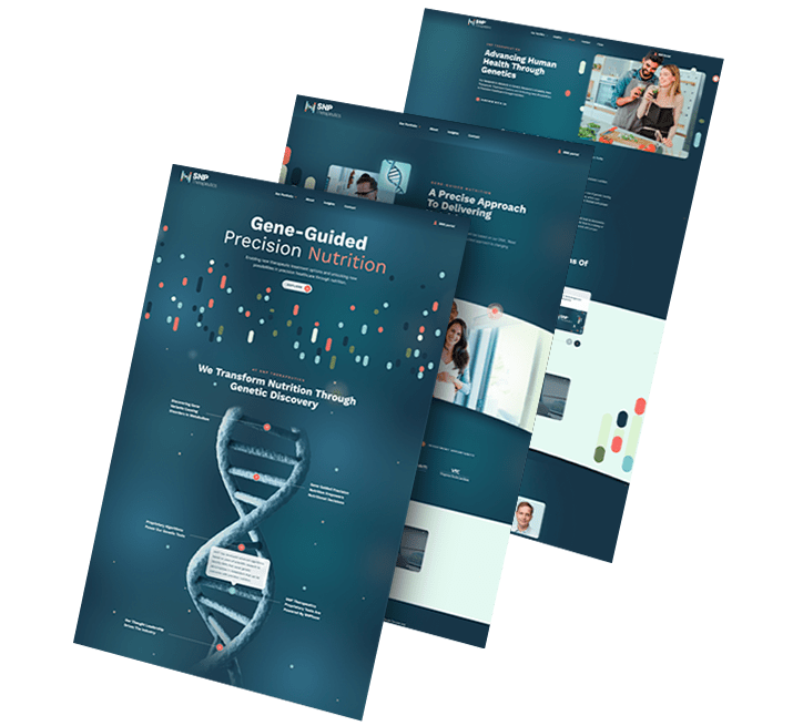
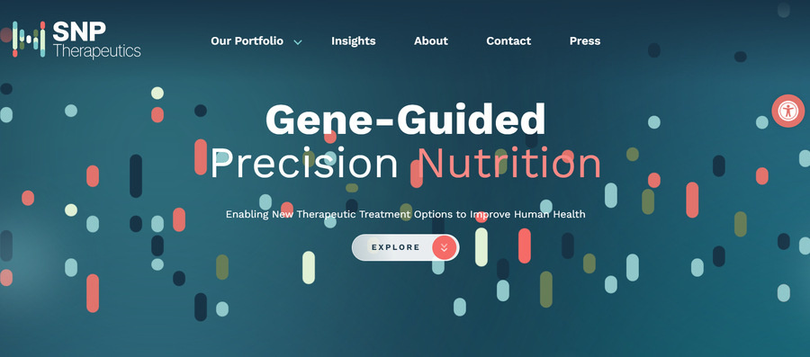
Animated illustrations are a popular way to add texture, movement and engagement to a modern website.
In 2023, many web designers are using geometric elements to pop from an otherwise flat page without taking attention away from desired consumer conversion hotspots.
[Source: SNP Therapeutics]
4. Accessibility
Accessibility in 2023 is more than just alt text for images.
As Google’s measurements for inclusivity continue to progress, modern websites need to keep track.
For example, if Google's crawlers have difficulty scanning your site's heading structures, navigation mechanisms and labels, they believe users face the same issue—and for good reason.
From landing page color contrasts to multi-language e-stores, modern websites are required to provide value for all users—and many (like Samsung) are going above and beyond!
[Design Story] Designs for All Abilitieshttps://t.co/8mFSiWJFbT
— Samsung Electronics (@Samsung) May 18, 2023
5. Y2K
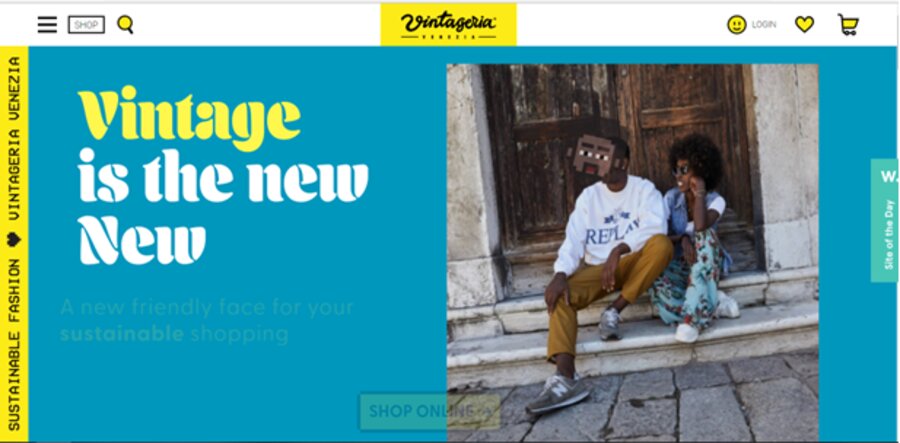
Our top trends for 2022 included retro 90’s nostalgia, and it shows no signs of slowing down this year. Retro might sound like the opposite to modern but this trend is on the rise.
Characterized by loud color palettes, basic web fonts and harsh lines. At the same time, we’re seeing the rise of neo-brutalism, also inspired by the 90’s revival but a bit more conservative when it comes to colors.
Here is an example of retro design and bold, colorful aesthetic:
[Source: Vintageria]
What Are The Benefits Of Hiring An Experienced Web Design Company?
An experienced agency will go beyond simply following current trends in website design. They also implement industry expertise, tested methodologies and highly skilled specialists to create a range of benefits for your business.
- High-Quality Results: Professional web designers create modern sites of the highest quality with attention to detail for a professional look and feel.
- Brand Identity: Skilled designers will customize your website design to match your unique brand messaging and values.
- User Experience (UX): Experienced designers understand how users interact with a website, creating an easy-to-navigate site that meets all UX requirements.
- User Interface (UI): From illustrations and animations to typography, an experienced web design team will create an eye-catching visual experience that converts.
- Functionality: An experienced web design agency will add bespoke features to your design that directly impact your target audience’s experience and satisfaction.
- Technical Expertise: Professionals have the technical knowledge needed when designing complex websites, minimizing chances of errors or other unforeseen problems.
- Site Maintenance: Experienced web designers provide regular maintenance services, keeping your design modern and fresh while fixing bugs around the clock.
Why Digital Silk Is The Only Modern Web Design Agency You Need
At Digital Silk, we specialize in creating modern websites design to convert. Whatever your business’ industry, size or background, our team members, processes and expertise combine to craft and deliver a unique digital strategy for your brand.
When working with us, you’ll gain access to five of our key value differentiators:
- We operate a team of award-winning designers
- We always take project ownership
- We act transparently from start to finish
- We utilize tried and tested methodologies
- We rely on research-driven, goal-oriented decisions
Contact us at (800) 206-9413 to discuss your modern design project or fill out our Request a Quote form to receive a custom proposal and expert recommendations.
