According to the latest World Health Organization estimates, over 1 billion people worldwide live with some kind of disability.
Out of this 1 billion, around 60% live in a household that frequently uses the internet. In other words, there might be as many as 600 million internet users who are afflicted with a certain disability.
Regardless of your industry, chances are that there are users with various limitations or disabilities within the audience of your website.
This is why it’s important to make sure that all users can navigate and use your website as intended, with no difficulties. This is where website accessibility comes in.
But what is website accessibility exactly? In this guide, we’ll provide the answer and explain in detail why website accessibility is so important, and how you can implement it within your website.
Digital Silk builds custom websites. Request a quote
What Is Website Accessibility?
Website accessibility is a set of best practices implemented in the web design process that is intended to make a website easier and more intuitive to use for people with visual, hearing, motor, or cognitive disabilities and limitations.
In other words, the purpose of website accessibility is to ensure that users with such limitations can have the same experience on a website as those who don’t have limitations.
Optimizing a website to be accessible usually involves a set of design principles and special accessibility tools that should ideally be implemented on the website during design and development.
Consult with our experts. Set Up A Consultation
However, even websites that were originally designed with no accessibility best practices in mind can still be made accessible.
For example, optimizing a website for accessibility often involves making sure it supports screen readers — a tool that many visually-impaired users often rely on to browse the web.
Check out the video below to learn more about screen readers and how to optimize your website for them!
What Is The Official Website Accessibility Standard?
The official, formal standard for website accessibility is detailed in the Web Content Accessibility Guidelines (WCAG), first outlined by the World Wide Web Consortium (W3C) in 1998.
Just like other internet standards developed by W3C, WCAG is an internationally recognized set of rules, recommendations, and best practices for implementing website accessibility.
In fact, most international legislations that set the legal standards for web accessibility in different countries either refer to WCAG directly or simply borrow its recommendations.
These legislations include:
- Title III of the Americans with Disabilities Act (ADA) in the United States
- Accessibility for Ontarians with Disabilities Act (AODA) in Canada
- EN 301 549, the EU standard for web accessibility
WCAG sets specific accessibility criteria for the content of a website, which it defines as both the content presented to the user (interface, web copy, images, etc.) and the “under-the-hood” content that makes up the website — namely, the website code and markup.
These accessibility criteria have been informally divided into four categories or, rather, principles. Each of these principles governs a specific area of user experience where a user with certain disabilities or limitations could have difficulties.
4 Key Principles Of Website Accessibility
The four key principles of website accessibility are perceivability, operability, understandability, and robustness. Here’s what each one of these principles includes.
1. Perceivability
The perceivability of a website has to do with whether all the website’s essential content — text, images, navigation menus, and so on — can be easily perceived and comprehended by a user.
For most users, perceivability of a website is tied to their capacity to understand information visually. However, visually impaired users may have difficulties perceiving information in the same manner.
As a result, they often rely on accessibility aids such as magnification tools or screen readers.
An accessible website should support such aids, while also being easily perceivable on its own, through the use of contrasting colors, legible text, and alternative methods of presentation for time-based media.
2. Operability
The operability of a website has to do with how easy it is to operate and navigate.
It is typically affected by how the user interface of a website is designed, including its navigation structure and control elements such as buttons.
Most users operate websites using the tools and techniques that are familiar to anyone who’s ever used a computer or other digital device: a keyboard to input information, a mouse to click on the different interface elements or to scroll through the website, or fingers to tap away at a smartphone screen.
However, this is not always the case with users who have certain motor limitations.
Instead, such users may rely on specific tools and methods to operate a computer or any other device, such as using only the keyboard for navigation, controlling the device via speech, or using a trackball or joystick instead of a mouse.
As such, your website must support these alternative input methods and devices, while also being easy to operate and navigate.
3. Understandability
The understandability of a website describes how easy it is to understand the website’s content and its meaning.
Understandability is usually affected by the language of the web copy, the content and presentation of the graphic elements, and the overall look and format of the website.
Understandability is an important principle in website accessibility because it caters to the users who may have certain mental or cognitive limitations and might have trouble truly understanding a website’s content, if its language and presentation are overly complex or confusing.
4. Robustness
The robustness of a website, also referred to as responsiveness, relates to the more technical aspects of website accessibility.
In other words, it refers to how “accessible” the website’s code is and how well it works with the software and hardware tools that people with disabilities commonly use when browsing the internet.
These include screen readers, speech input software, and so on. Robustness is usually accomplished by integrating Accessible Rich Internet Applications (ARIA) into your website.
Meet our web design and development team. Set Up A Consultation
Best Tools For Evaluating The Accessibility Of Your Website
Whether improving the accessibility of a bank website design, eCommerce store or everything in between, the first thing you need to do is evaluate how accessible it is in its current state.
The good thing is that you don’t have to do this evaluation manually and second-guess whether some aspect of your website is accessible or not.
Instead, you can use one of the following tools.
1. Web Accessibility Evaluation Tool (WAVE)
WAVE is a free tool that can help you perform a basic evaluation of your website’s accessibility features.
The criteria along which the platform evaluates websites closely follows the WCAG best-practices and analyzes elements, such as:
- Header structure
- Alternative text
- Color contrast
- Accessible Rich Internet Applications (ARIA)
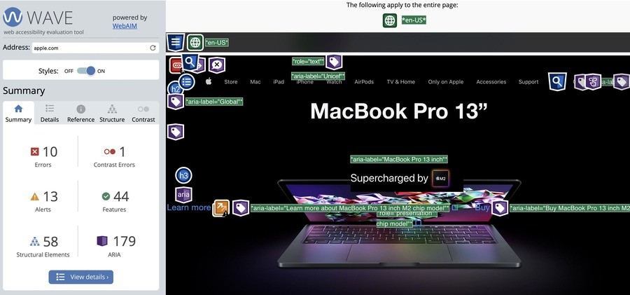
[Source: Wave]
2. Accessibility Checker
If you’re looking to perform a more thorough accessibility audit of your website, Accessibility Checker may be the right tool for you.
More of a web accessibility compliance portal rather than just a tool, it allows you to evaluate the accessibility of your website from the viewpoint of specific guidelines and legislations (such as WCAG and Title III of ADA), as well as from the viewpoint of specific jurisdictions.
The overall evaluation experience that the platform offers is very user-friendly (and free!), as it provides detailed explanations for all accessibility issues it discovers and suggests other tools (usually, paid ones) that can help you resolve those issues.
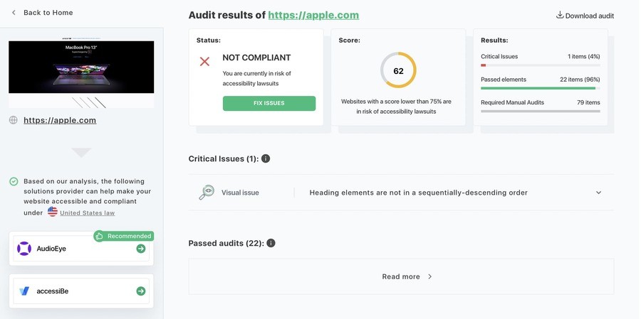
[Source: Accessibility Checker]
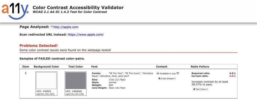
3. A11Y Color Contrast Accessibility Validator
Developed by the Bureau of Internet Accessibility, the A11Y Color Contrast Accessibility Validator has a more narrowly focused, but still essential purpose, compared to the other tools we’ve mentioned.
As its name suggests, it allows you to evaluate the color contrast of your website’s interface.
Color contrast is an important factor in website accessibility. In fact, WCAG has specific suggestions on the color contrast between the foreground elements of a webpage (such as buttons, menus, and graphics) and its background.
According to the WCAG, the colors of your website’s interface must have a contrast ratio of at least 4.5:1, meaning that the perceived brightness of its foreground elements should be at least 4.5 times higher than the perceived brightness of its background.
Tools such as the A11Y Color Contrast Accessibility Validator can help you figure out the color contrast ratio of your website’s interface and adjust it for optimal visual accessibility.
[Source: A11Y]
How To Create An Accessible Website
Now that we’ve covered what website accessibility is and explained its key elements, let’s explore what you can do to make your current or future website more accessible.
The process of website improvement for accessibility revolves around the four key principles we covered above: perceivability, operability, understandability, and robustness.
Here’s how you can strengthen each one of these elements on your website.
Optimizing For Perceivability
Optimizing your website for increased perceivability means adapting it for users with visual impairments. Here are the solutions you can implement to achieve this:
1. Include Alternative Text
Alternative text is most commonly added to a website’s visual elements, such as pictures so that users can have an idea of what the picture portrays, in case it doesn’t load.
However, alternative text is equally important for users with visual limitations. Make sure that all the critical visual elements of your website (such as logos and buttons) feature alternative text.
2. Utilize A Strong Color Contrast
As mentioned above, websites with a non-contrasting or poorly contrasting color scheme can be difficult to perceive for users with visual impairments such as color blindness or limited vision.
Design your website so that the perceived brightness of your website’s foreground elements (such as buttons, menus, or graphics) is at least 4.5 times higher than the perceived brightness of your website’s background color, as per WCAG guidelines.
3. Provide An Alternative Format For Time-Based Content
Time-based content includes videos, sound recordings, podcasts, and other forms of visual or audio-based content. Naturally, such types of content can be difficult or even impossible to perceive for users with a corresponding disability.
To make sure they can experience this content, provide an alternative means of presentation — such as captions for videos or transcripts for audio recordings.
4. Make Your Website Accessible To Screen Readers
Screen readers are among the most popular tools that people with visual disabilities use to browse the web.
Essentially, a screen reader scans the text that appears on the screen of the user’s device and reads it out loud — for example, whenever the user hovers their mouse cursor over a chunk of text.
This is why it’s so important to make your website accessible to screen readers on the technical level.
From contrast and light sensitivity to spacing, there are a lot of elements to consider when making a website accessible to people with low vision. Check out the video below for more info.
Optimizing For Operability
Poor website operability can affect people with motor impairments or certain cognitive impairments. Here’s how you can improve your website’s operability:
1. Avoid Content That Blinks Or Flashes Rapidly
In order for users who may have impairments or disability to navigate your website successfully, they must be able to navigate it safely.
Part of this is ensuring you don’t have any visual elements that blink or flash rapidly on your website, as it may cause an epileptic seizure.
However, if you do have such content and it’s something essential to your website, be sure to put a seizure warning pop-up that appears before the content is presented to the user.
2. Create A Clear Navigation Structure
Website navigation is an important component of website accessibility and good user experience as a whole.
Make sure that your website’s navigation structure is clear and easy to follow, with straightforward navigation menus, highly visible clickable links, and headers that clearly explain the purpose of each page and subsection.
3. Implement Keyboard-Only Navigation
Many users with limited motor abilities only use their computer’s keyboard to browse the internet — such as using the Tab key to switch between different clickable elements and using the Enter key as the click.
To learn more about keyboard-only navigation and how to implement it, watch the video below!
Optimizing For Understandability
In addition to perceivable content and an operable website, full accessibility also includes understandable content and website elements. Here’s how to optimize your website for understandability:
1. Write Straightforward Content
Web content that’s too complicated or difficult to understand can increase your bounce rate, and affect your website’s understandability.
When crafting content for your website, use simple language that your target audience can understand, and avoid jargon or overly colloquial and culture-specific expressions.
2. Implement A Logical Website Structure
Your content should not only be easy to understand, but also presented in a logical, simple, organized way that won’t disorient users.
To achieve a logical website structure, follow web design and content presentation techniques such as the F-layout, where the content of a webpage is organized in an F-shaped pattern that follows the manner in which most users typically look at a webpage.
Optimizing For Robustness
Finally, optimizing for robustness or responsiveness means making your website work well with what WCAG defines as different “user agents” — tools for accessing web content, such as web browsers or certain assistive technologies, such as the screen readers mentioned above.
For your website to work well with these tools, the HTML code needs to be well-formatted so the tools can interpret and display it correctly.
This works through a process called parsing, where a program such as a web browser scans the HTML code of your website, divides it into individual components (such as scripts or /div containers), and displays these components to users in the way and order that they’re meant to be displayed.
To ensure that tools such as screen readers can successfully parse your website’s code, make sure that all elements have clear start and end tags, and ensure that there are no duplicate IDs or attributes within the same HTML tag.
What Is Website Accessibility? Key Takeaways
While over 1 billion people all over the world are afflicted with different kinds of disabilities, these disabilities don’t prevent them from being active internet users.
This is largely possible due to the accessibility standards and guidelines that make sure all users can have the same experience on the web, regardless of their physical or cognitive abilities.
To properly optimize your current or future website for accessibility, follow these guidelines and implement the accessibility best practices described above.
At Digital Silk, we create custom websites designed to connect with and engage your target audience.
From alternative text to thoughtful, strategic navigation, our custom web design approach allows us to implement features and functionalities as needed to make your website visible, user-friendly, engaging and accessible.
"*" indicates required fields


