If you’ve ever looked into website design or redesign services, you may have heard the term “wireframe.”
But what is a wireframe in web design, exactly, and why is it important for the web design process?
We’ll explain what a website wireframe is, what features it includes and how it improves the web design process.
Let’s start!
Digital Silk builds custom websites. Request A Quote
What Is A Wireframe?
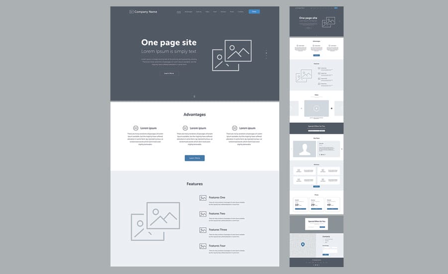
A wireframe is a basic, black-and-white layout that outlines the structure of a web page or an app screen. A wireframe focuses on site architecture, determines the size and location of page elements, and defines the paths between the pages.
A wireframe is the foundation of good web design just like a blueprint is the foundational element of a house project. Similar to how a house blueprint outlines the size of each room, but doesn’t define the style of each room, a wireframe provides a basic structure of each page, but without visual design.
It allows professional web designers like us to show clients the initial idea of their website before the actual design process starts.
Types Of Wireframes In Web Design
Wireframes vary depending on how detailed they are. There are three main types of wireframes in web design:
1. Low-Fidelity Wireframe
A low-fidelity wireframe is the simplest type of wireframe. This type of wireframe is created in the first stage of the wireframing process and is often drawn by hand, instead of with a digital tool.
A low-fidelity wireframe is like a skeleton of a website — it’s minimalistic and devoid of design elements. The aim of this type of wireframe is to address the user flow and define the hierarchy and structure of pages.
It’s a rough sketch of a website that designers then build upon later in the process.

2. Mid-Fidelity Wireframe
A mid-fidelity wireframe is more refined than a low-fidelity wireframe. It focuses primarily on functionality, further develops the page structure and is much closer to the final user interface (UI) design.
Mid-fidelity wireframes are often a continuation of low-fidelity wireframes, but they can also be the first step in the wireframing process.
This type of wireframe can be drawn by hand, but digital tools such as Figma are typically used.

3. High-Fidelity Wireframe
A high-fidelity wireframe is the closest version to what the final UI will look like when the project is finished. It focuses on usability and shows website components in more detail, compared to the previous two types of wireframes.
In a high-fidelity wireframe, designers define the UI components such as copy, images, fonts, colors, backgrounds and buttons, and all of the other elements that the final product will feature.
A high-fidelity wireframe is also referred to as a prototype.

When Is A Wireframe Created?
Wireframing usually takes place at the beginning of a web design project. In this phase, designers define the project requirements, exchange ideas and test the scope of the project before actually starting the design phase.
A wireframe serves as a jumping-off point for the next phase of the project after design, which is website development. If you don’t know the difference, check out our web design vs. development article.
What Does A Wireframe Include?
The features that are included in a wireframe depend on whether the wireframe is low-fidelity, mid-fidelity or high-fidelity.
However, the elements that are typically in every wireframe include:
- Pages
- Headers
- Logos
- Search fields
- Share buttons
- Placeholder text (Lorem Ipsum)
High-fidelity wireframes also include navigation systems, contact information and footers.
A typical web design wireframe does not include:
- Color scheme
- Typography
- Imagery
However, while typography and imagery are not included in wireframes, in some high-fidelity wireframes, designers may test text sizes, as well as shading. While wireframes are created in black and white, designers may play with tones and use lighter or darker shades of gray to represent lighter and darker colors.
How Does Wireframing Improve The Web Design Process?
While the wireframing step does require investing a bit more time and effort initially, it helps improve the website design process in multiple ways.
A wireframe:
1. Helps The Parties Involved Visualize The Website
A wireframe is the first step in turning an abstract idea into something tangible that can be seen and experienced. It displays the complete site architecture visually.
When putting abstract design ideas on paper in the form of a wireframe, everyone included in the web design project can communicate their opinions and ensure they are on the same page. They can approve or disprove the wireframe presented so designers can make adjustments accordingly.
2. Clarifies Website Features
One of the biggest advantages of wireframing is that it helps clarify website features before the designers start building them. Instead of using confusing technical jargon and trying to explain the features and functionalities the website should have, a wireframe helps designers present them visually and communicate their purpose.
This allows the parties involved to envision how the features will fit together and what the final project will look like.
3. Keeps The Project Focused On User Experience
A well-designed user interface improves the user experience, which leads to increased conversions. On the other hand, a poorly designed UX can lead to high bounce rates, as users quickly abandon sites that aren’t user-friendly.
A carefully made wireframe can help you avoid these problems and keep user experience a top priority. When designers create a prototype of a website based on the wireframe, they test it with real users to get valuable feedback and better understand the kind of experience users want.
User testing is a method applied to evaluate whether the web design works for the target audience. Designers observe how real users interact with the website to see how easy it is to use it. This allows them to identify flaws in the design and fix them.
User testing helps ensure a user-focused website from the get-go, focusing on the needs and expectations of the user to increase usability and engagement.
4. Makes Changes Easier To Implement
Creating a wireframe helps you iron out flaws before time and effort go into the page design. Identifying flaws in the design, such as poor navigation, and correcting them, is more time-consuming and costly.
Creating a wireframe is quick in comparison to full page design, and reviewing it to identify flaws and correct them takes significantly less time.
5. Helps Refine Navigation
A website wireframe is like a test run of a website. A wireframe helps you visualize the user journey and determine how easy it is to locate the content and the pages they need.
By testing the website navigation, designers can observe how easy it is for users to navigate the website and identify potential navigational issues, such as confusing dropdown menus or vague calls-to-action.
6. Saves Time
Wireframing in web design saves time throughout the project development process. A wireframe ensures that a design team knows what they need to build to meet your specific goals. As you provide feedback earlier in the process, designers spend less time on additional redesigns later on.
7. Saves Money
Wireframing helps you save money in the long run.
How so?
By ensuring that all stakeholders are on the same page as well as fewer edits. This means that both you and the design team will spend less precious time going back and forth discussing the design. This translates to fewer billable hours and costly design changes.
What Tools Are Used For Wireframing?
Creating a wireframe for a website doesn’t require more than a pen and paper, but there are a variety of digital tools available for this purpose, too.
Using a digital tool for wireframing results in a more polished, presentable wireframe. Plus, these tools allow designers to save and share their work with team members and collaborate.
Some of the most widely used tools for wireframing include:
1. Figma
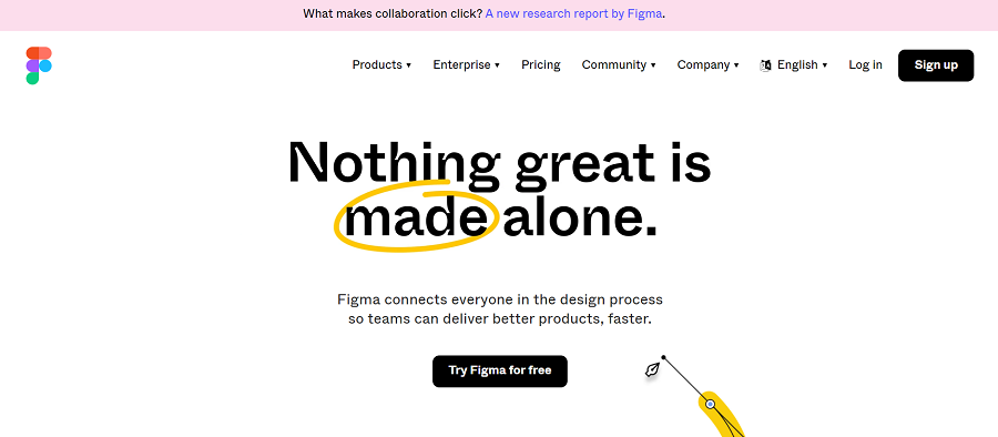
Our in-house team’s preferred platform, Figma offers wireframe templates, ready to be customized.
It enables easy collaboration as designers can share wireframes with team members by simply sharing the link, so others can comment on the project and provide feedback. It also features an online whiteboard so teams can brainstorm ideas.

2. Sketch
Sketch is a platform that facilitates a collaborative design process for designers. Sketch makes wireframing easy, with drawing tools and templates, and allows for the creation of all three types of wireframes: low-fidelity, mid-fidelity and high-fidelity.

3. Adobe XD
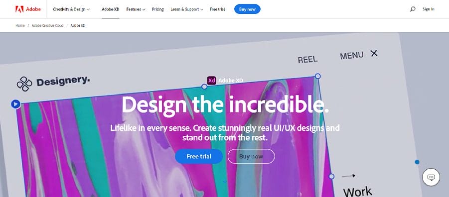
Adobe XD is a design tool that boasts a streamlined process for creating a wireframe.
It features easy-to-use tools for creating flowcharts, site maps and collaborating on projects as a team. It works best with other Adobe tools such as Illustrator, Photoshop and Adobe Fonts.

Wrapping Up On Wireframing
A wireframe is a very important step in the web design process that gives you a preview of what your website will look like. Wireframes can be:
- Low-fidelity
- Mid-fidelity
- High-fidelity
When designing a new website, a wireframe helps the designers (and you):
- Visualize the website
- Clarify website features
- Keep the project focused on user experience
- Make changes easier to implement
- Refine navigation
- Save time
- Save money
Our designers use wireframes for every website project, to map out the website’s architecture and define the user journey.
Our go-to platform? Figma!
As our client, wireframing helps you envision what your website will look like when it’s completed, and also gives you the opportunity to provide feedback regarding the structure of the website.
Once you approve the wireframes for your project, our web design team moves on to the next step in the web design process — adding your unique logo, colors and other branding elements, to create a static design of what each web page will look like to the user.
Our in-house team consists of expert designers, developers, strategists, branding experts and beyond. We provide web design services to brands of all sizes, across industries, to develop custom websites that drive measurable results!
"*" indicates required fields


