On average, businesses have about seven seconds to make a first impression on consumers.
This doesn’t leave much room for trial and error — brands have limited time to get their point across and make a lasting impact.
Having a strong and recognizable visual brand language can help you deliver a powerful message and create instant connections with your target demographic.
Below, we’ll examine the crucial elements of visual brand language and offer some examples to inspire your own strategy.
5 Essential Elements Of Visual Brand Language
55% of impressions are visual — most consumers draw conclusions about your brand based on imagery and graphics rather than plain text.
How well you implement these elements dictates how effectively your brand communicates its message without using words.
1. Logo
You see a red bullseye and immediately know it’s not a commercial for archery practice but the signature logo for Target, the retail store chain.
You catch a half-eaten apple and you immediately recognize trademark Apple products.

This is the power of a well-designed and easily identifiable logo — it speaks more words than any commercial or billboard ever could.
It represents your entire identity in its most condensed form and helps consumers recognize and remember your brand.
In fact, 78% of people see logos as a work of art, further solidifying their position in your marketing strategy.
Despite their seemingly simple form, most businesses spend hours meticulously designing and revising their logos to ensure consistency and proper representation.
After all, it’s not just one little mark — it’s a unique signifier that customers automatically associate with your business.
It’s merely the first piece of the much larger puzzle of your full visual identity that breathes life into your brand.
2. Color Palette
Why do basketball teams wear different-colored jerseys? Why do white-collar jobs stick to neutral and subdued hues? Why do construction workers usually wear neon shades?
This points to the integral role of color psychology and its influence on perceptions and emotions.
Not surprisingly, your color palette can boost brand recognition by a staggering 80%.
Take Starbucks for example — the company uses a prevailing green color scheme across all platforms and brand touchpoints.
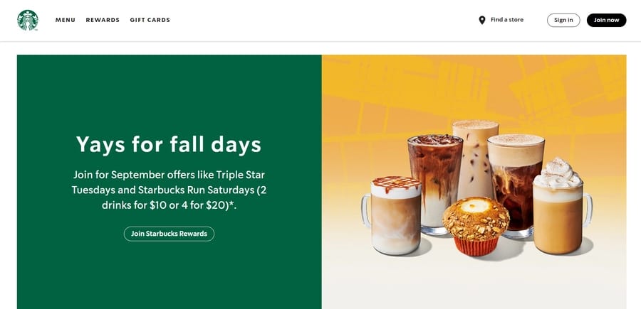
The shades you choose speak volumes about your product or service — much like red evokes passion and excitement or blue points to trust and professionalism.
3. Typography
Typography refers to the shape and style of your text — your visual medium for written communication.
While consumers may feel more strongly about some fonts than others, you should opt for something that reinforces your values and solidifies your identity in a packed market.
When combined with other design elements, fonts enhance your overall visual presence.
Bold and chunky text with soft, rounded edges often has a friendly and approachable feel as opposed to thinner and edgier serif fonts that may feel formal and impersonal.
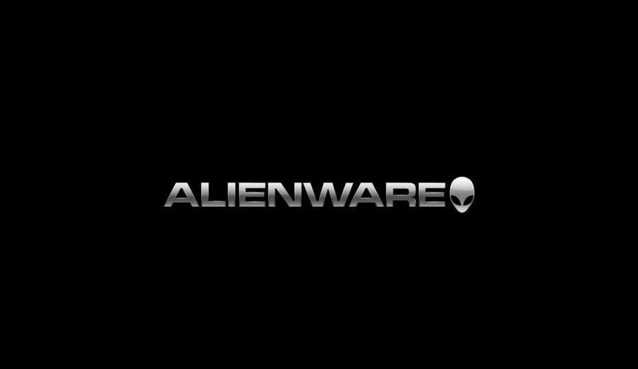
For instance, Dell’s Alienware series features a futuristic, sci-fi themed font to appeal to gamers and tech-savvy individuals.
4. Imagery
Images support your brand storytelling by conveying specific emotions and creating visual representations.
You can effectively decide on the type of images you want to include by keeping your audience in mind — what spurs their thoughts or what tugs at their heartstrings.
To narrow down your options, you can conduct A/B testing and present different versions of your visuals to see what works and what doesn’t.
Both stock and custom images are an option, but make sure you’re consistent throughout all marketing collaterals.
Hardly anyone would have doubts about what Jeep sells — and not just because of its well-defined consumer base.
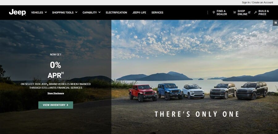
Even non-automotive enthusiasts can easily recognize the rugged and off-road imagery the company sports on every medium.
5. Graphic Design Assets
This is an entire visual system spread across your physical and virtual presence.
It includes animations, chart or infographic styles, color blocks and even the amount of white space you use.
Ideally, these should be visually unifying while still versatile enough to accommodate various layouts and designs.
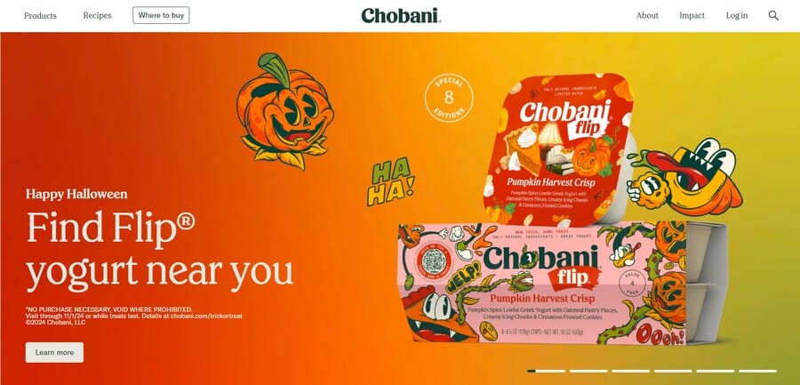
If you look at Chobani, it flaunts lively and vibrant animations coupled with clever use of white space and some out-of-the-ordinary designs.
5 Visual Brand Language Examples
74% of marketing content contains visual elements, pointing to their impact on capturing audience’s attention and conveying a particular brand message.
While every instance has its own quirks and standout features, the biggest players in the industry have nailed their identities to a T.
Most of the impactful examples of visual language implementation have an all-encompassing and well-defined structure that aligns with brands’ identities and values.
1. Duolingo
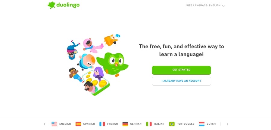
Duolingo’s entire brand is centered around its iconic owl mascot that takes center stage in all marketing mediums and visuals.
It offers a gamified language learning experience, with daily streaks and challenges users need to complete to advance through levels.
The visual branding is evident from the get-go — the signature cartoonish owl with vivid green plumage is the first thing that greets users on both desktop and app versions.
It might seem insignificant, but it’s become a vital aspect of the company’s marketing strategy.
Despite the seemingly playful and lighthearted approach, Duolingo uses a humorous and sarcastically threatening tone in its messaging, creating a distinct brand voice.
The combination of trademark visual language and witty copy appeals to Duolingo’s target audience and prompts discussions on social media.
2. Scrub Daddy
Who could’ve predicted a random sponge’s astronomic surge in popularity on the internet, right?
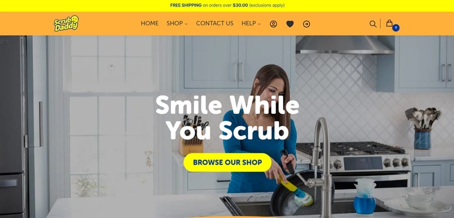
Scrub Daddy even flaunts the “America’s favorite sponge” tagline, which you don’t typically see in the cleaning aisle.
It works because it’s not like the conventional cleaning products we’re used to — thanks to its distinct bright yellow color and smiley face design.
Not to mention the comedic inspiration the sponge itself has stirred on social media — with people relating to everyday kitchen struggles and creating memes with the product in action.
Suddenly, having your sponge smile back at you while you scrub some stubborn stains makes cleaning a lot less stressful and more enjoyable.
3. Oreo
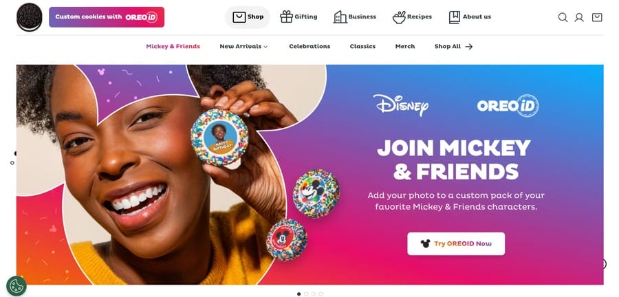
You can easily spot Oreo’s distinct blue and white packaging even on well-stocked cookie aisles.
The brand’s visual language is all about simplicity and consistency while adapting to changing cultural trends.
Oreo is no stranger to playful ads and marketing campaigns — often using the “Twist, Lick, Dunk” slogan with its distinctive color palette and 3D design.
Despite becoming more localized and translated into different languages, the Oreo brand language stays true to its mischievous and nostalgic roots.
4. Oatly
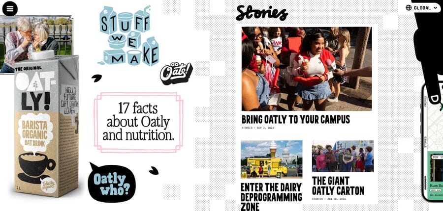
As far as unique and memorable visual branding is concerned, Oatly takes the cake with its eye-catching illustrations and bold yet relevant typography.
You can easily recognize its rebellious and outspoken brand identity, with striking images and clever copy that challenges traditional dairy industry norms.
The graphic elements extend to their packaging and print materials, each showing quirky illustrations and playful color schemes that showcase the brand’s personality.
Oatly’s comic-like scroll-through home page further emphasizes its distinct position in the market and brings an unmistakable energy to its digital presence.
5. Sonos
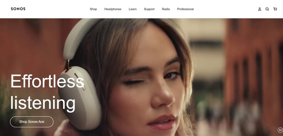
Offering a sophisticated and seamless audio experience, Sonos embraces its forward-thinking and cutting-edge philosophy through minimalist yet impactful branding.
The visuals all convey the same message — clean-cut and modern with a sprinkle of warm and homey elements to complement its high-tech image.
Sonos prioritizes user experience and convenience and seamlessly integrates all audio devices in its trademark ecosystem.
Its brand voice is personal and friendly, instilling trust in its customers and creating a sense of community among audiophiles.
Digital Silk’s Visual Brand Language Example
Our client Mintera needed a cohesive identity to position them strategically in a competitive market.

Our branding team helped the client with naming, brand strategy, custom logo design, visual identity creation and brand guidelines.
After aligning on the strategic direction, we moved forward with the visual discovery phase which involves creating a logo concept and defining the color scheme.
We came up with trademark visuals and guidelines to help the brand communicate its unique value proposition.
This included creating a modern design with a vibrant color palette that reflected their focus on refurbished home improvement products.
This strategic brand framework seamlessly connected Mintera’s name, messaging, and visual identity.
How To Define Your Visual Brand Language
A signature brand language can enrich and enhance your marketing strategy by fostering emotional connections with consumers and driving brand loyalty.
Defining your visual identity involves thorough research and creative execution through the following steps:
- Analyze your brand: Your visual language is only as good as your core identity, so you should revisit your signature mission, values, future direction, current market position and brand health. Think about how you can strategically differentiate from the competition through a distinctive story that feels authentic and relatable for your audience.
- Examine your target demographic: Do you know who’s interested in your products or services? What are some of their pain points and how can you address these issues more effectively than your competition? Create a buyer persona with a specific lifestyle, aspirations, favorite activities or hobbies so you can guide your artistic efforts in the right direction.
- Follow signature style guides: Develop brand guidelines that include specific assets and information to maintain consistency across all channels and boost brand recognition and awareness. These actionable directions also ensure that all your future projects follow the same rules, which can help you complete tasks more efficiently.
- Decide on key design elements: Once you’ve created your visual matrix, use your insights to develop a trademark identity by designing a logo, selecting a suitable color palette and deciding on specific design elements that align with your beliefs and brand promise.
Define Your Visual Brand Language With Digital Silk
Creating a unique brand persona can help sway customer decisions, improve recall and recognition and boost consumer loyalty.
At Digital Silk, our branding specialists stay on top of the latest trends to help you define a persona that increases conversions, builds lasting connections with your clients and delivers measurable results.
We help optimize your visuals, facilitate meaningful customer interactions and create a design language that brings your brand to life.
As a professional web design company, our services include:
- Custom branding
- Brand strategy and positioning
- Brand Identity
- Logo design
- Custom website design and development
We treat each project like our own and prioritize transparent communication throughout its lifecycle.
Contact our team, call us at (800) 206-9413 or fill in the Request a Quote form below to schedule a consultation.
"*" indicates required fields


