People have roughly 60,000 thoughts every day.
Whether purposeful or subconscious, these thoughts guide various factors like actions, perceptions and preferences.
UX design psychology in web design is the process of adapting your user experience (UX) by harnessing these thoughts, needs and motivations to shape the behaviors of your visitors.
Below, we outline eleven top tips, showing the best ways to leverage psychology in your website design.
Our web design experts also discuss wider benefits and principles to shape your digital strategy.
11 Top Tips To Leverage Psychology In UX Design
UX design psychology refers to the process of shaping meaningful interactions with your products and services by considering the thoughts of your customers.
It involves analyzing existing design psychology studies and principles before utilizing elements of the findings to improve a website’s UX.
Consumers’ emotional response plays a vital role in how they filter information, understand meaning, take action and remember your customer experience.
Here are 10 top tips to improve your UX through proven psychological principles and studies:
Digital Silk crafts custom websites. Request a Quote
Tip 1. Reduce Decisions Needed To Complete An Action
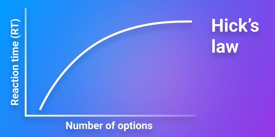
Hick’s Law states that the more choices a person has available to them, the longer it will take them to make a decision.

You can use Hick’s Law when optimizing your website’s navigation and aiming to increase conversions.
Reduce the number of options or steps your visitors must take when journeying through your website.
This way, you will help visitors quickly find what they need as quickly as possible, limiting bounce rates and streamlining the steps required for your desired conversions.
To reduce visitor decisions on your website:
- Cut back drop-down menu button options
- Reduce sign-up form fields
- Use repeated call-to-action (CTA) messaging
Tip 2. Rely On The Aesthetic-Usability Effect
The aesthetic–usability effect suggests users often perceive aesthetically pleasing designs as more usable.
Attractive designs often trigger positive emotional responses and foster higher levels of user satisfaction and trust, even if the product or interface has a few minor usability flaws.
This is partly due to the “halo effect,” where a single positive attribute influences overall perception.
To effectively use the aesthetic-usability effect, you should implement the following elements:
- Include consistent color schemes and typography
- Use high-quality visuals and graphic assets
- Strategically use white space to minimize visual clutter
Tip 3. Provide Social Proof
Social proof is the principle that people adapt their behaviors based on the actions of others. The greater the consensus of others, the more appealing that step looks to a customer.
Considering 98% of people read online reviews for local businesses, the relevance of social proof in driving conversions or desired actions is clear.
Display testimonials or reviews across your website to drive trust in your company’s solutions, in turn increasing confidence in your brand and encouraging conversions through confirmation bias.
To add social proof to your website:
- Add case studies with results and testimonials
- Publish product or service reviews
- Embed user-generated content from social media
Tip 4. Use Progressive Disclosure
Information overload can overwhelm website visitors, resulting in a confusing UX and cluttered user interface (UI) that harms your site’s performance.
A Google study found that conversion rates drop by 95% when the number of elements on a page increases from 400 to 6,000.
To avoid this, implement progressive disclosure – where information or options are gradually revealed as a visitor interacts with your UI.
By sharing information in manageable chunks as a user scrolls or clicks you will minimize the cognitive load, or brain strain, that comes with a visitor receiving too much information before they are ready to take it in.
To utilize progressive disclosure on your website:
- Implement scrolling reveal effects like parallax scrolling and scroll motion
- Add a modal design, where images and text appear over a web page when clicked
- Develop forms with multiple pages over one long page
Moreover, you can use the Zeigarnik Effect to encourage users to return and complete pending actions.
This psychological phenomenon suggests that users are more likely to recall unfinished or interrupted tasks than those they’ve completed.
You can do this through the following steps:
- Include visible progress bars or trackers during multi-step processes
- Add save and resume options so users can pick up where they left off
- Send gentle reminders or follow-ups for abandoned shopping carts
Tip 5. Ensure Consistency With Jakob’s Law
The principle of consistency in web design highlights the need for uniformity across a website’s elements— such as navigation, color schemes and typography — to help users intuitively predict how things will work.
This approach supports Jakob’s Law, which states that people expect your site to function like other sites they already use, which minimizes their learning curve and reduces confusion.
Drawing on established design standards aligns your site with common user expectations so it feels familiar, accessible and predictable.
To apply this UX psychology tip, you can:
- Keep menus and key navigation elements the same across all pages
- Use the same labels and terminology throughout the site
- Add standard icons for common actions like search, cart and settings
Tip 6. Optimize For Multi-Device Interactions
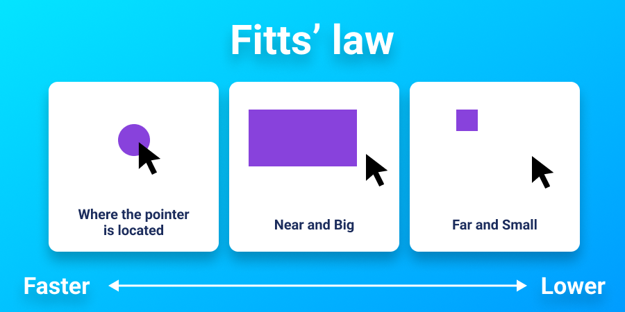
Fitts’s Law is a predictive model that states larger and closer elements are easier to interact with.

Apply Fitts’s Law by ensuring that interactive elements on your site are large and easily accessible for desktops of various sizes and mobile devices.
This will benefit your business as it improves navigation and engagement for all your visitors. By easily finding and interacting with your website’s core features, your UX will ultimately lead to higher conversion and retention rates.
To optimize your website for multi-device interactions:
- Use fluid grids for multiple screen sizes
- Consider element interactions on touchscreen
- Place content in a T-layout for mobile or F-layout for desktop
Tip 7. Use Scarcity Tactics
Scarcity in UX design is a psychological tool that leans on the fact people place more value on things in limited supply.
Using scarcity tactics in your web design allows you to tap into the fear of missing out (FOMO) – the perception of missing out followed by compulsive behaviors to maintain connections that affects 69% of Millennials.
In creating a sense of urgency and driving immediate action through scarcity tactics, you can boost sales or sign-ups.
Use scarcity tactics on your website with:
- Time-limited deals or pop-ups
- Access-limited, member-only areas
- Quantity-limited notifications on product pages
Tip 8. Apply The Reciprocity Principle
According to the Reciprocity Principle, when people receive something of value, they’re more inclined to return the favor.
In the context of UX design, offering products or services with genuine value can inspire users to reciprocate through actions like signing up, making purchases or staying engaged.
You can apply the reciprocity principle in the following ways:
- Offer free resources like eBooks, templates or tools with real benefits
- Give access to premium content in exchange for sign-ups or user information
- Use data-driven insights to personalize products or content recommendations
Tip 9. Leverage The Power Of Curiosity
The curiosity gap is the difference between what a visitor knows and what they want to know.
Due to the innate human instinct of curiosity, your prospective customers hope to fill their information gaps through your website’s content and wider experience.
In turn, you can leverage this curiosity by teasing intriguing content or features to pique users’ interest and encourage further exploration.
The result can be longer session durations and sign-ups to gated areas as visitors explore your site. In fact, one company delivered a 927% increase in conversions to the pricing page of Mad Mimi, a newsletter creation platform, by leveraging the curiosity gap in their copy.
Leverage the curiosity gap in your content with:
- Gated content like white papers and newsletters
- CTAs for further learning that lead to blogs or service pages
- Interactive elements such as quizzes or polls
Tip 10. Implement The Mere Exposure Effect For Familiarity
The Mere Exposure Effect states that people tend to develop a preference for things merely because they are familiar with them.
UX designers can consistently present certain website elements to encourage user trust and drive engagement and conversions.
To do this effectively, you should:
- Ensure consistent branding across all touchpoints
- Use retargeting campaigns to engage existing users
- Publish regular updates so returning users recognize your content
Tip 11. Optimize Visual Hierarchy
Visual hierarchy is the order in which people see things on your website. This hierarchy is made up of the elements on your pages, like text, images and graphics.
Hierarchy is not always linear. Instead, it is impacted by numerous factors like size, proximity, color and placement.
From adding visual anchors to adjusting typography, you can establish a visual hierarchy that guides visitors to the most important or helpful areas of your website.
The result can be quickly answered queries, comprehension of your core messaging and continued journeys down your desired conversion funnel.
Optimize visual hierarchy on your website with:
- Whitespace to make visual elements more noticeable
- F-shaped content to capture left-leaning scans
- Color contrasts and sizing to pull focus
Why Is UX Design Psychology Important For Web Design?
Using psychology to guide your UX design can provide overarching benefits for your website.
Considering the psychology behind UX helps you make decisions by better understanding:
1. The Differences In Color Perception
By understanding how different colors evoke emotions and convey meaning, you can use color strategically to influence user behavior and enhance usability.
For instance, using high-contrast color combinations for important elements like buttons or links can improve visibility and readability for users with visual impairments, while also drawing attention to key actions.
You don’t want a repeat of the viral dress sensation on your website where visitors are unable to distinguish one color from the next, for example.
2. How Users Make Choices
UX design psychology looks into the cognitive processes behind user decision-making, helping you optimize your interface to facilitate more informed and efficient choices.
By understanding principles like Hick’s Law or decision fatigue, where more options increase the difficulty of decision-making, you can simplify your experience and reduce cognitive load for users.
For example, offering clear navigation paths and minimizing distractions can guide users towards their goals more effectively, resulting in quicker decisions and a smoother UX.
By aligning your design with the way users naturally think and choose, you can increase conversion rates and drive business growth.
3. The Effects Of Short Memory Limitations
Human short-term memory has limited capacity and duration. In fact, human attention spans last just eight seconds – that’s less than that of a goldfish.
This can impact the way visitors will process and retain your website’s information.
Psychology in UX design addresses this by employing strategies like chunking, where related information is displayed together, and progressive disclosure to present information in a manageable way.
This improves usability, helps you effectively display your brand identity and enhances user satisfaction.
Meet our award-winning designers. Schedule A Consultation
UX Design Principles To Guide Your Web Design
Understanding the psychology that is compelling your audience to make certain decisions and perceptions is one thing. Using these insights to shape your UX is another.
By following proven UX design principles throughout your web design process, and combining UX design and psychology during their implementation, you can create a high-quality digital experience that considers the thoughts of your target audience.
Three central UX design principles to consider include:
- User-centricity: Ensuring the design revolves around what users want and need. In design psychology, user-centricity relates to addressing user intentions and perceptions to foster trust and long-term engagement.
- Consistency: Maintaining uniformity in design elements to prevent confusion and drive recognition. In design psychology, consistency cultivates familiarity and reliability, enhancing user confidence and ease of use.
- Hierarchy: Organizing information to prioritize user attention and streamline navigation. In design psychology, hierarchy leverages natural ways of seeing and understanding to guide users effectively, facilitating comprehension and task completion.
Digital Silk crafts custom websites. Request a Quote
Master Your Web Design’s UX With Digital Silk
Understanding the psychology that drives the actions and perceptions of your target audience is an important step to crafting a meaningful UX.
From quick wins to overarching strategies, your website design can benefit from insightful decision making that stems from psychological studies on UX and wider behavioral analyses.
However, understanding these key psychological drivers and implementing these into your web design takes skill, expertise and experience.
At Digital Silk, we have award-winning designers and developers, branding specialists and senior-level digital strategists with the know-how to craft a successful UX for your business.
As a full-service web design agency, our in-house solutions span the entire digital process, including:
- Custom web design
- Custom web development
- eCommerce web design and development
- Digital branding
- Digital marketing
Regardless of your project’s parameters, we guarantee:
- Project ownership
- Transparency
- Measurable results
Contact our team, call us at (800) 206-9413 or fill out the Request a Quote form below to set up a custom consultation and elevate your UX today.
UX Design Psychology FAQs
UX Design Psychology examines how psychological principles influence user interactions with digital interfaces. This helps designers create intuitive, user-centered experiences that meet users’ needs, create memorable brand experiences and drive conversions.
Colors evoke specific emotions and can influence user actions. For instance, blue often conveys trust and calmness, while red can create a sense of urgency. Strategic use of color guides users’ attention and decisions within an interface.
The aesthetic–usability effect suggests that users perceive aesthetically pleasing designs as more usable. Attractive interfaces can boost user engagement and tolerance for minor usability issues.
By comprehending how users focus and process information, designers can prioritize content, utilize visual hierarchy and minimize distractions to create more effective and engaging interfaces.
Emotional design focuses on creating products that elicit positive emotions to increase user engagement and loyalty. By addressing visceral, behavioral and reflective aspects, designers can create engaging, brand-specific and high-converting user interfaces.
Key psychological principles in UX design include the Aesthetic–Usability Effect, Zeigarnik Effect, Principle of Consistency, Reciprocity Principle and Mere Exposure Effect. Each principle influences user perception and behavior, which helps designers create more intuitive and user-friendly experiences.
"*" indicates required fields


