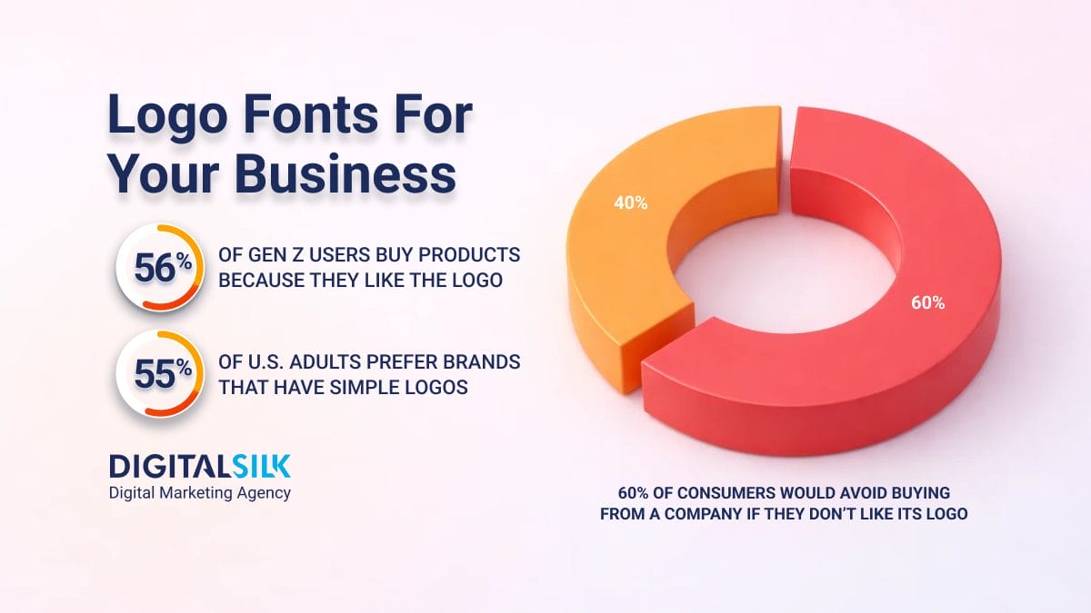
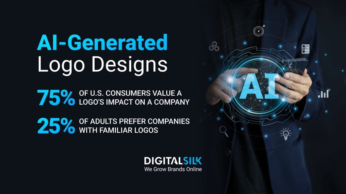
75% of consumers believe that a company’s logo design significantly impacts its success.
The shape, color and font of a logo are simple, yet important visual cues that audiences use to identify brands.
In fact, logos can boost brand recognition by 80%.
In this guide to logo shapes, we’ll explore why logos matter, how they affect consumer perception and how you can choose the perfect shape to represent your brand.
Why Are Logo Shapes Important?
Logos are often the first thing people notice about a brand, and our brains process visuals remarkably fast — taking only 13 milliseconds to interpret what the eye sees.
Once processed, logos and their shapes evoke various emotions within us.
For example, circles and ovals are usually associated with wholeness, growth, and harmony, while square and rectangular shapes convey strength and power.
Distinctive, organic logo shapes can make your brand more recognizable and memorable, fostering trust and customer loyalty.
The right logo shapes help you deliver your message effectively, strengthen your brand identity and establish meaningful connections with your target audience.
Geometric Logo Shapes
Geometric logo designs rely on simple geometric shapes, such as circles, squares, rectangles, triangles and lines to create visually striking brand identities.
Their simplicity makes them look elegant and professional, as illustrated by the examples below.
1. Circle Logos
Circles are among the most popular logo shapes.
They have no end and no beginning, and people usually associate them with something positive, such as a sense of community and trust.
That’s probably why people prefer curved visual objects to other shapes.
Brands leverage the positive effect of circles to create effective logos that resonate with their audience.
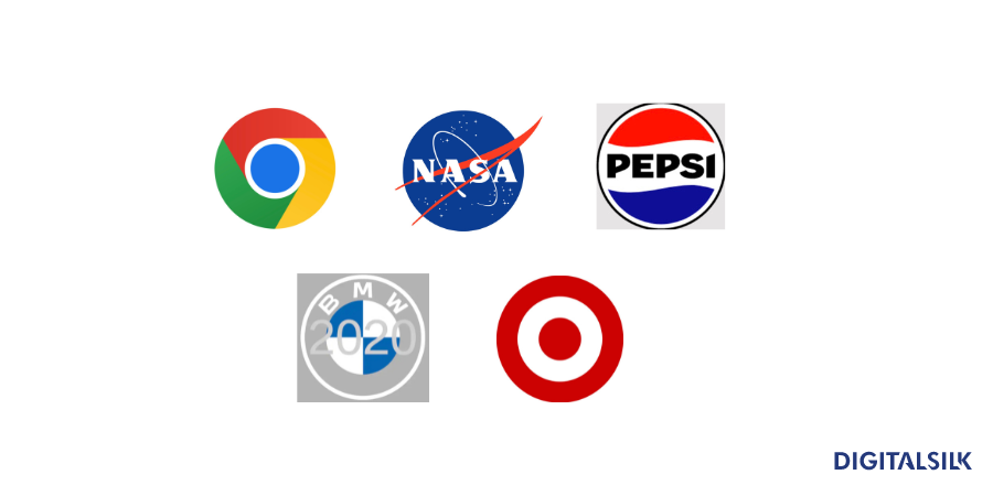
Google Chrome, NASA, Pepsi, BMW and Target are just some of the brands with circular logos that look timeless:
2. Square And Rectangle Logos
Square and rectangular logos indicate security, stability, credibility and reliability.
These shapes have a balanced and professional look, and they inspire a sense of trust, which is particularly important for industries such as tech, law and finance.
Even if a square or rectangle isn’t the focal point of a logo, they often serve as a frame, providing a sense of structure. Additionally, the even and symmetrical lines of squares and rectangles can enhance readability, which is especially important when logos contain text or detailed graphics.
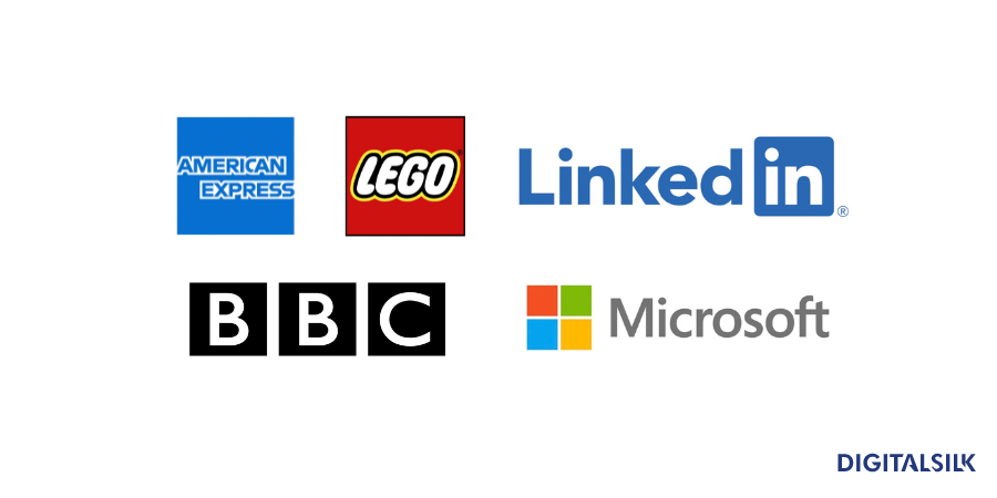
American Express, Lego and Microsoft are among the companies that use square and rectangular-based logos:
3. Triangle Logos
Triangles usually convey a sense of progress, movement and power.
However, triangles are less commonly used in logos.
They can be interpreted in different ways and their perception may not always align with a brand’s intended message. Shapes like circles and rectangles are more universally associated with stability and balance. These attributes are more desirable in branding and logo design as they foster a sense of trust and reliability.
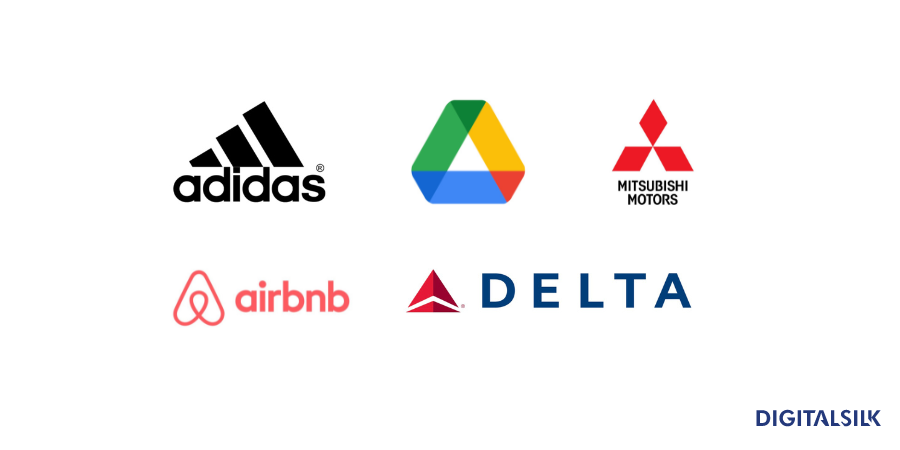
Still, several well-known companies use triangles in their logos and they do it masterfully. Brands such as Adidas, Delta, Airbnb, Mitsubishi Motors and Google Drive managed to develop strong and dynamic visual identities using triangles:
4. Horizontal And Vertical Logos
Logos that incorporate horizontal and vertical linesconvey a sense of balance, order, stability and calm.
Brands often choose these designs to emphasize their dependability.
Consider major brands like IBM, Honda, Cisco, DHL and Spotify. Each one uses horizontal or vertical lines in their logos, reflecting their strength and forward-thinking approach:
Organic And Abstract Logo Shapes
In addition to using traditional shapes, some brands choose to experiment with their logos to create more memorable and distinctive designs.
1. Organic Logos
Organic logos resemble forms in nature, including leaves, flowers, waves and animals.
That makes them appear softer and more approachable, which helps brands form an emotional connection with their audience.
Patagonia, Dove, Shell, Jaguar and John Deere are among the most popular brands with organic logos:
2. Spiral Logos
Spirals symbolize continuous progress and development, offering a dynamic and engaging visual appeal.
Their natural presence in galaxies, shells, fingerprints and snails evokes positive emotions and a sense of familiarity, harmonizing with the natural world.
Versatile in design, you can style spirals in various ways to convey different messages and feelings.
Ubisoft and Somersby have found creative ways to incorporate spirals into their logos to enhance their visual impact and brand identity:
3. Curve Logos
Curves are soft and flowy, evoking positive emotions.
Brands that incorporate curves in their logos often appear more approachable, making these designs ideal for companies that want to establish a personal connection with their audience.
Aside from evoking positive and friendly emotions, curves can also look elegant and sophisticated, which means that you can easily adapt them to various niches.
Coca-Cola, Disney, Vaio and Unilever have successfully incorporated curves into their instantly recognizable logos, showcasing their adaptability and appeal:
4. Abstract Logos
Abstract logo shapes are unique, versatile and fun to experiment with.
Unlike the rest of the logo types we mentioned earlier, abstract logos usually don’t represent specific real-life objects or imagery.
This quality typically gives abstract logos multi-layered meanings.
When brands choose an abstract logo, they usually want to make their audience feel something and communicate complex messages and values to them. The goal is to do it without making people spend too much time trying to understand the meaning of a logo.
If you opt for an abstract logo, it’s important to ensure that its design communicates exactly the message you want without leaving room for contradicting interpretations.
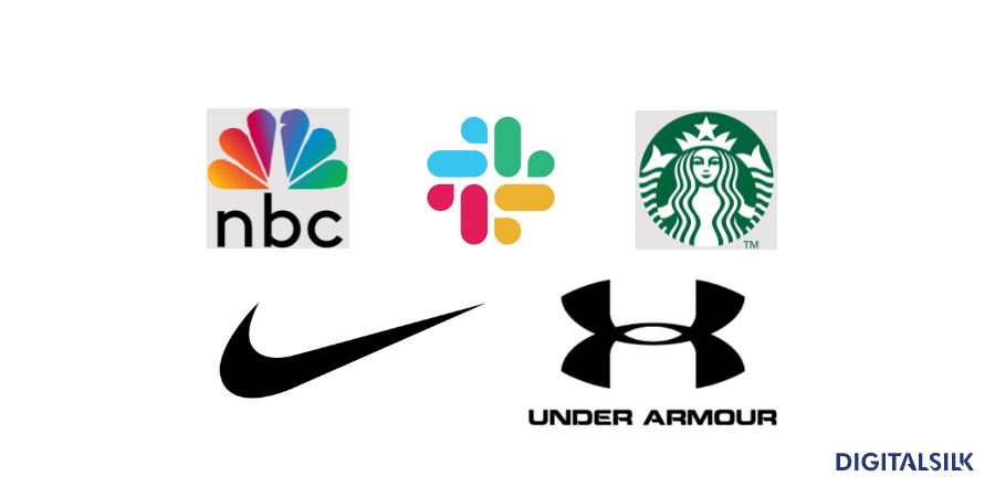
Some of the brands that use abstract logos include Nike, Starbucks, Slack, Under Armour and NBC.
How To Choose The Right Type Of Logo Shape
42% of consumers think that logos communicate a brand’s personality.
With this in mind, it’s clear that choosing the right logo shape is crucial for brands of all sizes.
Here are some key steps to take when creating a logo:
- Define your values: What’s your brand’s mission? What about the beliefs your company stands for? Before you start working on your logo, it’s crucial to define your brand’s voice, vision and goals to then choose the shape that best suits your plan.
- Understand your audience: Knowing your audience is key to picking the right logo shape. You need to be mindful of your target demographic’s beliefs and expectations to create a logo that emotionally resonates with them. That way, it’ll be easier for you to establish a deep connection with your users. Also, when you understand your audience, it’s easier to avoid cultural missteps since shapes have different meanings across cultures.
- Perform competitor analysis: This step is important because it helps you identify common themes and elements within your industry. That gives you the space to do something different and create a distinct logo. However, it’s important not to go overboard. Yes, it’s nice to stand out, but it’s also smart to align with norms typical of your niche to convey a sense of familiarity to your audience, so keep an eye on what resonates well with your target audience.
- Gather inspiration from various sources and create a mood board: Look at various sources and explore different design styles, techniques and trends. That way, you can get new ideas and start thinking outside the box. Then, make a mood board to combine your ideas and inspirations into a coherent visual theme to ensure that your logo’s shape aligns with your brand’s vision.
- Sketch initial concepts with the right color choices and matching typography: It’s important that your logo’s shape, color, and typography work well together from the start. A cohesive logo aligned with your branding materials reinforces brand recognition and maintains a unified image across platforms.
- Review logo concepts internally: Internal reviews ensure that your logo aligns with your company’s core values and vision. This is essential to maintain a consistent brand identity across all marketing channels and materials. Also, when you involve different departments and team members, you get diverse feedback that can help you identify potential areas for improvement that your design team might overlook.
- Trademark your logo design: A trademark protects your brand and ensures that your logo stays unique and associated solely with your brand. It also gives you exclusive rights to use the logo on the products and/or for the services you offer, preventing others from using a similar logo for their business.
- Launch your new brand identity and introduce the changes to consumers and clients: When you finish creating the new logo, it’s important to ensure that your target audience and clients see and remember your new brand identity. If you proactively introduce the changes, you can control the narrative around the rebranding and address any potential concerns early on.
Our Best Logo Shape Examples To Inspire Your Design
At Digital Silk, we work with clients from various industries.
Recently, we worked on two distinct logo designs that reflect the unique identities of our clients.
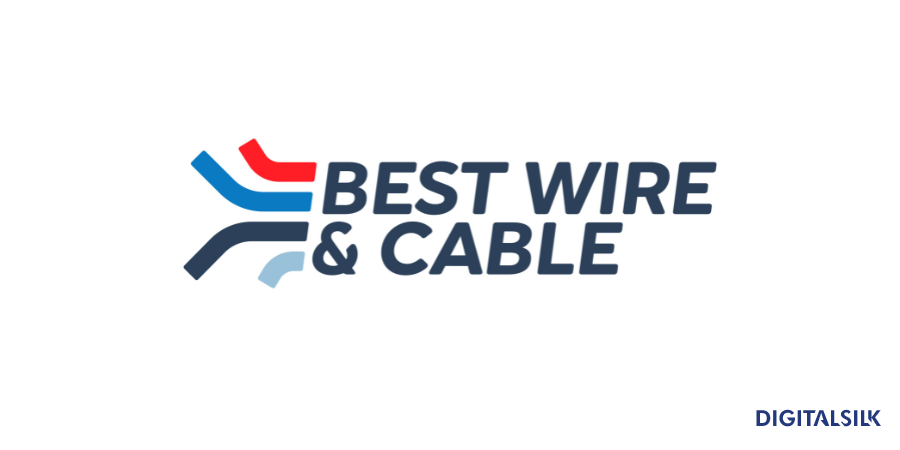
The first logo features a simple, yet smart design that instantly tells you what type of industry our client is in.
Best Wire & Cable are a national provider of low-voltage cable and wire solutions for commercial projects.
The logo we created for the company features its name written in a simple and clean sans-serif font on the right. The letters are large, bold and easy to read, suggesting strength and reliability — which are some of the key attributes of Best Wire & Cable.
The three colored lines on the left of the letters symbolize different types of cables and wires, hinting at the core products that Best Wire & Cable make.
The overall design is clean, simple and effective.
Another logo that we’re proud to show you is for Mintera — a brand that sells refurbished home improvement products.
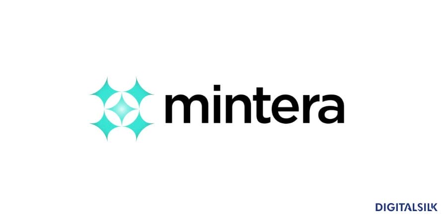
The logo we designed for them is inspired by a faucet handle.
We took the design to another level by using sparkling stars to form a faucet, but at the same time, the five stars you see also reflect the 5-star quality of Mintera’s products.
Our design team used turquoise for the logo because it evokes serene, calm and friendly emotions.
Design A Custom Logo With Digital Silk
If you want a logo that showcases your company’s value and vision, matches your brand’s identity, drives recognition and resonates with your audience, you need to work with an experienced logo design agency.
At Digital Silk, we’re fully dedicated to crafting custom logos that capture the essence of our clients’ brands.
Our process involves a range of experts, from digital strategists to brand designers, ensuring a comprehensive approach to logo creation.
As an experienced website design agency, we have in-house experts across multiple disciplines to deliver exceptional results.
Some of our services include:
- Conversion-focused branding solutions
- Brand design
- Brand naming
- Custom web design
- Custom web development
In addition to our deep expertise, we provide a trio of core values to every project:
- Project ownership: We take control of the technical elements of your logo design.
- Transparency: We keep you in the loop at every step, ensuring no hidden fees or surprises.
- Measurable results: We establish and track your key performance indicators (KPIs), making decisions that focus on delivering tangible results.
Do you need a logo and help with growing your brand?
Contact our team, call us at (800) 206-9413 or fill in the Request a Quote form below to schedule a consultation.
"*" indicates required fields


