As an online store owner, there’s a lot of effort to give when driving traffic to your website and creating an exceptional user experience.
But even with the most beautiful website and the best products, you may still face one common challenge: cart abandonment.
In fact, an average of 69.57% of online shopping carts are abandoned, according to Baymard Institute.
The good news is that with the right strategies in place, you can optimize your Shopify checkout process and reduce cart abandonment rates.
Here, we’re going to cover the basics of what Shopify checkout optimization is, why it is important and give 20 valuable tips on how to optimize your checkout process.
Digital Silk builds custom Shopify stores. Request a quote
What Is Shopify Checkout & How Does It Work?
Shopify Checkout is a gateway within Shopify that provides a simple and secure way for customers to purchase products online.
When a customer adds an item to their cart, they can proceed to checkout, where they are asked to provide their shipping address, payment information, and other relevant details.
A high-quality Shopify checkout function is user-friendly and intuitive. While not implemented across the board, some businesses achieve this by utilizing customizable features such as one-click payments, automatic shipping rates and real-time shipping tracking.
Once the customer completes the checkout process, the payment is processed securely through Shopify Payments or a third-party payment provider.
What Is Shopify Checkout Customization?
Shopify checkout customization is the modification of a Shopify checkout page’s appearance and functionality to create a custom experience.
Ways to customize your Shopify checkout can include:
- Making changes to the checkout form fields
- Adding custom branding
- Adjusting the layout and design
- Implementing additional features or functionality
What Is Shopify Checkout Optimization?
Checkout optimization on Shopify refers to the process of improving the checkout experience to increase conversion rates and maximize sales. Explore this case study and see how we helped one of our clients boost sales.
This involves analyzing and optimizing various aspects of the checkout process, such as the checkout flow, design, and functionality.
Some common strategies for checkout optimization on Shopify include:
- Streamlining the flow of the checkout
- Optimizing and testing the design of the checkout page
- Using precise messaging
- Personalizing the experience
[Source: Gymshark]
10 Tips For Customizing Your Shopify Checkout Process
One of the key stages of starting a Shopify store, customizing your Shopify process gives you an opportunity to create tailored experiences with your brand.
Here are some tips for customizing your checkout process:
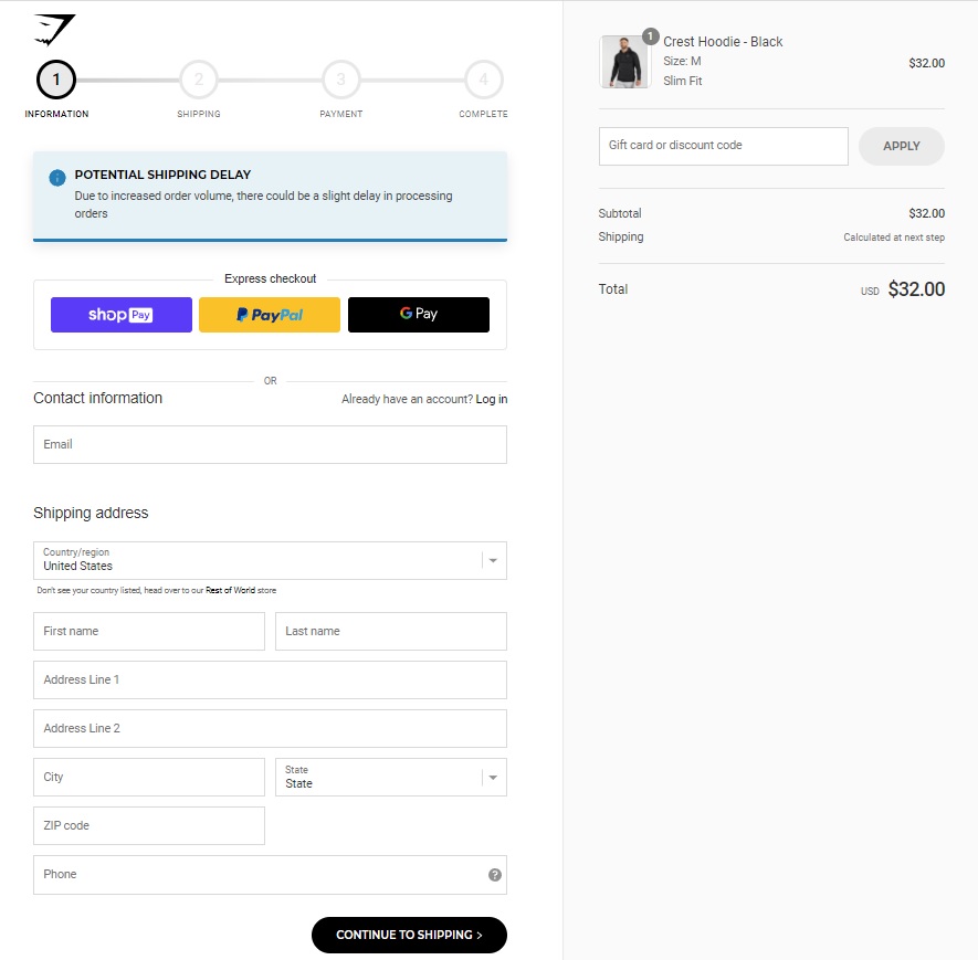
1. Install A Progress Bar
Installing a progress bar on your checkout page can help users visualize the steps they need to take to complete the purchase.
This provides a sense of direction and transparency, which can help reduce frustration and increase confidence in the purchase.
Here are some simple tips to have in mind when installing a progress bar:
- Use clear labels
- Show the number of steps
- Use a consistent design

[Source: Gymshark]
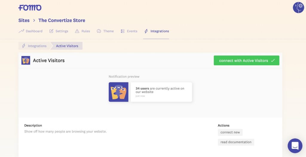
2. Add Social Proof & Ratings
Customers are more likely to trust and make a purchase from a website with positive reviews and ratings. By using social proof and ratings on your checkout page, you can increase customer confidence in your brand and products.
You can display customer reviews and ratings on your checkout page, or even include trust badges or seals from reputable third-party security providers to show that your website and the checkout process are secure.
[Source: Convertize]
3. Provide Multiple Payment Options
According to a study, 56% of individuals think that a website should offer several payment options when making a purchase.
Considering offering payment methods such as PayPal, Apple Pay, or Google Pay, in addition to credit card payments, will reduce possible cart abandonments due to inconvenient payment methods
Multiple payment options can also appeal to consumers who may not have been willing to pay the entire price of a product in one go. With methods such as Klarna, users can break their payments into installments, supporting the appeal of your product with a buy now, pay later structure.

[Source: Shopify]
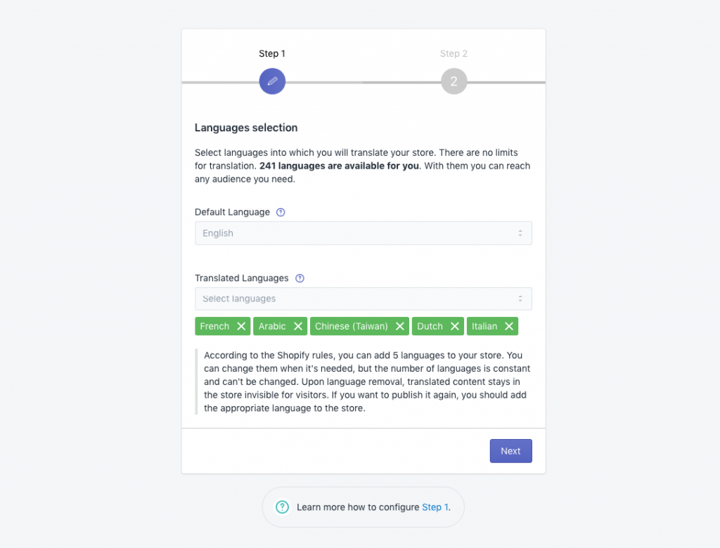
4. Add A Multi Language Checkout Function
Offering a multi-language Shopify checkout function shows that you’re committed to providing an inclusive and accessible shopping experience, which can enhance your brand reputation and help you stand out from competitors.
[Source: LangShop]
5. Add A Guest Checkout Option
Not all customers want to create an account or sign up for a newsletter to make a purchase.
Offering a guest checkout option can make the checkout process faster and more convenient for those customers.
For example, when the website’s primary goal is to increase sales, it’s best to provide a guest checkout option as it simplifies the checkout process and makes it easier for customers to complete the purchase.
6. Include Shipping Information
Make sure to provide clear and concise shipping information on your checkout page, including estimated shipping times and costs. This can help prevent cart abandonment and reduce customer frustration.
For example, include a message such as “estimated delivery: 3-5 business days” near the shipping options.
You can also list the available shipping options and their costs in a dropdown menu or a separate section on the checkout page.
7. Provide Real-Time Customer Support
Offering real-time customer support during the checkout process can help alleviate any customer concerns or issues that may arise.
Consider offering live chat or phone support during checkout to provide immediate assistance to customers.
8. Offer Upsells During The Checkout Process
Offering upsells or cross-sells during the checkout process can increase sales and improve customer satisfaction.
This can include recommending related products, offering add-ons or upgrades, or suggesting bundled deals
9. Use Trust Badges & Security Symbols
Adding trust badges and security symbols to your checkout page can help increase customer confidence in your website.
Displaying symbols such as the padlock icon, SSL certificate, or payment logos can give customers peace of mind that their personal and financial information is secure.
10. Add New UX/UI Design Features
Testing different design elements such as button colors, font styles, and page layout can help improve the overall user experience and increase conversions.
Use A/B testing to compare different versions of your checkout page and analyze the results to make informed decisions about design changes
Using clear and compelling calls to action (such as “Checkout Now” or “Complete Purchase”) can also help encourage customers to complete their purchase.
10 Tips For Optimizing Your Shopify Checkout Process
While customizing is focused on creating tailored brand experiences, optimization is focused more on streamlining using best practices to increase successful checkouts.
Here are some tips for optimizing your checkout process:
1. Reduce Checkout Steps
One of the most effective ways to optimize your Shopify checkout process is to reduce the number of steps required to complete a purchase.
A simple checkout process is essential in managing our ever-reducing attention spans, which now last just 8 seconds. By minimizing the number of clicks and pages required to complete the checkout process, you can reduce the likelihood of cart abandonment and increase the chances of conversion.
2. Streamline The Checkout Process
Streamlining your checkout process involves simplifying the layout and design of your checkout page.
This can include removing unnecessary fields or steps, optimizing the page speed, and making sure the checkout process is intuitive and easy to navigate.
By doing so, you can reduce friction in the checkout process and increase the chances of conversion.
Customers are also more likely to stick with a company that provides them with a seamless and enjoyable experience. By prioritizing user experience, companies can build trust and establish long-term relationships with their customers
3. Use Precise Messaging
Using clear and concise messaging can help prevent customer confusion and reduce errors during the checkout process. Make sure to use simple and easy-to-understand language on your checkout page.
For example, instead of using the label “Shipping Address Line 1,” use “Address” or instead of saying “Error: Invalid Input in Field XYZ,” use “Please Enter a Valid Email Address” or “Please Fill Out All Required Fields.”
4. Test Your Checkout Process
Regularly testing your checkout process can help you identify and fix any issues before they lead to lost sales.
Conduct A/B testing, usability testing, and customer feedback surveys to continually improve your checkout process.
A/B testing is a great way to test and compare different checkout page designs, layouts, and elements.
By testing different variations of your checkout page, you can identify which design and elements work best for your customers and improve your conversion rates.
Some other elements you can also use for A/B testing:
- Test different button placements
- Test different payment options
- Test different messaging and copy
- Test different contact forms
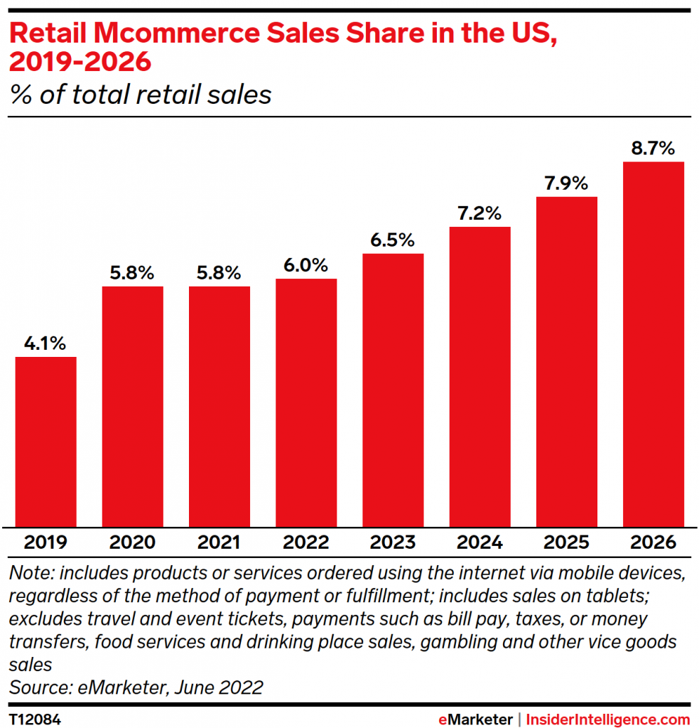
5. Optimize Mobile Checkout
With more and more customers shopping on their mobile devices, it’s crucial to optimize your checkout process for mobile users.
This includes having a mobile-responsive website, using mobile-friendly checkout forms, and ensuring that your website and checkout page load quickly on mobile devices.
For example, you could provide a one-page checkout process that includes all the necessary fields on a single screen.
Or you can test out other strategies such as:
- Creating a responsive design
- Using mobile-friendly input fields
- Using a mobile-friendly payment gateway
- Incorporating mobile-friendly buttons
- Providing visual cues
- Testing on different devices and browsers
[Source: Insiderintelligence.com]
6. Regularly Update The Checkout Area
Regularly updating your checkout process can help improve customer satisfaction and reduce cart abandonment rates.
This includes updating your checkout forms, adding new payment options, and optimizing your checkout page for speed and usability.
7. Create A Personalized Checkout For Returning Customers
Personalizing the checkout experience for returning customers can improve their satisfaction and increase their likelihood to make repeat purchases.
Ways to personalize checkout for returning customers include:
- Using customer information such as previous purchase data
- Offering personalized discounts or promotions and rewarding customers for loyalty
- Providing customer services such as a live chat support
8. Optimize Page Checkout Speed
Fast checkout page loading times are crucial for reducing cart abandonment rates.
In fact, 50% of Americans say they are less likely to make an online purchase if the checkout process takes 30 seconds or more.
Make sure to optimize your checkout page loading speed by compressing images and files, using a content delivery network (CDN), and minimizing the number of external scripts and plugins used.
9. Optimize Checkout For All Devices
Customers shop on a variety of devices, including desktops, laptops, tablets, and smartphones, as well as in different countries.
Make sure your checkout process is optimized for all devices and languages by testing it on different devices and screen sizes and making adjustments as necessary
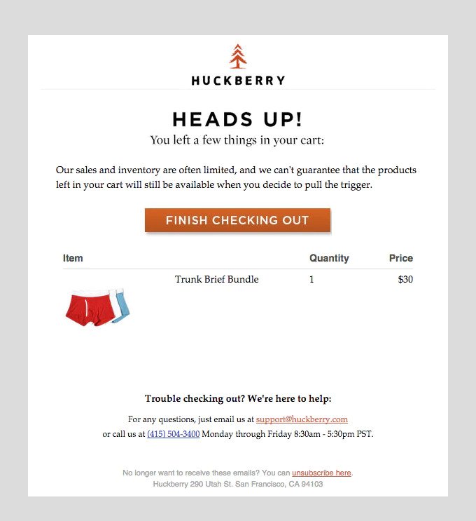
10. Send Abandoned Cart Follow Up Emails
Many customers may abandon their cart for various reasons, such as being distracted or changing their minds.
Sending follow-up emails to customers who abandon their cart can remind them of the products they were interested in and encourage them to complete their purchase.
Make sure to include a clear call-to-action in the email and offer incentives such as discounts or free shipping to encourage customers to return to their cart.
[Source: Shopify]
Benefits Of Optimizing Your Shopify Checkout Area
Optimizing your Shopify checkout process can have numerous benefits for your business, including:
- Increased Conversions and Sales: By providing a smooth and easy checkout process, you can reduce cart abandonment rates and increase the number of completed purchases.
- Reduced Costs and Increased Profitability: Optimizing your checkout process can help reduce costs associated with abandoned carts and increase profitability by increasing the number of successful purchases.
- Improved Customer Satisfaction and Loyalty: Providing a positive checkout experience can improve customer satisfaction and encourage repeat purchases, leading to increased customer loyalty.
Speak with our experts. Set Up A Consultation
Examples Of Optimized Shopify Checkout Processes
Some of the biggest brands utilize Shopify optimization and customization methods to streamline their checkout processes.
From single-page checkout and mobile-friendly checkout to progress indicators and multiple payment options, here is a handful of optimized Shopify checkout areas to take inspiration from.
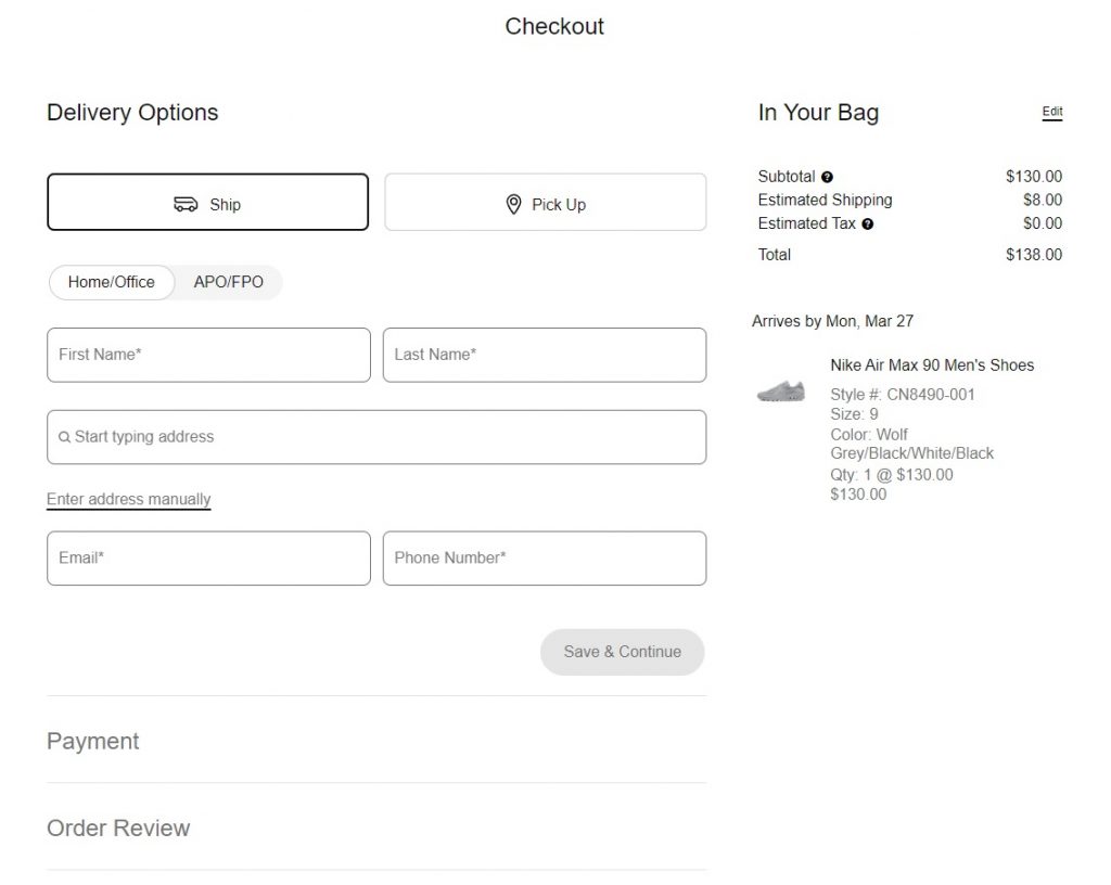
1. Nike
In general, Nike‘s Shopify checkout process involves the following steps:
- Cart Review
- Shipping Information
- Payment Information
- Order Confirmation
- Order Tracking
The simplicity of Nike’s checkout process and using a white background with black text also illustrates how a checkout process needs to be visually and contextually clean and concise.
[Source: Nike]
2. Taylor Stitch
Taylor Stitch is a clothing brand based in San Francisco, California, that specializes in creating high-quality, sustainably-made menswear.
Their checkout process has been praised due to its simplicity and added value.
But what makes their checkout area unique?
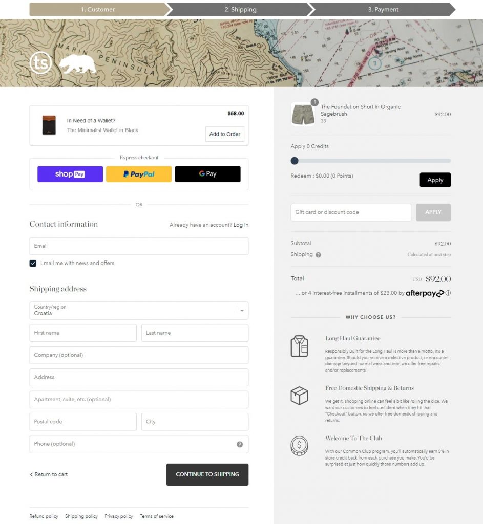
To start with, you can clearly see what steps you need to take to finish the checkout process by looking at the top of the example:
- Step 1: Customer Information
- Step 2: Shipping
- Step 3: Payment
Next, they utilize upselling opportunities by recommending related products to those in your basket. In the case above, a wallet has been suggested to sit in the pockets of the selected shorts. Below the price, there are two useful sections for sealing the deal.
The first section states that you’re able to pay in 4 installments, increasing affordability and accessibility to customers.
Additionally, the other section describes the brand’s values and benefits, which is important in building loyalty and trust with customers.
[Source: Taylor Stitch]
3. Muck Boot Company
Muck Boot is a company that specializes in manufacturing and selling outdoor footwear, specifically waterproof boots.
They offer a wide range of boots for various outdoor activities such as hunting, fishing, gardening, and industrial work.
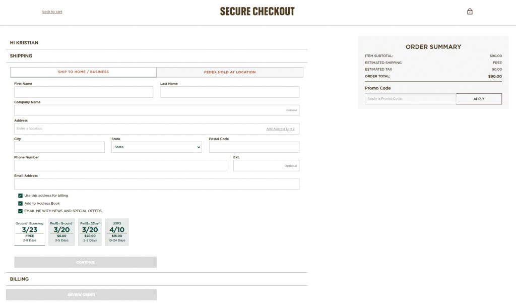
Their checkout process is an example of a one-page checkout flow which can be good for reducing cart abandonment and saving time.
One-page checkouts feature clear and concise instructions and labels, making it easier for customers to understand what information is required and where to enter it.
This can improve the overall customer experience and reduce the likelihood of errors or confusion during the checkout process.
[Source: Muck Boot]
Optimize Your Shopify Checkout Process With Digital Silk
As a full-service digital agency specializing in Shopify development and eCommerce development, we are experts in optimizing your Shopify checkout to deliver maximum sales and improved user experience.
We are focused on results, being transparent with you every step of the way and are able to take ownership and responsibility of the project.
In addition, we offer comprehensive Shopify maintenance services including software updates, security configuration, server hardening, and regular website maintenance.
Besides Shopify-related services, we also offer branding, web design, development and marketing services to provide a complete solution to all of our clients.
Contact our experts today to learn more about how we can achieve your Shopify checkout optimization targets.
"*" indicates required fields


