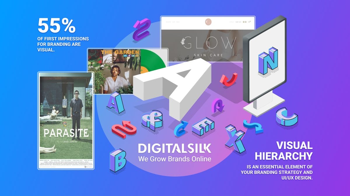
75% of a website’s credibility relies on its design and content presentation.
While the content on your site’s pages does matter, it’s the way you showcase it that captures people’s attention.
And you only have about 50 milliseconds to impress visitors.
Brands use colors to create recognition and convey their message online.
Neon colors, in particular, have the power to make the content stand out and captivate the audience.
Today, we’ll explore the 20 best neon color palettes you can use to create compelling and bold designs.
The Psychological Impact Of Neon Colors On Viewers
Colors affect our moods, feelings and behaviors.
In web design, they’re one of the most important tools you can use to capture people’s attention. In fact, almost 40% of users say that they focus on colors the most when exploring a website.
Neon colors, in particular, can have a strong impact on us.
With their vibrant and visually striking hues, neon colors can make any element stand out. This quality makes them particularly convenient for highlighting important features on a site, such as call-to-action buttons.
Most people perceive neon colors as energetic.
They have the power to make the audience feel excited and inspired, helping brands share their message effectively with their target audience.
But not all neon colors evoke the same feelings in people.
Neon green, for instance, is often associated with danger because it’s used in signage.
Other hues, such as neon yellow, green, purple, blue and pink are associated with the cyberpunk genre, psychedelic art and nightlife.
Choosing the right neon color combination for your project largely depends on your niche, the message you want to convey and the emotion you aim to evoke.
Intel, MSI, Stabilo, Miu Miu, Kramer, Badass Films, Zoox and Synchronized are just some of the brands that use neon colors to captivate their audience.
Find out below how you, too, can use neon colors to offer some true eye candy to your users.
The 20 Best Neon Color Combinations
Brighten up your designs with vibrant neon color combinations that are sure to make a statement — continue reading to see our best picks!
1. Neon Pink And Green (And More Soft Shades In Between)
The smooth transition from vibrant pink hues into bold neon green shades is attention-grabbing yet soft on the eye.
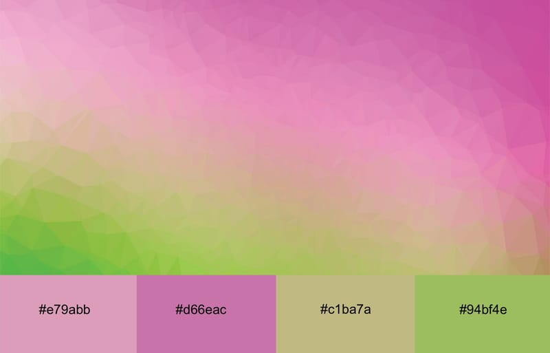
Neon pink and green are a youthful, modern, playful and energetic combination. When you blend these two colors and pair them with softer pink and green shades, you get a vibrant design that can make any type of content pop.
The neon pink and green gradient would look good as a backdrop or on specific elements, such as buttons. If you decide to use this neon palette combo for larger site elements or as a background, make sure that you contrast it with dark typography for good readability.
2. The Electrifying Neon Teal, Blue And Green Mix
The neon teal, blue, dark blue and green color palette is dynamic and visually striking.
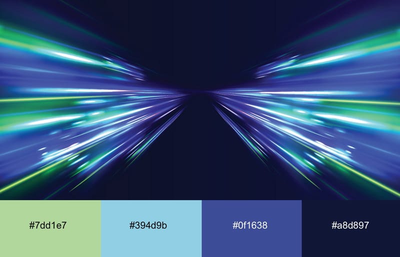
The deep, dark tones contrast with the vibrancy of the neon shades, creating an exciting, yet not overpowering color combination.
Because of its energetic and modern vibe, this palette is ideal for tech-related projects, gaming websites and app presentations.
3. The Passionate Neon Pink And Red Dance
The neon pink and red paired with subtle pink and lilac hues create a passionate and feminine color combination.
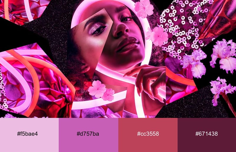
The addition of the soft colors provides a gentle contrast to the neon shades, while the dark background unites all the hues into a visually stunning, cohesive design.
The black backdrop also adds depth and a touch of elegance to the detail-rich design.
This color palette is ideal for fashion and beauty brands as well as for nightlife promos.
4. The Warm Neon Orange And Calm Purple Combo
Neon orange and touches of neon pink stand out boldly against the subdued purple backdrop.
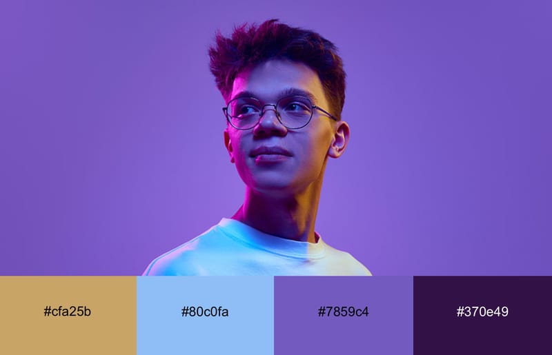
The serenity of purple balances out the energy of the neon colors, soothing the eyes.
The fresh neon yellow works great for color accents and highlights on specific elements, such as buttons, icons, or call-to-action elements. Calm purple can be used for larger sections to bring a sense of tranquility to a site.
Neon yellow and pink combined with purple are ideal for fashion campaigns, lifestyle and tech projects as well as music events.
5. The Attention-Grabbing Neon Yellow And Red Pairing
Neon yellow and red stand out strongly against each other. The high contrast between the two colors ensures that sections and elements with these colors immediately pop up.
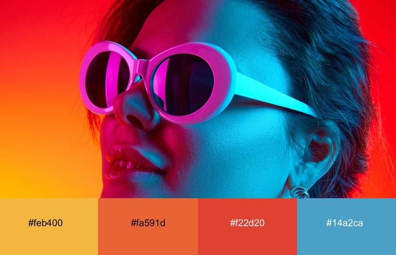
This color palette exudes boldness.
Neon yellow, orange and pink bring a sense of optimism, while neon red adds a touch of passion to the design.
A splash of darker colors is a must to juxtapose the energy of the neon hues.
These colors are ideal for branding and advertising materials, as well as for event posters and fashion and lifestyle brands.
6. The Neon Pink, Lilac, Teal And Mint Rapsody
The combination of neon pink, lilac, teal and mint is fun and visually captivating.
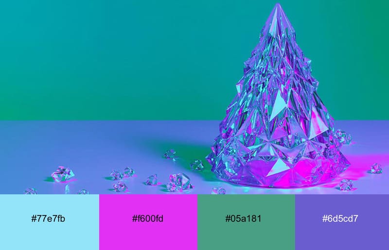
Mint and gentle lilac add depth to the bright, saturated neon colors.
The result is a playful and eccentric combination that’s perfect for music-related promo materials, out-of-the-box branding materials, as well as for bold photography projects.
7. The Tropical Neon Cyan, Pink And Black Pairing
The dark backdrop enhances the brightness and vividness of the neon cyan, pink, and blue colors, resulting in a high-contrast, eye-catching design.
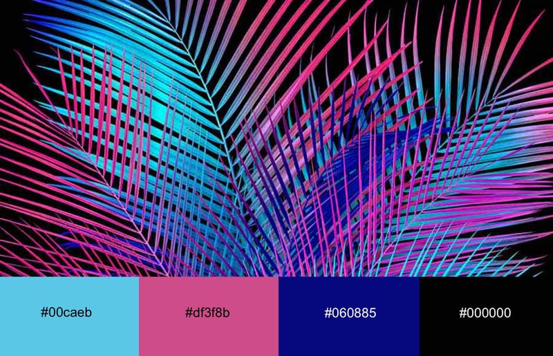
The electric neon cyan and pink appear even more intense against the darkness in the background and the splashes of tame blue and purple.
Gradients are a great choice for this neon color palette because smooth transitions between neon cyan, pink, and blue look dynamic and cohesive.
The dark backdrop combined with neon colors creates an edgy and bold aesthetic, which is ideal for daring and innovative designs within the music and fashion industries and for brands wanting to create cutting-edge designs.
8. The Neon Cyan, Purple And Pink Party
Neon cyan and pink are highly saturated colors that instantly grab the viewer’s attention.
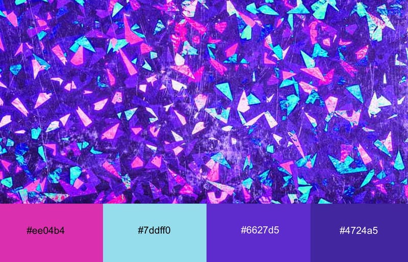
The addition of deep purple adds a refreshing contrast to the playful neon pink and cyan pairing, toning down its liveliness and making it easy on the eye.
This palette is perfect for creative industries, on websites and merchandise, as well as for eCommerce businesses, for product packaging and merchandise. The combo of neon cyan, pink and deep purple will draw users in and encourage further engagement.
9. The Punchy Neon Magenta, Lime, Yellow And Cyan Dance
The neon shades of magenta, lime, yellow, and cyan create an electrifying combination that exudes energy, fun and creativity.
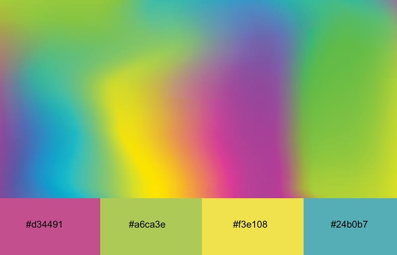
Each color in this neon color palette contrasts sharply with the other, making any design pop.
This fiery combo can be used for all kinds of promo materials and contemporary designs that need to inspire and engage the audience.
10. The Futuristic Orange And Magenta Neon Combo
The combination of neon orange and purple gives off a cyberpunk vibe.
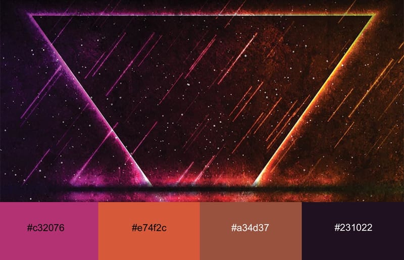
The sharp contrast between burnt neon orange and cool neon magenta against a dark backdrop is ideal for the entertainment industry, including music festivals and nightlife promotions, as well as for innovative tech companies aiming to make a strong visual impact.
11. The Calming Orange And Teal Neon Mix
The glowing orange and the refreshing teal are among the most beautiful neon color combos.
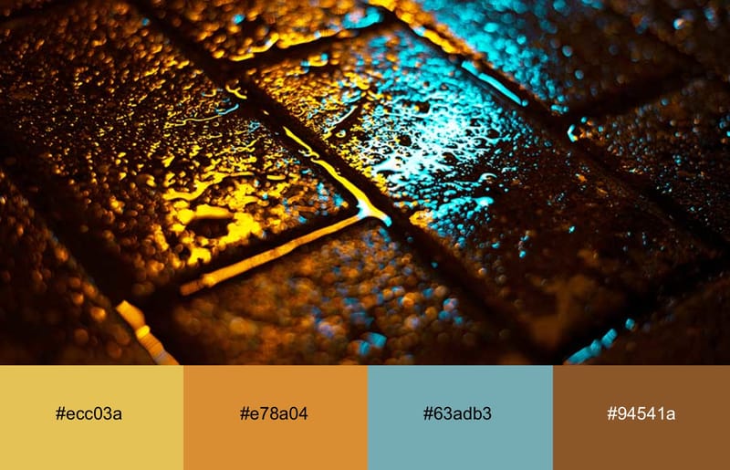
Despite their neon qualities, the two colors look tranquil, especially in combination with darker hues, such as dark brown and black.
This palette works well for nightlife promos, entertainment and hospitality industries.
12. The Soothing Neon Orange And Dark Blue Pairing
Neon orange, dark blue and black are another soothing color palette on our list.
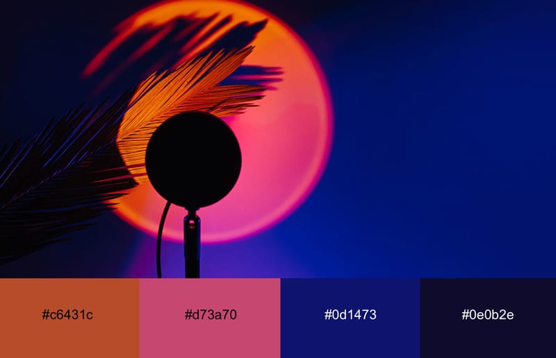
This color blend feels enthusiastic and warm, yet mysterious, all at the same time.
It’s ideal for branding and advertising, event promos and music and movie industries.
13. The Mysterious Neon Red And Blue
The neon red and dark blue color combination unites the intense vibrancy of neon red with the deep, calming sophistication of neon blue.
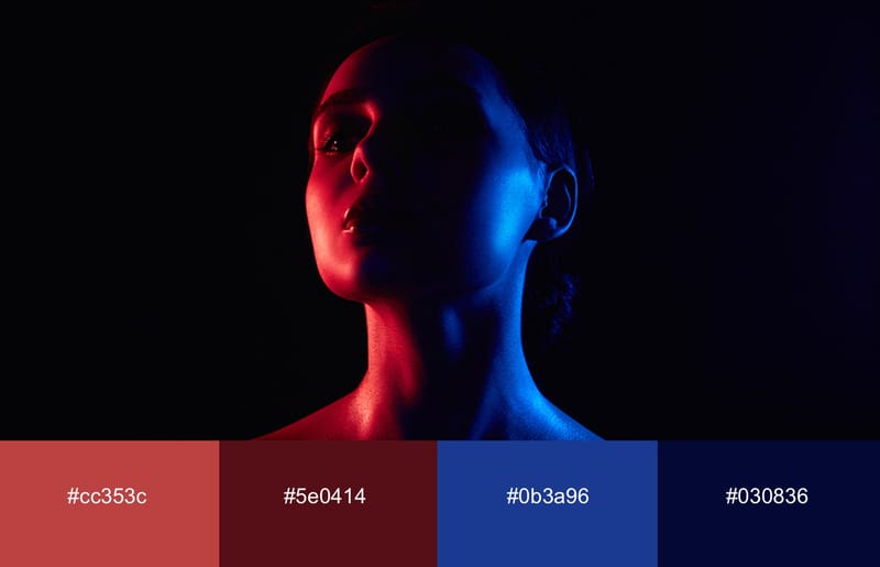
The bold neon red contrasts the dark blue, while the deep, neutral black background grounds the vibrancy of the two neon shades.
The result is a mysterious and sophisticated color blend suited for sports brands and tech companies.
14. The Neon Magenta And Blue Gradient
The subtle gradient transition from deep blue shades to neon magenta is playful and exciting.
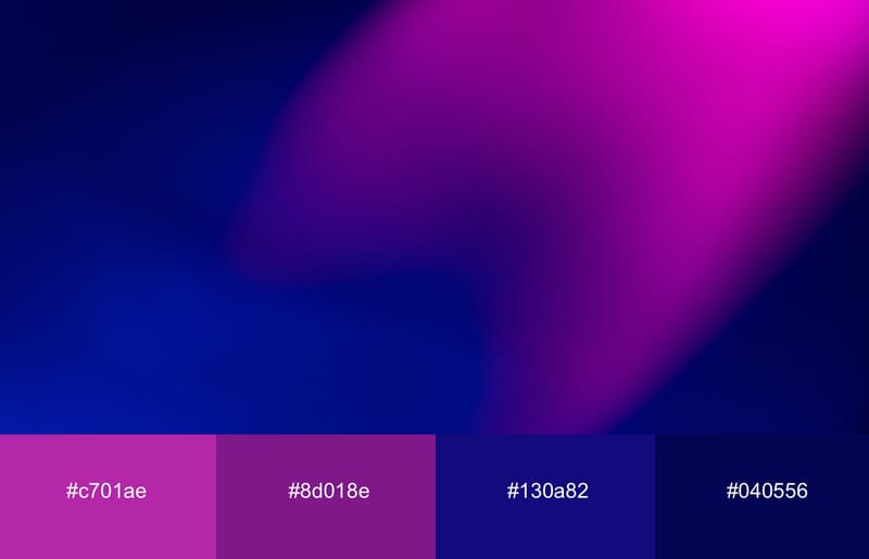
The two shades seamlessly mingle together, creating a combo that’s eye-catching but that also doesn’t overwhelm the audience.
This palette is versatile and suits content for both young and more mature audiences. It works well for many industries, including tech, entertainment and fashion. This combo would also look great on the packaging!
15. The Futuristic Neon Purple, Blue And Pink Color Palette
When you mix neon blue in various shades with purple and soft pink, the result is a futuristic-looking neon color palette.
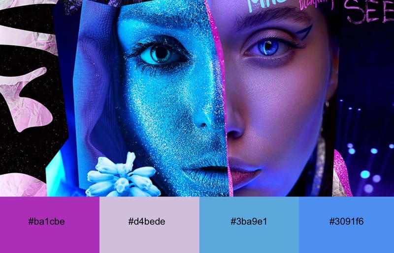
The soft pink details soften the mysterious blue and purple shades, while a dark backdrop unites all the elements and bright colors into a cohesive, eye-pleasing whole.
This palette is for tech companies, fashion brands, events for a younger audience, as well as for advertising agencies.
16. The Creamy Peach With Neon Yellow And Purple Shades
This color combo unites the warmth and softness of peach with the vibrant energy of neon yellow and purple hues.
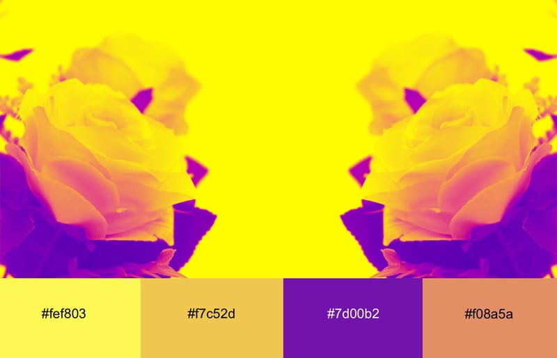
The purple neon shade boldly contrasts the warmth and energy of the peachy and yellow tones.
This palette feels vibrant and modern, making it ideal for cutting-edge digital and web design, branding, fashion and promotional materials.
17. The Refreshing Neon Pink And Teal Mix
The combination of neon pink and teal screams summer.
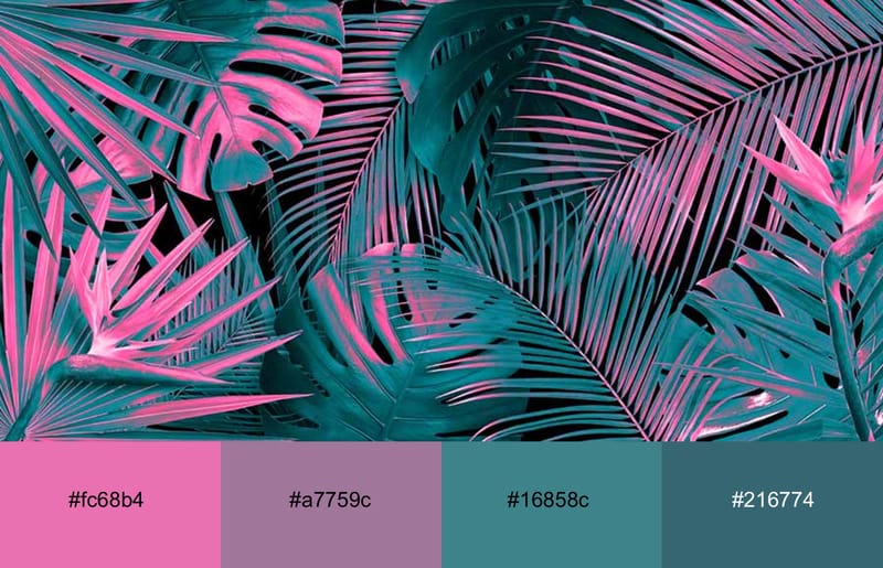
The calmness of the teal hue stabilizes the electrifying energy of the neon pink, while the black backdrop ensures that neither of the two brighter colors overwhelms the audience.
This color palette is suitable for a range of design applications, from digital and web design to branding, fashion and marketing materials.
18. The Energetic Neon Pink, Yellow And Orange Blend
Warm, fun, optimistic — the three words that best describe the neon pink, yellow and orange color palette.
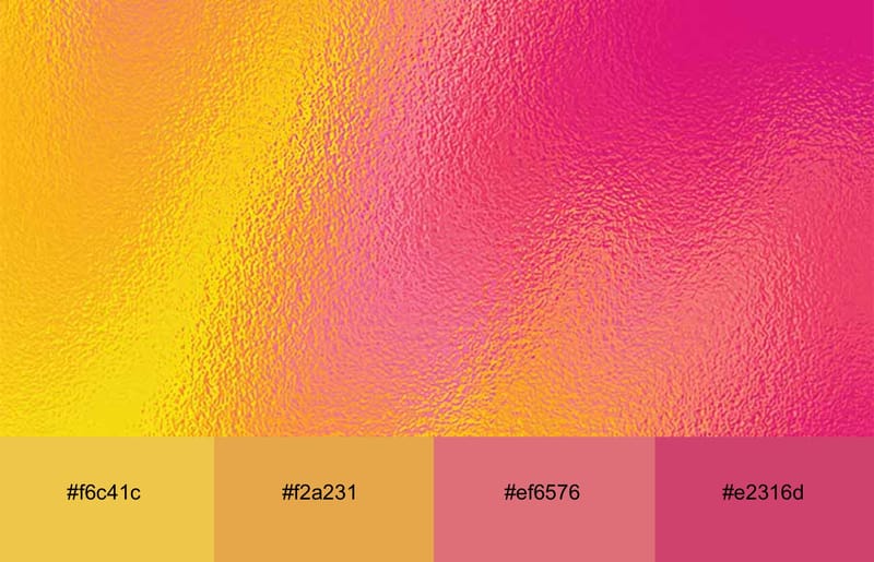
This blend of bright colors exudes love, softness and excitement. It works well as a background, but also as an accent color on CTAs.
The playful mix of neon yellow, orange and pink works particularly well for the fashion, lifestyle and beauty industries, especially those targeting a younger demographic. It is bound to make any promo material pop, but it would also look stunning on the packaging.
19. The Neon Yellow, Orange, Pink And Purple Party
Much like the previous palette on the list, the combo of neon yellow, orange, pink and purple looks enthusiastic and energetic.
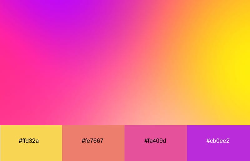
These colors harmonize beautifully, blending the warmth of yellow and orange with the energy of neon pink and the richness of purple. The result is a bold yet balanced neon palette that makes any design attention-grabbing.
This combo looks great as a trendy background, on logos, but also on packaging. These neon shades would work best for the fashion and entertainment industries, as well as the marketing and advertising niche.
20. Neon Cyan And Yellow With The Soft Lilac Touch
Three words best describe the combination of neon cyan and yellow with soft lilac — energy meets calmness.
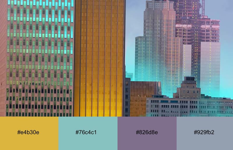
The neon shades juxtapose the tranquility of the pastel lilac hue, creating a dynamic yet balanced look.
This palette is suitable for a variety of businesses, including tech, fitness, fashion and even corporate businesses.
How To Use Neon Colors Effectively
Neon colors can enhance your designs, but you must use them carefully to avoid overwhelming the viewer.
Balancing neon colors with neutral shades is always a good idea.
For example, you can use neutral colors, like black, white, grey and beige as a backdrop for wilder neon shades.
This combination will help you achieve a striking high-contrast effect and make the neon elements on a site appear even more vivid while ensuring good readability.
Note that neon hues don’t work for every target audience.
They work best for projects targeting a younger demographic, such as music events, promotions, fashion brands, as well as websites for nightclubs, tech brands, fitness and sports businesses and creative agencies.
Common Mistakes To Avoid With Neon Colors
Neon colors are impactful, but using them smartly on a website can be challenging.
Some neon color combos work well as backgrounds, but most neon mixes work best as accents or highlights on elements such as call-to-action buttons, headlines, or hover effects.
Another thing to keep in mind is the fact that neon colors can jeopardize readability.
That’s why you have to ensure that there’s a high contrast between neon elements and the rest of the content. For instance, you can use neon colors on dark backgrounds or vice versa to enhance readability.
Neon colors aren’t for everyone, especially not the corporate crowd. A neon color palette best suits a younger audience.
We’d also advise you to test your designs on various screens and sizes to ensure your site always looks good, regardless of the device it’s viewed on.
Also, don’t forget to ensure you use color combinations that colorblind users can distinguish.
Last but least, ensure that the neon colors you choose fit your brand identity and the message you wish to convey.
Find The Best Neon Color Combination For Your Website With Digital Silk
At Digital Silk, we understand that selecting the right color scheme for your website can be challenging.
As a professional web design company, we offer custom web design creation, custom web development, branding services, eCommerce development, and much more for clients across industries.
Our in-house team of experts conducts extensive competitor, market and industry research to ensure that the chosen color palette best represents your brand and aligns with your image, target audience and industry trends.
Whether you prefer a vibrant neon palette or a more subdued combination, our web design specialists will craft a visual masterpiece tailored to the preferences of your target demographic.
Request a quote today and let Digital Silk’s experts craft the perfect color combination to make your website stand out.
"*" indicates required fields
