Fonts are much more than a means of written communication.
In fact, typography is an essential part of graphic and website design.
Choosing the right font gives a project its unique character and personality.
Throughout history, some typefaces became more popular than others, while others earned a bad reputation for certain reasons.
In this article, we’ll analyze the 15 most hated fonts of all time and examine the reasons behind their unpopularity.
Let’s dive in.
The Role Of Fonts In Web And Graphic Design
Typography strongly affects the way people perceive your brand.
It can also evoke specific emotions in people and incite them to further engage with your content.
This is especially important in web design, as visitors typically read only about 20% of the text on a site. To keep them engaged, your content must be readable, well-structured, and concise.
Good fonts are easy to read on all devices. They also allow you to experiment with different weights and font styles, helping you create a visually appealing content hierarchy.
In graphic design, choosing the right font is crucial for creating and maintaining a strong brand identity. The specific font used can convey your brand’s personality and help it stand out, reinforcing the overall aesthetic and message you want to communicate to your audience.
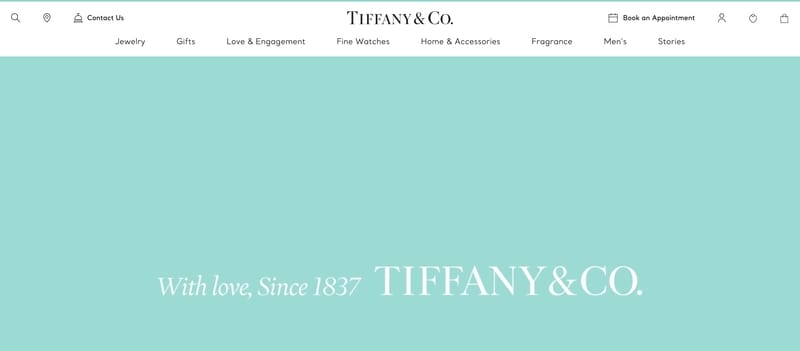
Take Tiffany & Co. as an example.
When you think about the company, the famous logo surely comes to mind.
They’re using a custom typeface called Tiffany Sterling in both the logo and as the primary font to reflect the luxury of their products:
If you consistently use a specific font on your site and packaging, people will associate it with your brand.
What Makes A Font Bad?
Although no font is bad per se, it’s what you do with it that can make typography look bad.
A “bad” font is one that is in discrepancy with the nature of your business and doesn’t match its purpose, so much so that it sends mixed signals to potential clients.
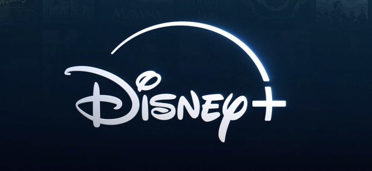
Can you imagine the Chase Bank logo written in a playful font like the one on Disney’s logo?

A “bad” font is also the one that’s hard to read.
If typography is too complex and ornamental, it strains your audience’s eyes, which is a luxury you can’t afford.
According to Contentsquare’s Digital Marketing report, the average time on site is 54 seconds across all industries.
That doesn’t leave you too much time to capture visitors’ attention and encourage them to stay on your site. So, overly complex fonts with poor kerning, i.e., space between characters would be a bad choice.
Another reason why a font might be considered bad is that it’s overused, so your designs could appear unoriginal and uninspired.
A font is also bad if it’s not accessible for people with visual impairments, such as those with overly intricate designs or with insufficient contrast.
The 15 Most Disliked Fonts
Now, let’s delve into the 15 most universally disliked fonts and uncover the reasons behind their widespread disdain.
1. Comic Sans
Comic Sans MS, a.k.a., Comic Sans, is, arguably, the least liked font of them all.
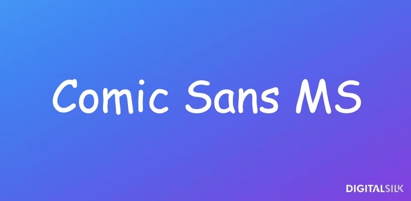
This sans-serif typeface was designed by Vincent Connare in the early 1990s. He was asked to create a typeface for Microsoft Bob —Microsoft’s new user-friendly interface created to appeal to a young audience.
Microsoft Bob featured an assistant dog named Rover, who was there to help users navigate the program. Rover had speech bubbles appear above his head, and the text was initially written using Times New Roman. Connare did’nt like that.
Inspired by Watchmen and Batman comics, he created a fun typeface that he modeled after the typography in comic books.
Comic Sans wasn’t used in Rover’s speech bubbles, but it was, in fact, included with Windows 95.
From there, the font found its way into pretty much everything, including school papers, video games, commercials, advertisements and restaurant menus.
Comic Sans was overused and, more importantly, misused, and people, sadly, got tired of seeing it everywhere.
A playful font doesn’t fit a company that offers, for instance, funeral services:
But the thing is, Comic Sans is a highly legible font and it’s recommended for use in schools. Even the British Dyslexia Association recommend it because the letters look less crowded.
Alas, it seems that the universal hatred for the font is here to stay, earning Comic Sans a spot on our list.
2. Papyrus
The Papyrus typeface was created in 1982 by Chris Costello, an American designer.
Costello was reading the Bible at the time, and he got the idea to design a font the way he imagined typefaces looked like in the biblical Middle East.
The result of his work is Papyrus.
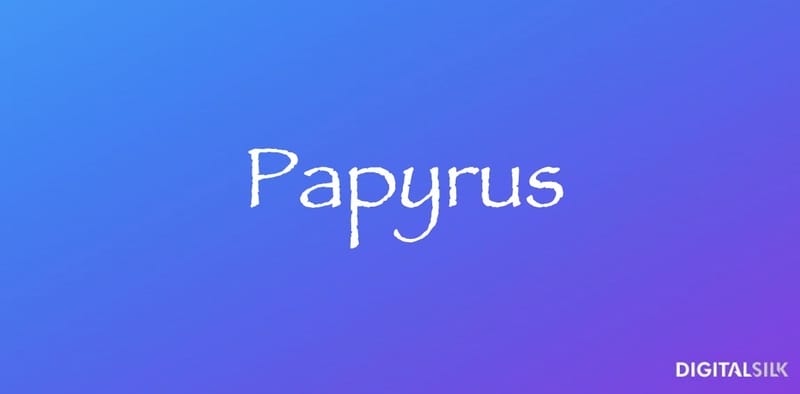
The biggest problem with Papyrus is similar to that of Comic Sans — this font is also misused and, well, overused.
The font was bundled in Microsoft, and it exploded in the 1990s.
But despite its initial popularity, the font is now widely unpopular.
So much so, that they made a sketch about it on Saturday Night Live starring Ryan Gosling:
Twice:
As Gosling points out, using Papyrus even in subtitles is a tad too much.
This isn’t a subtle font and seeing it overused in various, modern-day contexts can be tiring for the audience.
3. Arial
The Arial typeface was created in 1982 by Patricia Saunders and Robin Nicholas.

It used to be Microsoft’s default typeface, but that changed in 2007 when it was replaced with Calibri.
Arial has a clean and simple design, so why don’t people like it?
Well, the fact that the font has no flavor seems to be a problem.
Generic and omnipresent fonts aren’t unique, so they can’t catch people’s attention.
Also, one of the things that many seem to mind about the Arial typeface is its similarity to Helvetica.
After all, Arial was created to be metrically compatible with Helvetica to avoid license fees, which adds to Arial’s negative perception.
Singer Charlie XCX used Arial on the cover of her latest album.
She described the brat album as confrontational and the choice of the Arial font for the cover seems to complement the album’s nature.
4. Times New Roman
In 1931, the British newspaper The Times commissioned typographer Stanley Morison and graphic artist Victor Lardent to create a new typeface to replace their old one.
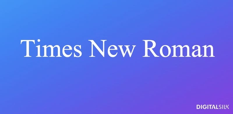
They created a recognizable serif typeface that spread beyond The Times and became a standard for books.
Times New Roman has a traditional design and as such can look outdated compared to contemporary typefaces.
Since this font is predominantly used in academic papers, legal docs and some books, some often associate it with dry content and view it as a vanilla font.
5. Brush Script
As its name suggests, the Brush Script typography looks as if it were written with a brush.
In 1942, Robert E. Smith designed this font with the desire to mimic the look of handwritten letters.
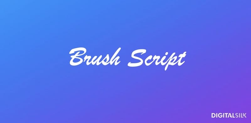
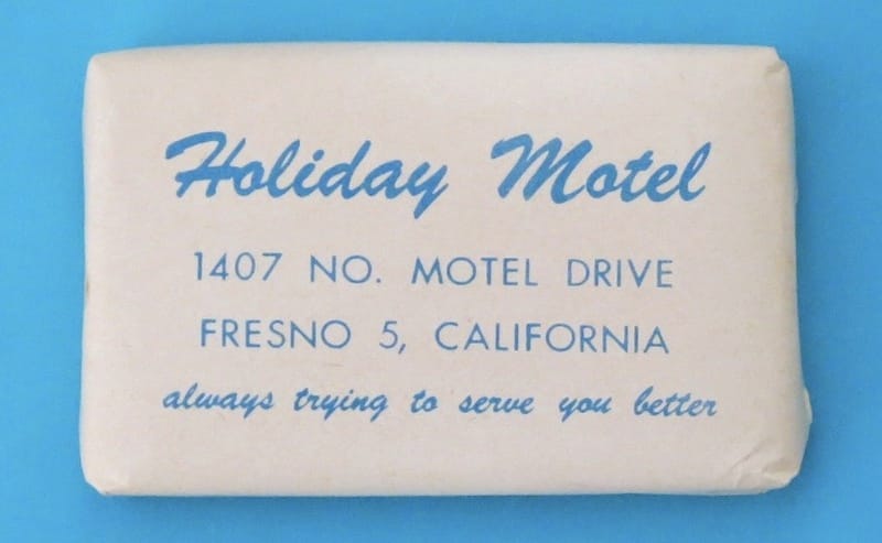
The Brush Script font has a retro feel, and so it has been used a lot in vintage designs.
That’s why it can look unoriginal and seem like a lazy choice whenever you need to create something with a nostalgic charm.
Due to its hand-written character, Brush Script can be hard to read, especially when used in larger chunks of text.
6. Helvetica
Helvetica was created in 1957 by a Swiss typeface designer Max Miedinger.
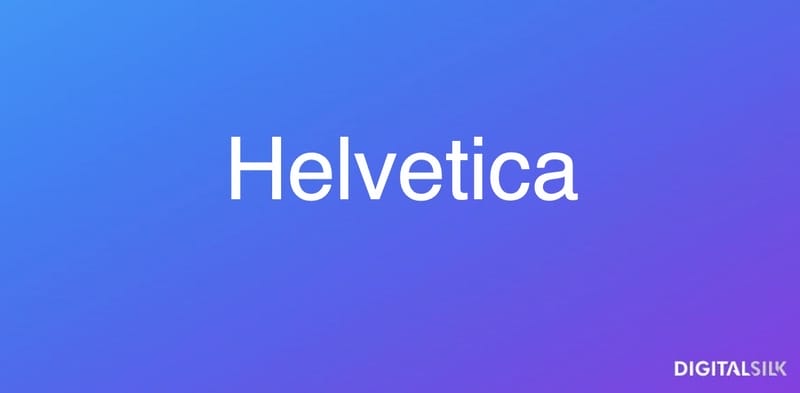
The font reflects the principles of Swiss design, including simplicity and clarity.
Because of these qualities, Helvetica became one of the most used fonts in the world, especially by corporations.
However, it’s also these characteristics that make the font look sterile and generic.
Certain characters in Helvetica, such as the lowercase “l” and the uppercase “I” can look similar (we used Helvetica for both letters here), leading to potential readability issues.
Helvetica’s relatively tight letter spacing can also make reading a challenge, especially at smaller sizes:

7. Mistral
In 1953, Roger Excoffon, a French graphic designer, designed a script typeface — Mistral.

Mistral was created to infuse designs with a warmer, handwritten touch.
It mimics the natural flow of handwriting, with connected letters and an informal look.
Like many other fonts on our list, Mistral is available to everyone, non-designers included, hence its inappropriate use.
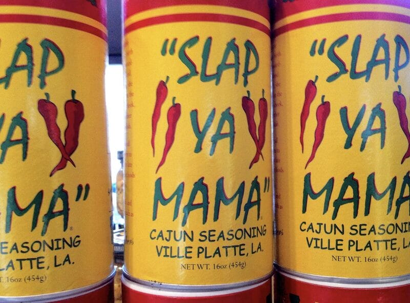
The biggest problem with this font is the effect it has on the audience when used in all-caps.
Instead of the usual elegant appeal, Mistral in all-caps appears shouty and almost amateurish, especially when combined with an equally disliked font such as Comic Sans:
8. Trajan
The Trajan font was created by Carol Twombly in 1989 for Adobe.
The inspiration behind it are the letterforms of the inscription at the base of Trajan’s Column in Rome, dating back to around 113 AD.

Despite its elegant design, some people dislike the Trajan font because it can be seen on many movie posters, particularly for epic, historical, or drama films.
Titanic, Game of Thrones, Star Wars Episode II: Attack of Clones and A Beautiful Mind are among the movies using the Trajan font on posters.
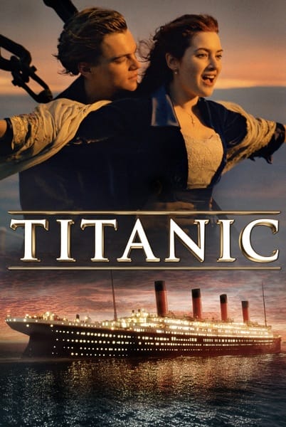
This overuse, however, leads to fatigue and a sense that the font is cliché.
Moreover, as an all-caps typeface, Trajan isn’t versatile.
It’s not suitable for body text and content that requires both uppercase and lowercase letters.
9. Courier New
The Courier New font is a revision of the original Courier font, and it was created in 1992 by Adrian Frutiger for IBM and their typewriters.

Like its predecessor, Courier New is a monospaced font.
This means that all characters align vertically and horizontally.
Because of its typewriter-like nature, Courier New is useful for coding, screenplays and certain types of technical writing.
However, the monospaced nature of this font means that each character takes up the same amount of space, which can make large blocks of text hard to read.
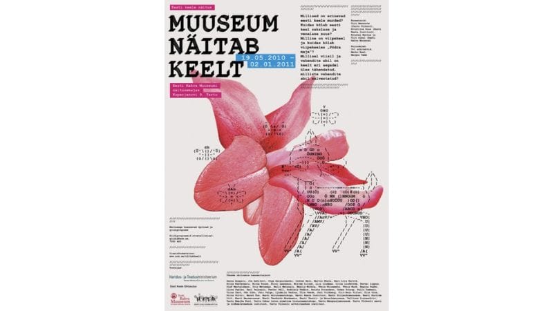
Also, the typewriter-like design of Courier New limits its versatility, making it less suitable for different types of design projects.
10. Gill Sans
Gill Sans font was created in 1928 by British designer Eric Gill.
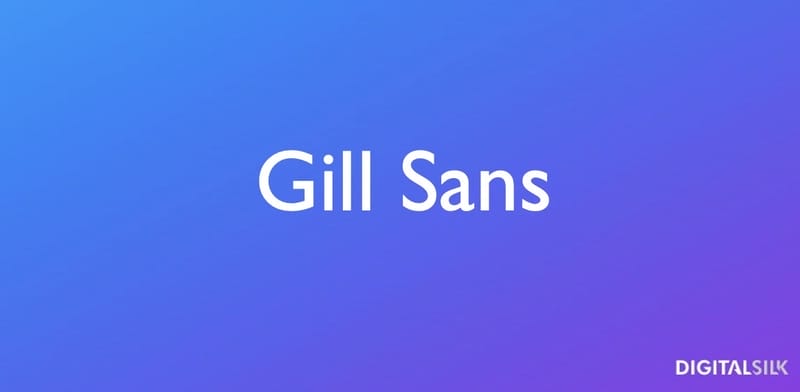
This sans-serif font was among the most popular typefaces in Britain at the time and its popularity slowly spread worldwide.
Gill Sans has clean lines and a classical feel to it.
The standard version of Gill Sans has been heavily used in branding and publications, which led to its overexposure.
Some even describe it as the Helvetica of Britain.

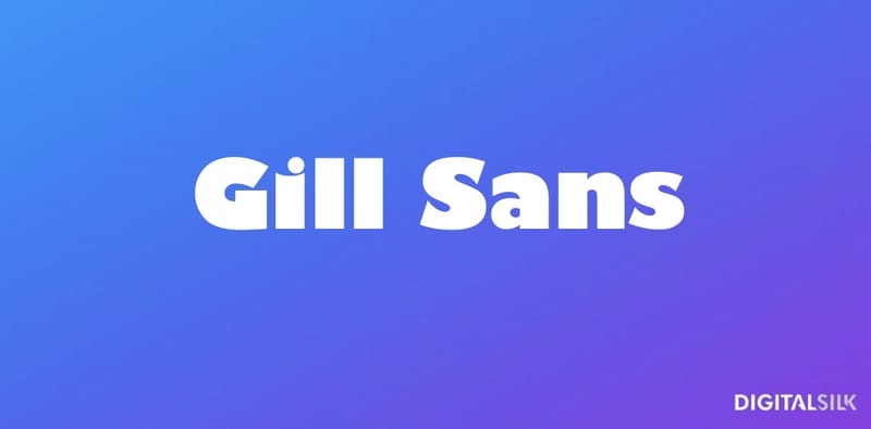
Also, the ultra bold version of the font is too hard to read, even in headlines, let alone in body text.
11. Franklin Gothic
Franklin Gothic font was created in 1902 by American typeface designer Morris Fuller Benton.
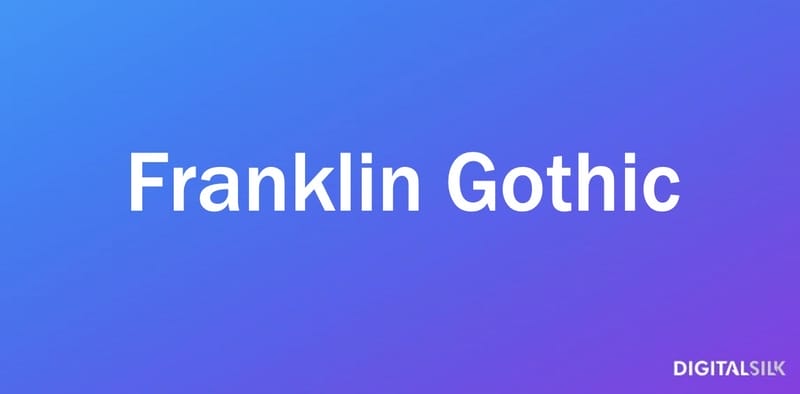
It gained popularity in the early 20th century and became a standard for American printing and advertising.
The font continues to be widely used in print and digital media even today, especially in headlines and logos.
But when too many brands use the same font, their logos can seem generic and uninspired.

12. Bradley Hand
As a font created at the dawn of the 20th century, Franklin Gothic can feel outdated for modern-day, cutting-edge content.
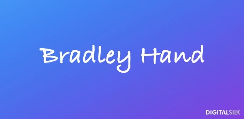
Due to its friendly vibe and informal appearance, Bradley Hand isn’t a particularly versatile font.
It fits best projects with a personal touch, such as invitations, greeting cards and scrapbooks.
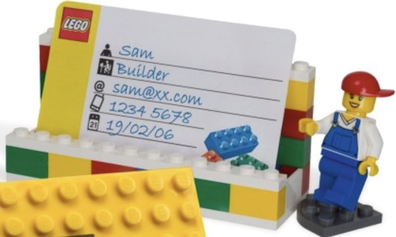
For many people, Bradley Hand is the Comic Sans of handwritten typefaces — you can see it in almost every informal context.
13. Curlz MT
Curlz MT was designed by Steve Matteson and Carl Crossgrove in 1995.
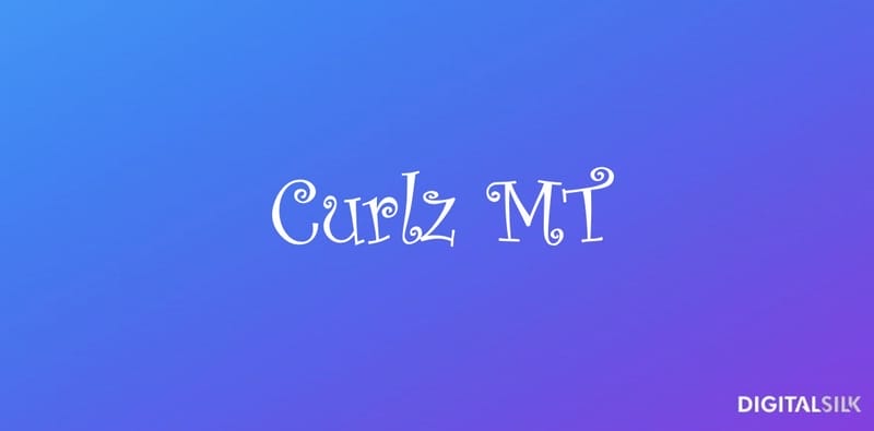
This typeface is characterized by curly letterforms that have a playful appearance, making Curlz MT popular for children’s materials, party invites, etc.
Although it can look cute and charming in some scenarios, Curlz MT isn’t appropriate for serious designs.
Many creatives dislike the curliness of the characters, feeling that they take away the sophistication from the letters.
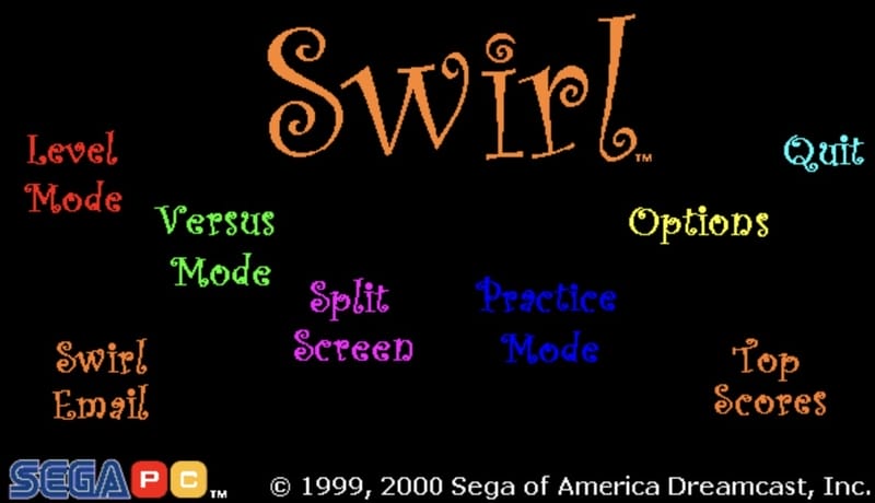
Curlz MT has become a cliché for girly and silly content, which is why it’s so strongly disliked.
14. Hobo
Hobo font was created in 1910 by Morris Fuller Benton.

This typeface is easily recognizable because of the curvy letters.
The lack of straight lines gives it a somewhat retro look.
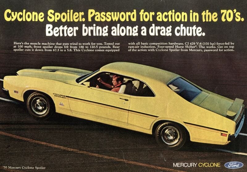
Although Hobo isn’t used as much as other typefaces on the list (you will see it on many flyers and posters, though), its outdated design that contrasts the contemporary clean and minimalist design trends is what makes a lot of designers steer clear from it.
15. Impact
Impact font was created in 1965 by Geoffrey Lee.

This sans-serif type is recognizable for its thick lines and compressed letters.
As such, Impact is ideal for headlines, signs and logos.
Over the years, though, this typeface became heavily used in memes.
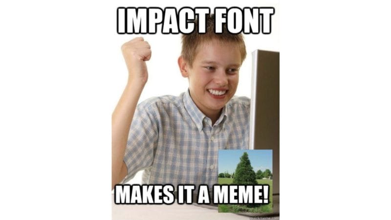
In fact, most people now associate it with the meme culture, which is why they avoid using it in professional and serious scenarios.
Find The Right Font For Your Brand With Digital Silk
Choosing the right font for your brand is more than a mere design choice — it’s a decision that affects the way your audience perceives your business.
At Digital Silk, we understand the nuances of typography and its role in creating a powerful brand identity.
The wrong font can send mixed messages, create confusion, or even turn potential customers away.
Our team of experienced designers and brand strategists will help you find the perfect font that aligns with your brand’s values, tone and target audience.
We also offer custom logo design services as well as logo redesign for those looking to freshen up their brand.
Digital Silk is a professional web design agency, and we offer a variety of services that will help you increase your brand’s online presence.
From custom web design and web development, branding services, and eCommerce development, to digital marketing and content creation, we have all you need to elevate your brand and make a strong impact in your niche.
Explore our case studies and see how we help our clients turn their business vision into reality.
Key Takeaways On The World’s Most Hated Fonts
The biggest problem with the majority of fonts featured on our list is their overuse.
Aside from being used excessively, many typefaces have been improperly applied across various contexts, making them look clichéd and unoriginal.
Certain fonts are disliked for their design qualities, like Curlz MT for instance.
Fonts can also be disliked if they are difficult to read, such as Brush Script and Mistral.
Legibility is crucial in design, and fonts that compromise readability can frustrate users.
"*" indicates required fields
