Interaction is crucial in creating a captive audience.
Just ask Robert Sabuda, the author of the best-selling Alice’s Adventures in Wonderland, an “imaginative, intricately detailed, and perfectly executed” pop-up adaptation.
Sabuda’s three-dimensional images require the turn of a page to become active.
This action pulls the reader down the rabbit hole and into the story of Alice in Wonderland.
Once a part of the story, they are hooked.
By using micro-interactions, your website can achieve the same effect.
But how?
Let’s glance through the looking-glass at the world of micro-interactions in web design, including examples, best practices and benefits, to find out.
What Are Micro-Interactions In Web Design?
Micro-interactions are interactive web design elements that respond to visitor or system actions with animations or other visual or audio cues.
They differ from micro-animations as they’re triggered by the visitor’s action, instead of occurring on their own throughout the user interface (UI). This direct interaction brings another level to the overall user experience (UX) of a website.
Micro-interactions have four parts:
- Trigger: The action that initiates a micro-interaction
- Rules: The instructions that guide a micro-interaction
- Feedback: The visual or audio cues that show a micro-interaction has been triggered
- Loops and modes: The duration, state or repeat of a micro-interaction
Micro-Interaction Examples To Inspire
What do these types of interactions look like in the flesh? Here are five high-end examples to see for yourself:
1. Stone Cycling
Stone Cycling is a provider of sustainable construction materials.
They provide consistent feedback through micro-interactions when visitors fill in their contact form.
By adding simple animations and guiding interactions, Stone Cycling limit abandoned contact forms as a result of confusing questions or unanswered queries.
2. Porsche Evolution
Porsche is a high-performance car manufacturer from Germany.
Their Porsche Evolution microsite takes visitors through the company’s famous history with scrolling effects and engaging interactions.
The site is centered around the visitor’s single vertical scrolling action, which signals a change in both imagery and background music.
3. Nexgen
Nexgen is a boutique private aviation company.
Their button-based micro-interactions add an extra attraction to their calls-to-action by turning the button white and animating an airplane take-off when hovered on.
Not just a small detail designed to engage visitors, the airplane animation also strengthens Nexgen’s brand identity and service offering throughout the conversion funnel.
4. Figma
Figma is a cloud-based design tool.
Their loading page is triggered when a design sheet is opened, and the colorful, spinning micro-interaction and progress help users wait for large files to load.
By combining this with a gradual reveal of the sheet’s contents, Figma increases user satisfaction and willingness to wait until the page is fully loaded before bouncing.
5. Google Assistant
Google is a brand that needs no introduction, and an innovator in UX.
While not one of their latest features, Google Assistant is a prime example of useful micro-interactions.
The floating dots, which represent Google’s brand colors, are a visual cue that responds to voice commands in a way that shows they are attentive and listening. This feature helps to avoid miscommunications, offering interactive and animated feedback to vastly improve UX.
What Are The Benefits Of Micro-Interactions In Web Design?
From direct user impacts, such as usability and satisfaction, to long-term effects, like developing insights and brand identity, web design micro-interactions can bring several key benefits for your business.
1. Improve Usability
Exciting and fun animations bring a website to life, but its usability will drive results for your brand.
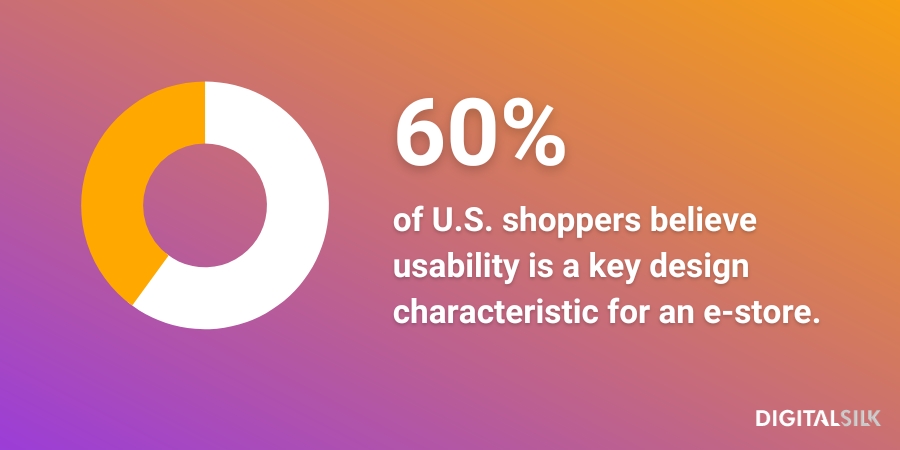
60% of shoppers in the United States believe usability is a key design characteristic for an online shop.
Whatever your business goals, adding functional interactions can help visitors get what they need from your website.
2. Boost User Satisfaction
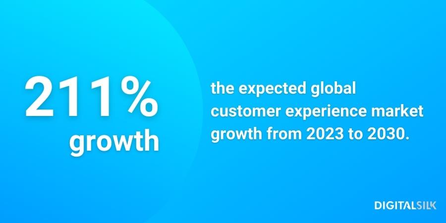
The global customer experience market is expected to boom from $16.9 billion in 2023 to $52.5 billion in 2030, a spike of 211%.
Clearly, companies are placing increasing value on meeting customer and user satisfaction.
In placing micro-interactions throughout your custom website design, you can provide useful feedback, guide user journeys and highlight important information to meet user intentions as quickly as possible.
The result?
Satisfied visitors with met expectations.
3. Increase User Engagement
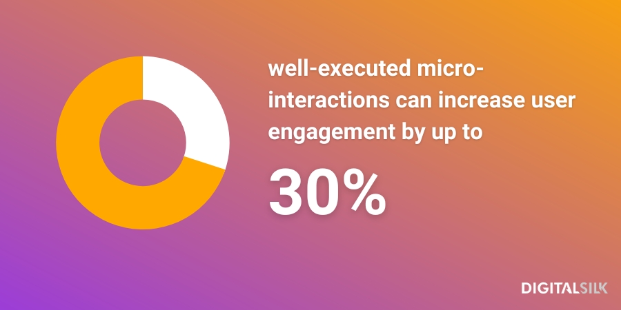
One study by UXPin found well-executed micro-interactions can increase user engagement by up to 30%.
This is a direct result of the added interactivity and responsiveness that these types of interactions provide a website.
Placing these elements throughout your website will foster a sense of connection between your site and your visitors, leading to longer sessions and an intuitive, enjoyable experience.
4. Build User Insights
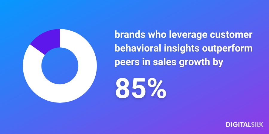
Research tells us that organizations who leverage customer behavioral insights outperform peers by 85% in sales growth.
By strategically adding and recording where micro-interactions are placed across your website, you can gather insights into which interactions perform well and those that are ignored.
But how to do this?
Tools like Hotjar allow you to track your site’s heatmaps and visitor behavior.
By mapping these results against the positions and types of interactions, you can better understand which animations your visitors respond well to, and which have an adverse effect on metrics like time-on-page and engagement.
5. Develop Brand Identity
According to Stanford University, 75% of consumers will judge a brand’s credibility on their web design alone.
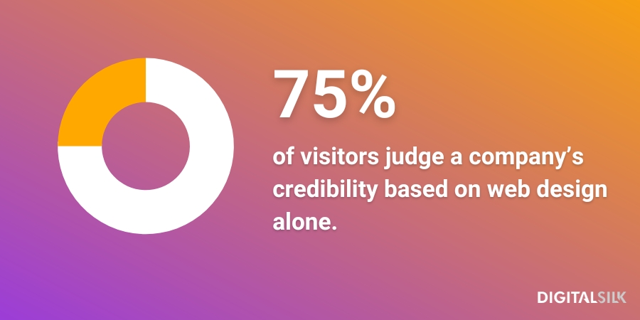
So, your website is a deciding factor in the way your brand identity is perceived by the public.
Micro-interactions help to portray your personality through engaging elements on screen.
Whether creative visuals or functional features, creating an experience that matches your business’ mission and values is essential in building credibility and strengthening your identity.
When To Use Micro-Interactions On Your Website
Using micro-interactions across your website can transform it into a superior digital experience.
Here’s a selection of the when best to use them:
- Single animations (hovers, clicks): Engage your visitors with small, animated details that react to a hover or click.
- Data input (signup, contact forms): Guide your visitors through your signup and contact processes, reducing abandoned forms and increasing user satisfaction.
- Page animations (swipes, transitions): Bring your user journeys to life by adding engaging elements that encourage the continued discovery of your website’s different areas.
- Calls-to-action (buttons, kinetic typography): Optimize your conversion funnel by directing attention to your important text and button prompts with eye-catching micro-interactions.
- Page status (progress bars, loading wheels): Utilize system initiated micro-interactions to let your website visitors understand your site status their position within it.
- Feedback (audio or visual): Help your visitors navigate your site’s features by providing accessible feedback in reaction to their specific user actions.
How To Use UX-Optimized Micro-Interactions
How can you maximize the positive impacts of micro-interactions for your users and therefore your business?
Here are six tips from our web design experts:
- Think as a visitor: Your micro-interactions should match user intent. Putting yourself in your target audience’s shoes can help you understand where and how you should utilize the design elements.
- Prioritize functionality: Your animated interactions need to work well to improve UX. Applying micro-interactions that bring added value to the visitor will prove more effective than simply visually impressive animations.
- Action less is more: Your interactions should be used sparingly. Overloading can disrupt user journeys, damage page loading speeds and confuse the viewer.
- Only use when necessary: Your engaging interactions should only be used when static design elements are unable to achieve the same goal. Avoid using animations simply because you can, instead, assess their added impact compared to regular designs.
- Aim to entertain: Your website interactions should capture the imagination of your audience. Get creative to capture attention and engage your website’s visitors without taking away from the overall user experience of your site.
- Stay on-brand: Your interactions should represent your brand and visual identities. Follow a brand book, or style guide, to make sure they follow your color palette, brand values, tone of voice and so on.
How To Create Your Micro-Interactions With Useful Tools
Creating micro-interactions used to be accessible only to the most experienced developers. But no more.
With user-friendly, drag-and-drop templated tools, you can create engaging and functional micro-interactions for your website.
Here are five tools to try yourself:
- Principle ($129 per device): An animation, interaction and multiple screens design platform
- Adobe XD (free, $9.99+ monthly): A vector-based prototyping design platform, currently under maintenance
- Origami Studio (free download): A design, animation and prototyping tool
- ProtoPie (free, $67 monthly, or custom pricing): A prototyping tool for dynamic & multimodal interactions
- Adobe After Effects ($54.99 monthly): A motion design software app for web, film, TV and video
Build A Custom Website With Digital Silk
Partner with Digital Silk to receive a tailor-made digital strategy and custom website created uniquely for your brand’s goals.
From captivating animations and interactions to optimized conversion funnels, our custom designs take every aspect of your brand’s unique digital presence into consideration.
We kick off every project with a free, custom consultation to understand your project requirements and begin to piece together the roadmap ahead.
What comes next?
- A transparent approach with no hidden fees or time additions
- A team of industry experts who take ownership of your project, led by a dedicated, senior-level digital strategist
- A goal-oriented strategy that leads to measurable results
Looking beyond web design?
As a full-service web design agency, we provide end-to-end services to grow your brand online.
These include:
Let us know your project requirements by contacting us or calling us at (800) 206-9413 to book your free, custom consultation. Or, fill in the request a quote form below to get your kickstart your web design project today.
"*" indicates required fields


