In modern design and visual communication, words have evolved beyond static text on a page.
They’ve become dynamic and animated, ushering us into the captivating world of kinetic typography.
We compiled a list of 10 real-life examples showcases the versatility of kinetic typography in all areas of graphic design, including web design.
Plus, we analyze several top kinetic typography patterns and where your business can add them for the best effects.
Find our examples, patterns and best practices for your business below.
We create engaging custom websites. Request a Quote
What Is Kinetic Typography?
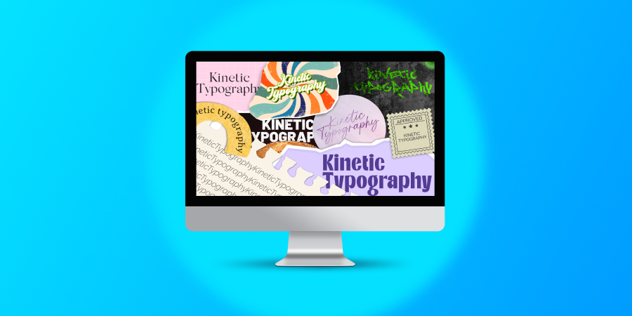
Kinetic typography is a graphic design technique used to animate text on screen.
By altering text elements, kinetic typography creates motion and visual effects to make content more dynamic and appealing to the viewer.
While used across advertising and video production, kinetic typography is also a popular tool in website design as it helps guide attention to important areas of a site while enhancing user experience (UX).
In addition, kinetic typography can help you promote your brand personality through a custom web design experience that promotes learning about your brand.
Kinetic Typography Layouts: Motion vs. Fluid Typography
According to research conducted by design theorist Dr Barbara Brownie, kinetic typography can be split into two key layouts, or genres:
- Motion layout: Text elements that move in relation to each other, either in 2D or 3D
- Fluid layout: Text elements that change or alter their form without necessarily changing location
The genre of a specific kinetic typography pattern or element will determine how it is received by the viewer and the impact it has on overall UX.
Types Of Kinetic Typography Patterns
There are countless kinetic typography patterns to utilize in your business’ website and graphic designs.
Your visual identity and target audience is key in deciding which will work best for you, but here is a selection of commonly used patterns for inspiration:
1. Morphing
Morphing in kinetic typography involves smoothly transforming one set of text elements into another to convey change and demonstrate transformations or transitions in a visually appealing way.
Your business can use morphing typography for:
- Logo transitions
- Product evolution
- Company timelines
2. Enter & Exit
Enter and exit typography involves using gradual animation for text elements to enter and exit a screen.
These dynamic layout patterns are useful for ordered storytelling or supporting a guided user journey.
Your business can use enter and exit typography for:
- Product features lists
- Service lists
- Price comparisons
3. Create & Destroy
Create and destroy typography is the generation and removal of text elements from a screen.
Unlike the gradual enter and exit style, create and destroy patterns offer a striking design element to draw attention and make a lasting impression.
Your business can use create and destroy typography for:
- Product teasers
- Campaign messaging
- Content highlights
4. Sequential Reveal
Combining enter and exit with create and destroy, sequential reveal is a kinetic typography pattern that builds text elements one by one.
Often used to mimic the process of writing by hand, sequential reveals are common in increasing engagement and building anticipation on web pages.
Your business can use create and destroy typography for:
- Customer testimonials
- Timeline infographics
- Showcasing features or unique value propositions (UVPs)
5. Textures & Gradients
A popular trend in modern web design, textures and gradients can be added to typography to create depth and visual appeal.
This form of fluid layout is useful in adding engagement to important areas of content without overloading a page with animation.
Your business can use create and destroy typography for:
- Headings
- Highlighting key text
- Transition effects
6. Flickering
Flickering typography is the rapid changing in visibility of text elements. This captures the attention of the audience, drawing focus to specific information or elements.
Your business can use flickering typography for:
- Calls-to-action (CTAs)
- Discount counters
- Important announcements
7. Hypnotizing
As the name suggests, hypnotizing typography refers to mesmerizing movements used to immerse a viewer and create a memorable user experience.
Usually preferred for artistic expression, adding hypnotizing typography to intricate elements of your website can add engagement opportunities in previously dull moments.
Your business can use hypnotizing typography for:
- Website loading text animation
- Progress bar text animation
- CTAs
10 Top Kinetic Typography Examples
Inspiration for your kinetic typography can come from all many sources.
Whether websites, video or graphic design concepts, here are some of our favorites:
1. Wodwo
Our custom website design for AI audience modeling platform Wodwo is a gold mine for storytelling kinetic typography, where animations are used to guide the viewer through the content.
Best seen on the how it works page, our designers used entry and exit typography and sequential reveal animations to encourage the viewer towards each new piece of important information.
2. Buddha Brands
Buddha Brands is a sustainable food and beverage provider with a playful, exciting brand identity. We created a website to match.
An essential enabler of this was our use of kinetic typography, especially in the page breaks. Using a motion layout, we created a moving wave of text on top of the homepage’s blue background, adding to the enjoyable user experience.
3. Sandler
Our professional web design for sales and training company Sandler uses subtle kinetic typography to add a layer of engagement and highlight key areas of the homepage.
The main effects appear as hover and counter animations. The hover creates user interaction with its headings moving to allow space for relevant information to appear on screen.
Meanwhile, the counter is an engaging effect that draws attention to some of Sandler’s key stats and figures.
4. Portledge School
Our award-winning designers teamed up with New York’s Portledge School to build a digital platform that showcases the best the school has to offer.
Keeping in mind the fact that a website only has 50 milliseconds to make an impression on a visitor, we layered a sequential reveal text on the center of the homepage heading and video.
This way, visitors are instantly greeted with school’s UVPs before being guided to conversion.
5. Citanex
Collaborating with business innovation service provider Citanex, our design team utilized kinetic typography to build brand authority and credibility.
We included a fluid layout effect in the homepage messaging, highlighting Citanex’ key services and benefits.
By adding the animated text in a gradient that contrasts with the background color palette, we ensured Citanex’s website is professional, clean, engaging and accessible for all users.
6. Apple
Apple’s most impactful use of kinetic typography comes from their advertising.
Look at the advert below, for example. Apple’s plan is to highlight their carbon neutrality pact in an entertaining way, highlighting the key aspects and making their main promises easily digestible.
Combine this with an upbeat soundtrack and green color palette, and viewers are left feeling excited about Apple’s brand identity and strategy.
7. Burger King
Burger King’s rebranding promotion caught the attention for its change in color palette.
However, it is the kinetic typography that really brings the ad to life.
From altering the shapes of letters to scrolling effects and fluid layouts, where the words Burger King are squeezed between two buns, there are dozens of patterns to take in during just over a minute.
8. Kvell Home
Interior design company Kvell Home incorporates kinetic typography immediately as the homepage is loaded.
Each word of their core brand statement is pulled front and center to make sure the consumer knows exactly what they get by choosing to shop with Kvell.
9. G-uld
G-uld is a Danish wool provider that cleverly integrates kinetic typography, and a video in hero element to beautifully guide their website visitors through their core UVPs.
By opening and closing each video with the brand’s name, G-uld drives brand awareness and an intrigue to learn more about their products and services.
10. North By Northwest
Kinetic typography is becoming increasingly popular for business websites and graphic designs, but it isn’t a new concept.
Alfred Hitchcock’s North By Northwest was released in 1959, and its opening scene created by Saul Bass is seen as a ground breaker for popular modern kinetic typography.
The sequence pushes and pulls the credits from above and below the scene, creating an engaging credits experience that we expect to see today in film and online.
Best Practices For Using Kinetic Typography In Web Design
How can you make sure your kinetic typography delivers the best results for your website?
Follow the best practices below:
- Focus on readability: Make sure your text is clear and readable throughout the animation to get your message across without misinterpretation.
- Consider time duration: Keep your typography effects short and swift to achieve your intended viewer response without heavily disrupting the user journey.
- Prioritize UX: Use kinetic typography strategically to avoid negatively affecting load times or cross-device responsiveness with heavy files and incompatible designs.
- Optimize for accessibility: Ensure your kinetic typography functions with screen-readers, have contrasting colors and emphasize elements instead of obscuring them to meet accessibility measures.
- Use fallback states: Have a plan b in the form of static images to avoid negative user experiences should an animation fail to load.
Design A Custom Website With Digital Silk
At Digital Silk, we are a full-service web design agency.
That means we can manage your entire brand, in-house. But what services do we provide, exactly?
We offer bespoke web design and development solutions, including:
- Custom web design
- Custom web development
- Professional web design
We offer end-to-end branding solutions, including:
We offer cross-channel digital marketing solutions, including:
In choosing to partner with us, you’ll receive an award-winning design team, a dedicated digital strategist and a custom strategy to grow your business online.
In addition, we’ll:
- Take project ownership
- Provide total transparency
- Deliver measurable results
Contact us or call us at (800) 206-9413 to let us know about your project requirements in a custom consultation. Alternatively, fill in the request a quote form below to get your project underway.
"*" indicates required fields
