From photo and video ads with branded text overlays to carousel and story ads with bold calls to action (CTAs), Instagram ads have the potential to reach millions out of the app’s one billion users.
But with so many sponsored posts and creative ads out there, how can you make sure that your ad captures users’ attention and stops them from scrolling?
Let’s take a look at some of the top-performing Instagram ad examples in B2C retail and break down the best practices used that helped propel them to the top.
Work with our experts. Request a quote
Top 5 Best Performing Instagram Ad Examples For B2C Retail
Instagram is one of the most effective digital maketing channels for B2C brands. Here are five great Instagram ad examples to learn from:
1. Clinique
Known around the world as a leader in the beauty industry, Clinique topped the list of best-performing Instagram ad examples when they launched the campaign shown below to announce their new line of moisturizers.
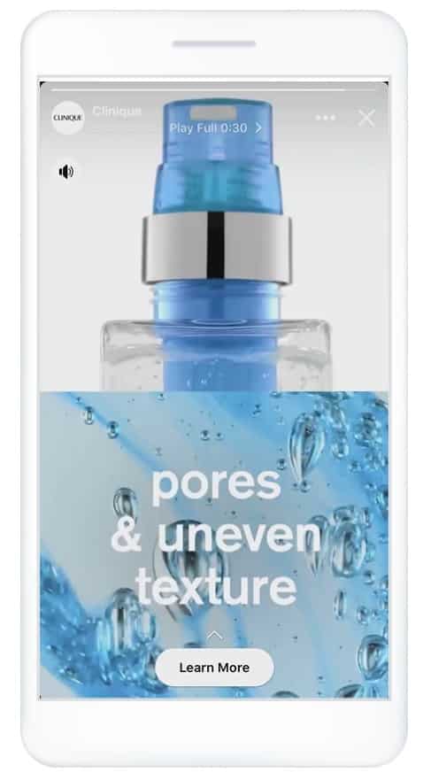
It marked the first globally synchronized campaign, premiering in over 20 markets.
The brand looked to assure sufficient reach and scalability for the new line, aiming to connect with Gen Z and millennials across local markets.
Targeting users in the awareness phase, Clinique used video ads focusing on product ingredients, emphasizing its use of whey protein and sunscreen, as well as the benefits of using the products, such as smooth lines and reduced wrinkles.
The company took a mobile-first approach, with vertical videos displaying branding and text overlays with simplified messaging. This is particularly evident in the brand’s use of Instagram Stories and its features to generate more audience engagement.
In the consideration phase, the campaign had a more local approach, allowing teams to adapt their creative assets according to each market’s nuances.
For example, the company relied on influencers in Korea, while in the Middle East, the beauty counter experience was simulated through Messenger.
The results?
- A 13-point lift average in ad recall
- A 10-point lift average in brand awareness
- A 7-point lift average in message association
- A 36-point lift average in add to cart
2. Bulgari
Known for selling luxury jewelry, fragrances and leather goods, Bulgari ran a video ad campaign, as shown below, to spread awareness about its partnership with the Save The Children charity in order to raise donation money on #GivingTuesday.
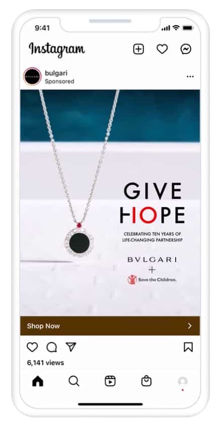
The campaign marked the company’s 10-year partnership anniversary with the charity, which is dedicated to improving the lives of children through education, healthcare and economic opportunities.
Bulgari, along with Facebook Creative Shop, reached out to over 50 influencers and asked them to post a personal message on their profile using Instagram Stories, to request donations.
Each influencer used a “How it started, How it’s going” theme, first posting a childhood picture, then posting a photo of where they are today — emphasizing that they had been blessed with a platform that allows them to give back.
Bulgari turned each video into a brand-sponsored Instagram ad, and each post included a “Donate” sticker that linked to Save The Children’s donation page.
To complement the campaign, Bulgari partnered with creative tech platform VidMob to create another video campaign, this time focusing on conversion, where part of the proceeds from jewelry sales went directly to Save The Children.
These ads were shown to US adults aged 18 and up from December 2-31, 2020, including a custom audience pulled from Bulgari’s CRM database, along with users interested in fundraising, philanthropy and non-profits, and Bulgari propelled to the list of top Instagram ad examples.
The results?
- More than a 3-point lift in ad recall
- $368,100 in estimated media value
3. Yoga International
At number three on our list of top Instagram ad examples, online yoga studio, Yoga International, offers more than 2,000 yoga classes online for beginners and experts alike:
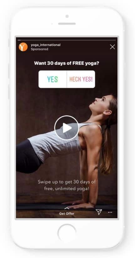
To generate both free-trial and membership signups around the world, the company ran an Instagram campaign using a variety of creatives, from photos and videos to GIFs and interactive poll ads in Instagram stories.
One such poll ad included the question, “Want 30 days of free unlimited yoga streaming?” with possible answers “Yes” or “Heck yes.” Users could choose a poll answer then swipe up to accept the offer and register for a free trial.
The campaign ran from July 15 to August 31, 2019, targeting users who showed an interest in yoga, those who spent time on the company’s website or had abandoned registration and a lookalike audience based on users who had completed a trial membership.
The use of Instagram’s exclusive poll feature allowed audiences to engage with the ads, which proved to be beneficial for the brand.
The results?
- 3,510 new memberships (18% of which came from poll ads)
- 21% decrease in cost per registration
4. American Family Insurance
The 13th largest property/casual insurance company in the US, American Family Insurance group set out to boost brand metrics when it ran this mobile-optimized photo and video ad campaign on Instagram and Facebook from August 22 to October 18, 2018.
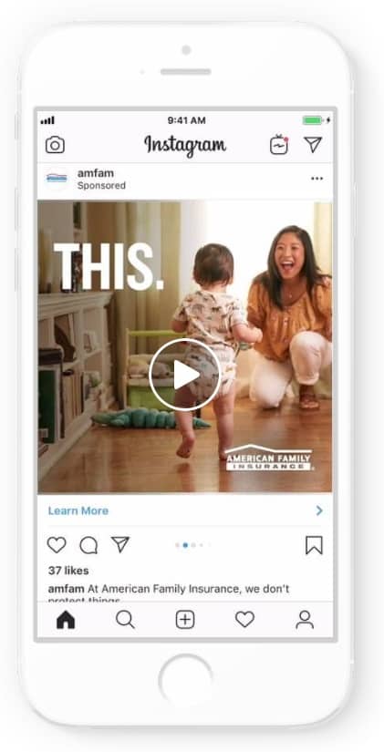
The company opted to reshape a TV ad campaign it previously ran, titled “The Dream,” which displayed how the insurance group helps protect people of all backgrounds with dreams of all sizes.
Since the original television ad was too long for mobile, American Family Insurance worked with VidMob to repurpose the commercial into photo and video assets.
The campaign followed mobile best practices, including clear branding and a logo overlay that helped deliver the message even with the sound off.
The ads ran in a carousel format in Instagram feed and Facebook News Feed, and each ad included CTA’s such as “Watch more” or “Learn more,” which linked to the insurance group’s website.
Let’s pause here for a minute to critique.
We’re not a fan of the “Learn more” CTA. In fact, we believe it’s one of the worst CTAs you can use, whether it’s in Instagram ad examples or anywhere else.
Why? Because it’s passive. And it implies that the user will have to put in work.
While American Family Insurance is included in our list of the top-performing Instagram ad examples, we wish they would’ve stuck with the “Watch more” CTA.
But let’s continue.
The ads were targeted at three groups: adults aged 25-54 in the 19 states where American Family Insurance operates, adults with an interest in “The American Dream” and a lookalike audience.
The results?
- 8.4-point lift in brand awareness
- 12.8-point lift in brand favorability
- 9.3-point lift in consideration intent
- 4.3-point lift in brand uniqueness (how it differentiates from other insurance brands)
5. WINC
At number five on our list of top Instagram ad examples, WINC is a “modern wine club” founded in 2012 that offers its subscribers over 100 wine choices via club membership.
In an effort to boost subscriptions, the company ran Instagram and Facebook video and photo ads, like the one pictured below, from March 10 to May 15, 2020.
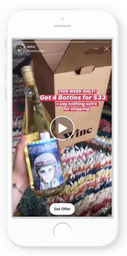
Instead of sticking to its traditional advertising approach, WINC took the COVID-19 pandemic into account and designed new creative ads with automatic features and updated messaging.
The ads featured text overlays like “Social distancing? We’ve got you covered” and “Good news: We deliver,” alongside photos and videos of wine deliveries being dropped off safely on doorsteps.
The company also offered discounts and free shipping and used a “Get offer” CTA on each ad, which linked to a Palette Profile Quiz on the WINC website.
The quiz featured six questions about personal taste preferences, which the company then used to create personally tailored wine recommendations.
While the images were simple, the photo ads were made in various sizes to adapt to different screens, and the company implemented a placement asset customization feature, which automatically reformatted the ads to vertical, square or rectangular, depending on what was needed.
The campaign targeted a broad audience – US adults 21 and over, plus a lookalike audience based on the company’s most valuable subscribers at the time.
The results?
- 2.4X lift in Winc Quiz completions
- 2.1X lift in subscribers
- 32-point lift in unaided ad recall
- 1.8X lift in branded search visitors to Winc
Instagram Carousel Ad Examples
According to an Instagram carousel study, carousel posts are the most engaging type of post across Instagram.
Why? Because they’re flexible. Brands can use photos, and videos or blend the two types of media to create the perfect ad mix.
Let’s take a look at some carousel ad success stories that made their way to our top Instagram ad examples.
1. alice + olivia by Stacey Bendet
Contemporary fashion brand alice + olivia by Stacey Bendet set out to drive brand awareness, increase ad reach and boost sales when they launched a multi-phase Instagram and Facebook ad campaign focused on New York Fashion Week in 2018.
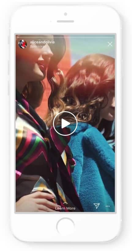
The company partnered with Facebook Creative Shop to create a campaign strategy and design mobile-first content for the ads, which they premiered in four phases.
In phase 1, the team launched video ads ahead of the fashion show, which featured the brand’s spring clothing collection. The ads included actionable messaging such as, “Follow our fashion week. First stop is Wonderland.”
The prominent CTA “Learn more” (sigh) linked to a landing page with details about the fashion show.
In phase 2, video ads premiered in a carousel format in Instant Experience. The ads portrayed models at the fashion show and included cohesive messaging, “We’ve stamped your passport, now step into Wonderland.”
The swipe feature linked to a landing page that featured the brand’s fall collection.
In phase 3, photo and video ads once again showed off the brand’s colorful fall line, with messaging that stated, “Shop our world of color.”
“Learn more” CTAs linked to alice + olivia’s online product catalog where users could shop the new looks. (While we love this campaign and its creative messaging, we have to again cringe at the “Learn more” CTA here).
In phase 4, the team used a carousel format to display key pieces from the collection, along with messaging that stated, “Shop these new styles to look and feel as powerful as you are.”
Each ad included a “Shop now” CTA button that linked directly to the specific product’s page on the website.
The campaign, which ran from September 9 to October 1, 2018, was directed at three audience segments: existing customers + email subscribers + social media followers, people who had visited the website in the last 90 days or engaged with video content, and 1-2% of a lookalike audience.
The results?
- 72% increase in revenue across all channels, year over year
- 2.2X increase in new visitors to the website, year over year
- 5X more conversions during phases 3 and 4, compared to phases 1 and 2
- 528,487 3-second video views
2. GAP
When iconic American apparel retailer, Gap, wanted to create a buzz around its new “Logo remix” collection, the company partnered with Facebook Creative Shop to design energetic and thumb-stopping digital ads.
Gap followed mobile-first best practices by creating short-form, vertical video ads with simple, straightforward messaging and upfront branding, which the company ran as full-screen carousel ads on Instagram:
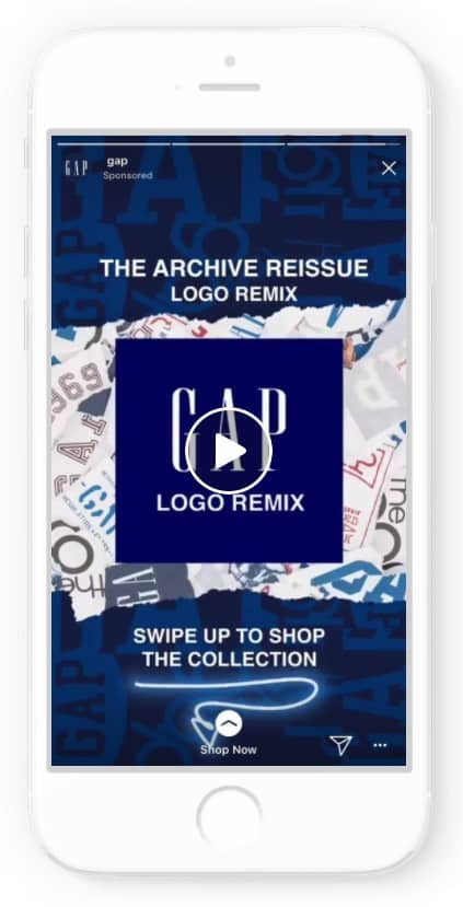
The three-carousel ads featured chart-topping singer/songwriters and producers, along with “regular people” dancing to hip-hop songs as they showed off the new collection.
Specifically, a remixed hip-hop rendition of the Tompson Twins’ song, “Hold Me Now” played in the background.
The ads were designed to encourage engagement: each card on the carousel was clickable and included a “Swipe up to shop the collection” CTA that linked to the GAP site where users could shop and purchase clothing.
The campaign was targeted at men and women in the US aged 18-34, along with individuals interested in men’s or women’s fashion, streetwear, hip hop music, 80s music, contemporary rhythm and blues music and singer/songwriter SZA — quite a crowd!
The ads ran for less than a month, from February 1-19, 2018.
The results?
- 17-point lift in ad recall
- 4-point lift in message association for Instagram Stories
- 73% higher click-through rate than the previous Instagram campaign
Instagram Story Ad Example
Launched in 2016, Instagram Stories allows users to post photos and/or videos and enhance the post with interactive media like music, stickers, hashtags, GIFs, polls and more. Stories show full-screen and disappear within 24 hours (unless saved).
Let’s check out an Instagram ad example success story from a brand that utilized Instagram Stories for its campaign.
Ralph Lauren
Global fashion brand Ralph Lauren has been around since 1968. When the company’s 50th anniversary rolled around, it decided to use the milestone to raise brand awareness about its new collections, specifically aimed at millennials, Gen Z and Gen X.
The company devised a social-first marketing approach using a variety of media, designed to move customers through the funnel, from awareness to purchase.

Photo, video and carousel ads announcing the company’s 50th birthday and showcasing clothing from the new collections ran in Instagram Stories, as seen above, as well as in-feed.
The campaign ran in six markets from September to November 2018: Italy, Spain, Germany, the UK, Sweden and France.
The results?
- 18% increase in online sales among acquired millennial audience
- 17-point lift in ad recall among acquired millennial audience
- 41% increase in product page views
- 7.1X return on ad spend online with dynamic ads
- 41% increase in product page views among Gen Z (post-millennial) acquisition audience
Instagram Video Ad Examples
Unlike most in-feed photos, Instagram video ads give brands an opportunity to be ultra-creative, bring products to life and invoke an emotional response from Instagram users.
Whether the message is empathy, empowerment, comedy or something else, dynamic video ads can stop scrollers in their tracks.
The campaigns below executed their Instagram video ads perfectly and in turn experience some amazing results.
1. Muscle Milk
Muscle Milk, a subsidiary of PepsiCo., set out to increase awareness about their products, from their protein powders and snack bars to their ready-to-drink shakes, aimed at athletes and other audiences who live an active lifestyle.
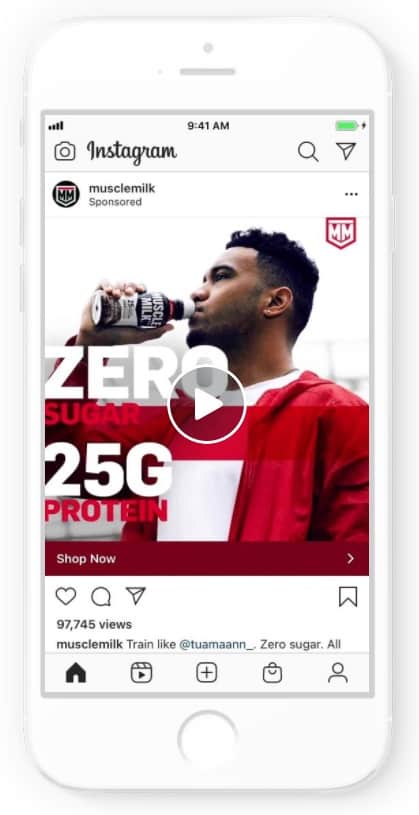
The company ran the above video ad campaign in multiple placements across both Instagram and Facebook, including in-feed, in-stream and Stories.
The ads followed Instagram best practices for video: a run time of less than 15 seconds, a display of strong branding elements within the first three seconds and of course, bold and vivid storytelling elements to bring the campaign to life.
The videos depicted people in different settings — at home, in their neighborhood, on a sports field, etc. — who were determined to stay active.
Bold text showcasing the company’s different products presented as a video overlay, and the hashtag #OwnYourStrength accompanied the campaign, urging people to invest in themselves and feel empowered.
Each video included a clear and concise “Shop now” button that linked to the featured product.
The results?
- A 4.8% increase in market penetration
- A 7.5-point lift in unaided ad recall
- A reach of over 16.9 million people
2. Sephora Collection
When beauty giant Sephora wanted to increase awareness about the new fragrances from the brand’s in-house product line, Sephora Collection, the team met with Instagram creators to produce new ad content dedicated to a new perfume line.
Instead of a traditional perfume campaign, Sephora teamed up with Jessica Herrington — a neuroscientist creator specializing in digital sensory experiences — and Roman Bratschi — a 3D animation designer. Here is the result:
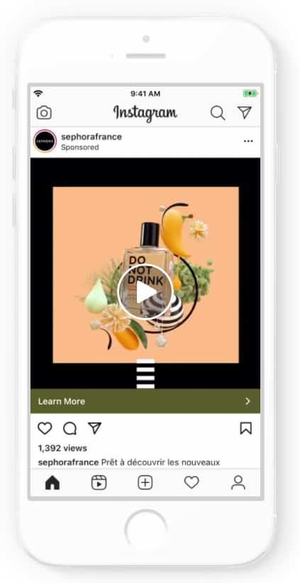
The theme of the campaign was “Smell with your eyes,” and the idea was to incorporate images in the ads alongside the perfume that suggested certain tastes and smells, to help users experience the scent through the screen.
Herrington design three Augmented Reality filters that played with the textures, shapes, colors and movements of the fragrances, while Bratschi created dynamic videos to help heighten the senses.
Sephora ran these AR ads in Instagram News Feed and Facebook News Feed, and also created a split test with brand-only creative assets in one cell vs. a combo of brand assets and the creators’ assets in a second cell, which they ran in Instagram and Facebook feed and stories.
The campaign ran from August 10 to 25, 2020.
The results?
- 17-point lift in ad recall with creator assets plus business-as-usual assets, compared to business-as-usual assets alone
- 6.6-point higher lift in ad recall with creator assets plus business-as-usual assets, compared to business-as-usual assets alone
- 2.4-point higher lift in standard favorability with creator assets plus business-as-usual assets, compared to business-as-usual assets alone
- 1.3-point higher lift in purchase intent with creator assets plus business-as-usual assets, compared to business-as-usual assets alone
Bonus Video: Instagram Checkout
Now that you’ve seen some of the best Instagram ad examples, it might be time to take advantage of Instagram for your brand.
Check out this video by one of our Digital Silk consultants for all you need to know about Instagram checkout: what it is, how it works and how it can benefit your business.
Top Instagram Ad Examples: The Best Practices That Helped Drive Results
What do these top Instagram ad examples have in common? They’re unique, creative and they followed some of Instagram’s best practices for ad campaigns.
- Use compelling media: To ensure your ad stands out among the millions of others floating around Instagram, the media you use needs to demand attention. Think interesting imagery, vivid colors and dynamic video scenes to encourage users to stop scrolling.
- Take a mobile-first approach: All campaigns created for Instagram, or any social media platform for that matter, need to be fully optimized for mobile. Media should be designed for vertical viewing, fitted to the correct dimensions (9:15 for Instagram Stories), and video ads should be 15 seconds or less.
- Encourage engagement: Instagram is full of engagement options – take advantage of them! Use the swipe up feature to link to the most relevant landing page, use polls in Instagram Stories and allow users to play along, add the question feature, Instagram checkout, music, stickers, hashtags and more to increase engagement, interest and visibility.
- Use text overlay: People scroll through Instagram in all kinds of places where they might want their sound muted — the grocery store, the bank, work. Using a text overlay can help get your ad’s message across even if the sound is off. This is also an important practice for users who may be hearing impaired. You want your campaign to come across seamlessly, regardless of the sound.
- Use clear messaging and bold CTAs: Your messaging should be clear, powerful and on-brand. Don’t leave users confused as to what they just scrolled past. Use bold CTA’s and take a chance — be creative. Take alice + olivia’s campaign messaging, for example. The messaging was kept consistent throughout each phase of the campaign, taking the user on an exciting journey.
- Include prominent branding: Whether your campaign revolves around photo or video, and whether it’s posted in Stories or in Feed, don’t forget to include your branding! If a user is scrolling and only manages to see a few seconds of your ad, you want to make sure they immediately recognize the brand. The best practice for video ads is to include strong branding within the first three seconds.
"*" indicates required fields


