38% of users will only engage with a website if they think the content or layout is unattractive.
Your website’s visuals play a crucial role in attracting and retaining visitors.
Unless you’re a graphic designer, deciding on the right image format to drive traffic to your website becomes merely a guessing game.
In this post, we’ll look at the best image formats for website design and how each one influences the user experience.
10 Best Image Formats For Website Design
You can use a mix of different types of image formats on your website or stick to a single format, depending on your website’s design and purpose.
You can format stock or real photos to meet specific requirements or achieve optimal site performance.
Using the right ones can significantly improve website loading speed, optimize image quality and enhance SEO visibility.
We focused on image formats that offer the best balance of quality and speed across various types of devices.
These formats cater to different user needs, including transparency, the creation of large-scale visuals and animations.
When you understand the strengths of each of the following image formats, you can better choose a format that best aligns with your needs and goals.
1. JPEG (Or JPG)
- Pros: Accurate color rendering
- Cons: Lossy compression
- Best For: All digital images and some printed photos
Perhaps the most common image format on the web, JPEG or JPG (Joint Photographic Experts Group) compresses impressive detailing into relatively smaller and shareable files.
This is particularly handy for photos or images with complex graphics, such as gradients or shadows.
However, most JPEGs are characterized by lossy compression, which means they can lose some of their quality if they’re compressed to a smaller size.
This can result in slight blurring or pixelation, which may not be noticeable to the untrained eye but can affect overall image quality.
2. PNG
- Pros: Precise source image reproduction, transparency
- Cons: Limited browser support
- Best For: Interactive website elements
PNG (Portable Network Graphics) files boast lossless compression, meaning they maintain the same quality as the original image even after being scaled down.
It’s worth noting that this is due to their inherent low resolution, which makes them unsuitable for large-scale printing or high-resolution displays.
One of the key benefits of PNGs is their built-in transparency which allows you to save images with sharper, more vibrant colors for interactive elements like banners, infographics or hero sections.
3. GIF
- Pros: Animated image with low file size
- Cons: Quality and color palette limitations
- Best For: Website graphics, email animations and memes
As lightweight and lossless image formats, GIFs (Graphics Interchange Format) can reproduce up to 256 simultaneous colors, which is why they often appear washed out or distorted.
They support simple animation by cycling through a series of images that change with each frame.
Since GIFs flaunt a relatively small file size for a dynamic image, they’re a common sight in web design projects where the page needs to load quickly at the expense of visual quality.
Even so, their widespread support across browsers points to their accessible and easy-to-use nature, especially for simple visuals like memes or social media posts.
4. BMP
- Pros: Detailed renders in uncompressed format
- Cons: Longer website loading times
- Best For: Design elements with non-negotiable quality
Bitmap images store graphics in an uncompressed format with every pixel accounted for, albeit in a much larger file package.
They support different bit depths and pixel orders, indexed color and alpha channels to create detailed and vibrant visuals.
You can also store JPEG and PNG images within the same BMP file, which may be a convenient and efficient solution for high-demand graphics.
5. EPS
- Pros: Lossless scaling and universal design software support
- Cons: May not be compatible with certain browsers
- Best For: Vector-based designs with high-resolution graphics
Encapsulated Postscripts are the go-to graphic designer’s vector file formats for scalability and accurate color representation.
They contain Bitmap data in terms of resolution but the images consist of mathematical equations and coordinates, so you can easily scale them without losing quality.
Plus, EPS files support embedded fonts, which means the text in your design will appear exactly as intended, regardless of the program users view it on.
However, once you save a file as EPS, you can’t make further edits. If you really need to change something, you’ll have to return to the original design and export it again.
6. AVIF
- Pros: Superior image quality with lossy and lossless compression
- Cons: Compatibility challenges due to limited browser support
- Best For: Still images that require high compression and exceptional quality
AVIF (AV1 Image File Format) is a relatively new file type that supports greater color depths, animated frames and transparency while maintaining crisp image quality.
While it was originally intended for video transmission online, it’s now optimized and quickly gaining traction as a web graphics format.
Its high-dynamic range (HDR) and wide color gamut offer rich and vibrant details, with significant contrasts between the lightest and darkest areas of the image.
On the flip side, AVIF has no support for progressive rendering, which means you need to download the entire image before you can display it on your site.
This doesn’t really have a major impact on real-world experiences because AVIF files are generally smaller than JPG or PNG ones, so downloading and displaying them happens much faster.
7. PSD
- Pros: Quick Photoshop editing with multi-layer functionality
- Cons: Limited compatibility with non-Adobe programs
- Best For: Saving designs for later re-designs and touch-ups
Photoshop Documents (PSD) are the native file format for Adobe Photoshop, perhaps the most well-known graphics editing software ever.
They differ slightly from the other options on this list because they support layers, which makes modifying and adjusting images much faster and easier.
As such, they’re best suited for professional designers and editors who value flexibility and having full control over the smallest details of the image.
The only downside is the format’s incompatibility with non-Adobe programs, which is why most people choose to export their PSD files to more browser-friendly options before using them on their website.
8. PDF
- Pros: Anyone can view them without any editing software
- Cons: Limited use in web design projects
- Best For: Cross-platform file sharing and editing
While not traditionally an image format, you can sometimes benefit from converting images to PDFs.
The main perk is that this allows you to share and distribute documents while preserving the formatting, which can come in handy when you’re creating portfolios or sending design mockups.
For instance, if a designer saves a vector image as a PDF, the client can review it and make comments without worrying about altering the original file.
You can also use it for separate reports and infographics that users can download directly from your website, which can help you maintain a consistent brand voice and identity across all channels.
The downside is that PDFs have limited editing capabilities compared to other formats, so you can’t exactly make changes to the image itself.
9. INDD
- Pros: Save complex and long projects quickly and easily
- Cons: Not considered a web-safe format
- Best For: Collaborative designs with multiple elements and pages
Another Adobe-exclusive format, INDDs (InDesign Documents) provides a multi-page layout so you can save all project files in their current state, including on-page content, swatches and styles.
Designers can easily toggle between different sections and make changes or additions as needed, which can be handy for team projects or presentations.
Despite its convenience, it’s not a web-safe format, so it may not display properly on all devices and browsers.
As such, you’d have to convert to a more universal file type — such as JPG or PNG — before using the design on your website.
10. TIFF
- Pros: High image clarity, multiple compression options
- Cons: Slightly heavier format, with larger file sizes
- Best For: Large-scale visuals with detailed designs
Finally, TIFF (Tagged Image File Format) files include a wealth of metadata that preserves the crisp quality of high-resolutions images.
You can identify each data point in TIFF files through their corresponding tag and type values — referring to the kind of information and storage format, respectively.
Moreover, this type isn’t just limited to the RGB color palette — it can also handle CMYK and YCbCr options for improved tonal accuracy.
Why Are Image File Formats Important?
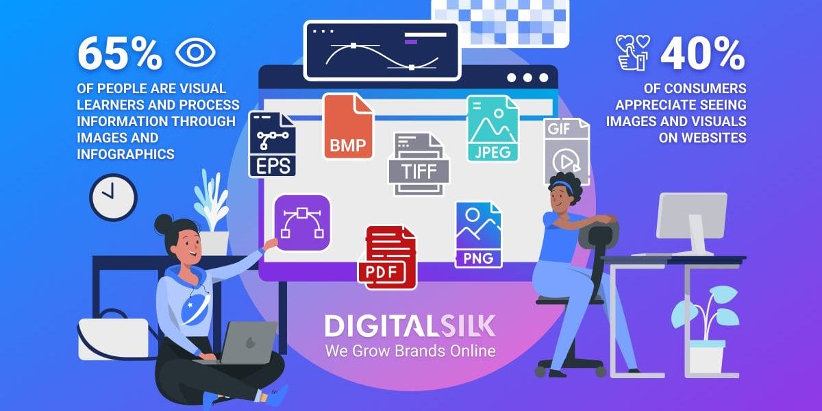
A notable 65% of people are visual learners, which means they prefer to process information through images and infographics.
This isn’t surprising in the slightest since images can often convey a message faster and more effectively than text.
Since the average user spends about 5.94 seconds looking at the main website image, it’s crucial to capture their attention and evoke the right emotions quickly to encourage users to keep browsing your site and engage more deeply with your content.
Using images helps you present your information in a more digestible and scan-friendly way, so your audience doesn’t feel overwhelmed with plain text.
Not to mention the impact visuals have on brand storytelling — relevant and high-quality images help you create an emotional connection with your target demographic since they can visualize your brand personality, values and mission.
Instead of describing your products and services through text, you can bring them to life through compelling imagery that caters to users’ short attention spans and leaves a lasting impact.
But if you get the image format wrong, that can take a toll on your website’s performance and even overshadow the quality of your content.
The format should match your website design and cater to your primary goal, whether it’s increased loading speed and site performance or better image quality.
Vector Vs. Raster Images: What’s The Difference?
As the two primary image file formats, the difference between vector and raster images lies in the way they’re created and stored.
Raster images consist of a series of pixels or individual blocks and are usually associated with digital photos — including JPEG, GIF or PNG files.
The number of pixels per inch (PPI) or dots per inch (DPI) determines the quality or resolution of each file.
With this in mind, downscaling raster images may result in loss of quality while upscaling them can produce larger files, which can slow down a website’s loading time.
Since most pixels have pre-defined proportions, it’s best to save raster files at their intended size and avoid scaling them when possible.
On the other hand, vector image formats consist of mathematical calculations based on design software and can be easily scaled up or down without compromising quality — or looking “pixelated”.
These include drawings, illustrations and logos, all of which can be easily resized and adapted to fit different screen sizes.
3 Things To Keep In Mind When Choosing Image Formats For Your Site
Since most consumers appreciate seeing images and visuals, you should take extra care in formatting the files when doing a website redesign to ensure they load quickly, display properly across devices and browsers and enhance the user experience.
- Resolution and Quality: Strike a balance between image quality and file size to ensure crisp visuals without disrupting the user interface. You should save raster graphics —like stock images or professional digital photos — at 72 PPI (pixels per inch) while vector graphics offer endless scaling capabilities without affecting file size or image clarity.
- Device Optimization: If the aspect ratio is 16:9 or 3:2, the image may look cropped on mobile devices. You may choose to upload different images for desktop instead of mobile, i.e. landscape vs. portrait orientation.
- Website Responsiveness: Most responsive web platforms automatically scale images to fit your device or screen resolution. Avoid using large images that could exceed the maximum resolution of a particular device and cause slow loading times.
Find The Right Image Format For Your Website With Digital Silk
Images are powerful visual tools that can enhance your website design and user experience.
When you know which graphics to include and draw inspiration from impactful examples, you can create aesthetically pleasing and functional images.
At Digital Silk, we understand the power of crisp visuals and impactful designs to drive measurable results.
Our award-winning designers and developers can help you bring your vision to life through research-based strategies and industry-leading practices.
As an experienced web design company, our services include but aren’t limited to:
- Custom Website Design
- Custom Web Development
- eCommerce Development
- Branding Services
- Digital Marketing
Our in-house team of experts conducts thorough market and competitor research, operates with complete transparency and treats each project like their own.
Contact our team, call us at (800) 206-9413 or fill in the Request a Quote form below to schedule a consultation.
"*" indicates required fields
