53% of visitors will abandon your website if it loads too slowly and 88% won’t return to your website after a bad user experience.
Evidently, it takes more than just pretty design and educational content to attract and keep visitors’ attention.
Some of the key brand pain points include low engagement and high bounce rates and having an interactive website design can significantly boost key performance indicators.
In this guide, we’ll walk you through the step-by-step process of how to make an interactive website, detail key elements for interaction and share top examples of websites across industries that offer an engaging user experience through interactive design.
How To Build An Interactive Website In 2025
Creating an interactive website isn’t an exact science and there is no one-size-fits-all solution. To create an interactive website, you need to understand your audience to figure out what elements appeal to them.
For example, if you’re based in Miami you shouldn’t create a website based on Tampa’s local specifications.
If you already have a website, you can hire a web designer to update it to add interactive features. On the other hand, if you’re launching a new site, the designer in charge can start thinking about interactive elements during the wireframing stage.
To make your website interactive in 2025, focus on the basics like:
1. Responsive Design
With an average eCommerce bounce rate of 48.4%, businesses can’t compromise on website responsiveness.
In 2025, it will be even more important to have a mobile-friendly and responsive design as the majority of internet users access websites through their mobile devices.
As such, mobile responsiveness is becomes a foundational element of interactive website design.
Ensure that your website is optimized for different screen sizes and devices to provide a seamless user experience.
Digital Silk builds custom websites. Request A Quote
2. Fast Loading Pages
Dynamic elements won’t help much if your website loads too slowly. 53% of users will leave your site if it doesn’t load in 3 seconds or less.
In other words, no matter how engaging your animation, videos or other web design elements may be, your user will never see them if your website takes too long to load.
So, a word to the wise — discard the web design elements that are weighing your site down.
3. Animations & Motion Graphics
Animations are excellent at capturing your website users’ attention.
From light motion graphics and website animations to 3D parallax effects, strategically designed and well-executed animation can increase your users’ time on site and reduce bounce rates.
4. Engaging Scroll Designs
To keep users longer on your website and inspire them to move down the conversion funnel, make the whole experience more amusing by implementing dynamic scrolling.
One of the most engaging techniques is parallax scrolling. This is when some background elements move more slowly compared to the elements in front of them.
5. Videos
Users spend about 88% more time on websites that have videos, while 86% of marketers say using videos helped them increase traffic and generate more leads.
Adding videos to your website helps increase on-site engagement and encourages users to spend more time browsing your site. Making shareable videos that users can easily share on social media can also help increase your brand’s reach.
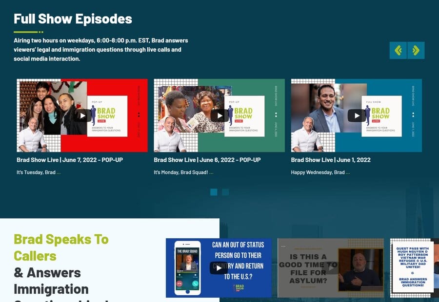
Take our clients, personal injury and immigration lawyers Spar & Bernstein. Their show Brad Show Live takes audience questions and provides legal insights live.
Today, this award-winning digital infotainment talk show is one of the top drivers of the law office’s brand visibility.
6. Chat Options
Personalized assistance and answers to users’ queries can provide great reassurance and facilitate their decision-making process.
One option is to add a live chat where users can chat with a real person. However, since having a live chat isn’t feasible for every business or website, an alternative is to add a chatbot and configure it to answer the most common or predictive questions visitors may have about your products or services.
Digital Silk’s client Ventura Foods incorporates a chatbot to help users navigate the site.
We integrated a custom virtual assistant (and named her Brie) to tackle common visitor queries around the clock.

7. Interactive Navigation
There are several different ways to make navigation interactive. Sticky navigation is when the menu follows the user as they scroll down a page, so the top menu bar is accessible regardless of where you are on a page.
Another example of interactive navigation is when the navigation bar is hidden until the user hovers over it.
Our experts can help. Set Up A Consultation
8. User-Generated Content
User-generated content makes your website more interactive. One simple way of doing this is by allowing comments on your blog posts or by creating a dedicated space or a forum where users can create content on their own.
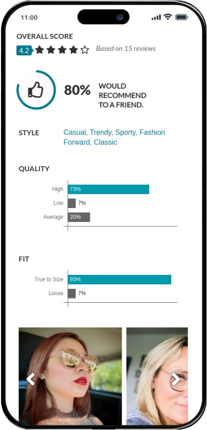
A great example is an eyewear brand called Zenni Optical. Harvesting their shoppers’ reviews and images using their products is central to Zenni’s conversion funnel. User-generated content functions as powerful social proof on their product pages, lending their reviews credibility.
9. Social Media Integrations
Allow users to share your content on social media such as Instagram, Facebook and Twitter. You can do this simply by adding social media share buttons. When users can share something they find interesting, such as a blog post, with a simple click, they will be more inclined to do so.
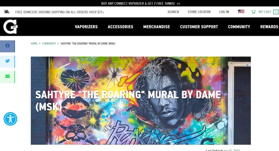
Check out the social media sharing buttons on G Pen, a Shopify website from our design kitchen. A portable vaporizer brand, G Pen places the sharing buttons right next to the content so users can quickly and easily distribute the content to their communities:
10. Quizzes And Games
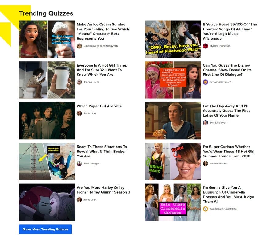
An excellent way to make your website more interactive is by incorporating fun quizzes, games or polls that can significantly improve your engagement rates and even help with lead generation.
Gating your quiz results can help you grow your emailing database and engage with prospective customers.
Check out Buzzfeed for inspiration — they do a great job in implementing quizzes to keep the audience engaged.
Examples Of Interactive Websites
So, what does an interactive website look like in 2025?
We’ve compiled examples of interactive website designs that engage audiences and create a memorable user experience.
1. FieldEdge
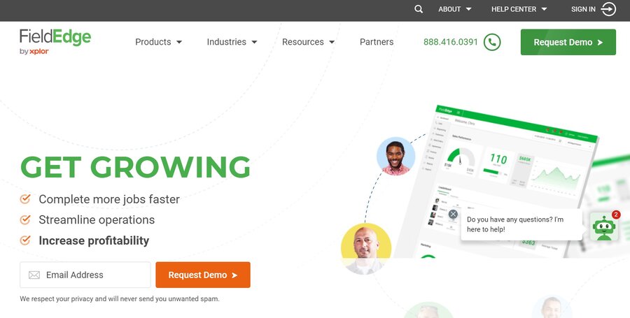
Let’s start with a B2B example from our design portfolio — FieldEdge, a service management software brand for contractors, features the following elements:
- Animations: A loading animation appears in the hero section and motion graphics are used throughout the homepage.
- Interactive navigation: The navigation bar follows the user as they scroll down.
- Video: The website features product videos and user testimonials on the homepage.
- A chat box: A chat box appears in the bottom right corner.
- Responsiveness: The website provides a seamless user experience across all devices.
- Fast loading speed: The website loads in under 3 seconds, to encourage visitors to stay.
When you visit the website, the elements in the header section assemble one by one. This loading animation engages the user and grabs attention with dynamic design from the get-go.
Further down the homepage, we included animation around an image showing FieldEdge software, where pieces of information rotate around the static image in the form of benefits-driven copy.
Another interactive element we implemented is sticky navigation, where the navigation bar follows the user as they scroll down, to ensure key menu items are always in sight.
We also incorporated video content to make the website more engaging, such as the testimonials section towards the bottom of the homepage and a video showing the software in use, to bring the offering to life.
2. Buddha Brands
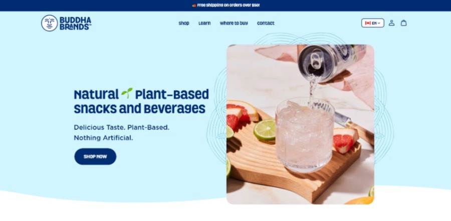
Another example from Digital Silk’s creative portfolio is a B2C interactive website for our client BuddhaBrands.
Colorful and engaging, Buddha Brands’ website is true to the brand’s identity, core values and messaging.
The site allows users to explore light motion graphics, social media integrations and customer reviews.
3. Cyclemon
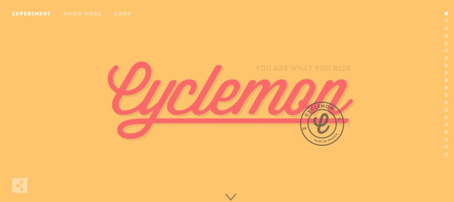
Cyclemon is a bike shop that excels at capturing attention and engaging site visitors through interactive web design elements, including:
- Parallax scrolling: The bikes and the background color changing as the user scrolls give the illusion that the user is actually traveling through these different places on a bike.
- Interactive navigation: The navigation bar follows the user as they scroll.
- Page load speed: The website loads in under 3 seconds, true to best practices for web design.
- Image gallery: The Shop page features products arranged as a stunning poster gallery for easy scrolling.
- Internal links: Links are prominently placed to encourage exploration, without overcrowding the homepage.
4. Rollink
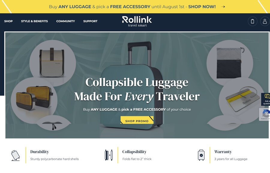
Rollink is a collapsible luggage manufacturer that teamed up with our eCommerce web design experts at Digital Silk to create an interactive website experience.
Rollink applies the following interactive elements:
- Hover over animation: The menu bar elements and the CTA move when a user hovers over them.
- Interactive scrolling: As the user scrolls, images and text move around, creating an engaging scrolling experience.
- Navigation: Rollink uses sticky navigation, so the menu bar stays visible as the user scrolls.
- Video: On the Style & Benefits page, a video showing how to use Rollink luggage plays in the background.
- Links: The selected links are prominently placed, but the homepage isn’t crowded.
- Fast loading speed: The website loads in under 3 seconds to encourage visitors to stay and explore.
Why Is Interactive Website Design Important?
As professional web designers, we typically recommend strategy-driven interactive design elements to improve key metrics such as engagement and conversions.
Here we stress “strategy-driven” as the investment, i.e. scale and complexity of interactive elements, should be proportional to the expected website performance.
Overall, interactive web design is known to:
1. Engage Visitors
73% of marketers agree that combining interactive elements with traditional content marketing strategies boosts retention rates and engagement.
Interactive website design engages your audiences and creates an immersive experience for them. If users are engaged, they are more likely to stay on your website longer and explore.
2. Reduce Bounce Rate
An interactive website encourages users to spend more time on a site, as it creates a better user experience. When users visit your website but leave immediately after viewing just one page, this is called a bounce.
The longer users spend on your site, the lower your bounce rates and the greater the chance that users will complete a specific action, such as subscribing to a newsletter, signing up for a free trial or making a purchase.
3. Encourage Sharing
If users find your web design, and in turn, your brand, interesting and dynamic, they might share it via social media to share it with others.
For instance, quizzes are a popular interactive element. You can create a quiz that is fun, informative, and relevant to your brand. Users can then share their results on social media platforms, which can attract new visitors to your website.
4. Increase Brand Awareness
92% of U.S. consumers prefer to shop online, so creating a recognizable and positive brand image is crucial to stand out from the competition.
When a website is interactive, it encourages users to explore more and learn about your brand. Creating a memorable user experience also helps improve brand recognition.
5. Improve Conversion Rates
Interactive website design can lead to higher conversion rates as it keeps users engaged and interested in your website.
When a website is interactive, users are more willing to perform the action you want them to complete, whether it’s signing up for your newsletter, filling out a form, or downloading materials.
For instance, the average users spend 88% more time on websites that feature videos as interactive elements.
Design An Interactive Website With Digital Silk
Interactive web design increases your brand’s visibility by providing a customized user experience and encouraging users to explore more of your website.
It can engage visitors, improve website personalization and increase brand awareness and conversion rates.
At Digital Silk, our in-house team of designers, developers, digital and branding strategists, marketing and content specialists can help you create an interactive website that encourages sharing and reduces bounce rates.
Some of our services include:
- Custom web design
- Custom web development
- Branding services
- Brand naming and logo design
Our team of experts creates interactive websites that draw attention, engage audiences, and provide an outstanding user experience.
We operate with complete transparency throughout our partnership, deliver measurable results and take full ownership of every project.
Contact our team, call us at (800) 206-9413 or fill in the Request a Quote form below to schedule a consultation.
"*" indicates required fields


