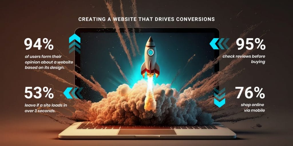
94% of the time, users base their opinion of a website on its design.
But even if you have a visually appealing design and follow the latest best practices, there’s no guarantee that you’ll convert casual visitors into engaged shoppers.
In this post, we’ll share some tips on how to design a website that converts and take a closer look at five effective examples to inspire your strategy.
5 Best Converting Websites For Inspiration
With over 1.1 billion pages as of 2024, creating a high-converting website structure and layout can determine how well your business performs in the industry.
If you want to learn how to design a website that converts, you should look into real-life brand examples that have hit the sweet spot between functionality and featues.
Below, we’ve selected five examples of the best converting websites based on their design, user experience and reputation within their respective industries.
1. Discord
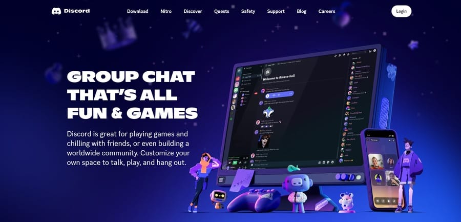
Avid gamers and streamers are well-versed in the features Discord offers as an all-in-one call and texting platform where like-minded individuals can interact.
Discord knows its target audience’s pain points and concerns.
Its playful and quirky design features crisp animations and engaging visuals, with clearly noticeable CTAs that guide users towards their desired actions.
Additionally, Discord features a clear unique value proposition in its streaming and chatting services.
But its success isn’t based solely on the growing popularity of multi-player game campaigns and chat rooms — even non-gamers can quickly figure out the platform’s features — and perhaps even join in on some of the fun.
2. Apple
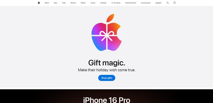
Apple needs no introduction in the industry — the tech giant’s website reflects its unwavering commitment to innovation, user-centric products and state-of-the-art digital solutions.
The brand uses a minimalist yet impactful design to avoid clutter and use negative space to its advantage, allowing its products to do all the talking. Apple’s trademark simple aesthetic is easy to digest, visually captivating and engaging for its target audience.
The website uses clear and prominent calls-to-action, high-quality product visuals and detailed descriptions to boost credibility and reinforce the company’s reputation.
3. RealSpace
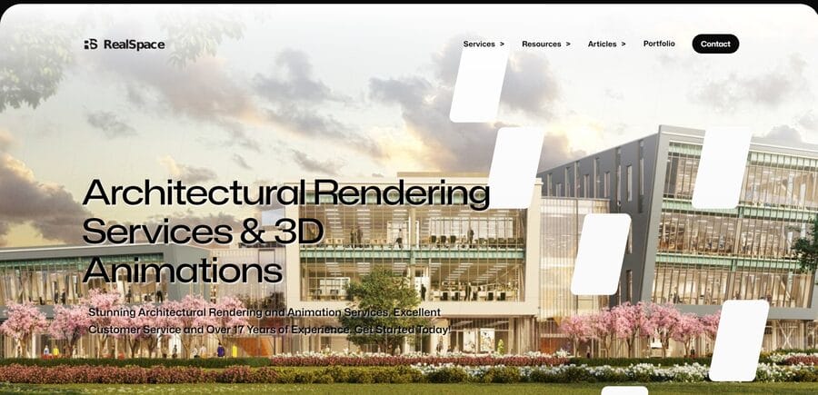
RealSpace caters to a niche audience with specific needs— 3D architectural renders of real estate properties and interior designs.
The website’s signature design element is its pixelated and dynamic hero section, which reveals new white blocks as users move the cursor across the screen. This creative and interactive element immediately grabs visitors’ attention and motivates them to explore the page further.
As users scroll down, they’re greeted by a selection of the company’s clients to reinforce social proof, an overview of its services and a glimpse into its latest projects.
4. MasterClass
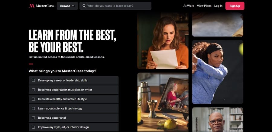
As far as unique value propositions go, MasterClass nails its website design and branding strategy to a T.
Do you want to attend an insightful cooking course with Gordon Ramsay? How do you feel about getting acting tips from Samuel L. Jackson? Or maybe have Mariah Carey teach you how to improve your singing technique? Say no more, you can find all that and more at MasterClass.
The website leaves no stone unturned when presenting its course offerings — users can take quizzes to determine suitable classes, explore different instructors and watch previews of the lessons before committing to a purchase.
5. GitHub
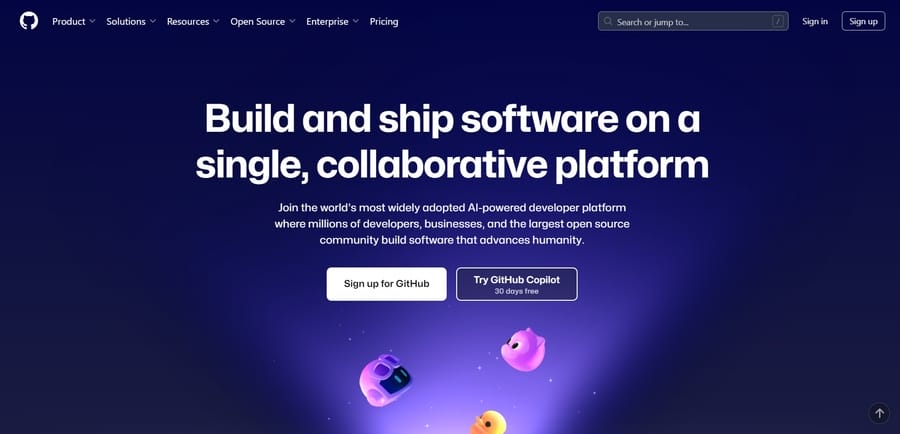
GitHub’s purple color scheme takes center stage in its website design, with bold and compelling copy in its hero section, straightforward user navigation and resources at the top and the latest community updates at the bottom.
The platform hits the sweet spot between form and function with its design by providing an organized yet aesthetically pleasing website interface.
Its human-centered design, strategic display of social proof and emphasis on its open-source and collaborative coding community have propelled GitHub to the top of the conversion rate charts.
How To Design A Website That Converts
You can avoid some common web design mistakes by following a handful of research-backed, conversion-focused and brand-aligned principles:
1. Make Your Unique Value Proposition Clear
94% of U.S. users prefer to shop online, so your brand should offer something relevant, valuable and desirable to catch people’s attention.
Visitors should know exactly what your services are from the minute they land on your website, why they should choose you and what sets you apart from the competition.
You should display your unique value proposition (UVP) prominently on the homepage, supported by strong visuals and compelling copy.
Take Slack for example, the collaborative productivity tracker and project management app aims to streamline team communication and improve efficiency.
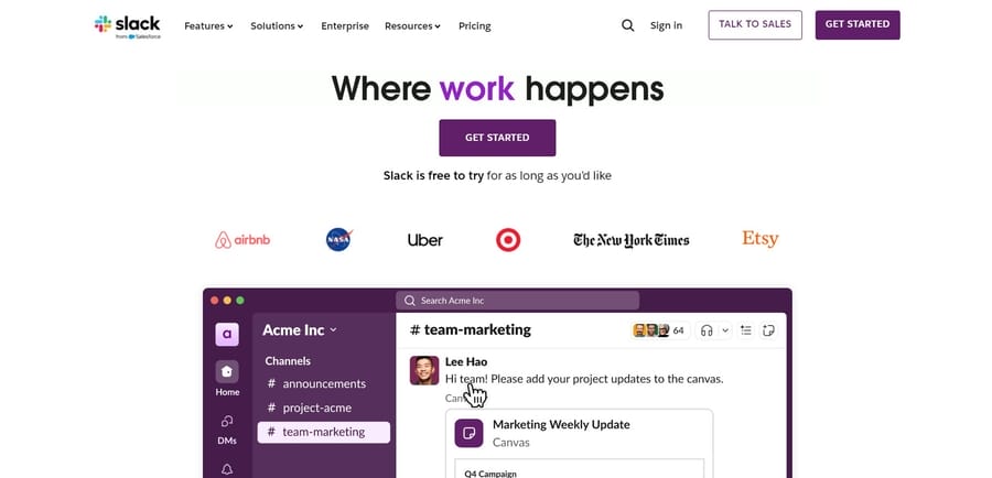
While this may be a defining trait for most project management tools, very few of them have as many integrations as Slack does.
As such, the platform can easily integrate with existing workflows, all while maintaining a straightforward and user-friendly interface.
2. Use A Consistent Color Scheme
Create a set of brand guidelines that define the exact colors you want your business to represent.
This can help you maintain visual consistency across all platforms, which helps you establish brand authority and build credibility within the industry.
Businesses should opt for contrasting hues when designing CTAs, submission forms or banners so they’re easily noticeable and don’t blend in with the background.
3. Prioritize Visual Hierarchy
Prioritizing visual hierarchy refers to organizing the elements of a website based on their importance.
This way, the user interface uses visual cues to guide visitors’ attention to the focal points of your website.
On the Cowboy Bikes website, users are immediately drawn to the silhouette of the brand’s e-bikes at the bottom because that’s the first design element that appears while the page loads.
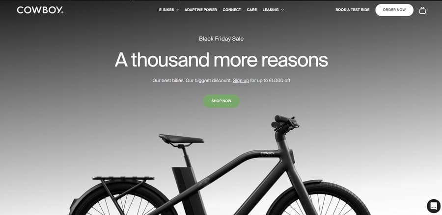
The accompanying headline comes into view quickly afterwards, promoting discount codes and special features to encourage users to continue browsing.
4. Include Personalized CTAs
61% of users expect tailored brand experiences based on their preferences.
You should analyze your target audience, determine their concerns and pain points and consider how your product or service can offer a solution.
For example, subscription-based businesses could offer free trials or discount promo codes to consumers, particularly if the target demographic is price-sensitive.
5. Follow The Rule Of Thirds
To create high-converting web pages, businesses should break up the design using a grid-like pattern of evenly spaced rows and columns.
This practice allows designers to arrange on-page elements evenly, align text properly across the entire page and strategically position images and icons for maximum impact.
The grid helps businesses identify key website areas where users’ eyes are drawn to the most, so they can strategically position important information.
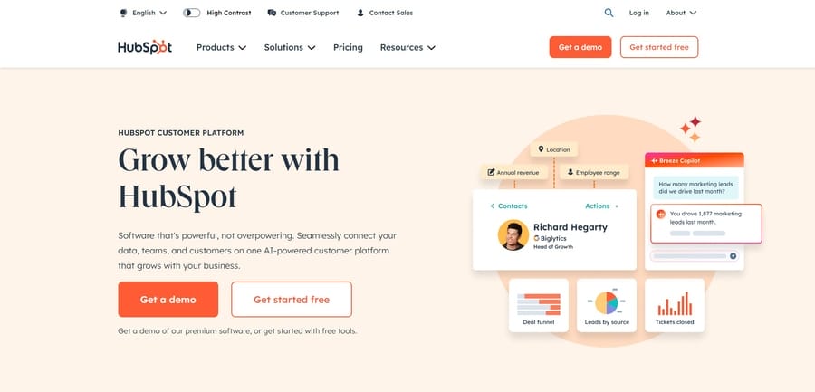
HubSpot makes clever use of this rule by drawing immediate attention to its ‘Grow better with HubSpot’ slogan, followed by two compelling calls-to-action on the left side of the page — because this is usually the first area that users scan when opening a page.
6. Use White Space Strategically
White space, also known as negative space, refers to the unmarked areas within a website design.
This can include wider margins on each side, spaces between on-page content or empty space within or around visuals.
Using white space effectively can simplify the design, divide the content into more digestible sections, guide users’ focus to your core message and improve readability by minimizing the cognitive load.
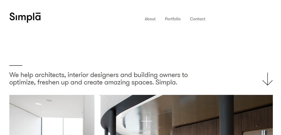
Simpla’s homepage accurately reflects the company’s straightforward, minimalist and uncluttered approach through a sizable white hero section that directs all attention to the upper navigation panel and headline copy.
7. Simplify Navigation Menus
Determine the purpose of your website and consider how users will search for relevant information to decide which pages to include in your navigation menu.
Brands should customize user navigation to maximize page functionality while minimizing website complexity, enabling visitors to easily find what they’re looking for.
Prioritize accessibility through readable font pairs, concise on-page copy, direct language and contrasting colors.
As a general rule, users should be able to find relevant information in three clicks or less. If it takes them longer to reach the desired content, your navigation likely needs improvement.
8. Emphasize Social Proof
95% of consumers read online reviews before purchasing from a particular brand.
This highlights the power of word of mouth in boosting your marketing efforts and shows that testimonials serve a purpose beyond mere decorative design elements.
Displaying social proof and positive feedback from satisfied clients can help bridge the trust gap between your brand and potential customers, which eventually contributes to improved engagement and increased revenue.
When you build positive brand associations, customers will be more inclined to browse your products or services.
You can use surveys, email requests, social media shoutouts or customer reviews on your website to gather and display positive feedback.
For instance, the professional event planning and organization platform Bizzabo has an entire page dedicated to customer success stories and case studies.
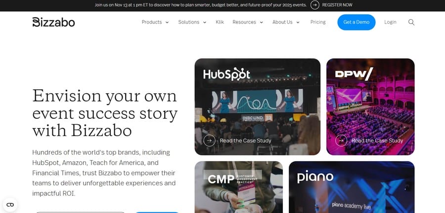
This illustrates the brand’s impressive track record and establishes credibility with potential clients.
9. Optimize For Mobile
76% of U.S. adults shop online using mobile devices.
Therefore, brands should adopt a mobile-first strategy when designing their websites.
Since smartphones have smaller screens, the goal should be to display only the most essential information.
Avoid placing CTAs at the corners of the screen because users might struggle to reach them with one hand.
Other key principles include using sticky navigation elements to ensure accessibility, “hamburger” menu buttons and font size and spacing that are easy to read on a small screen.
10. Improve Site Speed
53% of users abandon websites that take more than 3 seconds to load.
If your page takes longer to display relevant information, visitors are more likely to lose interest and close the browser window.
To minimize bounce rates and optimize the UI, you can decrease the number of HTTPS requests, compress image sizes, use a content delivery and caching network and write mobile-first code.
By following these steps on how to design a website that converts, you can create a user-friendly, fast-loading and brand-specific page.
How Can Web Design Boost Conversion Rates?
Using UI/UX design principles to create high-converting web pages can have several benefits, if executed properly:
- Improved credibility: 46.1% of users evaluate a site’s credibility based on its design. A well-structured, brand-specific and client-centric page can improve your brand’s trust, authority and reliability in the industry.
- Greater competitive edge: Having a custom website helps you establish your brand identity, adapt to changing business needs and consumer demands, incorporate advanced security measures and foster lasting connections with your clients.
- Better Return on Investment (ROI): While launching a new design may come with higher upfront costs, it can increase conversion rates and ultimately lead to a higher ROI.
How To Measure Your Website’s Conversion Rate
Brands can calculate conversion rates by dividing the number of completed preferred actions — such as filling out forms or signing up for newsletters — by the total number of website sessions or participants in a campaign.
You then multiply the result by 100 to get a percentage-based criterion.
If you have several conversion opportunities — such as downloading e-books, participating in surveys or following a brand on social media — you can either calculate the conversion rate separately or combine all the sessions from your website.
This metric can help you determine the success and efficiency of your current design, identify areas for improvement and track progress over time.
Design A High-Converting Website With Digital Silk
At Digital Silk, our in-house team of web designers and developers, branding strategists, SEO and content specialists create research-backed and results-driven websites tailored to your needs.
As a full-service web design agency, we plan, strategize and execute all website design and development aspects to ensure optimal conversions and customer satisfaction.
Our end-to-end services include:
- Custom web design
- Custom web development
- eCommerce web design
- Branding services
- Brand identity and logo design
Our team takes full ownership of each project, delivers measurable results and offers transparent communication throughout our partnership.
Contact our team, call us at (800) 206-9413 or fill in the Request a Quote form below to schedule a consultation.
"*" indicates required fields


