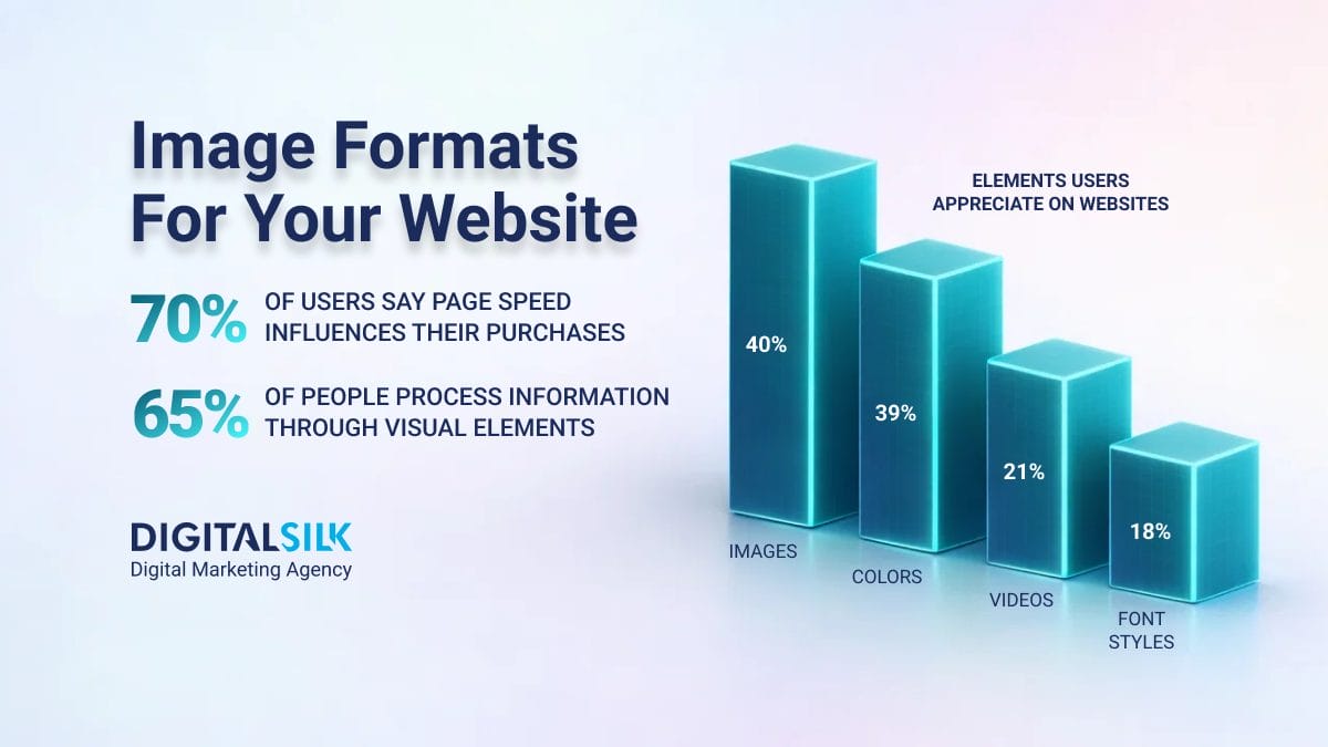
39% of consumers are attracted to brand color schemes the most.
Your signature color scheme can elicit emotional responses, convey messages and set the tone for your brand.
But how can you find a color combo that’s not only visually appealing but also reflects your brand identity?
In this post, we’ll outline the basics of how to choose brand colors and provide examples of effective combinations from well-established names.
How To Choose Colors For Your Brand
A signature color scheme can increase brand recognition by a sizable 80%.
Imagine walking down the street and catching a glimpse of the iconic red and white Coca-Cola logo or the bright yellow and fiery red McDonald’s arches.
Would you second guess which brands they represent? Probably not.
That’s how a well-chosen color palette can help you cut through the noise and differentiate yourself from the competition.
So, how do you choose the right colors for your brand? Several steps can help you pick the elements to include in your brand book and strategy:
Step 1. Understand Color Psychology
You can leverage color psychology in your branding strategy like you would in UX website design.
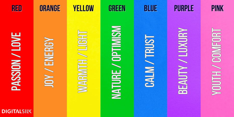
Colors play a crucial role in shaping brand perception, with each hue symbolizing distinct emotions and values.
Blue, for instance, conveys confidence and trust, which helps establish a dependable brand image.
Green evokes positivity and is often associated with health and sustainable causes, appealing to eco-conscious consumers.
Yellow, reminiscent of the sun, triggers associations with hunger and warmth while orange reflects enthusiasm and excitement.
A bold red hue signals caution but also love and intimacy, resonating deeply on an emotional level, while purple symbolizes royalty, success, wealth and wisdom.
Globally recognized brands tend to go for vibrant, strong hues that stand out and are synonymous with their identity.
In contrast, niche businesses such as makeup brands and baby clothing lines prefer lighter shades to communicate softness and approachability.
Take a look at some of the most common brand colors below and their associations:
Step 2. Learn About Basic Terminology
To establish a cohesive visual brand language and persona, you should know the basics of color terminology.
This allows you to effectively communicate your vision to designers and ensure a consistent appearance across all channels.
When your team clearly articulates color specifications and requirements, it’s easier for designers to maintain brand integrity and build a recognizable presence over time.
The branding and design glossary of common terms includes:
- Hues: Specific variations of primary colors that result in secondary or tertiary colors through mixing, tinting, shading and toning.
- Shades: Darker versions produced by adding black — the higher the percentage, the deeper the shade.
- Tints: Lighter versions produced by adding white — the higher the amount, the lighter the tint.
- Chromaticity: The purity of a hue, determined by the absence or presence of other colors.
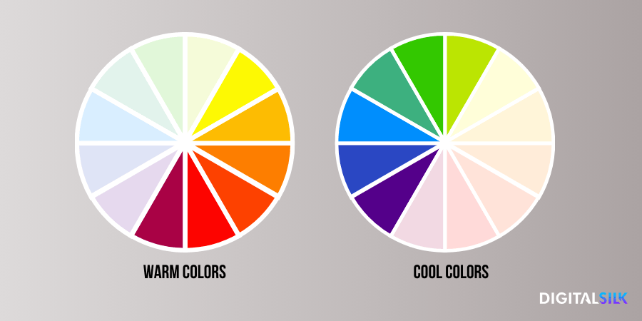
- Color temperature: How warm (red-orange-yellow) or cool (blue-green-purple) a color appears when placed next to another.
- RGB codes: Short for red, green and blue, these color values make up the spectrum of web-safe colors used in computer screens.
- CMYK and PMS: Color codes short for cyan, magenta, yellow and black (CMYK) or Pantone Matching System (PMS), acting as a standard system for consistent color matching.
Step 3. Analyze The Competition
Since a notable 55% of first impressions for consumers are visual, analyzing what works and doesn’t work for competitors can provide valuable insights.
This doesn’t mean you should copy their brand language or identity but rather understand your industry’s visual landscape and identify gaps in the market that your brand can uniquely fill.
If several businesses share the same color scheme, it might confuse customers or weaken the brand’s signature identity.
Being different and special starts with distinct branding. It helps consumers remember your brand for its trademark qualities, not because it reminds them of someone else.
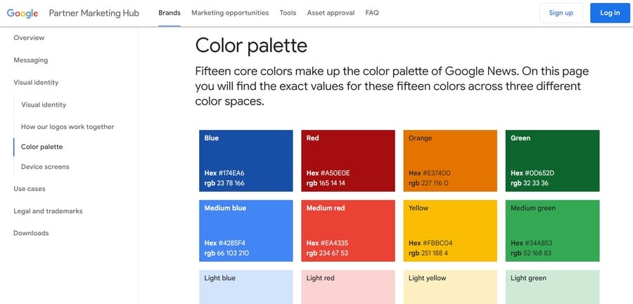
For instance, Google’s undeniable rainbow palette is one of its most recognized features. It’s vibrant, youthful and distinct from the blues, grays and whites commonly used by tech companies.
Step 4. Define The Number Of Colors
Too many options can be overwhelming and dilute your core messaging, while too few may limit your visual potential.
When choosing primary and secondary colors for your brand, you should aim for three for the former and four to five for the latter.
Your primary colors ensure cohesive and consistent branding across all platforms and reflect your brand’s strategic direction.
When you mix in four to five secondary colors, you add some depth and versatility to your identity and offer more creativity when designing marketing collaterals.
Step 5. Rely On The Color Wheel
The color wheel is a visual guide that organizes colors into primary, secondary and tertiary categories based on their relationships to one another.
You can see the categorization in the visual below, with the innermost circle showcasing primary, the middle ring focusing on secondary and the outermost ring featuring tertiary colors.
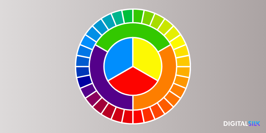
You can also split the color wheel into warm and cool tones, with the former focusing on reds, oranges and yellows while the latter highlights blues, greens and purples.
You don’t necessarily have to stick to colors on the opposite sides of the wheel to achieve balance and harmony, especially if they’re all very bright and vivid.
What may seem harmonious might be more disruptive, with each color competing for attention.
Instead, opt for complementary colors with varying intensity levels to create a more visually pleasing balance.
Step 6. Match To Your Brand Identity
When you define your brand’s personality and values clearly, you can choose colors that resonate with your core messaging and evoke the desired emotions from your audience.
To ensure your brand colors reflect your industry or your main values or benefits, ask yourself the following key questions:
What problem does your brand solve? What value does it offer? What principles guide your business and how can your audience connect with them through color?
For example, if your brand is focused on eco-friendliness and sustainable living, choose green tones to convey growth, freshness and natural living.
If you’re a luxury brand, opt for deep, rich and elegant colors like gold or purple to convey sophistication and exclusivity.
Step 7. Consider Target Audience
62-90% of the time, people assess brands based on colors alone.
Think about who your target audience is and what colors they may be drawn to.
How you present your brand visually can make a significant impact on how they perceive and connect with your business.
For example, if you’re targeting a younger audience, vibrant and playful colors may be more effective in capturing their attention.
On the flip side, if your target demographic is more mature or professional, choosing muted and sophisticated tones may be more appropriate.
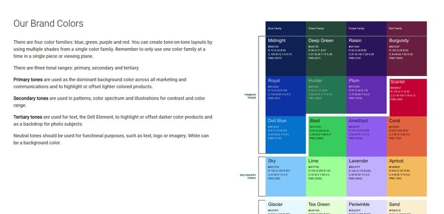
For instance, Dell features blue, green, purple and red as its main brand colors to reflect its core values of innovation, trust and collaboration.
Step 8. Create A Brand Book
Your brand book and toolkit should consist of complementary colors to ensure visual interest and balance.
Think about how you’ll use them in various applications, such as on your website, social media profiles, print materials and packaging.
This approach keeps your branding flexible yet unified, so that every piece of your marketing strategy feels interconnected.
The more cohesive and consistent your brand colors are, the more recognizable you’ll become to your target audience.
5 Best Brand Color Palette Examples
While theoretical advice can be helpful, sometimes seeing real-life examples can provide even more inspiration.
Below, we’ve compiled a list of brand color combinations that work, based on their recognizability, appeal and versatility:
1. Starbucks
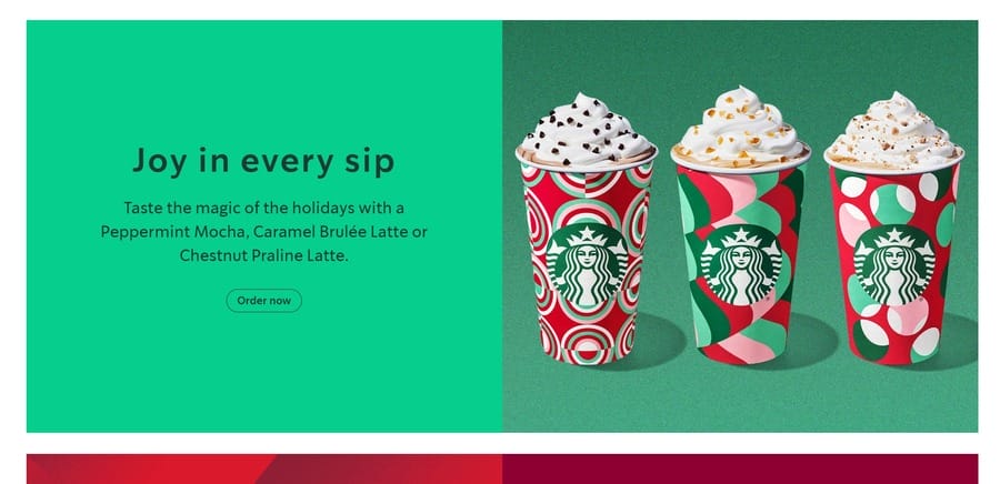
Starbucks uses its trademark “family of greens” color palette to symbolize healing, wealth and nature.
Its primary, darker green shade is a common sight on all brand elements, whereas the lighter, accent version is used sparingly for contrast.
The brand’s signature black and white colors act as clean, minimalist and anchoring options for typography or backgrounds.
2. Slack
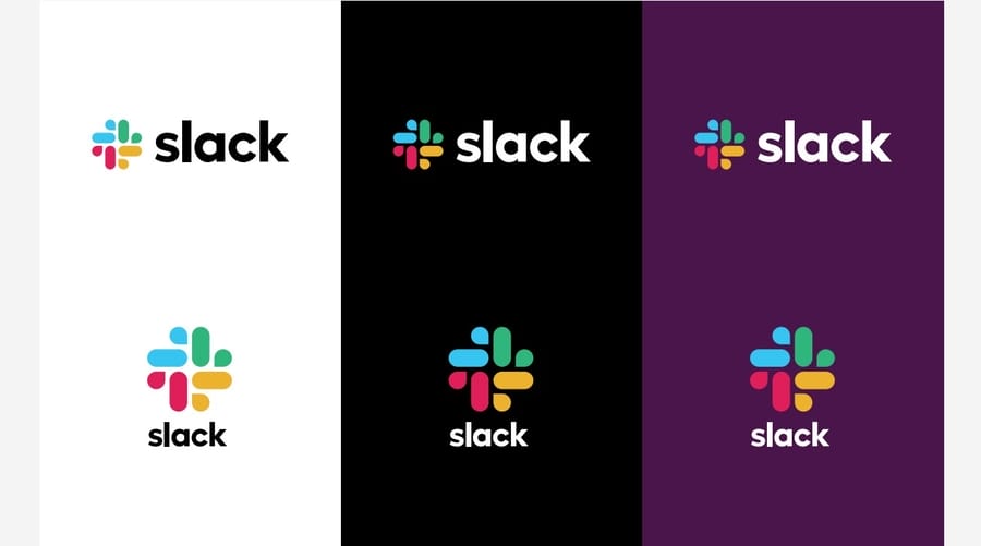
Next up, Slack’s brand guidelines focus on a multiple-color palette of pastel hues — blue, green, yellow and purple.
The brand’s primary color is Aubergine, which is a dark purple shade used for the logo and main branding elements.
The secondary colors — blue, green and yellow — are used as accent shades for visual interest and variety.
3. Instagram

Perhaps the most recognizable color gradient in the world, Instagram’s smooth-flowing, multi-dimensional and vibrant rainbow palette symbolizes diversity, creativity and fun.
This rich and polychromatic spectrum is interactive, attention-grabbing and more than suitable for a brand that relies on visual storytelling, dynamic content and individuality.
Instagram features this mix of bright and saturated tones — including yellow, orange, pink, purple and blue — across icon design, home layout and story highlights.
4. The Guardian
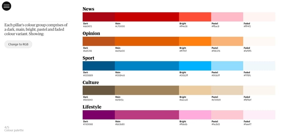
Most people wouldn’t associate a news media company with overly creative or free-spirited branding but The Guardian manages to break down this stereotype through its well-structured and content-based approach.
The brand’s primary color is a bright, bold and attention-grabbing red, which symbolizes urgency and importance in news reporting.
To balance out the intensity of the red shade, The Guardian uses calming blue tones for sports-related sections and purple hues for lifestyle content.
5. Mastercard
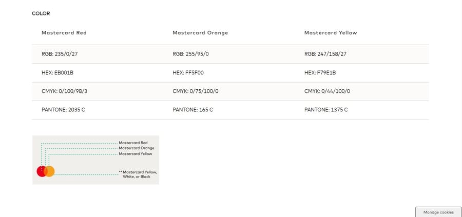
Mastercard‘s signature logo features two overlapping circles in red and yellow, which produce a vibrant orange gradient in the middle.
The company uses this bright and energetic color palette to convey a sense of innovation, technological advancement and optimism.
The brand also utilizes secondary colors such as gold or green to represent different services or products, which adds depth and versatility to its branding.
Digital Silk’s Brand Color Palettes
Digital Silk creates signature brand kits and guidelines for clients across industries to help them expand their reach, establish a strong brand identity and stay relevant in a competitive market.
Some of our trademark projects include:
Mintera
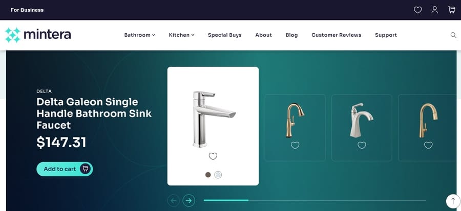
Our team chose colors that reflect the excellent, “mint” quality of Mintera’s refurbished home products.
These colors show the brand’s focus on style and quality, appealing to customers who want great, affordable home products.
Best Wire & Cable

Digital Silk’s branding team selected a palette that mirrors the core of Best Wire & Cable’s industry — technology and innovation.
The colors white, red and blue not only represent the vibrant wires within a cable but also symbolize the brand’s dedication to delivering modern, reliable products.
Benefits Of Signature Brand Colors
Your brand colors are the first thing people see and remember about your business, so therefore they bring a handful of benefits, including:
- Immediate brand recognition: Consistently using your trademark colors across all marketing channels and touchpoints helps customers associate them with your brand. Since consistent representation can increase revenue by 23%, having a strong color scheme is a crucial element of your brand identity.
- Greater emotional connection: Colors have the power to evoke emotions and create psychological associations with a brand. You can control how your audience perceives your brand through the use of colors and their meanings.
- Better market differentiation: In an era where people are exposed to countless marketing materials and ads every day, a unique and recognizable color scheme can help your brand establish its own space in the market.
Choose Your Brand Colors With Digital Silk
Digital Silk’s expert team of branding and digital strategists, web designers and developers, content and marketing specialists can help you create a recognizable, memorable and impactful brand color scheme.
Our team uses a data-driven approach to understand your target audience, industry trends and competition to develop a custom palette that reflects your brand’s unique identity and values.
We also ensure consistency across all branding elements, including logos and website design, social media and marketing materials.
As a full-service web design agency, our solutions include:
- Premium branding services
- Logo and brand design
- Digital marketing solutions
- Custom web design
- Custom web development
We take full ownership of each project throughout its lifecycle, ensure transparent communication and deliver tangible results.
Contact our team, call us at (800) 206-9413 or fill in the Request a Quote form below to schedule a consultation.
"*" indicates required fields


