The global eCommerce market will reach $8.1 trillion by 2026, so having an industry-leading online store is not an advantage but a necessity if you don’t want to miss out on that revenue.
Our web design and development experts at Digital Silk have put together a list of 20 must-have eCommerce website features for engagement and conversion.
From design to checkout, explore the features on our list and find out why they’re key in this fiercely competitive arena.
20 Must-Have Website Design Features
While eCommerce websites aren’t one-size fits all, there are certain features that every website should have to promote visibility, engagement and conversion.
We’ve broken down the features into several categories below: design, navigation, product and checkout.
eCommerce Design Features
Every successful eCommerce website starts with design features. Below are the three most important ones.
Feature #1: User-Friendly Design
Your eCommerce website needs to be designed for your audience and easy to use.
This means giving your visitors an intuitive interface, where they can effortlessly navigate through the site, find products and complete purchases with minimal friction.
Key elements for an eCommerce website include a search bar, a header and footer that offer value to your visitors, a menu and visible calls-to-action (CTAs) to guide your users towards checkout.
Specific design features of each of these elements depend on the amount and type of content that you have.
It is always best to consult with an expert web design company that can analyze your business goals and design and develop a website that works for you.
Feature #2: Mobile Responsiveness
60% of all global eCommerce purchases occur through a mobile device.
If you’re not making your online store mobile-friendly, you’re likely missing out on revenue.
Make your website function optimally across different devices and to offer your visitors a seamless experience regardless of whether they are using a laptop or a mobile device.
Feature #3: About Us Page
Every eCommerce website needs to offer its visitors an “About Us Page.”
While the purpose of your online store is to sell your products, the “About Us” page builds trust, lets your customers know who you are and gives you an opportunity to tell the story of your brand, crafting a narrative that resonates with your target audience.
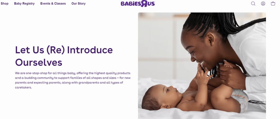
For Digital Silk client Babies R Us, the About Us page — titled Our Story — was especially important as we were designing the site. This page tells the story of the brand’s comeback after a long hiatus.
Website visitors can navigate this page to learn about the brand’s identity, history and mission, bolstering brand identity and building trust and credibility in the process.
eCommerce Website Navigation Features
Navigating an eCommerce website should feel like gliding through the aisles of your favorite store, where everything is within reach and nothing is too hard to find.
Below are the key features to implement to provide a user-friendly navigation experience.
Feature #4: User-Friendly Navigation Menu
A user-friendly navigation menu is an essential component of every online store. Its goal is to offer your visitors a clear view of your products or services.
The classic navigation menu is a header with anchor links taking your visitors to specific pages. However, there are different types of navigation menus such as a sticky menu, hamburger menu, dropdown menu and more.
Our Digital Silk team designed a website for luxury menswear brand, Paul Stuart, focusing on a user-friendly design.
We opted to go with a classic navigation menu to offer our client’s visitors a clear and straightforward reading pattern that can easily take them to their desired page, be it “NEW ARRIVALS,” “MENS” or “FEATURED.”

Feature #5: Product Search
An effective product search can be the key to your customer retention — 69% of visitors immediately go for the search bar when they visit an online store and 80% of them leave due to poor experience.
Offering your potential customers a user-friendly product search is key to keeping them on your page. Your search bar needs to be clearly visible and conveniently positioned in relation to other elements that are present such as login, newsletter, cart etc.
In the below image, you can see how Digital Silk designed the search bar for our client Studenglass, an award-winning Glass Gravity Infuser.
When designing Studenglass’ product search, we made sure to make it stand out by including the text “SEARCH.”
We also added additional features to it, such as autocomplete to start showing most relevant products as soon as the visitor starts searching.
Typing the letter “s” in the search bar already gives Studenglass’ visitors results, accelerating our client’s search process.

Feature #6: Product Filtering
Product filtering is an eCommerce website feature that allows your visitors to narrow down their search based on different criteria.
It gives your visitors a more personalized experience, offering them the opportunity to sort products based on their specific needs and preferences.
Filter options to implement include:
- Price Range
- Size
- Color
- Style
- Availability
- New Arrivals
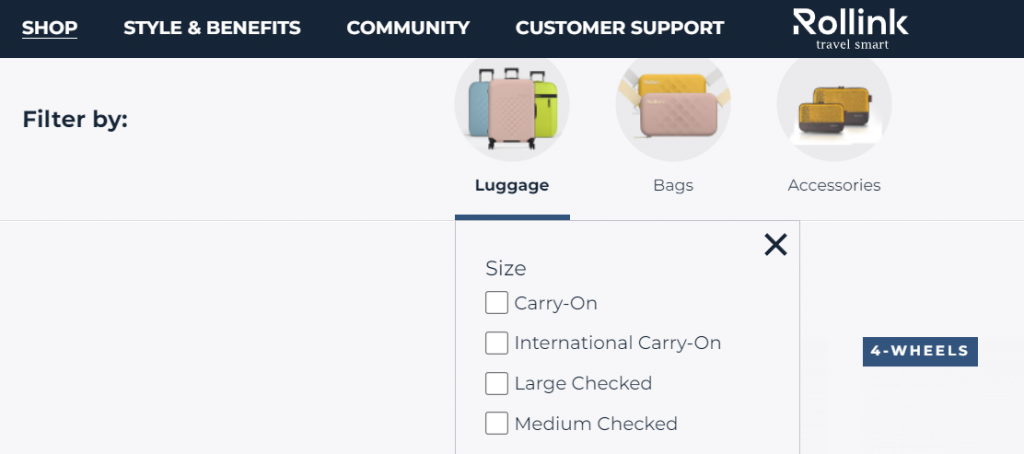
You can see this in another one of Digital Silk’s designs. Our client Rollink, a premium luggage brand, needed a new website. When delivering our website solution, we focused on addressing the specific pain-points of users looking to buy luggage. Our filtering options included the following, per size:
- Carry-On
- International Carry-On
- Large Checked
- Medium Checked
Feature #7: Customized Calls-To-Action
Calls-to-action or CTAs are any designs that encourage immediate reaction from the visitor. They are meant to guide the user towards conversion. In eCommerce websites that refers to purchase.
Effective CTAs should draw attention and stick out on the page. They should visually pop up though strategic placement and use of different colors and designs from the rest of the content. Additionally, the language of a CTA should be tailored to the audience on the page.
In the video below, you can see how we did it for our client Evlo Fitness, who provide their customers with online fitness classes.
In the top right corner and beneath the title, the CTAs engage the visitor by offering them a “14-Day Free Trial.”
The button itself has a rollover effect, resulting in a change of color when a user hovers over it.

Feature #8: FAQ Section
Your visitors will naturally have questions about your store or products before a purchase and by providing a Frequently Asked Questions (FAQ) section, you show your visitors that you care about their concerns and that you are willing to make it easy for them to find the answers they are looking for.
Include the questions that reflect some of your customers’ most pressing concerns.
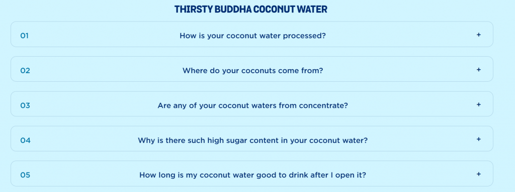
We designed the website for our client Buddha Brands. They make a range of clean snacks and beverages with a focus on making them plant-based and artificial free.
With that in mind, their customers naturally wished to learn more about their product, specifically whether their coconut water is processed, where their coconuts come from and why there is high sugar content in their coconut water, to name a few.
Feature #9: Footer Navigation
Footers are another important feature of an eCommerce website.
Typically located at the bottom of every webpage, they serve as a second navigation area, offering quick access to resources and information that can’t be found in the main menu.
Footers have an important role in search engine optimization (SEO), as they hold links to key content pages and help search engines better understand and index the site’s structure, which positively impacts search rankings (see this case study to know how SEO can help your website).
Footers also foster user engagement as they incorporate elements such as newsletter sign-up forms, FAQs, warranties and beyond.
In Rollink’s example below, we designed a footer that gives our client’s visitors everything they might need, from FAQ and order tracking to a newsletter sign-up bar, through which Rollink engages users and invites them to subscribe to their updates.

Product Features of an eCommerce Website
Your repeat customers might be familiar with your products. First-time visitors won’t be. That is why it is imperative to ensure your visitors can find all the product information they need to make a purchasing decision.
Feature #10: High Quality Visuals
High-quality photographs have a 94% higher conversion rate than low-quality photographs. Additionally, pages with photographs receive 95% more organic traffic than pages without them.
It’s important to keep the specific product in mind and to offer your visitors a way to see it. For example, when designing our client Paul Stuart’s website, we included high-quality images of their vests.
However, to give their visitors a better look of a product, we included a feature that zooms in on specific details of the clothing item once the visitors hovers over them.

Feature #11: Product Videos
Videos are a powerful tool to increase conversion. In fact, 87% of video marketers say that product videos have increased the dwell time on their page.
An effective product video communicates the value of the product and engages the audience to lead them towards the desired goal, whether to make a purchase or simply learn about the product.
There are 3 main types of product videos for eCommerce brands.
Those are:
- Product Demonstrations: Product demonstration videos all your customers to see your product in action and understand how it works.
- Explainer Videos: Explainer videos help customers understand key values of the product and demonstrate how the product answers a specific market need.
- How-To or Tutorials: Present a step-by-step process on how to use the product.
Feature #12: Product Reviews
Nearly 70% of shoppers read between one and six reviews before making a purchasing decision.
Having a product review section that showcases the strengths of your product can tilt the undecisive users towards making a purchase.
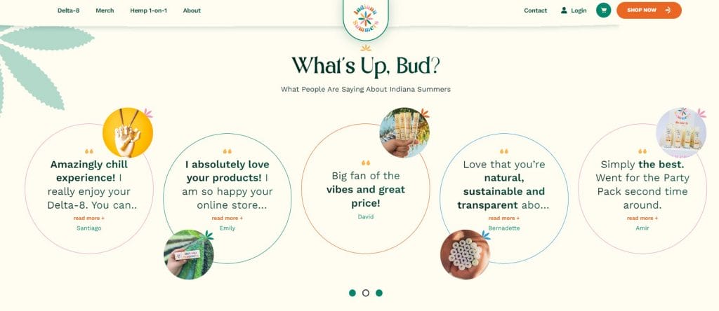
For Indiana Summers, a Delta-8 products manufacturer, we focused on a simple design that highlights some of their raving product reviews to elicit engagement from past, satisfied customers and to encourage their visitors to become customers.
eCommerce Checkout Features
Offering your visitors a simple and streamlined checkout process is paramount to the success of your online store, especially when you consider that 69% of visitors abandon their shopping without making a purchase.
Below are some of the important checkout features of an e-Commerce website.
Feature #13: A Wishlist
A Wishlist is a feature of eCommerce websites that lets visitors browse, track and save products they are interested in without buying them.
Essentially, it functions as a virtual shopping list, letting visitors make a note before purchasing a product later, at their convenience.
Google shows that 40% of shoppers think their shopping experience would have been better if retailers offered a Wishlist where they can save the items they are interested in.
Additionally, they are a powerful tool for any eCommerce brand for the following reasons:
- They encourage customer engagement even if the customer isn’t ready to make a purchase
- They act as a reminder for potential future purchases
- They provide marketing data
Feature #14: Multiple Payment Options
Consumers have come to expect a range of payment options when shopping online. They seek the convenience of using their preferred payment method, whether it’s credit or debit cards, eWallets, bank transfers or newer forms of payment such as cryptocurrencies.
Providing multiple payment options is not just a courtesy — it’s a strategic move that can significantly widen your customer base.
Feature #15: Order Tracking
Order tracking allows your customer to follow the progression of package’s delivery, from the moment is ready to ship to the moment it reaches their door.
It incorporates order tracking in real-time, updates, estimated delivery dates and interactive elements such as maps.
Considering that 91% of consumers actively track their packages, you want to makes sure to include this important feature when designing your eCommerce website.
Feature #16: Clear Exchange and Return Policy
A clear return and exchange policy is essential for every eCommerce website.
It provides transparency and gives customers reassurance when they buy a product from your eCommerce store.
While it can lead to greater customer satisfaction and a higher returning customers rate, it also demonstrates your willingness to address customer concerns and provide them with a positive shopping experience.
Two main ways to include exchange and return policy:
- Email: you want to include it in the confirmation emails for customers who have already made a purchase.
- As a link in your website footer.
You can see how we included it in the footer for our client Paul Stuart.

Feature #17: Customer Support
Customer support showcases your dedication to providing your customers with help in any situation. In fact, 70% of the buying experience is based on how the customer is treated.
An effective customer support system includes various channels like live chat, email support and a dedicated helpline, ensuring that customers can easily reach out in their preferred way.
Feature #18: Special Offers and Discounts
Special offers and discounts encourage your customers to make new purchases and they give them an incentive to come back and continue shopping on your website.
Special offers are a simple and effective way to elicit engagement from your users, boost sales, clear inventory and enhance customer loyalty.
By offering timely discounts, promotional codes and exclusive deals, e-commerce websites can stimulate purchase decisions and increase the average order value.
This is how we did it for our client Rollink.
We included the caption above the header in bright yellow and we used the text to engage the visitors by telling them about the “BLACK FRIDAY SALE.”

Feature #19: Email Opt-In
An email opt-in feature is a strategy that helps turn a casual visitor into a customer.
Email subscriptions provide eCommerce businesses with a direct and reliable channel to communicate with customers, bypassing the unpredictability of social media algorithms.
They allow for personalized and targeted marketing that can increase customer engagement and conversion rates.
You want to make this section of your website stand-out on the page, as email marketing serves various purposes for eCommerce brands.
Some of the main benefits of this feature include:
- Customer retention: Engage existing customers and encouraging repeat purchases.
- Abandoned cart recovery: This allows you to remind the customers of the items they left in the cart and possibly offer an incentive in the form a discount for them to finish the purchase.
- Cross-selling: Recommend complimentary items or higher-tier products through this personalized approach.
Feature #20: Loyalty Programs
Loyalty programs foster customer loyalty and encourage repeat purchases.
These programs include point systems, benefits or exclusive discounts for repeat customers.
You can utilize these programs to reward customers for their loyalty, in turn increasing customer retention, lifetime value and brand advocacy. These programs don’t only incentivize repeat business but also provide valuable customer data for future marketing efforts.
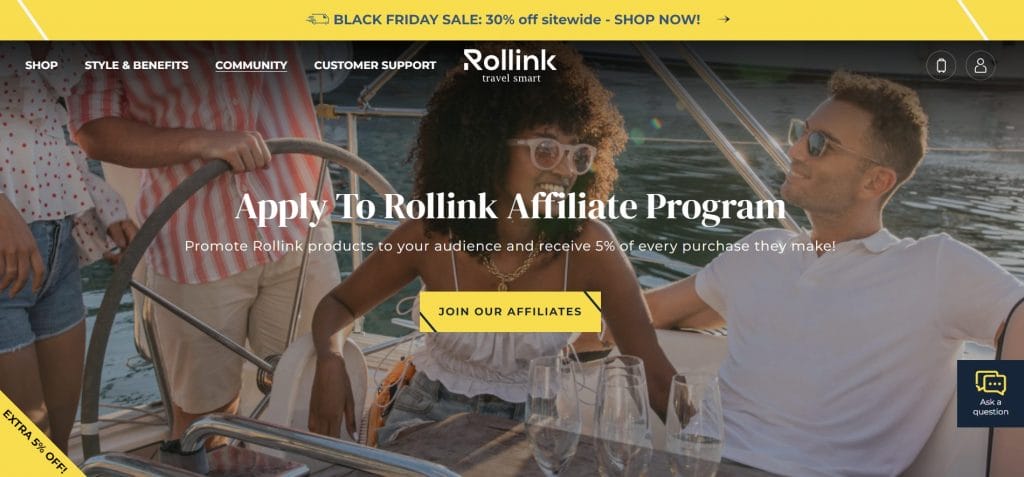
See how we did for Rollink. In the header, we included the “COMMUNITY” button. When a potential customer opens it, it leads to the page where we invite the customer to join Rollink’s affiliate program in exchange for 5% off every purchase.
Design Your eCommerce Website With Digital Silk
If you’re looking to design your eCommerce website, you came to the right place.
At Digital Silk we grow brands online. We have expertise in all things digital, from web strategy to branding, marketing, search engine optimization and beyond.
Relying on our extensive experience, we design custom eCommerce websites for our clients using all leading platforms such as Magento or Shopify.
Partner up with Digital Silk and receive your custom eCommerce website that fosters brand growth, increases your website traffic and converts your visitors into customers.
Explore Digital Silk services:
- eCommerce Website Development
- Shopify Development
- Magento Development
- Custom Website Design
"*" indicates required fields


