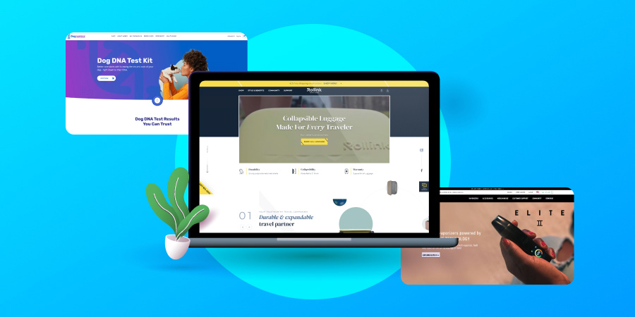
Whether you’re planning an eCommerce website redesign or looking to create your custom eStore from scratch, we’ve compiled the top five eCommerce website examples from our design kitchen to serve up some eye candy, while sharing our strategic design decisions.
Digital Silk builds custom e-stores. Request A Quote
eCommerce Industry Insights
Before building an eCommerce site, it’s important to gather industry insights that will help inform your design decisions.
How exactly can you use these insights to inform your design? Let us explain.
For example: In 2020, customer experience ranked as the top factor consumers considered when purchasing from a brand.
What does this mean for your eCommerce website?
It means that the user experience your website offers should be a top priority for your brand.
Through design elements like intuitive navigation, engaging media, dynamic product presentation and a seamless checkout process, you can ensure your website offers an enjoyable experience for website visitors.
In turn, visitors will be more likely to stay on your website longer, browse your offering, convert, and return.
Here’s another insight to consider: In a recent retail report, 79% of Americans said that free shipping would encourage them to shop online.
Does this mean that online shoppers are cheap? Not so fast — free shipping encourages online shopping and helps entice the customer to complete the checkout process.
How would you use this insight? To highlight free shipping perks on your eCommerce site, you could display a sticky discount code on your homepage, for example, so it follows visitors as they move about your website, always in view as a little reminder.
5 Examples Of eCommerce Websites & Our Expert Notes On Each
From luggage to clothing and beyond, here are five eCommerce website examples from our NYC design kitchen that stand out when it comes to robust product pages, search engine optimization, and design elements that create an engaging user experience for website visitors.
1. Rollink
Website: www.rollink.com
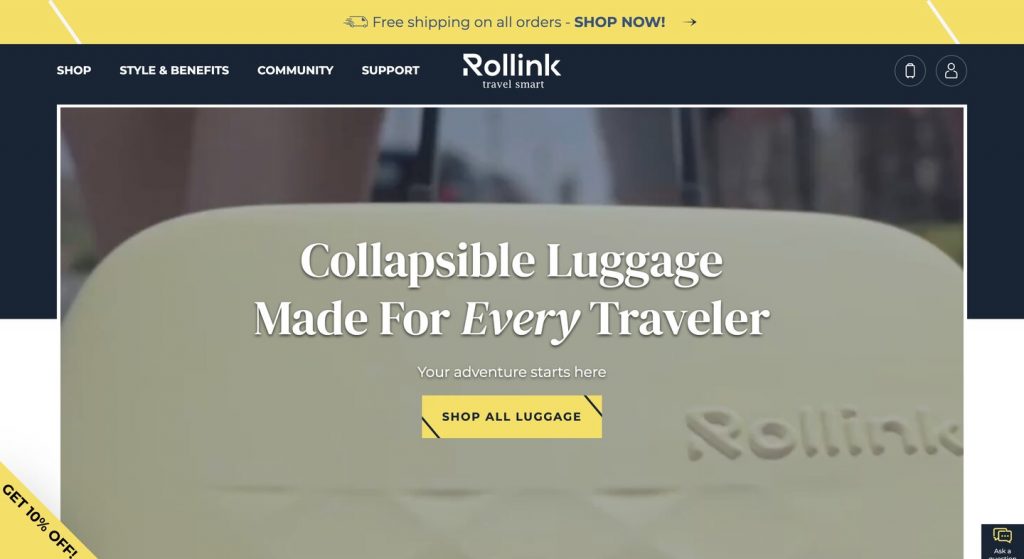
We’re starting off with Rollink as one of the top eCommerce website examples not only for its UI, but mostly for its carefully planned messaging and user experience.
Right off the bat, Rollink’s unique value proposition (UVP) explains what they offer as a brand – collapsible luggage made for every type of traveler. A clear UVP showcases who you are and what you offer as a brand.
The simple navigation bar displays Rollink’s key pages: shop, support, the user’s account and shopping cart.
It’s a sticky nav bar, so it follows the user as they scroll down the page and provides easy access to key points, wherever the user is on the website.

Our team optimized the placement and appearance of each CTA to entice click-throughs.
CTAs including “Shop All Luggage” and one on the lower left corner which says “Get 10% Off” stand out and draw the site visitor’s eye to key conversion points.
Scrolling down the page, site visitors are greeted with an immersive product experience through 3D models of luggage.
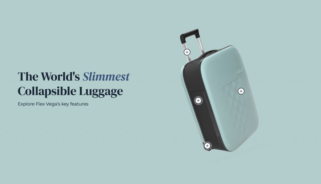
When hovering over the 3D models, our designers utilized each luggage part to highlight key benefits, such as impact-resistant polycarbonate shells and a height-adjustable telescopic handle.
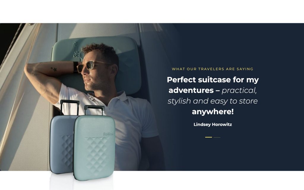
Social proof is displayed front and center to highlight how satisfied previous customers are with their luggage and encourage prospects to feel confident about purchasing Rollink products.
A sticky “Ask a question” button enables users to contact the team directly. Site visitors just have to fill out the form and wait for their queries to be answered by the Rollink team. The key importance of this button is to allow Rollink to build relationships with prospective customers and offer timely support.
Switching views, Rollink’s product pages are the real star of the show.
Our eCommerce web design team ensured that each Rollink product had a detailed product description and copy that communicates benefits and perks, such as free shipping and a warranty.
Each web page is fully optimized for search engines, to increase the brand’s visibility. To optimize the site, our team conducted research to narrow down target keywords. Then, we placed them in headers, title tags, meta descriptions, and original content in the blog section.
From simple navigation and clear UVP to 3D animations and robust product pages, Rollink’s site accurately displays the brand’s offering and key messaging while engaging visitors and ushering them toward conversion.
2. G Pen
Website: www.gpen.com
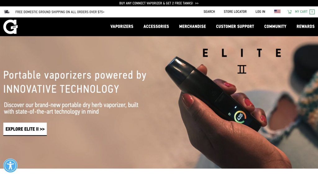
G Pen, a brand known for its portable vaporizers and vape pens, uses the hero section to display product launches or promotions, so site visitors are instantly informed about the latest offering.

Below the homepage, GPen isn’t shy about showing off their media mentions, such as BuzzFeed, TechCrunch and Complex. This type of social proof promotes credibility and helps potential customers feel confident about their choice of purchasing from the brand.

In addition to media endorsements, highlighting the value of your offerings such as warranties and return rates can build the additional trust the user needs — which is why our designers displayed G Pen’s product warranties on key pages, to gain the user’s trust and help sway them towards conversion.
From vaporizers to accessories, the product pages are filled with a benefits-driven copy to further educate prospects.
Similar to Rollink, our creative web designers utilized immersive 3D models to emphasize GPen’s technological features. Each part is broken down to explain the material used and the purpose behind it.
This type of animation emphasizes the components of the product, to attract vaping enthusiasts looking for a quality product.
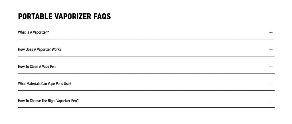
Next, we find the FAQs section. In addition to answering potential questions, the FAQ section allows G Pen’s site to rank in search, compete for featured snippets, promote product education, and establish transparency.
Speaking of organic search, the website is fully optimized and the brand outranks competitors on search engine results pages.
Thanks to 3D animation and optimized web pages, G Pen has earned its spot in our list of best eCommerce website examples.
3. Dognomics
Website: www.dognomics.com
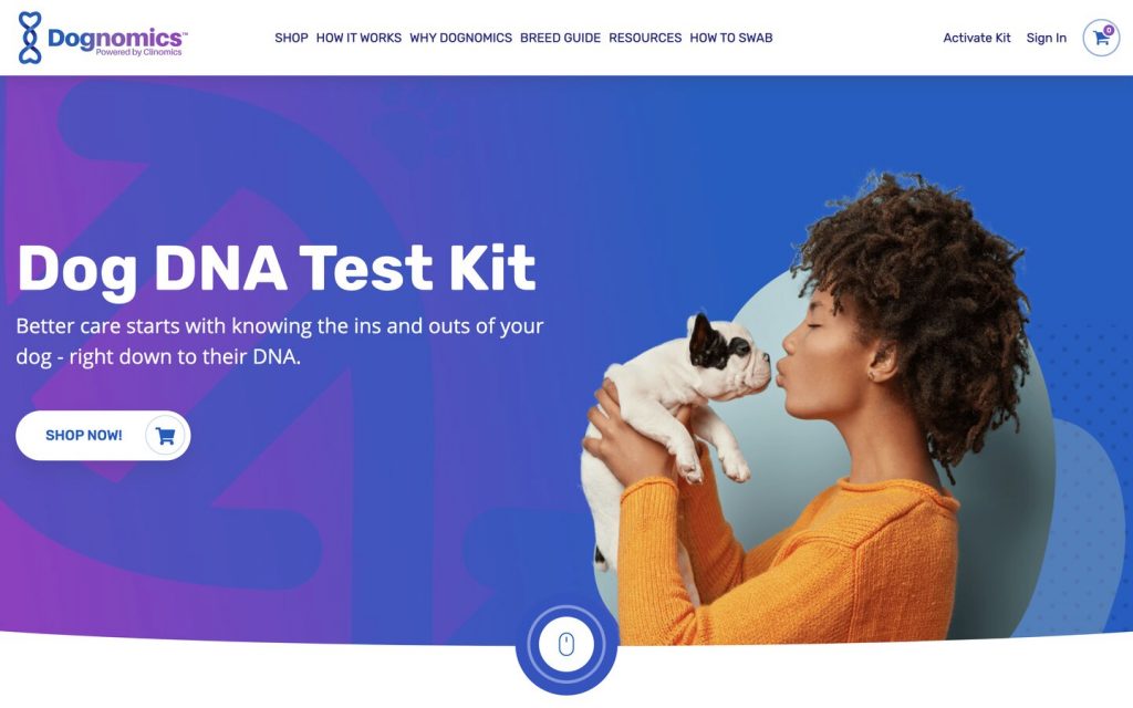
Fully optimized for search engines with intuitive and sticky navigation, Dognomics — a dog DNA test company — presents a highly informative eCommerce site to educate site visitors on their offerings.
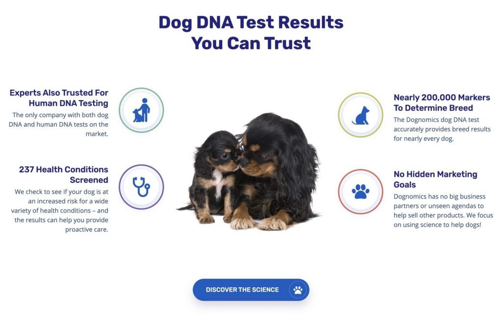
Scrolling down the page, site visitors are educated more about how the product works and its benefits, thanks to the easy-to-read and skimmable copy displayed throughout.
CTAs are specific, such as “Shop Now,” “Join Now,” “Discover The Science” and “Learn How To Swab,” allowing the site visitor to know exactly what’s behind every click.
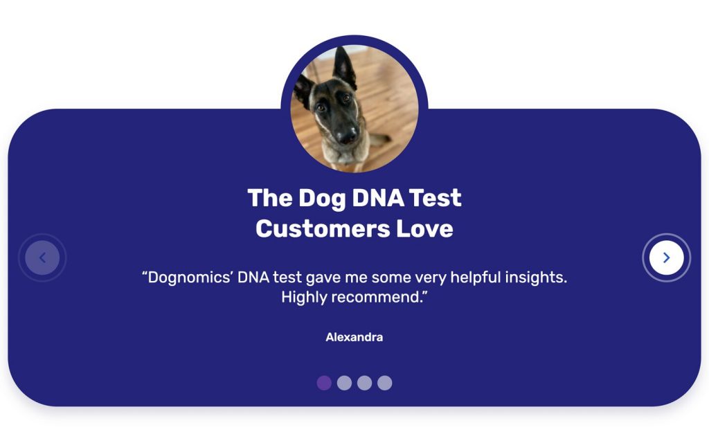
We showcased customer testimonials front and center, together with images of doe-eyed pups to draw attention, trigger emotion and build credibility.
Product education — key to an eCommerce site — is further displayed on product pages, thanks to detailed descriptions and skimmable, benefits-driven copy.
We must also credit our talented brand design teams for creating the foundations of this fun eCommerce website.
4. Buddha Brands
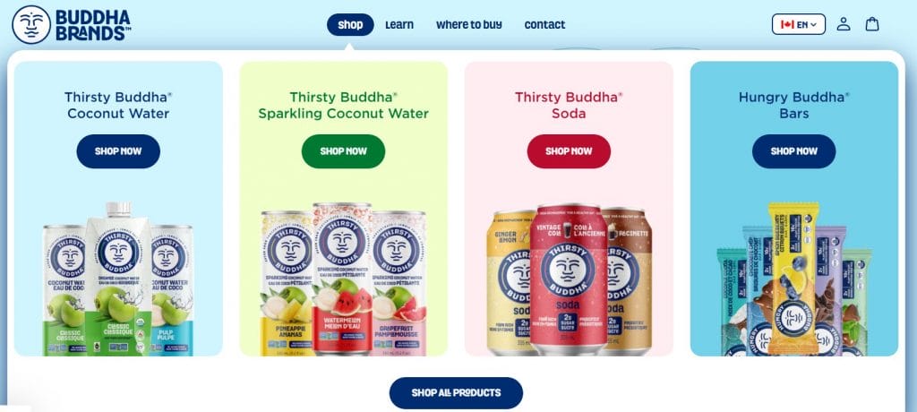
Buddha Brands’ plant-based snacks and beverage e-store delivers an exciting, engaging and easy-to-use experience.
Visitors are greeted with an explosion of colors, animations and illustrations that match the brand’s trendy identity when they land on the homepage.
The layered imagery and design features provide a captivating tone to the site that’s completed by enticing videos and hover animations.
Our website design for Buddha Brands goes beyond its visual display.
The online store also focuses on streamlined user journeys and facilitating a seamless UX through its:
- Engaging mega menu design: High-quality visuals and micro-interactions guide customers to the e-store section that fits their needs best.
- Interactive CTA buttons: Hover animations and changing colors boost ongoing user journeys and conversion opportunities.
- Amazon checkout feature: Pop-ups and product page CTAs direct customers to Buddha Brands’ Amazon checkout area within one click.
5. Stündenglass
Website: www.stundenglass.com
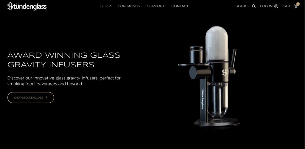
If you are looking for more minimalist, high-end-looking eCommerce website examples, check out Stündenglass, the brand behind premium gravity infusers.
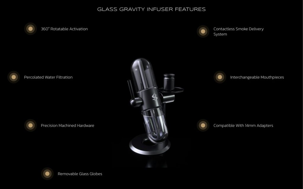
Our team ensured that each feature of the glass gravity infuser is explained in detail, to provide product education and showcase quality.
Scrolling down to the bottom of the homepage, the website has a dedicated section to flaunt a bold 10-year product warranty. Minimal and direct copy is used to convey this benefit.
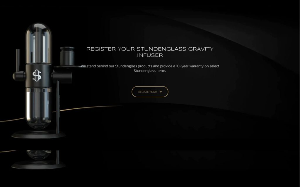
A long-lasting product warranty assures customers that they’re opting for a high-quality product. In addition, the Stündenglass team is willing to go beyond the usual one- or two-year product warranty to build customer relationships.
Our designers took it up a notch by using immersive videos to wow site visitors. Key features are listed using bullet points, to allow skimming and better readability.
Speaking of immersive videos, check out our blog on how to make interactive websites.
The brand stays away from fancy, long-form copy and instead opts for concise, to-the-point language to showcase transparency and build a trustworthy relationship with prospective buyers.
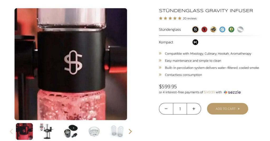
Similar to Archon, our team leveraged stunning visuals and skimmable copy to entice customers, keep them engaged and offer education, to help push prospective customers towards conversion.
Meet our award-winning designers. Set Up A Consultation
Our eCommerce Website Best Practices, From Header To Footer
From detailed product descriptions to positive testimonials to help with your customer’s decision-making process, here are some eCommerce website best practices our experts follow.
- Display your key CTA and unique value proposition in the hero section of your homepage so site visitors immediately understand who you are and what you offer.
- Implement user-friendly navigation so visitors can quickly find products. If applicable, group products into key categories such as popular items and sale items.
- Implement a sticky navigation bar so key details such as the shopping cart and your contact details are always displayed as the site visitor scrolls.
- Utilize specific CTAs to funnel site visitors to actions you want them to perform, such as signing up for your newsletter or making a purchase.
- Ensure your product pages thoroughly describe your offerings and communicate your UVPs, such as a warranty or free shipping.
- Integrate a return policy to boost consumer confidence.
- Build a dedicated section for frequently asked questions to educate your customers, establish trust and rank for organic search and featured snippets.
- Integrate a chatbot on your homepage to answer any questions your customer may have at any time.
- Follow SEO best practices by optimizing title tags, image tags, meta descriptions and headers for target keywords to improve your eStore’s ranking on search engine results pages (SERPs).
- Ensure your eCommerce site is responsive, considering that 79% of people say that they are more likely to revisit a site that works across various devices and screens.
- Ensure your copy is skimmable — we’re talking about three lines max in a section — for readability, so your site visitor isn’t overwhelmed.
- Display social proof such as customer reviews, ratings and testimonials to establish that your eCommerce brand is credible and trusted by other customers.
Our eCommerce Web Design Process
Wondering how our team brings your eStore to life? Here’s a sneak peek at our comprehensive web design process.
1. Onboard & Plan
Once we form a partnership, we assign a dedicated website strategist to your eCommerce project.
We then hold a meet and greet session via Zoom call, so you can meet and hear from each expert who will be part of your eCommerce website project.
We conduct extensive research about your market, brand, competitor landscape, user behavior and target audience, which will act as our North Star throughout your project.
2. Wireframe
After collecting insights from our strategy sessions, we map the informational architecture of your key web pages, and create black-and-white wireframes to show you what your eStore will look like.
3. Design
Next, we add your logo, colors and other branded design elements to your eCommerce site.
We incorporate carefully selected typography, high-quality imagery and distinctive brand elements to ensure your eStore accurately represents your brand.
4. Launch
Before your eCommerce site goes live, we strictly follow a quality assurance checklist to assess your eStore’s performance, accuracy and security, to make sure it’s ready for launch.
We provide post-launch maintenance and support as add-ons to ensure your website is always running smoothly.
Ask us about our web design process. Set Up A Consultation
Wrapping Up On eCommerce Website Examples
It takes more than just visual appeal to make an eCommerce website convert.
To boost traffic, generate leads and increase conversions, your eStore must communicate your brand offering immediately, rank on search engine results pages, display positive social proof, offer detailed product descriptions and more.
Digital Silk is a professional web design agency. Our design decisions are backed by eCommerce industry best practices and our extensive research and planning processes.
In addition to creating custom eCommerce websites from scratch, we perform industry, audience and competitor research to craft strategic conversion funnels and benefits-driven copy that resonates with your target audience.
We also optimize your website for search engines to increase visibility, and create a custom web design that perfectly represents your brand.
"*" indicates required fields


