For your website visitors, an engaging site can mean the difference between a swift exit and a lasting impression.
When it comes to eCommerce, even the best of products can be overshadowed by a poorly designed website. User experience is key to ensuring your visitors not only stay but also engage and purchase.
So, how do you strike the perfect balance between aesthetic appeal and user functionality in your online store? That’s what we’re here to explain.
We’ll share how to design an eCommerce website in six steps, plus cover best practices for engagement and share our favorite examples for inspiration.
How To Design An eCommerce Website
While designing an e-store is no easy feat, we’ve broken down the process into a step-by-step guide to help simplify.
Step 1. Define Your Objectives & Set Goals
The first step is to set measurable goals for your eCommerce website. Your goals could include targets for sales, traffic, conversion and even brand visibility.
For example:
- Sales targets: Monthly, quarterly, or yearly sales or revenue objectives. These can serve as stepping stones to long-term goals. For example, if you aim to increase yearly sales by 20%, break it down to 5% quarterly growth to make it more manageable and measurable.
- Traffic goals: Target numbers for monthly website visitors or specific campaign-driven traffic. For example, you might be experiencing organic website growth due to SEO and your next goal could be that you want to increase your website traffic by 15% over the next quarter.
- Conversion rates: This is typically the number of desired actions (e.g., purchases) divided by the total number of visitors. For eCommerce brands, 2-3% is considered a good conversion rate.
Step 2. Perform Market Research & Analysis
Part of the design process is to understand the market conditions, along with your competitors and target audience. This requires research.
Understanding market conditions by gathering data on:
- Economic trends
- Technological trends
- Industry specific trends
- Regulatory changes
- Consumer behavior
To perform a competitive analysis, research competitors in the same niche or sector. During your analysis, look at:
- Website
- Product range
- Product presentation
- Pricing strategy
- Customer reviews and feedback
- Marketing and branding initiatives
- Customer service
Tools like Ahrefs can help you benchmark competitor websites to understand their strengths and gaps.
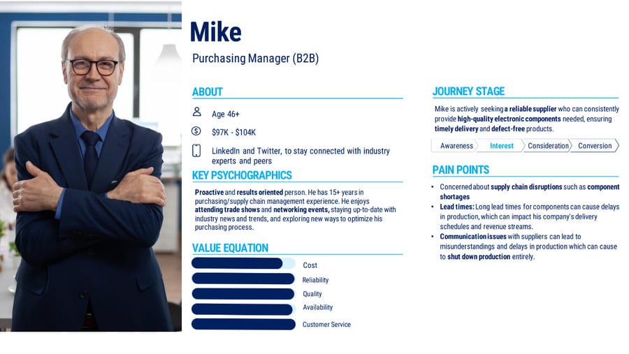
To get to know your audience, research your target market and create detailed buyer personas (like the one of Mike below). This involves understanding their demographics, interests, pain points and online shopping behaviors.
Step 3. Define Your Technical & Functional Requirements
Every eCommerce website has its technical and functional requirements, which are the features and functionalities the site needs to achieve its objectives.
Define:
- Types of payment: Decide on payment gateways like Stripe, PayPal, or regional favorites. Make sure they’re secure and cater to your audience. To choose, reference the data you collected from the audience research stage, regarding user behavior and preference.
- eCommerce store features: Features for your e-store might include a wish list, product comparison, multi-language support and more, based on your audience’s needs and expectations.
- Scalability plan: Make sure your site can handle growth, whether in terms of products, traffic, or global reach. For example, if you’re planning to expand to global markets in the future, consider multi-language support early on.
Step 4. Choose An eCommerce Platform
The next step is to choose a platform for your website, whether Magento, Shopify or WooCommerce, for example.
Choose a platform that’s user-friendly, integrates seamlessly with other tools you want to use, and scales with your business growth. Consider platforms with strong community support for smoother troubleshooting and enhancements.
The most popular eCommerce platforms to consider are:
Shopify
- Design: Shopify offers a range of responsive themes that cater to various industries and aesthetics. Their drag-and-drop interface allows even novices to customize their website’s look without deep technical knowledge. The platform’s design is geared towards a smooth eCommerce experience, ensuring all essential elements are at the forefront.
- Functionality: With its integrated payment system, Shopify simplifies the transaction process. Plus, its app store contains thousands of plugins to enhance and customize the user experience.
- User experience: Shopify sites are known for their streamlined user journeys, fast load times and intuitive interfaces. This makes it an excellent choice if you’re prioritizing user-centric design.
WordPress (WooCommerce)
- Design: WordPress, with its WooCommerce plugin, provides a flexible environment for website design. The vast array of themes available allows for extensive customization. Since WordPress began as a blogging platform, it offers advantages in content integration and SEO.
- Functionality: WooCommerce transforms a WordPress site into a full-fledged eCommerce store. Its extensive plugin ecosystem means businesses can add nearly any functionality they envision.
- User experience: Given its open-source nature, WooCommerce sites can be tailored for specific user journeys. However, achieving the perfect user experience may require more hands-on design and development work compared to more out-of-the-box solutions like Shopify.
Magento
- Design: Magento is a powerhouse for custom eCommerce development solutions. It can handle multiple stores, languages, and even currencies, making it ideal for larger enterprises or international stores.
- Functionality: Being open-source, Magento offers a vast landscape of extensions and customization possibilities. Its built-in features cater to larger businesses with a broad product range and diverse user base.
- User experience: Magento’s complexity can deliver incredibly tailored user experiences, but it often requires a more substantial development investment. The end result, when executed well, can be a highly optimized and user-friendly interface.
Step 5. Plan The UX & UI
UX is about how your website visitor feels when using your website — whether or not it’s easy to use or enjoyable. UI is about the look of the site, including its design and graphics.
To map the user journey (UX):
- Begin with a flowchart or wireframe to visualize the user’s path, from landing on the site to final checkout.
- Prioritize clarity in site navigation. Each category or product should be easily accessible.
- Streamline the checkout process, eliminating unnecessary steps or redundancies.
- Monitor site performance to ensure speedy load times. Delays can deter potential customers.
- Utilize tools like Hotjar or Crazy Egg. Their heatmaps and session recordings can offer valuable insights into areas where users linger, click, or drop off, helping you refine their journey.
To design the visual touchpoints (UI):
- Choose a color scheme that resonates with your brand and appeals to your target audience.
- Settle on typography that is both aesthetic and readable. It’s not just about style; it’s also about delivering information clearly.
- Design buttons, icons, and other interactive elements to be both visually pleasing and intuitive.
- Maintain a consistent layout. Whether a user is on a product page or reading a blog post, they should feel they’re in the same ecosystem.
Step 6. Allocate A Budget & Resources
Your budget will depend on the size of your eCommerce business, along with the needs and requirements for your e-store.
To allocate a proper budget, consider:
- Development costs: Based on the platform and customizations needed, development can range from relatively affordable to quite expensive.
- Design costs: While using a template can be cost-effective and quick, opting for custom UI/UX design offers numerous benefits, including a site specifically designed for your target audience and better metrics.
- Maintenance and upgrades: Consider costs for regular updates, backups, and security checks to keep your site secure and bug-free.
Best Practices To Follow When Designing An eCommerce Website
An optimized, user-friendly site is a strong starting point for attracting visitors, but turning those visitors into long-term customers involves a combination of great products, excellent customer service, and consistent engagement.
Best practices to follow when designing an e-store include:
1. Create A Descriptive Product Catalogue
The product catalogue is essentially the digital equivalent of a brick-and-mortar store’s physical shelves. It’s where potential customers “walk” through, examining what you have to offer, making decisions, and eventually, selecting what to buy.
To create a descriptive catalogue:
- Plan your product categories: This not only aids in navigation but also helps search engines understand and index your products better. Utilizing breadcrumb navigation can also help visitors understand their navigation path.
- Use high-quality images: Ensure that all product images are of high resolution and standardized in terms of size and presentation.
- Write consistent product descriptions: Maintain a consistent format for product descriptions, highlighting the most important features. This helps visitors quickly scan information and compare different products.
- Enable dynamic filters: Allow visitors to refine their search based on various criteria such as size, color, brand, price range, and more. This can be especially beneficial for stores with a wide range of products.
2. Display Products Transparently
The way products are presented directly influences a customer’s purchasing decision. Clear images and detailed descriptions can increase the likelihood of a sale, while poor presentation can lead to cart abandonment or high bounce rates.
Important features for product pages include:
- High-quality images: Offer multiple, clear and zoomable images or a 360-degree view to provide visitors with a better understanding of the product.
- Detailed descriptions: Provide comprehensive details about product specifications, like dimensions, uses and benefits.
- Availability & pricing: Clearly state the price, any discounts or promotions, and stock availability.
3. Ensure A Seamless Checkout Process
No matter how captivating your products are or how impeccable the user experience is, if customers encounter hiccups at the last step, it can negate all prior positive interactions and lead to cart abandonment.
To ensure a seamless checkout process:
- Use fewer steps: Minimize the number of steps to complete a purchase and aim for a single-page checkout if possible.
- Display transparent costs: Clearly display additional costs like taxes, shipping fees, or handling charges.
- Simplify guest checkout: Always offer the option for visitors to check out without creating an account.
- Add secure elements: Design elements like SSL certificates, secure payment gateways and visible trust badges play a crucial role in making visitors feel safe enough to make a purchase.
4. Optimize For Search Engines
SEO can help your website appear to potential customers on search engines, who are searching for your products or services.
To optimize your site for search engines:
- Research relevant keywords: Use tools like SEMrush or Seranking to find relevant keywords for product descriptions, blogs, and meta tags.
- Implement SEO best practices: Implementing keywords effectively is a critical part of optimizing a website for search engines. Use relevant keywords in headers, meta descriptions, title tags and throughout your site to boost organic traffic.
- Implement technical SEO: Make sure URLs are descriptive and reflect the hierarchy of your website. For example: website.com/category/sub-category/product-name. Use a logical site structure that has a clear hierarchy of main categories, sub-categories or individual product pages and regularly check for broken links or pages.
- Optimize images: Make sure your images are optimized by compressing their file size, using keywords to name them properly and adding alt attributes.
5. Improve Performance & Speed
Whether it’s on mobile or desktop, site speed can greatly influence user satisfaction and SEO rankings. For most users, one second can be the difference between a bounce or a conversion.
To improve performance & speed:
- Minimize scripts & plugins: Only use essential plugins and scripts to prevent bloat and slow load times.
- Use CDNs: Content Delivery Networks like Cloudflare can boost website speed by distributing the load.
- Reduce image sizes: Compress images before uploading them using tools like TinyPNG or Compressor.io. Ensure they’re appropriately sized; don’t upload a large image and then scale it down with HTML.
- Optimize videos: If hosting videos, use services like Vimeo or YouTube rather than hosting them directly on your server.
- Remove outdated media and content: Regularly clean up your media library, removing unused or outdated images, videos, and other media.
Common eCommerce Website Design Mistakes
Following best practices is important, but it’s also helpful to know about the most common mistakes to watch out for and avoid.
The most common frequent eCommerce website design errors that can hinder user experience include:
Mistake 1. Poor Navigation
Poor navigation causes 60% of potential buyers to abandon purchases. When a site presents overcrowded menus or a confusing user journey, visitors can easily become overwhelmed, leading to a decline in user engagement and potentially lost sales.
Products need to be logically and coherently categorized to ensure a seamless browsing experience.
Mistake 2. A Complicated Checkout Process
A complicated checkout process is a major roadblock for potential buyers. In fact, 17% of shoppers are deterred by a complicated checkout. When faced with numerous steps, extensive forms, or unexpected costs, many opt to abandon their cart.
Mistake 3. Unclear CTAs
Calls to action (CTAs) serve as guiding beacons for your visitors, pointing them towards the desired action, whether it’s making a purchase, signing up for a newsletter, or reading more about a product.
Despite the crucial role of clear and compelling CTAs in guiding visitors’ next steps and boosting conversion rates, a surprising 70% of small business websites lack a call to action, often leaving users uncertain about the next step, which reduces the chance of potential conversions.
Mistake 4. Excessive Design Elements
While it’s tempting to incorporate various design elements to make a site stand out, going overboard can do more harm than good.
Excessive design elements can clutter the site, making it difficult for visitors to focus on the primary content. Overloaded graphics can also slow down the website, further degrading the user experience and harming SEO efforts.
Mistake 5. Insufficient Product Information
For online shoppers, detailed product information is key. Without the physicality of a traditional store, visitors rely on comprehensive descriptions, high-quality images and user reviews to inform their purchasing decisions.
Insufficient product information can leave potential shoppers hesitant to purchase, leading to decreased trust and potentially driving them to competitor sites for a more informed shopping experience.
10 Top eCommerce Website Design Examples
We’ve covered best practices, but what do these look like in practice? Find 10 of eCommerce website designs from our web design agency below, including a few examples from our own Digital Silk portfolio!
1. Apple
Apple’s minimalist design, high-quality visuals and easy-to-navigate interface set a standard in tech product eCommerce. Their site emphasizes the brand’s commitment to quality and innovation. The navigation is intuitive and the user journey is linear, reflecting Apple’s philosophy of simplicity and user-centric design.

2. EV Universe
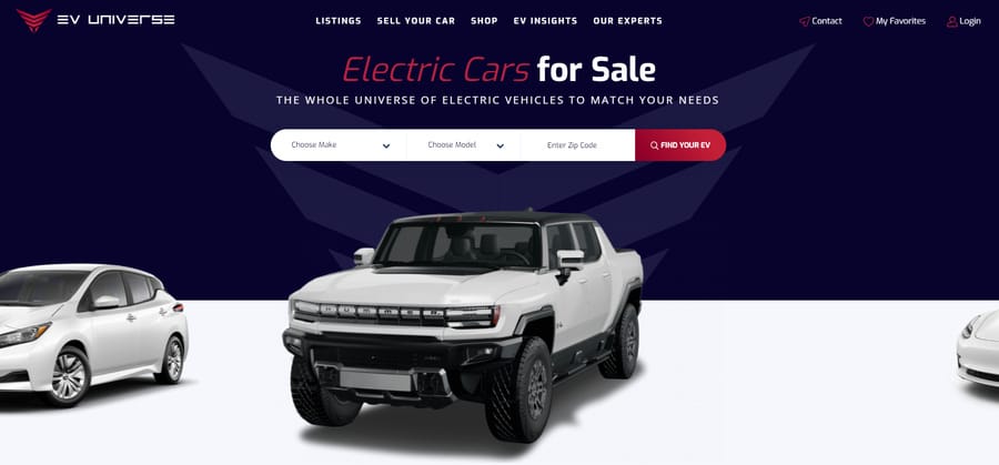
We had the privilege of partnering with EV Universe, a leading purveyor of pre-owned electric vehicles. Our collaboration aimed to redefine the online car buying experience.
We crafted an eCommerce website store for EV Universe that seamlessly integrates their vast inventory of top-tier electric cars with a user-friendly interface. Website visitors have the option to filter search, to find the exact matches they’re looking for.
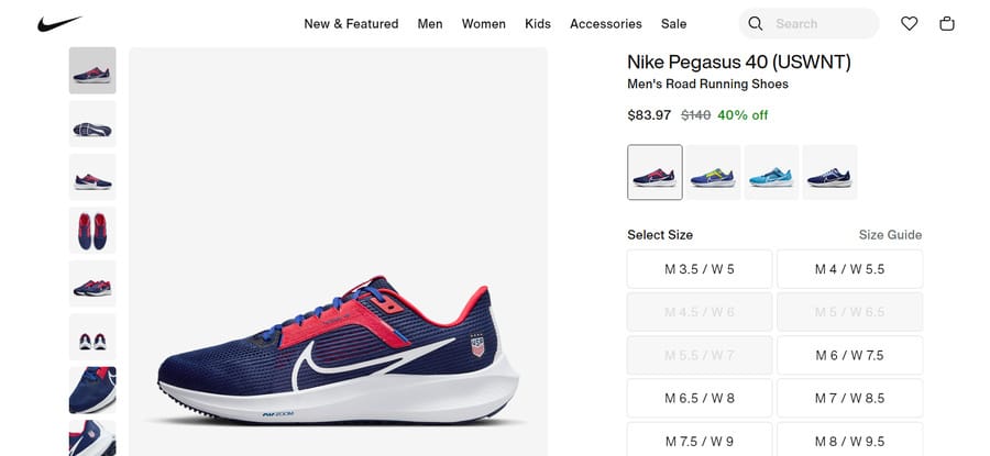
3. Nike
Nike blends lifestyle content with eCommerce. Their customization options combined with a dynamic display of products provides an engaging user experience.
Nike’s site is not just about purchasing; it’s about immersing website visitors in a culture of sports, motivation, and individuality. The mix of high-quality imagery, motivational content, and user-driven customization makes for an immersive shopping journey that captures the spirit of the brand.
4. G2 Esports
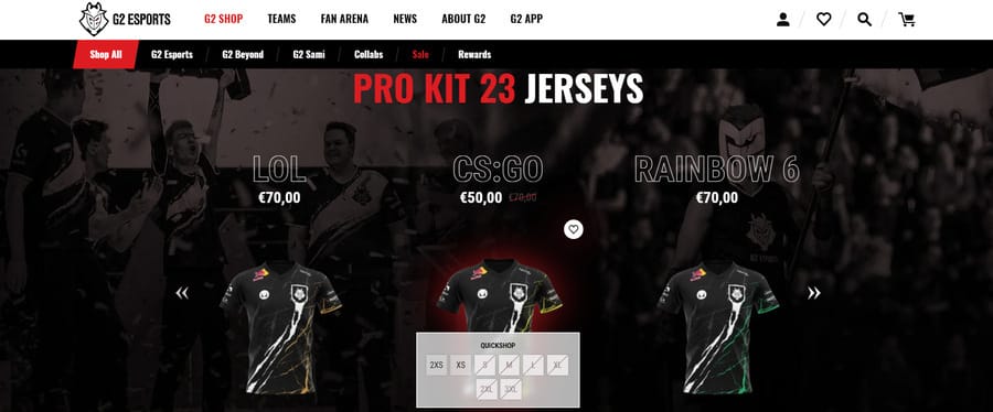
We were thrilled to join forces with G2 Esports, a titan in the competitive gaming arena. Recognizing the fervor of the esports community, our collaboration set out to elevate their eCommerce platform.
We stayed true to the brand’s core guidelines to ensure customer engagement through engaging visuals and smooth checkout navigation.
5. Best Buy
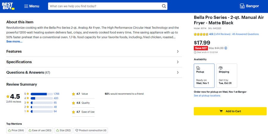
As one of the premier electronics retailers, Best Buy’s website is designed for efficient browsing, with an emphasis on deals, customer reviews and a wide range of products.
Their focus on customer testimonials and reviews builds a sense of community and trust, guiding potential buyers in making informed decisions. The balance of comprehensive product information, user feedback, and promotion-centric design positions Best Buy as a go-to hub for electronic purchases.
6. Rollink
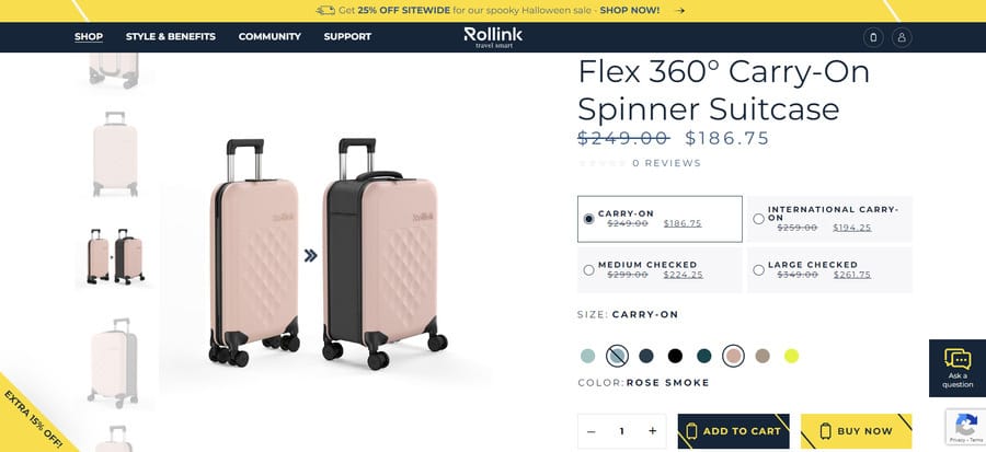
Recognizing the modern traveler’s need for adaptability and style, our NYC web design team set out to design an eCommerce platform that truly embodied the transformative nature of Rollink’s foldable & expandable luggage.
By highlighting the unique foldable features of Rollink suitcases, we made sure visitors instantly grasped the product’s value proposition.
Combined with a engaging microanimations and a retro color experience, Rollink’s website leaves a lasting impression on website visitors.
7. Chewy
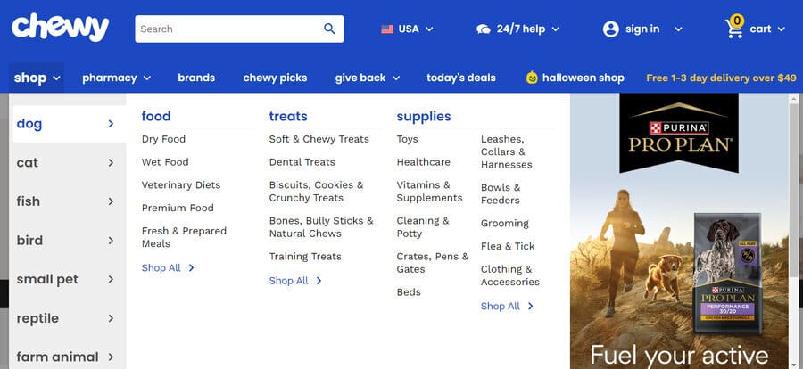
Catering to pet owners, Chewy offers a colorful, easy-to-navigate website that emphasizes customer reviews, recurring delivery options and detailed product categories.
The site is designed not just to sell but to advise, with many products accompanied by detailed product descriptions and user testimonials, creating an environment of trust and community for pet enthusiasts.
8. Buddha Brands
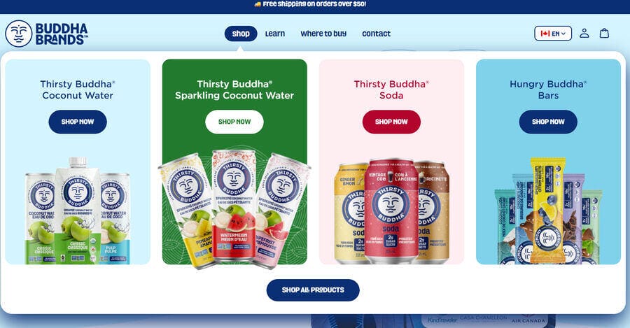
Our collaboration with Buddha Brands was focused on creating an engaging website that showcases their products in a fun and refreshing way.
While creating the website, we had in mind that crafting a narrative around products enriches the shopping experience. Instead of mere transactions, customers engage in a brand’s vision and values, building deeper connections so that’s why we made sure all aspects of the website are visually appealing.
9. Bellroy
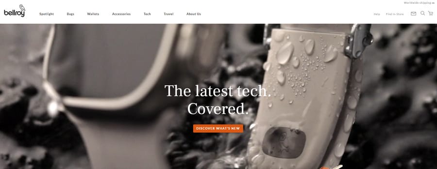
Bellroy is an online store that sells bags, wallets and other accessories. The brand uses animations and graphics to illustrate the functionality and capacity of their wallets and other leather goods, making the shopping experience both informative and engaging.
The blend of animation with real-life images gives potential buyers a tangible sense of the product. By focusing on the functional attributes of their products in a visually rich format, Bellroy offers an informative and captivating shopping experience.
10. G Pen
G Pen is an industry leading online vaporizer store.
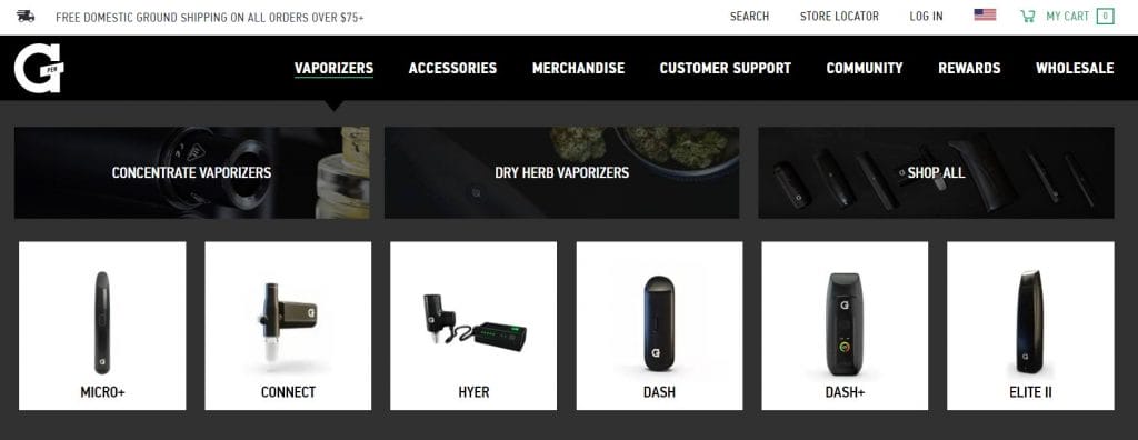
The company wanted a website design that informs new customers about its range of products and provides a seamless journey to checkout.
Our web design team and digital strategists refined G Pen’s website funnel, ensuring a smooth transition from product discovery to purchase to enhance UX, drive conversions and reduce cart abandonments.
We achieved this by adding a highly visual mega menu navigation and including the product descriptions of bestsellers on the e-store’s homepage.
Build A Custom eCommerce Website With Digital Silk
At Digital Silk, we specialize in crafting not just websites, but digital masterpieces tailored to the unique intricacies of eCommerce. We’re not just a web design agency, we’re eCommerce design strategists, branding strategists and web development experts, all attuned to the pulse of the online shopping world.
Every design choice and every pixel is meticulously curated, grounded in in-depth industry insights, competitor evaluations and market research. This ensures that our eCommerce designs don’t just look good; they attract, engage and convert.
Our services at Digital Silk include:
- Custom eCommerce Design: Beyond aesthetics, we develop intuitive and enriched eCommerce sites, knowledgeable in leading platforms, and extending support from the design phase through to marketing and continual maintenance.
- eCommerce Redesign Services: Reinvent and rejuvenate your online store’s persona. We strategically redesign with a potent mix of UX/UI and SEO, ensuring your e-store doesn’t just fit in but stands out.
- End-to-End eCommerce Development: Our craftsmanship extends to architecting brand-aligned online stores on premiere platforms. We ensure meticulous planning, SEO optimization, a user-centric design approach and an easy-to-navigate CMS tailored to your needs.
- eCommerce Branding and Content Creation: Beyond the storefront, we mold your brand’s digital voice. Crafting content that doesn’t just describe but entices, coupled with branding that tells a story at every shopper’s touchpoint.
Reach out to Digital Silk today. By creating custom e-stores that are search engine -optimized and adhering to eCommerce best practices, we prioritize both aesthetics and performance. Our commitment guarantees an online shopping experience that’s not only memorable but drives traffic, engagement and conversions for your eCommerce brand.


