

Most people have a love-hate relationship with website pop-ups. They can either disrupt your browsing and annoy you or introduce you to new promotions and services that you’re glad to find.
Either way, there’s no denying their impact on the modern digital stage. Like them or not, they’re an effective marketing strategy that grabs your attention, even if just for a few seconds.
In this post, we’ll unpack how website pop-ups are used in marketing strategies and share several examples that demonstrate their effectiveness when used correctly.
What Are Website Pop-Ups?
Simply put, they’re small, overlaying windows that appear on users’ screens when they land on a particular website. Generated using JavaScript, they typically contain informational or promotional offers to prompt visitors to act.
It doesn’t matter if you’re doing a complete website redesign or creating a new one from scratch, this particular element can help you get your message across more effectively.
Given that 44% of consumers abandon a brand if they can’t find the information they’re looking for, you can use pop-ups to highlight important information and guide visitors towards a desired action.
Why Are Pop-Ups Important?
To get users to go through all the stages of the sales funnel, you need to nudge them in the right direction. With pop-ups, you direct their attention to the desired action and urge them to engage with your brand.

In most cases, these windows don’t disappear until users manually close them. Since they pop into view and become the main focus of the page, people are more likely to notice them.
Since 42% of users decide whether they want to leave or stay on a website within 10 seconds, pop-ups can be effective in catching their attention and encouraging them to explore further.
With pop-ups, you can promote specific segments of your custom website to the target audience, which brings a range of benefits, including:
- Promoting website content
- Boosting conversion rates and lead generation
- Growing email subscribers list
- Advertising special offers or promotions
Main Types Of Pop-Up Styles
While this is a potent marketing solution, how you display your pop-ups can significantly impact user experience. Their size, style and overall design determine whether visitors ignore or interact with them.
Lightbox
Perhaps the most common type, this small window appears on top of a website’s content and dims the background.
Its (preferably) eye-catching colors and messaging direct the user’s attention away from the page and onto the pop-up.
Digital Silk implemented this design for Buddha Brands, with a sleek blue-and-white layout that complements the website’s home theme.

Full Screen
A less subtle but more impactful approach is to use a window that’s big enough to block the background content entirely. It’s hard to ignore so visitors may feel more inclined to interact.
Floating Bar
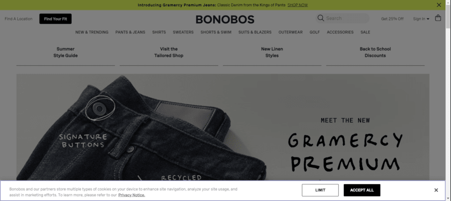
This narrow and horizontal design normally appears at the top of the page. The key is to avoid static designs — the banner should come up at a specific and contextual moment in the customer journey.
For instance, Bonobos makes use of a subtle floating bar to let users know they store multiple types of cookies.
Exit Intent
With a whopping shopping cart abandonment rate of 70.19% globally, re-engaging users with your content is more important than ever.
This pop-up message appears when the user directs the cursor out of the main browser window, presenting a final call-to-action.
Digital Silk used this type of pop-up on Spark Education’s design, to re-engage users and get them to sign up for a free trial class.

Yes/No
As the name suggests, this type offers users a choice between two directions. You’ve probably seen this type of pop-up when you add an item to your cart and are prompted to either proceed to checkout or continue shopping.
On-Click
These are normally accompanied by an embedded webpage trigger with anchor text. When a customer clicks on the designated link or button, there’s a pop-up campaign that lets them complete the action.
You can see this on Eight Ounce Coffee’s website, which triggers a pop-up when users click to browse their collection.

Scroll-In
Offering a less intrusive alternative, scroll-in designs don’t disrupt the user experience as part of the website structure and don’t explicitly block the content on the main page.
Instead, they appear as smaller boxes in the corner of the screen once the visitor has spent a considerable amount of time browsing.
This is exactly what happens with Portrait Coffee‘s website — users can browse the home page for a little bit before they’re prompted for a discount.

Game-Like
Finally, the most interactive pop-ups use gaming elements to keep users engaged. These playful designs encourage users to complete the designated action.
This can include activities like opening surprise boxes, spinning wheels, or using scratch cards to receive special gifts.
30 Successful Website Pop-up Message Examples
Some of the best website pop-up examples leverage target audience personalization, eye-catching yet non-intrusive designs, and smart messaging to promote their products or services.
1. Flaus

Type: Lightbox
This simple yet effective example delivers an impactful message. It emphasizes the main product — an electric flosser — and offers an immediate additional perk for customers — a 10% discount and free shipping.
Users can sign up almost instantly by entering their email in the designated box, minimizing the need to search through the website and saving valuable time.
2. Wild Souls
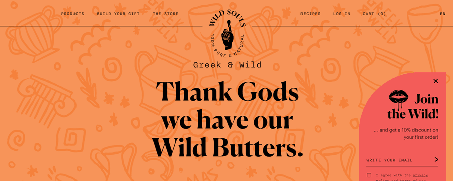
Type: Scroll-In
The brand’s effortlessly cool and refreshing branding is reflected in the pop-up in the bottom right corner. Its message is just as stimulating as the brand’s entire website design – join the wild and get a 10% discount.
It doesn’t overwhelm users and allows them to browse their catalogue without distractions. However, it remains visible out the corner of your eye as a gentle reminder.
3. Elder Statesman

Type: Lightbox
Combined with a bold and visually appealing image, this pop-up stays on brand with the store itself.
The laid-back luxury that’s at the core of Elder Statesman is visible in the elegant yet simplistic fonts and detailing. The copy is clear and concise, with minimal distractions or embellishments.
4. Huda Beauty

Type: Lightbox
This is a prime example of establishing close rapport with users to drive sales. Referring to their customers as ‘love’ and urging them to join the Huda family has undeniable emotional appeal.
5. Snif

Type: Lightbox
Getting a new fragrance or scented candle just by signing up? Sounds like a steal, who wouldn’t try their luck? That’s exactly why Snif’s pop-up message is so effective.
It doesn’t need much in the way of design, but it does have a red scrolling stripe at the top that gives users a sense of urgency.
6. Partake Foods

Type: Lightbox
The site’s vibrant and visually striking details take center stage here. Big and bold letters express the handful of perks users get by signing up, while the snack imagery at the bottom is just a taste of what’s in store.
7. Blume

Type: Full Screen
Blume takes the go big or go home concept to a whole new level with their full-screen message. Despite taking up the entire page, its simplistic design doesn’t feel overbearing.
Plus, it’s personalized, allowing users to select their skin concerns and tailor their routine based on their needs.
8. Chillhouse

Type: Lightbox
What’s so effective about this design is that users don’t need to do much to get a discount. It features minimal copy and a few signature illustrations on the right.
However, once you click on the prompt, you’re asked to add your email. By then, you’ve likely already decided to get the discount, so it doesn’t really matter — you sign up anyway.
9. Luna Nella

Type: Game-Like
Gamified pop-ups are at the forefront of Luna Nella’s store. With a side panel showing the potential rewards, you’re prompted to spin the wheel and get yours.
It’s a fun, playful and engaging way of attracting new customers and keeping old ones interested.
10. Marlow

Type: Full Screen
Taking the Yes/No approach to a full-screen message, Marlow leverages a back-to-school sale to promote sales.
While there’s not much in the way of graphic design and embellishments, the simple image of a child cuddled up with a teddy evokes an emotional reaction from users.
11. Yes You Can Drinks

Type: Lightbox
Who says all the examples of website sign-up and pop-up messages are boxes only? Add to that a dose of humor — ‘I hate discounts, value and fun’ — and you have a witty and amusing call to action that reels users in.
12. JUST Egg

Type: Full Screen
Another full-screen message, another signature piece of copy. While it covers the entire main page, the transition between the two feels silky smooth thanks to the similar design.
They both feature the same yellow background and black lettering so you can’t really tell it’s a pop-up until you realize you can’t just scroll past it.
13. Lil Bucks

Type: Lightbox
When you match the pop-up colors to your main page, you create a visually consistent, easily recognizable and appealing combination.
Despite not having any fancy bells and whistles design-wise, Lil Bucks captures users’ attention and encourages them to go buck wild.
14. Startward Consulting

While most people avoid reading chunky descriptions, Startward Consulting leverages an emotional connection with consumers.
By empathizing with their experiences and offering potential solutions, she stands out from the concise and straight-to-the-point crowd.
15. Stumptown Coffee Roasters

Type: Lightbox
The welcome message matches the sleek and modern design of the main page, clearly reflecting the brand’s design strategy.
The crisp black, red and golden hues create a visually appealing aesthetic that resonates with coffee fanatics and casual drinkers alike.
16. Moooi

Type: Yes/No
Boasting a somewhat futuristic and avant-garde design, the whole website embraces a sleek, almost otherworldly feel.
The pop-up complements the ultra-modern feel, offering the brand’s digital newsletter without sticking out like a sore thumb.
17. Scott’s Protein Balls

With a seemingly basic and neutral design, Scott’s Protein Balls delivers a clean and effective call to action.
There are no flashy images or color palettes to get the point across, which is a bonus for people who appreciate simplicity.
18. Proweb

Type: Yes/No
We’re all more than used to websites notifying us about their cookie policies, but that doesn’t mean you can’t give them a creative twist.
This one stands out because of its playful and humorous tone, which softens the typically intrusive feel of pop-ups.
19. Sincerely, Tommy

Type: Lightbox
When it comes to unconventional and artistic pop-ups, this one takes the cake. It’s unique and visually appealing, with minimal distractions and displays the core message in a fun and aesthetically pleasing way.
20. Alexander Daas

Type: Lightbox
Pulling off the effortlessly suave and trendy dark theme is at the heart of the Alexander Daas campaign.
It has a straightforward, sophisticated and streamlined design that ties in with the brand’s core message.
21. Bukky Baldwin

Next up is a bright and lively spectrum of colors that immediately catches your attention.
The dynamic images on the main page are dimmed to highlight an even more vibrant window that’s hard to miss. While this design is attention-grabbing, it can be a bit difficult to read the copy, so keep that in mind.
22. Sola Garden

Type: Lightbox
Using the same color scheme and typography from the main page, this design offers a charming and cohesive pop-up style.
It motivates customers to add that same WOW factor to their own garden and receive a handy discount in the process.
23. Kirrin Finch

Type: Lightbox
Who wouldn’t want to win a free $100 gift card? You don’t have to be overly persuasive either, people will inherently try their luck when the opportunity arises.
Pair that with an additional discount and you’ve got yourself the winning formula to Kirrin Finch’s pop-up message.
24. TOMS Shoes

Type: Game-Like
Another spin-to-win wheel, encouraging users to do your bidding, but in a larger format. Despite having fewer options than the one higher up on this list, it’s still engaging and intriguing.
25. Omsom

Type: Lightbox
This one has a bold and bright design that instantly grabs your attention. It’s unapologetically unique and interactive, which can certainly leave a lasting impression on consumers.
Not to mention the welcome greeting from the co-founder at the bottom right corner to add a subtle personal touch.
26. The Oodie

Type: Full Screen
Nothing boosts sales quite like seeing bright and lively images on the main page. The Oodie takes advantage of radiant and high-spirited individuals to urge people to claim their discount.
27. Caraway Home

Type: Yes/No
There’s something exclusive and privileged about being the first to know about any promotional drops and that’s exactly what Caraway Home takes advantage of.
Plus, the free shipping option is a welcome perk in a digital era where most people shop online.
28. A Dozen Cousins

Type: Lightbox
This exit intent pop-up is an impactful last resort to persuade consumers to try the soulfully seasoned sides.
It’s colorful, aesthetically appealing and personalizes your experience by taking your name, email and phone number.
29. Recess

Type: Floating Bar
The floating bar at the bottom of the page doesn’t prevent users from browsing the main page, which is why it’s such a convenient and user-friendly solution.
It tells you everything you need to know about their promo without blocking your shopping experience.
30. Tully’s Training

Type: Lightbox
At the tail end of the list is an example of a website focusing on a tailored experience. You’re asked to select your concern right off the bat to get relevant information and advice.
Best Practices For Designing Pop-Up Messages
As an integral part of your website structure, using pop-ups can have both a positive and negative impact on user experience. To get the most out of these branding tools, you should:
- Make sure the pop-up doesn’t cover the whole screen, so it doesn’t feel annoying.
- Include a clear close button so users can easily exit the pop-up if they’re not interested.
- Offer something users find valuable, like a special discount or free eBook.
- Use a clear CTA, like “Sign Up Now” or “Get 10% Off.”
- Optimize for mobile devices while keeping the same layout.
- Ensure it doesn’t slow down website loading times.
Tailor Your Website’s User Experience With Digital Silk
Drive organic traffic and increase conversion with Digital Silk’s end-to-end website development and consulting services.
Our expert team crafts bespoke digital solutions tailored to your unique needs, ensuring seamless navigation and engaging interactions.
Whether you’re looking to refine your site’s functionality or revamp its visual appeal, our solutions are designed to elevate user satisfaction and maximize your digital impact.
Take a look at our case studies to see how we help clients develop, design and launch innovative digital solutions.
Our web design and branding services include:
- Brand strategy
- Logo and Graphic Design
- Custom web design
- Custom web development
To kick things off, contact our team, call us at (800) 206-9413 or fill in the Request a Quote form below to schedule a consultation.
"*" indicates required fields


