The global market size of the software-as-a-service (SaaS) industry is projected to reach $232.2 billion in 2024.
However, staying ahead of the curve and above the competition in such a competitive market can be a challenging task.
That is where a visually stunning and optimized SaaS website design comes in.
With 81% of individuals reporting that they think less of a business if they have an outdated website, you want to make sure that your website works for you and not against you.
That is why we created this list of the best SaaS websites to inspire and help you make your own.
We create custom website designs. Request a Quote
What Is A SaaS Website?
A SaaS company website is the online platform of a company that provides digital or software services over the internet.
Some of the famous SaaS companies include Slack, Dropbox and Zoom.
Typically, SaaS companies function on a subscription model where they provide you with a software service for a predetermined amount of time (monthly, yearly, etc.)
The key uses of SaaS websites include:
- Customer Relationship Management (CRM) Systems
- Enterprise Resource Planning (ERP)
- Project Management
- HR Management
- e-Commerce Solutions
What Makes A Good SaaS Website?
Much like in any industry, a good SaaS website is one that effectively communicates the unique value of your service, attracts potential customers and converts them into customers.
Below are some of the key elements that every good SaaS website should have:
1. Intuitive Website Design:
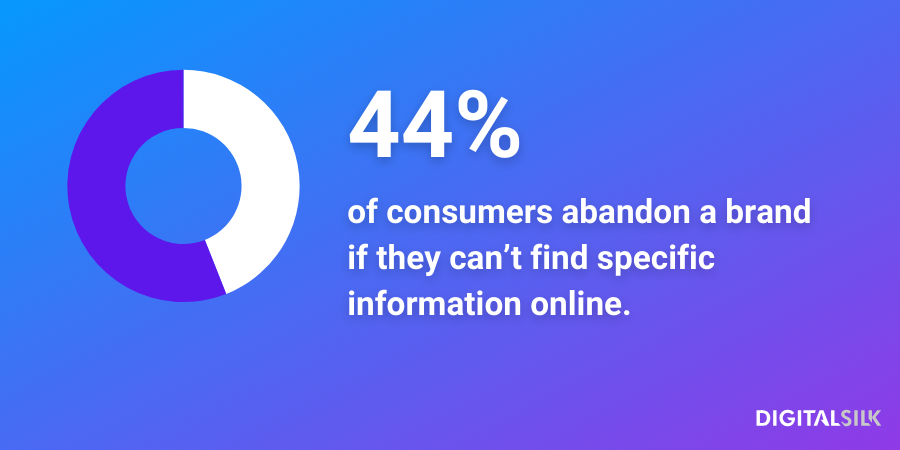
An intuitive SaaS website design focuses on creating a user-friendly and easy to navigate interface. 44% of survey respondents report that they would stop doing business with a brand after failing to find specific information.
Aim for clear navigation, layout and pathways to key information on your SaaS website to ensure that the visitors can explore your offerings without confusion.
2. Clear Unique Value Proposition
Your SaaS website should articulate a Unique Value Proposition (UVP).
Clearly communicate how your software solves specific problems or fulfills needs, emphasizing the unique benefits that set your product apart from competitors.
3. Compelling CTAs
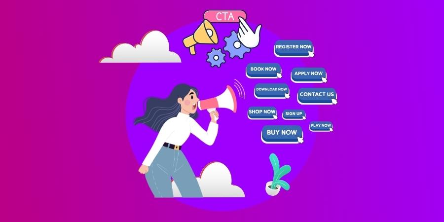
Calls to action (CTAs) are phrases or statements used to prompt an immediate response or encourage an immediate sale.
On a website, calls to action typically manifest as prominently displayed buttons with imperative text such as “Request A Proposal,” “Buy Now” or “Subscribe,” or as banners and pop-ups that might appear at strategic points during the user’s navigation.
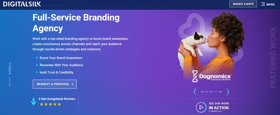
They can also be subtly integrated into the content as hyperlinked text within articles, or as persistent widgets in sidebars, all designed to be visually striking and encourage user interaction.
4. Responsive Design
A responsive design means that the website layout adapts to the screen it’s being displayed on to ensure readability, optimal loading speed and easy navigation.
This contributes to a positive user experience, regardless of whether your website visitors use a laptop, mobile or tablet.
In fact, 75% of respondents prefer a mobile friendly site, while 96% report encountering a site that was not designed for mobile.
Given that 60% of global internet traffic comes from mobile devices, not optimizing your website for mobile means potentially losing a lot of revenue.
5. Media Showcasing The Product
Visual elements such as high-quality images, videos or interactive demos play a crucial role in showcasing your product’s features and functionality, helping users understand your SaaS solution and see it in use.
Consider your audience and what they might be looking for; what are their pain points?
Then, use high-quality media to demonstrate how your product helps them solve those pain points.
Work with our web design experts. Schedule A Consultation
6. Engaging Content
Engaging content is vital to retaining your website visitors, as it can capture their attention while addressing their specific concerns.
Consider your ideal customer’s pain points and create compelling content that helps them solve those pain points, delivering a memorable and valuable user experience.
Additionally, pay attention to the information hierarchy: the arrangement and organization of text elements in design to emphasize important information.
Use larger font and/or bold colors for content you wish to stand out on the page.
For example, improving the copy and design for our client, Keona Health, resulted in a 42.5% increase in organic search.
7. Search Engine Optimization
Optimizing your SaaS website for search engines will help you appear higher in search results and attract more potential customers.
You can increase your search engine ranking by providing your audience with original, authoritative content that utilizes keywords people search for.
Writing blogs and articles on the topics your audience is googling can increase the chances of them visiting your website.
And finally, follow SEO best practices, such as using images with optimized alt tags and creating meta names and description to help Google rank your website higher than competitor websites.
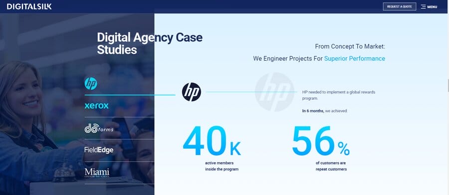
8. Customer Testimonials & Case Studies
Highlighting positive customer experiences through testimonials and case studies adds credibility to your SaaS offering, building trust through authentic experiences of existing customers.
Feature measurable results on your SaaS website to demonstrate how your product has benefited others to help prospects in their decision-making process.
9. Customer Support
A good SaaS website provides accessible customer support options.
Clear contact information, live chat features and a comprehensive FAQ section can help your potential clients find answers to their questions and build trust in your product and service.
10. Analytics And Tracking
Implementing analytics tools is essential for monitoring and understanding user behavior on your SaaS website.
This will give you insight into important metrics that showcase your visitors’ behavior across your website, such as:
- Website traffic: the number of people that land on your page
- Bounce rate: the number of people that landed on your website and left without completing a single action
- Time on site: amount of time a visitor spends on a website during a single browsing session
This data helps you make informed decisions, refine your website’s performance and optimize user experience over time.
15 Best SaaS Website Design Examples
To help you get inspired and create your own SaaS website, our award-winning web design experts have selected 15 SaaS website examples that will help you come up with your own.
1. Juno
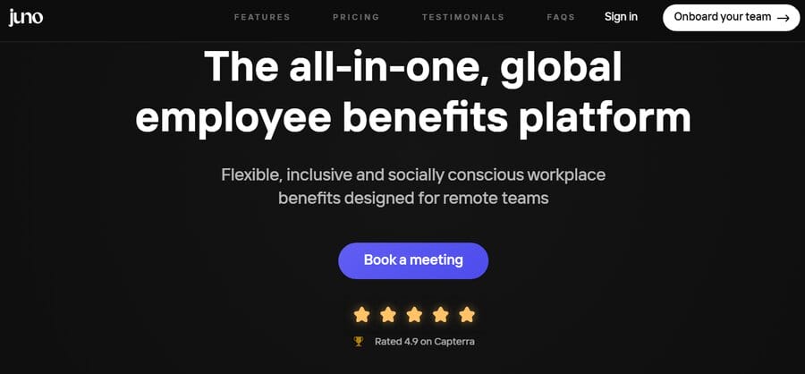
Juno is an employee benefits platform, offering users “Juno Points” which can be exchanged for different benefits.
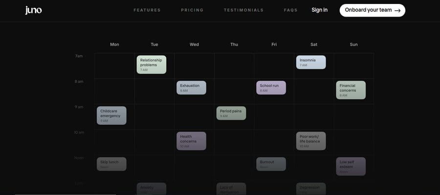
To emphasize the positive reactions to their product, the website highlights its 4.9 rating on Capterra, demonstrating user satisfaction and providing an incentive to prospects who are unsure about Juno’s services.
Additionally, the website includes a client section, demonstrating real-world examples and providing social proof to instill confidence in potential buyers.
2. Sellx
Sellx delivers a comprehensive sales engagement platform to streamline business operations.
Their website uses a simple design in dark mode, allowing for less disruption when exploring the company’s services.
One of the main features that makes Sellx a great SaaS website design example is its pricing page. It offers Sellx’s prospects clear pricing tiers through clean design and simple, understandable language.
Therefore, potential customers can clearly understand the cost structure, helping them make informed decisions about whether the service aligns with their needs and budget.

3. Dropbox
Dropbox, a cloud storage solution, is a popular choice for businesses and individuals alike to store their photos, videos, documentation and other media.
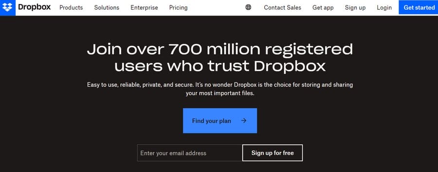
The company’s navigation bar includes all the relevant data a SaaS website should offer from products and pricing to a CTA in a different color from the rest of the content.
What really makes Dropbox’s website stand out is its short home page. Without using a lot of space, the website manages to convey all the relevant information you might need.
This is further achieved through effective typography hierarchy — a design principle that involves organizing text elements on a page in a way that communicates their importance and guides the reader through the content.
4. Slack
Slack is a business messaging platform.
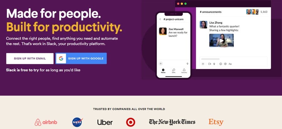
The company’s home page features colorful design, with ample white space around the short copy, making it easily readable.
Meanwhile, Slack’s “TRUSTED BY COMPANIES ALL OVER THE WORLD” section establishes the credibility and widespread adoption of their platform.
Featuring renowned clients like Uber and The New York Times, the section showcases the trust global enterprises place in Slack, offering an incentive to Slack’s prospects.
The website also goes beyond client endorsements, utilizing video testimonials that demonstrate real-world success stories and the impact Slack has on diverse businesses.
5. Mailchimp
Mailchimp is one of the most popular email platforms available on the market.
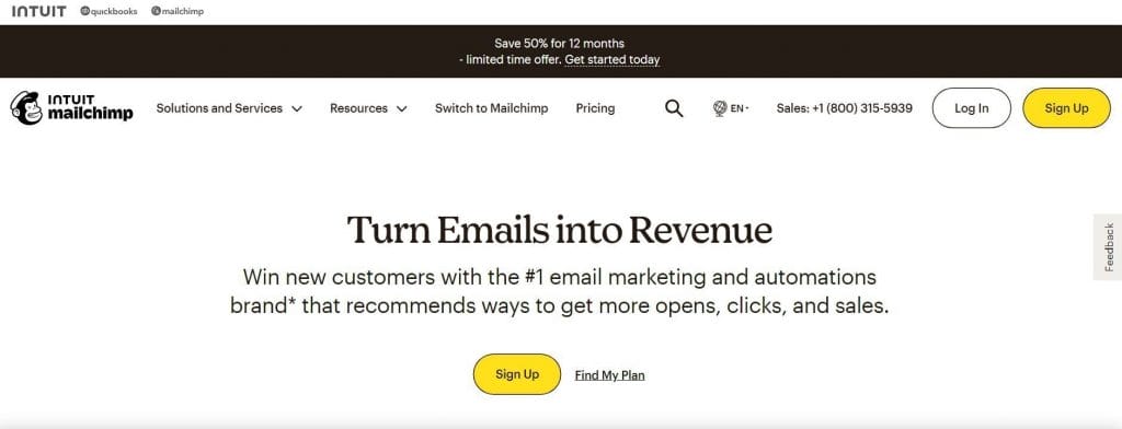
Their website blends scrolling with motion graphics to help website visitors better understand the software’s features.
Mailchimp’s navigation bar also holds all the relevant information, combining contact information, resources, solutions and multiple CTAs that use different words to elicit engagement.
Additionally, Mailchimp transparently shares its prices on the website, giving potential customers insight into payment options and letting them easily find the one that works for them.
6. Worksome
Worksome is a platform that helps businesses manage their contractors and external partners.
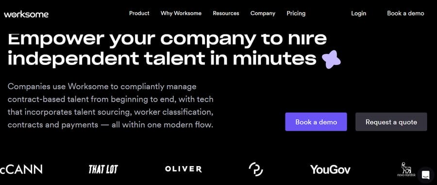
They developed an award-winning worker classification — something they proudly displayed on their website.
Like Slack, Worksome also includes a section on its clients. However, instead of still images, the logos are presented through website animation, drawing visitors’ attention to Worksome’s client list.
To declutter their navigation bar they placed supplementary information in the footer: from resources to social media handles.
We create custom, optimized websites. Schedule A Consultation
7. ClickUp
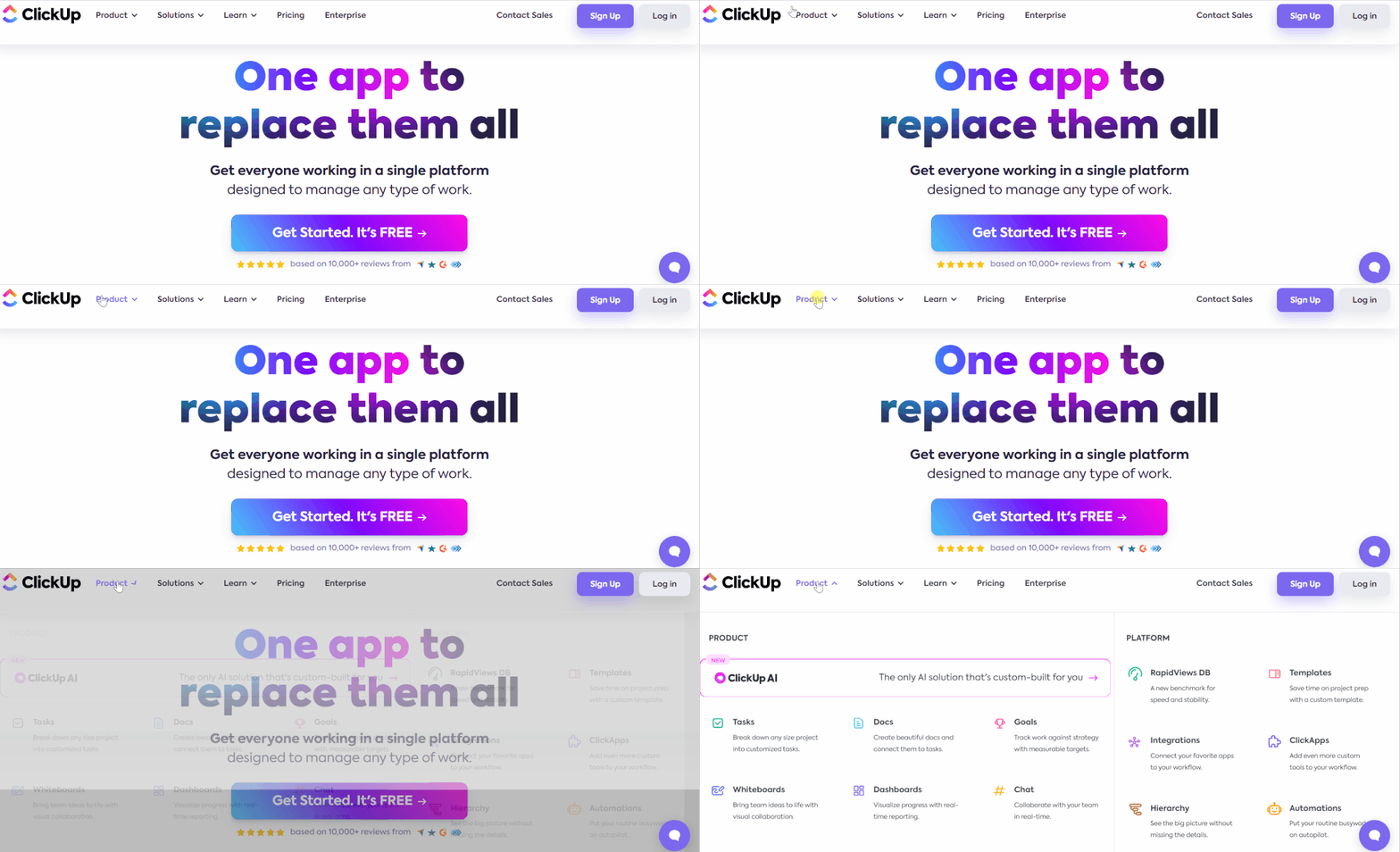
ClickUp is a project management platform. With a distinct, colorful design and color palette, their bright lilac CTAs are hard to miss.
The colors featured on the website are on- brand: they follow the same gradient pattern visible in ClickUp’s logo, which further reinforces the company’s brand identity.
The website also highlights the benefits of their service by showcasing testimonials that provide social proof and a list of ClickUp’s satisfied customers..
Due to the amount services the company offers, they have implemented a dropdown menu from their navigation bar. This effective categorization ensures that website visitors can easily navigate and find the service they are looking for.
8. Wodwo
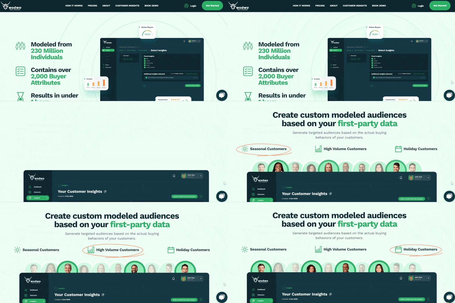
Wodwo builds AI audience modeling platforms for marketers.
By analyzing more than 230 million people, the company provides businesses with consumer demographic information based on custom criteria of each business.
The website utilizes effective storytelling through motion graphics that highlight their products, benefits and testimonials.
For example, as you scroll the website you will encounter the section that explains how Wodwo creates custom modeled audiences.
Using website animation, Wodwo’s website brings specific information into focus, alternating between different target markets and Wodwo’s offerings to each of the market segments.
9. Loom
Loom is an AI-powered video messaging platform.
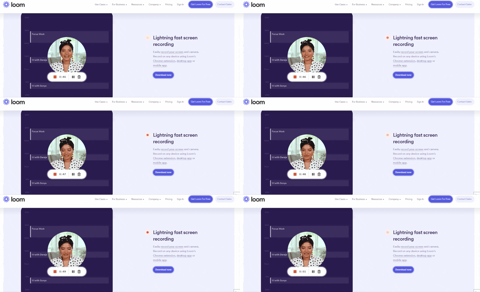
The company’s tagline reads: “One video is worth a thousand words,” and its website relies on videos to reinforce it.
The home page features a two-minute intro video right below the hero section to demonstrate how to best use Loom’s services.
In the Use Cases section, the website features different lines of work that can benefit from using Loom’s product — from sales and engineering to customer support and design.
This demonstrates Loom’s adaptability and underscores its wide-reaching advantages, showcasing real-world scenarios where teams can rely on Loom for enhanced collaboration and productivity.
10. Copilot
Copilot is a SaaS platform that streamlines business processes — from internal communication and payments to file sharing and custom app access.
With a clean and simple design, Copilot’s website quickly conveys its main benefits, then invites you to sign up.
Additionally, the website offers social proof through testimonials and different applications of Copilot’s software.
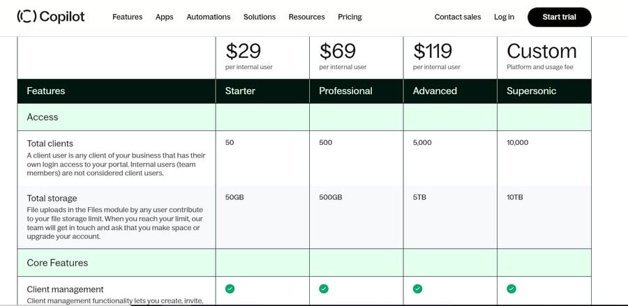
A great feature of this SaaS website design example is its transparent pricing list. The website offers a clear overview of different payment options and tiers followed by a Show Plan Details button.
By clicking it, you can get a comprehensive look at all the different features Copilot offers with each plan. This allows you to align your needs and budget with Copilot’s offerings without being overwhelmed or having to contact support to request more information.
11. Rohirrim
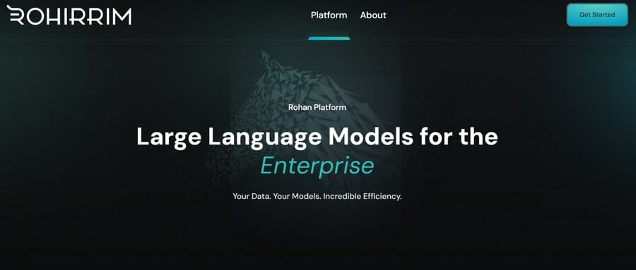
Rohirrim offers its customers a generative AI platform that structures company data.
The website’s home page is short and decluttered, making it easy to digest and switch between different sections.
Rohirrim also efficiently uses typography – different font sizes and colors across the website copy – to direct the attention to specific information without overwhelming the visitor.
12. Calendly
Calendly is a scheduling automation platform that aims to increase workplace productivity.
Their website is intuitive and simple in design: relying on good typography hierarchy, it quickly draws attention to specific information, such as “Easy Scheduling Ahead” to encourage visitors to explore Calendly’s options.
Although rich in content, none of Calendly’s pages seem cluttered, thanks to lots of space between the website copy.
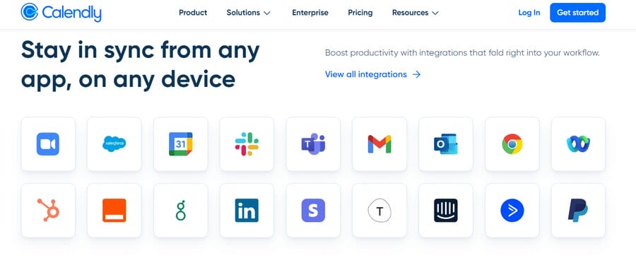
After showcasing Calendly’s client base and number of users, the website highlights all the available integrations. This is a strong selling point considering how many businesses use some of the apps on Calendly’s list.
13. Welcome
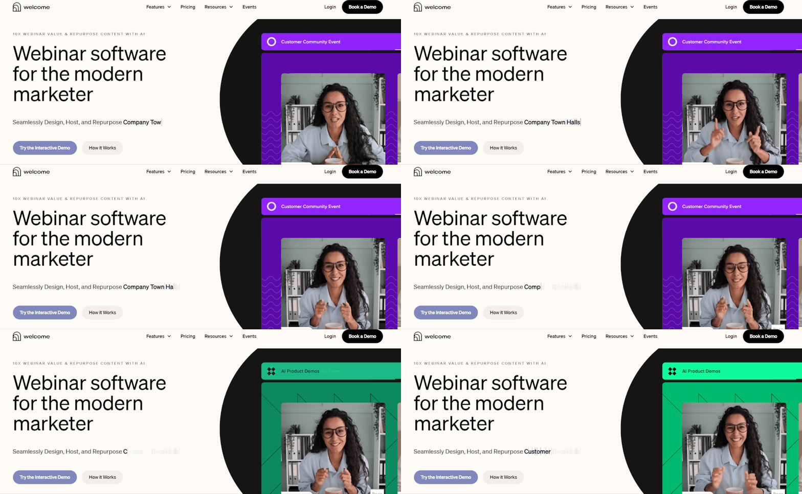
Welcome is a webinar software for marketers, letting them instantly create video content and host webinars.
They drive this point home by using videos instead of still images on their website and they immediately invite visitors to try the interactive demo in the CTA.
What makes their SaaS website design unique is its effective use of minimalist design, simple navigation and highly visible CTAs.
14. Ramp
Ramp is a fintech company that produces software to automate companies’ financial processes.
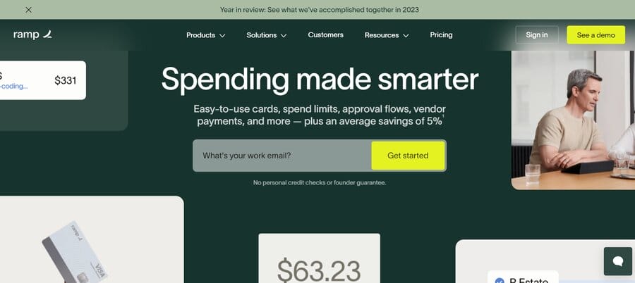
The website strategically incorporates video testimonials, offering compelling proof of the product’s benefits and establishing trust.
The website features minimal text to highlight the company’s offerings from accounting automation to procurement.
What makes their website stand out is the expert flow of the page.
As you scroll down, the content changes and brings specific information to focus through expert web animation that makes Ramp’s website unique.
15. Pipe
Pipe is a SaaS platform that helps startups find investors and raise money.
They have a clean website design which results in a decluttered page with easily digestible content.
The website also uses motion graphics to explain everything from the product’s features to multiple CTAs that invite you to Get Started.
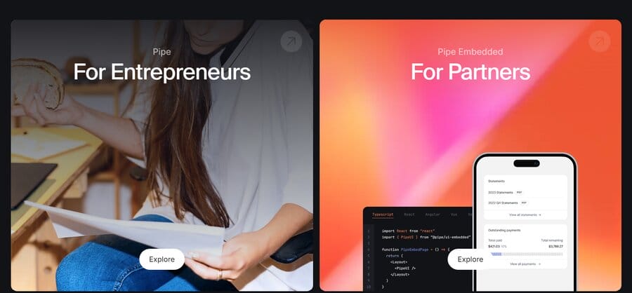
Pipe’s website offers two different options in the navigation bar: one for entrepreneurs and the other for partners. This results in easier website navigation and access to the relevant information, depending on what your specific needs and wants from the company.
Create A SaaS Website With Digital Silk
Leveraging decades of experience within the industry, Digital Silk has the expertise to deliver a SaaS website design that works for your business.
As a full-service marketing agency, we take projects from conception to deployment, acting with complete transparency so you’re never out of the loop.
Our solutions span web design, development and search engine optimization to ensure your website continues to thrive long after we’re done.
Our services include but are not limited to:
Have a web design project in mind?
Call us at (800) 206-9413 or complete our Request a Quote form below to set up a consultation and receive a custom quote for your project.
"*" indicates required fields


