Window displays are the main reason 53% of people enter a store.
The storefronts of Macy’s and Harrods are known worldwide. They craft eye-catching displays that stem from the themes of their trendiest stock to entice visitors inside.
Just like the designs in high street shops, your portfolio website can attract and retain visitors.
Translating this approach to your portfolio web design can help you achieve your brand goals, whether aiming to boost sales, awareness or both.
In this article, we’ll show 15 of the best portfolio website examples and uncover what they can teach you for your own portfolio.
We’ll also cover how to create a successful portfolio website.
We create custom websites. Request a Quote
3 Best Personal Portfolio Website Examples
The best personal portfolio websites act as an extension of your personal brand. They successfully deliver a connection with your target audience, showcasing your skills, values and mission.
By improving your personal branding strategy, personal portfolios work to boost credibility and opportunities.
In fact, 77% of respondents to one survey claimed that personal branding has helped their careers.
Some examples to inspire include:
1. The Duke & Dutchess Of Sussex
Harry and Meghan’s digital presence differs from common portfolio website examples. It promotes initiatives and values over specific pieces of work.
The web design portrays a statesmanlike appeal with clear imagery and tasteful typography.
Simple hover animations reveal text to expand on headings and CTAs. This places emphasis on the core message of community support and global responsibility.
Using imagery from a range of community visits and quotes from the likes of the Queen, Harry and Meghan’s portfolio successfully highlights their prestige and willingness to act.
2. Tiger Woods
Tiger Woods is a household name in golf and beyond. He doesn’t need to show off his medals and sporting successes.
Instead, his portfolio highlights his other ventures, such as TGR Design, TGR Foundation, TGR Live and The Woods.
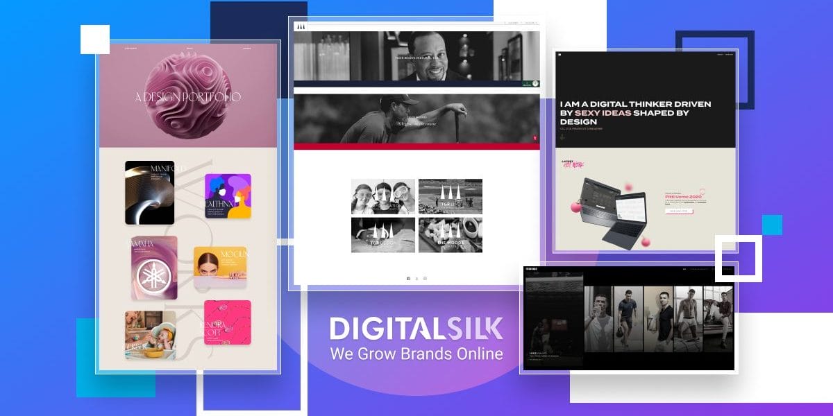
The stripped-back site offers external links to his other ventures, making it easy to navigate while reducing loading times.
The main goal of Woods’ portfolio website is to direct user journeys to his more detailed websites. This is achieved through an attractive drop-down menu in the main navigation.
The site also uses a black-and-white theme where elements turn colorful once hovered over, driving attention to continued user journeys.
3. Cristiano Ronaldo
Cristiano Ronaldo is not only a soccer superstar but also a specialist in winning brand collaborations.
His carousel portfolio starts with an instantly engaging video of career highlights. As visitors hover over each frame, they are made aware of his work outside of soccer.
The web portfolio design uses a selection of photoshoot images to highlight Ronaldo’s personal branding.
It also tells visitors about his house of brands and the businesses he has partnered with through a social proof logo module and dedicated landing page design.
As Ronaldo’s target is to keep the public engaged and aware of his actions to continue securing brand deals, the newsletter and social media CTA are well-considered key conversion points.
We build custom web designs. Schedule A Consultation
4 Best Graphic & Creative Design Web Portfolio Examples
If you visit a fashion stylist, it’s comforting to see that they take care of their looks and match your desired image.
The same can be said for designers.
When building a graphic and creative design portfolio, the entire site needs to be an extension of your style and portfolio quality.
Some examples to inspire include:
1. Julia Sloane Design
Julia Sloane is an Austin-based designer. She specializes in product design, web design, branding and more.
How do we know what she does?
Because her previous experience is the main content on the homepage of her modern, interactive portfolio website.
Above the fold, Sloane’s website captures attention through a hypnotic 3D ball animation. This is followed by examples of her previous clients, acting as social proof and visual representations of her style of work.
Finally, we reach an oversized footer asking visitors to connect with Sloane to discuss her projects and work. This XXL — extra-large and detailed — footer acts as a lead magnet, pulling potential customers to her email inbox.
2. Steven Mengin
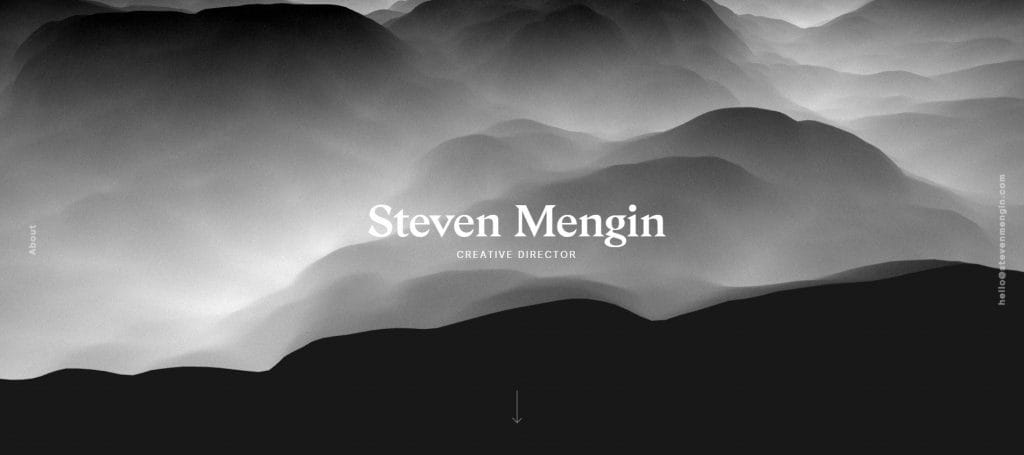
Steven Mengin is a creative director who works across multiple channels, from augmented reality (AR) to documentaries and physical art installations.
His artistic vision is instantly clear with his portfolio website’s hero animation featuring a cloudscape. It’s unique and striking, just like the portfolio examples strategically placed in whitespace that follow below.
Visitors can learn about Mengin’s professional experience by clicking the About button and reading the pop-up text.
This feature appears without taking you to a separate landing page, meaning users can see clients like Google, Adidas, Shopify, Twitter and Oculus without leaving the homepage.
3. Enrico Deiana Design
Enrico Deiana’s user interface (UI) and product design portfolio website is an end-to-end showreel of his “sexy ideas shaped by design”.
As a graphic and web designer, Deiana uses the entire website as an example of his capabilities instead of adding images of his previous work to a static background.
Kinetic typography, gradient design and interactive buttons are just a few of the techniques used to craft an immersive UX alongside the necessary promotion of past projects and awards.
4. Space Cowboys
Space Cowboys is a creative and post-production company operating out of New York.
Just like their work, their portfolio website is progressive and innovative.
An interactive loading video animation sets the tone by keeping viewers engaged from the get-go. Then, visitors enter a gamified case study section, using keyboard arrows to journey through past projects.
The experience feels like virtual reality (VR). Short video clips are surrounded by 3D illusions in an empty space, mirroring the experience of a showroom and delivering an unforgettable UX.
4 Best Architecture & Interior Design Web Portfolio Examples
The global architectural design market is expected to grow 4.3% annually until 2032, and the interior design market 5.16% a year until 2027.
Successful brands will capitalize on this growth by generating leads through a portfolio website that highlights their brand’s unique value proposition (UVP).
Some examples to inspire include:
1. Charlie Horner Design
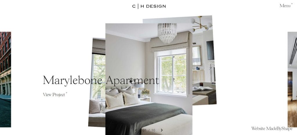
“Charlie Horner is a forward-thinking interior designer.”
This is the message on Charlie Horner’s website. The direct messaging is typical of the entire web design’s straightforward, intuitive approach.
High-quality images of clients’ interior designs are brought to view by a scrolling animation, while images stay central throughout the site to help potential clients visualize Horner’s type of projects and style.
This helps narrow down leads into those that fit Horner’s budget and working techniques.
2. MLA Architecture & Development
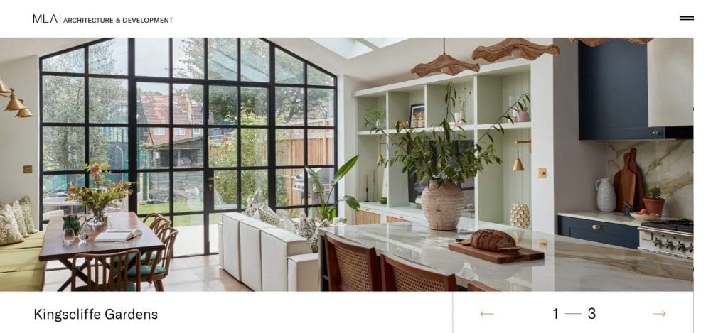
MLA Architecture is an architectural design and land development company based in the U.K.
Their website is a full-scale informational site, providing details on the company’s services, processes and UVPs.
However, the web design’s central component is its portfolio design.
Visitors are immediately greeted by three project examples in the homepage hero section where a core message and CTA button would usually be.
This tells MLA’s prospective customers that the business is results focused. Users can visualize the brand’s ability to meet their own architectural requirements before learning of the specific services MLA offers.
3. Pixelflakes
Pixelflakes delivers architectural marketing services.
The brand’s website homepage is a combination of crystal-clear messaging, videos that showcase the team behind the work and a set of portfolio examples.
This approach of employer branding alongside case studies helps viewers understand the goals of Pixelflakes.
Laughter and smiles on video are accompanied by phrases like “We champion artistic value” and “We champion creativity.” These give visitors the impression of what it would be like to work with Pixelflakes while they browse the portfolio website.
4. Cameron Mac Neil
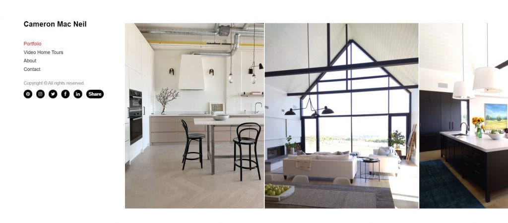
Cameron Mac Neil’s interior design portfolio website follows a simple image carousel layout.
A large selection of high-quality images helps viewers understand MacNeil’s design choices and previous projects.
While scrolling, a sticky main navigation follows to provide clear directions to Video Home Tours, Contact pages and social media links.
MacNeil’s portfolio website is successful in its simplicity, showing viewers what they need to see before showing them how to get in touch or keep exploring.
We deliver bespoke designs. Schedule A Consultation
3 Best Photography & Art Web Portfolio Examples
Web portfolios are an essential channel to grow awareness for your photography or artwork.
However, the best photography and art portfolios in 2025 can also drive direct sales. In fact, 38% of global artists recently reported a yearly growth in online sales.
Some examples to inspire include:
1. Sayo Miyajima
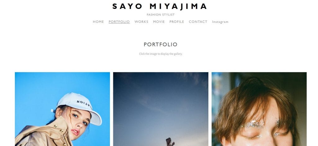
Sayo Miyajima, a Tokyo-based fashion stylist, delivers an eye-catching, stripped-back portfolio website.
By using surrounding whitespace, Miyajima draws viewers to the two important website features: the portfolio and navigation menu.
High-quality images have subtle hover interactions, and lead to in-depth portfolio pages when clicked.
Meanwhile, visitors can immediately find further information, like Works and Contact, in a clearly visible main navigation menu.
2. Bryan Gentry
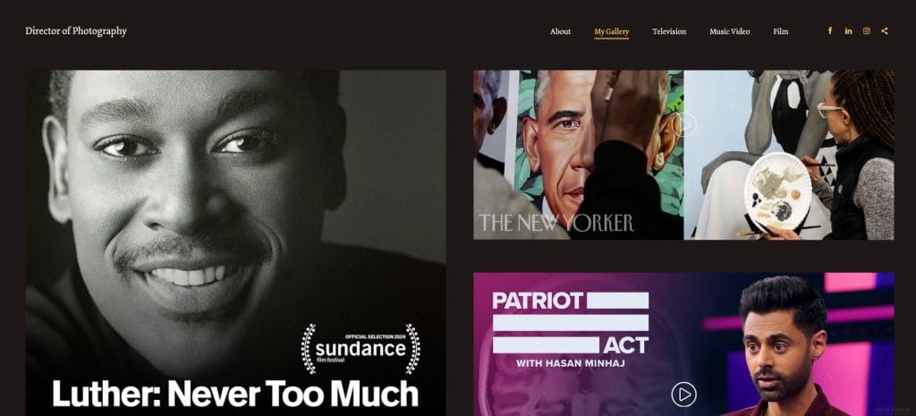
Bryan Gentry is an experienced director of photography. His portfolio website showcases this from the moment visitors land on the site.
Samples from his work with The New Yorker and Sundance Film Festival-selected documentary Luther are placed above the fold. This gives visitors an immediate testimonial and visualization of his talent.
Gentry’s site also provides a seamless user experience — viewers can explore his work without interruption or frustration.
3. Alice Lee
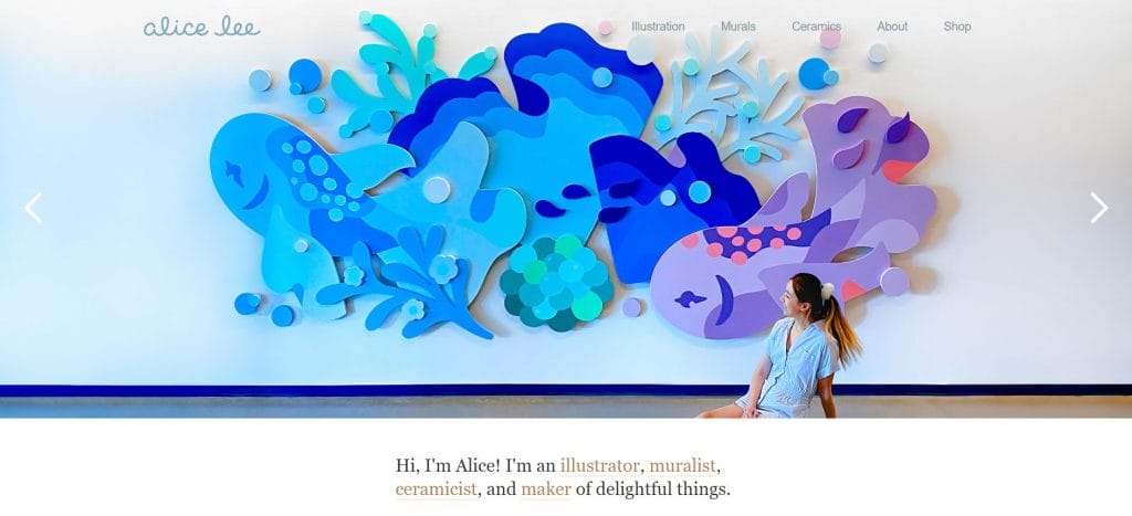
Alice Lee is an illustrator, muralist, ceramicist and maker of DIY experiments.
Her portfolio website opens to this description, with an internal link pointing to the relevant page from each of the keywords.
This helps website visitors find the section of her portfolio that best aligns with their search intent.
The description, which sits below a custom hero illustration of Lee’s work, is followed by numerous portfolio projects.
Lee’s illustrations are visually stimulating. Her portfolio makes the most of this by placing important text around custom visuals, not the other way around.
4. Shantell Martin
Shantell Martin is a Los Angeles-based interdisciplinary artist.
She has crafted an engaging digital presence with an interactive website that effectively demonstrates her recognizable artistic vision.
Upon entering the site, visitors are greeted by an image of Martin herself. This drives an automatic connection between artist and viewer, while the surrounding doodles highlight the style Martin is best known for.
With one click from the homepage, visitors can access her portfolio of works, which includes collaborations with brands like Tiffany & Co. and Max Mara.
The detailed project summaries give insights into Martin’s work processes, further strengthening the resonance between the artist, her work and the viewer.
We create custom websites. Request a Quote
How To Create A Successful Portfolio Website
Whether you’re aiming to secure opportunities, boost digital recognition or generate sales leads, your portfolio website design should have:
- Easy navigation: Use unmissable navigation menus and directive messaging. This will ensure visitors can explore your catalog and information as easily as possible.
- Quick and seamless loading: Optimize your media and content to enable fast loading. This helps to reduce bounce rates and increase user satisfaction.
- A clear explanation of your niche: Define who you are and what you do immediately on your portfolio. This avoids any confusion and lets relevant visitors know your site is the right one for them.
- High-quality visuals: Make use of captivating visual elements in your working portfolio. This allows users to see your experience for themselves in an engaging, professional way.
- Bold calls-to-action (CTAs): Add ongoing links to social media or contact channels with bold, clear messaging across your portfolio site. This lets high-quality leads contact you or continue their journey into your work.
Design Your Portfolio Website With Digital Silk
The best portfolio website examples capture visitor attention with custom design features.
They then showcase your UVPs and provide ways for viewers to continue their journey of discovery into your brand.
If you need support creating your portfolio website, our award-winning design team is on hand to help.
At Digital Silk, we offer innovative web design solutions based in decades of industry experience to craft tailor-made websites that drive results.
As a full-service web design company, we are experts in:
- Custom web design
- Custom web development
- Digital branding
- Digital marketing, and more
We assign a dedicated, senior-level digital strategist to keep every project on track, as well as ensuring:
- Project ownership
- Total transparency
- Measurable results
Contact us, call us at (800) 206-9413 or fill out the Request a Quote form below to tell us about your unique portfolio website requirements.
"*" indicates required fields


