The average user visits up to 130 websites daily, which can add up to around 4.000 sites per month.
With such an overwhelming amount of data and information, the competition for consumer attention and loyalty grows fiercer by the day.
Your homepage serves as your digital storefront and is the first thing consumers see when they open your website. What they see directly influences their decision to stay or leave.
In this post, we’ve compiled a list of the 25 best website homepage design examples for inspiration, along with several best practices to help you design a high-converting homepage for your brand.
25 Best eCommerce Homepage Design Examples
The average time users spend on site is 54 seconds, so brands have a limited time to attract and retain visitors’ attention.
Part of creating a responsive, engaging and interactive site includes a well-designed homepage that captures your brand’s identity and clearly communicates your core messaging.
Below, we’ve listed the 25 best website homepage design examples based on their aesthetics, user experience and signature functionalities.
1. Mad Tasty
Standout feature: Easy access to relevant information
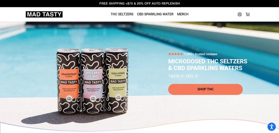
Mad Tasty takes the high-contrast, colorful route when promoting its hemp-inspired sparkling water with signature health and wellness perks.
Judging by its name, it’s clear that the brand doesn’t take things too seriously and this happy-go-lucky vibe is reflected in its homepage design.
The bold colors and gradients, simple typography and clever animation deliver a well-rounded user experience that matches the brand’s fun and energetic personality.
2. Chipotle
Standout feature: Mouth-watering hero section visuals
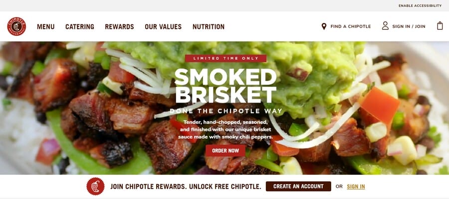
Chipotle is unabashedly and unapologetically food-focused.
Its hero section alone is enough to make your mouth water, let alone the cleverly written taglines and easy-to-use navigation bar.
The brand doesn’t need fancy visuals or motion graphics to get users to click — the clean and uncluttered interface puts all the emphasis on scrumptious food photography, compelling calls-to-action and clear messaging.
3. Colorsmith
Standout feature: Always visible “Craft My Color” CTA
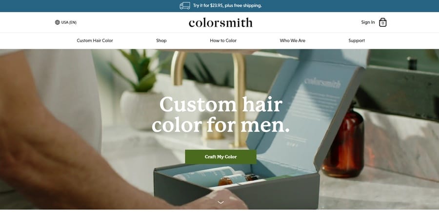
Visitors are unlikely to have any doubts about what Colorsmith sells, thanks to its easy-to-read headline and supporting background visuals.
After the fold, the site offers a three-step guide to its “Craft My Color” feature, which allows users to tailor the brand’s products to their specific hair needs and preferences.
Scrolling further down, customers are greeted by the brand’s “2020 Best Hair Dye Award Winner” banner which reinforces the brand’s credibility and quality.
4. Magnolia Bakery
Standout feature: Colorful and playful design elements
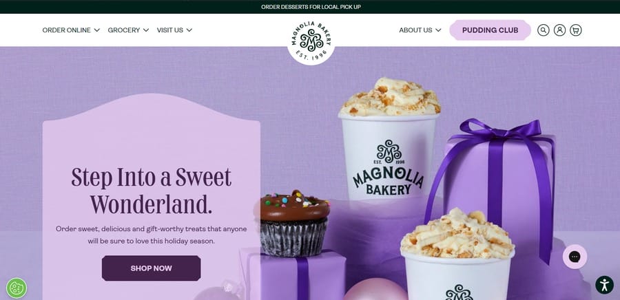
NYC-based baked goods brand Magnolia Bakery moved its offerings online with a stunning website that captures the essence of its brick-and-mortar locations.
The initial all-purple hero section is complemented by a minty green and pastel pink sliding visual that advertises the brand’s offerings.
Magnolia Bakery uses fun typography and whimsical illustrations throughout the site to entice and delight visitors, while its detailed product categories and purchase information make ordering a breeze.
5. Superpower
Standout feature: Scroll-in animation and interactive elements
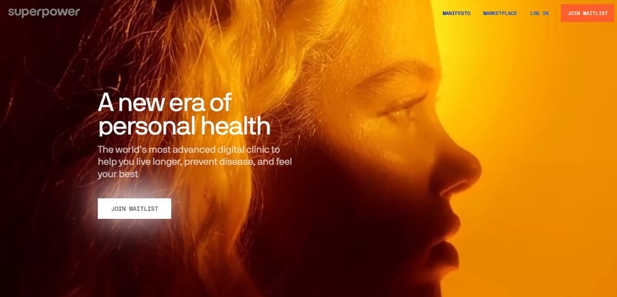
Superpower embraces a sleek and futuristic scrolling effect to reflect its cutting-edge health and wellness programs.
As users scroll past the fiery orange hero section, their focus turns to the woman’s eye in the center of the screen. This eye follows the scrolling motion and transforms into a colorful, funnel-like effect.
Visitors can even scroll back and forth to watch the animation in reverse and appreciate the details.
Once they navigate past the initial animation, the site presents a clean and organized layout with interactive elements like motion graphics and hover effects for better engagement.
6. Lovi
Standout feature: High-quality visuals to describe the product
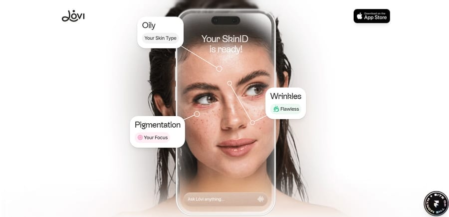
Lovi takes advantage of its all-white background to flaunt its AI-powered and science-backed skincare-building platform.
Once you get past the initial fold, the subtle dynamic imagery takes center stage, showcasing the app’s features and benefits in a straightforward yet impactful manner.
This clean and minimalist design lets the product speak for itself, emphasizing its user-friendly features, AI scanning capabilities and personalized skincare recommendations.
7. Mr. Pops
Standout feature: Bold and compelling typography
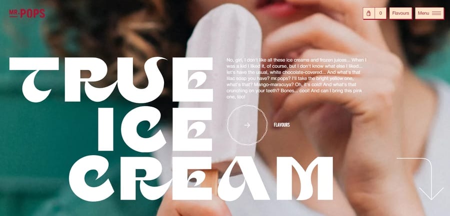
Mr. Pops takes visitors on a high-contrast, immersive ice cream experience with bold, flamboyant and authentic visual brand language.
Its website design reflects the brand’s unapologetically bold and fun personality through vibrant colors, oversized typography and cartoonish animations.
The striking typography is at the forefront of the design, while the white accents paired with the saturated red and beige background create a balanced and cohesive visual aesthetic.
8. Deon Libra
Standout feature: Clever use of color psychology
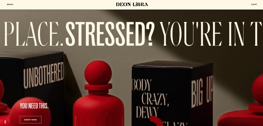
Deon Libra’s stress-reducing products and wellness homepage ironically uses red as its main color, which is often associated with intensity, urgency and passion.
However, the brand cleverly pairs this bold color with calming beige tones to downplay the intensity and create a soothing, balanced effect.
Moreover, the sliding banner with signature oversized typography, the cleverly chosen “You Need This” call-to-action and the informative resources below create a visually appealing and persuasive homepage.
9. Rocco
Standout feature: Vintage-inspired visuals
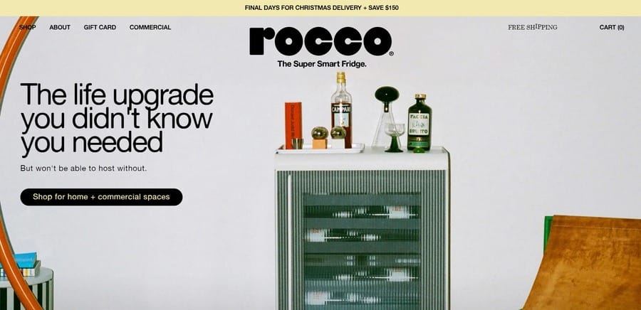
An innovative product that combines a mini fridge and a bar cart, Rocco’s website design perfectly complements its unique concept with vintage and retro visuals.
The homepage features visually appealing font pairs, including a big, bold display typeface and a traditional, elegant serif layered on top of a vintage-style photo.
The overall color scheme is muted and warm, with shades of beige, brown and gray creating a cozy and nostalgic feel.
10. Plastno
Standout feature: Curved fonts and design elements
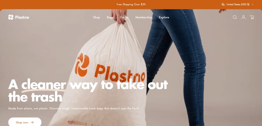
Although Plastno’s products — sustainable and compostable trash bags — aren’t original or groundbreaking, the brand’s website design is anything but ordinary.
The homepage features a signature orange and white color palette, with curved fonts and design elements used throughout the page to convey a sense of movement and modernity.
Below the fold, users can find the brand’s mission statement and messaging, accolades and recognition, customer reviews and useful product information.
11. Apidura
Standout feature: Transparent navigation bar and minimalist design
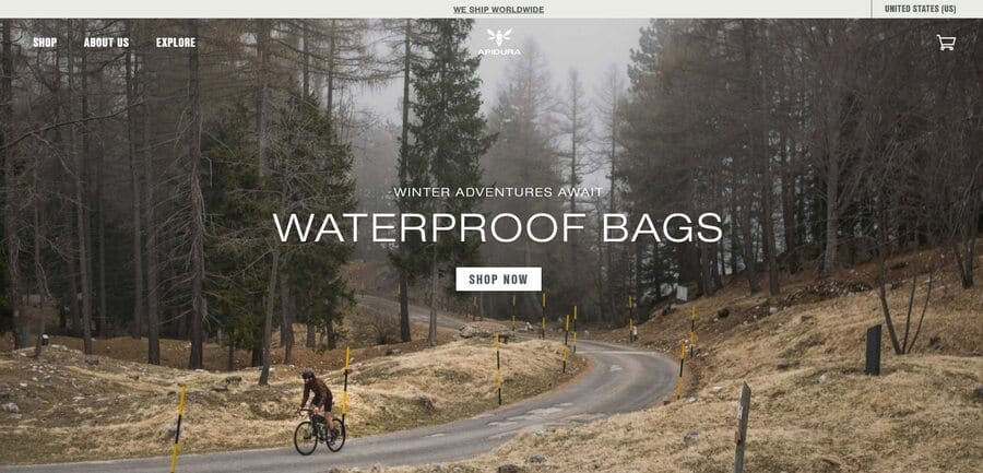
What makes Apidura stand out is its simplicity — just like its sustainable, waterproof cycling bags.
The homepage features a minimalist design with clever use of negative space and clean lines, which highlights the vibrant hero image of a cyclist in the woods.
Visitors can easily browse Apidura’s latest offerings, read more about the brand’s mission and values and explore its eco-friendly practices through transparent and informative sections on the website.
12. Evernote
Standout feature: Large CTAs and consistent branding
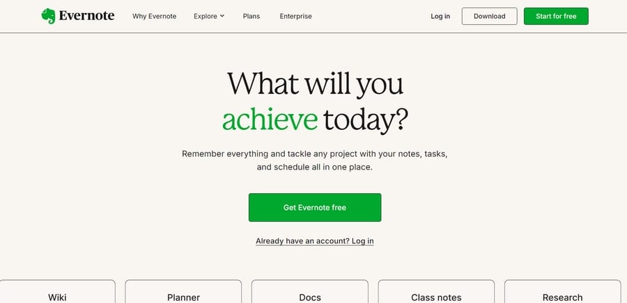
Evernote doesn’t need flashy design elements — its product speaks for itself. Its productivity and time management software helps users stay organized and efficient, much like the brand’s website design.
The homepage features a large central CTA that prompts visitors to get started for free, whereas the simple yet effective messaging throughout highlights its core features and benefits.
13. Fallen Grape
Standout feature: Pastel and playful design
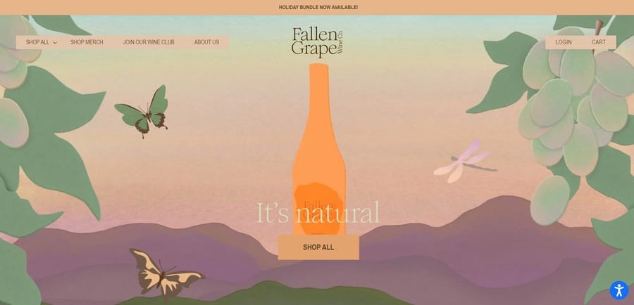
Fallen Grape uses a muted pastel color palette to promote its all-natural wine collection —, and its website design is nothing short of quirky, mischievous and aesthetically pleasing.
The hero section headline emphasizes Fallen Grape’s unique selling point with an “All Natural” slogan, while the unconventional and memorable illustrations give the page a 3D depth effect.
14. HealthyBaby
Standout feature: Tailored, relevant and impactful on-page content
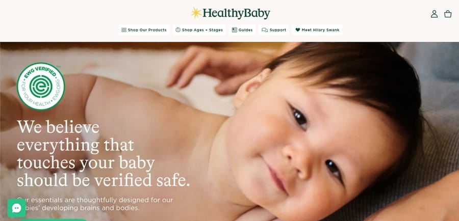
HealthyBaby targets its specific audience of parents and caregivers with adorable visuals, calming pastel hues and a clean layout.
The homepage features a large hero image of a happy and well-fed baby, instantly evoking positive emotions in visitors and prompting them to shop the brand’s collection.
HealthyBaby’s Environmental Working Group (EWG) verification badge also establishes trust and assures customers of the brand’s safe and natural alternatives to everyday baby essentials.
15. Aather
Standout feature: Simplicity and minimalism
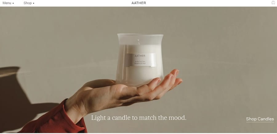
Candles and home fragrance brand Aather adopts a straightforward approach for its homepage, with a large hero section visual focusing on its signature product and a simple, minimalist layout.
The use of ample white space and clean fonts adds to the overall aesthetic, resulting in a creatively refreshing and visually pleasing design.
16. Loisa
Standout feature: Compelling family-inspired visuals
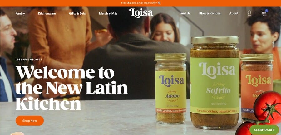
There’s no greater bond than family and Loisa effectively conveys this message through its website design.
It proudly displays its Latinx roots with a video of a family preparing and enjoying a meal together, showcasing the brand’s authentic and natural ingredients.
The use of warm tones and rustic textures throughout the website further enhances the familial vibe, which brings Loisa closer to its target audience.
17. Omsom
Standout feature: Traditional Asian-inspired design
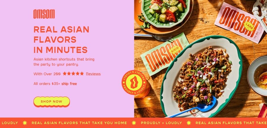
Omsom takes traditional Asian culture and cuisine and translates it into a vibrant and scrumptious website that effectively captures the essence of its brand.
It uses big, bold and bright visuals coupled with delicious and mouth-watering food imagery to get visitors to explore more, while the 5-star reviews badge highlights its authentic, flavorful and convenient meals.
18. Alicia Moore
Standout feature: Monochromatic, modern and mellow design
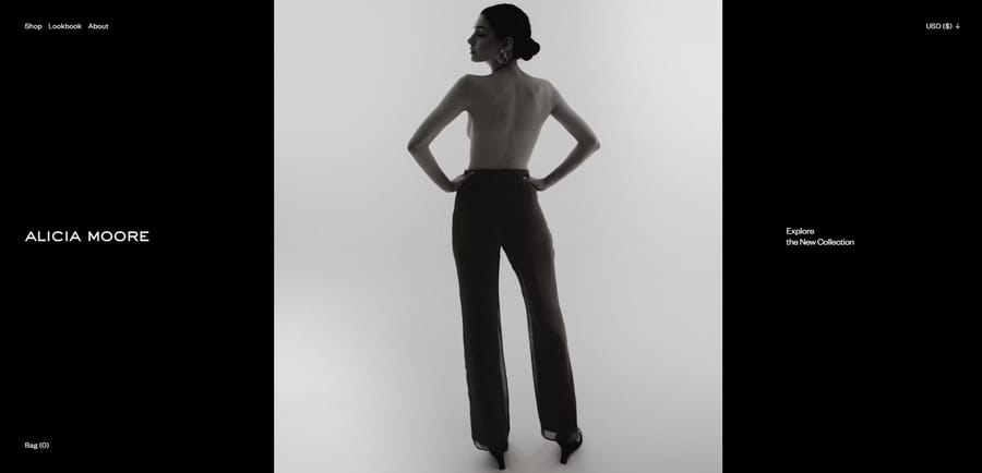
Alicia Moore’s website redefines femininity, embraces simplicity and celebrates women’s empowerment through black and white tones.
Scrolling through the website feels like going through Alicia Moore’s latest fashion collection, with each page showing a different aspect of the brand’s persona.
The muted color scheme creates a sense of calmness and elegance, while the detailed images and clean layout exude sophistication with every click.
19. Fiome
Standout feature: Informative and user-centric design
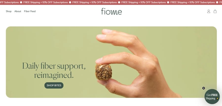
Fiome boosts its brand awareness through useful and informative content on its website, such as ingredient breakdowns and nutritional information for its fiber chews and blog posts on health and wellness.
The prevailing green tint to Fiome’s website emphasizes the brand’s commitment to all-natural, vegan and organic ingredients, while the clean and organized layout makes it easy for visitors to navigate and find what they need.
Additionally, the brand offers a free gut health guide to consumers with a simple email sign-up, which points to Fiome’s customer-centric practices.
20. Prezi
Standout feature: Clear visual hierarchy and reading sequence
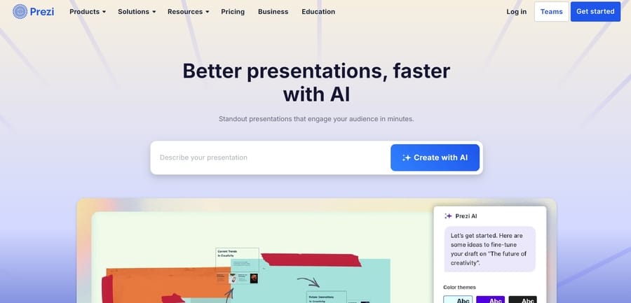
Prezi offers a refreshing alternative to traditional slide-based presentations with AI-powered dynamic visuals and animations.
Users can explore the platform’s capabilities and learn more about its features through the large educational video in the middle of the homepage, while the list of renowned clients underneath highlights Prezi’s success and credibility.
21. Champo
Standout feature: Personalized hair care advice and quiz
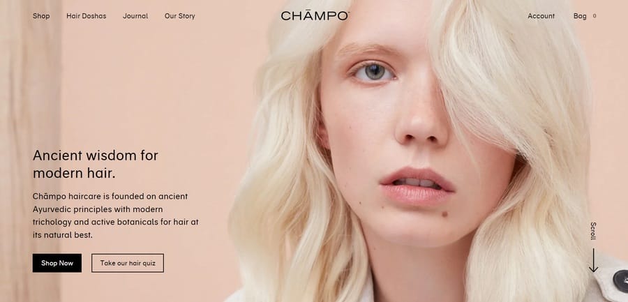
81% of consumers prefer brands that offer personalized experiences and Champo uses this to its advantage by offering a hair care quiz.
This feature allows users to input their specific hair concerns and preferences, which the brand can then use to offer personalized product recommendations.
Additionally, Champo highlights its unique selling point, which is rooted in Ayurvedic principles combined with modern technology and active botanicals, prominently displayed in the hero section of the brand’s homepage.
22. Raw Juicery
Standout feature: List of product perks to increase sales
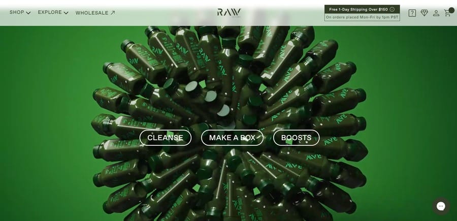
A looping, multi-colored and smooth-flowing hero section video welcomes visitors to Raw Juicery’s homepage.
The three CTAs that grace the middle of the page offer quick access to useful product categories and information while the automatic customer review slider offers instant validation.
Scrolling down, customers come across a nifty list of benefits they can expect from Raw Juicery’s products which encourages further exploration and engagement.
23. Spotify
Standout feature: Clear product benefits and FAQs
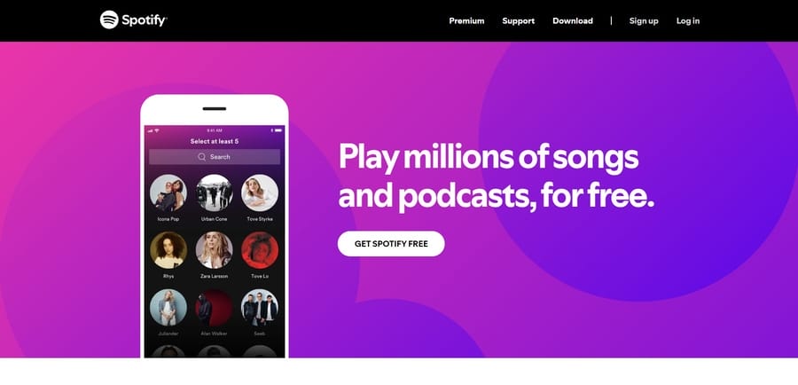
Spotify takes a less-is-more approach to its homepage hero section, using simple language and a clean layout to communicate the platform’s benefits.
Users can quickly scan the core features, learn how to use Spotify with helpful FAQs and sign up for a free account with just one click.
24. Firebrand Bread
Standout feature: Slow-motion, single-take hero section video
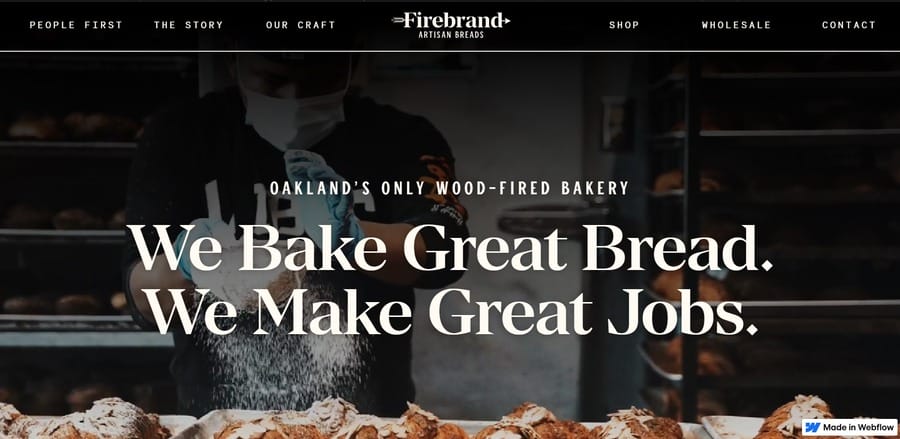
Firebrand Bread captures the essence of its unique value proposition with looping, slow-motion footage of its artisanal bread-baking process in the hero section.
The tempting and mouth-watering visuals are accompanied by large, bold text that the brand makes “great bread” and useful links to the brand’s story and production process, shop and contact pages in the navigation bar at the top.
25. Hartzler
Standout feature: Oversized product images

Hartzler makes a statement with large, realistic and detailed product images as the central element of its homepage.
The brand emphasizes its fresh ingredients, flavorful offerings and glass-bottled products through its somewhat unconventional layout, which pairs well with the light background and logo animations.
Digital Silk’s Best Website Homepage Design Examples
Digital Silk helps clients avoid common web design mistakes by creating research-backed, experience-driven and results-focused designs.
Here are some of our best homepage design examples:
Ghayath Foundation
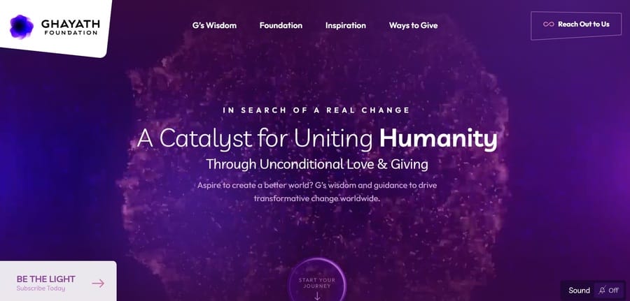
Digital Silk designed Ghayath Foundation’s homepage to reflect its spiritual message of unconditional love, unity and inclusive community.
Our team added pulsating central motion graphics to an all-purple color palette as a nod to the brand’s primary goal of creating positive change and spreading love.
Scrolling down on the page, users are greeted by the foundation’s core values, beliefs and mission statement, followed by a scroll-in animation of two hands moving towards each other with the heart-warming tagline “Together We Are One”.
Laser By Aleya
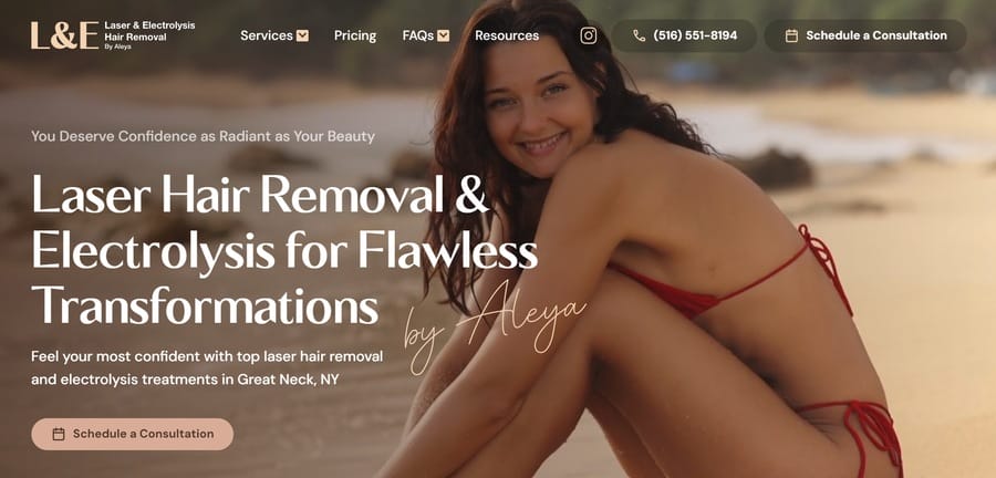
Our design team used smooth typography, soothing colors and calming visuals on Laser By Aleya‘s homepage to contrast the usually painful experience of laser hair removal and electrolysis.
Digital Silk showcases the brand’s unique value proposition through large fonts, while the looping background video of a calm and serene woman on a beach enhances the overall sense of relaxation and comfort.
Lower on the page, users can explore the brand’s services through quick links, a section dedicated to customer reviews and useful resources from Laser By Aleya’s blog.
Homepage Design Best Practices
While exploring practical examples of the best homepage designs offers hands-on learning opportunities, knowing the theoretical principles behind modern web design can be equally important.
Some of the key elements of the best website homepages:
- Effective hero banner: Users spend an average 5.94 seconds looking at the central website image, so use this timeframe to effectively communicate your brand’s message, create engaging visuals and present your unique selling point.
- Simplified navigation menus: 38% of users notice a website’s layout and navigation when they first land on a homepage. Focus on simple, clear navigation options that lead users to the most important pages on your website.
- Compelling headline and copy: 67% of users go directly to a brand’s website to learn more about its products or services. Use a consistent brand voice, actionable CTAs and concise copywriting to increase conversion rates and engagement.
- Strategic first fold: Content above the fold accounts for 57% of total viewing time, so you should prioritize important elements and have a clear visual hierarchy to guide users through your homepage.
- High-quality visuals: Having detailed and aesthetically pleasing visuals can improve your brand positioning, increase market authority and build trust with potential customers. Consider image formats that don’t affect website loading speed, reflect your brand persona and evoke emotions that align with your values.
- Cross-device responsiveness: With over 61.5% of global internet traffic coming from smartphones, brands should adopt a mobile-first strategy when designing their homepage. This means using “hamburger” menus, responsive design elements and optimizing for touchscreen navigation.
Design Your Homepage With Digital Silk
Designing a homepage is a significant step that most brands often overlook or take lightly, so it’s crucial to get it right.
At Digital Silk, we specialize in creating brand-specific, conversion-focused and interactive designs that align with your brand identity.
Our team of experts combines strategy, data and creativity to design on-brand digital solutions that generate leads, improve engagement and boost sales.
As a trusted custom web design agency, our services include:
Have a web design project in mind?
Contact our team, call us at (800) 206-9413 or fill in the Request a Quote form below to schedule a consultation.
"*" indicates required fields


