Nobody wants to land on a 404 page.
In short, a 404 page shows a website visitor that the page they are looking for doesn’t exist.
It’s a sign that something has gone wrong.
However, 404 pages are a crucial element in your website’s navigation and structure.
When added successfully, they can lead your visitors to helpful areas of your site and elevate your overall website user experience (UX).
When ignored, your visitors can be left in the lurch, facing confusion and frustration before leaving your website.
Below, we’ve listed the 30 best 404 pages that keep users on track in 2025. We also detail their key features and list the best practices to inspire your own successful 404 page designs.
30 Best 404 Pages To Avoid User Frustrations
A 404 page is designed to appear when a website’s content is unavailable or doesn’t exist.
Often referred to as a 404 Error Page or 404 Page Not Found, its content contains a message explaining to visitors that what they have searched for can’t be displayed.
By adding extra information and ongoing links, a 404 page guides users to helpful answers or different areas of the website.
In general, 404 pages can occur when:
- A URL is broken
- There was a typo in the URL
- The page does not exist
- The page has been moved
- The server is down
Here are the 30 best examples of 404 pages that navigate visitor confusion and frustration while driving continued user journeys, conversions and brand credibility.
We create custom websites. Request a Quote
1. Figma
Main feature: Interactive, on-brand render functionality
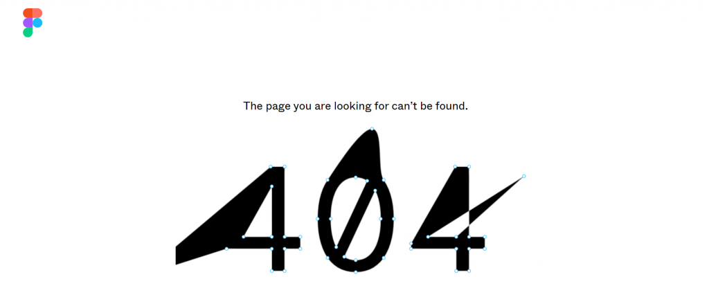
Figma is a collaborative interface design tool.
As such, its 404 page design leans on the software it provides. Visitors can stretch and pull the curves and points of its 404 message as if they were creating a design within the actual software.
This interaction not only boosts engagement but remains on-brand, strengthening the credibility of Figma’s design tool capabilities.
2. Codecademy
Features: Playable mini game and call-to-action (CTA)
Codecademy is an online interactive learning platform.
Its 404 page features the usual error message, stating “Oh No! Looks Like You’re Lost.” Below the message, however, are two buttons: Play the Game and Build your own.
The first opens a playable mini game, while the second leads to Codecademy’s game development course.
This gamification helps to reduce visitor frustrations and increase engagement. It also shows what can be achieved through Codecademy’s relevant course, which is linked to maximize conversion opportunity.
3. Carwow
Main feature: Interactive racing game
Carwow is an online marketplace for buying and selling cars.
Its 404 page involves a racing mini game. Once you crash, you are cleverly redirected to find a new car through the website’s homepage.
The 404 page design also includes on-brand, car-related messaging such as “Looks like we sent you the wrong way” and “Let us guide you back.”
4. Dribbble
Main feature: Interactive color slider displaying related designs
Dribbble is a self-promotion and social networking platform for digital designers.
The website’s 404 Page Not Found message is short and simple: Whoops, that page is gone.
This helps to reduce wasted time for visitors aiming to find a certain designer or its owner’s page.
However, the page also includes a unique interactive feature that displays the site’s most popular designs by color.
Visitors can adjust the slider and images of the same HEX code are automatically generated in the 404 shape, driving continued journeys into the website.
5. Medium
Main feature: Selected articles about being lost
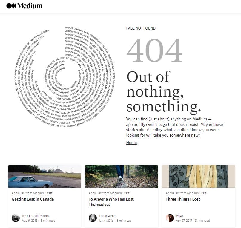
Medium is an open online publishing platform.
The 404 page adds an element of humor by including a collection of articles related to getting lost.
If visitors aren’t interested in the added articles, there is a clear link that lets them return to the homepage and restart their journeys.
6. Wendy’s
Main feature: Interactive mini game
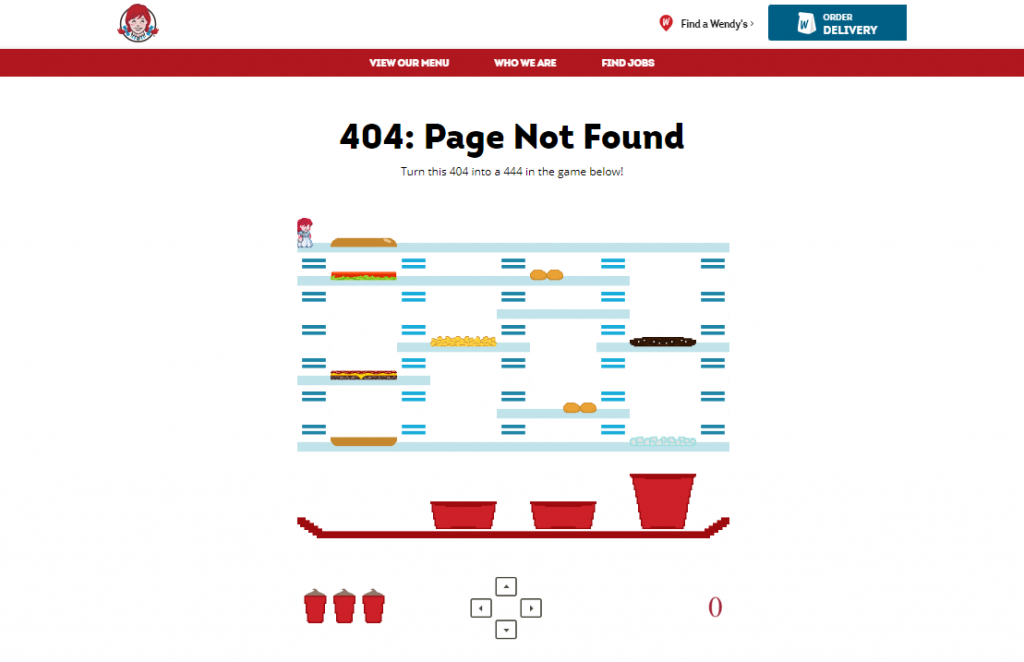
Wendy’s is a fast-food chain known for its humorous and witty approach to branding.
Its 404 page matches this fun brand identity with an interactive game. Visitors are welcomed to play as Wendy stacking burgers.
This gamification matches Wendy’s wider brand identity and physical store setup, which strive to deliver customer enjoyment.
7. Ahrefs
Main feature: Broken Link Checker tool CTA
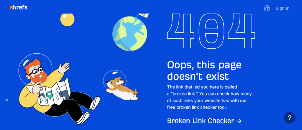
Ahrefs is a full-suite search engine optimization (SEO) tool.
The company offers a range of solutions to help businesses manage, improve and grow its online presence.
One of these services is its Broken Link Checker. Ahrefs explains that a 404 page is a form of broken link before directing visitors to its Broken Link Checker tool to check their own sites.
This approach turns Ahrefs’ non-existent pages into another conversion rate optimization technique.
8. DashThis
Main feature: Humorous Lord of the Rings graph and tone of voice
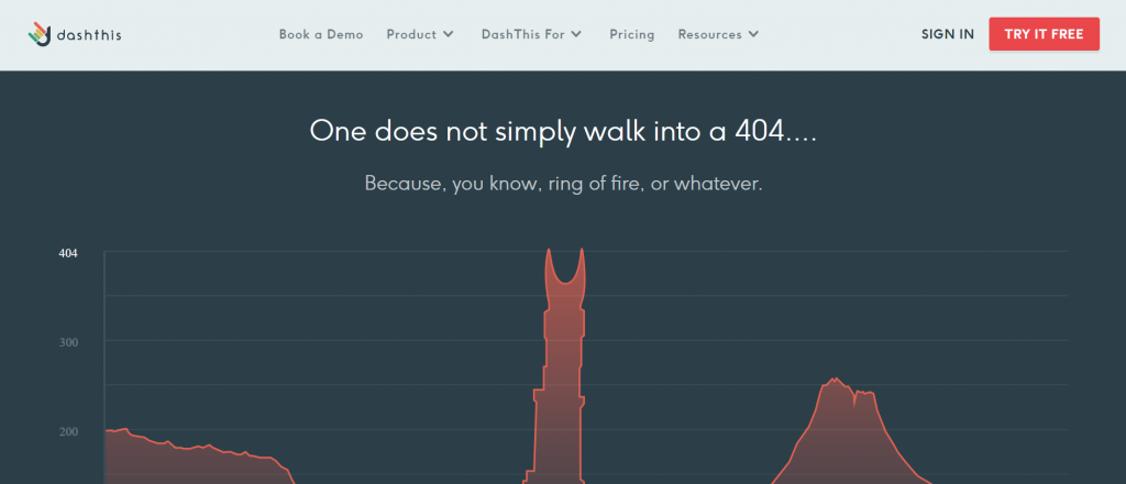
DashThis is a marketing reporting dashboards software-as-a-service (SaaS) provider.
The company uses humor for its error pages. Following a Lord of the Rings theme, it recreates the Tower of Sauron, Barad-dûr, through a reporting graph.
DashThis uses phrasing like “One does not simply walk into a 404” before adding “Perhaps going back to the Homepage would help?”
This eases visitor frustration while guiding them to the best website area for their needs.
9. Kualo
Main feature: Playable version of Space Invaders
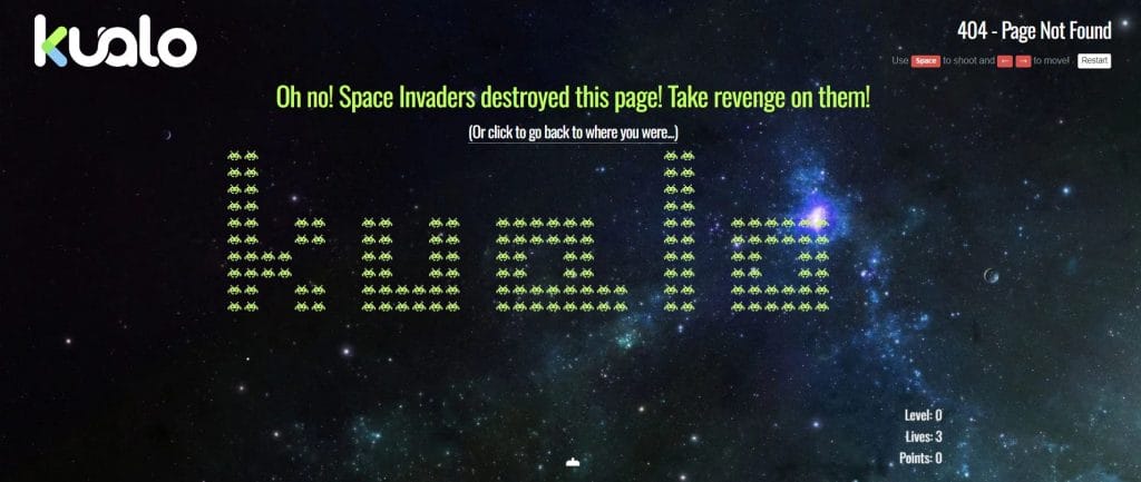
Kualo is a site hosting, domain registration and cloud hosting provider.
Its messaging strays from the norm, claiming the space invaders have destroyed the page. This tells visitors that the page doesn’t exist in a playful way.
Kualo then offers visitors a route back to the homepage or the chance to play a version of the game Space Invaders, with the enemy organized in a formation that spells Kualo.
From nostalgia to engagement, the design uplifts Kualo’s UX more than a simple 404 Page Not Found message.
10. IMDb
Main features: Film and 404 page-related quotes
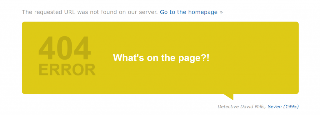
IMDb is an online database of film, TV and celebrity content.
The 404 page on IMDb features random, modified quotes to connect with its audience of film fanatics.
The quotes are adapted to fit the missing page theme, while a link to the homepage signals a way back for those who wish to continue their user journey.
11. GitHub
Main feature: Animated character with a search bar
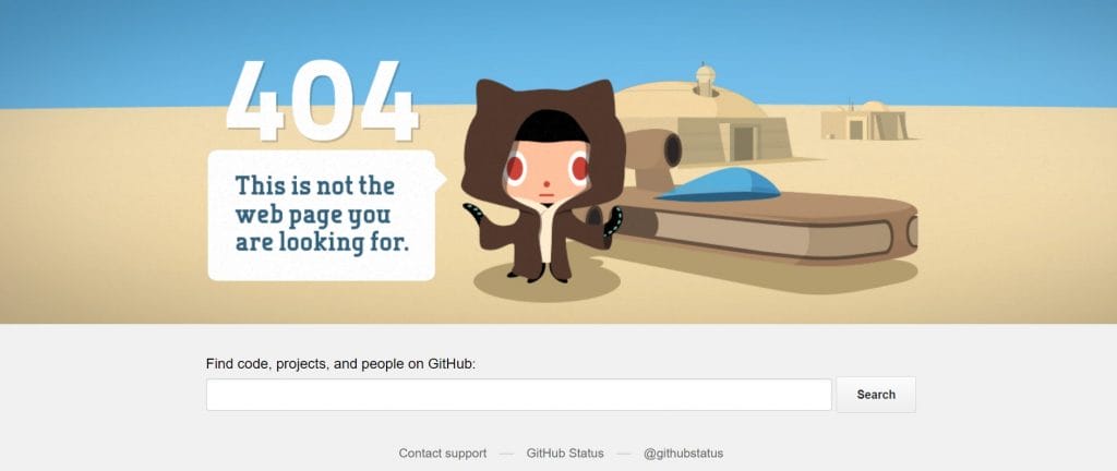
GitHub is a developer platform that enables the creation, storage, management and sharing of code.
When landing on a non-existent page, visitors are shown an animated character with the message: “This is not the web page you are looking for.”
The quick, yet endearing animation and message are followed by a search bar, where developers can directly enter the page they initially hoped to find.
12. LEGO
Main feature: Animated LEGO character
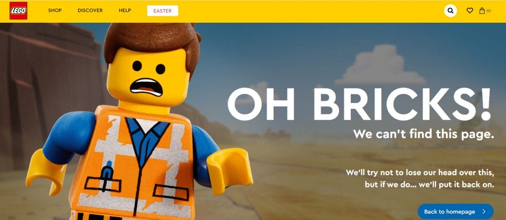
LEGO is a Danish toy construction company.
The LEGO website speaks directly to its target audience, children and their parents, with an on-brand animated character.
Using phrasing like “Oh Bricks!” also helps to reengage visitors through humor and play.
A contrasting, simple blue CTA with Back To Homepage text follows the error message, allowing users to restart their journeys without friction.
13. Digital Silk
Main feature: Social proof and trending articles
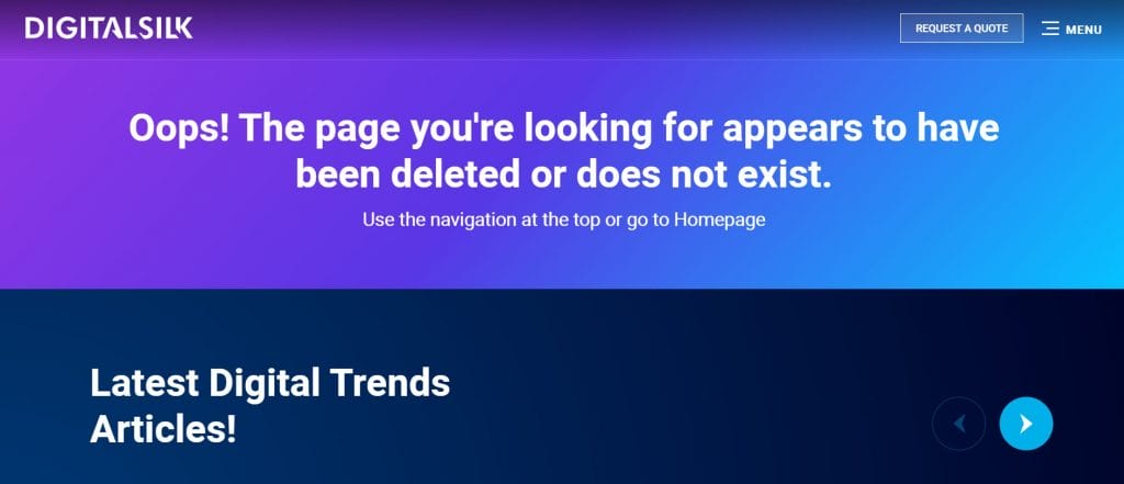
Digital Silk is a full-service web design agency.
Our 404 page contains an immediate message to let visitors know the page they are looking for has “been deleted or does not exist.”
If visitors choose to scroll down, they will find a range of thought leadership articles, testimonials, and awards.
This additional content helps drive credibility and authority in our solutions, even from an error page.
We’re award winners. Meet Our Team
14. Dropbox
Main feature: Internal links
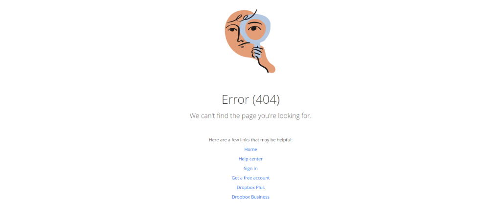
Dropbox is a file hosting service.
Its stripped-back 404 page focuses on getting its visitors back on track. A simple image and message are followed by six core links, from the website homepage to signing up for a free Dropbox account.
Surrounded by endless whitespace, attention is concentrated on these links only to reduce bounce rates.
15. BuzzFeed
Main feature: Animated cat with a Buzzfeed logo shirt
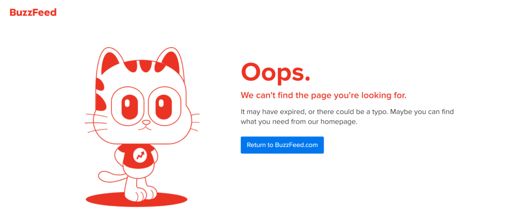
BuzzFeed is an American digital media, news and entertainment company.
The title tag for its 404 page is Page Not Found, instantly showing visitors that they have landed in the wrong place.
BuzzFeed uses its 404 page as a touchpoint for building brand awareness. The company does this by adding its logo to the t-shirt of a blinking animated cat.
Meanwhile, visitors can return to the homepage via a clear CTA button.
16. Audible
Main feature: Audio clip recommendations
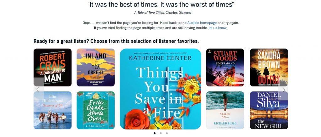
Audible is an online audiobook and podcast service delivered by Amazon.
The 404 page contains a quote from literature, appealing to the shared interests of its target audience.
It also contains a sliding gallery of listener favorites. When hovered on, more details such as reviews, length and a blurb appear.
This provides an extra touchpoint for prospective customers to find an audiobook they like and sign up to Audible’s subscription service.
17. Airbnb
Main feature: Animation of a girl dropping an ice cream
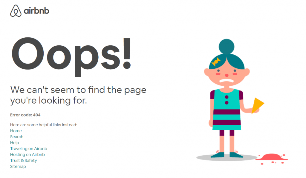
Airbnb is an online marketplace for holiday and short-term rentals and experiences.
The hospitality group’s 404 Page Not Found uses an animation of a girl dropping an ice cream to evoke an emotive response from its website visitors.
The design mirrors the feeling of a small accident before swiftly offering a continued route for website exploration via a selection of helpful internal links.
18. Adobe
Main feature: Product placement
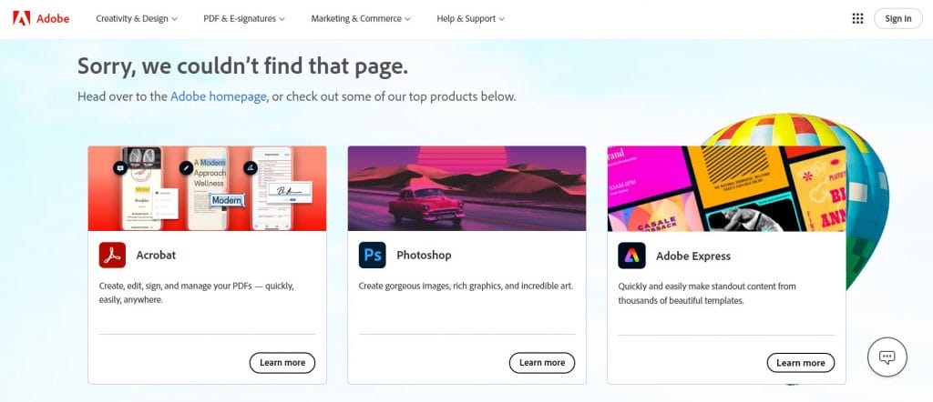
Adobe is a multinational computer software company.
Adobe uses its 404 page design as an opportunity to promote the company’s most popular products.
Short descriptions of Adobe Acrobat, Photoshop and Express are provided with Learn More CTAs, guiding visitors directly to its product pages.
19. Geissele Automatics
Main feature: On-brand visuals and copy
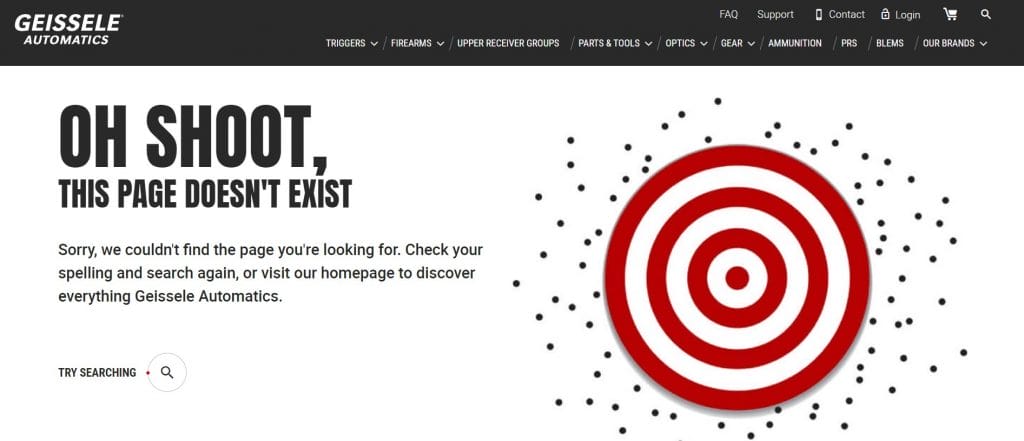
Geissele Automatics is a weapons manufacturing company.
The 404 Error Page’s heading reads “Oh Shoot,” while it also features a target that has been missed at every shot.
These features provide on-brand humor, speaking directly to Geissele’s audience of weapon shoppers.
The page also includes a newsletter sign-up button, increasing potential email marketing subscribers for Geissele’s online sales.
Meet our experts. Schedule A Consultation
20. KonMari
Main feature: On-brand messaging
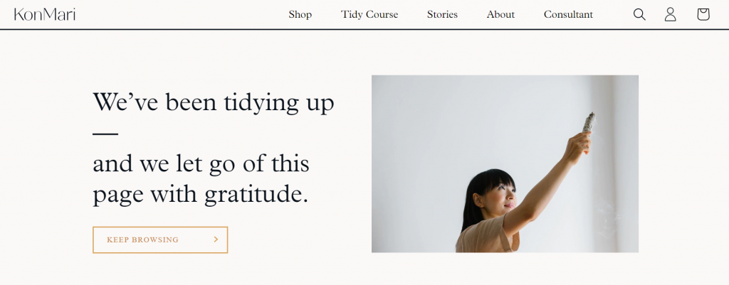
KonMari is a professional Japanese organizing consultant.
Her 404 page messaging displays her recognizable brand personality. By claiming that she “Let go of this page with gratitude,” KonMari is referring to her approach to tidying and decluttering.
The page highlights KonMari’s core brand values while also giving visitors the option to Keep Browsing through a CTA button.
21. Magnt
Main feature: Custom Venn diagram imagery
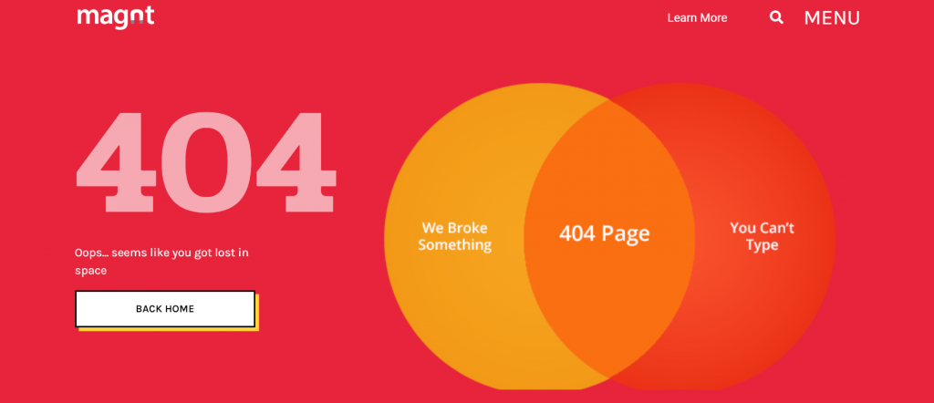
Magnt is a website building platform.
It uses a humorous Venn diagram to highlight the reasons for a 404 page, stating “We Broke Something” and “You Can’t Type.”
The page also uses micro-interactions to create an engaging UX. These include a hover animation over the CTA button and a reaction of the Venn diagram to website visitor’s cursor position.
22. 9GAG
Main feature: Background meme GIF
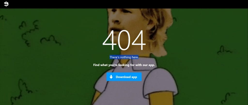
9GAG is a social media platform for internet humor and breaking news.
It keeps its 404 page on-brand and light-hearted by combining two famous memes into one for the page’s background.
The memes of Blink 182’s Tom DeLong and The Simpsons’ Homer Simpson show confusion and wanting to disappear – both of which are relevant reactions to a broken webpage.
9GAG keeps its visitors on track by using a central CTA to suggest a mobile app download.
23. Buddha Brands
Main feature: Floating fruits and geometric shapes
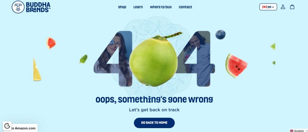
Buddha Brands is a plant-based snacks and beverages eCommerce brand.
Our award-winning design team at Digital Silk created a 404 page for Buddha Brands that represents its playful and exciting brand identity.
Floating fruit and layers of geometric shapes give the page texture and intrigue, while simple messaging and one key CTA help direct visitors back toward the online shop.
24. Spotify
Main feature: Spinning vinyl animation
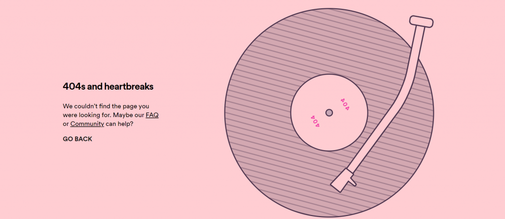
Spotify is a globally renowned music streaming platform.
Its 404 page refers to Kanye West’s 2008 album 808s & Heartbreak and provides a spinning vinyl animation.
As well as finding common ground with its listeners through popular culture references, Spotify offers its visitors a trio of ongoing links to find what they were originally searching for.
25. POWR2
Main feature: On-brand messaging and animations
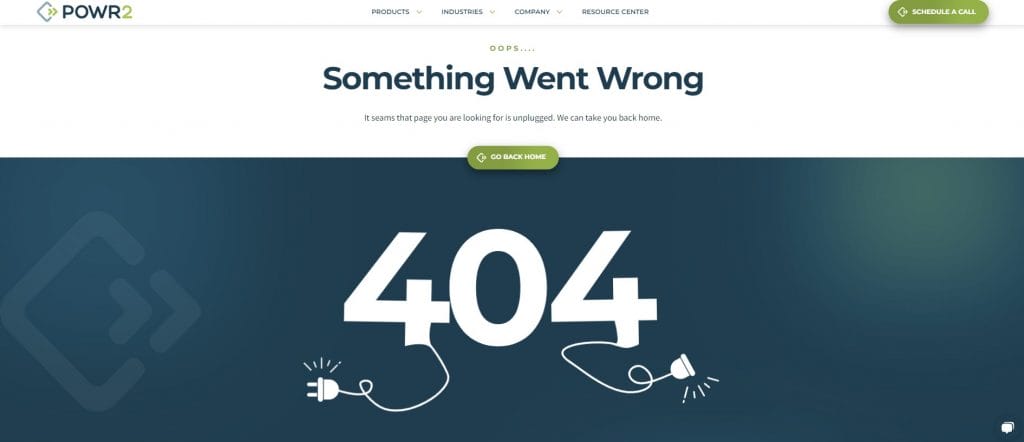
POWR2 is an industrial energy storage company.
Our team at Digital Silk designed POWR2’s 404 page in line with its wider brand and visual identity. Stating that the page has been unplugged and including electrical plug illustrations follows the theme of POWR2’s energy storage solutions.
Meanwhile, a central CTA includes a hover interaction and straightforward messaging to “Go Back Home,” making the website’s navigation as simple as possible.
26. MAD
Main feature: Interactive 404 buttons
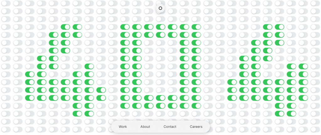
MAD is a digital product design agency.
Its 404 page contains hundreds of interactive buttons set to display the term 404.
Visitors can flip the buttons on or off to spell anything they please. While simple, the buttons provide a pleasing experience that highlights the attraction of micro-interactions in web design.
27. Feldman Studio
Main feature: Interactive retro snake mini game
Feldman Studio is a Paris-based creative studio.
It uses its 404 page as an opportunity to improve website UX and reduce visitor frustrations through the retro snake arcade game.
Users are given just three seconds before being launched into the game, complete with a scoreboard to drive competition and interactive website sessions.
Once finished, players can leave their email addresses to join the leaderboard, providing a conversion opportunity for Feldman Studio.
28. Pixar Animation Studios
Main feature: Animated character from the film Inside Out
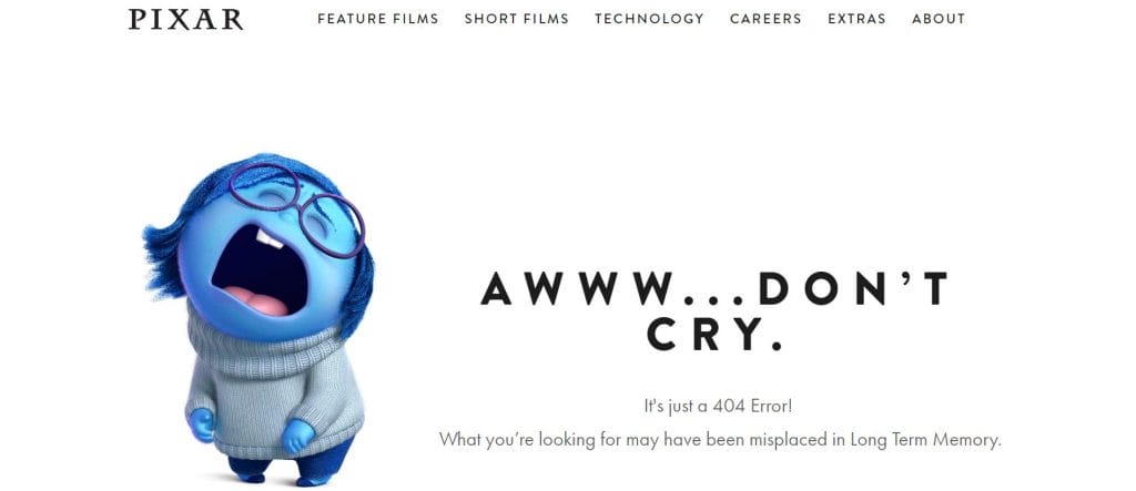
Pixar is a U.S.-based animation studio operating as a subsidiary of the Walt Disney Company.
In 2015, Pixar released the movie Inside Out, where each character represents an emotion. One of the main characters is Sadness, who is depicted on Pixar’s 404 page.
The page also refers to Long Term Memory, a location in the movie containing all the main character’s known memories.
Pixar uses these references to connect with its audience of animation fans, while also downplaying the seriousness of a 404 Error Page.
29. Love Beets
Main feature: Social media links
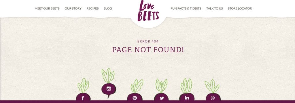
Love Beets is a provider of beetroot products and recipes.
Its website’s 404 page contains two short messages – “Error 404” and “Page Not Found” – to let visitors know the page they searched for doesn’t exist.
The design then features several social media links embedded within beetroot illustrations that are planted within the design. When hovered over, each beetroot rises as if being handpicked in a clever, on-brand design feature.
30. Lyft
Main feature: Looped driving car animation
Lyft is an American rideshare platform.
Its 404 page features a loop animation of a car driving in circles around a roundabout.
The design combines the situations of being lost on a website and in real life in a fun, almost hypnotic animation that captures visitor attention.
Meet our team. Schedule A Consultation
Essential Best Practices For 404 Pages
To build a 404 page that maintains a high website UX, upkeeps a streamlined navigation and represents your brand identity, you need to consider five key best practices:
Best Practice 1. Add A Straightforward Error Message
Visitors need to know that they have gone off track and why it has happened.
Whether your tone of voice is direct or humorous, you need to get your message across in the simplest way possible.
Why?
Because as sentence length increases from eight to 43 words, user understanding decreases by over 90%.
By using short, easy-to-read messaging you can make sure your website visitors understand why they have landed on a 404 page and how they can fix the issue.
Best Practice 2. Craft Engaging Visuals & Interactions
Even on 404 pages, your design elements are crucial in shaping brand credibility.
Adding custom animations, imagery and interactions to not only improve user experiences but also develop a high-end digital presence that boosts brand authority.
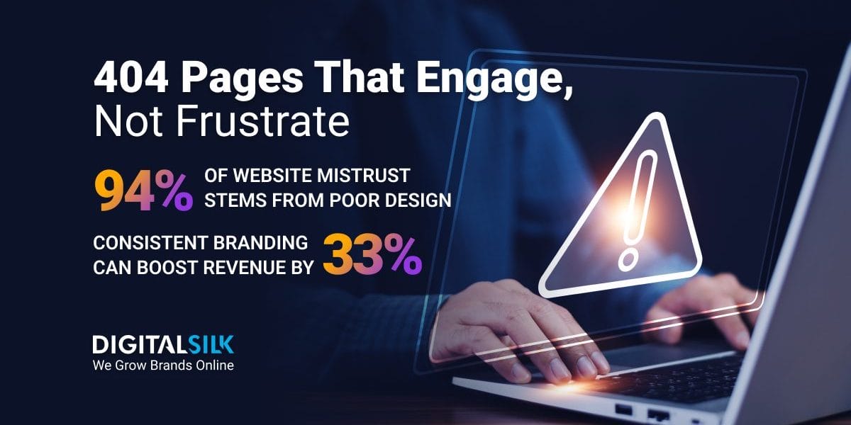
After all, 94% of initial mistrust for a website comes from design alone.
Best Practice 3. Provide Ongoing Navigation
Simple navigation is essential in providing a high-quality UX for your website visitors and supporting your desired user journeys.
Be sure to add clear links, buttons and CTAs that shape your visitors’ next steps.
By clarifying how to exit the 404 page and where your site visitors can find the information they were originally looking for, you have a higher chance of reducing bounce rates and meeting your audience’s intentions.
Best Practice 3. Stay On Brand
Companies with consistent branding can see revenues increase by up to 33%.
Just like the rest of your website, your 404 page is an opportunity to drive brand recognition, awareness and sales through consistency.
Use the messaging and visual elements detailed in your brand guidelines to ensure a consistent approach to your 404 page design.
These can include:
- Imagery
- Color palettes
- Typography
- Tone of voice
- Logo usage
Best Practice 5. Include Contact Information
Adding contact information to your 404 Page Not Found design delivers two benefits for your business.
- They act as a final outlet for those who still aren’t able to find the content or page they are looking for.
- They provide a conversion opportunity for nurtured leads searching for a particular product or service.
You can either add your phone, email or social media details in text or create a custom form to help drive conversions and organize your internal customer relationship management (CRM) operations.
Craft The Best 404 Pages For Your Site With Digital Silk
The best 404 pages explain, connect and direct.
They show your website visitors what has happened and where to go next, while diffusing frustrations to maintain a high-quality UX.
At Digital Silk, our award-winning web design team crafts custom, on-brand websites that include winning 404 pages.
As a full-service web design agency, our senior-level professionals deliver a range of solutions to grow your brand online.
These include:
- Custom web design
- Custom web development
- eCommerce web design and development
- Digital branding
- Digital marketing
We set ourselves apart from other agencies by focusing on three core values:
- To take project ownership
- To provide transparency
- To drive measurable results
Learn how we create the best 404 pages and see how we can build yours by contacting us or calling us at (800) 206-9413. Alternatively, fill out the Request a Quote form below.
"*" indicates required fields
