Did you know that 96% of your thoughts are automatic and unconscious?
If your brain is so set on making instinctive decisions, it begs the question: how can you influence the choices that your website visitors make?
The answer is behavioral design — the idea that design elements can influence decisions and behaviors.
By using innovative design techniques to address user behaviors and intentions, web designs can influence these split-second decisions while also boosting user experiences.
Below, we showcase commonly used patterns, top-of-class examples, benefits and principles of behavioral design in web design.
What Is Behavioral Design In Web Design?
Behavioral design in web design is the practice of encouraging specific actions or behaviors through design features.
User experience (UX) designers lean on user psychology ideas and research, like the neurological loop, where an initial cue triggers a behavior (or routine) which is rewarded and repeated.
By following these concepts from behavioral science, web designers can create user experiences that guide visitors towards a desired action through elements like color, layout and interactions.
In turn, a website built with behavioral design in mind can effectively convey a chosen message, drive conversions and also boost user satisfaction.
Best Design Tools To Influence Behavior On Websites
What are the popular behavioral design tools used to influence the actions of website visitors, and how can you make the most of them? According to our team of NYC web design experts, below are some of the best design tools with explanations and examples.
| Tool | How does it work? | Web design examples |
|---|---|---|
| Reward learning | Offering return users rewards to increase visits, loyalty and website usage. | Add a discount on future purchases when a shopper completes a checkout on your online store. |
| Stopping rules | Giving, or withholding, signals to show a visitor has completed an action. | Implement infinite scrolling on your blog page or product list to keep a visitor scrolling. |
| Choice architecture | Using design to direct attention towards a preferred choice or action. | Create eye-catching CTAs or typography to entice a button click that leads to your contact form. |
| Progressive disclosure | Withholding information to entice prolonged user journeys and avoid information overload. | Allow readers to view your brand’s updates only once they have submitted an email address. |
| Soft incentives | Offering a ‘carrot’ of future rewards for today’s actions. | Craft a signup form for future events, using messaging to highlight that visitors will be informed of the next opportunity you have something relevant for them. |
| Gamification | Implementing stimulating, game-like features to promote interaction and engagement. | Build a digital puzzle or game that either relates to your services or provides rewards and ensure your visitors can share their results on social media. |
| Optimal challenge | Testing a visitor’s skills just enough to provide enjoyment in completing an action without putting them off. | Add content-related polls and quizzes to your blogs to boost engagement. |
| Sunk cost | Leaning on fears of losing pre-gained progress by showcasing how much a consumer or user has already given to a certain process. | Send daily or weekly reports of time or money spent on one of your business’ tools, promoting the effort and expense that shouldn’t be lost. |
5 Best Behavioral Design Examples
What does behavioral design look in practice?
Let’s take a look at some influential examples from innovative brands:
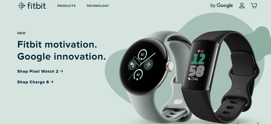
1. Fitbit
Fitbit is a leading health and fitness technology company.
They used behavioral design to address the question: how do you get people to keep exercising regularly?
The answer? By creating tangible, attainable targets.
In starting every user with the goal of reaching 10,000 daily steps, Fitbit helps to foster a habit within its audience through reward learning and sunk cost design techniques.
In turn, those with a Fitbit device create a daily loop, returning to their device to check their step-count and becoming reliant on Fitbit to track their progress.
2. TikTok
You’ve probably heard of social media giant TikTok.
You also know that one of the biggest concerns they, and many other social media platforms, face is the spread of misinformation.
Misleading content can harm user experiences by creating a negative, potentially harmful environment.
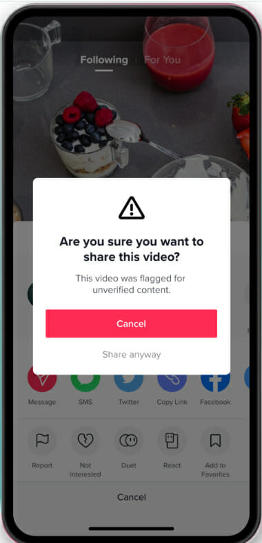
By creating a pair of prompts through behavioral design practices, Irrational Labs reduced shares of flagged content by 24% when compared to a control group.
As a result, their prompts are due to be rolled out across TikTok’s platform, increasing user confidence and trust.
3. Octopus Energy
Octopus Energy is a British renewable energy company.
Submitting energy meter readings isn’t exactly the highlight of anyone’s week, but it is something many, particularly those living in the U.K, must do on a monthly basis.
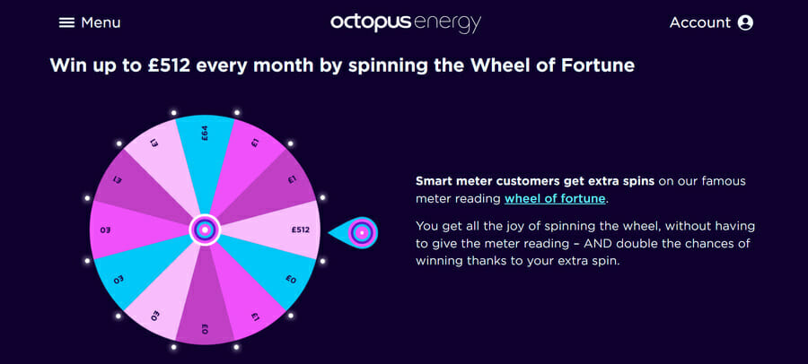
To combat the monotony, Octopus Energy created a ‘Wheel of Fortune’ game that appears after a customer submits a meter reading.
In spinning the wheel, customers not only experience a fun, playful gamification of Octopus Energy’s website, but are also offered rewards of up to nearly $500 for their loyalty.
This enhances the UX of something as mundane as submitting meter readings and keeps meter reading submissions on time.
4. Spotify
Spotify is an industry leader in digital music services.
Their yearly roundup, called Spotify Wrapped, is an innovative example of behavioral science in design.
In offering an individualized overview of your year in music, Spotify appeals to countless core factors in user behavior.
From personalization to gamification, social proof to surprise and excitement, Spotify Wrapped creates a buzz and social community around the way customers listen to music, building a habit that their listeners can explore every 12 months.
5. Glassdoor
Glassdoor is a United States-based employment services and reviews website.
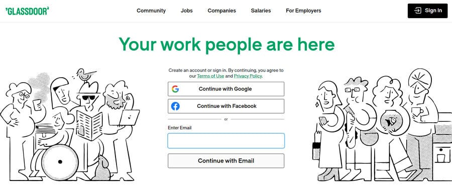
The brand utilizes progressive disclosure to maximize conversions and community interactions.
One of the main functions of Glassdoor’s website is to see employee reviews and salaries of individual companies.
However, to unlock the info, viewers need to both sign up with contact information and leave a salary or review themselves.
This approach creates a cyclical outcome that drives conversions for Glassdoor while boosting UX through a growing number of community notes.
Benefits Of Behavioral Design For Websites
Understanding behavior is an important approach taken by UX designers as they look to guide visitors towards an intended action.
But what are the specific benefits it can bring to your website?
1. It Provides Added Value
By anticipating user needs and acting upon them, behavioral design enhances user experiences and boosts satisfaction. This way, visitors are more likely to return to your site.
In the words of revered graphic designer, Ivan Chermayeff: “Design is directed toward human beings. To design is to solve human problems by identifying them and executing the best solution.”
Design is directed toward human beings.
Ivan Chermayeff
2. It Offers A Direct Connection
Behavioral design allows you to form lasting connections with your target audience through the appeal of personalization.
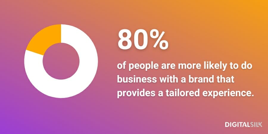
In fact, one survey found 80% of respondents more likely to do business with a brand that provides a tailored experience.
In researching, segmenting and adhering to your target audience’s needs and preferences, you can speak directly to their desires with a flexible and unique user interface (UI) and UX.
3. It Speaks To Your Audience
Behavioral design helps create content that resonates with your target audience.
Whether driving confidence, utilizing language or offering tailored solutions, behavioral design uses strategic messaging and placement to both build bonds and increase engagement.
4. It Builds A Lasting Relationship
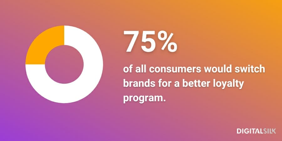
Did you know that 75% of all consumers would switch brands for a better loyalty program?
By offering targeted rewards on top of user-centric experiences, behavioral design techniques can help to win over new customers and drive brand loyalty for your business.
Why does this work?
As we touched on earlier, a cue triggers an action, but a benefit creates a loop or habit.
5. It Influences User Journeys
Behavioral design optimizes user journeys, guiding visitors toward desired actions.
In strategically placing cues and incentives throughout your website, your visitors are steered in the direction that best suits them.
The result?
Satisfied website visitors and a boost in conversions.
How To Use Behavioral Design In Web Design
There are endless ways to use behavioral design in your website.
Each will only prove successful if it directly appeals to your target audience while triggering an action and rewarding a habit.
While behavioral design principles require innovative and individualization, here are some specific ways to implement them in your custom web design:
- Create clear calls-to-action (CTAs): Powerful CTAs will influence user journeys and decisions, guiding visitors to areas of your website based on the behaviors connected to their placement within your conversion funnel.
- Utilize social proof: Social proof leans on human behaviors of trust and confidence in others, building the likelihood of conversions through previous reviews or testimonials.
- Offer user feedback and guidance: Real-time feedback and support addresses potential user frustrations, building satisfaction in your website and supporting the completion of user journeys.
- Provide progressive disclosure: Progressive disclosure boosts signups by withholding content while simultaneously limiting information overload.
- Add default choices: Default choices that are in line with common user preferences can speed up processes and the effort taken to interact with your website.
- Promote urgency and scarcity: Creating a sense of urgency or scarcity in the form of limited availability or time pressures will trigger a fear-of-missing-out (FOMO) response to increase engagement or conversions.
- Focus on personalization: Personalizing your user experiences is vital in improving user satisfaction, fostering return visits and creating a loop of loyalty.
- Guide with anchoring and decoy effects: Strategically placing anchoring or decoy effects, such as animations and interactions, can guide user attention to certain actions or outcomes.
- Aim for habit formation: Habit formation is a core desired outcome of behavioral design and can be achieved by making every design choice, such as offering rewards or social interactions, with habit formation in mind.
- Craft emotionally engaging designs: Leaning on emotive responses through visual elements, storytelling and interactive design features is key in connecting with user behaviors at a deeper level, in turn building brand loyalty and repeat visits.
Build A Custom Website With Digital Silk
At Digital Silk, we build unique, goal-oriented digital experiences for brand of all sizes and industries.
In partnering with our team of award-winning designers, you’ll receive:
- Total transparency throughout your project
- Project ownership from our experienced web design specialists
- Measurable results that grow your brand online
In addition, as a full-service web design agency, we can manage all aspects of your brand under one roof.
Our solutions span:
- Custom web design
- Custom web development
- Digital branding
- Digital marketing
- Consulting, and more
Interested in crafting a custom website that appeals to your target audience and drives user satisfaction?
Contact our team or call us at (800) 206-9413 to tell us about your web design project. Or, alternatively, fill in the request a quote form below!
"*" indicates required fields


