A young woman and a young man in yachtwear uniforms
Background Gradient
SMALLWOOD’S YACHTWEAR WEB DESIGN CASE STUDY

Increasing Website Traffic 80% For Luxury Yachtwear Brand

  • Smallwood’s Yachtwear, a leading provider of uniforms for private yacht crews, sought to migrate their website from Magento 1 to Magento 2. They also aimed to reflect the high-end, modern aesthetic of their newly renovated showroom on their website, targeting B2B clients in the yachting industry.
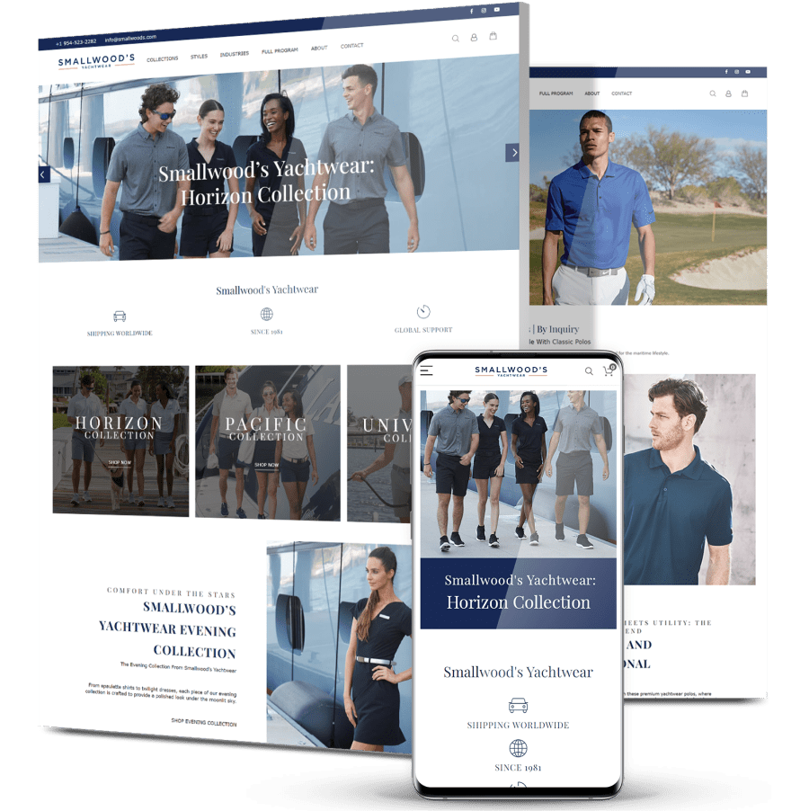
  • Our team developed a comprehensive strategy to migrate Smallwood’s Yachtwear’s website to Magento 2 while ensuring that the new design aligned with their showroom’s upscale ambiance. The primary focus was highlighting their range of services.
  • With 80% more visitors and 45% more engaged sessions compared to April 2023, the website now serves as a powerful tool for highlighting their offerings and encouraging engagement with their target B2B audience.
A trio of images for Smallwood's Yachtwear

The Challenge

Smallwood’s Yachtwear’s challenge involved migrating their website to Magento 2
while capturing the luxury ambiance of their renovated showroom in their online presence.

A trio of images for Smallwood's Yachtwear

Website Migration

Smallwood’s Yachtwear needed to transition their website from Magento 1 to Magento 2 to ensure compatibility and access to the latest features and security measures.

Reflecting Showroom Aesthetic

Following a showroom renovation featuring a sleek, contemporary design, the challenge was to convey this aesthetic online, capturing the essence of luxury and sophistication.

Two young people in yachtwear

THE SOLUTION

Our custom web design and web development teams executed the migration to Magento 2
and crafted a sleek, contemporary design in line with Smallwood’s Yachtwear’s showroom.

Some of our deliverables included:
  • Magento 2 Migration

    Our team carried out a seamless migration from Magento 1 to Magento 2, ensuring minimal disruption and preserving essential functionalities. The new platform offers enhanced performance, security and scalability, catering to Smallwood’s Yachtwear’s evolving needs.

  • Showroom-Inspired Design

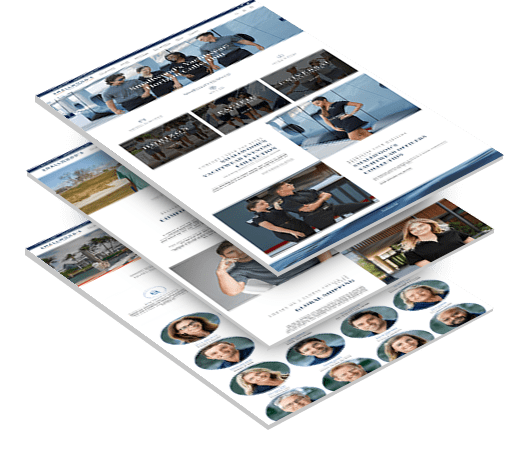
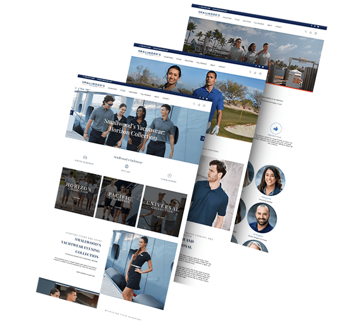
    Drawing inspiration from the visuals and ambiance of Smallwood’s Yachtwear’s renovated showroom, we crafted a website design that exudes luxury and sophistication. Clean, modern layouts and high-quality imagery showcase their premium uniforms and services.

  • Content Highlighting

    We curated content to highlight the wide array of services offered by Smallwood’s Yachtwear, including customization options, fitting consultations and after-sales support, all tailored to meet the specific needs of their B2B clientele.

A trio of images for Smallwood's Yachtwear

The Results

The project successfully positioned Smallwood’s Yachtwear as an industry leader, bolstering their online presence and reinforcing their commitment to quality and sophistication.

Increased website traffic by

80 %

compared to April 2023.

Achieved a significant rise in user engagement, with a

95 %

increase in sessions.

Enhanced user interaction, with a

45 %

boost in engaged sessions.

Request a Quote For Your Project

Featured Case Studies

Explore Our Case Studies & See How Digital Silk Grows Brands Online.
A background image for EV Universe of a car driving on an empty road. ev
Positioning A Brand For Digital Growth

We helped EV Universe create and develop its brand positioning and identity to stand out as a new marketplace and knowledge hub for used electric vehicles.

We launched this brand with targeted messaging, a custom-designed logo, a vibrant color palette and custom brand guidelines to ensure brand consistency and growth online.

ds-branding portfolio-frontier auto parts-bcg (2) frontier abs trio
Rebranding To Realign Brand Values

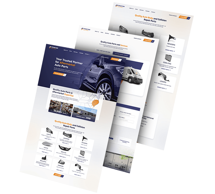
We rebranded automotive company Frontier Auto Parts, crafting a strong, distinctive identity that drives associations of efficiency and reliability.

Our team crafted branded assets to boost recognition across touchpoints. Wall graphics, employee uniforms, van design and even stationery were designed to align with the new branding efforts.

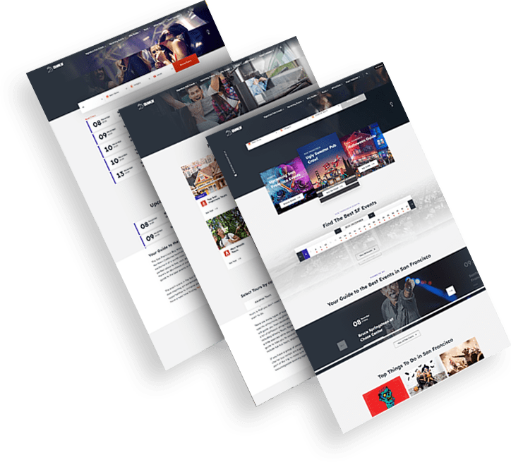
Golden Gate Bridge Trio of CrawlSF web design images
Delivering Growth Through Brand Design

We helped San Francisco-based event company CrawlSF create an all-new logo and visual identity to support its brand growth.

We helped CrawlSF express their “Experience Francisco Like a Local” promise through visual design, messaging and website launch.

opto-branding portfolio-bcg-min KPI Solutions
An End-To-End Brand Transformation

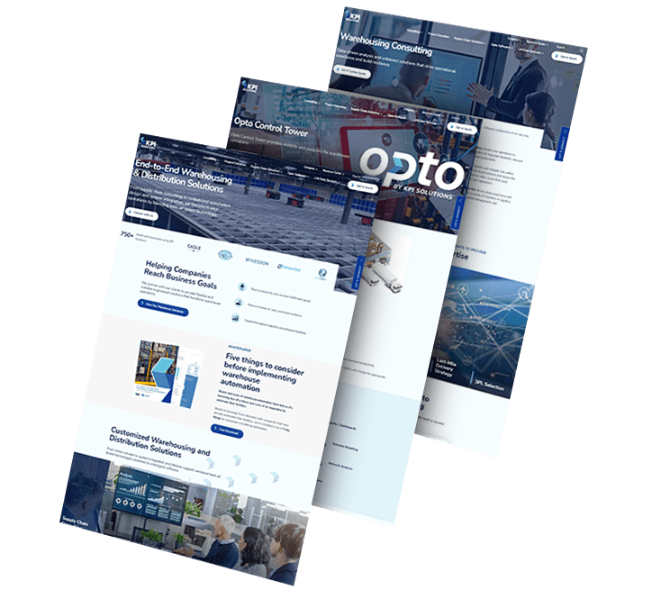
We helped KPI Solutions, a warehouse operations management company, reposition its corporate brand.

To achieve this, our team created a differentiating brand name, updating from KPI-S to OPTO.

We also created Opto’s logo and envisioned various uses of its revamped visual identity through a conceptual mood board.

ds-capixa-branding portfolio-bcg Capixa – Other Side
Complete Brand Overhaul

We delivered an extensive, dynamic brand overhaul for Capixa, a startup specializing in small business funding.

Our challenge was to craft a compelling new brand identity, complete with a catchy name, custom logo and captivating graphics.

Leveraging the diverse talents of our team, from brand strategists to content marketers, we aimed to develop a straightforward yet supportive lending brand, appealing to a broad customer base.

Chicago logo design firm featured background - TRC Healthcare trc healtcare_flip
Connecting A Portfolio Of Brands

We helped TRC Healthcare, a leader in continuing education in the healthcare space, create and organize a cohesive visual language used across their large and expanding portfolio of brands.

Our brand strategy, brand architecture and brand visual design services combined to help set the brand up to scale.

load more examples