Background Gradient
WEB DESIGN

Miami Country Day School Web Redesign Case Study

  • A top private school in Miami wanted to grow online visibility and engagement
  • We redesigned over 60 pages and worked with over 5,000 images to capture the school’s unique culture and campus
  • The result: 32% decrease in bounce rate shortly after launch
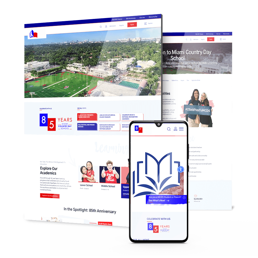
Miami Country Day School hero collage

THE CHALLENGE

Miami Country Day School (MCDS) needed an engaging and informative website that captured the spirit of the school’s community.

Infographic showcasing data and charts

Short Timeframe

The site needed to be ready in just three months, in time for students to go back to school and teachers and parents to find the information they needed to prepare for life back on campus.

Multiple Stakeholders

Their website was a company website with very few critical touchpoints in influencing customer’s decision – but it wasn’t created for this scope, and was ultimately unsuccessful in securing leads. In addition, the leads that Miami Country Day School did capture weren’t sent directly to the sales force.

Different Audiences

We had multiple audiences and we needed to accommodate the customer journey and the messaging for each of them: existing parents and students, faculty members, prospect parents and students, alumni and more.

THE SOLUTION

We designed an engaging website considering all audiences and built a conversion-based customer journey.
for prospective families and an engaging portal for parents with the latest news and events. Some of our deliverables included:

  • Website Strategy

    We worked closely with the client and each head of department to understand the school’s philosophy, and supplemented their insights with thorough competitive research. These insights informed MCDS’ new sitemap, user journeys, look and feel.

  • Custom Website UX & UI

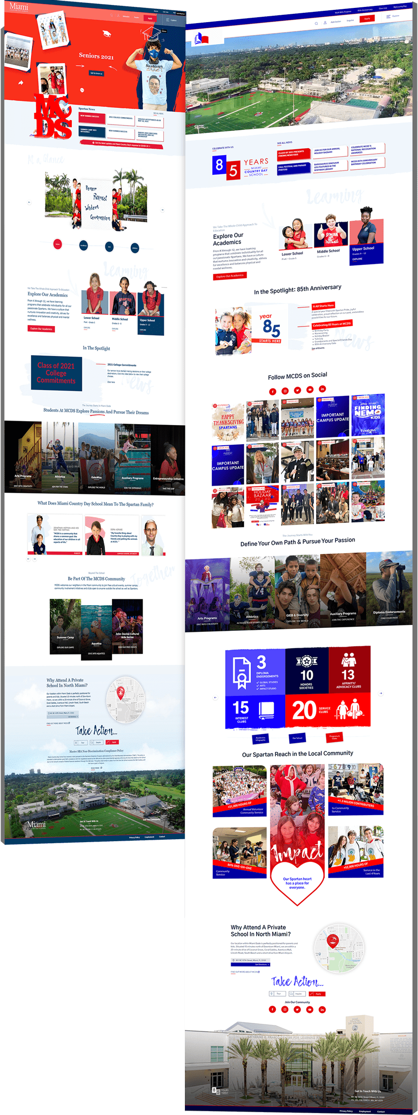
    Digital Silk worked with over 5,000 images to capture the real look and feel of the school. Our copywriter created content to showcase the school’s dedication to each student’s unique mind and made sure we told a story that resonated with both parents and students.

  • Educational Website Development

    We developed MCDS’ redesigned website on their platform of choice Blackbaud. Blackbaud is a school management software and CRM designed for K-12 schools.

  • Search Engine Optimization

    Every website we plan and create is fully optimized for search engines. From on-site to technical optimization, MCDS’ redesigned website is discoverable on search engines and ready for SEO campaigns.

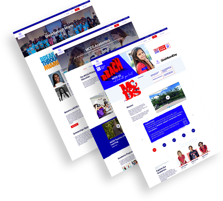
Miami Country Day School website redesign

The Results

Shortly after launch, MCDS’ new website recorded:

An increase
in organic traffic of

15 %

decreasing MCDS’
paid advertisement and marketing expenses.

A decrease in
bounce rate of

32 %

by improving MCDS’ content.

Request a Quote For Your Project
before and after arrow image
Miami Country Day School before and after image
Click to view more Hide

Featured Case Studies

Explore Our Case Studies & See How Digital Silk Grows Brands Online.
A background image for EV Universe of a car driving on an empty road.
ev
Positioning A Brand For Digital Growth

We helped EV Universe create and develop its brand positioning and identity to stand out as a new marketplace and knowledge hub for used electric vehicles.

We launched this brand with targeted messaging, a custom-designed logo, a vibrant color palette and custom brand guidelines to ensure brand consistency and growth online.

ds-branding portfolio-frontier auto parts-bcg (2)
frontier abs trio
Rebranding To Realign Brand Values

We rebranded automotive company Frontier Auto Parts, crafting a strong, distinctive identity that drives associations of efficiency and reliability.

Our team crafted branded assets to boost recognition across touchpoints. Wall graphics, employee uniforms, van design and even stationery were designed to align with the new branding efforts.

Golden Gate Bridge
Trio of CrawlSF web design images
Delivering Growth Through Brand Design

We helped San Francisco-based event company CrawlSF create an all-new logo and visual identity to support its brand growth.

We helped CrawlSF express their “Experience Francisco Like a Local” promise through visual design, messaging and website launch.

opto-branding portfolio-bcg-min
KPI Solutions
An End-To-End Brand Transformation

We helped KPI Solutions, a warehouse operations management company, reposition its corporate brand.

To achieve this, our team created a differentiating brand name, updating from KPI-S to OPTO.

We also created Opto’s logo and envisioned various uses of its revamped visual identity through a conceptual mood board.

ds-capixa-branding portfolio-bcg
Capixa – Other Side
Complete Brand Overhaul

We delivered an extensive, dynamic brand overhaul for Capixa, a startup specializing in small business funding.

Our challenge was to craft a compelling new brand identity, complete with a catchy name, custom logo and captivating graphics.

Leveraging the diverse talents of our team, from brand strategists to content marketers, we aimed to develop a straightforward yet supportive lending brand, appealing to a broad customer base.

Chicago logo design firm featured background - TRC Healthcare
trc healtcare_flip
Connecting A Portfolio Of Brands

We helped TRC Healthcare, a leader in continuing education in the healthcare space, create and organize a cohesive visual language used across their large and expanding portfolio of brands.

Our brand strategy, brand architecture and brand visual design services combined to help set the brand up to scale.

load more examples