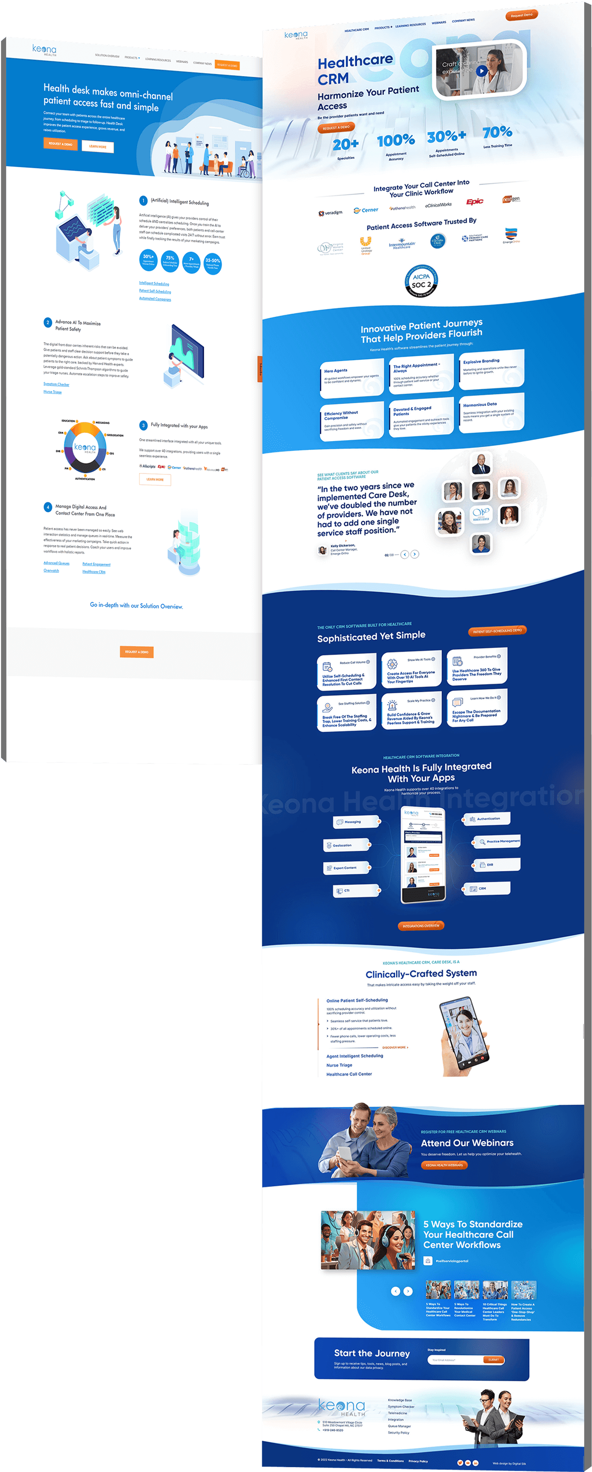
keona health hero
Background Gradient
Keona Health Website Redesign

Growing Organic Traffic
By 42% Through Strategic Optimization

  • Keona Health faced messaging, navigation, and conversion challenges with B2B leads.
  • We optimized messaging, improved navigation, and enhanced design for a better user experience.
  • This approach led to a 42.50% improvement in organic search, resulting in enhanced discoverability and user engagement.
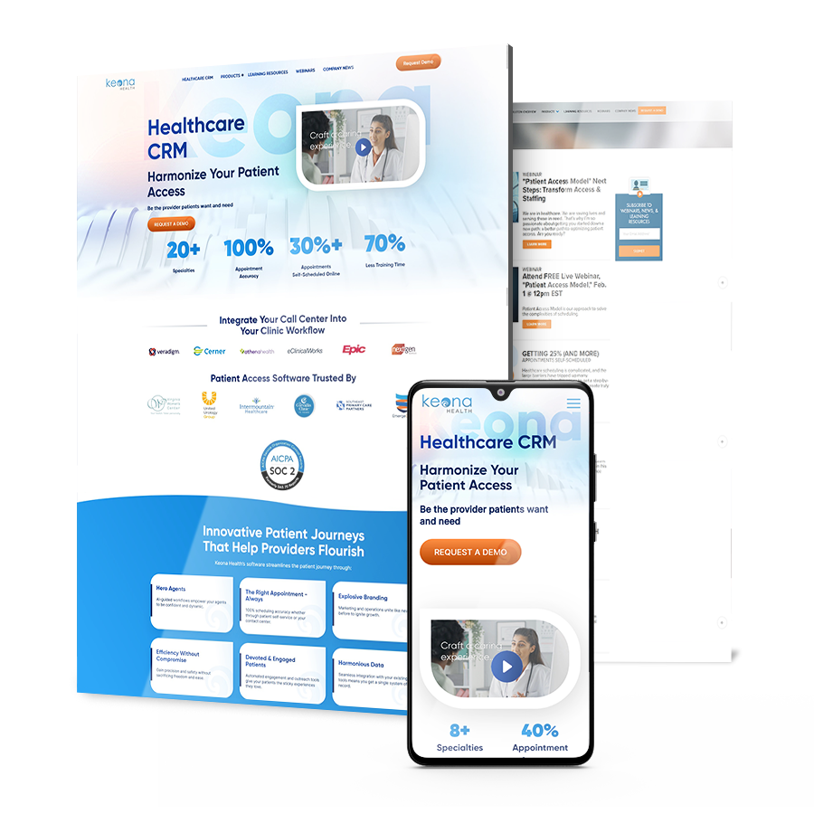
keona health website redesign case study

The Challenge

Messaging obstacles, navigation issues and conversion barriers prevented the brand from conveying their unique value proposition, offering and engaging user experience and driving B2B leads.

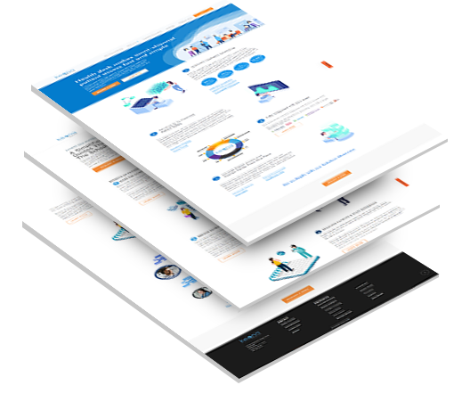
keona-health-stacked-3B

Messaging Obstacles

Keona Health’s unique value proposition was hindered by unclear messaging, making it challenging for website visitors to understand the benefits of the brand’s AI intelligent patient self-scheduling software.

Navigation Issues

The website posed navigation challenges, which resulted in low time on site and limited traffic, signifying a poor user experience.

Conversion Barriers

The cluttered copy and confusing navigation elements presented significant barriers to conversion, preventing the effective capture of B2B leads.

keona health solution

THE SOLUTION

Digital Silk revamped messaging, navigation and web design
to overcome challenges and grow traffic.

Some of our deliverables included:
  • Optimized Messaging for Clarity

    To address the issues of unclear messaging and cluttered copy, we refined Keona Health’s value proposition and created compelling messaging that resonated with the target audience.

  • Improved Navigation for User Experience

    We redesigned the navigation system to make it more user-friendly, ensuring that prospective users could easily find the information they needed.

  • Keyword Messaging & Planning

    Our team conducted comprehensive keyword research and optimized the site for search to improve search engine visibility.

  • Landing Page and Navigation Design

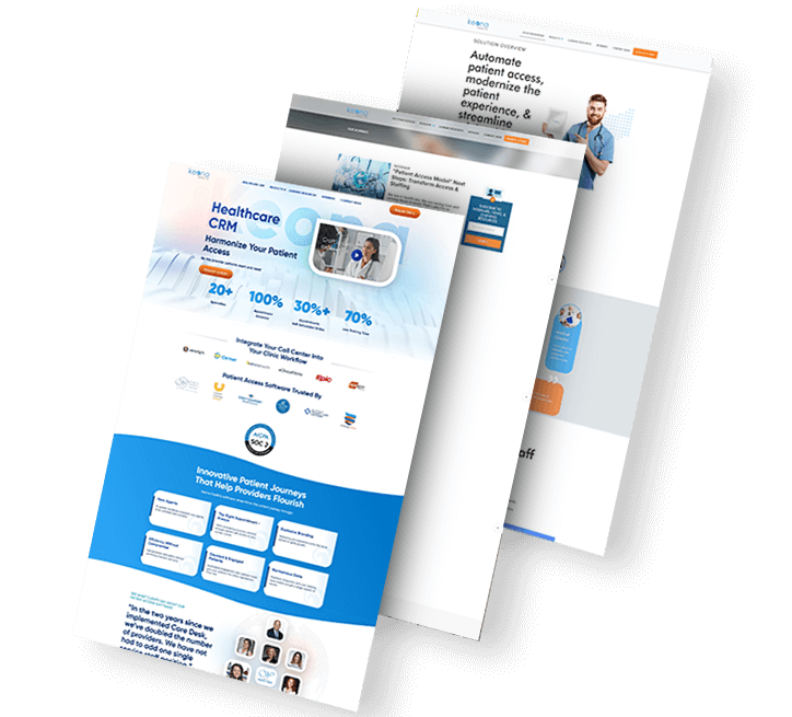
    We designed and implemented a visually appealing and user-friendly landing page, incorporating new navigation features to enhance the overall user experience.

keona health solutions-2

The Results

After one year, our strategies resulted in:

Organic search
increase by

42.5 %

offering Keona long-term sustainability.

Session duration
increase by

104 %

through more engaging content.

Time On Page
increase by

43.5 %

improving the likelihood
of conversions.

Request a Quote For Your Project
before and after arrow image
keona-health-before-after
CLICK TO VIEW MORE Hide

Featured Case Studies

Explore Our Case Studies & See How Digital Silk Grows Brands Online.
A background image for EV Universe of a car driving on an empty road.
ev
Positioning A Brand For Digital Growth

We helped EV Universe create and develop its brand positioning and identity to stand out as a new marketplace and knowledge hub for used electric vehicles.

We launched this brand with targeted messaging, a custom-designed logo, a vibrant color palette and custom brand guidelines to ensure brand consistency and growth online.

ds-branding portfolio-frontier auto parts-bcg (2)
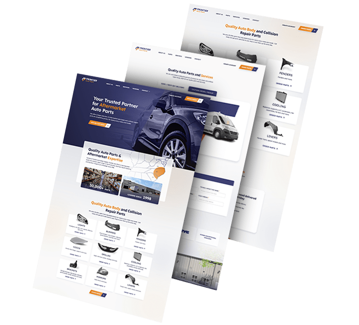
frontier abs trio
Rebranding To Realign Brand Values

We rebranded automotive company Frontier Auto Parts, crafting a strong, distinctive identity that drives associations of efficiency and reliability.

Our team crafted branded assets to boost recognition across touchpoints. Wall graphics, employee uniforms, van design and even stationery were designed to align with the new branding efforts.

Golden Gate Bridge
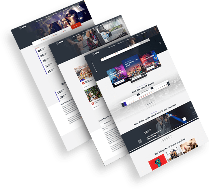
Trio of CrawlSF web design images
Delivering Growth Through Brand Design

We helped San Francisco-based event company CrawlSF create an all-new logo and visual identity to support its brand growth.

We helped CrawlSF express their “Experience Francisco Like a Local” promise through visual design, messaging and website launch.

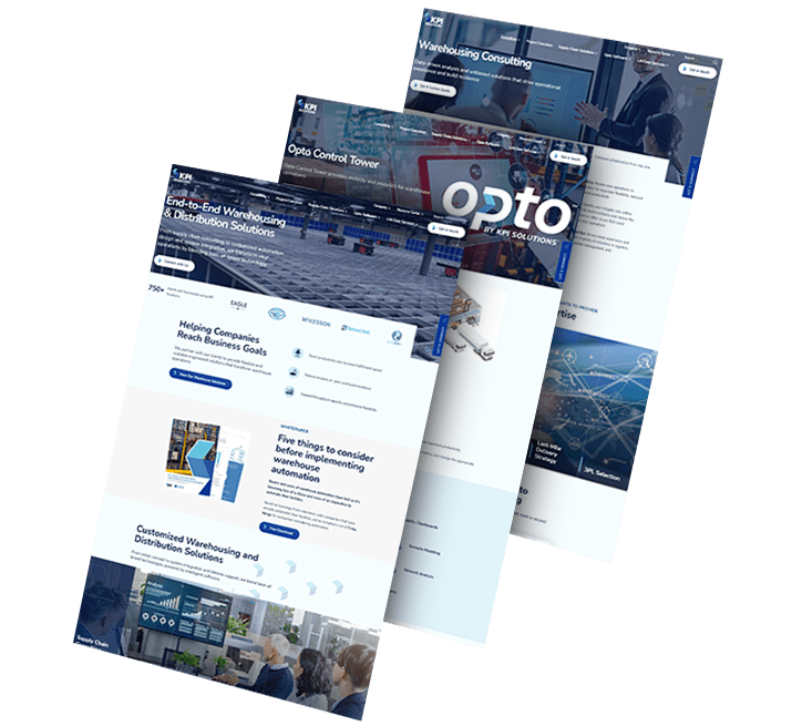
opto-branding portfolio-bcg-min
KPI Solutions
An End-To-End Brand Transformation

We helped KPI Solutions, a warehouse operations management company, reposition its corporate brand.

To achieve this, our team created a differentiating brand name, updating from KPI-S to OPTO.

We also created Opto’s logo and envisioned various uses of its revamped visual identity through a conceptual mood board.

ds-capixa-branding portfolio-bcg
Capixa – Other Side
Complete Brand Overhaul

We delivered an extensive, dynamic brand overhaul for Capixa, a startup specializing in small business funding.

Our challenge was to craft a compelling new brand identity, complete with a catchy name, custom logo and captivating graphics.

Leveraging the diverse talents of our team, from brand strategists to content marketers, we aimed to develop a straightforward yet supportive lending brand, appealing to a broad customer base.

Chicago logo design firm featured background - TRC Healthcare
trc healtcare_flip
Connecting A Portfolio Of Brands

We helped TRC Healthcare, a leader in continuing education in the healthcare space, create and organize a cohesive visual language used across their large and expanding portfolio of brands.

Our brand strategy, brand architecture and brand visual design services combined to help set the brand up to scale.

load more examples