Background Gradient
WEB DESIGN

doForms Website Redesign Case Study

  • doForms needed more user-friendly and SEO optimized website to attract more app users
  • We created a new website, paid media campaigns, and SEO Strategy
  • The result: 22% increase in new traffic in 2 months
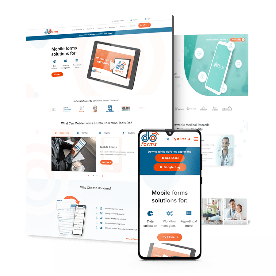
Hero collage of doForms designs

THE CHALLENGE

The doForms Website Needed A Better UX To Increase Conversions

Challenges vector of an error 404 page

Cluttered UX

doForms’ product is an advanced, highly scalable mobile forms software solution. It allows customers to build custom forms in minutes. However, their valuable product was overshadowed by a cluttered interface that was bogged down by too many unused web pages.

Stifled Growth

doForms wanted to generate more leads, garner more brand visibility in the market, and rank better for specific keywords in order to generate better organic traffic. In addition, the client aimed to improve on-site metrics, such as visitors, time on site, lower bounce rates, and more.

doForms-additional

THE SOLUTION

We Created A New Website, Paid Media Campaign
& SEO Strategy

In order to improve the website’s aesthetics, organization and value, Digital Silk decided to create a new website step-by-step. Some of our deliverables included:

Some of our deliverables included:
  • Website Audit

    Digital Silk conducted competitor research, a website audit and an SEO analysis to identify the weak points of the existing website.

  • Website Strategy & SEO

    Digital Silk created a new sitemap, removed zombie pages, and completed optimization tasks aimed at boosting SEO.

  • Website Redesign

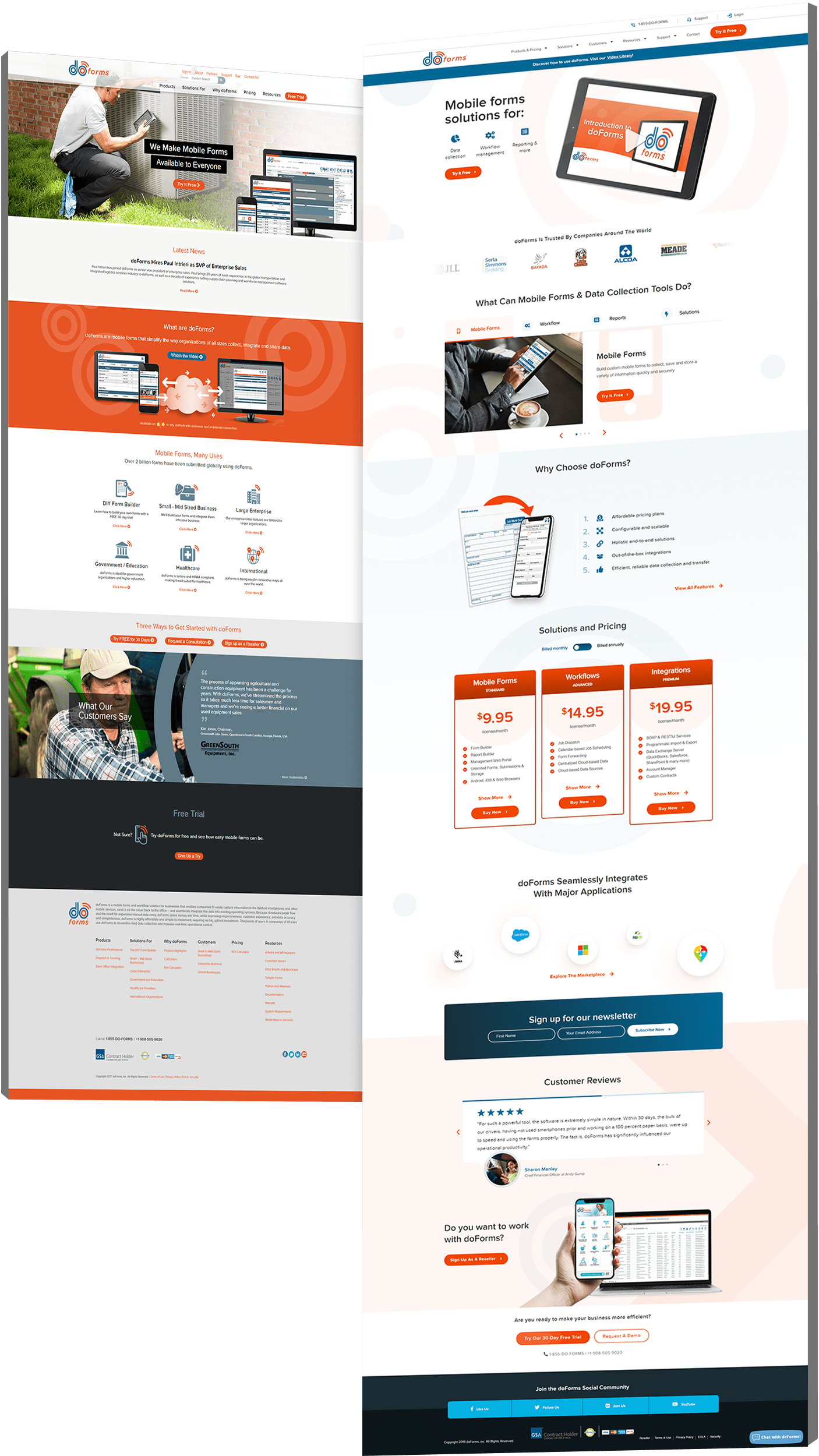
    Piece by piece, we wireframed and designed new pages for doForms, including a homepage, free trial page, product page, a blog (complete with new, fully optimized content from us!) and more

  • Multi-Channel Marketing

    We coupled the new website with a retargeting campaign, organic social media schedule and social media ads to boost brand awareness and traffic.

doForms website design

The Results

In 2 months, we improved doForms’ SEO and website engagement.

We increased
backlinks by

53

increasing doForms’
authority and trustworthiness.

We targeted
additional

1.5 K

to reach
a wider audience.

We decreased
bounce rate by

21 %

on the home page
and by 18% on the free trial page.

Request a Quote For Your Project
before and after arrow image
Before and after of doForms' web design
Click to view more Hide

Featured Case Studies

Explore Our Case Studies & See How Digital Silk Grows Brands Online.
A background image for EV Universe of a car driving on an empty road.
ev
Positioning A Brand For Digital Growth

We helped EV Universe create and develop its brand positioning and identity to stand out as a new marketplace and knowledge hub for used electric vehicles.

We launched this brand with targeted messaging, a custom-designed logo, a vibrant color palette and custom brand guidelines to ensure brand consistency and growth online.

ds-branding portfolio-frontier auto parts-bcg (2)
frontier abs trio
Rebranding To Realign Brand Values

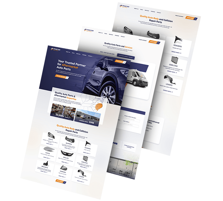
We rebranded automotive company Frontier Auto Parts, crafting a strong, distinctive identity that drives associations of efficiency and reliability.

Our team crafted branded assets to boost recognition across touchpoints. Wall graphics, employee uniforms, van design and even stationery were designed to align with the new branding efforts.

Golden Gate Bridge
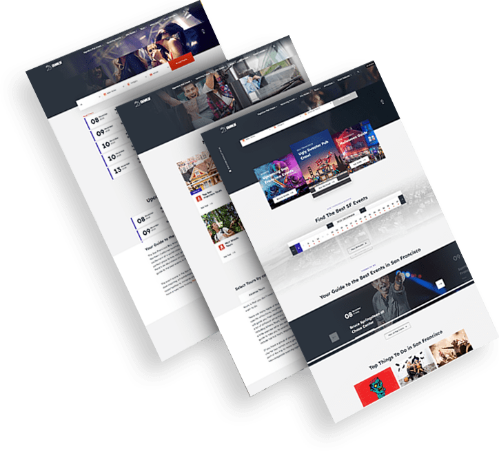
Trio of CrawlSF web design images
Delivering Growth Through Brand Design

We helped San Francisco-based event company CrawlSF create an all-new logo and visual identity to support its brand growth.

We helped CrawlSF express their “Experience Francisco Like a Local” promise through visual design, messaging and website launch.

opto-branding portfolio-bcg-min
KPI Solutions
An End-To-End Brand Transformation

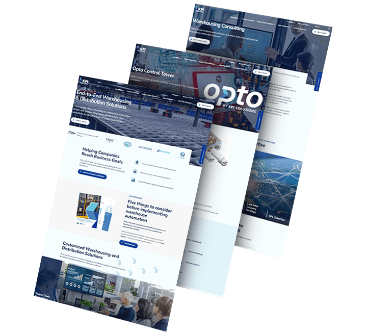
We helped KPI Solutions, a warehouse operations management company, reposition its corporate brand.

To achieve this, our team created a differentiating brand name, updating from KPI-S to OPTO.

We also created Opto’s logo and envisioned various uses of its revamped visual identity through a conceptual mood board.

ds-capixa-branding portfolio-bcg
Capixa – Other Side
Complete Brand Overhaul

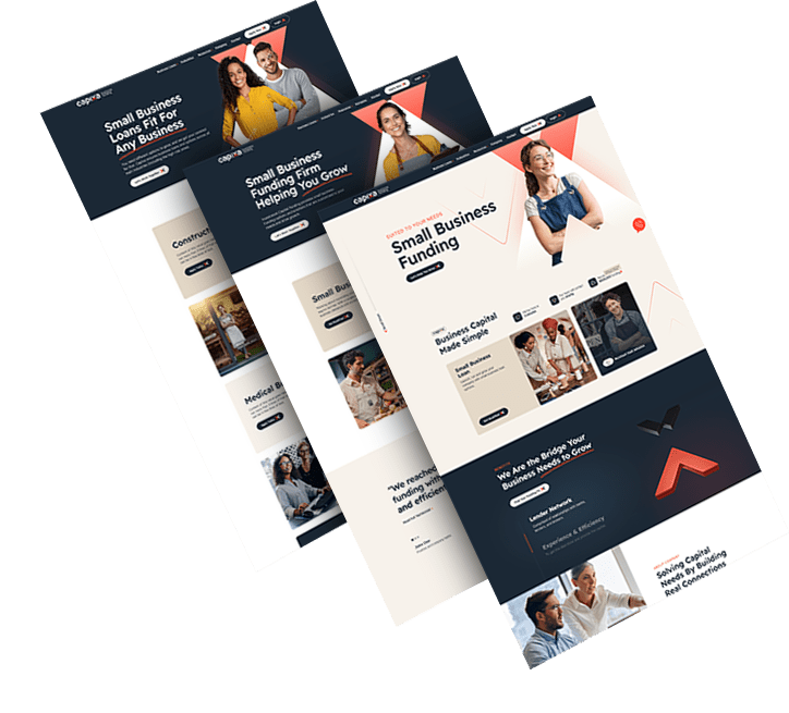
We delivered an extensive, dynamic brand overhaul for Capixa, a startup specializing in small business funding.

Our challenge was to craft a compelling new brand identity, complete with a catchy name, custom logo and captivating graphics.

Leveraging the diverse talents of our team, from brand strategists to content marketers, we aimed to develop a straightforward yet supportive lending brand, appealing to a broad customer base.

Chicago logo design firm featured background - TRC Healthcare
trc healtcare_flip
Connecting A Portfolio Of Brands

We helped TRC Healthcare, a leader in continuing education in the healthcare space, create and organize a cohesive visual language used across their large and expanding portfolio of brands.

Our brand strategy, brand architecture and brand visual design services combined to help set the brand up to scale.

load more examples