Golden Gate Bridge
Background Gradient
CrawlSF WEB DESIGN Case Study

Securing 23% More Users Through Design & Branding

  • Leading organizer of pub crawls and holiday events in San Francisco Bay Area ​needed a new website and branding.
  • We created a new logo and designed a fresh website with great user experience and execution of the technical SEO.
  • The result: 23.41% more users and a 213.89% increase in average session duration
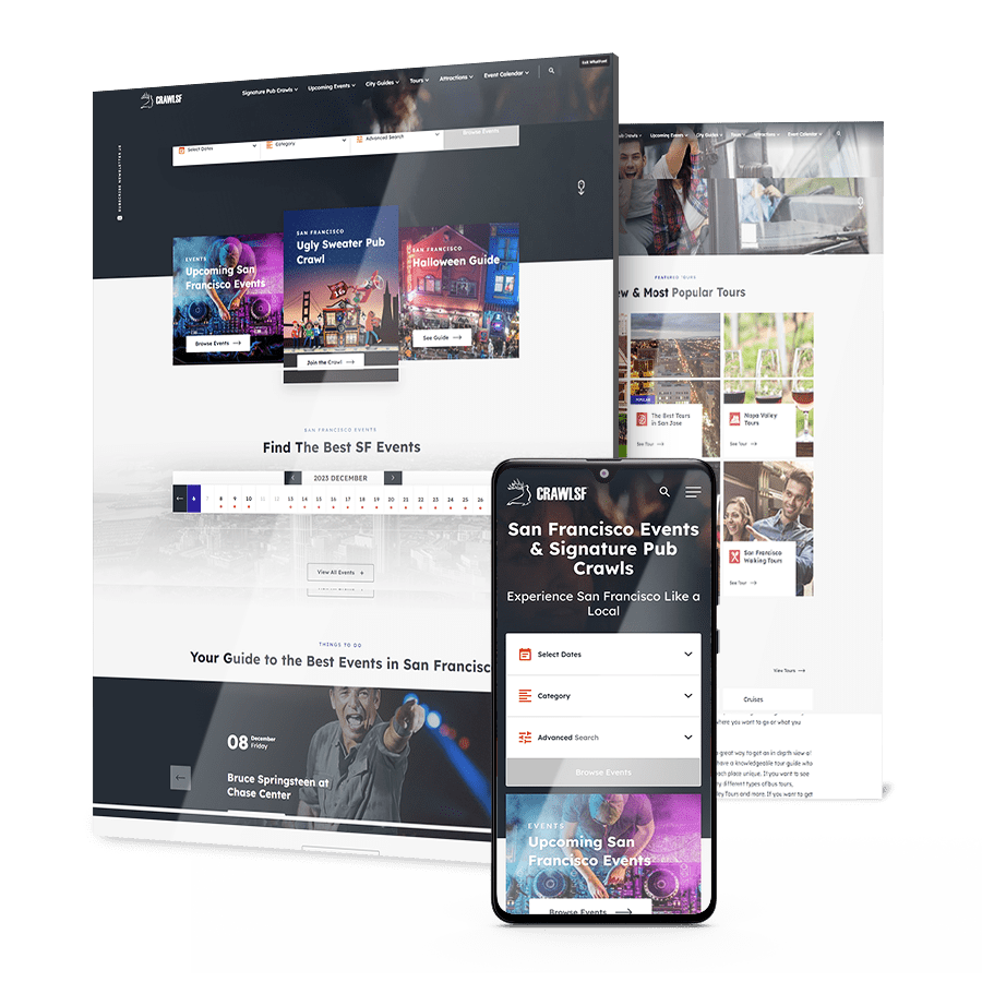
CrawlSF's website across devices

The Challenge

​CrawlSF approached us to help with their goal of becoming the go-to resource for discovering events and activities in San Francisco, appealing to both residents and tourists alike.

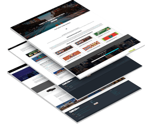
Stacked CrawlSF web design images

Poor User Experience

CrawlSF needed to address the critical issue of improving user experience on their platforms, aiming to substantially increase user satisfaction for both desktop and mobile users and turn visitors into customers.

Preserving Existing Ranking & Traffic

They had dedicated significant efforts to SEO on their old website and faced the challenge of ensuring that these search engine rankings were not negatively impacted following the website redesign.

San Francisco skyline

THE SOLUTION

Our branding team and web design experts identified key insights for the brand strategy and superior user experience.

Some of our deliverables included:
  • Industry Trends & Competitor Review

    To establish a clear and effective brand strategy for the new website, we conducted a comprehensive review of current industry trends and a detailed analysis of key competitors, which allowed us to identify areas where CrawlSF could uniquely position itself in the market.

  • Crafting UVP & Brand Identity

    The insights gained from our analysis were instrumental in shaping a distinct unique value proposition (UVP) for CrawlSF. We worked to articulate what sets CrawlSF apart from its competitors, focusing on its strengths and unique offerings to appeal to both locals and visitors in San Francisco.

  • Creation Of The New CrawlSF Logo

    As the culmination of this strategic branding process, the new logo served as a critical component in establishing the brand’s identity and was integrated throughout the website, reinforcing the brand’s presence and recognition in the market.

  • New Website Strategy & UX Design

    Digital Silk worked on the optimal website sitemap and layout that would help users find events and information that they need very fast on the website. We also emphasized the importance of typography and photography on the web space, that would make it more readable and easy to navigate.

  • Search Engine Optimization

    Our approach included a detailed content audit, strategic keyword research and implementation, and enhancing the website’s technical framework to improve structure, speed, and responsiveness, thereby boosting search engine visibility and user experience.

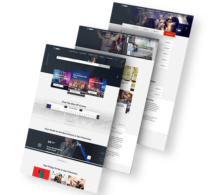
Trio of CrawlSF web design images

The Results

Some of our year-over-year results:

We increased
user growth by

23 %

expanding CrawlSF’s market presence.

We increased
organic user growth by

17 %

helping CrawlSF achieve higher rates of sustainability.

We increased
returning users by

73 %

helping CrawlSF achieve repeat business.

We decreased
bounce rate by

37 %

through engaging and
informative content.

Request a Quote For Your Project
before and after arrow image
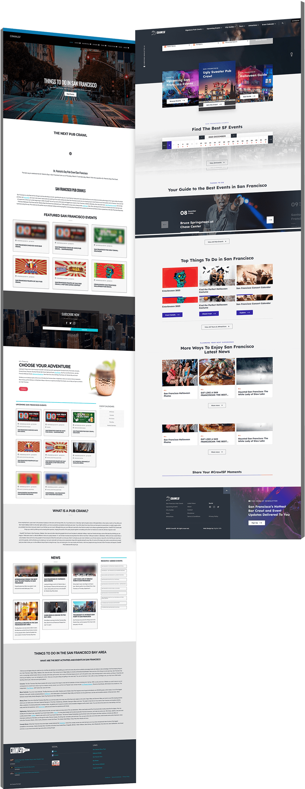
CrawlSF website before and after designs
Click to view more Hide

Featured Case Studies

Explore Our Case Studies & See How Digital Silk Grows Brands Online.
Featured
A background image for EV Universe of a car driving on an empty road.
ev
Electric Vehicle eCommerce Marketplace

Our team crafted a cutting-edge, on-brand design that strengthens the distinctive visual identity of electric vehicle marketplace EV Universe.

Featuring dynamic visuals and interactive elements, the innovative platform drives credibility while elevating user experience for buyers and sellers alike.

A scientist doing his work in a lab
SNP
Biotech Brand & Digital Presence Development

We delivered a custom website redesign alongside new brand positioning and brand messaging solutions to rebuild SNP Therapeutic’s visibility in the DNA testing market.

Following in-depth research, our brand and digital strategists crafted a corporate design across redefined site architecture.

A background image for Bang & Olufsen of a man wearing headphones
BO
Hi-Tech eCommerce Store

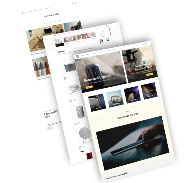
By creating a distinctive design tailored for a high-end electronics eCommerce store, we helped position Bang & Olufsen as a tech market innovator.

With a unique design and a streamlined sales funnel, our digital solutions targeted both UX and UI to grow brand visibility and customer engagement.

four people on a vacation
rollink solution-2
Premium Luggage e-Shop

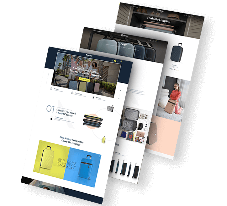
From website design to digital marketing, brand strategy and SEO, our end-to-end digital solutions helped Rollink grow their revenue by 500% as they entered the U.S. market.

Our WooCommerce-powered solution features micro-animations, an immersive product experience and a checkout process optimized for conversions.

A background image for NewDevRev of skyscraper buildings
Trio of NewDevRev website images
Real Estate Digital Experience

Our web design and development specialists worked to provide NYC-based real estate firm NewDevRev with an upscale web design on a custom-developed platform.

Through a creative, responsive design that includes a tailor-made search and filter element, visitors can easily access NewDevRev’s upscale website.

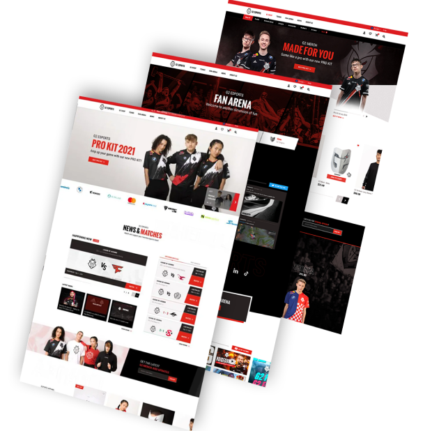
A background image for G2 Esports of a live eGaming show
g2
Reimagined eSports Platform

Working with G2 eSports’ community-based identity, we developed a custom eCommerce platform to reinforce the organization’s legendary position in the eSports industry.

Our design and development team introduced a streamlined shopping experience and strategically planned community design to grow conversions and support brand authority.

An image of a shoe store
paul
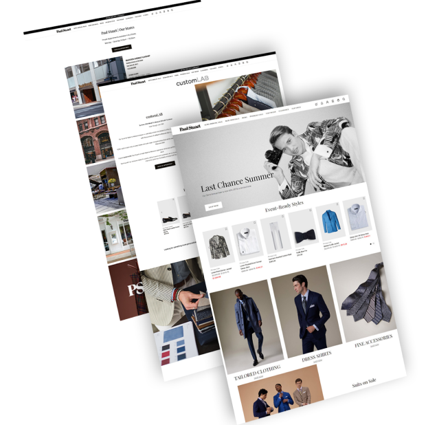
Luxury eCommerce

We reimagined luxury men’s clothing brand Paul Stuart’s digital experience with a streamlined conversion funnel and custom eCommerce design.

Our design helped increase on-site engagement and conversions through a mixture of user-friendly features and a reinvention of Paul Stuart’s classic visual identity.

Background image of a man filling up his car with gas for Puma Energy
puma energy solution
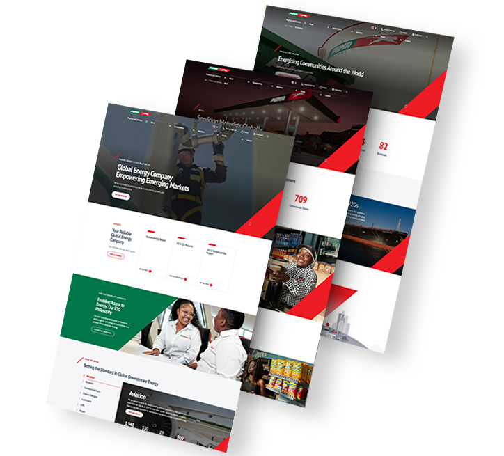
Modern Energy Website Redesign

We delivered a modern website redesign for global energy company Puma Energy. Our team created a responsive web design with UX-optimized features, including strategically chosen typography, vibrant colors throughout and high-quality custom graphics, in turn increasing engagement by 63% in three weeks.

We also provided extensive keyword research and search engine optimization, helping to grow website visitors by 27% in the same period.

person cooking
ventura
Food & Beverage Web Development

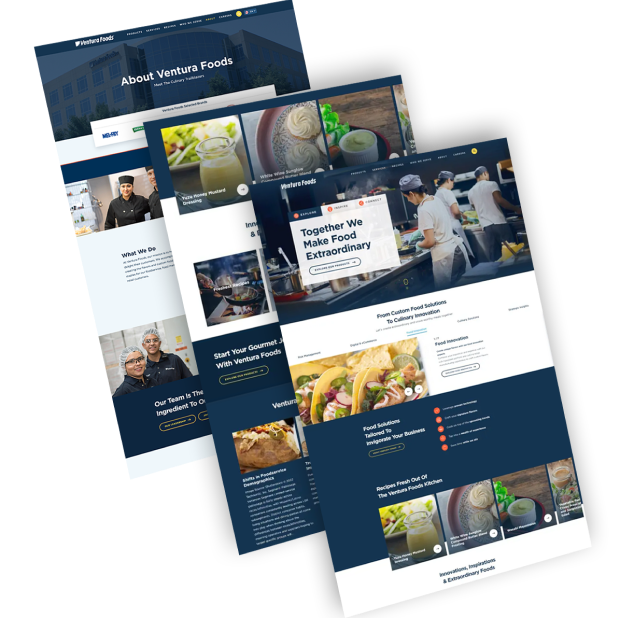
We redesigned Ventura Foods’ corporate website to create a fully optimized digital experience.

Included in the user-centric design is a video in the hero section, engaging micro-animations, a custom cursor and chatbot functionality.
Background image of a woman using a tablet for MOD
A trio of Modula website images
B2B eCommerce Design & Development

We were tasked with launching a new website for National Lighting’s high-quality B2B power charging accessories and lighting solutions company, MOD.

Our team delivered end-to-end digital services to elevate MOD’s UX and boost orders. Our partnership spanned website strategy, architecture and messaging, responsive design and development, custom eCommerce integrations and marketing.

load more examples