A high-quality website experience is vital in meeting your business target, whether that’s driving sales, extending brand awareness or fostering brand loyalty.
In fact, every $1 invested in user experience (UX) can provide a $100 return for your business.
To achieve this, your site needs a strong foundational framework — made possible by website wireframes.
Wireframes can lay the groundwork to deliver a UX that prioritizes usability through an intuitive layout and streamlined structure.
Below, we’ll show some of the best website wireframe examples to inspire your design. We’ll also outline how to create your own website wireframe from scratch.
We build custom websites. Request A Quote
What Is A Website Wireframe?
A website wireframe is a skeletal representation of a website’s structure and framework.
It is used as a blueprint that maps the main features and navigation of a website or webpage’s design.
Website wireframes are usually placed in three categories, depending on the depth that their prototype provide as a guide for the website’s design layout:
- Low-fidelity wireframes: Simplified sketches or outlines of a design that focus on layout and structure without detailed content or styling.
- Example: A rough pencil sketch of a website’s homepage layout on paper, showing the placement of the header, footer, sidebar and main content areas.
- Mid-fidelity wireframes: Somewhat detailed structures that include a more precise layout, basic content placeholders, and simple interactions but still lack final visual design.
- Example: A grayscale digital mockup of an app’s login screen, created in a tool like Balsamiq or Sketch, showing the arrangement of input fields, buttons and navigation elements.
- High-fidelity wireframes: Detailed and polished representations of the final design, often including actual content, colors, typography and interactive elements.
- Example: A detailed Adobe XD or Figma design of an eCommerce product page, featuring real images, text, branding colors and interactive elements like dropdowns and buttons.
Best Website Wireframe Examples
See a collection of the best website wireframe examples, from low-fidelity to high-fidelity, that can set strong foundations for your site regardless of your niche.
1. Low-Fidelity Wireframe Design Examples
Low-fidelity wireframe design offers an opportunity for both team collaboration and trial and error.
Here’s one example of sketching separate versions of the same website wireframe on a whiteboard to determine the best approach for your website.
The versions include basic website sections filled with varying extents of content.
While this simple website wireframe sketch doesn’t offer details on the organization of exact sections of the website, it works to give an overview of the wider user flow. By choosing between three versions, you can establish the style of UX that best suits your brand and targets from the get-go.
Despite acting as initial brainstorming activities, low-fidelity wireframes don’t have to be boring.
Below, we’ve included a more in-depth sketch that showcases how certain sections of the website will work.
By showcasing that there is a video slider section near the top of the page, the sketch outlines both the website goals and how they can be achieved.
Videos are an important driver in visual storytelling, with testimonials and explainer videos being the most popular forms of branded content videos in 2024.
This tells us that the goal of the website is to spread brand awareness, with informative videos playing a central part in the strategy.
The final of our low-fidelity website wireframe examples is a mobile-first design.
By printing out the outline of a mobile device, the sketch immediately provides real dimensions and sizing guides for smaller screens.
This helps the website owner to understand how the UX will feel, and how the UI will look once developed.
One Google study found that conversion rates drop 95% when a web page’s elements increase from 400 to 6,000.
By sketching the wireframe on a real-sized prototype, you can spot any clutter and establish valuable whitespace from the first step of your web design process.
2. Mid-Fidelity Wireframe Design Examples
Mid-fidelity wireframe design expands on initial sketches by creating digital versions of a near-finalized layout.
The first of our mid-fidelity examples is for a mobile movie app that follows a similar process to the other website wireframe examples.
The design adds placeholder blocks and text to highlight the most important elements of the app and its desired user journeys.
By focusing purely on app features like text fields, buttons and icons without the distraction of on-brand imagery, the mid-fidelity mobile app design shows how visitors will find, play or download the movies they want to watch.
The second mid-fidelity design features multiple webpage wireframe examples on mobile.
In placing the pages, or mobile app screens, next to each other, the wireframes map out how a visitor will explore the travel site to make a booking.
These grayscale frameworks help identify potential frictions in the conversion funnel. This way, the UX can be simplified and refined before added details like logo design and color palette are added to the design.
The final example is an eCommerce website wireframe.
This simple website wireframe design strips the e-store of its products and messaging, focusing entirely on the site’s layout and composition.
Considering 27% of online shoppers have abandoned their carts due to a complex or long-winded process, creating an intuitive and streamlined shopping experience is a vital first step in developing any successful online store.
3. High-Fidelity Wireframe Design Examples
High-fidelity wireframe design expands on your previous frameworks with on-brand elements that bring your UI to life.
Take the first case below, for example.
The design, shown above in our mid-fidelity examples section, has added imagery, color schemes, logo designs and messaging to create a final mockup of the mobile app.
This example uses red to highlight key call-to-action (CTA) buttons, drawing visitor attention to Sign In and Play actions.
While the colors and imagery bring the UI to life, their impact is amplified by the thoughtful placement established in the wireframe. This approach prioritizes usability, making the wireframe crucial to the app’s functionality even before visual elements are added.
Finally, the wireframe example highlighted below showcases the user journey with the support of engaging visuals and buttons.
The “clickable elements in blue,” such as icons and CTAs, guide the visitor further into CoolTour’s app.
Meanwhile, extra features, like an interactive map and star-rating system, provide added opportunity to engage visitors and impact decision making.
How To Create A Wireframe For Your Website
Create a wireframe for your website by following these four steps:
1. Set Up Website Objectives
Before creating a wireframe, it is essential to define your website’s objectives.
After all, how can your website structure help you achieve these goals if they have never been established in the first place?
Focus on the key actions you want visitors to take, such as downloading a form, learning about your brand or buying a product.
Also, consider your site’s UX. How you want visitors to navigate your website is a core aspect of your wireframes.
This is important, as 67% of consumers consider bad UX as one of the main reasons to leave a website.

With this information, you define which are the key elements of your website and how they will help you achieve your goals. This knowledge becomes the backbone for your structure and site architecture.
2. Hand-Sketch Website Structure & Flow
Next, it’s time to put pen to paper and start sketching your website’s structure and flow.
You don’t need to be a designer for this stage. In fact, consider involving your entire team and working on a large whiteboard. This way you can consider, discuss and improve all ideas for your website’s layout.
Whether driving conversions and sales or boosting brand awareness, direct visitors to key areas of your site using elements like whitepaper downloads and external resource links to achieve your target.
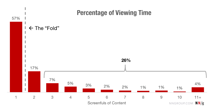
While you don’t have to get everything right at this stage, make sure to spend extended time sketching the layout of the elements at the top of your website — especially anything above the fold.
Visitors spend 74% of their time on your website within the first two screenfuls of content. So, making sure your website wireframe is valuable and intuitive from the get-go is particularly important for these sections.

3. Craft Your High-Fidelity Wireframes
Now is the time to enlist the support of expert designers, either through an external web design agency or in-house specialists.
These designers will take your low-fidelity sketches and turn them into a high-quality mockup of your website.
During this stage, which requires online design tools like Figma, take time to perfect your UX and add UI elements to your structure.
Backed by expertise and creativity, designers will refine your layout and add on-brand elements like colors, high-quality imagery and animations.
When creating your high-fidelity wireframe, it’s crucial to consider how your layout adapts to multiple screen sizes and devices.
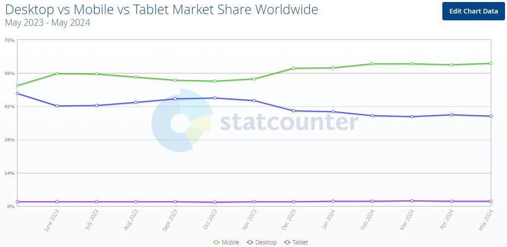
As of 2024, mobile represents over 60% of all traffic on Google. Whether your website is mobile-first or responsive to mobile devices, ensuring a seamless UX on smaller devices is critical to your site’s success.

4. Receive & Implement Feedback
Once you have created your wireframes, it is essential to present them to your team or client for feedback.
This step allows you to gather additional ideas, refine your design and ensure that everyone is on the same page.
Continue improving your wireframes until you have a final product that meets your objectives and user needs, as an organized wireframe will save you time and resources during the development process.
We build custom websites. Request a Quote
Build Your Website With Digital Silk
Analyzing successful website wireframe examples is a strong starting point to understanding how you can create a UX that meets user expectations.
However, to put your ideas into practice — especially during the high-fidelity wireframe creation process — the support of experts cannot be understated.
At Digital Silk, our team of award-winning designers have built website wireframes to help businesses of all backgrounds achieve their bespoke goals.
Our team makes data-backed decisions and leans on design expertise to craft high-quality wireframes that act as the foundation for your successful website design.
In addition, as a full-service web design agency, we then put your wireframe into practice through a range of solutions, including:
For every project, our senior-level specialists:
- Take project ownership
- Provide total transparency
- Deliver measurable results
Looking to build a website that hits your targets?
Contact us, call us at (800) 206-9413 or fill out the Request a Quote form below to schedule a free, custom consultation with our team today.
"*" indicates required fields


