Web design trends are always evolving.
Like the graphic designer Neville Brody said: “Digital design is like painting, except the paint never dries.”
Many businesses are quick to adopt the latest web design trends, hoping to capture the fleeting attention of potential customers.
But can following web design trends hurt your business? What if you choose an outdated design style or a trend that damages your website’s user experience (UX)?
Below, we discuss how a web design trend can damage UX. We then analyze five current trends, what websites they work best for and what to consider when adopting these trends for your business.
How Web Design Trends Can Negatively Affect UX
Web design trends are often user interface (UI)-driven, focusing on bringing designs to life in a certain way.
This can lead to important UX elements being overlooked, resulting in poor website performance.
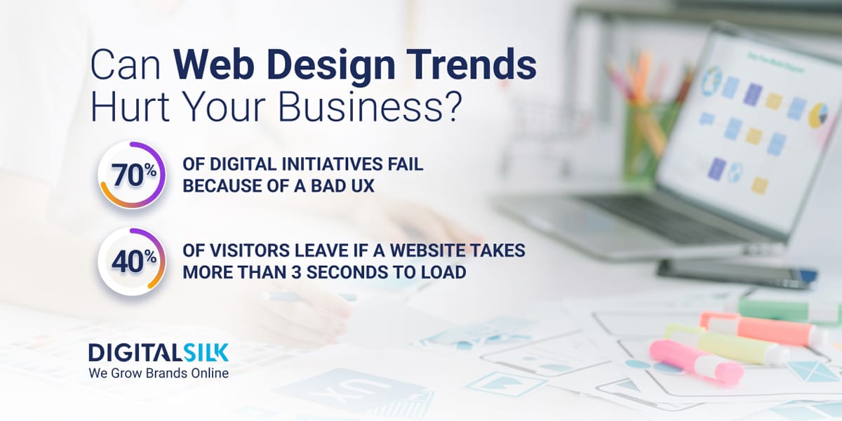
In fact, 70% of digital initiatives fail because of a bad UX.
It’s vital for your business to understand how a web design trend will impact the way visitors use your site, not just the way it looks.
Five central components of your website’s overall experience that can be damaged by web design trends include:
- Navigation: Some trends can remove or understate navigation elements like menus, links and checkout processes, disrupting the way visitors are able to journey through your website.
- Accessibility: A web design trend can undervalue usability for all visitors by ignoring best practices such as color contrasting, content hierarchy and compatibility with accessibility tools like text-to-speech readers.
- Interactivity: A web design trend can overly target engaging, interactive features, cluttering the UI. Interactive design elements like hover animations, gamification and scrolling effects all have a say on overall UX. Conversely, a web design trend can favor a flat and simple design, reducing the ability to captivate your audience or differentiate from your competition.
- Responsiveness: It’s important to consider how a web design translates to mobile devices. Web design trends that don’t support responsive design flexibility, through factors like image flexibility or fluid grids, can alienate visitors on certain devices or screen sizes.
- Readability: The typography supported by web design trends plays an important role in how visitors read your core messaging and understand what your website is about. A web design trend can dismiss readability in favor of its UI goals by underutilizing whitespace or suggesting typography purely for aesthetic reasons.
5 Latest Trends In Web Design In 2025
Knowing what the current trends in web design are can help you understand whether the trend will work for your business and analyze which elements to add to your digital strategy and which to avoid.
This way, you can stay on top of evolving trends without harming the usability of your website and authority of your digital presence.
Five prominent web design trends in 2025 include:
Trend 1. AI-Generated Graphics
AI-generated graphics are visuals created through complex algorithms that produce personalized imagery based on user inputs.
AI image generation tools are improving year-on-year. In fact, AI was named Word Of The Year in 2023 and many AI tools now offer accessible, affordable and easy-to-use experiences.
Your business can turn to dedicated tools like ChatGPT and Midjourney to generate bespoke graphics that go beyond simple stock photography — driving on-brand designs while saving time and cutting costs.
The Collins Word Of The Year 2023 Is… AI
Collins Dictionary
What to consider:
Your AI prompts may return similar designs to other users or even competitors showcasing a similar product or service.
To avoid this, create detailed prompts or customize your images post-generation to differentiate your website from the crowd.
Will it work for my business?
AI-generated images will not work as a direct replacement for real imagery.
For example, if you run an eCommerce store or a restaurant you must use real images of your products or menu items. Using AI-generated images of your unique products or services can cause mistrust and damage your website’s credibility.
Instead, consider generating background graphics or icons with AI tools. These images can add depth to your design without taking away from your company’s individuality.
The key is to balance AI-generated images with authentic content and ensure your brand remains relatable and transparent.
Trend 2. Parallax Scrolling
Parallax scrolling is a visual effect in which background and foreground layers scroll at different speeds.
Previously, parallax scrolling worked to superficially spice up designs. In 2025, it can act as an important extension for visual storytelling through video and motion graphics.
What to consider:
When implementing parallax scrolling into your website design, consider where to use it.
For example, the most popular forms of branded video content in 2025 are testimonials and explainer videos.
Your business can use parallax scrolling to showcase these storytelling or informational videos in an immersive way that engages your audience.
Will it work for my business?
Parallax scrolling is a useful design functionality to keep your visitors engaged while they journey through extended amounts of content.
In turn, if your website is informational and you aim to drive awareness of your brand’s mission, services or story, parallax scrolling is a standout feature.
However, parallax scrolling can add unnecessary complexity to your website’s flow and design. If you operate a simple online store, or rely on capturing leads from above the fold, this design trend may not be a useful addition to your site’s functionalities.
Trend 3. Scroll Motion
Scroll motion is a modern web design effect where static design elements are activated to follow a visitor as they scroll down a page.
See an example our team created for restaurant and events group Barton G, where a butterfly follows the user as they scroll.
Stories, such as customer experiences, statistically increase reader engagement on websites, boosting consumer-to-brand connections.
Scroll motion gives businesses the capability to tell these stories through interactive UX.
What to consider:
Scroll motion is an attractive website feature that adds an engaging element as visitors journey through a web page’s content.
Consider activating on-brand elements, such as icons or images, to drive memorability and future brand recognition.
However, high-quality scroll motion can’t act as a substitute for the quality of the content it surrounds.
While scroll motion can help you present your values to your website visitors in an engaging way, your brand first needs a strong set of values in place to make it work.
This is particularly important in 2025, as 84% of younger Gen Z shoppers buy and advocate based on values alone.
Create a mission and vision statement that aligns with your target audience and follow this with every action you take and message you promote.
Will it work for my business?
Scroll motion is an interactive way to showcase your portfolios, story or testimonials.
So, if you’re an established brand with high-quality reviews and an engaging story, this web design trend can boost your digital authority.
However, if you are a startup with a lower budget, scroll motion can make your website heavy and impact page loading speeds. This, in turn, can lead visitors to leave your site as 40% of visitors leave if a website takes more than three seconds to load.
Trend 4. XXL Footers
XXL footers are an upgraded version of the generic footer seen on most websites. In short, they wake up the visitor with a responsive design element as they reach the bottom of your site.
Currently, 64.04% of internet users worldwide come from mobile devices. Header information is condensed into smaller menus on mobile, reducing the possibility to drive home brand awareness from the get-go.
XXL footers come to the rescue, giving brands the opportunity to show off their core brand elements, such as logos, imagery and messaging, while marking a definitive end to the website’s scroll.
What to consider:
When creating an XXL footer, consider how it renders on various screen sizes. While a high-quality image or design can seem engaging on desktop, it may look low-quality or impact surrounding content on mobile.
This can hurt the readability of important footer links, like privacy policy or contact details.
Will it work for my business?
To understand whether XXL footers are necessary for your website, you first need to analyze your website traffic.
Using tools like Google Analytics, check if visitors are using desktop or mobile to reach your site.
If the answer is desktop, your time may be better invested in your above-the-fold content. This is the content visitors see when they first open your site, and it receives 57% of all viewing time.
However, if your visitors come mostly from mobile devices, your above-the-fold content is likely to be dispersed down the screen. This gives added importance for your footer to drive onward user journeys and brand awareness.
Trend 5. Hand-Drawn Graphics
Hand-drawn graphics are custom designs that go beyond simple stock photos and videos.
As unique designs that aren’t used elsewhere, hand-drawn graphics give value to web pages.
These designs help build an original UI that supports your messaging and provides a bespoke experience to your target audience.
Considering 252,000 websites will be created every day in 2025, hand-drawn graphics are a popular method to craft one-of-a-kind designs that highlight distinctive brand capabilities and offerings.
What to consider:
While hand-drawn graphics give more creative freedom, they still need to act as accessible, responsive visuals for your website.
This means you need to consider factors like color contrasting and sizing variations from the beginning of the design phase.
Without taking this step, your hand-drawn graphics can negatively impact your UX in ways you will only discover once they have been uploaded to your website.
Will it work for my business?
Using hand-drawn graphics is a question of resources and viability.
Will these graphics better resonate with your visitors? Meaning, are they worth it?
If you are creating a website for an art studio, for example, these graphics will be essential in displaying your distinct visual identity.
However, companies that need to build trust through personal connections, such as law firms, may find hand-drawn graphics not as successful in building trust as headshots of team members and graphics of previous results.
4 Well-Known Web Design Trends To Use With Caution
Web design trends can become incredibly popular, but don’t always represent the right approach for all brands.
Some trends that have hurt businesses when followed blindly include:
Trend 1. Neumorphism
Neumorphism is a UI design trend that embeds elements into a background with a 3D effect. Rather than using a layered approach, neumorphism blends design elements, like buttons, into their surroundings.
One example of neumorphism is Google Drive’s file preview feature, where the preview pop-up sits in line with its background.
Below you can see a concept creation for if Google Drive’s entire UI followed neumorphism trend:
Despite its visually appealing design, neumorphism can cause accessibility issues.
It can be challenging for users with visual impairments to distinguish between the UI elements and the background.
Trend 2. Infinite Scrolling
Infinite scrolling is a design technique where content continuously loads as the user scrolls down the page, eliminating the need for pagination.
The most successful use of infinite scrolling is social media, with platforms like TikTok, X and Instagram all using suggested content to fill an ongoing scroll.
While infinite scrolling remains a success for certain channels and websites, like news outlets, it isn’t always the best choice.
An infinite scroll can make it difficult for visitors to find specific content on a webpage. It also makes it harder for search engines to successfully crawl your site.
These factors can combine to take value away from your website’s UX, complicate your conversion funnel and reduce your potential to appear highly on Google.
Trend 3. Custom Mouse Cursors
Custom mouse cursors are a design trend where websites replace the standard mouse cursor with a custom design that aligns with their brand identity.
For example, Figma, a design interface provider based in California, has replaced its cursor with a custom cursor within its graphic design tool area.
While custom cursors can improve brand recognition, they can also limit your website’s usability.
Some cursors are cumbersome, slowing down page scrolling and causing accidental clicks that can disrupt user journeys.
Moreover, if your audience is not especially tech-savvy, they may be confused by the design feature that they have not come across before.
Trend 4. Animation And Interactivity
While animations and interactive elements can increase user engagement, their excessive use can distract users from the content they’re looking for.
Additionally, they can slow down your pages, resulting in higher bounce rates and reduced sales. According to data, retailers lose $2.6 billion in sales due to poor page load times.
It’s also important to take into account that not all users can interact with dynamic elements effectively, meaning they could alienate individuals with disabilities.
When adapting to new trends like this, it’s crucial to balance aesthetics with functionality to maintain a positive user experience.
Every new animation you introduce should serve a functional purpose and enhance usability rather than hinder it.
Digital Silk creates custom websites. Request a Quote
The Risks Of Following Design Trends Without User Testing
Implementing new design trends without adequate user testing can lead to many unforeseen usability issues. Therefore, it’s essential to validate design changes with real users to ensure they meet their needs and expectations.
To confirm that the modifications benefit the user experience instead of harming it, you should:
- Conduct usability testing with a sample of your target audience before implementing a new design trend.
- Use analytics tools and keep track of how users interact with new design elements.
- Be ready to make adjustments based on user feedback and performance data.
Verdict: Can Web Design Trends Hurt Your Business?
Yes, web design trends can hurt your business if you follow them blindly and without critical thinking.
These trends are not created or adjusted to a certain business or audience. Instead, they aim to craft an appealing UI with elements that can be adapted and interpreted in many ways.
It is common for web design trends to favor design over the usability of a website. This, in turn, limits factors like:
- Content understanding and clarity
- Page flow
- Conversions
As a result, by blindly following web design trends your business can deliver poor results as you fail to understand and solve the needs of your audience.
However, web design trends can be beneficial when used correctly and adapted for both your business requirements and audience needs.
By keeping on top of the latest trends and cherry-picking the elements that will improve your design while maintaining a top-level UX, you can consistently deliver a modern website that drives results.
Yes, web design trends can hurt your business if you follow them blindly and without critical thinking.
Alec Hanak, Head of Design at Digital Silk
Build A Timeless Website With Digital Silk
Following a web design trend that doesn’t consider your site’s wider UX can impact your online experience, reputation and credibility.
However, by not keeping up with the latest trends in web design you risk providing and outdated solution that doesn’t connect with the preferences of your target audience.
Without the relevant industry experience or expertise, knowing which trends suit your brand identity and will help you reach your goals can be difficult.
Our team at Digital Silk provides decades of web design experience to deliver an online experience that is both modern and enduring.
By assigning a senior-level digital strategist to every project, we ensure you are guided through each decision that is made to drive measurable results.
As a full-service web design agency, we provide end-to-end digital solutions, such as:
- Custom web design
- Custom web development
- eCommerce web development
- Digital branding
- Digital marketing
For every project, our mantra is to:
- Take project ownership
- Provide total transparency
- Deliver measurable results
Looking to create an on-trend, yet timeless website design?
Contact our team, call us at (800) 206-9413 or fill out the Request a Quote form below to tell us about your unique requirements and request a free, custom consultation.
Can Web Design Trends Hurt Your Business? – FAQs
Yes, blindly adopting modern web design trends can affect your business negatively. Trends often prioritize aesthetics over functionality and if not implemented thoughtfully, they can lead to poor user experiences.
Some web design trends can have a negative impact on user experience by introducing complex navigation, slow load times or distracting elements. This can cause user frustration and lead to higher bounce rates.
Focusing on user experience helps ensure that your website is functional and accessible. This translates to higher user satisfaction, increased engagement and more sales.
An outdated website design can make your business look unprofessional and untrustworthy, driving away potential customers and hurting your brand reputation.
Clear navigation allows users to find information easily. While complex menus may look good, they can frustrate users, causing them to leave your site.
Overusing pop-ups and animations can distract and annoy users. If they are too intrusive, they can lead to higher bounce rates and lower engagement.
"*" indicates required fields
