Although many users dislike pop-ups or interactive elements on the page that pop up and take their attention away from the content they were looking at, the statistics don’t lie.
An effective use of a modal can have a conversion rate of 9.28%.
Keep reading to find out how and when to use modals to improve your website’s conversion.
What Is A Modal In Web Design?
A modal window, simply known as modal or a modal dialogue, is an interactive element that pops on a page to display a message or prompt an interaction with the website visitor.
It can provide the visitor with valuable information, confirm the completion of a certain action or request that the visitor takes an action before being able to continue browsing the website.
In other words, a modal interrupts the user journey and overlays the existing content on the page, without disrupting the page itself.
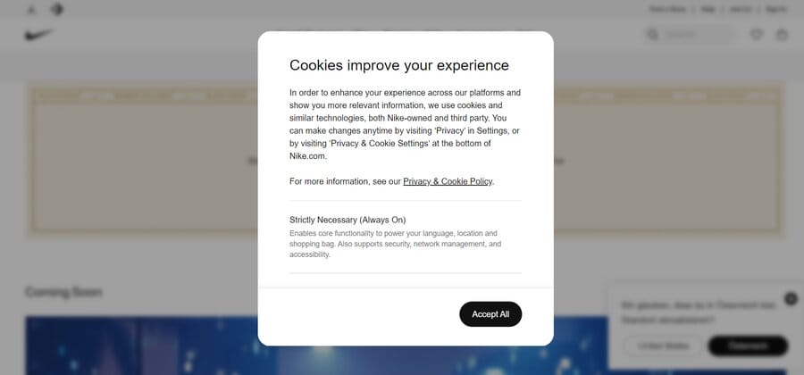
For example, when a visitor lands on Nike’s website, they immediately encounter a cookie modal.
The rest of the screen darkens and becomes blurry and the user cannot perform any other action on the website until they interact with the modal by pressing on “accept all” button to accept cookies.
Modals Vs. Pop-Ups
Although the terms “modals” and “pop-ups” are sometimes used interchangeably due to their similarities, they are not the same.
Both appear on the page and bring the user’s attention to specific information or action that needs to be taken.
However, there is an important difference between the two.
While popups appear on the page and focus the visitor’s attention on specific information, they don’t disable other elements of the page and the user is free to disregard the popup and continue browsing.
On the other hand, modals require the visitors’ immediate attention, by disabling the rest of the page.
They use visual cues of blurring, darkening or otherwise indicating to the user that they cannot interact with the page until they interact with the modal first.
Types Of Modals In Web Design
There are different types of modals in web design and they can be classified according to their purpose — whether they relay or require user information, display an image for the user or provide contextual information within the page.
Informational Modals
Informational modals appear as a window within a window of a page to focus the user’s attention on a piece of information that can be an alert, update or a general message.
Depending on the purpose of the modal, the user may be able to dismiss it by clicking elsewhere on the page or pressing the “x” button in the top right corner.
Or, some modals will require the visitor to input certain data to continue, such as email, name, country of origin, etc.
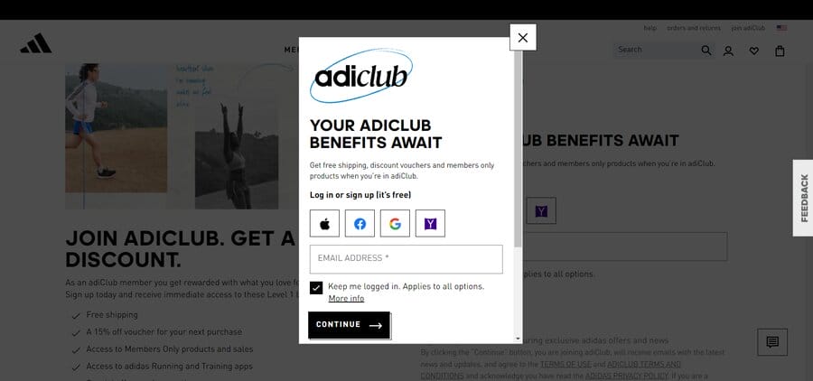
Here’s an example of how Adidas relies on a modal to prompt their users to sign up.
Using simple language that highlights the benefits of becoming a member, Adidas encourages its visitors to become members of their club.
Lightbox Modals
A lightbox modal is a visually captivating modal that enlarges and showcases multimedia on the webpage.
It is typically used to showcase the features of a product or a service.
Lightbox modals prevent interaction with the rest of the page while the modal is active, by darkening or blurring the out-of-focus page elements.
These modals can typically be closed by clicking the “x” or clicking on any out-of-focus elements on the page.
Here’s how doForms uses a lightbox modal to enlarge its homepage introductory video:
Inline Modals
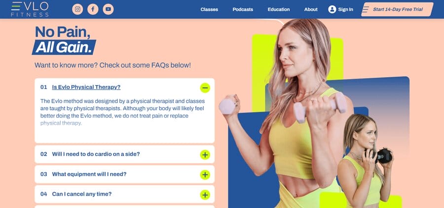
Inline modals open in line with the page, meaning they do not overlay the main content but provide further context to the product or service described on the page.
They are an excellent tool for providing additional information without taking website visitors to a new page or increasing the length of the webpage.
You can see how Evlo Fitness, a brand that provides online fitness workouts to their customers, uses in line modals to offer their visitors answers to some of the most common questions.
This allows Evlo Fitness’ visitors to stay on the page they were looking at, while gaining valuable information about Evlo’s services.
Benefits Of Modals In Web Design
There are several key benefits of using modals in web design, when used correctly.
Explore the three main benefits of modals in web design below, pertaining to user focus, space efficiency and improved conversion.
Modals Improve User Focus
Modals reduce visual clutter on the page and help your visitors focus on the specific action, information or multimedia you want to portray, without requiring them to navigate away from the page.
In doing so, they create a dedicated space for user interaction which improves user navigation.
For example, a checkout modal lets the visitor interact with the cart and items in it without going to the dedicated checkout page.
After reviewing the items, the customer can easily choose to either proceed with the checkout or, by pressing anywhere outside of the modal, continue shopping.
Modals Effectively Use Space
Modals can be an effective way of providing visitors with contextual information within the page they are viewing.
They highlight certain information for website visitors, whether an update, multimedia or an alert and prompt user action.
For example, a lightbox modal allows you to enlarge a picture of a product or service so you can focus on its features or benefits, without navigating the visitor away from the page they’re on.
Modals Can Improve Conversion
The general purpose of modals is to grab attention and encourage actions.
Modals can invite your website visitor to sign up for a newsletter, or to fill out a form.
If strategically placed and designed on the page, they can be a powerful tool to guide your visitors’ journey and send them down your conversion funnel.
When To Use Modals In Web Design
Modals instantly grab the user’s attention, which is why they are widely used for alerts, warnings and confirmations.
You should pay attention when you use modals, as using modals incorrectly can lead to user frustration and abandonment of your page.
At Digital Silk, we offer end-to-end web development and design services.
We regularly use modals to guide our client’s visitors and send them down the conversion funnel.
Below you will see some of the examples of how DS uses modals in our designs.
Informational Messages
When you want to direct your visitor’s attention to specific information, you can rely on the informational message modal.
It should use few words and simple message to get the message you need your visitors to receive.
GPen, another one of Digital Silk’s clients, produces vapes.
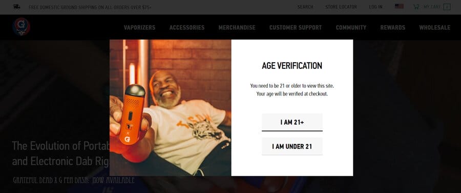
Their highly regulated product is exclusively for individuals over 21, and upon visiting GPen’s websites, users must input their age in an immediate alert to access the page.
Forms & User Input
Modals are a great way to gather user feedback or relevant information from your visitors.
While the alternative is to provide your visitors with dedicated pages for data input, using modal forms to do so is a great way to collect this information without making the user navigate from the page.
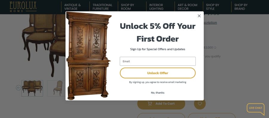
You can see how Digital Silk used a modal to grab the attention of our client’s EuroLux’ customers.
EuroLux sells furniture, lighting and other home décor elements
In the below modal, we used simple language to incentivize the visitor to leave their email with a 5% discount from their first order.
We also used similar language for the CTA button, where we invite the reader to “Unlock Offer.”
Decision Points
This modal is used to grab the user’s attention and requires confirmation before completing an action.
A decision or confirmation point modal works best in situations in which the user is about to make an irreversible change.
Using a confirmation modal here is wise, as it gives the user an opportunity to reflect on what they are about to do.
For example, a window pops-ups and asks the user: are you sure you want to complete the following action?
The user can then make a choice to either complete or discard the changes he wished to make.
Media Displays
Images play a vital role in enhancing user experience on a web page by showcasing your product or service and complementing the page’s content.
However, in situations where the product or service takes center stage, it’s essential to provide visitors with a distraction-free way to closely examine the offering without leaving the current page.
This is where media display modals come into play, supporting images, videos, and all other media types seamlessly.
For our client, doForms, we implemented modals for their Video Library which includes how-to’s, testimonials and webinars.
Clicking on any video triggers a modal that enlarges the video for a full screen viewing experience, allowing users to focus solely on the content.
Multistep Workflows
Modals are an effective way of breaking down complex actions into smaller, more manageable parts.
When requiring your visitors to perform longer actions that have multiple steps, you can simplify their experience by offering them modal window for each step of the process.
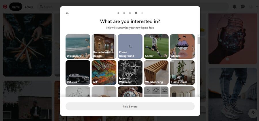
Pinterest does a great job with this upon sign-up: when visitors begin the registration process, they are presented with a modal that asks for their language and country.
After completing that step, another modal pops up that asks about their gender, interests, etc., like you can see in the image below.
How To Use Modals In Web Design
To avoid irritation in your website visitors, due to frequent, poor quality or simply interrupting modals, you want to follow expert recommendations on when and how to use them on a page.
Below are our recommendations on how to design modal windows:
- Keep them concise: Don’t confuse your readers with unnecessary words. Include the title of the modal and then use direct language to inform the reader of why it appeared and what’s its purpose (to notify, gather data, showcase your product or service, etc.).
- Use visual cues: Darken all other elements of the page. Deactivate other features of your site until the modal is engaged with.
- Use modals infrequently: Modals are disruptive in nature. Make sure to only use them when your page requires it and make the text on the modal relevant to your visitor, otherwise you will risk them leaving your page in frustration.
- Enable users to close the modal: Make sure your visitor can “exit” the modal by clicking on the “x” in the top right corner. Alternatively, offer your users the option to click on an “exit” button within the modal or remove the modal if the visitors press any of darkened elements of the page.
Modals In Web Design FAQ
Question #1: What is the difference between a dialog box and a modal?
A dialog box is a generic term for a small window that appears on the screen to prompt the user for input or to convey information.
It can include various UI elements like buttons, text fields and checkboxes.
A modal, on the other hand, is a specific type of dialog box that requires user interaction before allowing further actions on the main interface.
Question #2: What is the difference between a tooltip and a pop-up?
A tooltip is a small piece of contextual information that appears when a user hovers over or clicks on a specific element.
It provides additional details about the element’s function or purpose.
Question #3: What are interstitial modals?
Interstitial modals are window dialogues that appear overlaying a piece of content for a set duration of time.
After the set timeframe passes, the user can access the content on the page.
Create A Custom Website With DIGITAL SILK
While this post may have helped you learn more about modals, you don’t have to know every aspect of web design and development by heart.
That’s our job.
At Digital Silk, we are a comprehensive web design agency.
We offer digital marketing services end-to-end or as a standalone service and we take pride in each project we undertake.
By meticulously studying each of our clients’ brand, industries and competitors, we devise custom strategies to help each client attract and retain customers while fulfilling their business goals.
Have a web design project in mind?
Call us at (800) 206-9413 or complete our Request a Quote form below to set up a free consultation and begin the reinvention of your online brand.
"*" indicates required fields
