“Some people think design means how it looks. But of course, if you dig deeper, it’s how it works” – Steve Jobs
There’s a lot more to user experience (UX) design than looks. From simplicity and consistency to accessibility and visual hierarchy, we will explore the top user experience design principles that can transform your website into a conversion powerhouse.
Let’s get started!
Digital Silk designs custom websites. Request A Quote
What Is UX Design?
User experience (UX) refers to the level of engagement and satisfaction a user has when interacting with a website. It includes a broad range of factors, such as ease of use, efficiency, functionality, visual appeal and emotional response.
UX design aims to optimize these aspects by understanding the users’ preferences, needs and behaviors and incorporating those findings into creating intuitive, engaging and meaningful experiences
Why Is UX Design Important?
As many as 70% of online products fail due to poor UX design. The experience that your website offers directly affects your conversion rates, as well as factors like consumer opinion about your brand.
Considering that 67% of consumers consider bad user experience to be one of the main reasons to leave a website, it becomes clear that your website’s UX design is the backbone of customer satisfaction, engagement and retention, which again, play key roles in your conversion rates.
7 Key Principles Of UX Design
Derived from industry best practices and user research, here are the seven fundamental UX design principles to know when optimizing your website for user-friendliness.
1. User-Oriented Design
User-oriented design, also known as user-centered design (UCD), is a web design approach that places users at the center of the design process.
Step one to creating a user-oriented design is to know who your users are, but more on this below.
In addition to knowing your audience inside and out, creating a user-oriented design includes:
- Developing user scenarios: Imagine realistic scenarios in which users would interact with your website and identify pain points or areas for improvement in your UX design.
- Creating information architecture: Organize content and structure to ensure intuitive navigation and easy access to information.
- Designing for usability: Focus on intuitive interfaces and clear instructions.
- Iterating and prototyping: Continuously refine your UX design through prototyping and feedback loops to address user needs and preferences.
- Conducting usability testing: Test your design with real users to identify areas of improvement and refine the user experience.
- Incorporating user feedback: Continuously gather user feedback and adapt your design based on their insights.
2. Consistency
Your landing page’s primary purpose is to turn visitors into customers. So, it’s only natural to put an em
Consistency in UX design refers to the practice of maintaining a uniform experience across all aspects of your website. This means ensuring that all visual elements, such as layout, colors, typography and imagery, remain consistent.
To illustrate: Imagine you’re embarking on a journey, and you unfold a map to guide you along the way. The map symbols, such as roads, landmarks, bodies of water, mountains and vegetation are consistent and standardized. This consistency is what allows you to understand and interpret the map effortlessly, making it easier to find your desired destination.
Similarly, in UX design, consistency provides users with a visual map that helps them navigate your website. When elements like navigation menus, call-to-action buttons and links follow a consistent design pattern, users can quickly locate and access the information they’re looking for.
Best practices for optimizing your website for consistency include:
- Avoiding unnecessary elements that can overwhelm your users, like excessive pop-ups, ads or distracting animations
- Optimizing your website for different devices and screen sizes through responsive design, so content automatically adjusts to fit the dimensions of each device.
- Ensuring that similar functionalities behave the same way throughout the application to minimize user confusion. For instance, selecting or deselecting a checkbox should always produce the same outcome or trigger a consistent action, regardless of their location or context within the website pages.
- Keeping branding elements consistent across your website.
3. Hierarchy
Hierarchy in UX design refers to the prioritization of elements on a web page to create a clear visual structure and guide the user’s attention. It involves arranging content and design elements in a way that establishes their level of importance to help users understand the information presented.
Just as a skilled narrator guides their listeners through a story, a web designer guides users through each webpage. The designer carefully structures and presents the content, establishing a hierarchy of importance, similar to how a narrator emphasizes key plot points or characters in a story.
Key elements that add to visual hierarchy in web design include:
- Size or scale: Larger elements naturally attract attention. Using varying sizes helps emphasize important content and create visual order.
- Color: Thoughtful use of color can draw attention to specific design elements. Bright colors or strategic color contrasts can be effective in highlighting important information on your website.
- Contrast: Creating contrast, whether through typography or color, ensures that elements stand out and are easily readable.
- Proximity: Placing related elements close together indicates their association and relative importance. Proximity helps users understand the relationships between different pieces of information.
- Whitespace: Utilizing white space (empty space) effectively allows important elements to stand out and improves overall visual balance, while providing breathing room for your users.
To create a strong hierarchy in UX design, consider the following:
- Choose a focal point: Determine the most important element or message in your design and ensure it receives the appropriate attention through strategic design choices.
- Consider viewing patterns: Understand how users scan content on the web. Utilize common patterns like the Z pattern or F pattern to guide users’ attention effectively.
- Create multiple versions: Explore various design options to find the best visual solution. Experiment with different colors, element arrangements and messaging to find the most impactful hierarchy solution.
4. Context
Context in web design refers to the circumstances, background or environment in which a website exists or is used. It encompasses factors such as the target audience, cultural influences, user behavior, technological considerations and the purpose of your website.
Here are some key points highlighting the importance of context as a UX design principle:
- Meaningful design: Context is crucial for giving meaning to what users see and experience. When the context of a design is vague, it can lead to a design that fails to communicate effectively with the intended audience, resulting in poor user experience.
- Sociocultural context: Sociocultural context considers the immediate physical and social setting in which people live. It encompasses the immediate physical and social environment in which the audience resides, including factors such as cultural norms, values, beliefs, social interactions, and geographic location. For instance, in Brazil, it’s common for shoppers to use installment payments for online purchases. An eCommerce platform designed for this market should incorporate an installment payment option during the checkout process to align with the local cultural norm.
- Language and localization: Translating a product into different languages for global audiences is just the first step. Localization involves addressing cultural references, idioms and other linguistic and non-textual components to ensure clear communication and avoid misinterpretation.
- Iconography and familiarity: Iconography, which includes symbols and visual representations, should consider the cultural familiarity and context of the target audience.
5. Accessibility
Accessibility in web design refers to designing and developing websites in a way that ensures equal access and usability for individuals with disabilities. It involves creating an inclusive digital environment that allows people with diverse impairments to perceive, navigate and interact with web content effectively.
By prioritizing accessibility as a UX design principle, you can reach a broader audience and provide a seamless user experience for everyone.
Here’s how to ensure accessibility in web design:
- Alternative text (alt text): Add descriptive alt text to your images to enable individuals with visual impairments to understand the context of your images. For informative images, provide detailed descriptions, while decorative images can have empty alt text to indicate they are not essential for understanding the content.
- Heading hierarchy: Structure your content properly by using heading tags (H1, H2, H3, etc.) to establish a clear hierarchy and help your users navigate through the information with ease. Bear in mind that screen readers rely on heading structure to provide textual context.
- Color contrast: Choose colors with sufficient contrast to ensure readability for users with visual impairments. Use a contrast checker, such as Coolors to verify that your color combinations meet accessibility standards. Aim for a clear distinction between foreground and background colors.
- Audio and video accessibility: Provide alternatives for audio and video content. Include transcripts for audio files, allowing users with hearing impairments or those who prefer text-based content to access the information. For videos, include captions or subtitles, to enable individuals who are deaf or hard of hearing to understand your visual content.
- Clear and concise content: Use plain language and avoid complex jargon or technical terms to help users with cognitive disabilities or limited language proficiency to better understand the content.
- Keyboard accessibility: Ensure that all functionality and interactive elements can be accessed and operated using a keyboard alone. This is vital for individuals with mobility impairments who rely on keyboard navigation rather than a mouse or touch input.
Check out the video below from our Digital Silk team to learn more about web accessibility — a key UX design principle:
6. Usability
Website usability refers to the quality of a website in terms of how easy it is for your users to navigate and interact with.
There are five key principles of website usability as a UX design principle:
- Availability: This refers to the ease of access to a website, which can be influenced by factors such as your preferred web hosting and compatibility with different devices.
- Clarity: Your design should be clear and intuitive and optimized for avoiding distractions or confusion that might hinder your users from finding what they need. A clutter-free design and well-organized navigation contribute to clarity.
- Recognition: Users should be able to recognize and understand the elements and interactions on your website without having to spend much time learning how to use them. Familiar patterns and conventions can help reduce the learning curve.
- Credibility: Building trust and credibility with your users is important. This can be achieved through offering transparent and reliable information and showcasing your customer reviews or testimonials.
- Relevance: Ensuring that the content on your website is engaging and relevant to your target audience. Understanding your users’ needs and tailoring the content accordingly enhances usability.
7. Storytelling
Storytelling in UX design is a powerful technique that leverages the innate human affinity for stories to create more engaging and meaningful user experiences.
By incorporating storytelling principles into UX design, designers can go beyond mere information delivery and tap into the emotional aspects of user experiences.
Here is how to incorporate storytelling in your UX design:
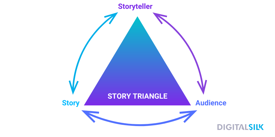
- Understand the Story Triangle: Effective storytelling involves a dynamic exchange between the story, the storyteller and the audience. It’s essential to view storytelling as a conversation rather than a one-way broadcast. Keep in mind that different audiences may interpret the same story differently based on their specific experiences and perspectives.
- Plan for audience engagement: Encourage active participation from your audience throughout the storytelling process. Create opportunities for feedback and invite them to share their assumptions, motivations and experiences related to the story. This engagement can provide valuable insights and ideas for your UX design.
- Strike the right balance of details: Be mindful of the level of detail you provide in your stories. Too few details can leave too much room for imagination, potentially sidetracking the audience. Conversely, too many details may restrict the audience’s creative thinking and emotional involvement. Find the appropriate balance based on your storytelling goals.
- Establish the hero’s journey: Create a time-tested structure for storytelling. Your hero’s journey can be divided into five sections: exposition, rising action, climax, falling action and resolution.
As a part of the storytelling UX design principle, here’s the hero’s journey explained:
- Exposition: Start by establishing the users and the setting of your story. Introduce the main character, such as Mary in your example, and provide relevant details about her background, needs, and motivations.
- Rising Action: Gradually escalate the problem your users face. Highlight the challenges, obstacles, and decisions they encounter. Build tension and emphasize the importance of finding a solution.
- Climax: Reach the peak of the story where a turning point occurs. Depending on your goals, you can present a positive outcome to showcase the benefits of your UX solution or a negative outcome to highlight areas for improvement.
- Falling Action: Show the steps taken to address the problem. Describe how your UX design helps solve the user’s challenges, improve their experience, or mitigate issues.
- Resolution: Conclude the story by revealing the final outcome. Demonstrate whether the UX design successfully resolved the user’s problem and the impact it had on their overall experience.
“We are, as a species, addicted to story. Even when the body goes to sleep, the mind stays up all night, telling itself stories.” – Jonathan Gottschall, the author of “The Storytelling Animal.”
How To Optimize Your Website For User Experience
88% of online shoppers are less likely to return to a website after having a bad user experience. Here’s how to optimize your website for your users, through UX design principles:
1. Define Your Target Audience
Knowing who your users are is the first step in crafting a site that’s optimized for user experience.
Here’s a step-by-step guide to help you understand who your target audience is:
- Study your existing customers: Use audience research tools such as Care Cloud or SparkToro to analyze demographics, behavioral traits and discussion topics.
- Get data: survey customers for immediate market research.
- Check your competition: Research your competitors to identify their target audience and find potential gaps in the market.
- Research your audience’s psychological characteristics: Conduct surveys, interviews and social media listening to understand your audience’s personality traits, attitudes, values, interests, hobbies, lifestyles and behaviors.
- Create user personas: Develop 3-7 fictional representations of your customers, grouping them by shared challenges and goals. Use these personas to make decisions regarding your brand, from branding and digital strategies to email marketing campaigns, SEO strategy and beyond.
Knowing who your users are can help you reach more informed UX design decisions.
For example, if a user persona indicates that the target audience consists of tech-savvy millennials who value convenience and personalization, designers may prioritize intuitive mobile interfaces, quick access to personalized recommendations and seamless integration with social media platforms to enhance the overall user experience.
2. Simplify Navigation
Simple navigation is a key part of UX design. To make it easy for users to move around your website, follow these best practices for designing intuitive navigation:
- Use descriptive navigation labels: Instead of generic labels like “Products” or “Services,” use key phrases that accurately describe what you offer. This helps with search engine optimization (SEO) and improves usability for your visitors.
- Use topic-based navigation labels: Rather than organizing content based on formats (articles, videos, whitepapers), focus on topic-based labels that address visitors’ specific interests and questions, such as “New healthcare trends,” or “Technology breakthroughs.”
- Place a call to action (CTA) to your header: Place a visually prominent CTA, such as a “Contact” or “Get Started” button, in your header to allow quick access to your visitors who are ready to reach out.
- Create a navigation hierarchy: Arrange your navigation items strategically to take advantage of the serial-position effect — a cognitive phenomenon where individuals tend to remember and recall items more effectively when they appear at the beginning or end of a list or sequence.
- Optimize your website for mobile devices: Design a responsive mobile menu to ensure easy navigation for mobile users. Make sure all your icons and links are thumb-friendly and easily clickable on smaller screens.
- Use Google Analytics to optimize your navigation: Google Analytics can provide insights into user behavior, popular pages, navigation paths and search behavior, enabling you to optimize your website’s navigation for better user experience and engagement.
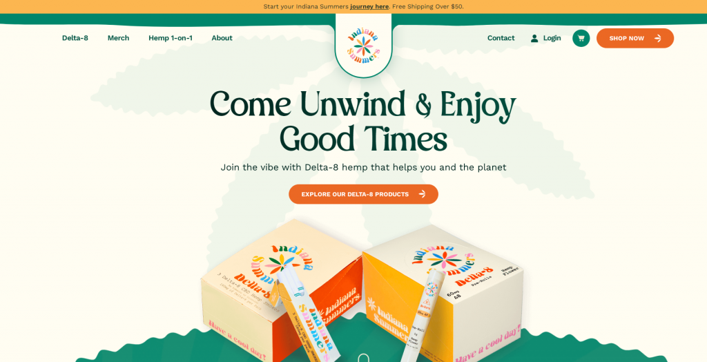
[Source: Indiana Summers]
3. Prioritize Content
When it comes to prioritizing content in web design, here are some strategies to consider:
- Establish a visual hierarchy: Determine the order of importance for different content elements on your web page, ensuring that key information stands out and is easily scannable for users.
- Prioritize user goals: Identify the primary goals or tasks that users want to accomplish on your website and ensure that relevant content supporting those goals is easily accessible and prominently displayed.
- Streamline and condense content: Present information concisely and eliminate unnecessary clutter to enhance readability and user comprehension.
Remember, the goal is to guide users toward the most important or relevant content while providing them with the freedom to explore and navigate the site as they please.

[Source: Analyst 1]
4. Place Your Visuals Strategically
To create effective visuals in your web design, consider the following strategies:
- Utilize visual cues: Incorporate visual cues such as arrows, icons or images to guide users’ attention towards important content and actions on your web page.
- Optimize imagery: Use high-quality and relevant images that support your content and enhance the visual appeal of your website.
- Consistent branding: Maintain a consistent visual style, color palette and typography throughout your website to establish a cohesive and professional appearance.
5. Optimize Page Load Speed
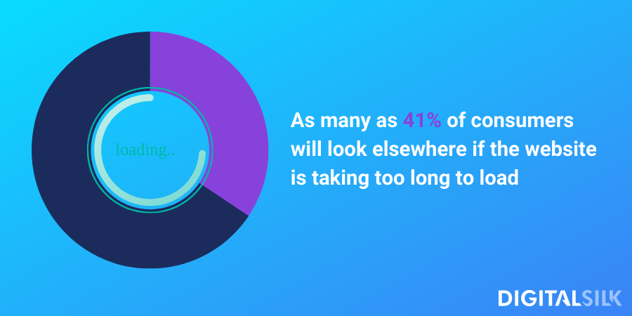
Users have little to no patience for slow-loading websites. As many as 41% of consumers will look elsewhere if the website is taking too long to load.
In web design every second counts, so to ensure your users do not bounce off because of your page loading time:
- Choose a performance-optimized hosting solution: Select a reliable hosting provider such as BlueHost or GoDaddy that offers powerful platforms designed for speed.
- Compress and optimize your images: Large image files can significantly slow down your page loading times. Compress and optimize your images by changing file formats and enabling lazy loading.
- Reduce redirects: Too many redirects can negatively impact loading times. Minimize unnecessary redirects and ensure your Top-Level Domain (TLD) resolves with a maximum of one redirection. Tools like Screaming Frog can help identify and eliminate redundant redirects.
- Cache your web pages: Caching stores copies of your site’s files, reducing the server’s workload when serving pages to visitors. Use server-level caching or caching plugins like W3 Total Cache or WP Rocket to improve Time to First Byte (TTFB) and overall page loading speed.
- Enable browser caching: Browser caching allows browsers to store certain website resources locally, reducing the need to reload them on repeated visits. For this purpose, you can use the same plugins as for caching your web pages.
- Optimize CSS, JavaScript and HTML files: Reduce the weight of your CSS, JavaScript, and HTML code by removing unnecessary characters, spaces, comments, and other elements. Plugins like Autoptimize, SiteGround Optimizer, or manual code optimization can help streamline your files and reduce their size for faster loading.
- Leverage a content delivery network (CDN): A CDN distributes your site’s static content across multiple servers globally, reducing latency and improving loading speeds.
- Eliminate unnecessary plugins: Keep the number of plugins on your site to a minimum. Outdated or poorly maintained plugins can slow down your site and introduce security risks. Regularly review installed plugins and disable/delete those not in use. Test plugins individually for their impact on page speeds using tools such as PageSpeed Insights.
6. Opt For A Mobile-Friendly Design
Users are spending more than 4 hours on their phones every day. A mobile-friendly design isn’t a luxury — it’s a necessity.
To ensure your website is mobile-friendly:
- Implement responsive design: Responsive design ensures a website automatically adapts and responds to the user’s device, whether it’s a desktop computer, laptop, tablet or mobile phone, by adjusting the layout, content and functionality to ensure usability and readability.
- Minimize or eliminate pop-ups: Pop-ups can be challenging to handle on mobile screens and may negatively impact user experience.
- Optimize button size and placement: Ensure that buttons on your website are appropriately sized and strategically positioned for ease of use on mobile devices. Consider placing buttons within thumb-reach by positioning interactive elements, such as buttons or navigation controls, in areas of the screen that are easily reachable and comfortably operable with the user’s thumb.
- Opt for legible fonts and readable text: Choose a font size that is easily readable on mobile screens, typically around 14 pixels or larger. Test your font choices on different mobile devices to ensure readability. Stick to fonts that are clear and easily recognizable, avoiding complicated or script-type fonts.
- Provide ample spacing for links: To accommodate for touch input, leave sufficient space between links to avoid accidental clicks. Spacing out your links enhances usability and reduces user frustration.
- Simplify and declutter your web design: A cluttered website can make navigation difficult on mobile screens. Focus on essential elements and use white space effectively to provide visual clarity and organization.
- Regularly test your website on mobile devices: Frequently test your website on various mobile devices, both Android and iOS, to ensure optimal user experience. You can test how mobile-friendly your website is with tools such as Google’s Mobile-Friendly Test.

7. Test & Iterate
Continuously test your website’s design with real users to identify areas for improvement. Conduct usability tests, gather feedback and analyze user behavior through analytics.
Keep your eye on the following UX design metrics:
- Time on task: This metric measures the time a user spends on specific activities within your website. For instance, if you run an eCommerce business, you can track the time it takes for a user to complete an online purchase.
- Average session length: This metric indicates the average duration of user sessions on your website. It serves as a measure of user engagement and enjoyment of the overall experience.
- Abandonment rate: The abandonment rate measures the ratio of abandoned purchase attempts to the total number of initiated transactions. This metric is highly relevant in online shopping experiences as a high abandonment rate often indicates issues with the checkout design, process or other usability problems.
- Error rate: The error rate reflects the number of users who make mistakes while performing tasks. Errors can result from usability issues such as selecting the wrong action or encountering difficulties in filling out forms. By calculating the error rate, you can identify areas where users face challenges and work on improving them.
- User retention rate: This metric indicates the percentage of users who continue visiting your website over a given period. It helps evaluate the effectiveness of your user retention strategies.
Contact our experts
UX-Optimized Web Designs By Digital Silk
As a full-service agency, our team at Digital Silk grows brands online through custom digital solutions. We offer a wide range of services, including strategic branding, custom web design, UI/UX design solutions, mobile app development and digital strategy.
UX design is at the core of every web design project we have worked on provided some efficiency leading to the desired results. Explore our case studies and see how our approach empowers our clients’ visitors to personalize their user journey, crafting a truly tailored and immersive experience.
See our UX design work in action:
1. User-Centered Design: Spar & Bernstein
Spar & Bernstein is a U.S. law firm, based in New York, specializing in personal injury and immigration law. For their website, our designers crafted a user-centric journey that allows the visitor to choose between personal injury law or immigration right after they land on Spar & Berstein’s homepage.
Once they choose their desired service, it takes them to a main landing page with sub-categories, such as construction accidents, motor vehicle or product liability, under personal injury law.
This type of UX design approach customizes the user experience by allowing the visitors to customize their user journey.
2. Design Consistency: EVLO Fitness
EVLO Fitness is a workout platform that offers various video classes to people who want to get in shape. We designed a website for the brand that is consistent throughout, from branding elements like logo, typography and color palette to messaging style and tone of voice.
This focus on consistency as a UX design principle (along with a strategic conversion funnel, clear messaging and other design elements) offers clarity to website visitors and enhances the user experience.
3. Hierarchy: LIG Solutions
LIG Solutions bridges the gap between people looking to find the best individual or group health insurance and insurance providers.
For their website design, our designers created two-tier navigation where the main navigation contains high-level service categories, and the local navigation provides more specific subcategories within each of the main sections.
The local, drop-down menu allows LIG Solutions’ users to access the main services directly from the landing page, so they can easily find what they’re looking for across the site.
4. Context: Welch’s Fruit Snacks
Our next example of UX design is Welch’s Fruit Snacks — a food brand that needs no introduction. Our Digital Silk team designed their website for the brand’s Mexican market.
Our research showed that fruit is the first ingredient moms look for in nutrition snacks, but they also value strong flavors and unique textures.
We incorporated these findings in our web design by crafting custom 3D graphics that pop up from the screen, showing the texture and evoking a mouthwatering feel from website visitors.
5. Storytelling: ACLU Virginia
American Civil Liberties Union (ACLU) Virginia is a non-government organization passionate about human rights. We had the privilege of designing their annual report for 2020 – 2021.
During this period, they fought their battles in various fields, including criminal legal reform, free speech and gender equality, and it was our job to bring their achievements to life through storytelling.
With our user-centric design solution, we made sure that each of their stories had a seamless flow, from the beginning (stating the problem) and elaboration (offering solution) to the final closure (promises for the future).
We also included eye-catching animations and adapted a background color for each individual story to evoke different emotions as the user scrolls.
Create A UX-Centered Web Design With Digital Silk
At Digital Silk, we are a professional web design company that specializes in all things digital, including UX design, web development, branding, content creation and more.
We will delve deep into industry insights, competitor analysis and market research to shape a tailor-made solution for your brand that attracts and connects with your target audience.
At Digital Silk, we provide:
- Expert guidance: Our experienced digital professionals not only deliver exceptional results but also serve as trusted advisors, offering valuable insights and guidance throughout your project journey.
- Transparent collaboration: We believe in fostering transparent partnerships. From regular check-ins and detailed progress reports to timely updates on project milestones, we ensure you are always in the loop, informed, and engaged.
- Custom-crafted solutions: We understand that one size doesn’t fit all. Our dedicated web design specialists collaborate closely with you to grasp your unique requirements, brand essence, target demographics, and goals. This collaboration allows us to deliver tailor-made solutions that resonate with your audience and reinforce your brand identity.
Request a quote today and let our exceptional team at Digital Silk craft a custom website for your brand that is fully optimized for superior user experience.
"*" indicates required fields


