Did you know that your website has 50 milliseconds to make a good first impression?
Luckily, there is a way to break the ice!
Adding animations to your website can help you draw your audience’s attention, boost engagement rates and enhance the overall user experience (UX).
However, creating effective website animations can be a daunting task, especially if you are not familiar with the latest trends in web design.
We’ll explore the best website animation examples, as well as animation types, techniques, and tools, to help you create stunning and effective motion graphics for your business website.
Digital Silk builds custom websites. Request A Quote
What Is Animation In Web Design?
Animations in web design refer to the graphical effects that are used to create movement and interactive features on a website.
It is an extension of animation in its primal form, which is the process of bringing inanimate objects to life.
Typically, web designers use animations to add visual interest, communicate information and enhance UX. This is often achieved by highlighting a call-to-action (CTA) button, providing feedback on user interactions, or guiding users through a multi-step process.
Website animations can be simple, such as a button changing color when hovered over, or complex, such as a full-page animation sequence.
Types Of Website Animation
Let’s see what the six most common types of website animations are, how they work, and the benefits they can provide for your business website.
1. Hero Animation
A hero animation is an animated version of the hero image that is usually placed above the fold of the webpage and right below the website header.
Animated hero images are a popular choice in making that initial contact point more dynamic, lively, and appealing to the user.
2. Loading Animation
Loading animation is one of the most widely used types of user interface (UI) animations in web design. Its purpose is to let the user know that a particular process is in progress.
Simply put, loading animations give your users something to look at while waiting for their request to be processed.
3. Accent Animation
Accent animations are a type of animation used to draw the user’s attention to specific elements on a website. Designers use this animation to emphasize key information or interactive elements, such as buttons or menus, and make them stand out from the rest of the content.
By adding motion to these elements, an accent animation can increase the user’s engagement and make the navigation experience more intuitive and dynamic.
Additionally, they can improve your website’s scannability and visual hierarchy by guiding the user’s eye to the most important parts of the layout, such as keywords or phrases.
Digital Silk builds custom animations. Speak With Our Experts
4. Interactive Animation
An interactive animation refers to the website animations triggered by users’ actions, such as hovering, clicking, or scrolling on a web page.
These types of animation come in many forms, from simple button animations that change color when hovered over to more complex interactions such as drag-and-drop or scroll-triggered animations.
For instance, you can use interactive website animations to provide your users with more information about a product or service by showing it in action or providing a 360° view of it.
By providing instant feedback, interactive animations can help users navigate through a website more efficiently and make the experience more engaging and enjoyable.
5. Hover Animation
Hover animation is a type of interactive animation that responds to the user’s mouse cursor hovering over an element on a website.
It is an important aspect of web usability as it helps users understand which elements are clickable and interactive on a website.
Hover animations can be used to highlight important information or call to action, and they can also enhance the overall aesthetics of the website design.
6. Scrolling Animation
Scrolling animation is a type of website animation that activates when the user scrolls down or up a web page.
These animations are designed to create a sense of motion and interactivity, helping with user engagement and offering a more dynamic browsing experience.
There are several types of scrolling animations that web designers can use for your website, including:
- Fade-in animations: Animations that are triggered as the user scrolls down the page, causing elements to gradually disappear from or appear on a website layout.
- Parallax scrolling: Layers of elements that move at different speeds as the user scrolls down the page, creating a sense of depth and a 3D impression.
- Sticky elements: Certain elements, such as navigation menus or CTA buttons, remain fixed in place as the user scrolls down the page, making them always readily available for the user to interact with.
- Animated backgrounds: Dynamic, moving elements on a page’s background, creating a sense of motion and mesmerizing effect.
Website Animation Techniques
Animation techniques in web design refer to the various methods web designers use to create and implement animation elements on a website. The most common techniques include:
1. Progression
Web designers use the progression technique to create loading animation that visually communicates the progress of a certain process on a web page.
This progress can be shown in a circular or linear way:
- Circular progress indicators involve a circle moving in the clockwise direction in either a determinate way (shows how long a process will take) or an indeterminate way (shows undetermined wait time).
- Linear progress indicators are visual elements that indicate the progress of a task or process, typically in a horizontal format. They consist of a bar or line that is segmented, filled or highlighted and show how far along the task or process has progressed.
2. Skeleton Screens
Skeleton screens are a technique used to create the impression that website content is being loaded quickly and seamlessly on a web page. It is a simplified version of a page layout that provides an outline of the content to be loaded.
When the page is loading, the skeleton screen is displayed first, and then the content is loaded gradually on top of it. As each element of content is loaded, it fills in the corresponding space in the skeleton screen.
You can use skeleton screens on your website to reduce the perceived loading time and to provide your users with an immediate sense of progress and action, making their experience on the website more positive and satisfying.
3. Visual Feedback
The visual feedback animation technique refers to the kinetic typography type that provides visual cues and feedback to users as they interact with certain elements on a website.
Its main purpose is to help users understand the website’s response to their actions and provide guidance on how to proceed.
For instance, when a user hovers over a button, the animation can highlight it and indicate its purpose. Similarly, when a user fills out a form, the animation can show which fields have been successfully completed or highlight errors to indicate which information was imputed incorrectly.
4. Attracting Attention
Attracting attention animation technique is a web design that refers to using animation to draw the user’s attention to specific elements on a webpage.
This technique is built around the fact that human attention gravitates toward any kind of motion. An example of animation created to draw attention can be an entry form that tilts in a nod kind of motion when the form is completed correctly or “shake its head” when denying a certain input.
5. Storytelling
Storytelling website animations are a type of web design technique that uses animated graphics to convey a narrative or tell a story.
For example, an animated infographic can illustrate data in a more engaging way than a static one. Moreover, this can help users better understand the presented information and make the entire content more memorable and visually appealing.
Want to expand your website terminology?
10 Leading Website Animation Examples
What does it look like when a website uses animations strategically, so as to create an immersive UX without cluttering the page and slowing down the site?
Here are 10 best web animation examples of well-balanced website animations to inspire you, based on our web design experts in Miami, New York City, and California.
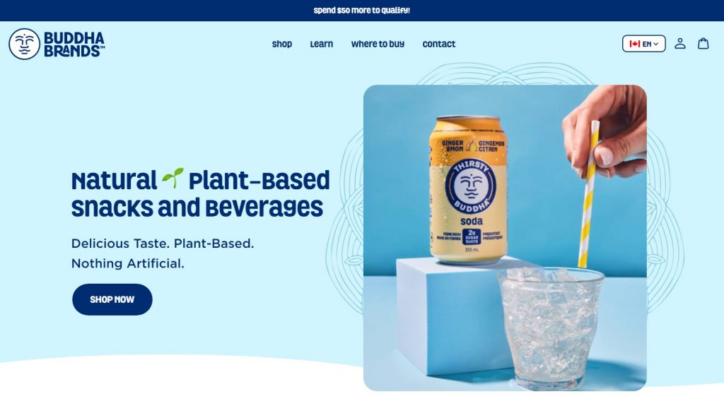
1. Buddha Brands
Buddha Brands’ B2C website offers discrete yet very effective animations that exude fun and playful energy.
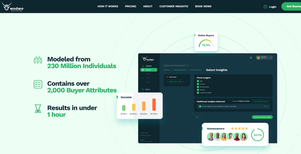
2. Wodwo
Wodwo’s B2B website is full of interactive and scrolling animations that make the user’s experience unique, enjoyable and entertaining.
3. Field Edge
Heating, ventilation and conditioning company, Field Edge chose an interactive layout for their website with various elements popping up as you scroll down their landing page.
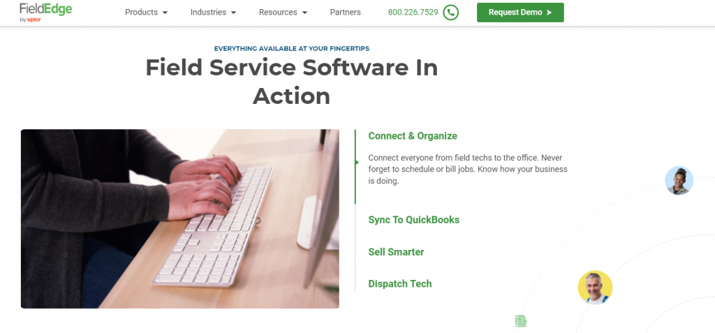
[Source: FieldEdge]
4. Welch’s Fruit Snacks
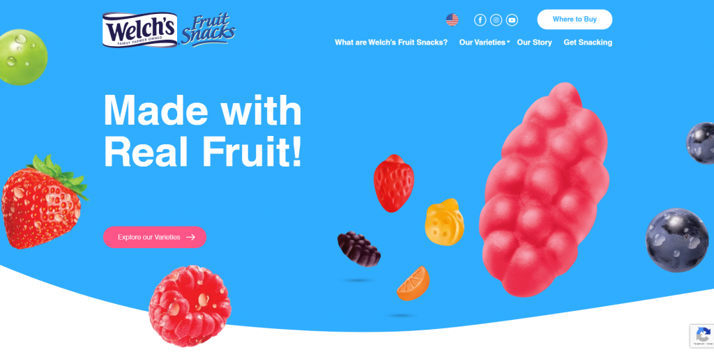
We used animation to educate audiences on the product category of Welch’s Fruit Snacks including their texture, benefits, and portion control.
5. Plenty
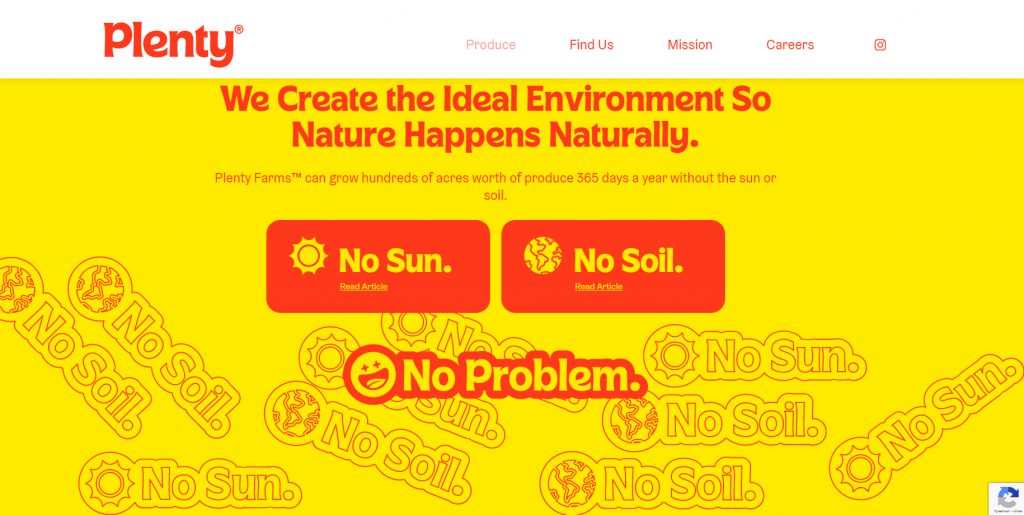
In collaboration with Plenty’s designers, we created a fun cursor animation that turns the arrow into a dot when hovering over a CTA brake section.
6. Affinity
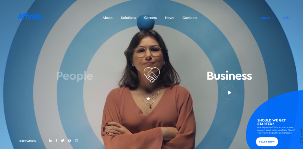
A consulting company specializing in technology and information systems, Affinity, chose a website layout packed with interactive elements and stunning graphics.
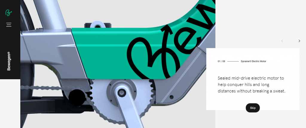
7. Bewagen
A bike share network, Bewagen, included scrolling-triggered animations for websites to make a compelling user experience.
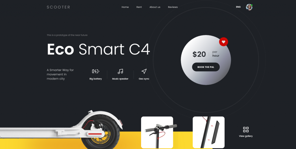
8. eScooter
A rental service website, eScooter, chose interactive animations for websites that get triggered either by scrolling or hovering to look professional and draw attention.
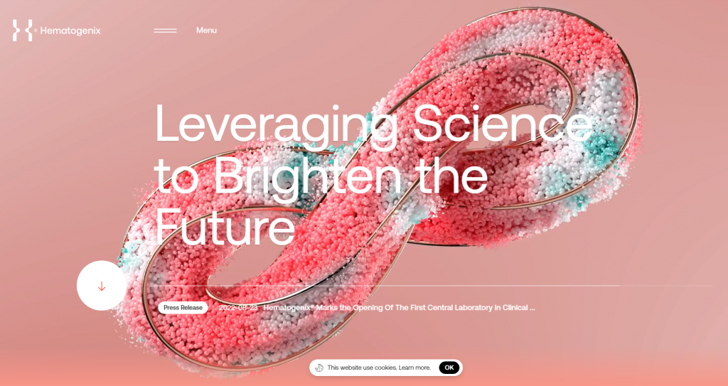
9. Hematogenix
A reference laboratory service provider, Hematogenix, implemented an animated hero image website animation that grabs the users’ attention instantly. They even included futuristic background music to keep their visitors engaged and absorbed in the content.
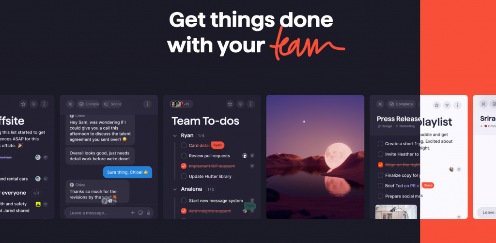
10. Superlist
As soon as you start browsing Superlist’s website everything starts to move around. From hover-triggered to automatic animation, Superlist offers a unique user experience.
5 Best Website Animation Tools
Looking to create eye-catching website animations like in the examples above?
Here are five popular tools that web designers use for creating animations for websites that capture user attention.
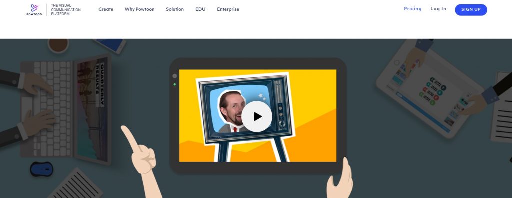
1. Powtoon
Powtoon is a video and visual communication platform available for free or for one of their three payment tiers:
- Lite: $15/month.
- Professional: $40/month.
- Business: $120/month.
Its main features include:
- Animated videos
- Video messaging
- Custom character building
- PowerPoint to Video conversion
2. Adobe Animate
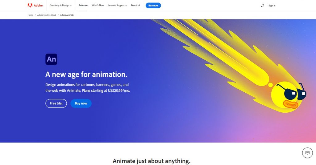
Adobe Animate is one of the most popular tools used for creating interactive website animations, doodles and avatars. It provides a trial version and comes in four pricing models:
- Adobe Animate Single App: $20.99/month.
- Creative Cloud All Apps: $54.99/month.
- Students And Teachers: $19.99/month.
- Business: $35.99/month per license.
Some of its main features include:
- Any platform publishing
- Frame-by-frame animation
- Interactive web banners creation
- Envelope deformer
3. Blender
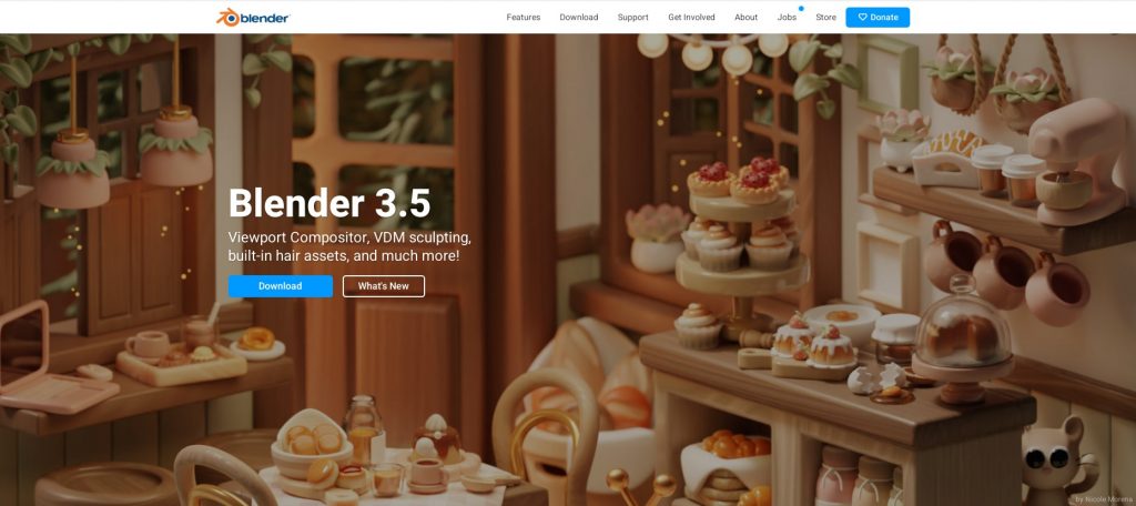
Blender is a free, open-source software, best used for creating 3D computer graphics (CG) content.
Besides including free technical and creative production, this tool also comes with the following features:
- Rendering
- Modeling
- Sculpting
- Animation & Rigging
- Video editing
- Scripting
- Simulation
4. Synfig
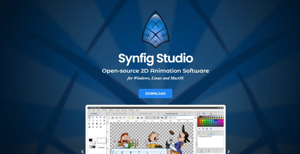
Syntig is another open-source platform, optimized for Windows, Linux and MacOS, best used for creating film-quality 2D animation.
Some of its main features include:
- Vector tweening
- Over 50 layers and filters
- Full-featured bone system
- Advanced controls
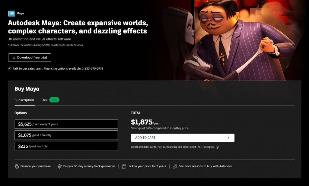
5. Autodesk Maya
Maya is a professional platform, best used for 3D website animations and visual effects. It offers three different payment plans:
- 3-year subscription: $5,625
- Annual subscription: $1,875
- Monthly subscription: $235
Some of its key features include:
- Powerful animation tools for 3D model crafting
- Polygon modeling
- Integrated Arnold renderer
- Time and graph editor
- Character setup
Create A Custom Website Design With Digital Silk
Looking for engaging animations for websites?
At Digital Silk, our award-winning designers build custom websites for brands across industries.
From custom animations to logo design and more, our full-service web design agency specializes in:
- Web design
- Web development
- Branding
- Content Creation
Partner with our experts on your website project to receive:
- Expertise: Our team is comprised of senior-level experts across web design and development, strategy, branding, marketing and more.
- A proactive approach: We create custom solutions that drive results. In order to deliver on this promise, we spend ample time researching and strategizing to find the solutions that work best for your brand.
- Customized solutions: Why work with a template when you have creative web design professionals at your disposal? At Digital Silk, we treat every project and every client as our own, offering custom recommendations and solutions throughout our partnership.
Contact our team to schedule a consultation for your digital project!
"*" indicates required fields
