43.6% of marketers say generating leads is their main goal.
While there are several ways to attract new customers and re-engage existing ones, having a visually appealing, brand-specific and engaging landing page can make or break your sales pitch.
In this post, we’ll list 30 product landing pages to inspire your design and offer useful tips to maximize conversion and engagement rates.
30 Best Product Landing Page Examples
94% of users form their opinions on websites based on their designs,
The effectiveness of your landing page in showcasing the quality of your products or services, as well as how well it aligns with your brand persona, core values and mission statement, directly affects your website traffic, conversion rates and return on investment (ROI).
Sometimes, landing pages may be home pages, so they often share the same design principles.
Below, we’ve compiled a list of 30 visually appealing product landing pages based on their visual appeal, usability and relevance to their target audiences.
1. Recess
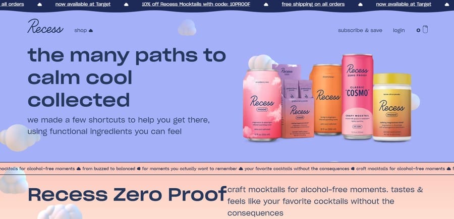
Recess’ vibrant and lively color scheme is its signature feature — it’s playful, inviting and instantly captures visitors’ attention.
The site’s hero section prominently displays its ‘Many paths to calm cool collected’ slogan, along with relevant on-page copy that highlights its unique value proposition of non-alcoholic beverages.
The hero section further flaunts the brand’s colorful range of products through high-quality visuals.
There’s also a cheeky footer pop-up that promotes discount codes for users who sign up.
2. Mooala
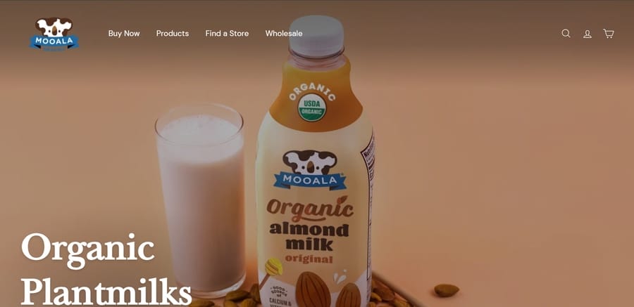
Mooala’s landing page features a simple, minimalist design with effective use of negative space to highlight the company’s organic and plant-based products.
The brand uses bold typography, a soothing color palette, large product images and a clear overview of its offerings to encourage visitors to explore further.
3. Beardbrand
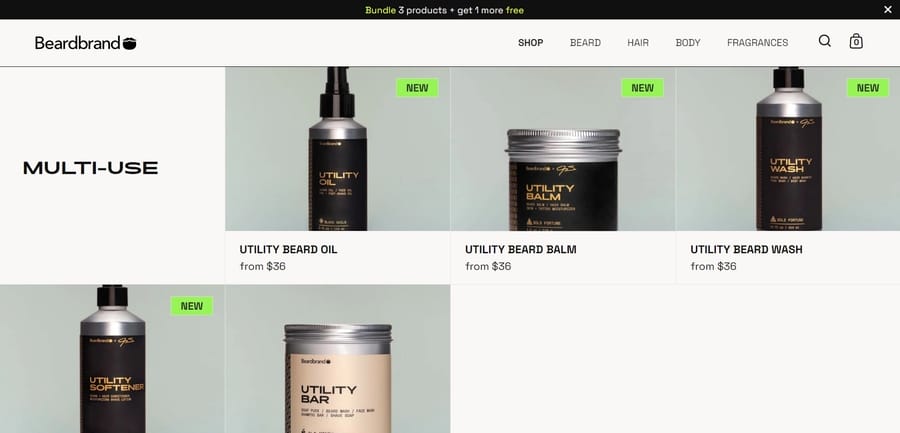
Beardbrand’s landing page narrates a story of bold and fresh scents, with complimentary notes of male self-care and grooming and base notes of fresh-smelling lifestyles.
Users can explore the brand’s selection of beard care products and fragrances through detailed product descriptions and real-life visuals, followed by a sweet bundle offer to save up on bulk purchases.
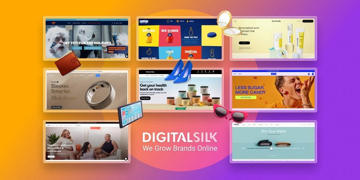
4. Behave Candy
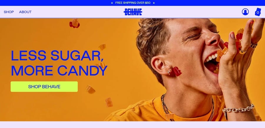
Selling low-sugar candy isn’t an easy feat — after all, you’re practically removing the signature vice that makes this guilty pleasure so indulging and addictive.
Luckily, Behave Candy takes on a more rebellious approach to marketing its more health-conscious products.
The brand’s strike-through logo plays down the ‘behave’ angle, i.e., the idea of restraint.
The vibrant color palette, composed of fiery orange, deep blue and neon yellow adds a jolt of energy into the brand, while the visually appealing design of its website contributes to its eye candy status.
5. Medik8
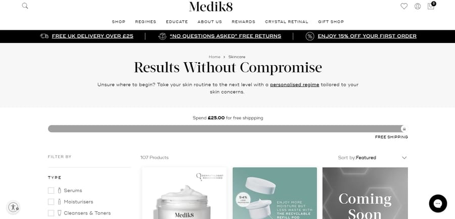
The skincare industry is a fiercely competitive and saturated market, so Medik8 aims to challenge some of the traditional products and everyday routines with cutting-edge ingredients and skin-friendly formulas.
Users can explore the brand’s products through simplified navigation menus, select appropriate ingredients based on their skin concerns and discover useful resources from in-house experts.
6. Oura Ring
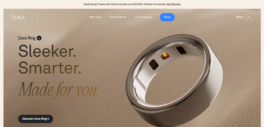
The Oura Ring, a wearable health tracker designed as a ring, is a niche product.
However, Oura has successfully broadened its appeal to a wider audience through sleek and ultra-modern animations, clear presentation of product benefits and practical tips for daily use.
The sticky navigation bar at the top gives users quick access to Oura Ring’s signature perks and functionalities, while the sandy-toned hero section features dynamic product visuals to showcase its streamlined design and versatility.
7. Perfect Keto
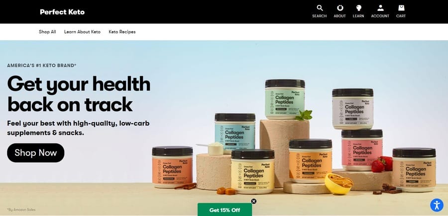
Perfect Keto strikes the sweet spot between highlighting their bars’ health and nutritional value and marketing them as tasty treats.
The hero section features impactful product visuals, a sliding banner with their core selling points and a dedicated testimonials section to reinforce social proof and industry authority.
8. Smalls
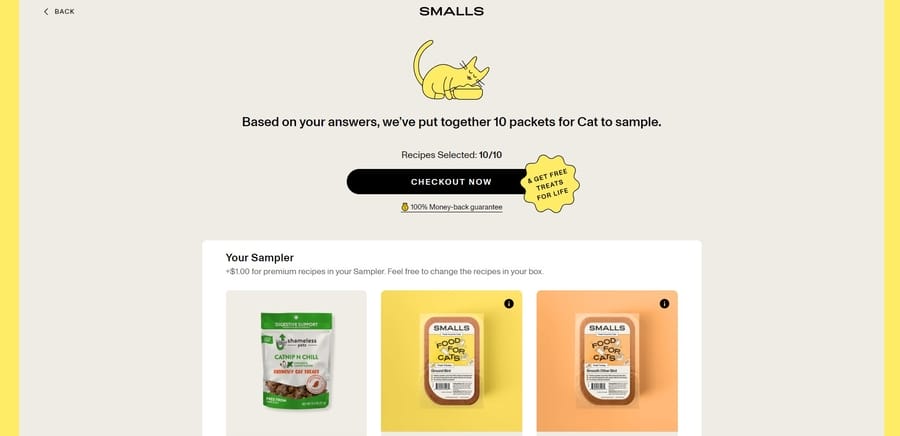
Most pet owners want only the best nutritional products for their feline friends and Smalls tries to establish emotional connections by emphasizing its #1 healthiest cat food vote.
The brand highlights its vet-approved formulas, offers risk-free samples to try out before committing to a purchase and includes customer satisfaction rates to support its claims.
Once users fill in a short questionnaire with their feline friend’s main concerns, they can choose suitable products from a list of recommendations.
9. Calm
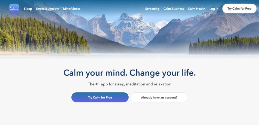
Most of us lead hectic lifestyles and often need extra time to unwind and recharge. Calm targets this exact pain point and brings a relatively straightforward solution — an app that helps users “stress less, sleep more and live mindfully.”
The page immediately encourages visitors to try out its services, including a free trial demo to get a taste for what the app offers. The au naturel background complements the white space underneath, keeping the CTAs in full focus.
10. Cowboy
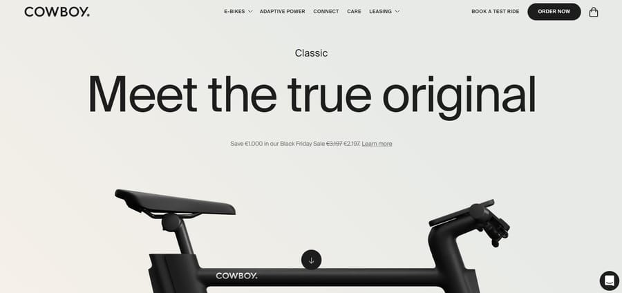
Users will hardly have any doubts about what product Cowboy’s landing page sells — the cheeky glimpse of the e-bike in the hero section and bold headlines immediately grab attention and spark curiosity.
The website encourages visitors to explore more of the e-bike’s features through dynamic scrolling, interactive elements and in-depth product descriptions.
11. Goby Toothbrush
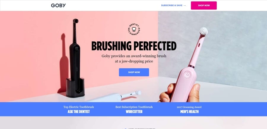
Toothbrushes typically lack exciting or attention-grabbing features, but Goby uses a clever website structure, comprehensive product anatomy overviews and a collection of impressive accolades to make its product appealing to users.
The “buzz on Goby” centers around its user-friendly design, ergonomic handling and powerful brushing technology.
Moreover, the site’s clean and modern design mirrors the brand’s promise of a simple and effective oral care routine.
12. Nauto
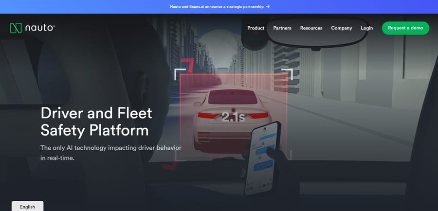
Nauto is an AI-driven driver and fleet safety platform that cleverly illustrates its unique selling proposition in its animated hero section.
Users don’t have to read through the on-page content as they can clearly see what the product is all about just by taking a quick look at the animation — which ultimately saves them time and effort.
13. Copper Cow Coffee
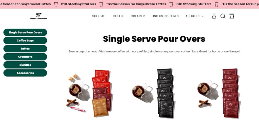
Copper Cow Coffee flaunts its sustainable, smooth and flavorful beverage on an orange-green landing page that features relevant imagery, compelling CTAs and quirky copy.
The website’s bold and playful design reflects the brand’s personality and values, encouraging visitors to discover the brand’s best sips.
14. Dollar Shave Club
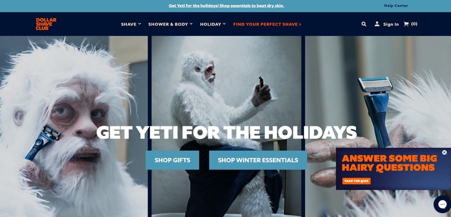
Dollar Shave Club’s latest design is inspired by the upcoming holiday season — it feels timely, relevant and human-centric and accurately conveys the brand’s unique personality.
The two large CTAs are easily noticeable amid the quirky and humorous background, while the small pop-up on the side prompts users to take a quiz to answer some “hairy” questions.
15. Thinx
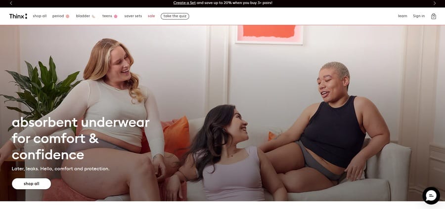
Shopping for feminine hygiene products is a breeze with Thinx’s intuitive, user-friendly and product-centric website design.
The clean, white background highlights the impactful hero section — an image that embraces body positivity, challenges the stigma surrounding female reproductive health and empowers women of all backgrounds to feel confident about their bodies.
16. Snooz
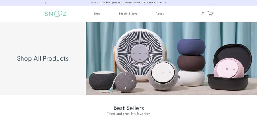
Snooz challenges the hustle-focused and sleep-deprived culture of the modern world and urges visitors to prioritize their sleep schedules and improve their general well-being.
The product is prominently showcased at the top of the page, so users can clearly see what it looks like and what its main purpose is.
17. Bellroy
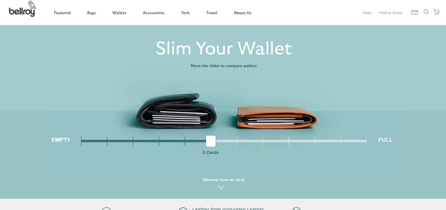
What better way for customers to visualize the quality of Bellroy’s wallets than with an automatic slider visual that clearly shows how the product can store several cards without getting too bulky?
This clever use of animation showcases the product’s functionality and adds an interactive element to the website and keeps users engaged.
18. Orangina
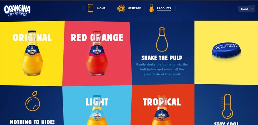
Once users get past Orangina’s bottle-filling loading animation, they’re greeted by a square-ish, colorful and dynamic homepage layout that’s fun and easy to navigate.
As visitors hover over each section, the images and text move in response — a playful design detail that adds to the brand’s quirky and energetic vibe. Orangina
19. Dr. Squatch
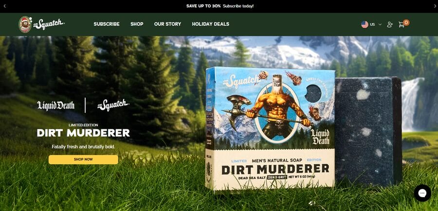
Dr. Squatch promotes rugged, fresh-scented and natural grooming products for men, with all three selling points prominently displayed in the hero section of the landing page.
With its earthy colors, bold typography and images of nature, the site offers a modern yet rustic feel that resonates with its target audience while providing valuable solutions to their concerns.
20. Tala
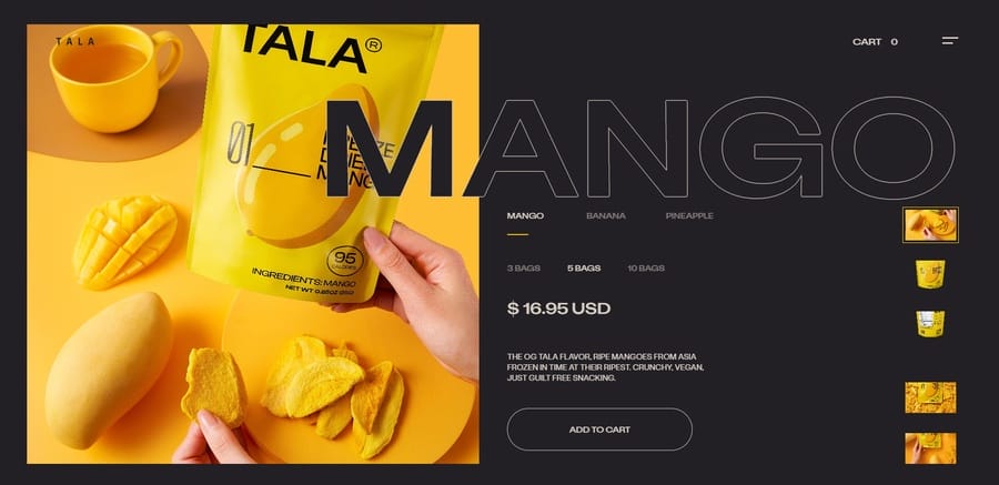
Tala’s scrumptious, no-sugar-added and all-natural mango snacks are beautifully showcased on their website through vibrant, descriptive images and an easy-to-browse product gallery.
The website landing page for product selection offers silky smooth transitions, detailed nutritional facts and a streamlined checkout process to speed up purchases.
21. Reel
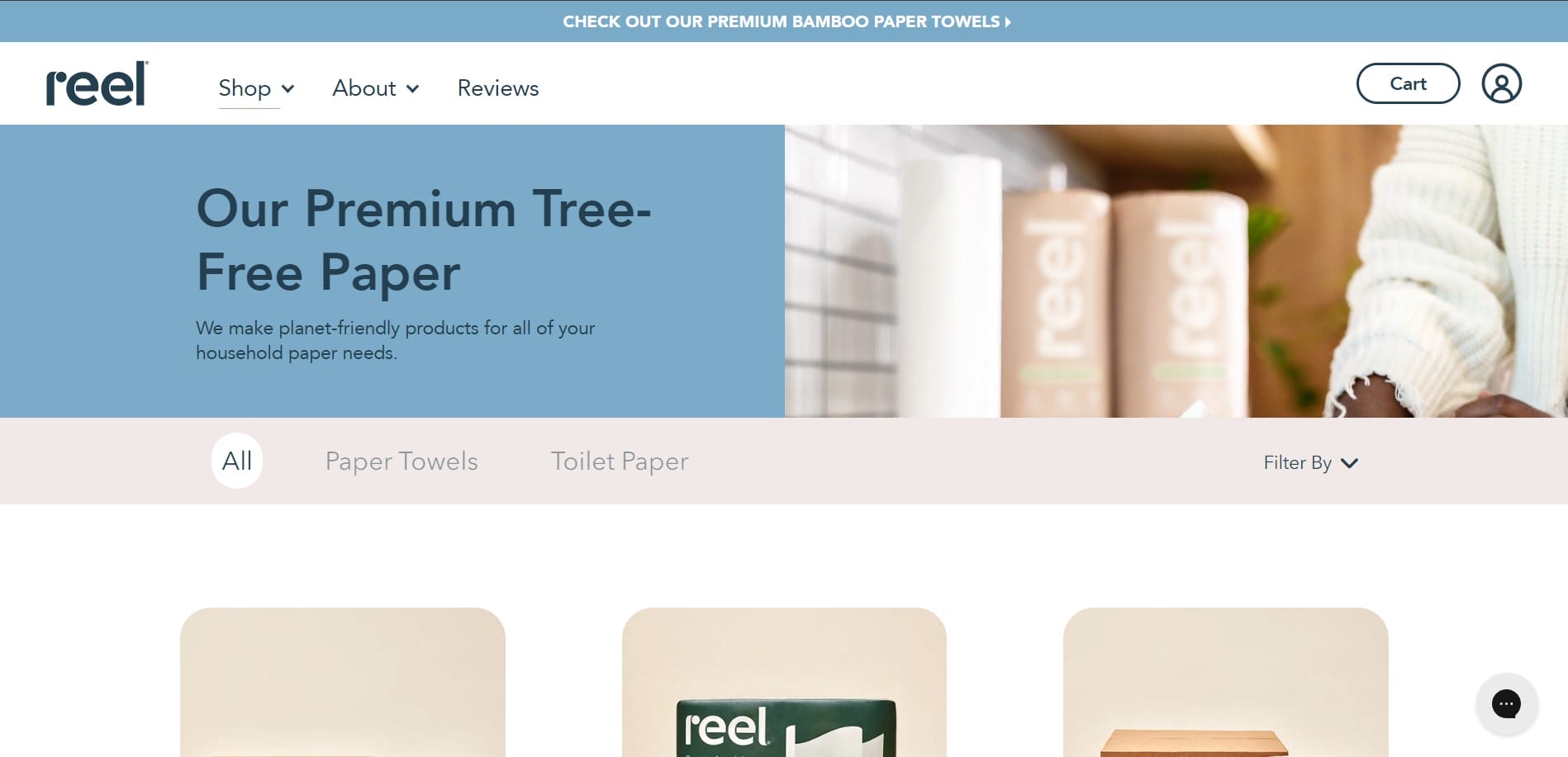
Reel’s tree-free and plastic-free paper production methods are its biggest selling point and the brand’s prodly flaunting its sustainable and authentic personality.
With a light and pastel color scheme, product-focused on-page content and eco-friendly design elements, the website effectively communicates Reel’s core values and mission to potential customers.
22. Birchbox
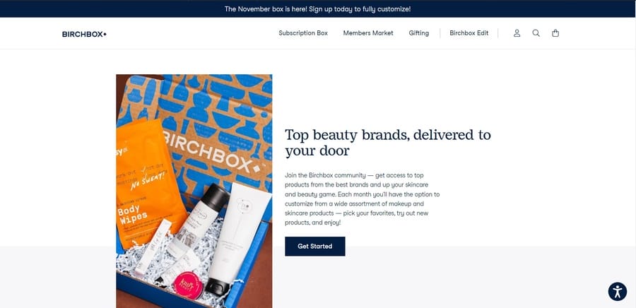
Birchbox makes clever use of white space, minimalistic design and simple but tasteful color choices to create a cohesive brand image and highlight its subscription service.
Its “Beauty that delivers” tagline takes on a literal meaning as Birchbox’s box of pre-selected beauty products gets delivered to customers’ doorsteps every month.
23. Blue Apron
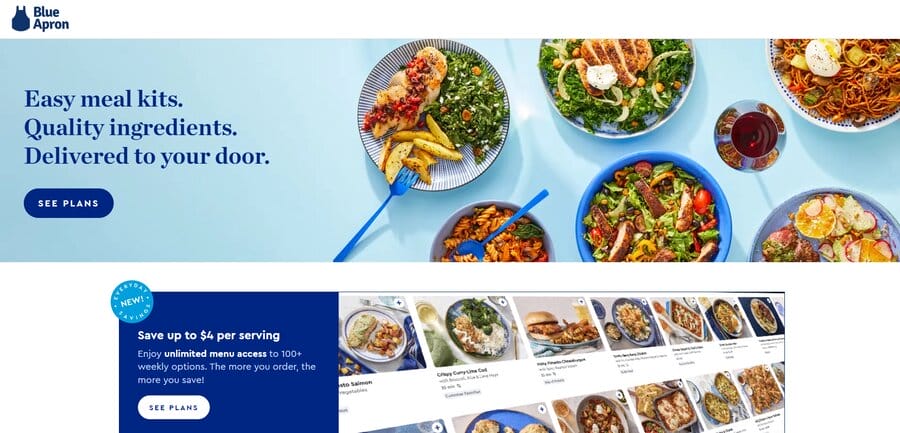
While there’s isn’t anything overtly glamorous or flashy about a meal ingredients and recipe kit company, Blue Apron uses a predominantly — you guessed it — blue color palette to illustrate some of its delicious offerings to its customers.
If the crisp, vibrant and mouth-watering visuals aren’t enough to get customers’ stomachs growling and entice them to click the “See Plans” button, then the succinct and enticing customer testimonials will certainly do the trick.
24. Judy
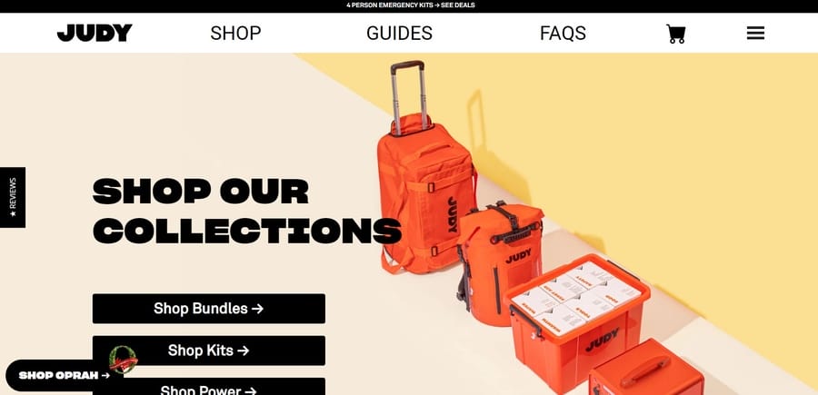
Users can ‘Ready, Set, Judy’ with the brand’s comprehensive range of outdoor and emergency gear that gives users exactly what they need — a durable, waterproof and easy-carry solution for on-the-move days.
Judy uses a sizzling hot red accent color throughout its landing page, complemented with a high-tech design and bold typography to convey a sense of confidence and reliability.
25. Bev
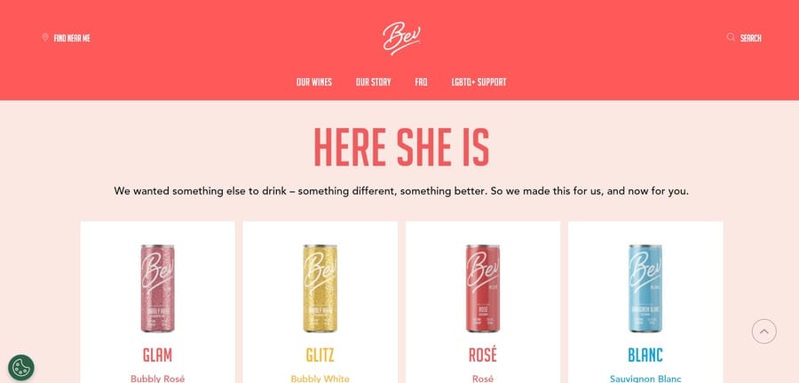
Bev sells wine in a can, which is already a unique selling proposition.
The brand enhances this uniqueness with ‘Here she is’ tagline and a playful, vibrant color scheme.
The landing page clearly guides users through each stage of the sales funnel — building awareness, capturing interest and converting leads into sales — with interactive elements, vibrant product images and a dedicated introduction to Bev’s story and values.
26. The Farmer’s Dog
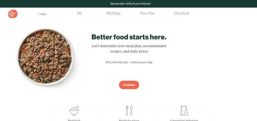
The Farmer’s Dog is another addition to the best product landing pages list that appeals to the connection between humans and pets.
The landing page flaunts the brand’s vet-approved and human-grade dog food offerings and features media recognition to establish credibility.
Perhaps the most interesting detail of the page appears right after the hero section — a visually appealing scroll-in graphic that illustrates the transformation of fresh ingredients into a ready-made food bowl designed for pets.
27. BarkBox
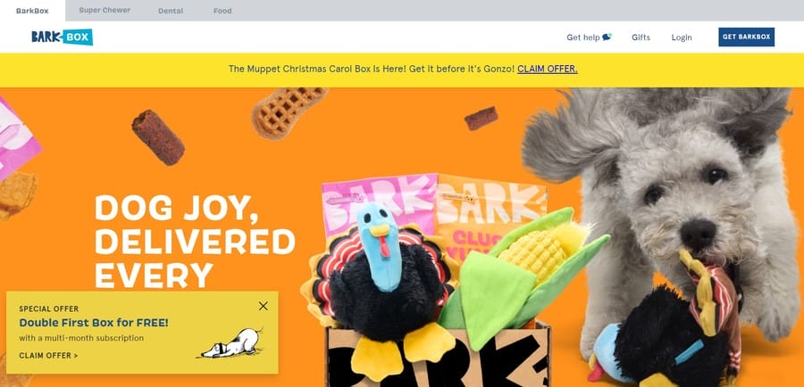
BarkBox uses a persona-based approach when designing its landing pages, with specific solutions and fun, relatable on-page content — a strategy that works well for its dog-loving, subscription-based audience.
The page works well because of its simplicity — it’s direct, to-the-point and uses saturated visuals that grab visitors’ attention.
28. Flewd
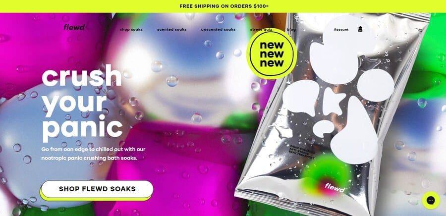
Flewd sells an interesting line of stress-reducing and nootropic bath soaks to help customers forget the daily grind and find inner peace.
The ‘Shop Flewd Soaks’ button takes center stage on the brand’s site and urges visitors to try their soothing spa-like products.
29. Apostrophe
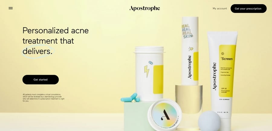
Despite its name, Apostrophe leaves nothing unsaid about the value of its acne treatment through a modern and minimalistic site that instills trust and confidence.
Users can engage in a virtual dermatologist visit to address their skin concerns, get proper support and guidance throughout their treatment and benefit from the brand’s skincare expertise.
30. Block Watches
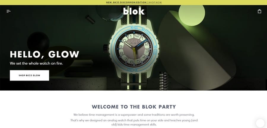
A watch that glows in the dark makes it easier to tell the time in dimly lit environments and Block Watches has the perfect solution to this need.
The brand’s landing page emphasizes its innovative product features, with bold typography and stunning images that highlight the glow-in-the-dark feature.
Digital Silk’s Landing Page Example
Digital Silk uses data-driven and research-backed strategies to design high-converting and brand-specific landing pages to drive more traffic and increase engagement.
Our team designed Karaz App’s landing page to reflect the brand’s unique value proposition, core values and target audience.
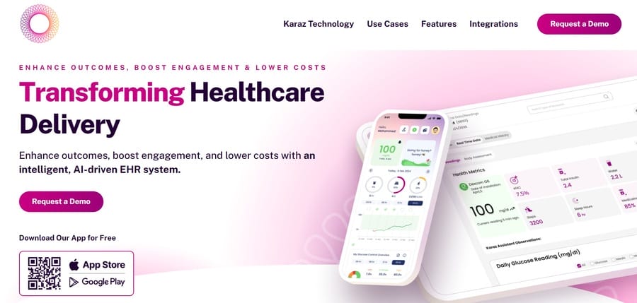
Our experts used the tagline “Transforming Healthcare Delivery” to illustrate the app’s unique features as an AI-powered EHR system.
The app monitors real-time patient metrics and insights for personalized care, offers action plans for users to achieve their health goals and gives access to a proactive and health-conscious community.
The page’s design uses a pinkish-purple color palette to convey health and wellness, showcases a QR code to download the app easily and includes industry recognition and certificates to build trust and credibility.
Key Elements To Include On A Landing Page
59% of users spend more time on well-designed websites compared to basic ones.
To capture and maintain a user’s attention, you should include several key elements into your landing page design:
- Problem-focused and memorable headline: Your headline should be clear, relevant and relatable for the target audience. With clear and memorable messaging, you can build trust and ensure potential clients recall your brand while browsing other sites as well.
- Solution-based sub-headings: Once you establish the problem, you should offer a signature solution while explaining what you do, who you do it for and why. When you offer a solution to consumers’ problems, you show them you care and are willing to help.
- Compelling calls-to-action: Brands should build their websites with a conversion funnel in mind, so that the right CTAs come up at the right time. Don’t push for a CTA too early in the buyer’s journey, as they may not yet feel confident in your brand. Instead, incorporate CTAs naturally within the content, after you’ve established value and built credibility.
- Clear visuals and product descriptions: On average, users spend 5.94 seconds looking at the main website image, so choose your landing page images wisely. Use high-quality visuals that effectively showcase your product or service and include concise but engaging descriptions to entice potential customers.
- Testimonials and social proof: Word of mouth can be a powerful marketing tool and testimonials from satisfied customers can help build trust and credibility for your brand. Include positive reviews or ratings from previous clients on your landing page to show potential customers the value of your product or service.
How To Track Landing Page KPIs
Both new product launch landing pages and existing ones should monitor KPIs to measure progress and evaluate the effectiveness of the design:
- Website traffic: The number of page views and unique visitors indicates the overall traffic to your landing page. This helps you assess how many people are interested in your product or service and how well the landing page attracts potential customers.
- Conversion rate: This is the percentage of users that move in the preferred direction and take the desired action. To calculate the conversion rate, take the total number of visitors and divide it by the number of conversions.
- Bounce rate: This metric reflects the percentage of users that leave the website after looking at only one page. Higher bounce rates may point to issues with your landing page design or targeting the wrong audience.
- Form submission: If your landing page includes a form for visitors to fill out, tracking the number of submissions can show how many people are interested in your product or service. Consider offering a free trial or discount to encourage more engagement.
- Cart abandonment rate: This measures how many visitors add items to their cart but do not complete the purchase. Try to keep this at a minimum by creating a seamless checkout process or addressing common issues like high shipping costs or unclear return policies.
Design Your Landing Page With Digital Silk
At Digital Silk, we specialize in creating high-converting, user-centric and visually appealing landing pages that effectively communicate your brand message and drive organic traffic.
Our expert team of web designers, developers, branding and marketing specialists follow industry-leading practices to deliver engaging and SEO-optimized digital solutions.
As a professional web design agency, our services include:
- Custom web design and development
- eCommerce development
- Branding services
- Brand naming and logo design
For each partnership, we offer complete transparency, ongoing communication and take full project ownership at every stage of its lifecycle.
Contact our team, call us at (800) 206-9413 or fill in the Request a Quote form below to schedule a consultation.
"*" indicates required fields
