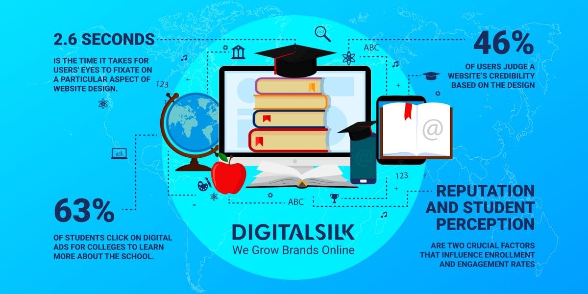
63% of students click on digital ads for colleges to learn more about the school in question.
From there, they’re likely redirected to your homepage to explore courses, fees, scholarships and campus details.
Since it takes about 2.6 seconds for users’ eyes to fixate on a particular aspect of website design, universities don’t have the luxury of an extra moment to impress.
In this post, we’ll review some of the best university websites with signature designs that capture the attention of prospective students.
30 Best University Websites
59% of users would rather consume content that’s beautifully designed as opposed to basic layouts.
Since universities rely on their reputation and student perception to boost enrollment, having a user-friendly and easy-to-navigate website is the heart of their marketing strategy.
When we were making the list of the best university websites, we focused on sites that provide great user experience and feature clear navigation.
In the following examples, the information and resources the students may need are also easy to find, while the design highlights each university’s values and unique identity.
1. University of Pennsylvania
Standout Feature: Streamlined and straightforward user navigation
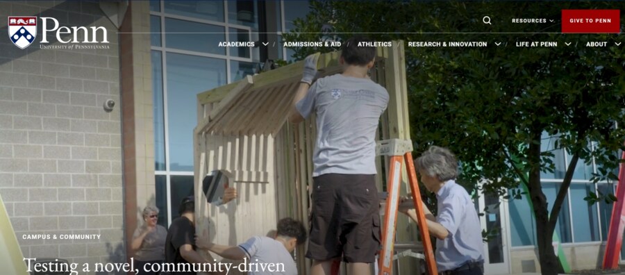
Benjamin Franklin founded UPenn as one of the nine colonial universities before signing the Declaration of Independence.
The college’s website reflects its rich history and reputation through clean and sophisticated navigation, sleek typography and engaging dynamic hero visuals.
Each page maintains a consistent brand identity, with stunning campus visuals and helpful student information.
2. Bates College
Standout Feature: Colorful and engaging design
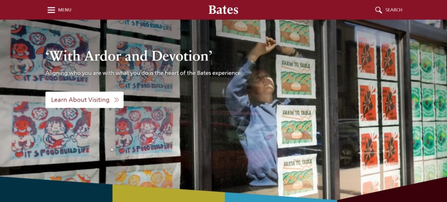
Bates College combines a vibrant and dynamic layout with clever use of white space and clear website navigation.
The homepage embraces diversity and inclusivity with images of students from different backgrounds and showcases the university’s welcoming community.
The website’s user-friendly and intuitive interface offers easy access to important information — introductions for prospective students, academic programs, calendars and important dates.
3. University of Wyoming
Standout Feature: Consistent branding and storytelling
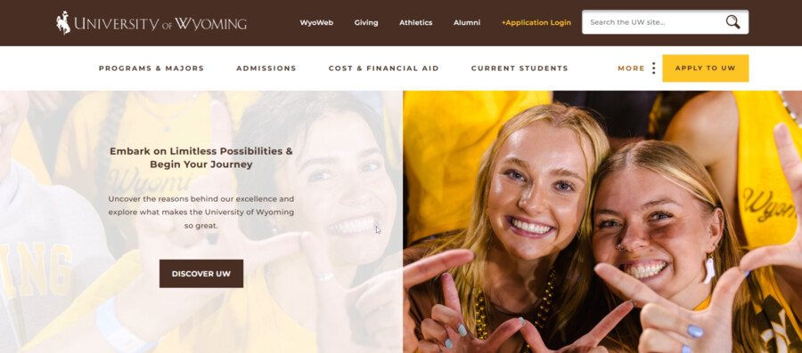
Despite having a seemingly simple design, the University of Wyoming implements a signature color scheme and course catalog to connect with students.
The website feels like an extension of the university’s branding, with the latest data on course programs, admissions requirements and campus tours.
4. University of Chicago
Standout Feature: Bold typography and impactful visuals
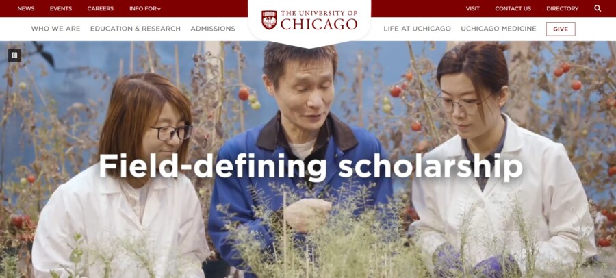
The University of Chicago’s homepage makes a bold statement with its unique, dynamic visuals and engaging copy.
The images portray students’ academic excellence, research and scholarship opportunities and unique campus life.
It’s more than just a website — it’s an immersive experience that captures the essence of the university and its prestigious reputation.
5. Pepperdine University
Standout Feature: Multiple sub-domains for all in-house colleges
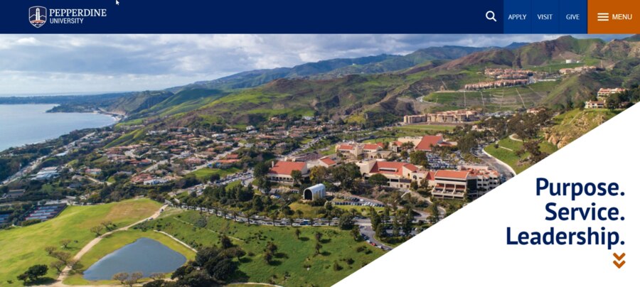
Pepperdine University takes brand management to a whole new level by including sub-domains for all its departments and branches.
This all-inclusive approach serves as a one-stop shop for students interested in a specific program.
The site’s breathtaking visuals and solid use of white space don’t hurt either — they complement the university’s coastal location and surrounding campus areas.
6. Princeton University
Standout Feature: Empowering language and well-rounded design
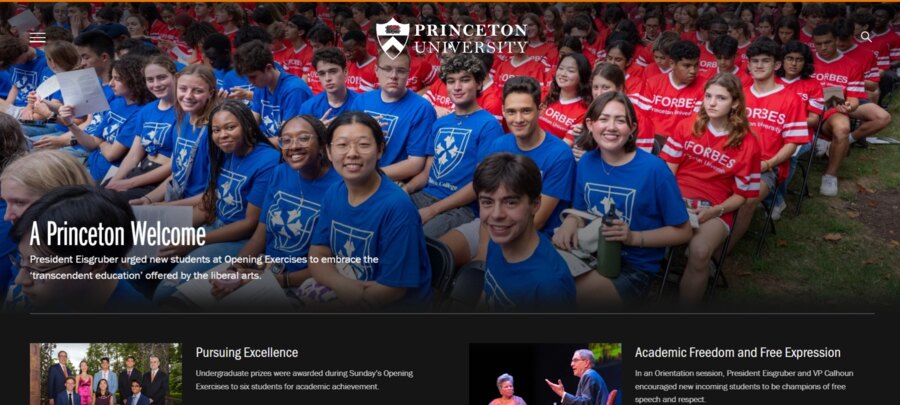
Princeton University‘s website reflects its status as a prestigious Ivy League institution, exuding excellence and prestige.
Its signature branding, emphasis on community and inclusivity and minimalist font design deliver a powerful message — anyone, regardless of their background, can thrive at Princeton.
7. Kentucky Community And Technical College System (KCTCS)
Standout Feature: Human-centric design and integrated job references
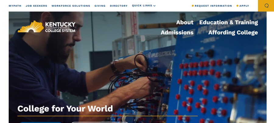
Kentucky Community and Technical College System boasts a ‘College for Your World’ communication strategy to entice students from all walks of life.
The hero section features sleek and contemporary typography, resourceful job search tools and visually appealing dynamic images.
8. Rhode Island School Of Design
Standout Feature: Scroll-in navigation
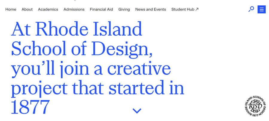
At first glance, Rhode Island School of Design’s website seems plain, with plenty of white space and large typography.
But the clever use of scroll-in navigation creates an immersive experience, with different visuals popping in and out of view as you go down on the page.
This serves as a testament to the school’s focus on hands-on learning and experimentation in various fields of art and design.
9. Virginia Commonwealth University
Standout Feature: Strong sense of community and belonging
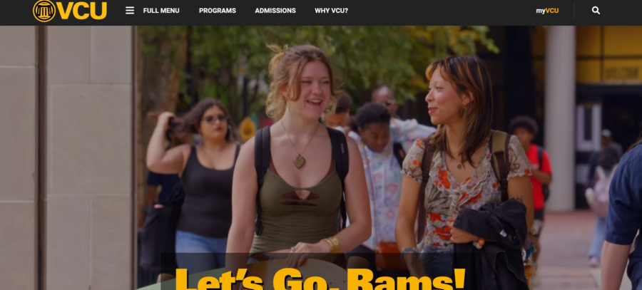
VCU’s vibrant and inclusive homepage reflects the university’s diverse and welcoming community.
It uses vivid colors, animated and engaging visuals and student testimonials to reinforce that sense of belonging and mutual respect.
The college focuses on community-based learning and civic engagement, which appeals to prospective students and reinforces connections with old ones.
10. University of Notre Dame
Standout Feature: Faith-based education and culture
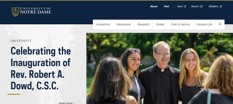
You don’t have to be devoutly religious to appreciate University of Notre Dame’s dedication to its Catholic faith and values.
Notre Dame’s homepage reflects this identity through its design and on-page content, with elements of tradition, spirituality and cultural fluency.
11. Ferris State University
Standout Feature: Hands-on learning and motivational copy
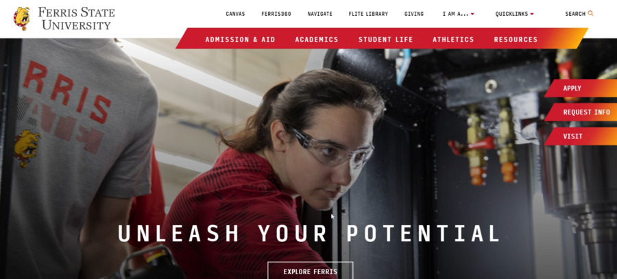
Ferris State University’s website feels like a pep talk for students — it’s direct, informative and authoritative.
With tailored calls-to-action, personalized and informative content and prompt access to admissions and student aid details, the site offers a clear roadmap for prospective candidates.
12. Oberlin College and Conservatory
Standout Feature: Modern interface with signature branding
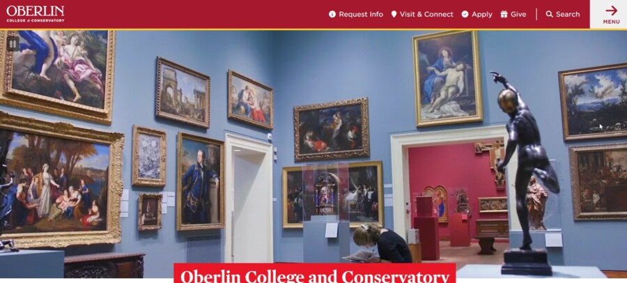
Feel inspired by Oberlin College and Conservatory‘s inviting and intuitive website design as you delve into the school’s course catalog and student resources.
The site reflects the university’s state-of-the-art facilities and innovative programs, with easy-to-access interactive maps and virtual tours.
13. Adelphi University
Standout Feature: Personalized approach to admissions and student support
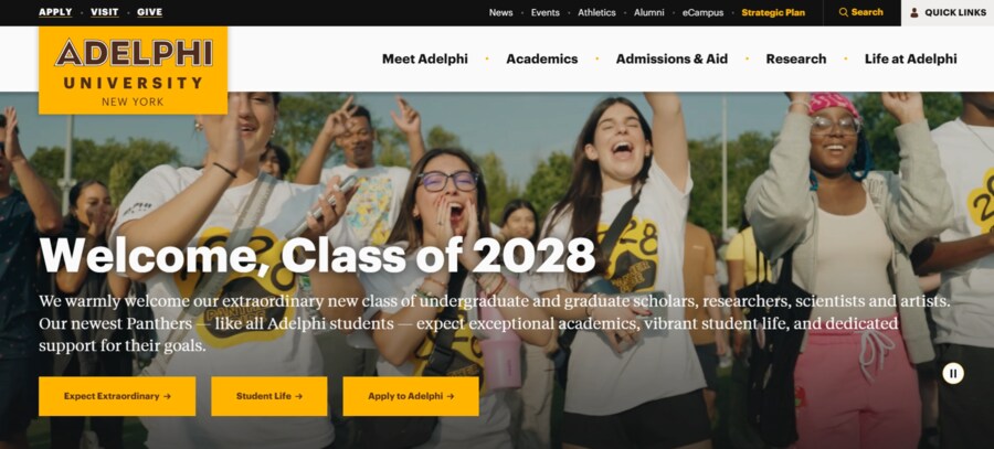
Adelphi University’s website is all about making students feel seen and supported — it feels like a tight-knit community that values individuality and diverse perspectives.
The bright yellow accents give the site its signature warmth while the hero banner is nothing short of inspirational and inviting.
14. Duquesne University
Standout Feature: Beautiful interface with motivational copy
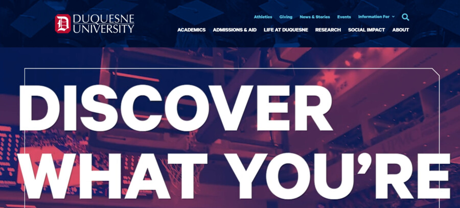
The website’s boxy navigation and inspirational hero section are the heart of Duquesne University’s contemporary and vibrant feel.
The user navigation takes on a persona-based approach, with drop-down menu sections and tailored content for both new and current students.
15. College Of DuPage
Standout Feature: Cohesive green color theme
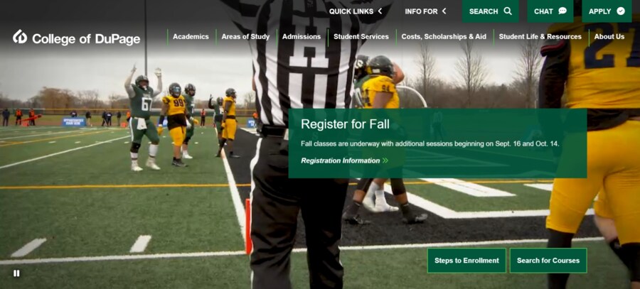
College of DuPage’s sleek homepage takes its branding to new heights without overwhelming its visitors.
It features smooth transitions, gray gradients on the navigation panel at the top, accessible CTAs and its signature mascot embedded at the bottom.
16. Howard University
Standout Feature: College mission clearly displayed with responsive design
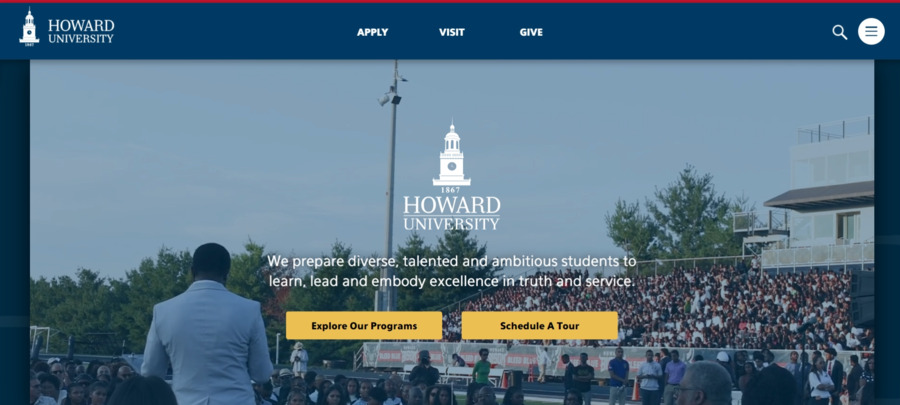
The Howard University homepage looks like a well-designed PowerPoint presentation, with visually engaging images and interactive elements.
As you scroll down, you’re greeted by useful statistics regarding the university’s history and community, a dedicated blog section with useful information and alumni testimonials to reinforce the school’s image.
17. Georgetown University
Standout Feature: Content-rich website with clear navigation
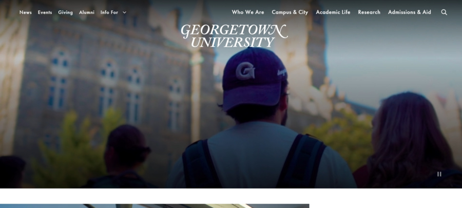
Georgetown University flaunts its rich history and prestigious reputation through its homepage — it features student-relevant articles, detailed event guides, news sections and social media plug-ins.
This omnichannel and comprehensive approach gives students a well-rounded understanding of its culture, academics and campus life.
18. University Of Iowa
Standout Feature: Contrasting color scheme for better readability
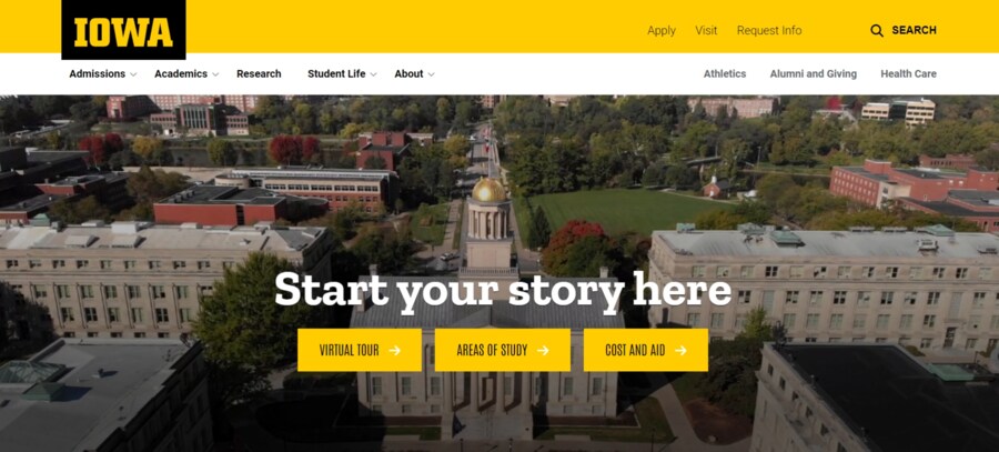
Users with visual impairments will find Univeristy of Iowa’s website a pleasure to navigate thanks to its contrasting color scheme.
The large white letters pop against the signature hero section, with eye-catching yellow CTAs and a simple yet impactful layout.
19. University Of Washington
Standout Feature: Donations and fundraising integration
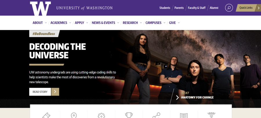
Giving back to the community is at the forefront of UW’s mission and its website shows the university’s dedication to its humanitarian cause.
Donating through the page is a breeze — with several payment solutions, donation amount options and easy-to-use forms.
The prominent icons on the site immediately draw users’ attention to its most important features.
20. Florida A&M University
Standout Feature: Creative use of signature colors
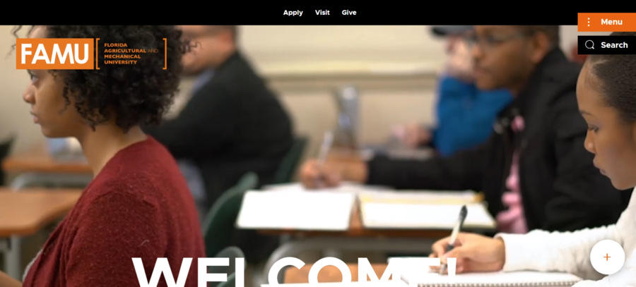
Florida A&M University nails the website color scheme game by featuring two of its trademark colors — green and orange — in every aspect of their homepage design.
The on-click side navigation menu is a nice touch since it doesn’t interfere with the content on the main page but is still visible out the corner of your eye.
21. Wheaton College
Standout Feature: Student-centric image slider on hero section
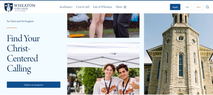
Most examples of higher education website design have student-oriented content, but Wheaton College kicks things up a notch by dedicating an entire section to athletics, including recitals on events calendars and Christian friendship orientation programs.
The minimalist navigation panel at the top fits well with the college’s simple yet effective image.
22. Massachusetts Institute Of Technology
Standout Feature: Futuristic design with complementary navigation
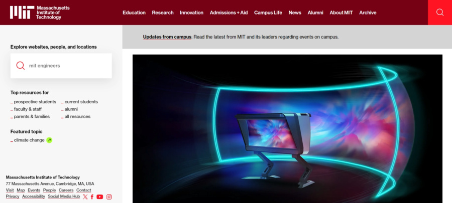
With a name as prominent as MIT, you’d expect a website that’s on par with the university’s reputation and that’s exactly what it delivers.
The juxtaposition of the website’s futuristic hero section and the static navigation panel on the left is a delightful and perhaps intentional touch.
23. Kennesaw State University
Standout Feature: Easy-to-use branded website
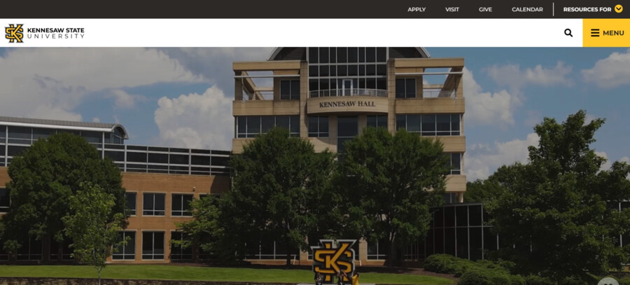
Kennesaw State University ditches flashy design elements and instead focuses on a clean and streamlined user interface.
The website uses an interesting approach to student orientation by allowing visitors to choose their interests first and then suggesting suitable courses and career paths.
24. Juniata College
Standout Feature: Powerful storytelling through visuals and copy
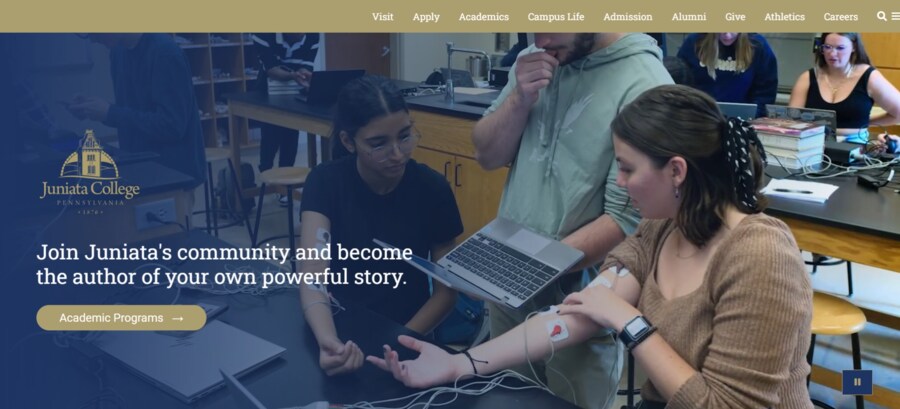
Juniata College empowers its students to take charge of their careers and develop their academic skills to new heights with compelling copy, relevant statistics and impactful imagery.
The homepage highlights the school’s mission statement and its commitment to experiential learning.
25. The University Of Texas At Austin
Standout Feature: Consistent branding and visual identity
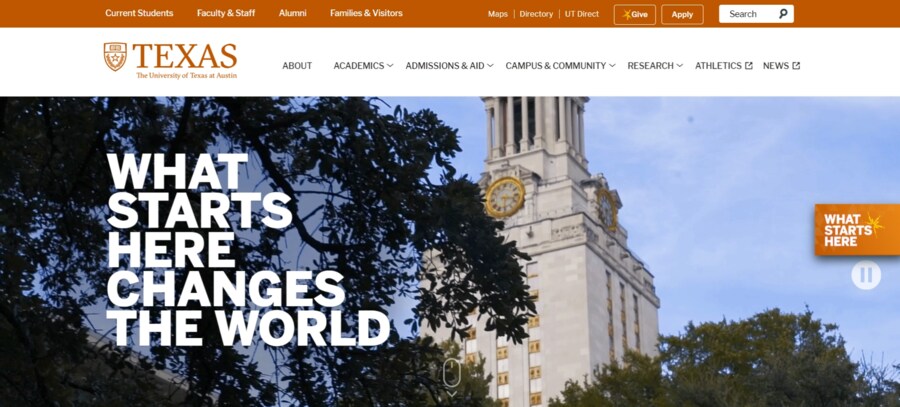
The high-resolution hero image and bold typography are two standout features of the University of Texas at Austin website.
The use of deep orange accents — the university’s signature color — throughout the site further reinforces its strong branding and signature identity.
26. Alverno College
Standout Feature: Typography takes center stage
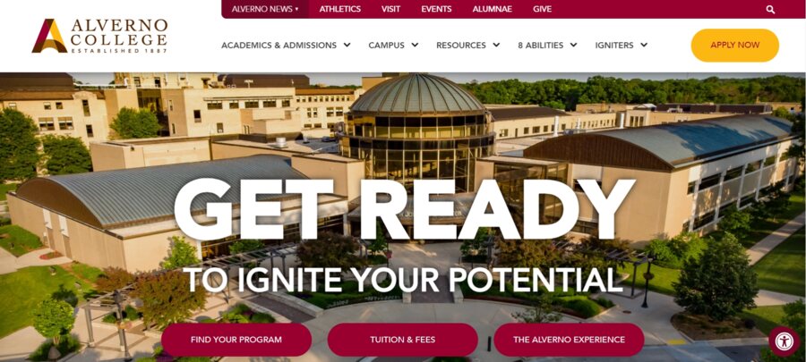
Nothing draws visitors’ attention more than big, bold and brilliant typography. It doesn’t have to be long either — short, sweet and to the point — is exactly the formula Alverno College used.
Users can explore signature study programs, teacher feedback policies and upcoming events all in one place.
27. Roosevelt University
Standout Feature: Interactive and engaging user experience
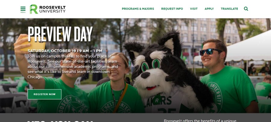
Roosevelt University’s site has a well-organized homepage with clearly visible CTAs that give users straightforward pathways to relevant information.
The on-page content also emphasizes the university’s more affordable price range compared to other options, which serves as a strong selling point for prospective students on a budget.
28. Flagler College
Standout Feature: Small institution with big design ideas
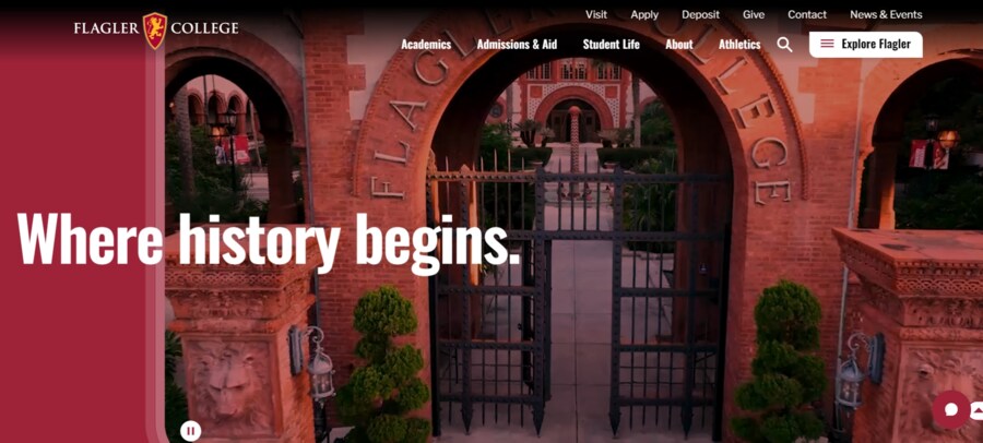
Despite being a small-scale educational institution, Flagler College has large-scale plans with its homepage design.
The all-red hero section you see when you first open the page changes colors as you scroll down and the visuals clearly depict the school’s culture and campus, coupled with a convenient pause button for better accessibility.
29. McGill University
Standout Feature: Clean and minimalist design with plenty of white space
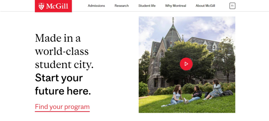
Despite featuring a somewhat subdued design with no apparent animations or embellishments, McGill University effectively showcases essential student information through on-page copy.
Everything looks like a well-oiled machine — compelling CTAs and community testimonials, a simplified navigation menu and useful program resources and links.
30. Loyola University Maryland
Standout Feature: Green is the new black color palette
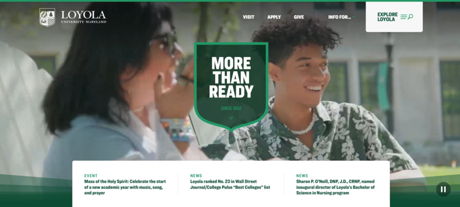
As one of the oldest Jesuit universities in the United States, Loyola University Maryland celebrates its Catholic values through mostly green accents and fantastic visual clarity.
The navigation bar at the top showcases three main CTAs — visit, apply and give — which direct users to three high-demand and high-value pages for the institution.
Digital Silk’s Best College Websites
American University In Bulgaria
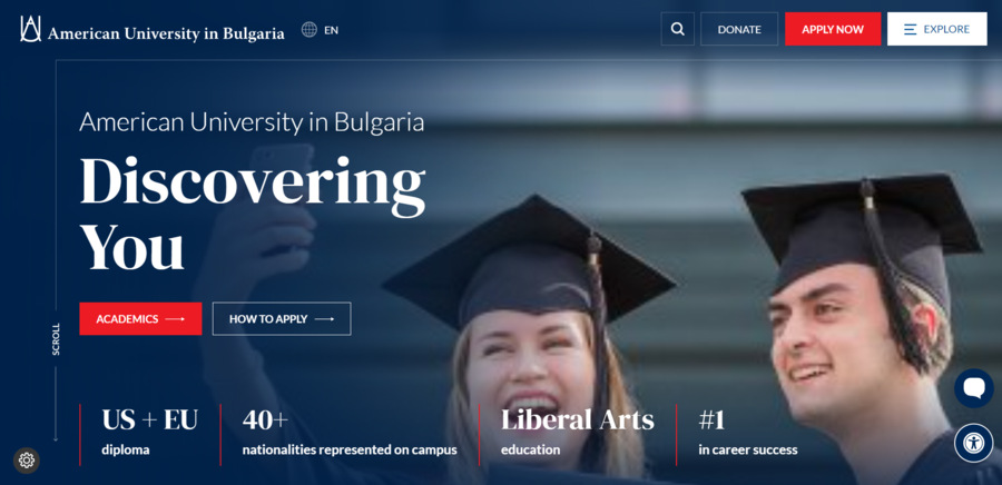
We designed American University in Bulgaria’s website to reflect the school’s signature academic opportunities and student experience.
With high-contrast design elements, compelling alumni testimonials, advanced search features and clear calls to action, the website effectively captures the attention of potential students and encourages them to learn more.
Northwestern University Medill School
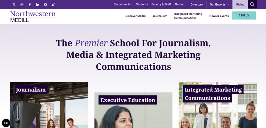
The purple color palette, modern layout and visually appealing images are the focal point of Medill School’s website.
It feels clean, informative and student-focused with complete content about programs and positions, a sticky menu with drop-down visuals at the top and specific CTAs throughout the website.
Key Elements Of Successful University Website Designs
The best university website examples have several elements in common that attract and engage users, including:
- Optimized UI and CTAs: Focus on a user-friendly interface and strategically placed CTAs to capture visitors’ attention. Since users spend about an average of 6.44 seconds focused on the home navigation menu, every feature counts. Use relevant micro-interactions, clear and concise copy and visually appealing imagery to guide visitors towards essential actions, such as scheduling campus tours or filling out applications.
- Search Feature: Most students don’t have the patience to sift through pages of information on a university website. Including an advanced search feature makes it easier for them to find specific information.
- Event Calendars: Universities usually have lively calendars with numerous events, webinars and informational sessions for prospective students. Having a dedicated event calendar on your website offers a centralized and organized approach to keeping your target audience updated on the latest news.
- Student Blog Section: This gives current students a platform to share their insights and experiences with others and create authentic representations of campus life. A notable 80% of users interact with blogs and social media posts, so this can be an effective way to reach your target demographic.
Best Practices For Designing College Websites
Only 36% of higher education students have ‘quite a lot’ or ‘a great deal’ of confidence in their education.
As such, universities need to create an effective online presence that attracts new students and instills confidence in the quality of education offered.
1. Include Alumni Success Stories
Your target demographic can’t possibly imagine life on campus if they can’t see themselves prospering there.
Testimonials help new students relate to people who’ve already experienced that life and gain valuable insight into achieving their academic dreams.
You can also establish mentorship programs that connect prospective students with alumni in their field of interest.
This serves as both a networking opportunity and a chance to discuss career prospects and options available after graduation.
2. Prioritize Accessibility
Universities should create websites that serve all potential students, allowing them to engage with the academic content and services they need, without barriers.
To do this, you should ensure that all interactive elements — such as links, forms, and buttons — are fully navigable using a keyboard alone. This is crucial for users with motor disabilities who can’t rely on a mouse.
Features like clear focus indicators help users understand where they are on the page, enabling them to complete tasks like finding the admissions page or submitting an application.
For visually impaired users who rely on screen readers, you should code your websites using semantic HTML and ARIA landmarks.
This ensures that content, like course descriptions or class schedules presented in tables, is properly interpreted and read aloud.
Moreover, you should provide descriptive alt text for images, charts and graphs to ensure that users with visual impairments understand non-text content.
Additionally, transcripts for video and audio content make multimedia accessible to all users, including those who rely on text-based alternatives.
3. Include Virtual Tours
Most students, especially international and out-of-state ones, may not be able to visit campus in person.
Virtual tours allow them to explore the campus and get a feel for the environment without physically being there.
In this way, they can visualize themselves as part of the community, which can be a determining factor in the student decision-making process.
Design Your University Website With Digital Silk
As a recognized web design company, Digital Silk’s team has extensive knowledge and experience in designing, developing and optimizing websites across industries.
We understand the intricacies and unique needs of the saturated higher education market, which is why we focus on creating custom, user-centric and appealing university websites.
Our services include but aren’t limited to:
Have a web design project in mind?
Contact our team, call us at (800) 206-9413 or fill in the Request a Quote form below to schedule a consultation.
"*" indicates required fields


