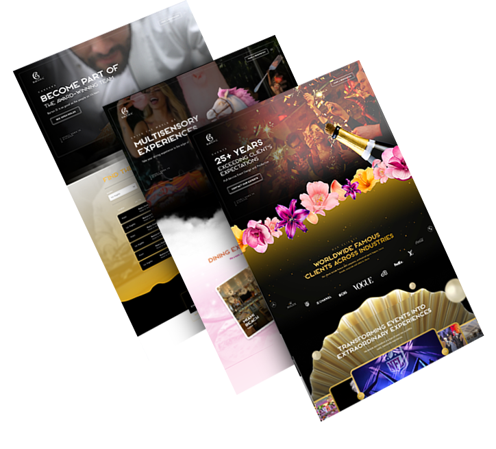
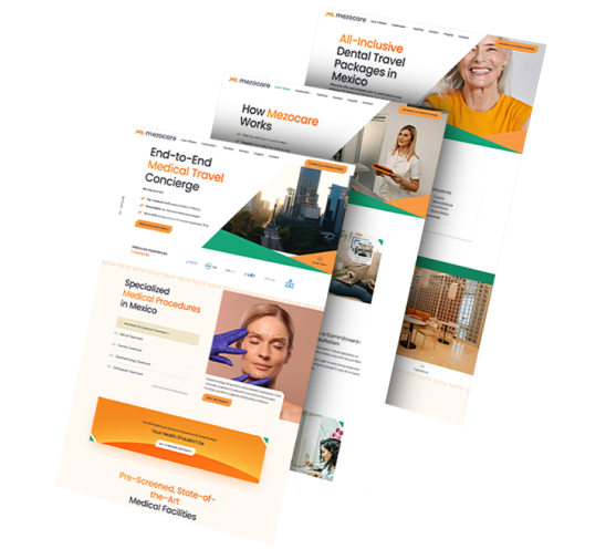
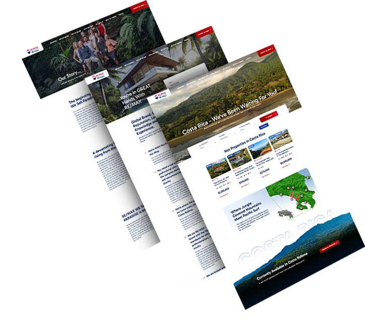
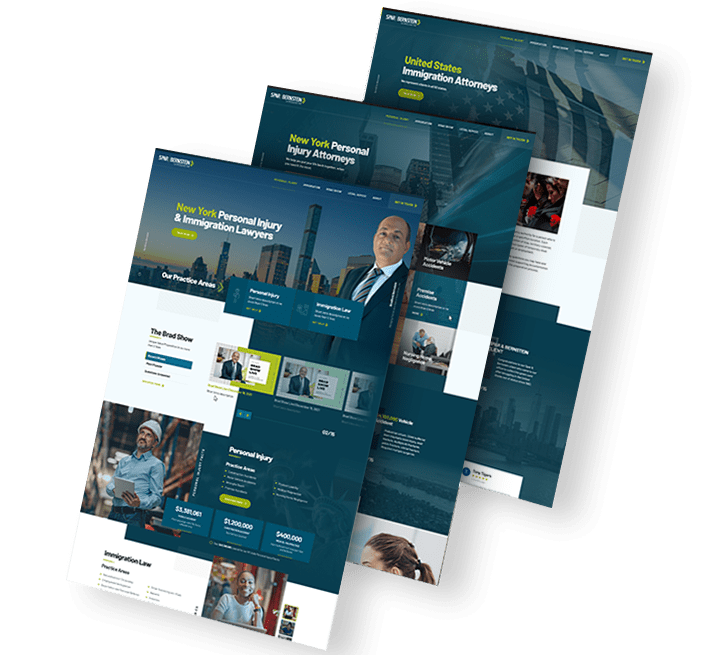
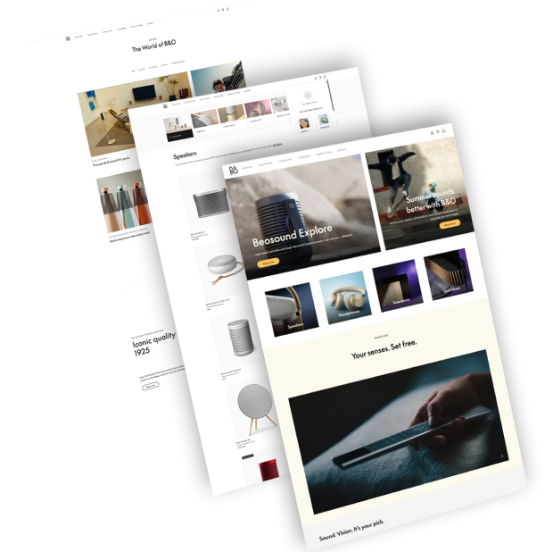
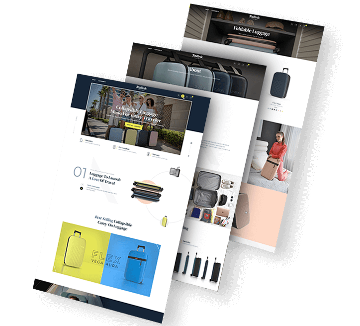
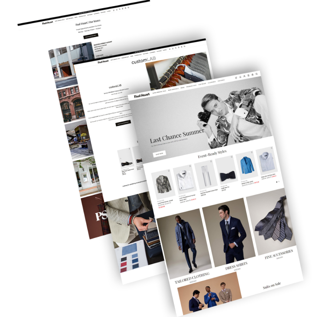
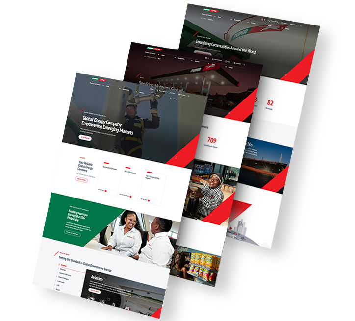
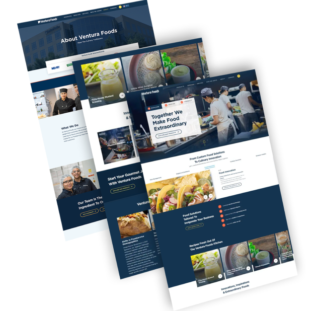
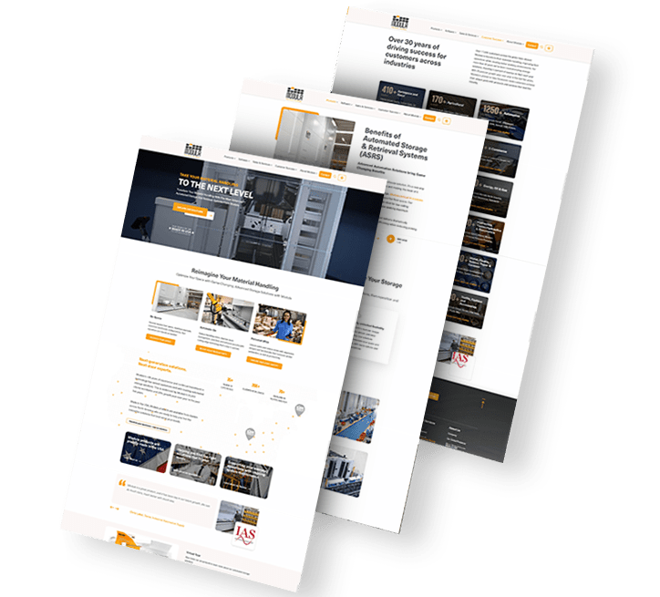
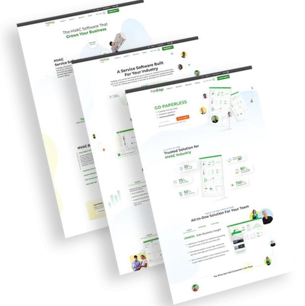
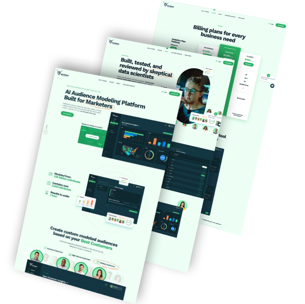
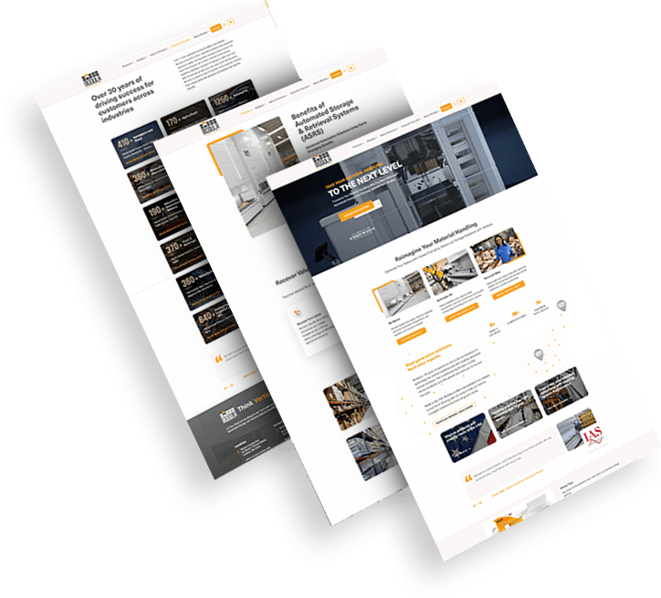
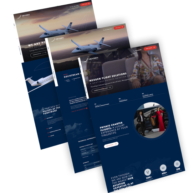
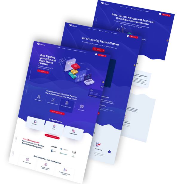
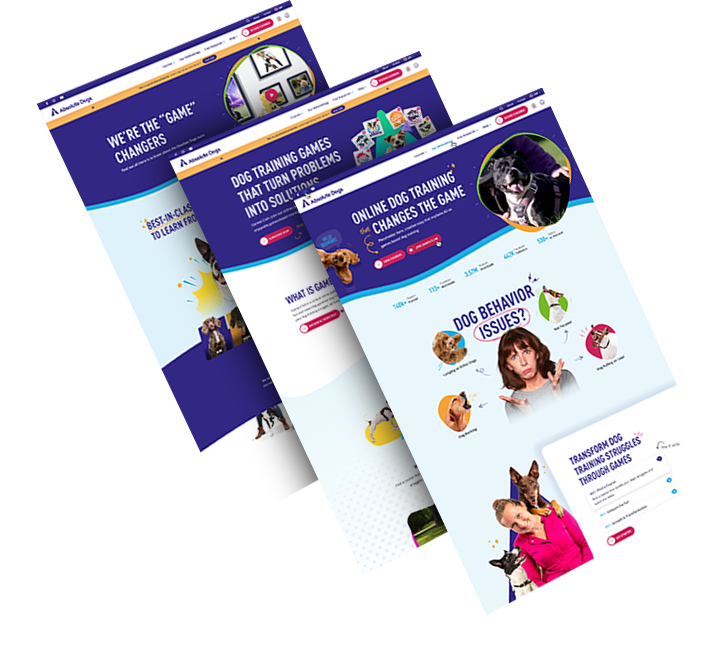
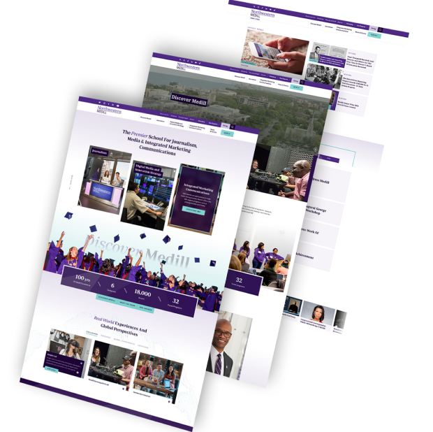
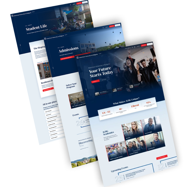
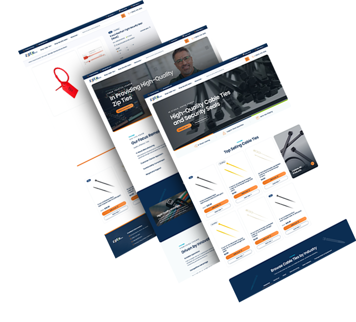
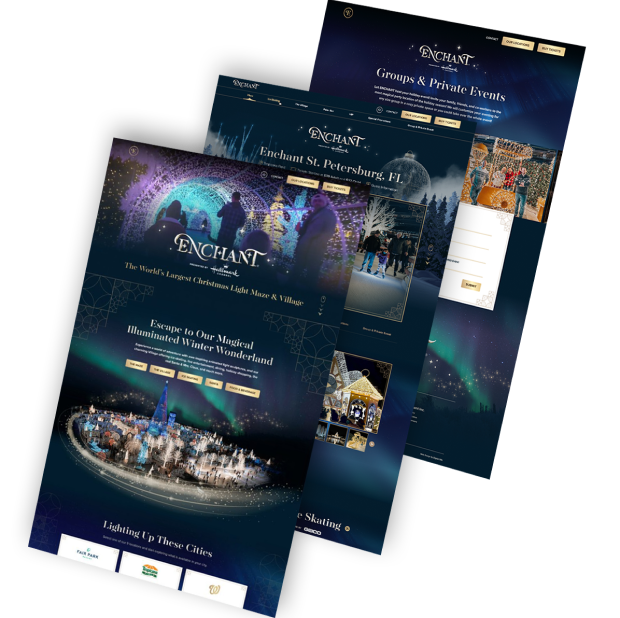
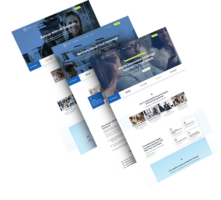
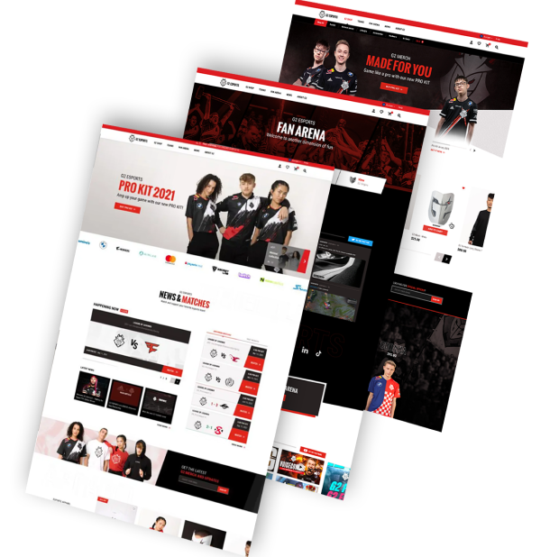
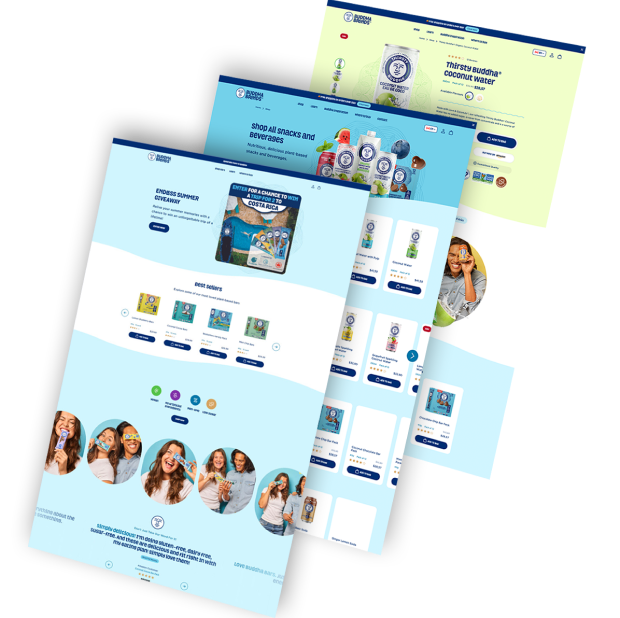
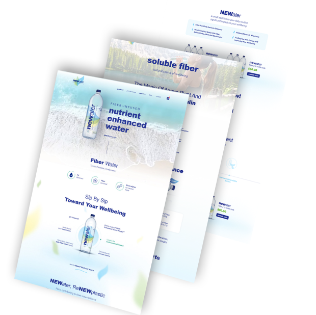
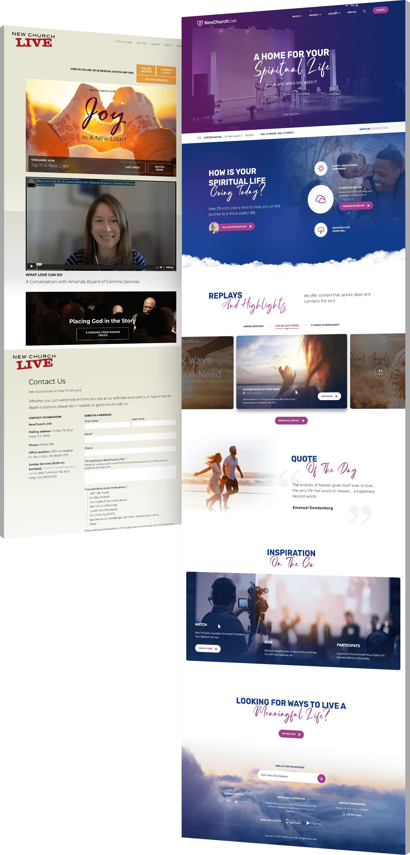
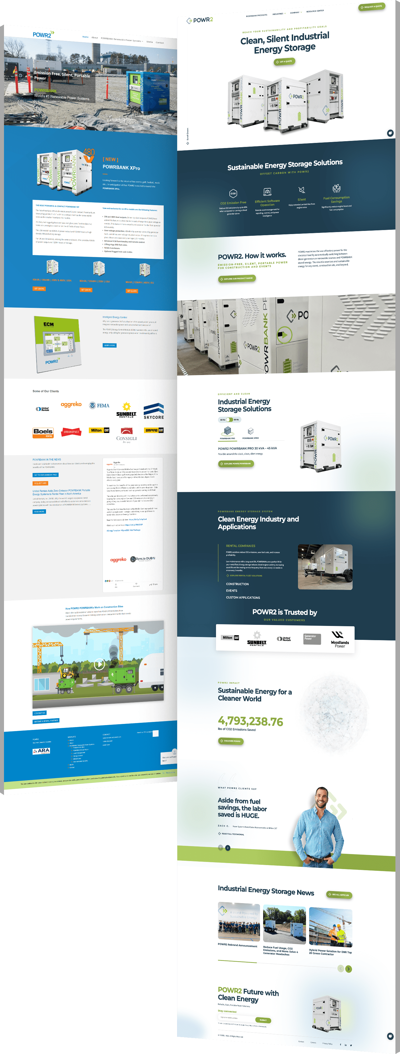
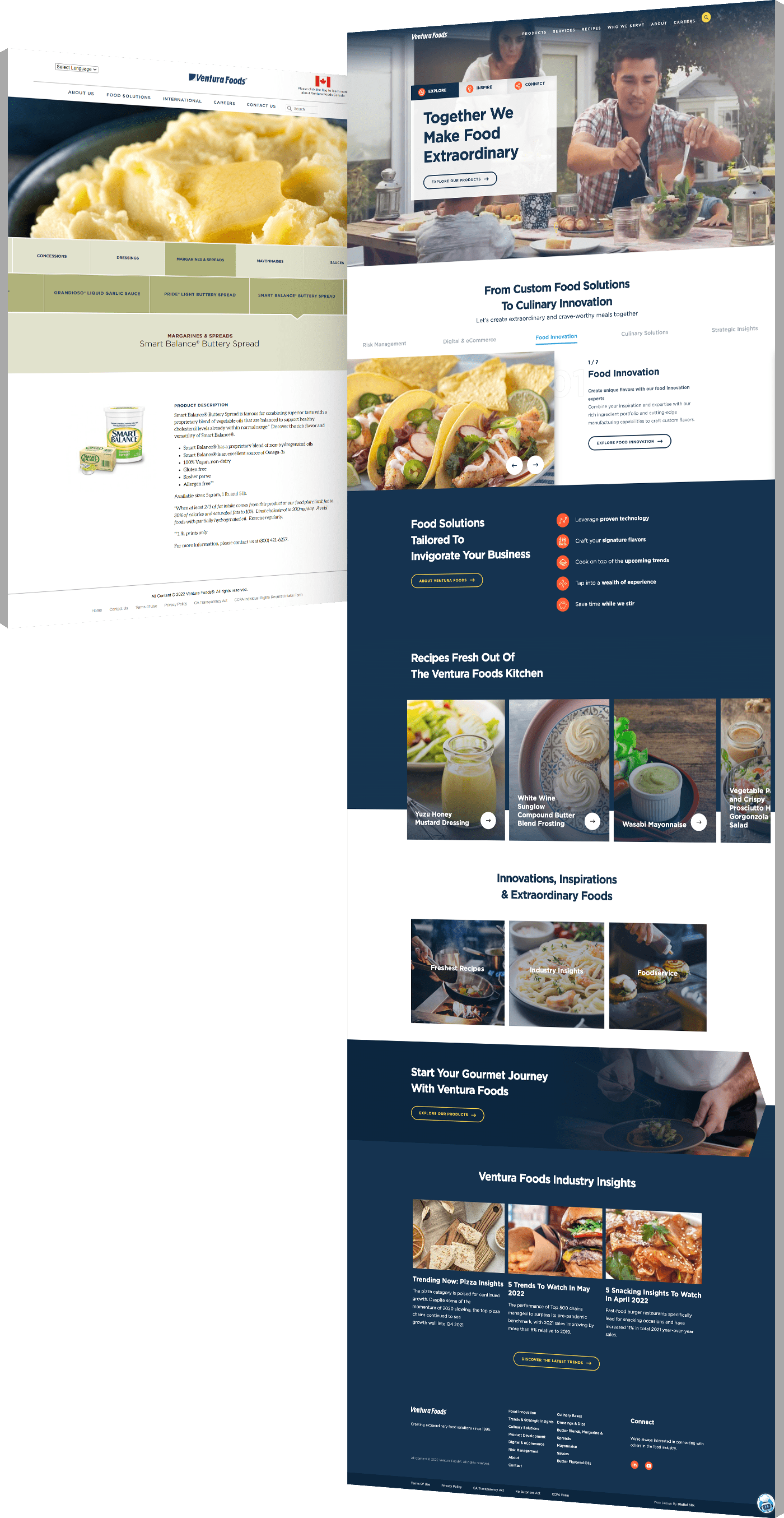
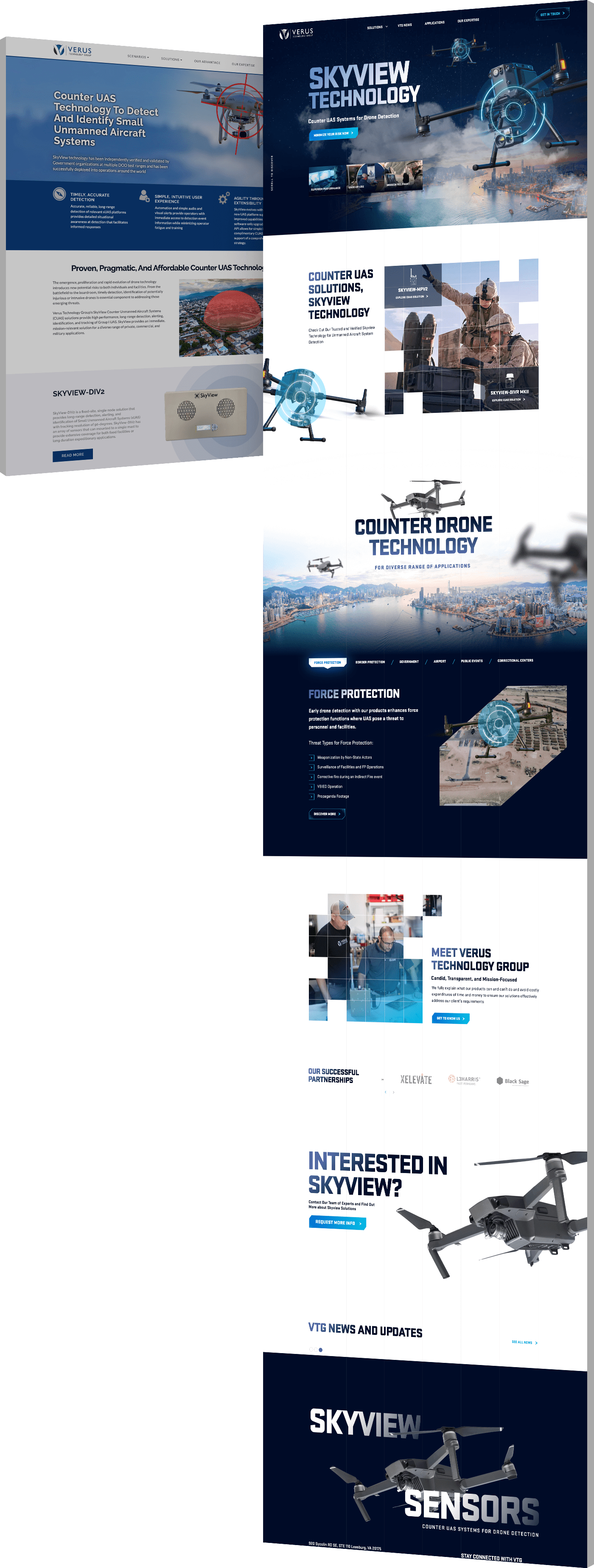
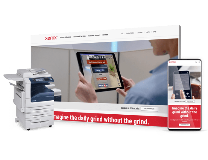
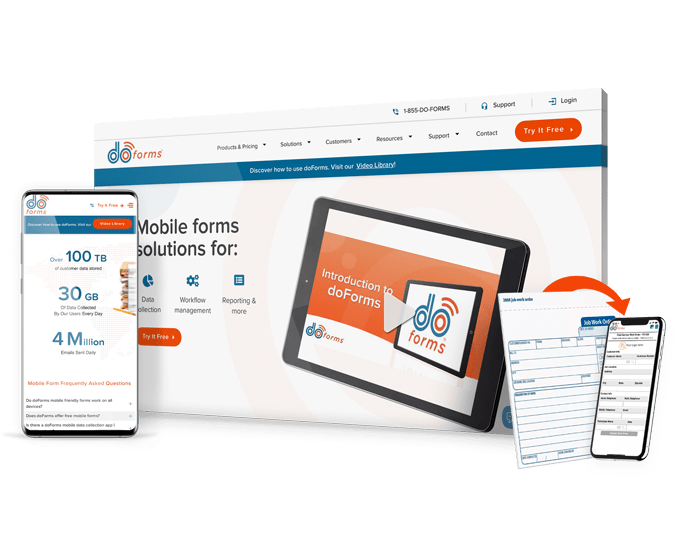
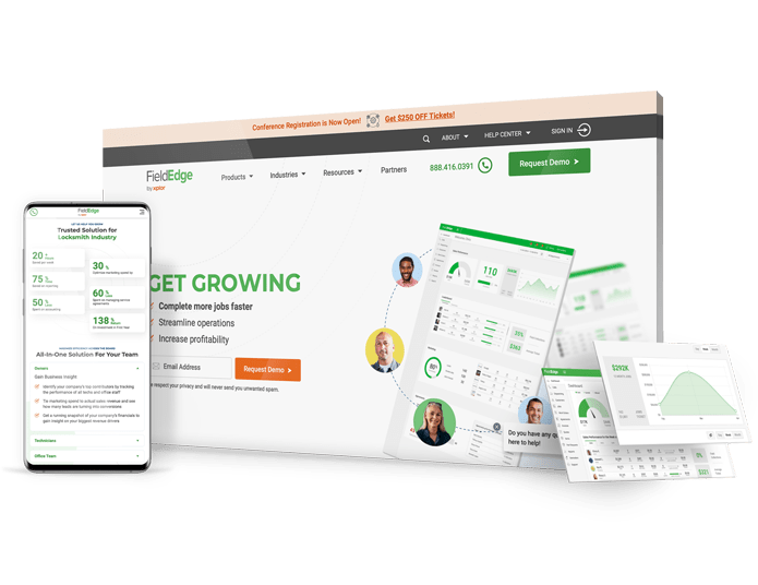
Featured Case Studies
Mobile-First Web Design Services
With the majority of users browsing the internet on their phones, it is paramount that your website seamlessly adapts to different screen sizes and devices. A responsive, mobile-first design ensures that your content remains engaging and that your visitors can easily access it, regardless of their location and device. Our solutions are geared towards increased visibility and conversion, making sure you don’t lose potential customers due to a clunky, unresponsive website.
Mobile-First Website Design
With half of the web traffic worldwide coming from mobile devices, investing in mobile-first web design will help you meet the expectations of this new reality.
Generate higher on-site engagement and conversions with mobile-first web design that loads quickly and offers the same great user experience across devices.
Explore our custom web design services.
Mobile-First Website Redesign
Slow loading speeds, lack of security and unresponsive development are all factors that might affect your visitors’ online experience, consequently hurting your business. At Digital Silk, we redesign brands online to address all of these issues and more, to ensure your visitors have an engaging, responsive and error-free experience with your brand.
Explore custom website redesigns.
Mobile-First Website Development
From strategy to design and development, mobile-first web design prioritizes the most important aspects of your website and its content.
We cater to your mobile device users by optimizing for faster loading times on mobile networks and search intent based on your target audience for increased visibility. We also keep the site lightweight with optimized images and assets to account for possible data limitations.
Explore our custom web development services.
Web App Development
Whereas a website typically acts as a digital brochure for your business, a web app offers features that allow visitors to perform tasks and actions, such as making reservations, editing documents, or managing accounts.
Our end-to-end web app design process is driven by user behavior insights, industry best practices and the latest design trends.
Website Marketing
After launching your custom mobile-first website, you need people to come to it, otherwise, it won’t serve its purpose. That’s where our team of marketing experts comes in.
We can help you grow the number of visitors and keep them browsing your website for longer with our website marketing services which include social media, PPC and email marketing — to name a few.
Explore our digital marketing services.
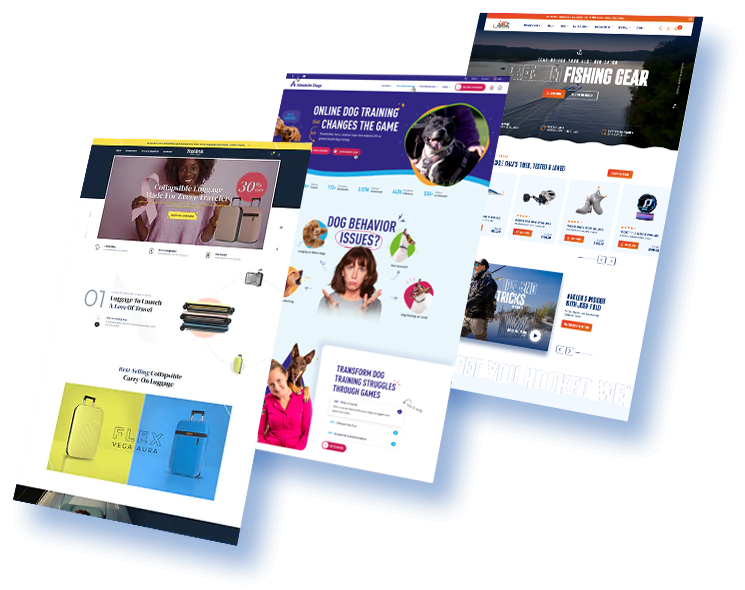
Capture Mobile Conversions With Digital Silk
"*" indicates required fields


Trusted Mobile-First Web Design
From thriving startups to Fortune 500 companies, we work with brands across industries.
Mobile-First Website Design Process
Here’s a glimpse at our process of developing
a custom mobile-first website design for your brand.
Before & After
Featured Website Redesigns
We reimagine digital experiences for brands of all sizes and across industries.
Explore our redesign portfolio.
Our Web Design Case Studies
See for yourself.
WHY COMPANIES CHOOSE US
Digital Silk’s Unique Value As A Mobile-First Web Design Agency
Project Ownership. Transparency. Results.
Digital Silk is your trusted partner in mobile-first web design. Boasting extensive industry experience, our teams of experts in branding, marketing, optimization and design collaborate to develop a bespoke strategy that drives measurable results.
We will also act as consultants throughout your digital reinvention, ensuring optimal performance and execution during each step of your mobile-first web design journey.

Digital Silk’s award-winning designers blend creativity and innovation to come up with custom designs that differentiate your brand and make you stand out from the crowd in your industry.
Our approach seamlessly combines strategic insight and engaging designs to guide your visitors across your website, turn them into paying customers and offer them a unique digital experience.

At Digital Silk, we believe in complete project ownership. We manage your mobile-first web design project from the discovery session to launch and beyond.
Our collaborative process ensures you have an active role in shaping your digital brand’s online presence and your participation ensures that we will grow your brand online while keeping your specific business goals in mind.

Our core mission is to grow your online brand. By analyzing your brand, research and competitors, we implement strategies that aim to increase your visibility, reach your target audience and convert them.
Our comprehensive web design services include custom strategy, design, development and search engine optimization, ensuring your brand’s growth, increased website traffic and improved bottom-line.

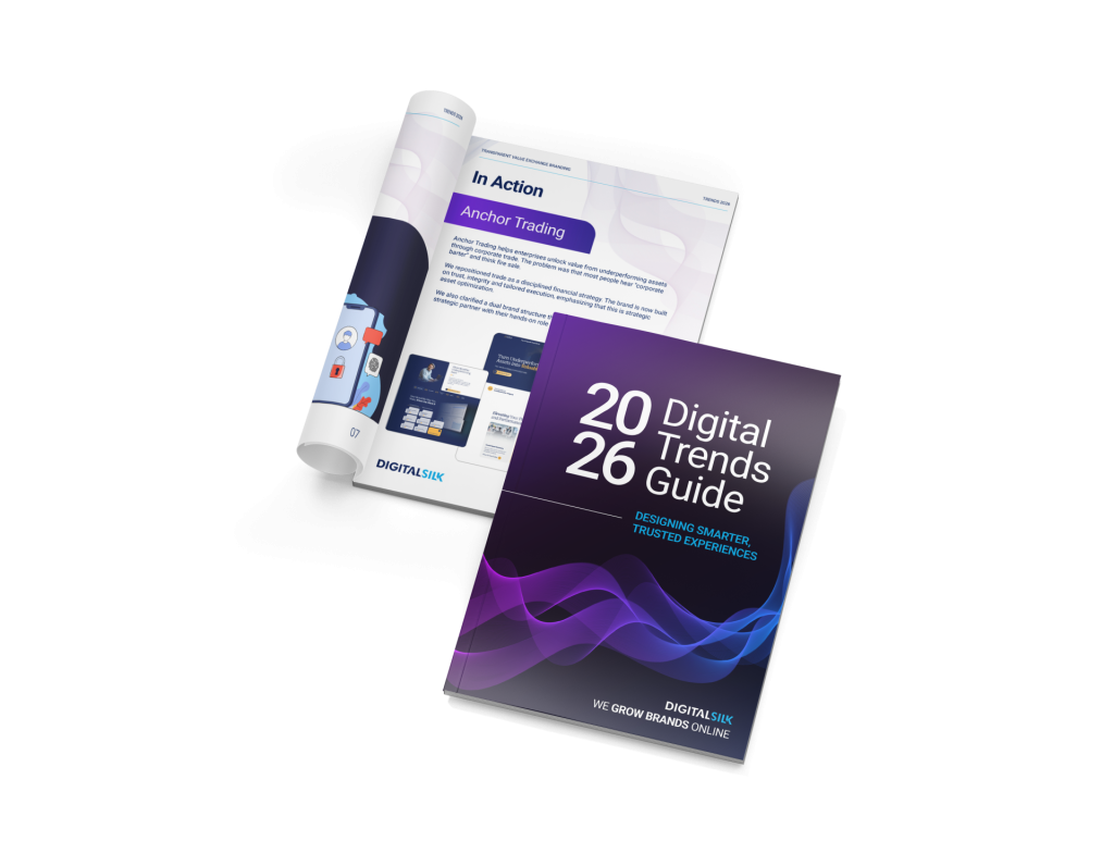
We emailed you the download link. Check your inbox and enjoy the whitepaper!
Stay Ahead in 2026!
Download the Top Digital Trends Shaping Branding & Web Design
"*" indicates required fields

Recognized Digital Agency Experts


- Brand Strategy
- Communication Strategy
- Logo & Graphic Design
- UI & UX Design
- Package Design
- Custom Web Design
- eCommerce Development
- Mobile App Development
- Software & AI Development
- ERP Portal Integration
- Marketing Strategy
- Social Media Marketing
- Search Engine Optimization
- Paid Media Marketing
- Email Marketing
- Creative Copywriting
- Content Marketing
- Influencer Marketing
- Affiliate Marketing
- B2B Direct Marketing
Keep Exploring
Web Design Services
- Creative Web Design
- Mobile-First Web Design
- Magento Development
- Mobile App Development


